VisComm Website UX Design
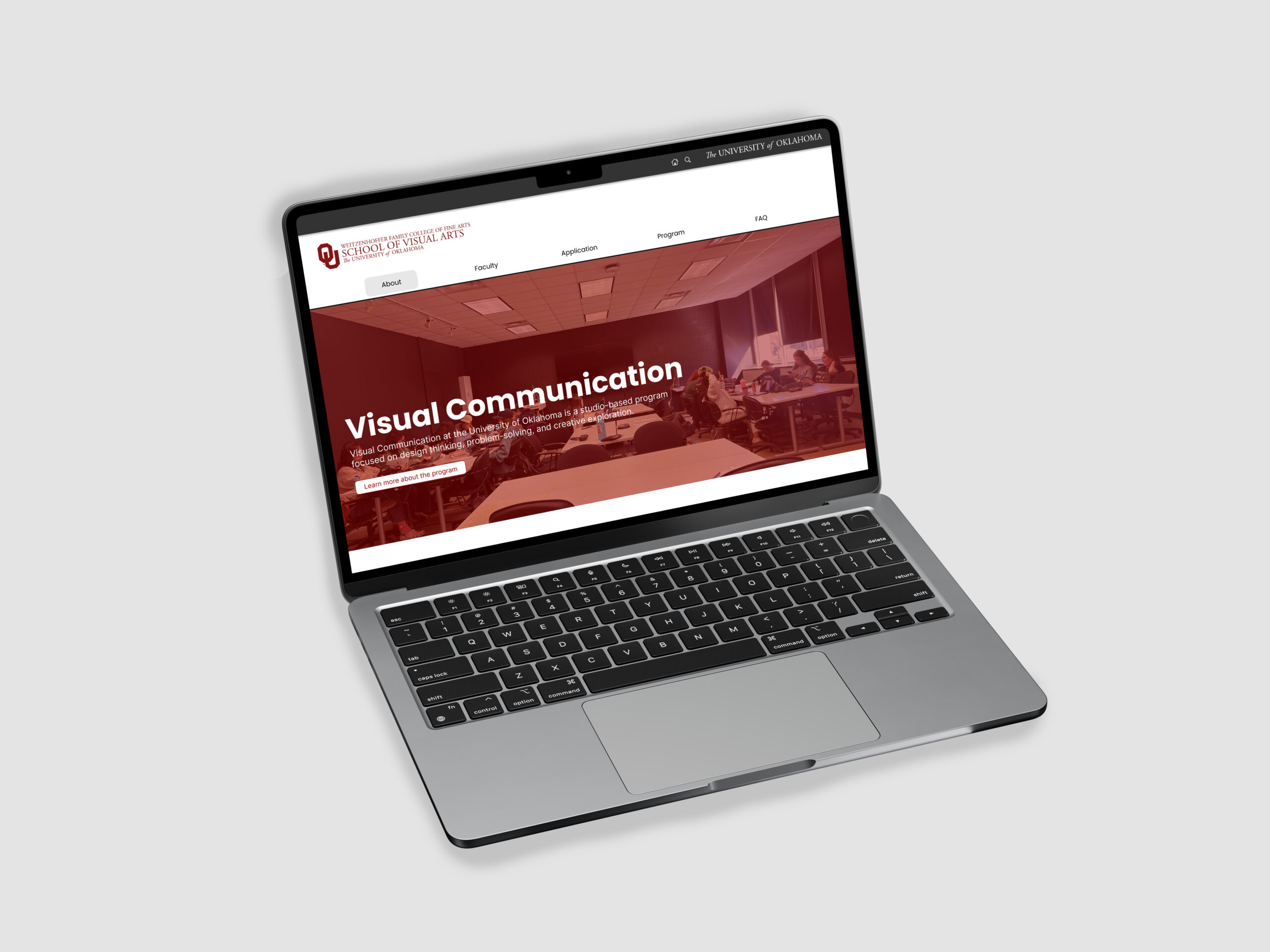
The goal for this project was to design a website for The University of Oklahoma’s Visual Communication program. We used UX research methods to produce the results we needed.
We began our design by conducting research
Empathize:
Our goal for the empathize stage is to gather insights from both competitors and potential users that can directly inform the design of the new and improved website. By taking all of our research into account, this stage will serve as a strong foundation and starting point for the redesign process.
Competitive Analysis
For the competitive analysis, our process began by identifying potential competitors to OU’s Visual Communication program. To do this, we searched for Visual Communication degrees online and selected the top school websites that appeared in the results, especially since these programs ranked higher than OU’s. We considered these schools to be direct competitors because prospective students are likely to see them first when researching programs. In addition, we included an international Visual Communication program to account for the perspective of international students who might be comparing options beyond the U.S.
Ohio State University
Strengths:
- Spotlights students in many ways
- Includes course curriculum – throughout all 4 years
- Lots of links to other websites are included
Weaknesses:
- Lots of text compared to images
- Doesn’t include much about minors
- No professor information
Tsinghua University
Strengths:
- Clear navigation with a well-structured hierarchy
- The interface features a simple and uncluttered design
- Designed with global users in mind
Weaknesses:
- Interface feels outdated and does not meet modern design standards
- The browsing experience is compromised by the need to zoom in and out frequently
Oklahoma State University
Strengths:
- Video showcasing major
- Shows list of career options
- Includes important resources for students
Weaknesses:
- Does not have a Frequently asked questions page
- Does not include class information
- Does not include professor information
Our competitor analysis revealed that one of the biggest areas for improvement is the program’s visuals, particularly in how we showcase student work and internships. It also highlighted the importance of ensuring that the website’s design clearly reflects the essence of the program.
Interviews
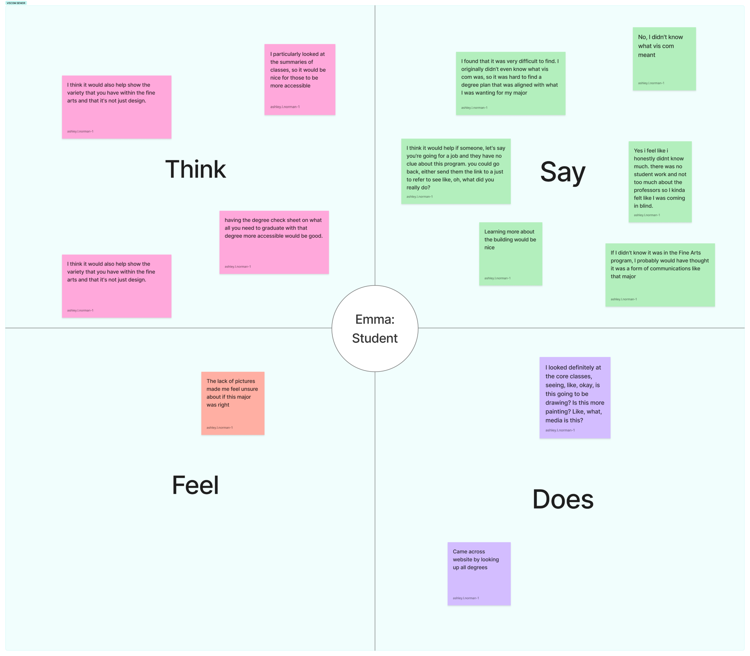
To gain a deeper understanding of our users’ needs, our team conducted interviews with nine participants. Below are the empathy maps from the three interviews I conducted: a prospective student, a current senior majoring in Visual Communication, and a parent of a Visual Communication student. These conversations offered valuable insights, especially regarding the challenges of limited and confusing information on the current website. Other key findings included issues with visual design, content clarity, and accessibility—all of which will play an important role in shaping our redesign. By focusing on these areas and applying what we’ve learned, we aim to engage in collaborative discussions that will guide our approach to improving the updated website.
Define:
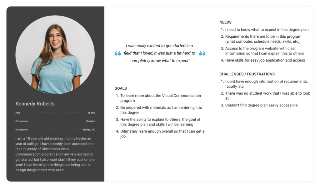
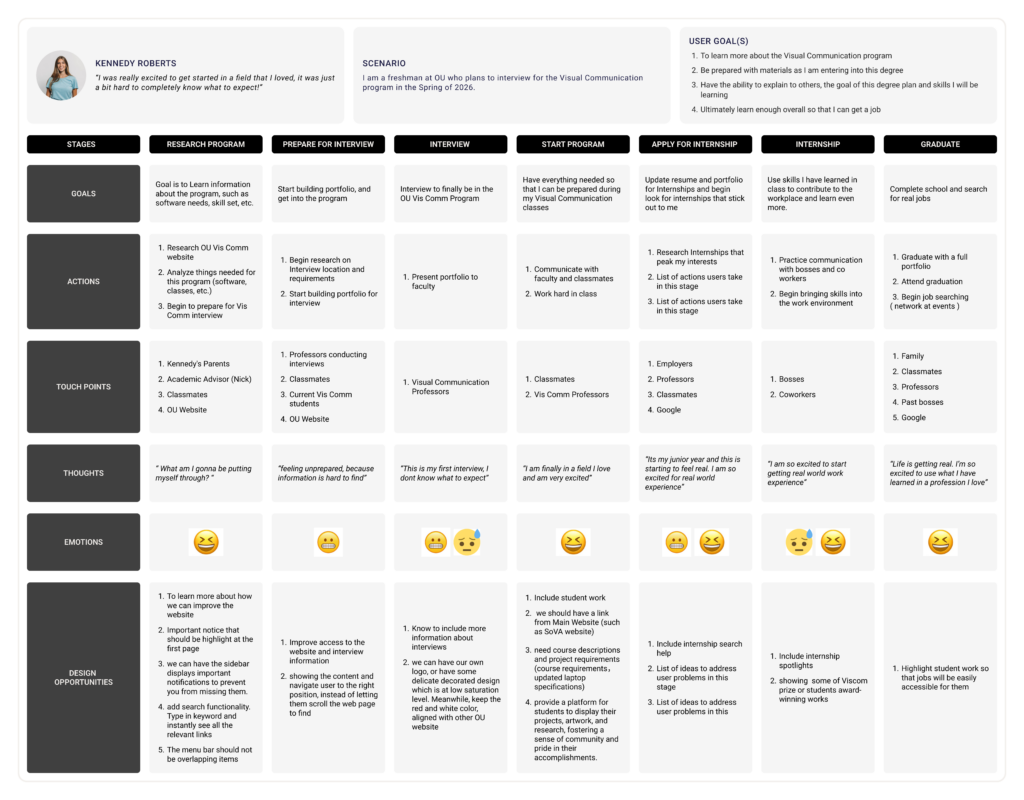
Drawing from the user interview data, we developed three personas: prospective students, parents, and alumni, along with their current journey maps. These personas helped us gain a deeper understanding of how each group navigates different stages of their lives, highlighting their goals, actions, touchpoints, thoughts, and emotions. Through this process, we gained valuable insights into how we, as designers, can apply what we learned to improve the OU website. While many of the personas’ stages occur after accessing the OU website becomes essential to do so; the research also revealed opportunities to provide useful information for parents and alumni beyond enrollment. Equally important, hearing directly from prospective students gave us a clear understanding of the specific information they prioritize when first engaging with the OU website.
Ideate:
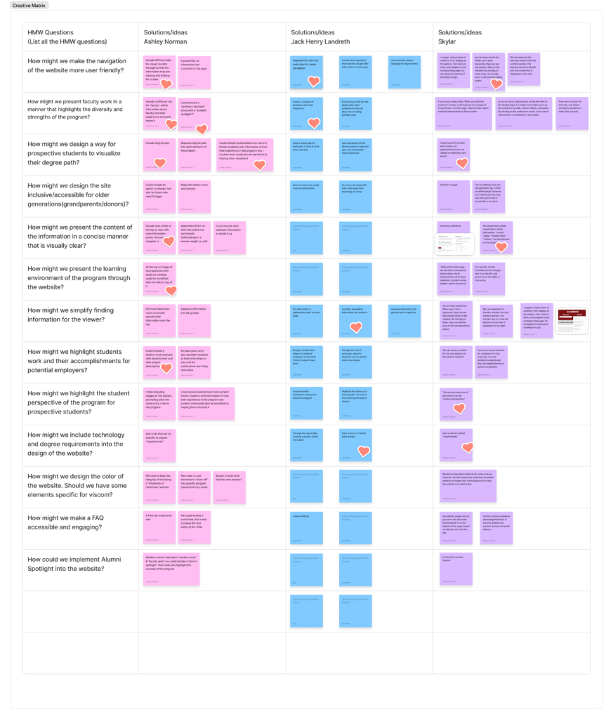
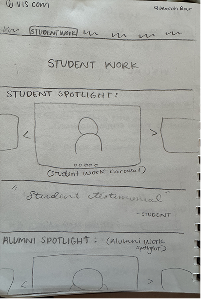
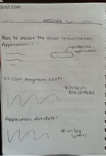
Through the ideation process, we began to shape a clear vision for the website’s design and functionality. This stage allowed us to transform our research insights into tangible design concepts. We started by creating a creative matrix using “How might we…” questions, which guided our brainstorming and encouraged us to think critically about user needs and challenges. From this process, we identified our strongest and most practical ideas to serve as the foundation for our website design. Key features included a “Student Spotlight” carousel and an “Alumni Spotlight” carousel, both intended to highlight the work of current and past students in an engaging way. Additionally, we found it beneficial to incorporate an application section with essential program information, along with a Visual Communication news section to keep the site dynamic and informative.
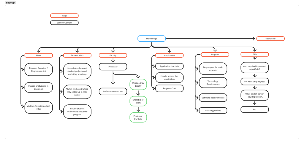
After narrowing down our ideas, we created a sitemap to outline the structure of the site, including the main tabs and the information that would appear under each one. This step helped us visualize how users would navigate the website and ensured that the layout and content would be clear, accessible, and user-focused.
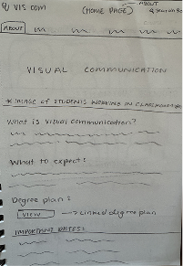
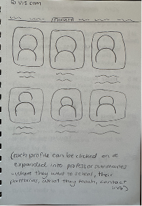
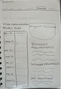
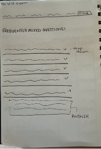
These are the initial exploration of the UI designs through sketches…
Lo-fi Prototype:
Based on the sketches my group and I created, we each began developing individual wireframes for our website. Using our research as a guide, I made sure to incorporate all the elements we discussed during that stage. We identified easy access to student work, degree plans, applications, and faculty information as top priorities. To make these features simple to find, I organized the navigation so each tab clearly reflects its content. I chose the “About” tab as the landing page, since it feels like the most natural starting point for visitors to the Visual Communication website. From there, users can easily explore the rest of the site. I also added interactive elements, such as carousels and buttons, to make the site more engaging and to present information in multiple, easy-to-understand formats. We were also expected to use the University of Oklahoma’s website guidelines, which were necessary for the structure of the website. This included adding the appropriate header and ensuring the footer contained the correct information. Below are a few of my main pages—the Home/About page, Faculty page, and Program page. On the About page, the button under “Degree Plan” links directly to the Program page, adding an interactive element. On the Faculty page, users can click on each professor’s photo or name to view their individual bio and work.
Wireframe Prototype
Think Aloud Testing
For the “think-aloud” testing phase, I recruited three participants from different user groups—a parent, a student, and a faculty member—each of whom provided valuable feedback. I created five tasks for every tester to complete: locate Professor Raju Maharjan’s bio and work page, find upcoming News and Events, identify the list of senior-year courses, find Student and Alumni work, and locate the Visual Communication application. I asked each tester to screen-record their process with audio so I could clearly follow their thought process.
The parent navigated the site with ease but recommended adding brief text labels to the News and Events carousel to make the content more immediately understandable. They also suggested making student work images clickable so additional project details could appear in a pop-up. The student tester also found the site easy to use, but noted that the News and Events section was difficult to locate since it sits at the bottom of the About page. They felt the Programs page could benefit from more interactive elements to make the information more engaging. Finally, the professor moved through the site smoothly overall, although he accidentally clicked the Students tab instead of the Classes page. His main recommendation was to remove the Students tab entirely and relocate student work to a section like News and Events, since that content is frequently updated.
After reviewing the test results, one change I’d like to make is adding the student work carousels to the Programs page. That way, as users scroll through the degree plan, they can also see examples of what students created during each semester. I’m also considering combining the “Alumni” section with the Faculty tab to make their profiles easier to find and view. Additionally, I want to incorporate pop-ups into the carousels so users can access more information about each piece of work.
Hi-Fi Prototype:
Based on my wireframes, I began developing my high-fidelity prototype. II incorporated OU brand colors, images, interactions, and feedback on my wireframes. As I added visual elements, I noticed a few areas that needed improvement, so I made adjustments and added additional information along the way.
During this stage, I made several updates: I redesigned the program page by turning the table into individual clickable buttons so users could access more information about each class. I added a student spotlight on the homepage, corrected the quote on the faculty page, and moved Nick (the academic advisor) to his own page to avoid confusion. I also made other refinements, such as replacing the faculty work section with direct links to their portfolios and adding a notable alumni page to highlight where graduates have taken their work. I explored several design options for key pages and sections, then used A/B testing to evaluate them and implement the strongest solutions.
A/B Testing
For my A/B testing, I compared two versions of three key areas on my site—the News and Events section on the home page, the application page, and the student work section on the program page. I created A and B versions because I wanted to test whether layouts that were visually engaging (like carousels) were actually less clear for users than more straightforward card-based layouts. Overall, the B versions consistently performed better.
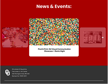
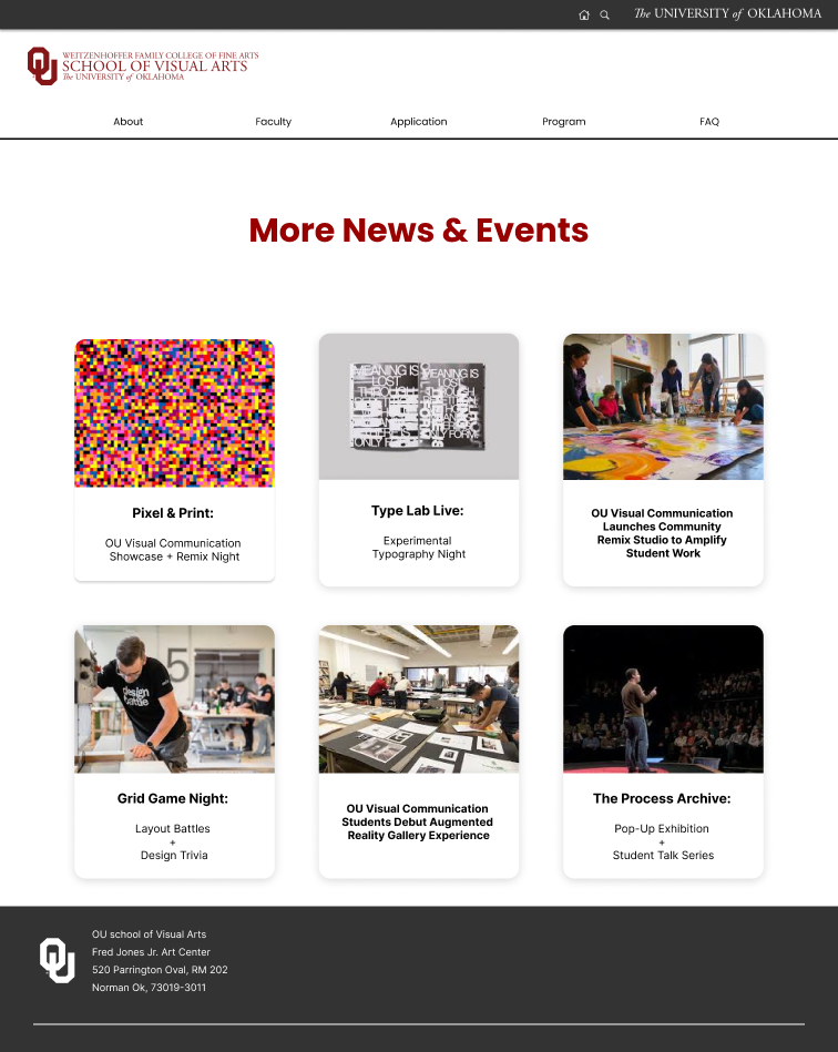
For the News and Events section, I originally liked the visual movement of the carousel, but I suspected that users might prefer a simpler, more direct way to view updates without having to click through slides. In Version B, I switched to individual cards for each item and added a “More News and Events” button so users could easily access additional content. Testers responded very positively to this change—they found the card layout much clearer, easier to navigate, and more informative at a glance. Several mentioned that they preferred this over the carousel, which they found confusing and easy to miss information in.
News & Events (A&B)
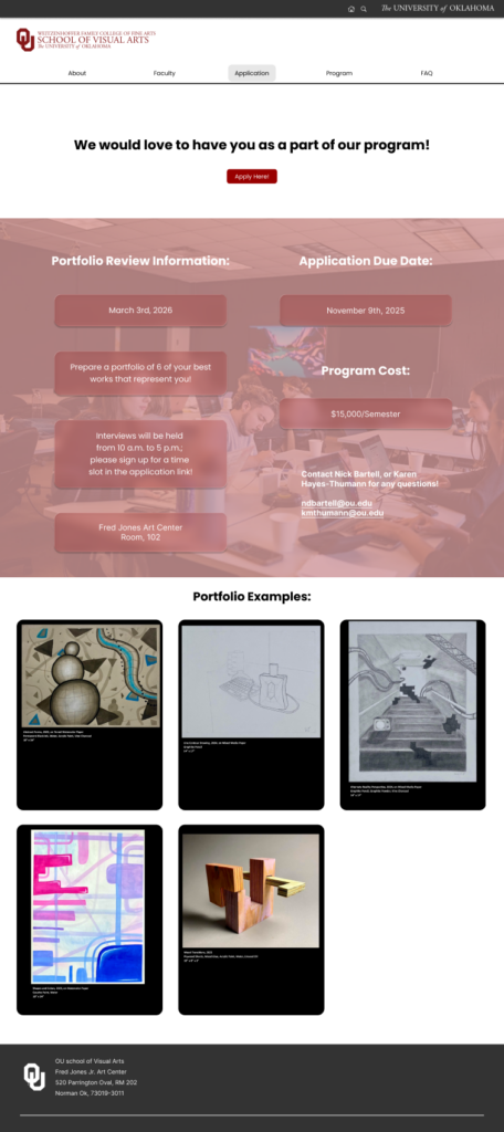
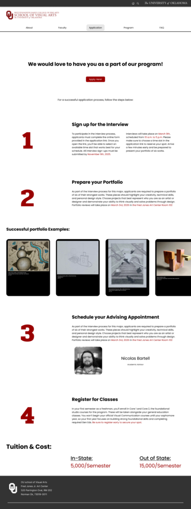
On the application page, I wanted to see whether reorganizing the information and simplifying the layout would improve clarity. Testers struggled with Version A, noting that the content felt disorganized and hard to read. Many were unsure about the steps or the purpose of the page. Version B, however, was much more successful—testers said it felt cleaner, more intuitive, and easier to follow. One tester even shared, “If I were an incoming freshman, this page would make me feel much more comfortable and excited because I would know what steps to take.”
Application Page (A&B)
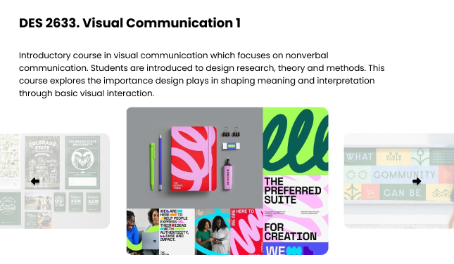
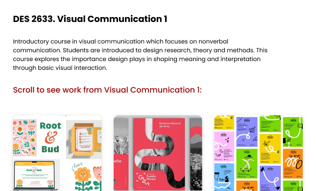
Finally, for the student work section under each class button, I tested whether switching from carousels to a card-based, scrollable layout would help highlight more examples and reduce confusion. Like with the News and Events section, I suspected the carousel might be limiting how much work users could easily browse. In Version B, I replaced the carousels with cards and made the section scrollable to allow more pieces to be displayed. Testers appreciated having a wider range of work to look through and felt that the new layout was simpler, more cohesive, and more consistent with the updated design across the site.
Student Work/Class Description (A&B)
Final Prototype:
Conclusion & Reflection:
The goal of this project was to design a website for the University of Oklahoma’s Visual Communication program. We started by researching other Vis Comm websites to understand what information they included and how they presented it. Then, we interviewed three user groups, prospective students, current students, and parents, to learn what they wanted to see on a program website. This research helped shape our content and structure.
Next, we created a sitemap and early sketches, which guided the layout of our wireframes. These wireframes were tested using the Think-Aloud method, and the feedback we received informed our Hi-Fi prototype. We followed this with A/B testing to compare design options and identify the most effective solutions. All of these insights were then applied to the final version of the website.
I’ve really enjoyed learning UI/UX design. It wasn’t something I expected to study or even enjoy, but this project has helped me gain so many new skills and a much better understanding of the process. I do wish I had pushed myself a bit more and spent additional time outside of class working on my designs. School got busy, so it was hard to dedicate extra time to exploring Figma and figuring out more advanced techniques. Still, even with the time I had, I noticed steady improvement and real growth as a designer.
This project showed me how valuable practice and repetition are; the more I worked through the same steps, the more natural and intuitive they became. I think these skills will be incredibly useful moving forward, and I’m confident I’ll be able to carry what I’ve learned into my future work.