
Objective
The goal of the empathize stage was to understand the real needs and experiences of those connected to the University of Oklahoma’s Visual Communication (VisComm) program. Before jumping into design, we wanted to learn directly from students, parents, and faculty about their challenges, expectations, and what information they look for. We also studied other design school websites to see what worked well and what didn’t. This step gave us the foundation to make smart, user-focused design choices for the new website.
Approach to Interviews & Competitive Analysis
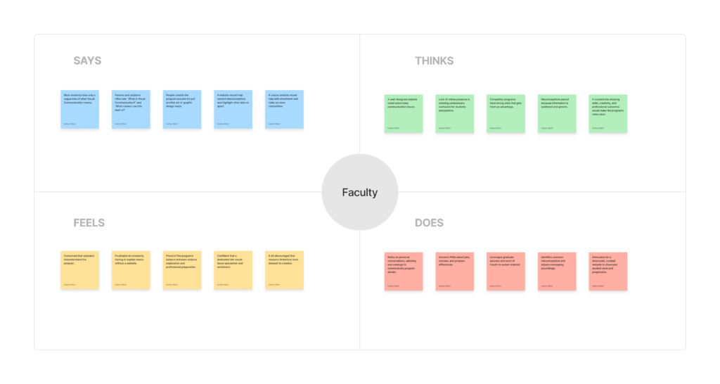
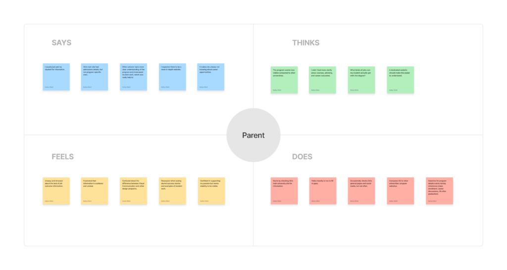
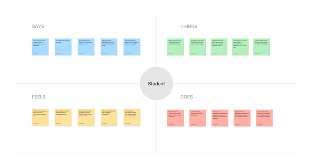
We interviewed three user groups: parents, current students (including seniors), and faculty members. Each group gave us a different point of view. Parents talked about how hard it is to find clear information about the program. Students explained that they relied on word of mouth and advisors because the current online resources didn’t help much. Faculty shared how often they have to repeat basic information because there’s no central website to point people to.
After collecting responses, we used empathy maps to organize what people said, thought, felt, and did. We grouped their answers into four themes: website improvements, program visibility, information clarity, and reasons to enroll.
At the same time, we studied the websites of University of Central Oklahoma (UCO), Kansas City Art Institute (KCAI), and Savannah College of Art and Design (SCAD). UCO inspired us with its constant search bar, alumni highlights, and dynamic hero graphic. KCAI showed how powerful it is to make student work the focus, have clear navigation, and keep the design consistent. SCAD stood out for its bold visuals, clear content hierarchy, and concise information. These examples gave us practical ideas to apply to our own design.
Challenges
One of the biggest challenges was making sense of a lot of interview data. Each person had unique insights, so it took time to find patterns and turn them into useful takeaways. Working as a team helped, we used affinity mapping, grouping similar ideas together to see the bigger picture.
Another challenge was analyzing competitor websites more deeply. Instead of just looking at how they looked, we had to focus on how information was structured, how easy it was to navigate, and how they communicated their program. This required slowing down and being intentional.
Benefits Realized
This stage gave us a clear direction for what the new website needs. All user groups shared similar struggles: scattered information, unclear program details, and low visibility online. Parents and students had trouble finding course and career info, while faculty lacked resources to share with prospective students.
Through competitor analysis, we learned specific strategies: feature student and alumni work, keep navigation simple, use bold visuals, and organize content clearly for different audiences. These insights are now guiding our design decisions.
Reflection
The empathize stage reminded me how important it is to listen before designing. Talking with real users revealed overlapping needs that we wouldn’t have understood otherwise. It also improved my skills in organizing research, working with a team, and looking critically at other websites beyond surface design.
Overall, this stage gave me a strong understanding of what users need from the site and helped me grow as a designer who can connect research to real design choices. It set a strong foundation for the next steps in the design process.