
Objective
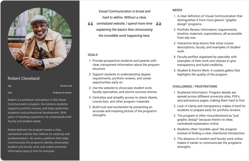
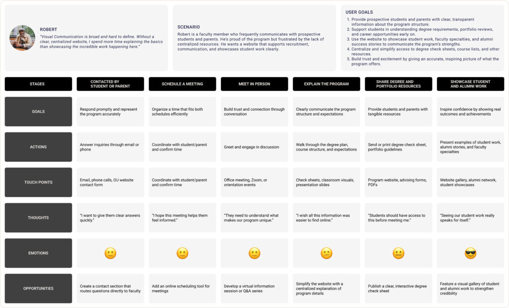
The Define stage was where all the interviews and research started to come together. After talking with students, parents, and faculty, I needed a way to make sense of everything I had learned. Creating personas and user journey maps became my main tools for doing this. By visualizing each user group (a student, a parent, and a faculty member), I could step into their shoes and better understand how they currently interact with the Visual Communication program, what they need, and where their frustrations lie.
This wasn’t just about collecting facts. It was about finding patterns in their experiences and turning those patterns into something meaningful that could guide the rest of the project.
Challenges
One of the biggest challenges I faced was synthesizing a lot of messy interview data into clear personas and journey maps. At first, it felt overwhelming, there were so many different quotes, perspectives, and pain points. I had to learn how to look for patterns without losing the variety of individual experiences.
Another challenge was making sure each persona felt realistic and grounded, not just a list of bullet points. I wanted them to feel like real people with motivations, frustrations, and goals. This took time and multiple iterations, but it was worth it.
Going through this process pushed me to become more empathetic in how I analyze user research. I learned to slow down, listen carefully, and let the insights shape the problem definition instead of rushing to design solutions.
Benefits
Developing these personas gave me a much deeper understanding of the users than I expected.
For students, I realized how much they depend on word of mouth to figure out basic information like course structures, portfolio reviews, and career paths. This showed me that the lack of a centralized, clear online resource doesn’t just inconvenience students, it shapes how they navigate the program entirely.
For parents, I saw how much they value transparency. They want to understand what their child will experience, see examples of student work, and learn about alumni success stories. Without this, they’re left piecing together information on their own, which can make the program feel vague and uncertain.
For faculty, I learned how much time they spend repeating the same information to students and parents because the existing online resources are scattered and outdated. This not only slows them down but also highlights how much clearer the program’s online presence could be.
These insights helped me see the program’s communication gaps in a new way. Instead of just hearing complaints, I could now understand how these gaps affect different people at different stages of their journey.
Reflection
This stage taught me the value of deep understanding before designing. Creating personas and journey maps wasn’t just a checkbox, it changed the way I saw the problem. I moved from a surface-level understanding of “we need a better website” to a much clearer picture of who we’re designing for and why it matters.
As a designer, this was a big growth moment for me. I realized that defining the problem well sets the tone for everything that comes after. By understanding my users more deeply, I felt more confident and intentional as I moved into the next stages of the design process.