
OU Visual Communication Website UX Design
This redesign of the OU Visual Communication website applied design thinking to create a clearer, more accessible experience for prospective students, parents, and faculty.
Empathize
The Empathize stage focused on understanding real user needs rather than making assumptions. To do this, we gathered insights from parents, current students, and faculty to better understand their experiences, frustrations, and expectations when searching for information about the Visual Communication program online.
From this research, several consistent issues emerged: unclear program information, low visibility of student work, and the absence of a centralized, structured website. These insights guided the direction of the project and ensured the design addressed real user needs across all audiences.
Competitive Analysis
To understand how other design programs communicate online, we analyzed the websites of the University of Central Oklahoma (UCO), Kansas City Art Institute (KCAI), and Savannah College of Art and Design (SCAD). Each site was evaluated based on layout, navigation, content clarity, and overall usability.

Strengths:
- Clean, readable layout with good spacing
- Key information easy to find
- Engaging interactive elements
- Clear introduction to careers in design
Weaknesses:
- Header navigation is inconsistent
- Limited showcase of student work and alumni
- The search bar is hard to use

Strengths:
- Strong focus on student work
- Alumni stories add credibility
- Clear, organized navigation
- Good use of whitespace for readability
Weaknesses:
- Some sections feel too text-heavy
- Image grids can become cluttered
- Weak mobile responsiveness
Strengths:
- Bold visuals and strong first impression
- Clear connection between education and careers
- Well-structured program information
- Concise and easy-to-read content
Weaknesses:
- Design lacks excitement and visual variety
- Off-center layout affects readability
- Poor hierarchy and inconsistent spacing
By analyzing UCO, KCAI, and SCAD, we identified effective strategies to improve OU’s Visual Communication website. UCO inspired stronger navigation and alumni visibility, KCAI highlighted the importance of showcasing student work with clear structure, and SCAD demonstrated the impact of bold visuals and concise content. Combining these strengths informed a design that is visually engaging, easy to navigate, and clearly communicates the program’s creative and professional identity.
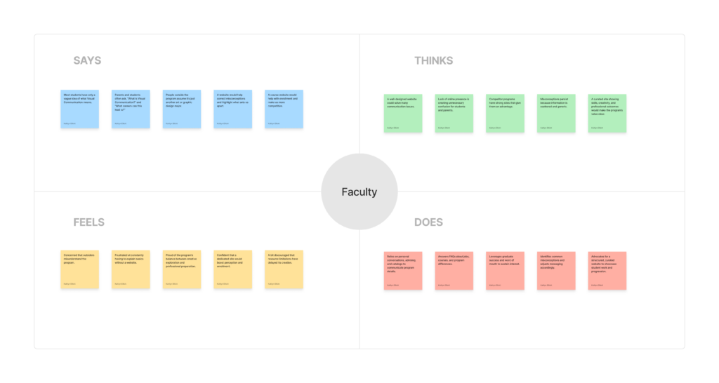
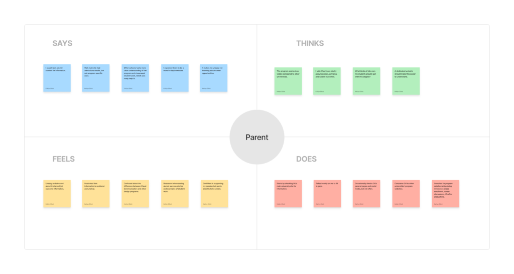
Interviews
To gain deeper insight into user needs, interviews were conducted with:
- 3 parents
- 4 current students and 1 senior
- 3 faculty members
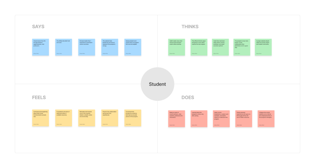
Responses were analyzed using empathy maps and grouped into key themes, including website structure, program visibility, information clarity, and reasons for enrollment. Across all users, a clear pattern emerged. Participants wanted a well-organized, visually engaging website, but found important program details difficult to locate. Many noted that student work, studio culture, and faculty mentorship were not clearly represented online. This lack of accessible information often led to confusion, especially for prospective students and parents.
Overall, these insights highlighted the need for a website that not only informs users but also accurately reflects the culture, strengths, and identity of the Visual Communication program.
Define
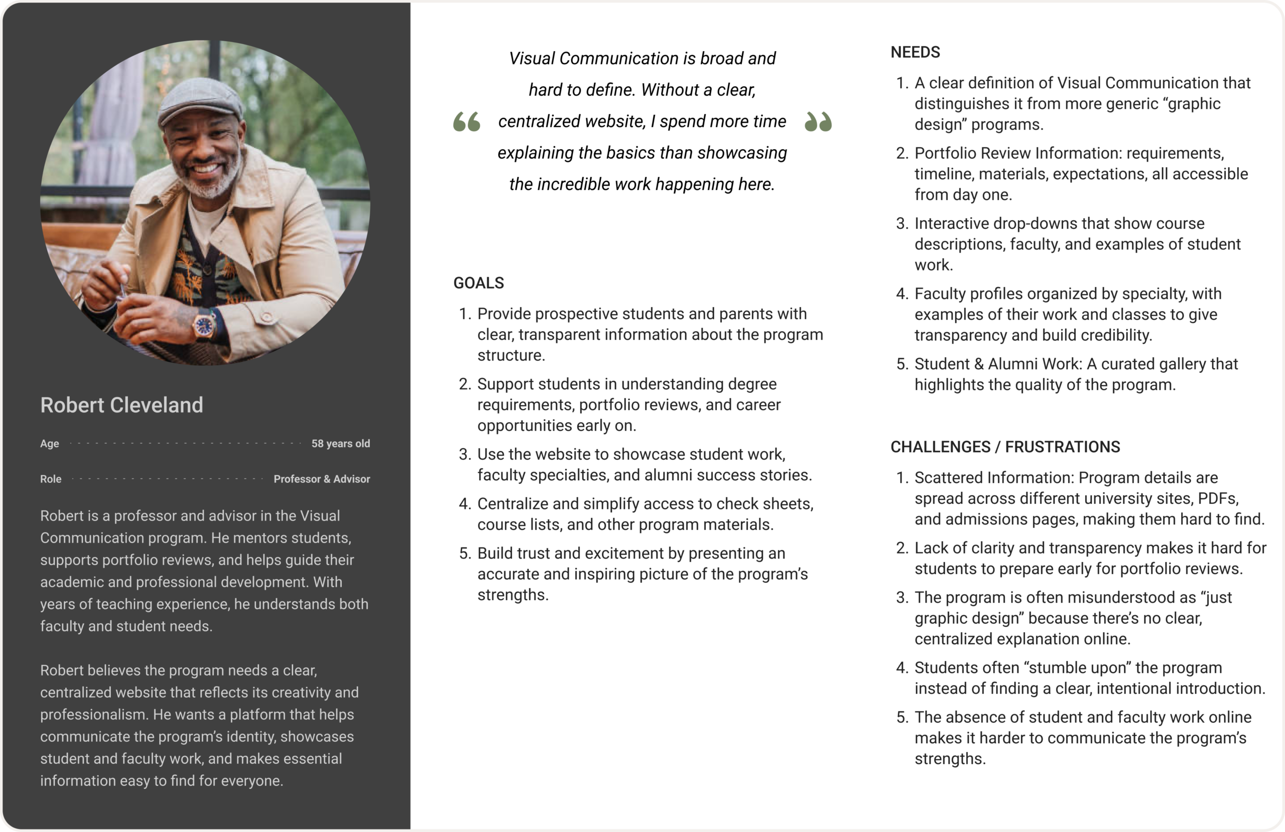
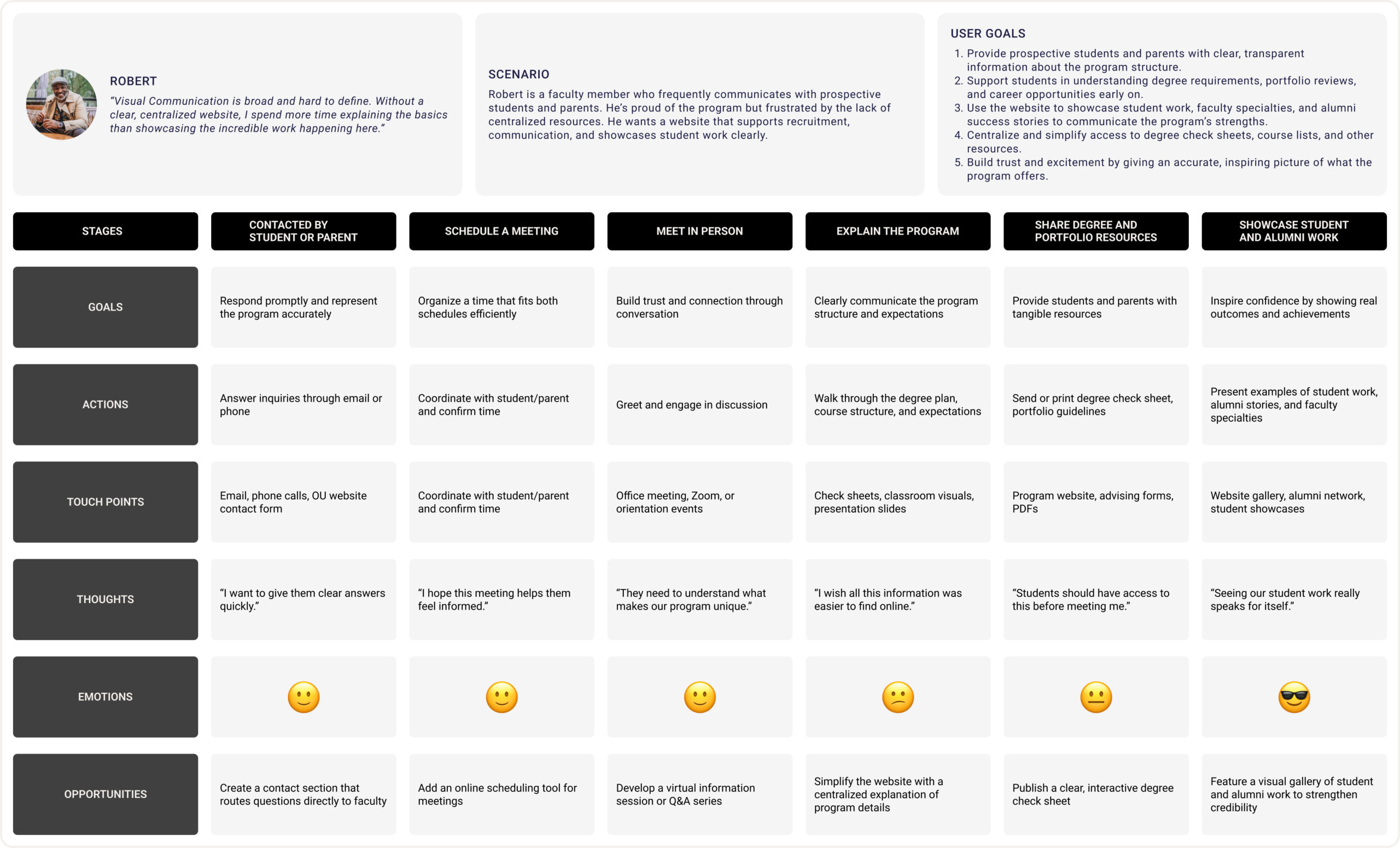
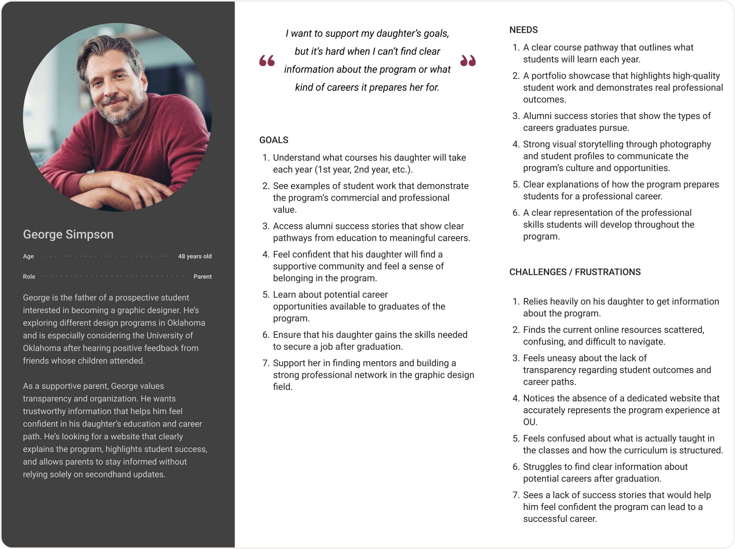
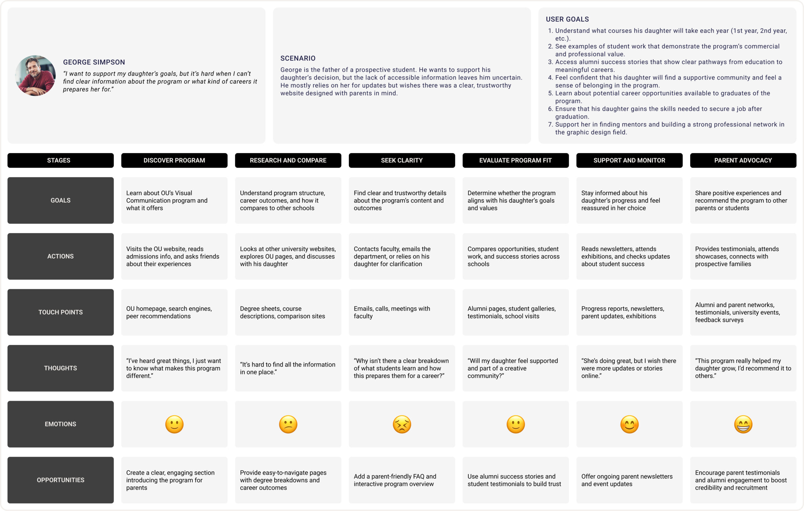
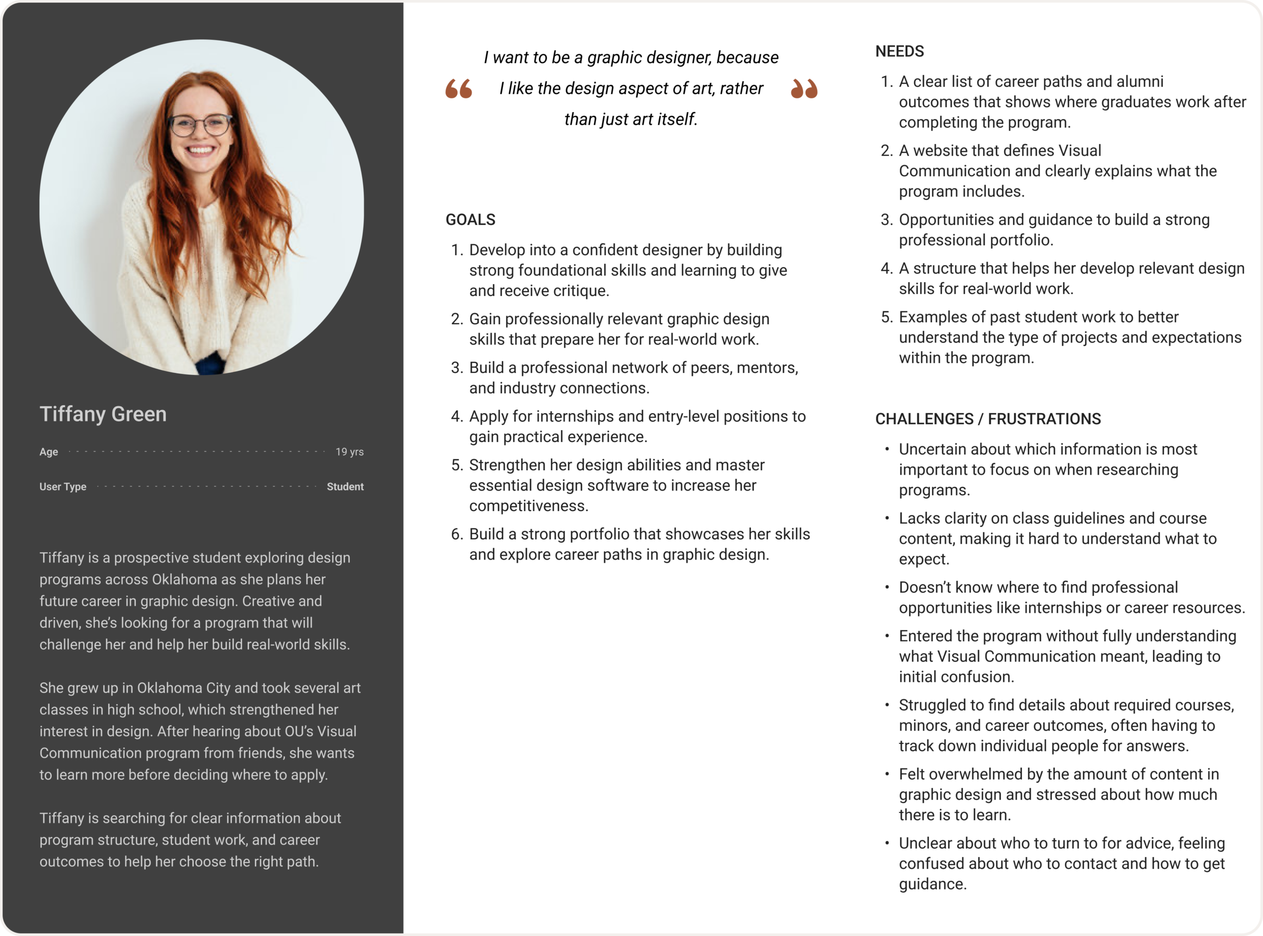
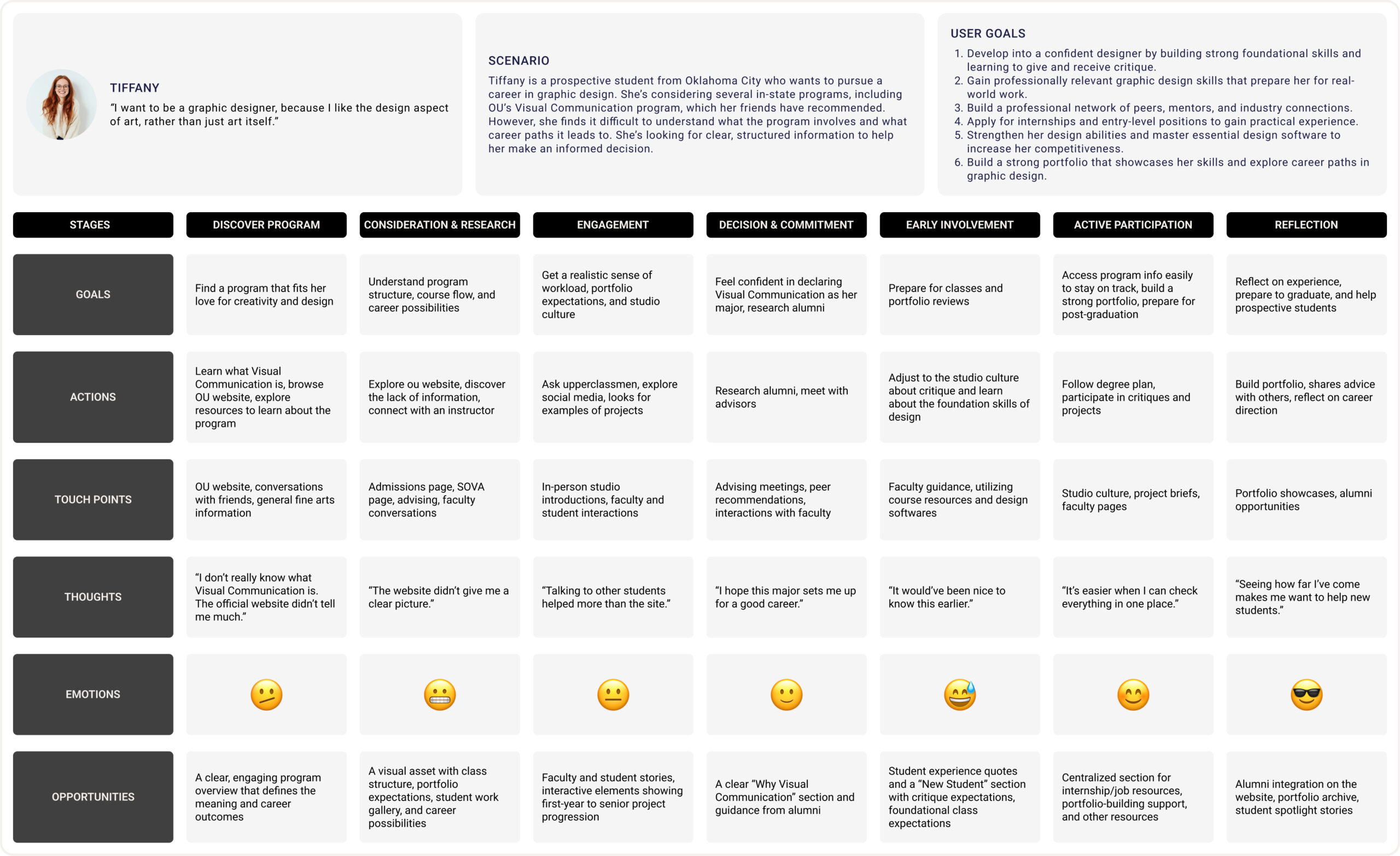
Based on insights from user interviews, we created three personas: a prospective student, a parent, and a faculty member and mapped their current user journeys. This helped us understand how each group finds information about the program, how they engage with it, and where they face challenges.
For students, the main issue was the lack of clear information about the program’s structure, portfolio reviews, and career paths, forcing them to rely on word of mouth. Parents needed transparent details like course structure, success stories, and student work to build trust. Faculty struggled to explain program basics due to fragmented and outdated resources.
These personas and journey maps clarified the core problems: unclear and scattered information, limited visibility, and missed opportunities to highlight the program’s strengths. Defining these pain points early on set a clear foundation for the next design stages.
Personas and User Journey Maps
Ideate
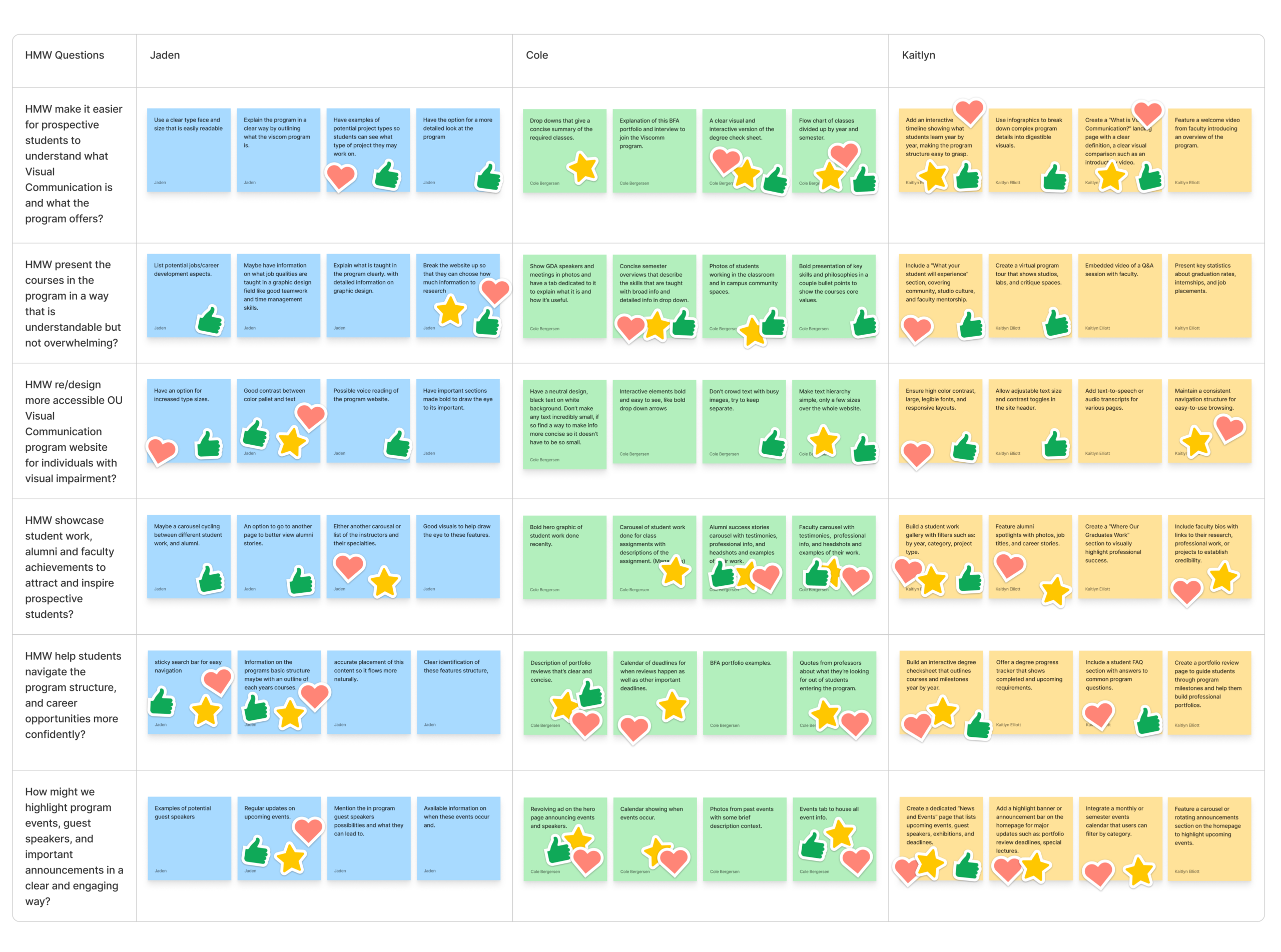
Out of the many design ideas we developed in the creative matrix, we chose to focus on creating a clear “What is Visual Communication?” section, an interactive program timeline, an alumni and student work showcase, and a news and events section.
As a team, we began the creative matrix by brainstorming several “How Might We” questions based on user needs identified during our research. Each team member contributed their own ideas into the matrix, which helped us explore a wide range of potential solutions before narrowing them down through discussion. This collaborative process allowed us to see where our ideas overlapped and identify the most impactful features that directly aligned with our personas goals and frustrations.
Each selected idea serves a specific purpose. The “What is Visual Communication?” section defines the program clearly for new visitors. The interactive timeline helps students and parents understand what is learned each year. The alumni and student work showcase builds credibility and excitement by highlighting real success stories and projects. Finally, the news and events section connects the program community by sharing upcoming exhibitions, guest speakers, and important updates.
Together, these features make the site more informative, transparent, and engaging, addressing real user needs for clarity, trust, and connection.
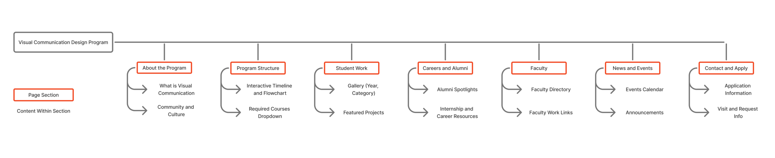
After finalizing our key ideas from the creative matrix, we organized them into a sitemap to define how users would move through the Visual Communication Design Program website. Our goal was to create a simple, logical structure that clearly communicates information to students, parents, and faculty without overwhelming them. We began by identifying the main content areas users most often search for, an overview of the program, course structure, student work, career opportunities, faculty information, news and events, and contact details.
From there, we focused on building a clean hierarchy that allows each section to serve a clear purpose. For example, “Program Structure” helps students and parents understand degree progress, while “Careers and Alumni” highlights real outcomes to build trust. Each section connects naturally to the next, guiding users from discovery to deeper engagement.
The sitemap process helped us simplify complex information and ensure the website feels organized, approachable, and transparent. It also provided a strong foundation for our next step, creating sketches and exploring how users will visually interact with this structure.
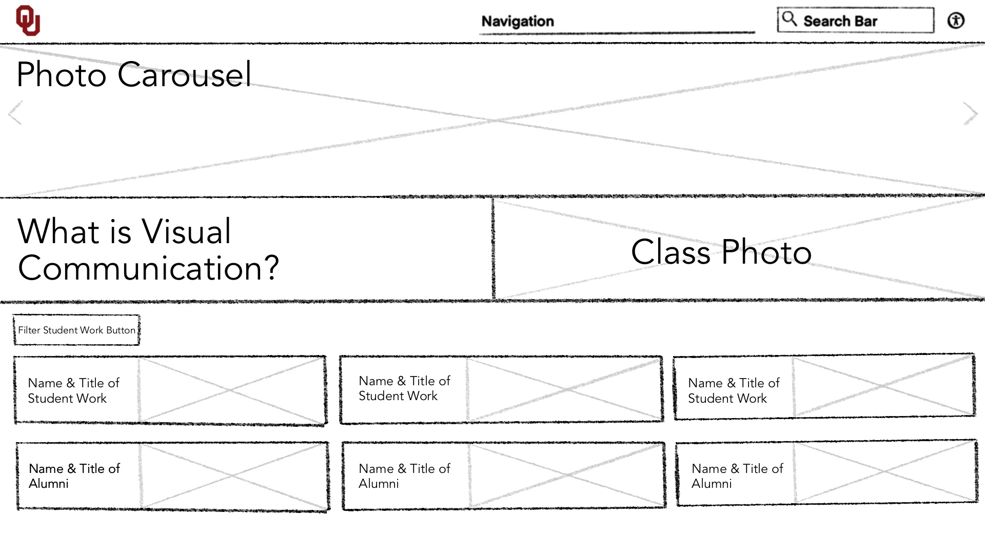
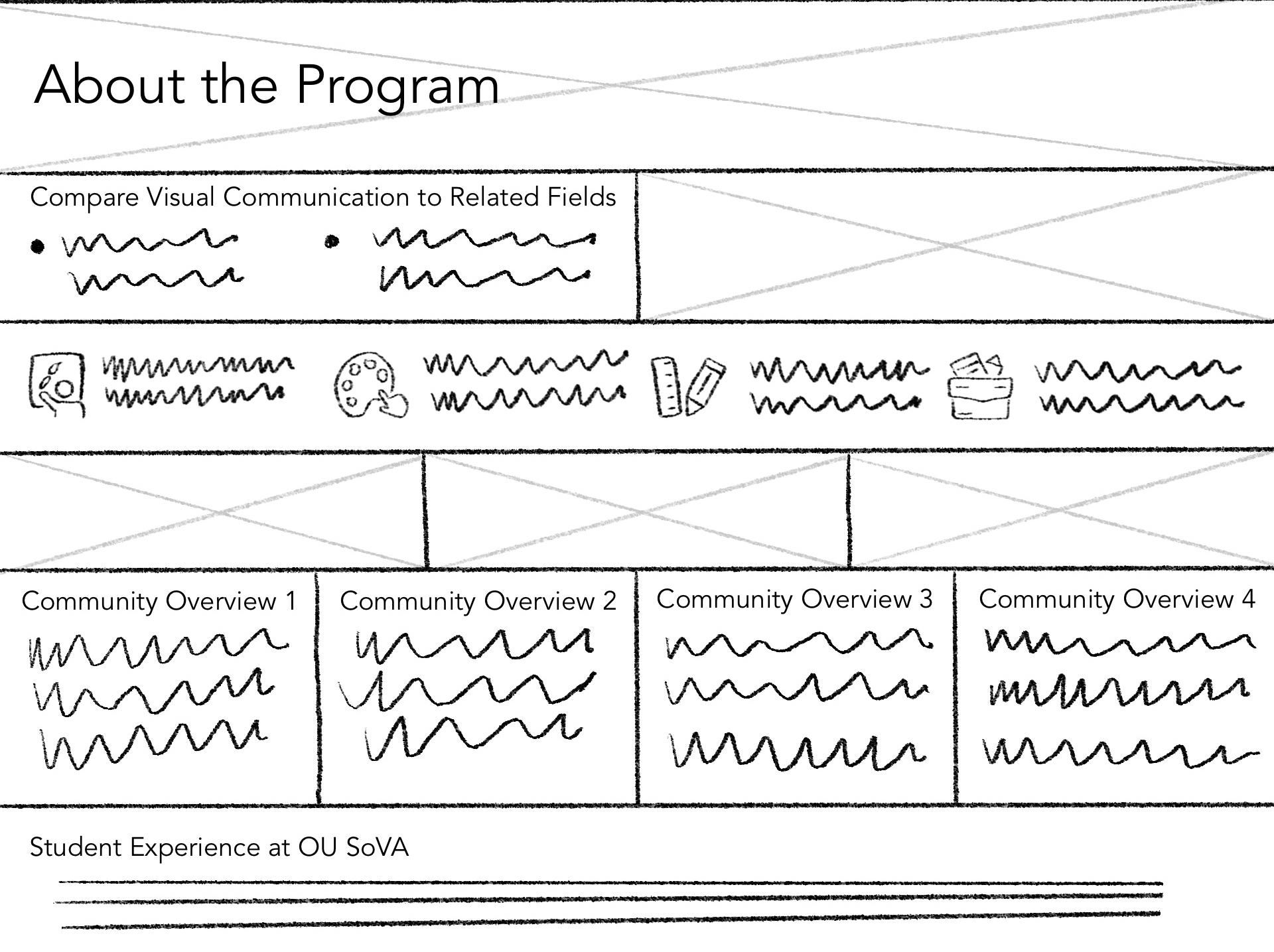
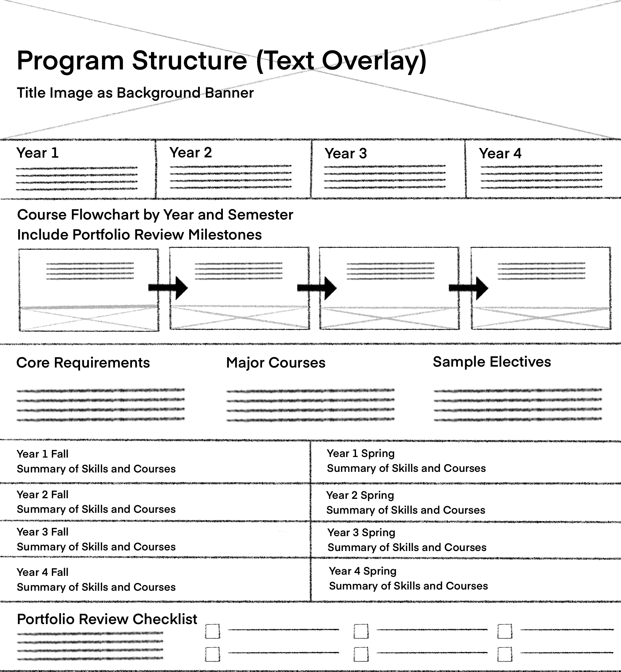
These are the initial explorations of the UI designs through sketches, created to visualize how features like navigation, interactive elements, and content structure could come together to improve usability, highlight student work, and clearly communicate the Visual Communication program’s identity.
Initial Sketches
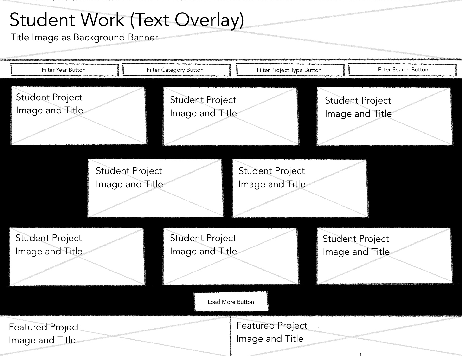
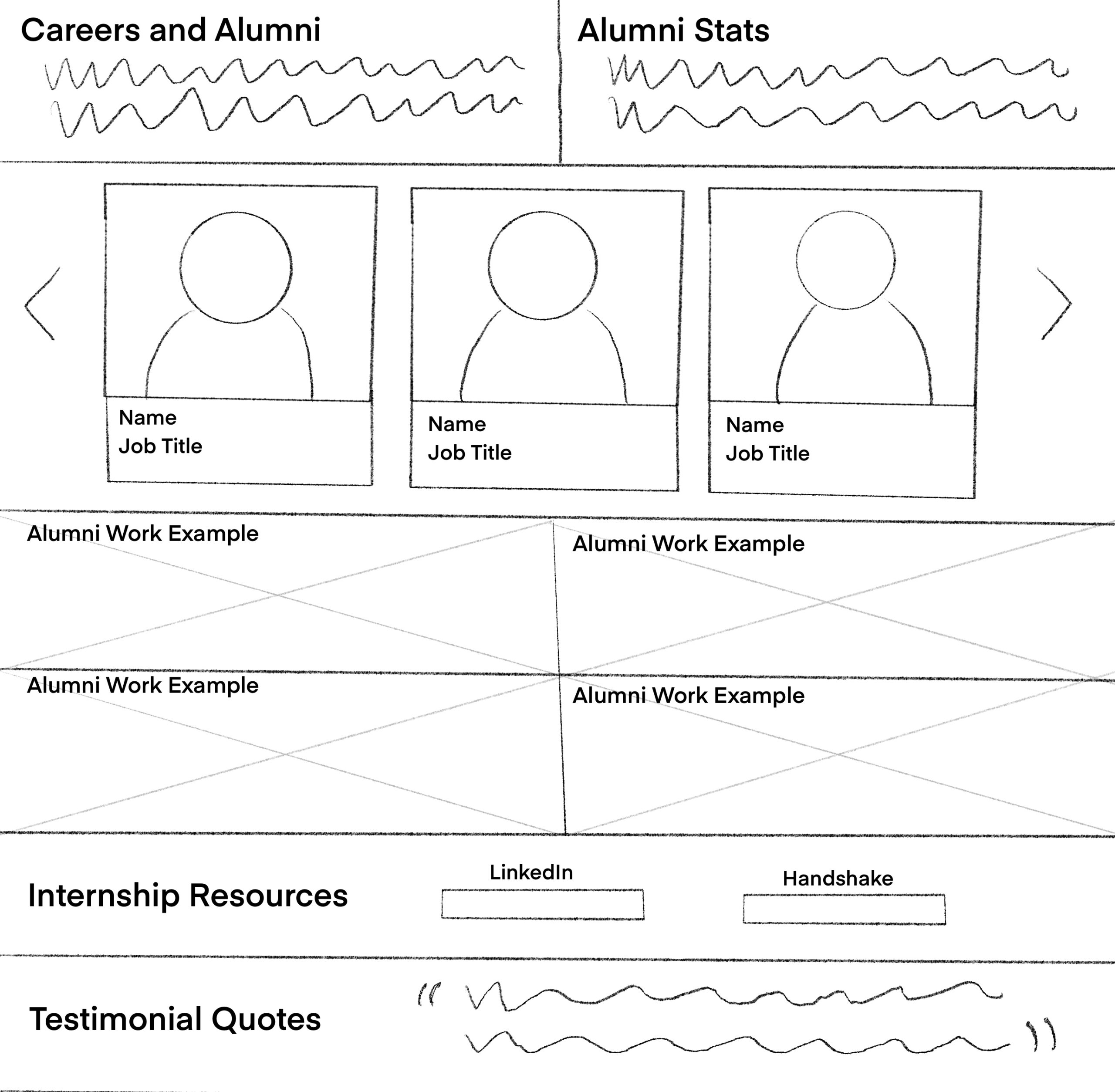
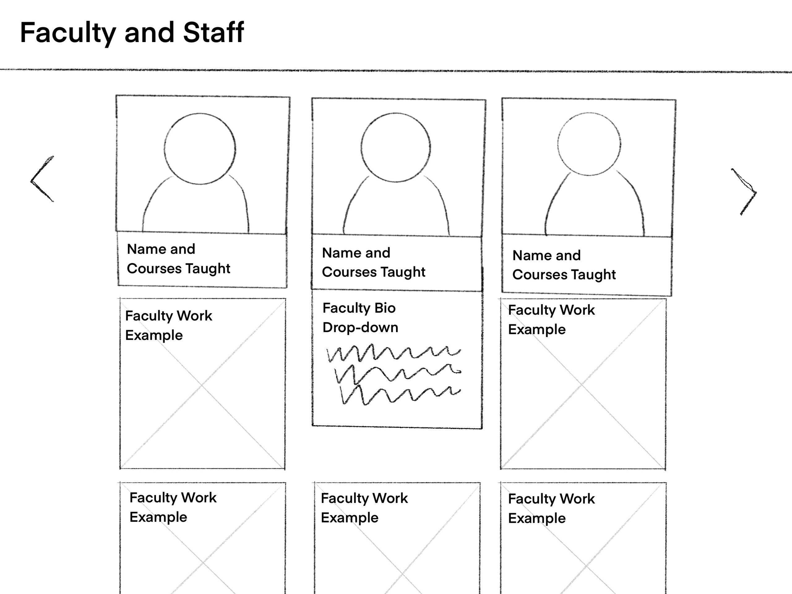
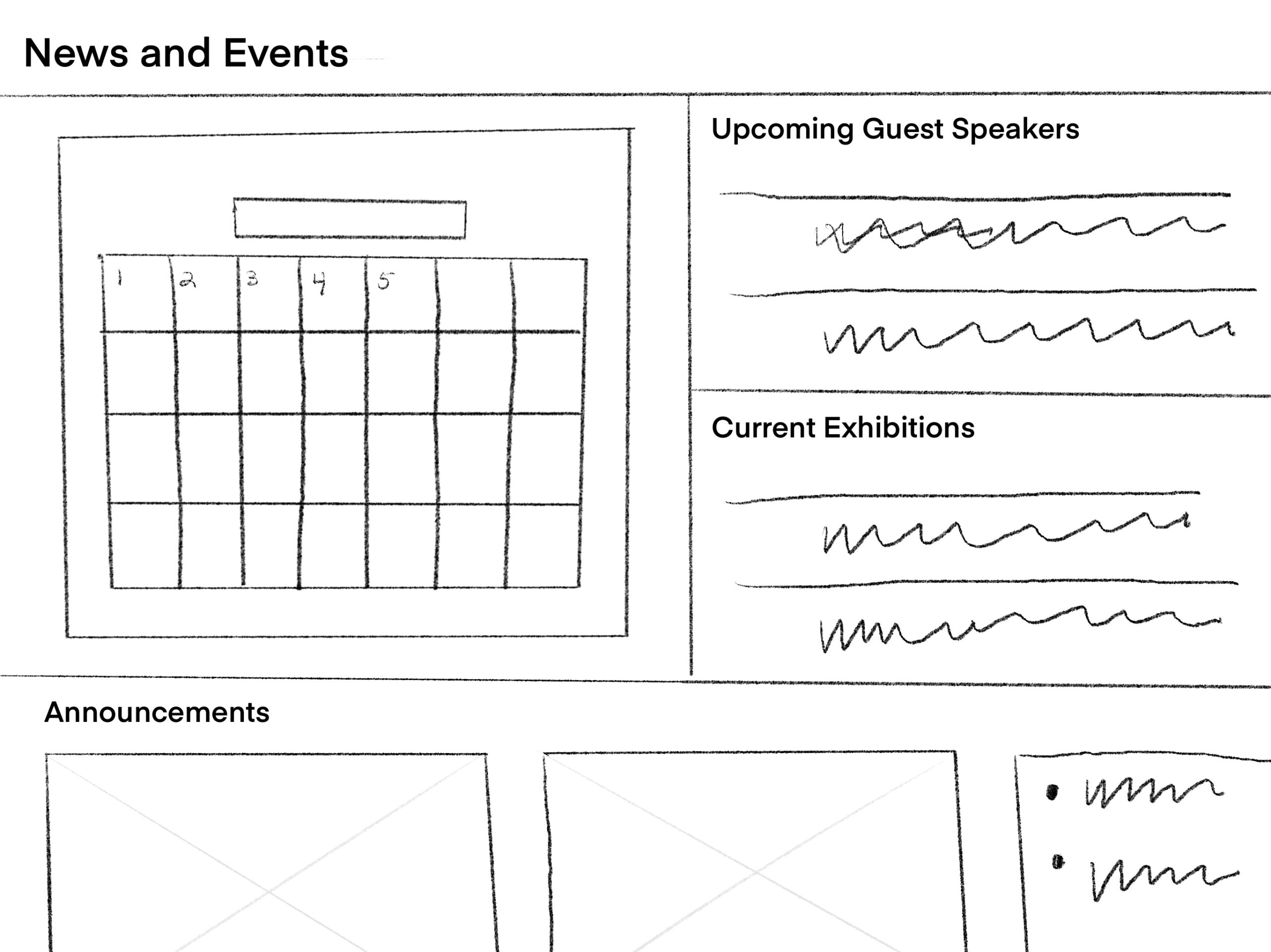
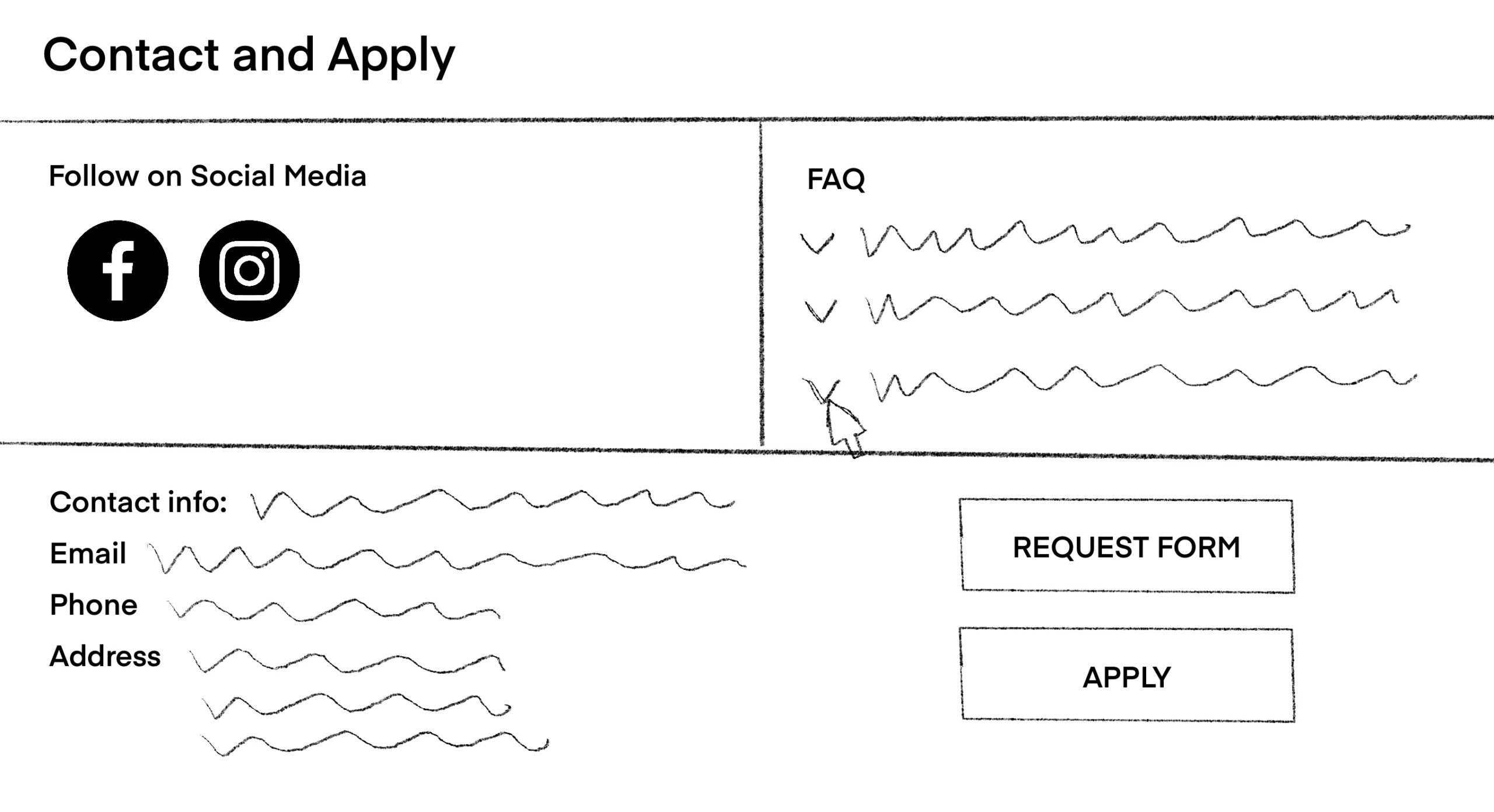
Lo-Fi Prototype
I created wireframes based on the initial sketches and sitemap. The sketches helped me explore layout ideas and visual hierarchy, while the sitemap provided a clear structure for organizing content across the main pages. Together, they shaped the overall flow and navigation of the website.
My goal during this stage was to translate my groups ideas into functional, low-fidelity layouts that showed how users would move through the site based on functionality and usability. Each section was designed with clarity in mind, highlighting the most relevant content for each audience. For example, parents can easily find alumni information and program structure, students can explore projects and information about faculty members, and faculty can access quick links to news, events, and resources.
This process allowed me to test information hierarchy, spacing, and usability before moving to higher-fidelity designs. It provided a solid foundation for improving visual hierarchy, ensuring intentional navigation, and aligning the site’s structure with user needs.
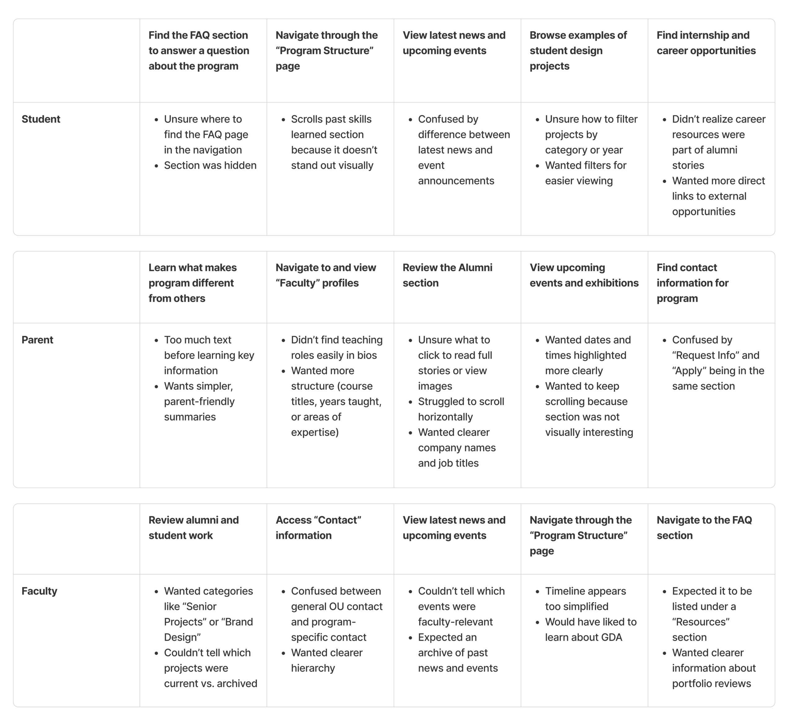
Test (Think Aloud)
I tested the usability of my website wireframes using the Think Aloud method. Three participants representing students, parents, and faculty were asked to complete five key tasks while explaining their thoughts out loud. This helped me observe how users navigated the site, found information, and where confusion or hesitation occurred.
From this process, I learned that users generally found the main navigation clear and easy to follow, but some sections had too much text, making information hard to scan quickly. I also noticed that users wanted more visually engaging elements and interactive features, such as more engagement within the FAQs and visual elements with the highlighted events, to make content more interesting.
Based on this feedback, I plan to make several design updates:
- Simplify text-heavy sections with more concise summaries and bullet points.
- Improve visual hierarchy through spacing, contrast, and consistent typography.
- Update navigation labels for clarity and ease of use.
- Redesign events and exhibitions sections with stronger visuals and clearer details.
These findings help me to refine the design by simplifying section layouts, improving visual hierarchy, and adding more interactive features for easier usability. In the next iteration, the site will feel more intentional, visually clear, and better aligned with the needs of students, parents, and faculty to create a smoother, more enjoyable user experience.
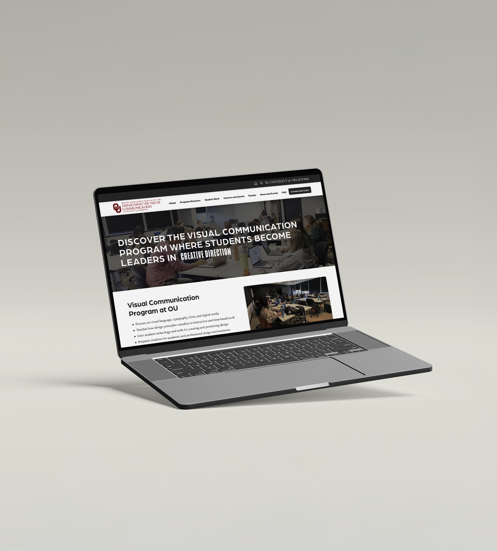
Hi-Fi Prototype
For the high-fidelity prototype, I aimed to translate my wireframes and early design decisions into polished, interactive sections that use real program content, refined typography, and a clear visual hierarchy. I followed the atomic design framework by expanding on the foundational components such as buttons, cards, navigation elements, typography styles, variables, and effects, and then combining them into dynamic features used throughout the site. This helped maintain consistency and made it easier to refine and update the design as it evolved. During this process, I wanted to focus on building a unified visual system with thoughtful use of effects and interactions, while also including interactive elements like scrolling, hovering, clicking, and video throughout. These details helped the prototype feel more realistic and demonstrated how users would navigate and engage with the final website.
Test (A/B)
I used the A/B testing method to evaluate decisions in my hi-fidelity prototype. This process allowed me to compare two versions of the same UI element, gather user preferences, and understand which designs better supported clarity, engagement, and usability. I focused on following 3 UIs and used A/B testing method to evaluate different designs of the interfaces. I was able to observe how small changes in layout, typography, interactivity, and visual engagement influenced the overall user experience. From this evaluation, I learned several important insights:
- Users consistently respond to visual engagement, especially when motion or interactivity is present.
- Clear hierarchy and consistent layout patterns improve usability across different sections.
- Some features can benefit from combining the strengths of both versions rather than choosing a single winner.
These findings guided the refinements I made to the final prototype, helping me create a more intentional, user-centered design system.
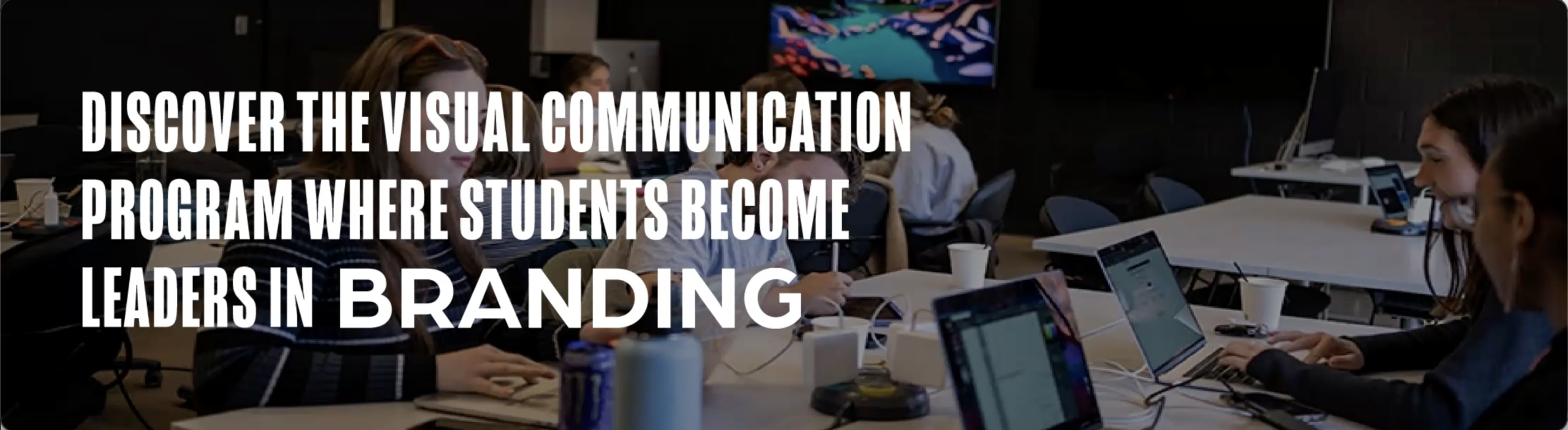
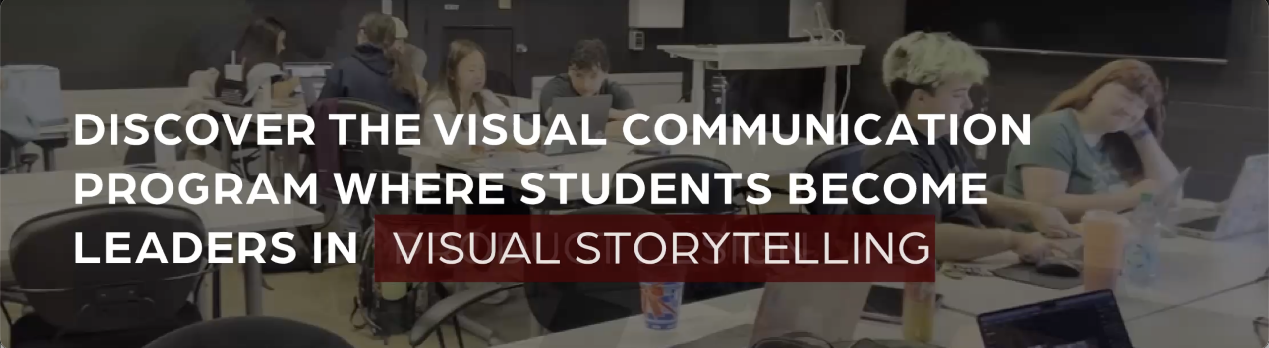
Test 1 – Hero Section Layout/Typography Design
First, I tested two hero section layouts to determine which design best communicates the Visual Communication program in an engaging and clear way. The hero is the first element users see, so it needed strong visual impact while remaining easy to understand.
- Version A: Strong typographic layout with structured definition text
- Version B: Video-based hero section with motion and a more immersive feel
Users preferred Version B overall because the background video added engagement and visual interest without being distracting. However, they preferred the typography of Version A, noting that it felt clearer and more aligned with the overall consistency of the layout of the site. I chose to keep Version B in my final prototype because users responded more positively to its visual engagement. I then refined the typography using elements from Version A to improve clarity and hierarchy.
Test 2 – Student Work Card Presentation
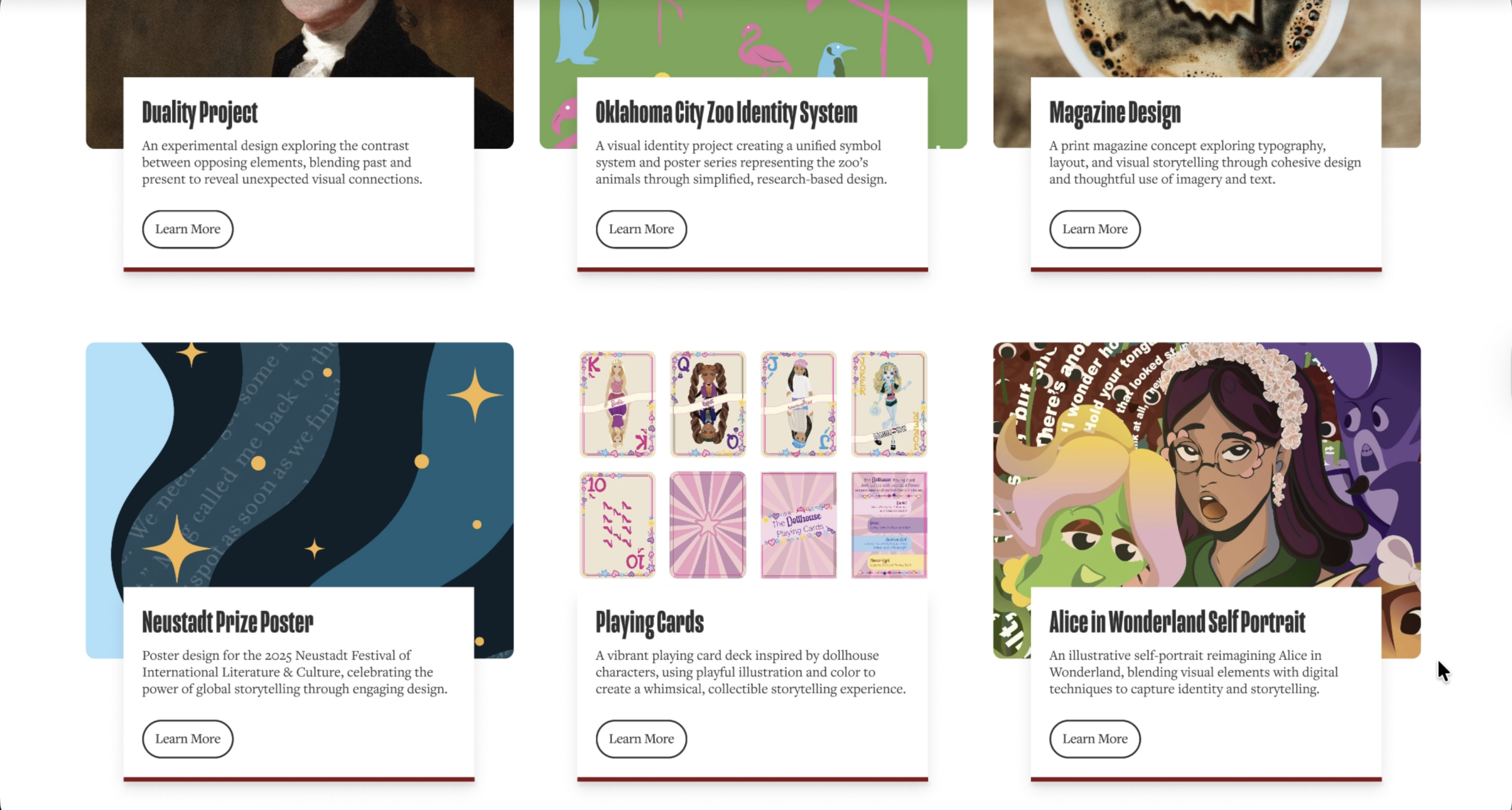
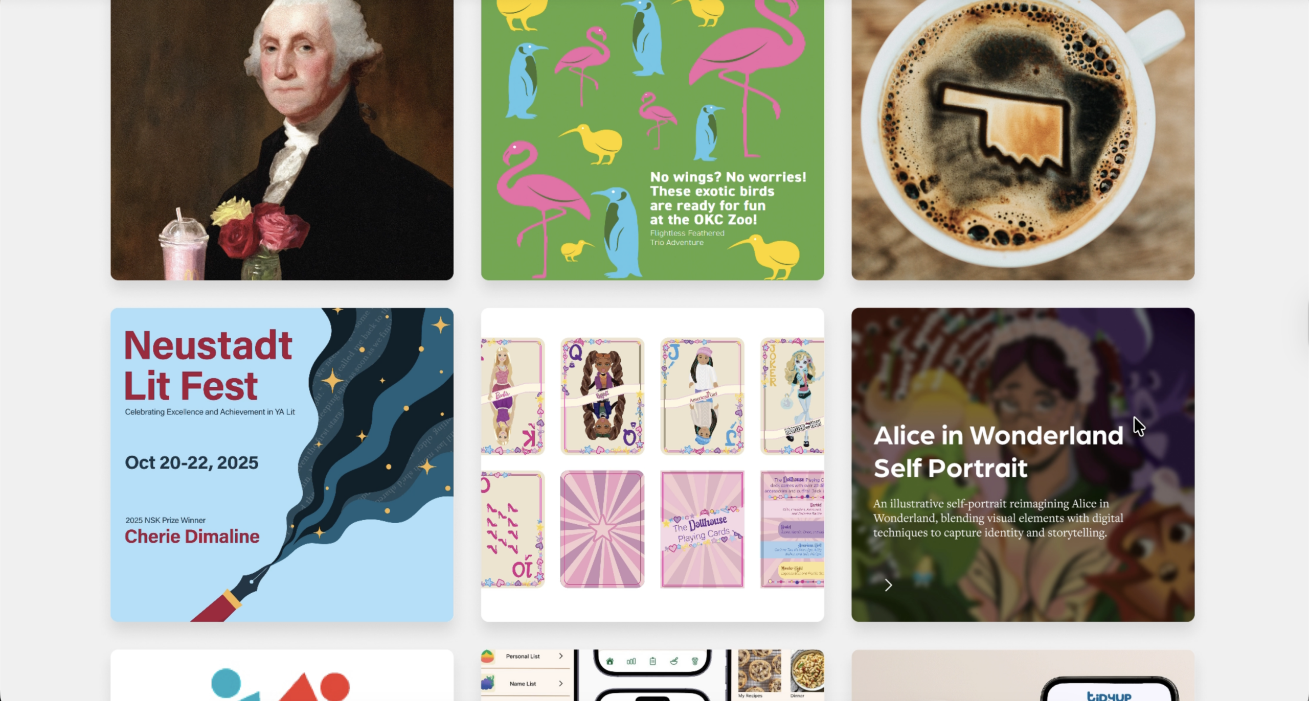
Next, I tested two student work card designs to understand which option was more user-friendly and easier for users to scan and navigate. This section is critical for showing program quality and needs to feel intentional and consistent.
- Version A: Clean layout consistent with other cards throughout the website
- Version B: Interactive cards with hover animations
User feedback revealed that Version A was generally preferred because it felt more consistent with the layout used throughout the rest of the site, which made navigation feel clearer and more informative. At the same time, users also appreciated the hover interaction in Version B, noting that it added a dynamic moment to the experience. One user even suggested combining elements from both designs to improve usability and engagement. Based on this feedback, I chose to keep Version A for its stronger overall consistency, but I incorporated a subtle hover effect inspired by Version B to maintain some of the interactivity users enjoyed.
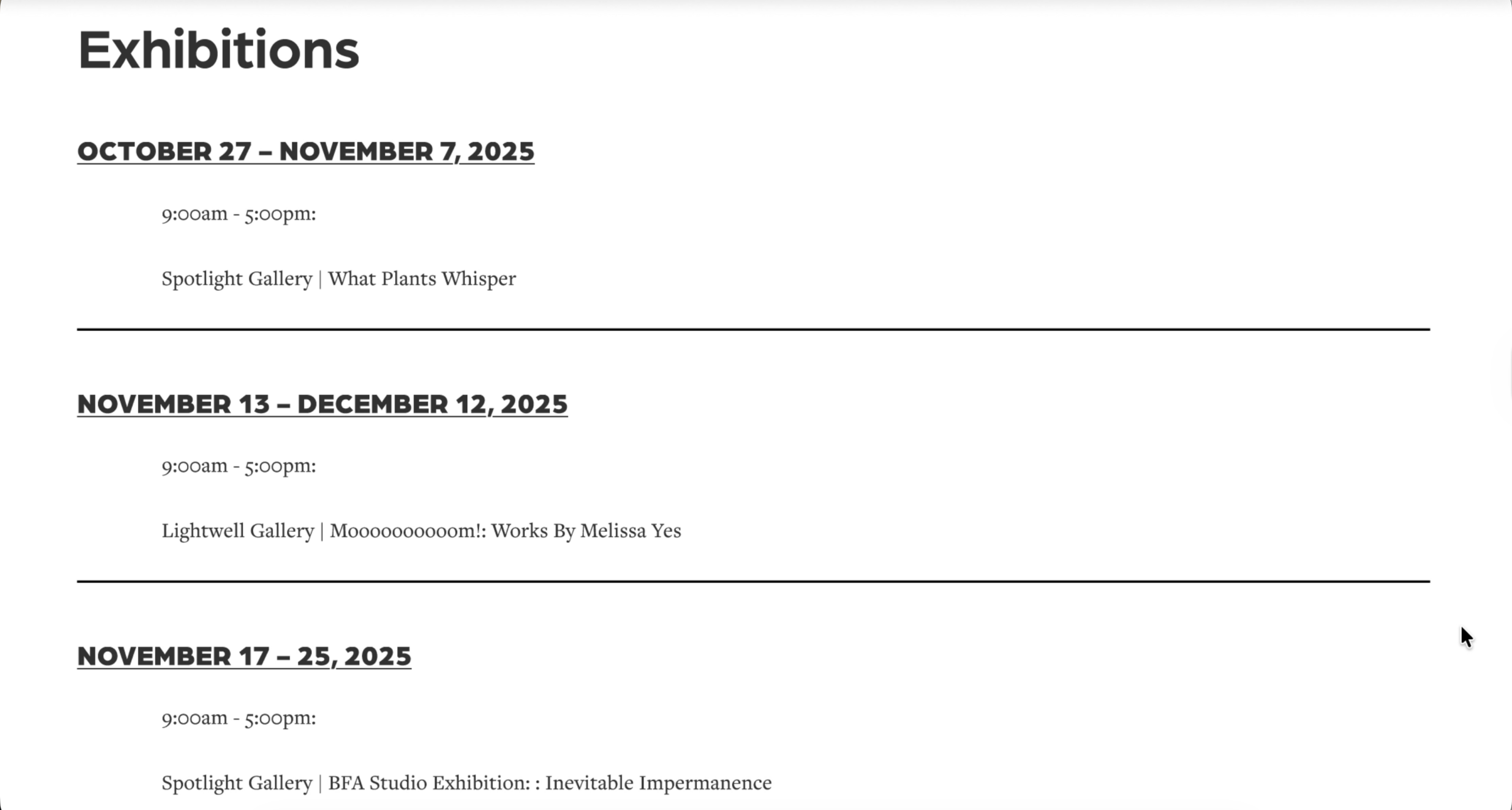
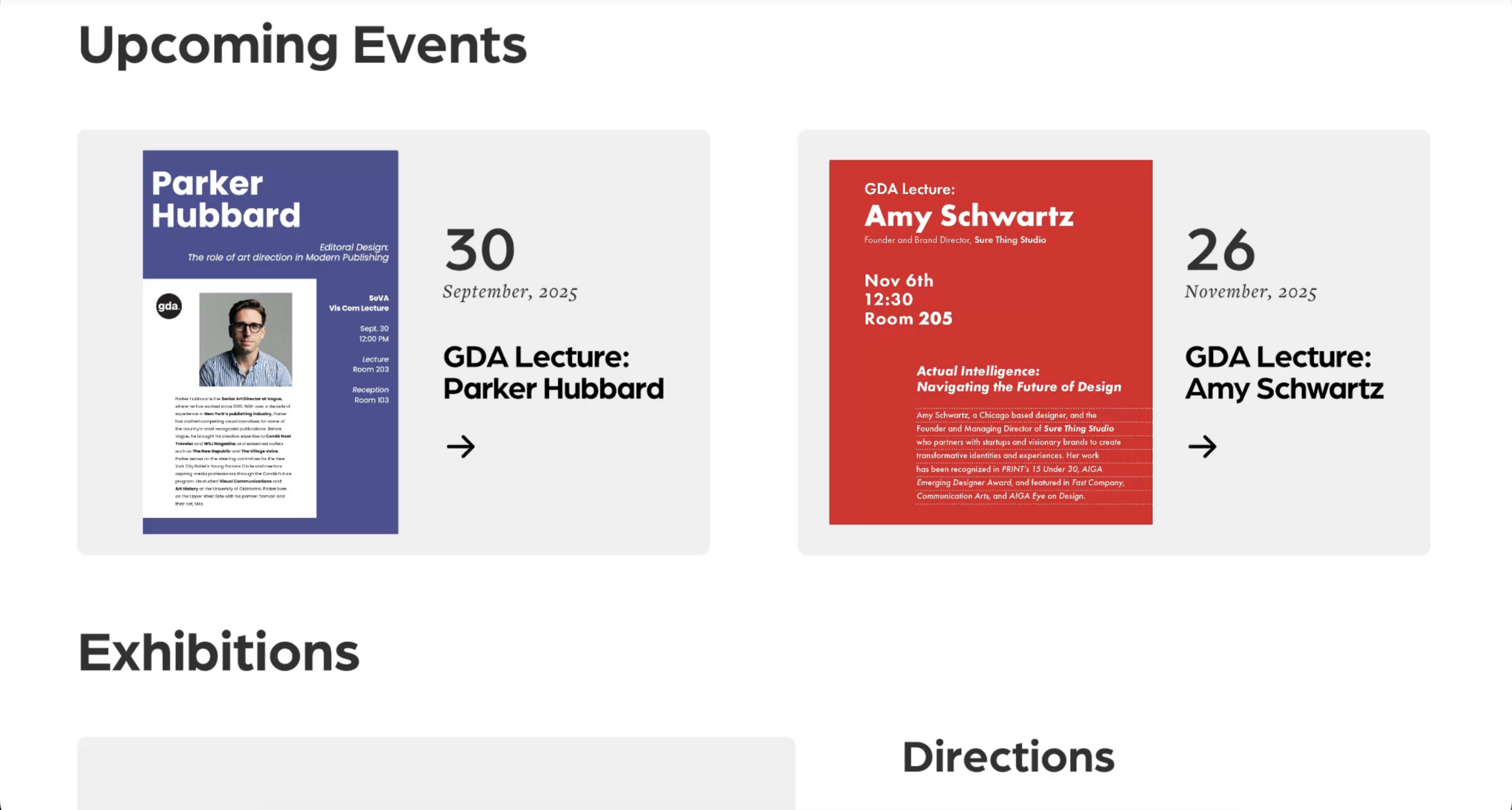
Test 3 – Events and Exhibition Section
Lastly, I tested two versions of the Events and Exhibitions section to determine which layout users were more likely to click on for more information. Engagement was a key goal for this portion of the site.
- Version A: Simple list layout
- Version B: More visual and interactive event cards
Users preferred Version B because it was more engaging and visually appealing, offering a stronger sense of interaction that encouraged exploration. Although one user noted that it felt “slightly out of place,” they still chose it due to its inviting design. Based on this feedback, I kept Version B in the final prototype because it created a more exciting and clickable events experience. I refined some of the styling to improve alignment with the rest of the site, ensuring it remained both engaging and visually cohesive.
Final Prototype
For the final prototype, I refined the design based on insights gathered from the A/B testing. User feedback helped me identify which layouts and interactions were most effective, allowing me to strengthen hierarchy, improve clarity, and enhance engagement across sections of the website. I implemented the winning versions of the hero section, student work cards, and events layout, while also making smaller adjustments such as improved hover interactions, clearer typography, and more consistent layouts. These refinements created a more cohesive visual system and a smoother overall user experience. The final prototype demonstrates a interactive version of the Visual Communication website that reflects user needs, intentional design decisions, and a more polished interpretation of the program’s identity.
Conclusion & Reflection
This project guided me through the full design process of creating a high-fidelity website for the Visual Communication program. In the early stages, I worked as part of a team, which was new for me but incredibly valuable. Collaborating allowed us to share perspectives, learn from one another, and bounce ideas back and forth, helping establish a strong foundation for the project. As the project progressed into the wireframing and prototyping phases, the work shifted to a more independent focus, allowing me to take ownership of design decisions and execution.
Throughout the process, research played a key role in shaping my design choices. User interviews, testing, and iterative feedback helped me move beyond assumptions and design with clearer intention. I also used AI tools to support content development, particularly when writing realistic placeholder text, program descriptions, and summaries of student experiences. This helped the prototype feel more complete and authentic, making it easier for users to engage with and evaluate during testing.
There were many positive aspects of this experience. Collaboration introduced me to new ways of thinking, while testing methods like Think Aloud and A/B testing provided insight into how users actually navigated layouts and interacted with different design elements. These findings directly informed refinements in hierarchy, clarity, and interaction throughout the site.
I also encountered challenges along the way. Time management became more difficult in the later stages as the prototype grew in complexity. Another challenge was getting stuck on certain design directions, making it hard to explore alternative ideas once I had committed to a solution. This experience taught me the importance of stepping back, staying flexible, and pushing myself to think beyond my first idea.
Overall, this project helped me grow as a designer. It strengthened my skills in research, prototyping, collaboration, and user testing, while reinforcing the value of iteration and adaptability. Most importantly, it emphasized designing with the user in mind and using the right tools, feedback, and process to create thoughtful, effective solutions.