
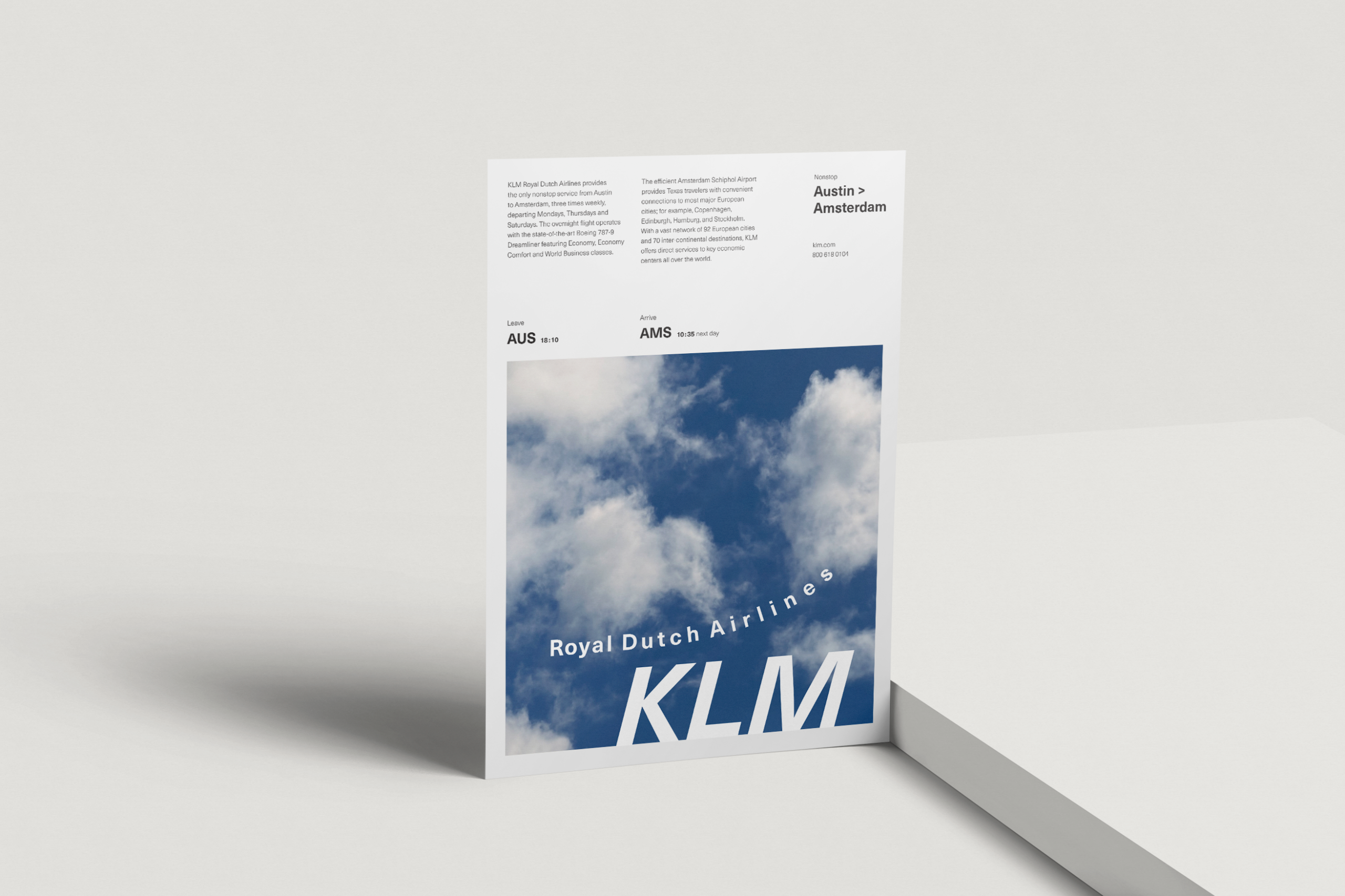
Type, Image & the Grid
This project examines type hierarchy, scale, and grid systems through editorial-style compositions developed for a promotional concept for KLM’s nonstop flight from Austin to Amsterdam.
Challenge
This project challenged me to design within strict grid and typographic limitations while still creating visual interest. Early phases restricted me to a single type size and weight, pushing me to rely on spacing, alignment, and composition instead of contrast. As the project progressed, I needed to introduce stronger hierarchy and movement without breaking the grid or sacrificing readability. Balancing expressive type with functional information was a key focus throughout.
Solution
I approached the project as a gradual exploration, allowing each phase to build on the previous one. By using the grid as a consistent foundation, I experimented with scale, placement, and directional type while maintaining structure. Hierarchy was introduced through subtle changes in size and contrast, and later through movement and composition. The final layouts feel intentional, dynamic, and clear while still respecting the grid system.
Same type size and weight


Different type sizes, same weight (moderate contrast)


Different type sizes, same weight (stronger contrast)


Different type sizes and weights


Communicating flight and movement


