
Hilltop Montessori School Brand Identity
This branding project reimagines the visual identity of Hilltop Montessori School in Mt. Laurel, Alabama. The goal was to create a timeless and flexible identity system that reflects Montessori values while supporting the school across print, digital, and everyday applications.

Problem
Hilltop Montessori School needed a clear and cohesive visual identity that reflects its educational philosophy and sense of community. The existing identity did not fully communicate the school’s mission of fostering curiosity, independence, and respect for the world, nor did it translate easily across different uses and formats.
Challenge
The main challenge was designing a logo that feels playful and welcoming for children while still appearing professional and trustworthy to parents and educators. The identity also needed to be simple, recognizable, and adaptable across many formats, from stationery to apparel and signage. Translating abstract values like growth, curiosity, and independence into a clear visual system required careful exploration and refinement.
Solution
The final identity is built around a simple, memorable mark paired with a friendly wordmark. The logo system is designed to scale easily and remain consistent across both small and large applications. A cohesive visual system was developed to support the brand across print, merchandise, and daily school materials, creating a unified and approachable presence.
Target Audiences
The primary audience is parents and families seeking an educational environment rooted in curiosity and independence. Secondary audiences include educators, staff, donors, alumni, and the surrounding community. The identity was designed to feel warm, trustworthy, and inclusive for all of these groups.
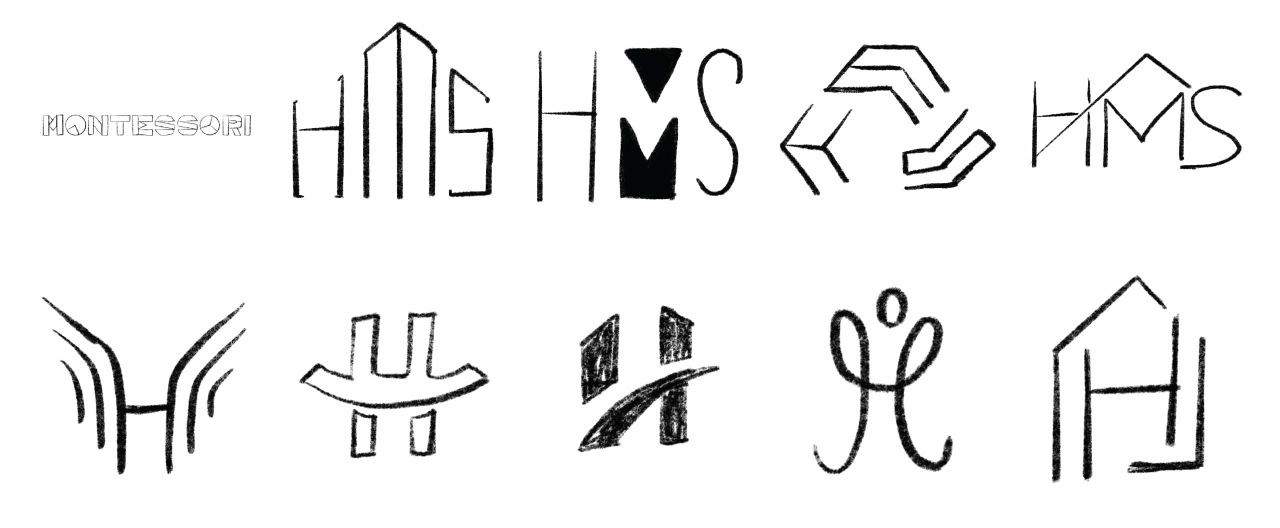
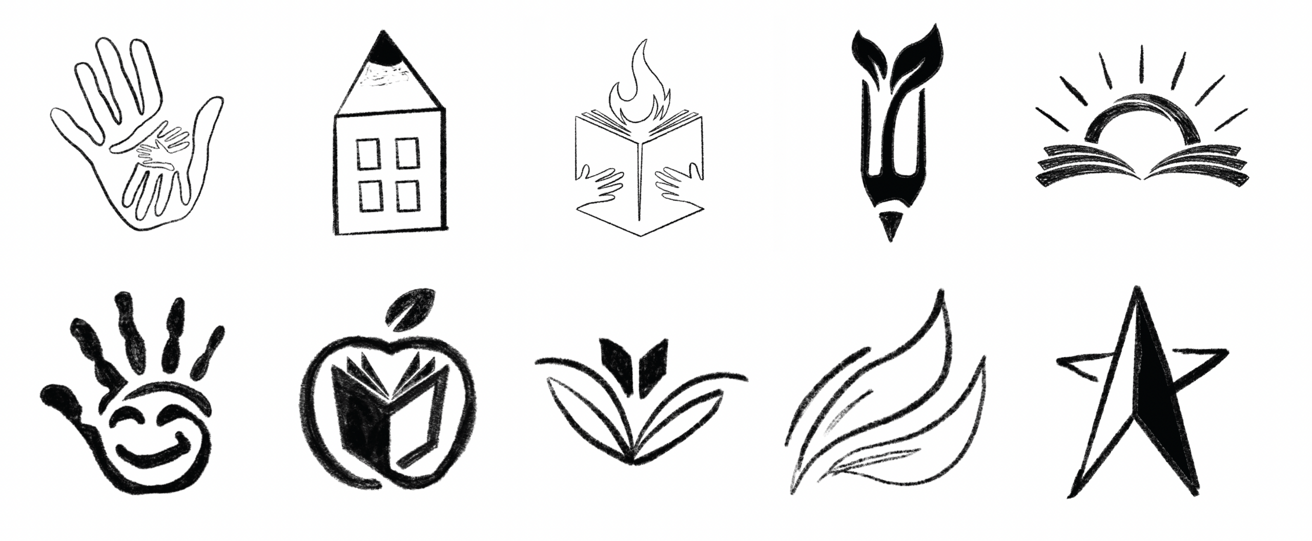
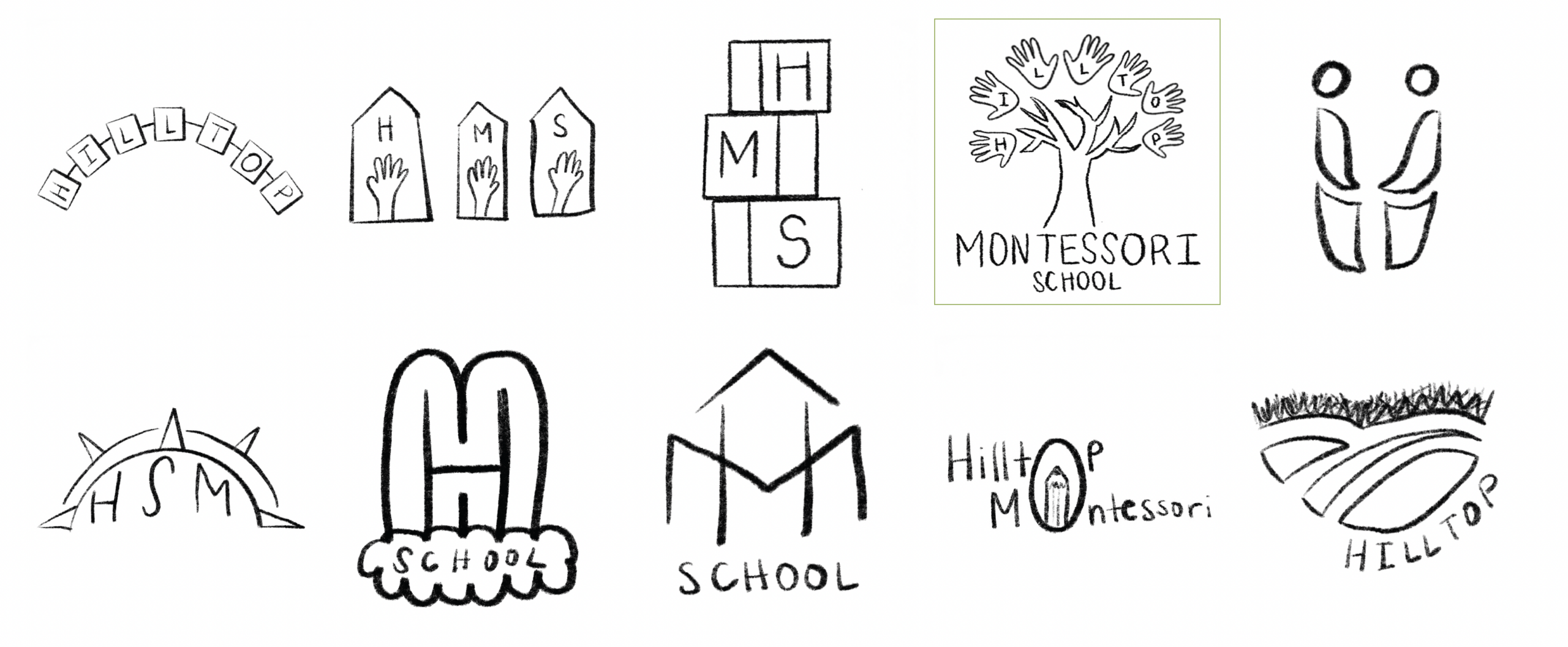
Sketches
Early sketching focused on exploring symbols related to learning, growth, and discovery. Concepts included hands, books, nature elements, and letterform-based ideas. These sketches helped narrow down visual directions and allowed ideas to develop organically before moving into digital refinement.
Final Logo

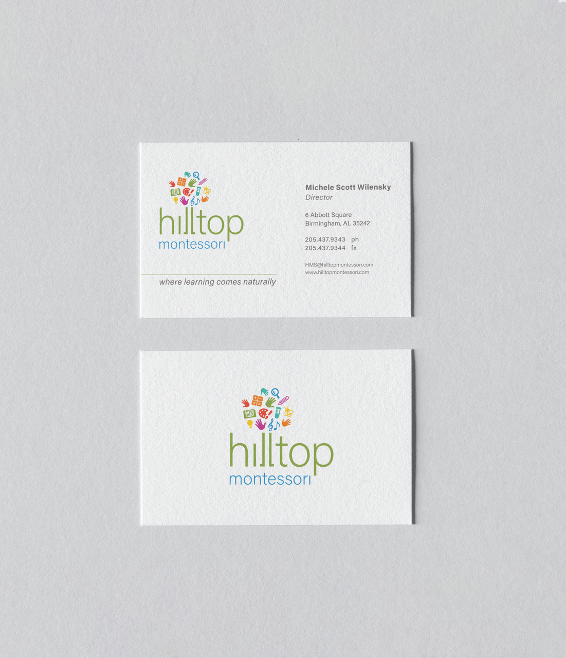
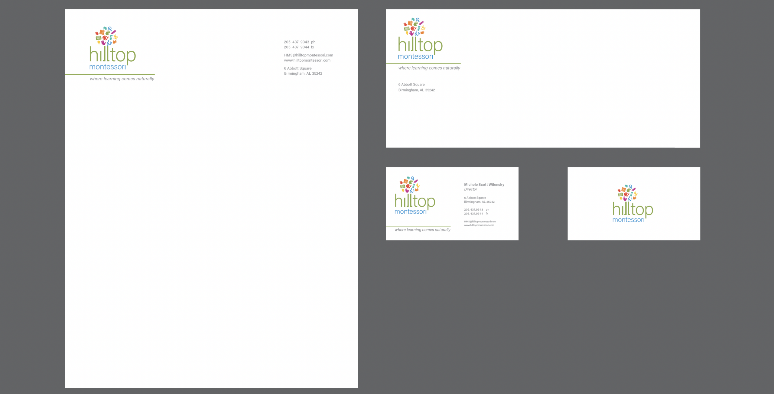
Business System
The business system includes a letterhead, envelope, and business card designed as a cohesive set. Consistent typography, spacing, and logo placement create a clean and professional system that can be easily extended across future brand materials.
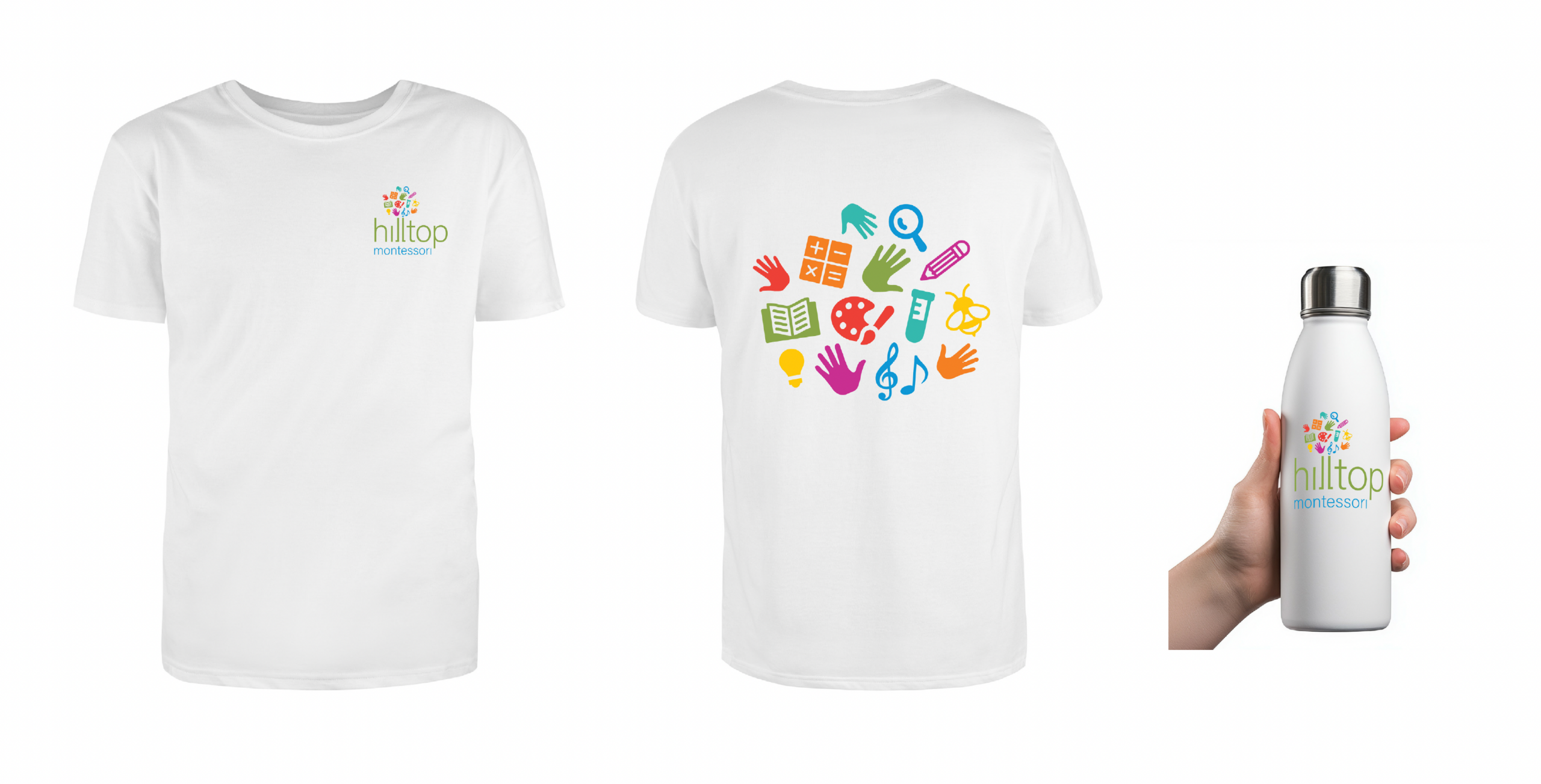
Mockups
Mockups were used to test how the identity works in real-world applications. Applying the logo to items such as apparel, water bottles, and stationery ensured that the mark remained clear, balanced, and recognizable across different materials and sizes.
Conclusion
This project challenged me to think beyond a single logo and design a complete identity system that communicates values, purpose, and personality. By grounding the visual direction in Montessori principles, I created a brand that feels warm, flexible, and approachable while remaining clear and functional across many applications. The final identity reflects Hilltop Montessori School’s focus on curiosity, independence, and growth, and demonstrates my ability to translate research and concept into a cohesive, real-world branding system.