Hilltop Montessori Identity
This branding project reimagines the visual identity of Hilltop Montessori School, creating a timeless and flexible system that reflects Montessori values across print and digital applications.
Challenge
I reimagined the visual identity for Hilltop Montessori School to better reflect its educational philosophy and sense of community. The challenge was creating an identity that feels playful and welcoming for children while remaining professional and trustworthy for parents and educators. The system needed to be simple, recognizable, and flexible across many applications. Translating values like growth, curiosity, and independence into a clear visual language required thoughtful exploration and refinement.
Solution
I designed a friendly, adaptable identity centered around a memorable symbol and approachable wordmark. The logo system was created to scale easily and remain consistent across both print and digital applications. I developed a cohesive visual system, including typography and supporting materials, to ensure the brand feels unified and approachable in everyday school use. The final identity reflects Hilltop Montessori’s values while remaining flexible for future growth.
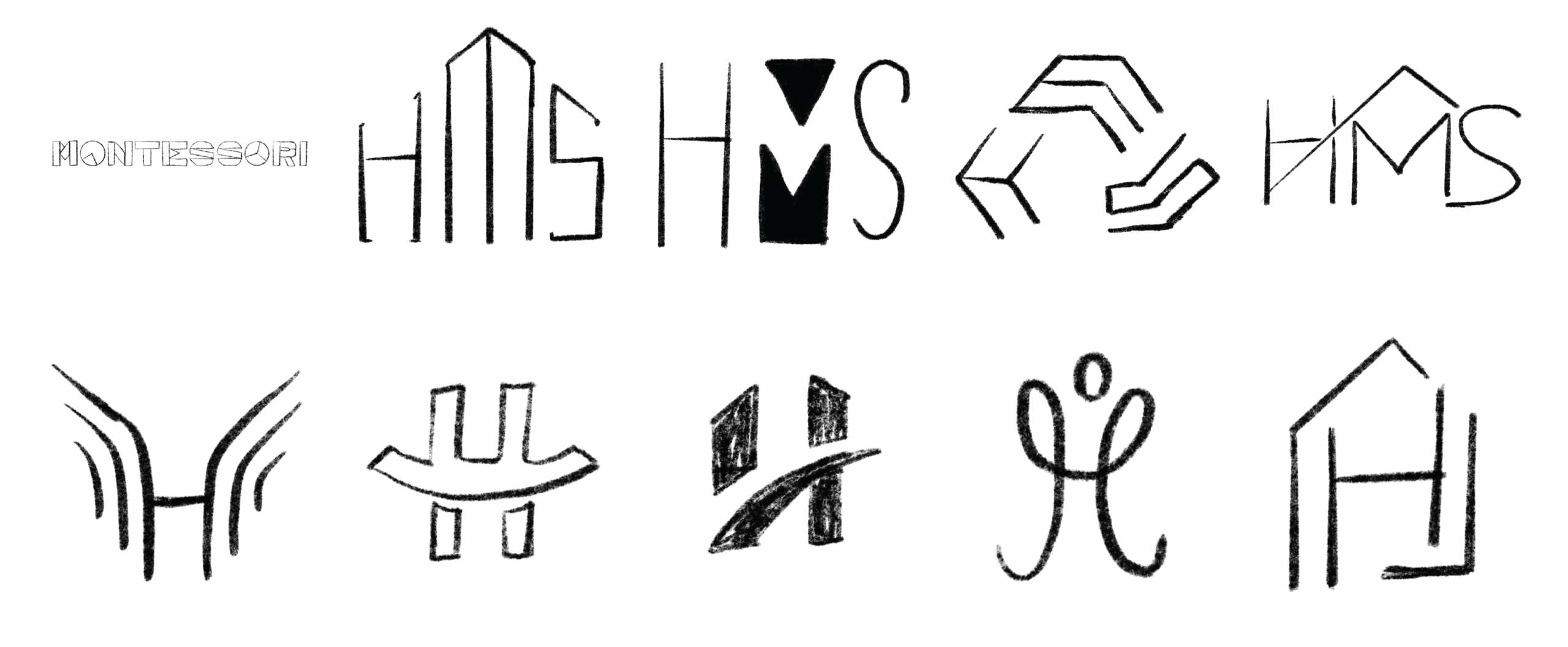
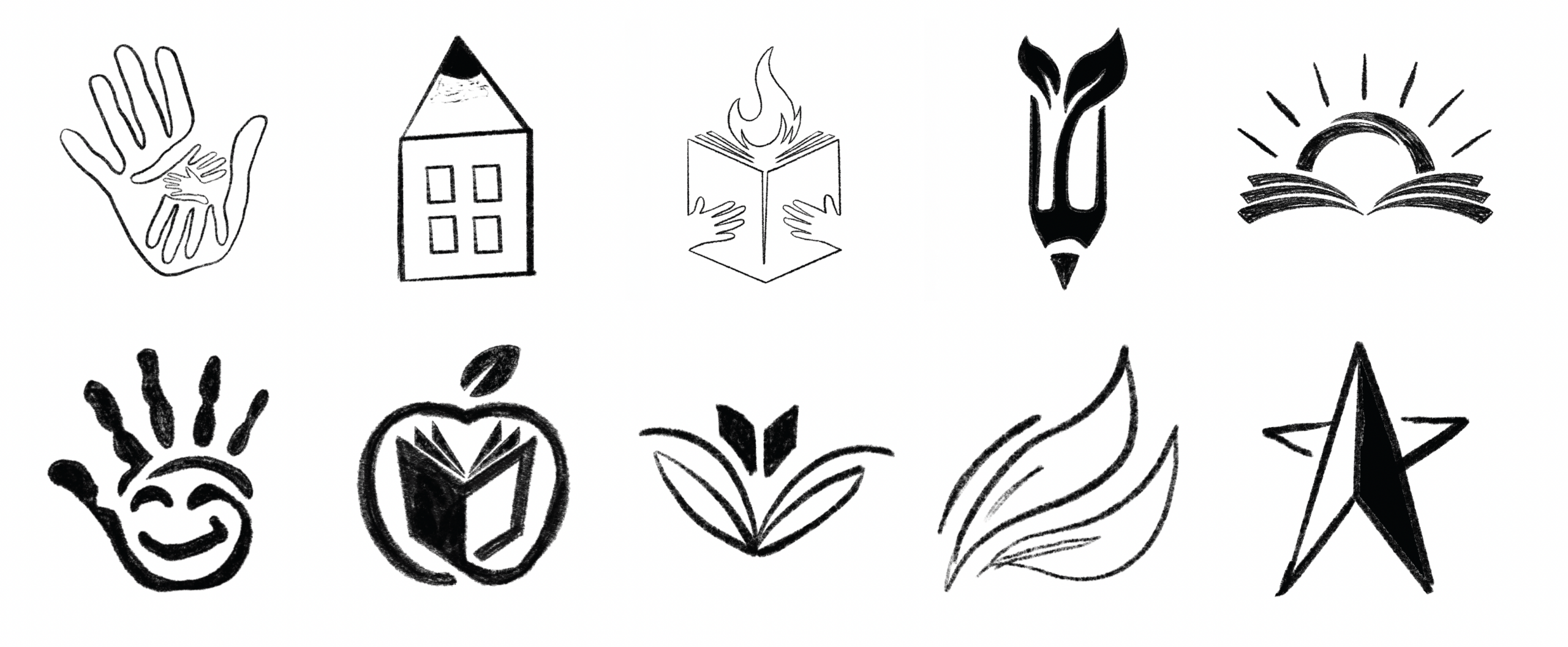
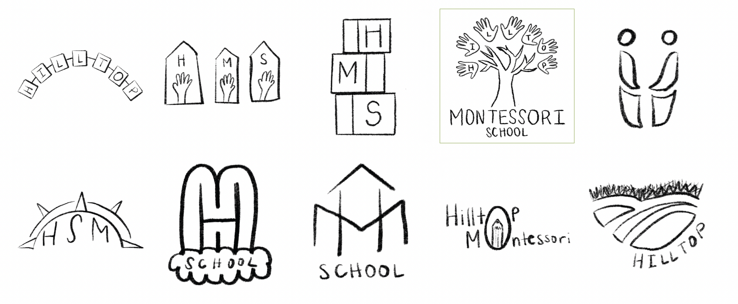
Sketches
Early sketches explored symbols of learning, growth, and discovery, helping refine visual directions and allowing ideas to develop organically before digital refinement.
Final Logo

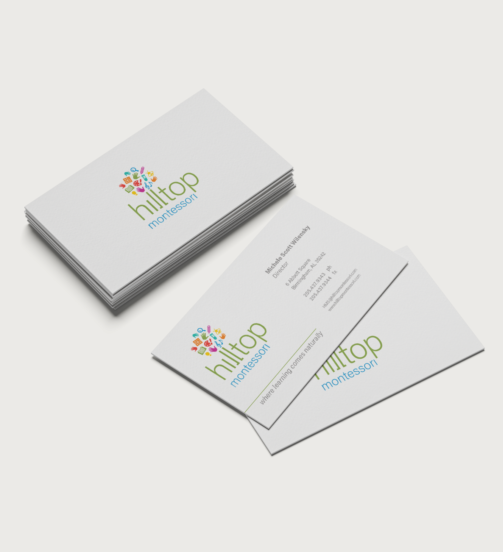
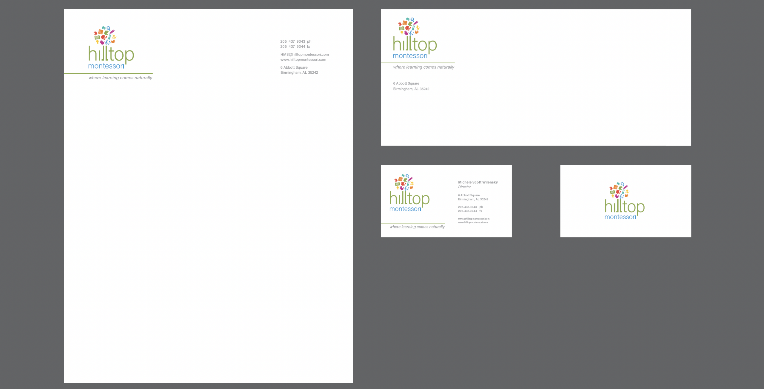
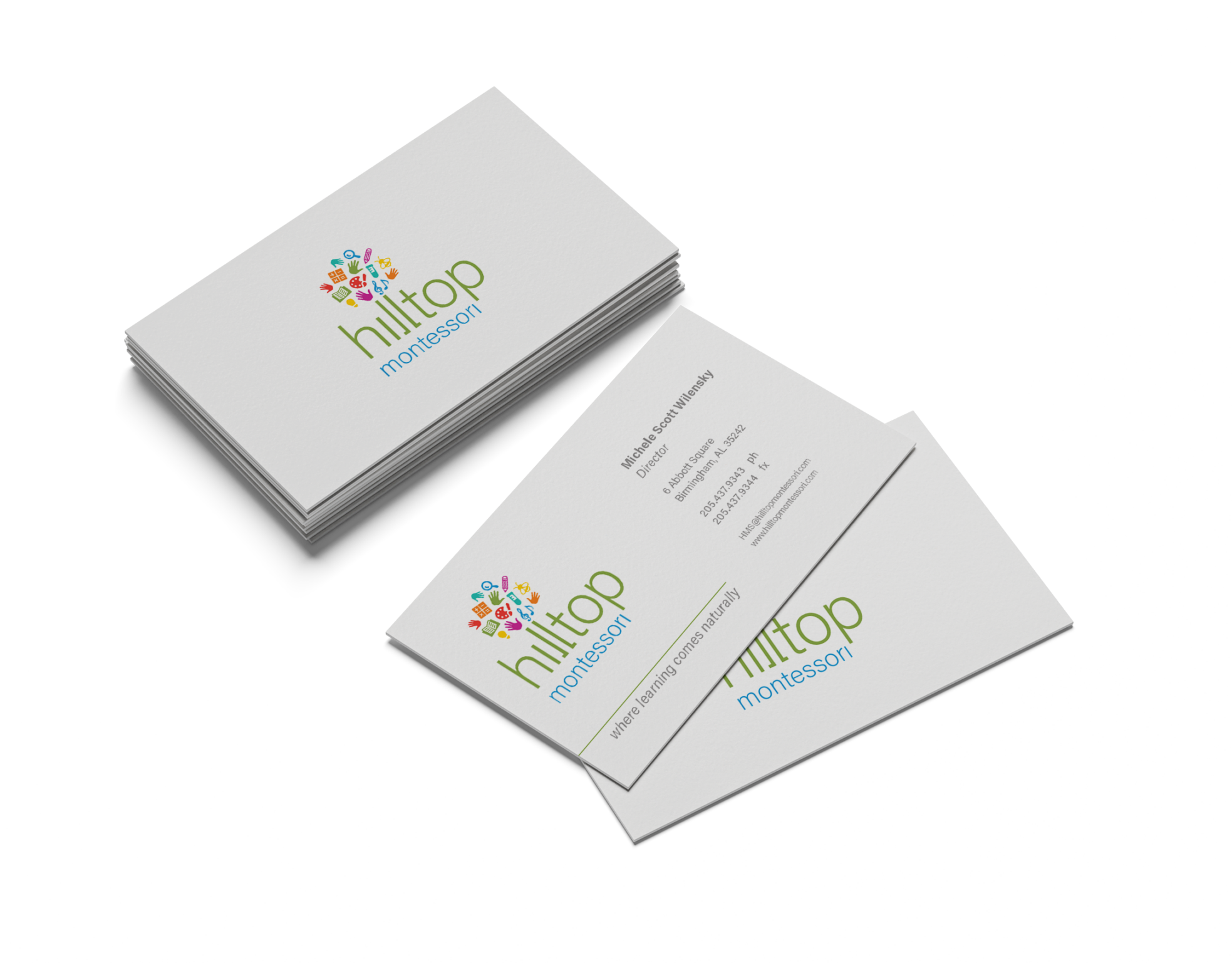
Business System
The business system includes a letterhead, envelope, and business card, designed with consistent typography and spacing to create a clean, professional, and adaptable brand system.
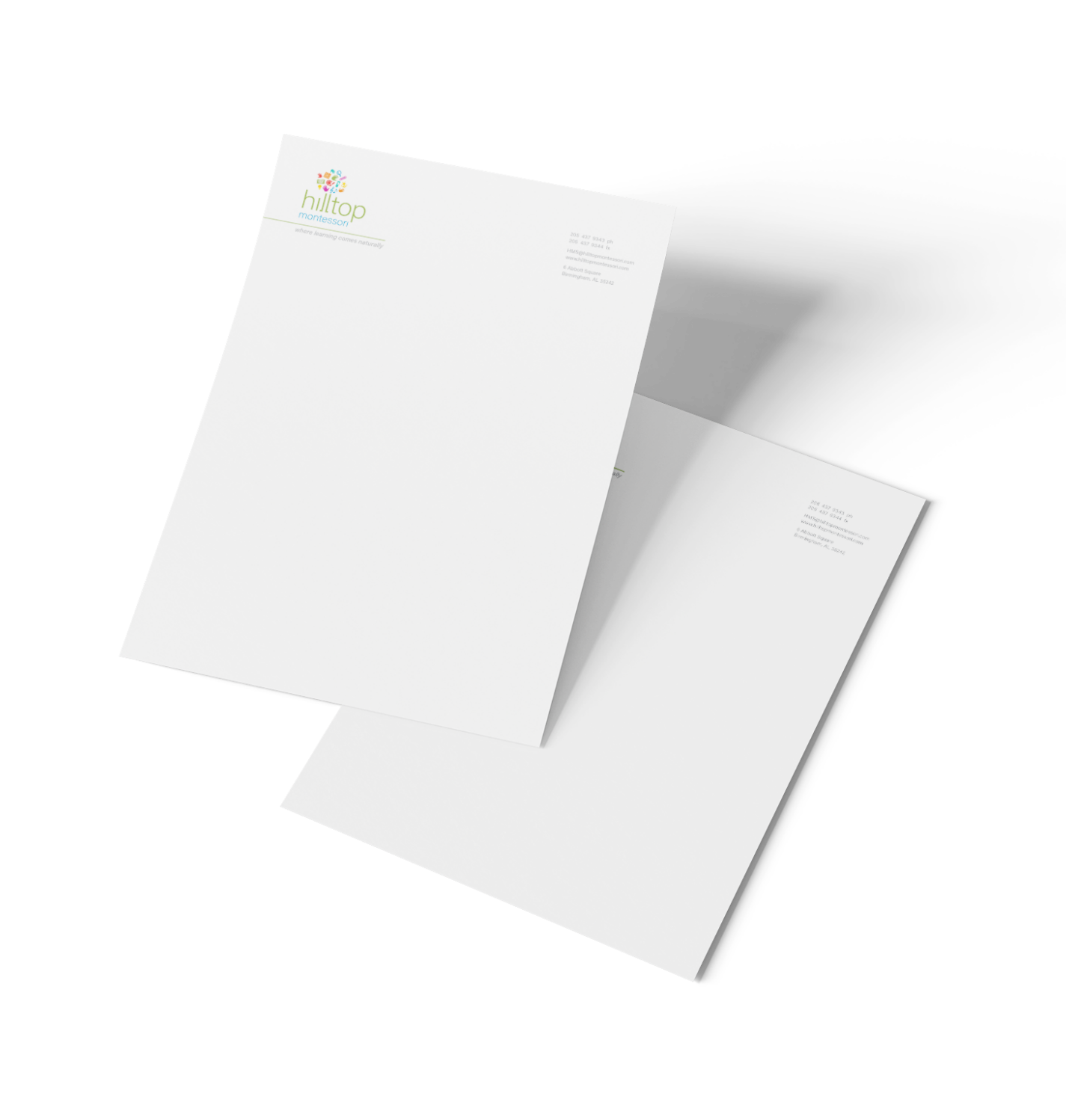
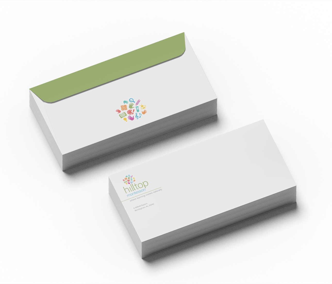
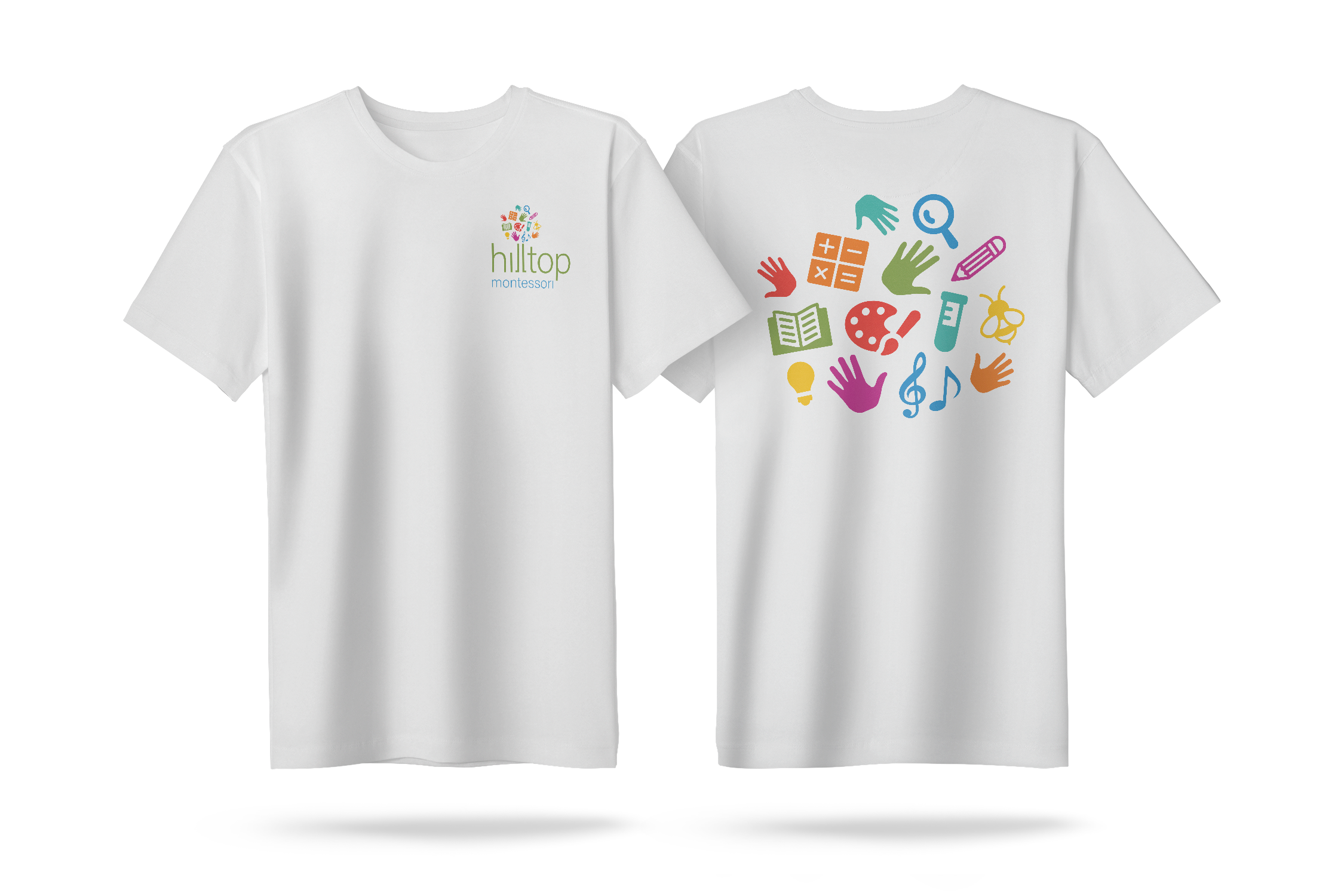
Mockups
Mockups tested the identity across real-world applications, ensuring the logo remained clear, balanced, and recognizable on various materials and sizes.