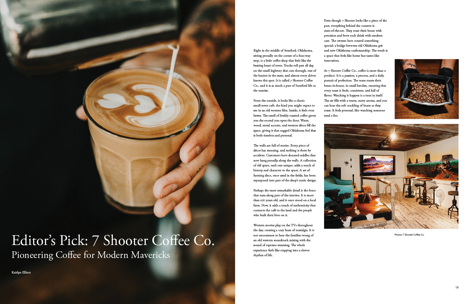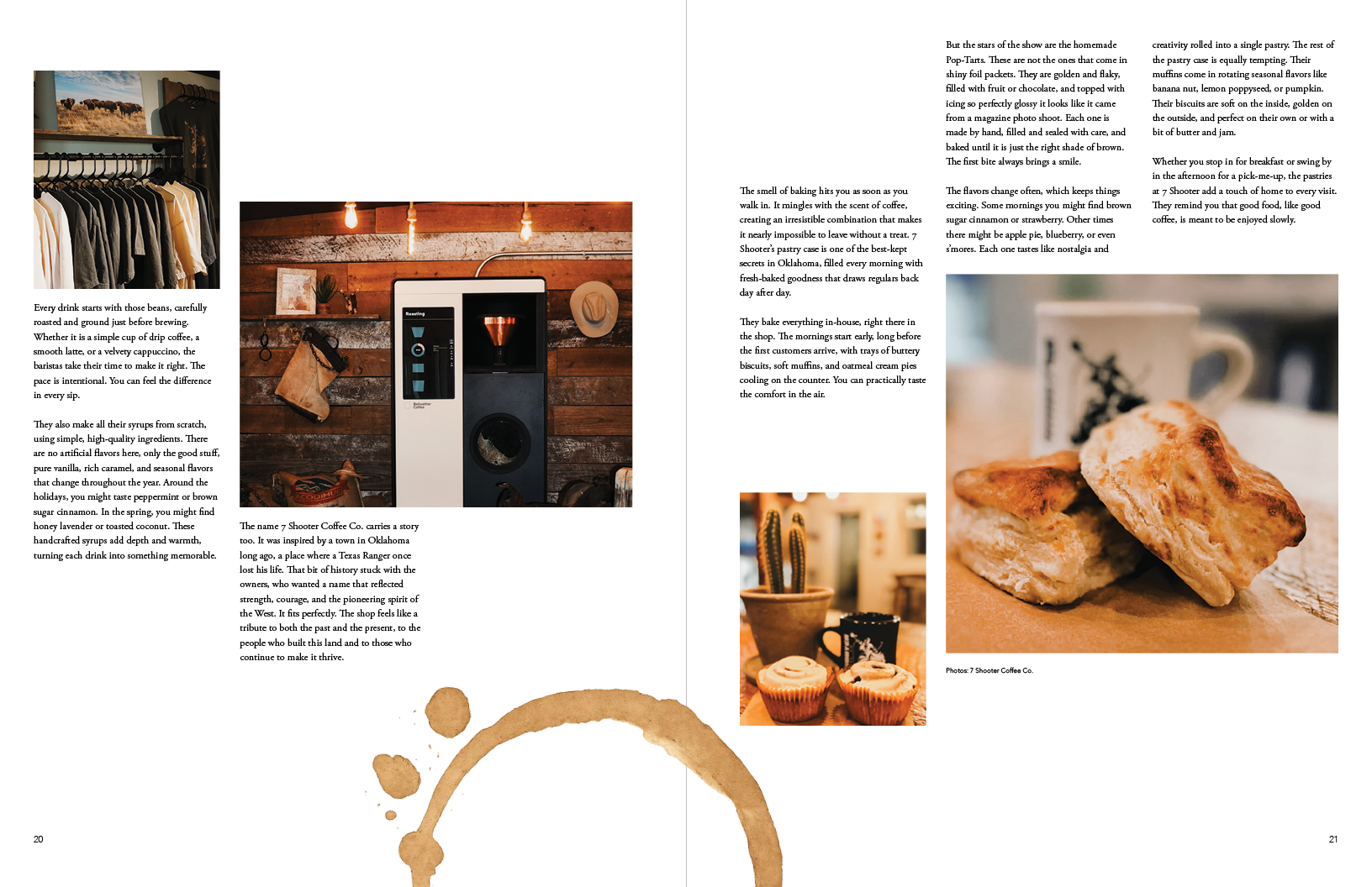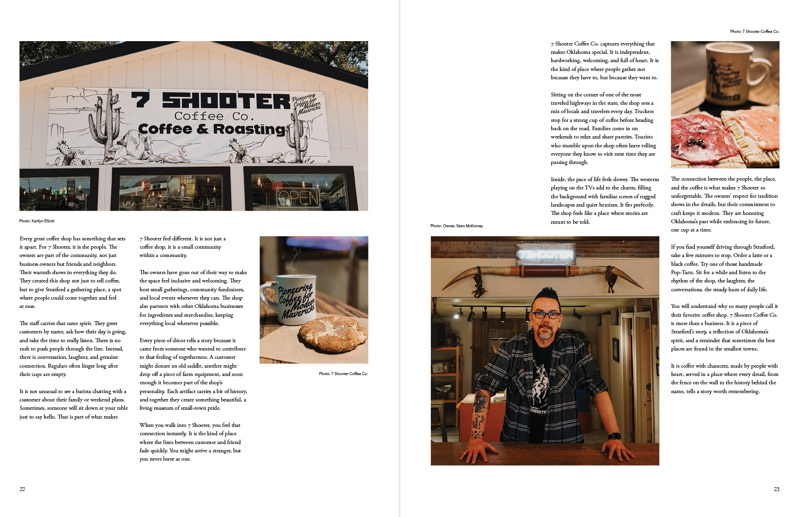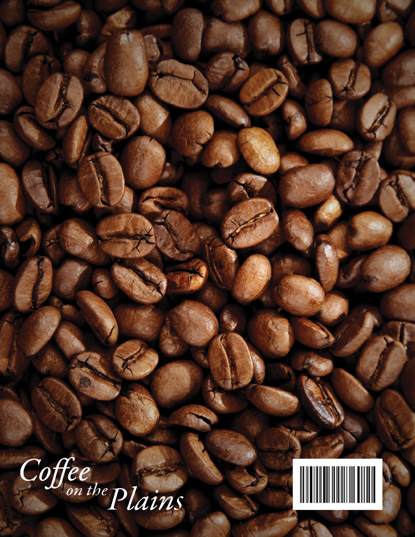
Coffee on the Plains
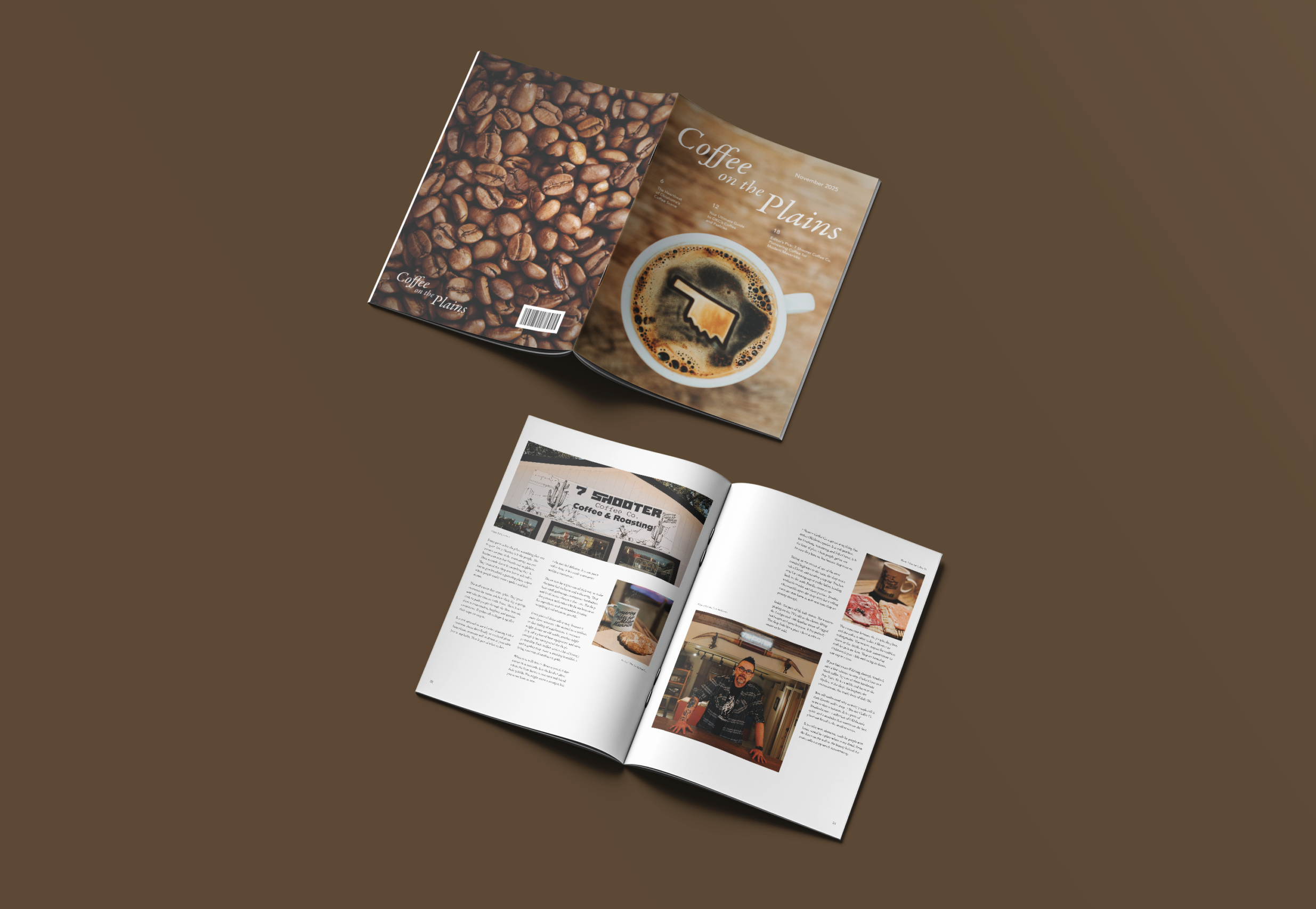
Coffee on the Plains is a print magazine exploring Oklahoma’s coffee culture through editorial layout, typography, and photography, highlighting local cafés, roasters, and the communities around them.
Challenge
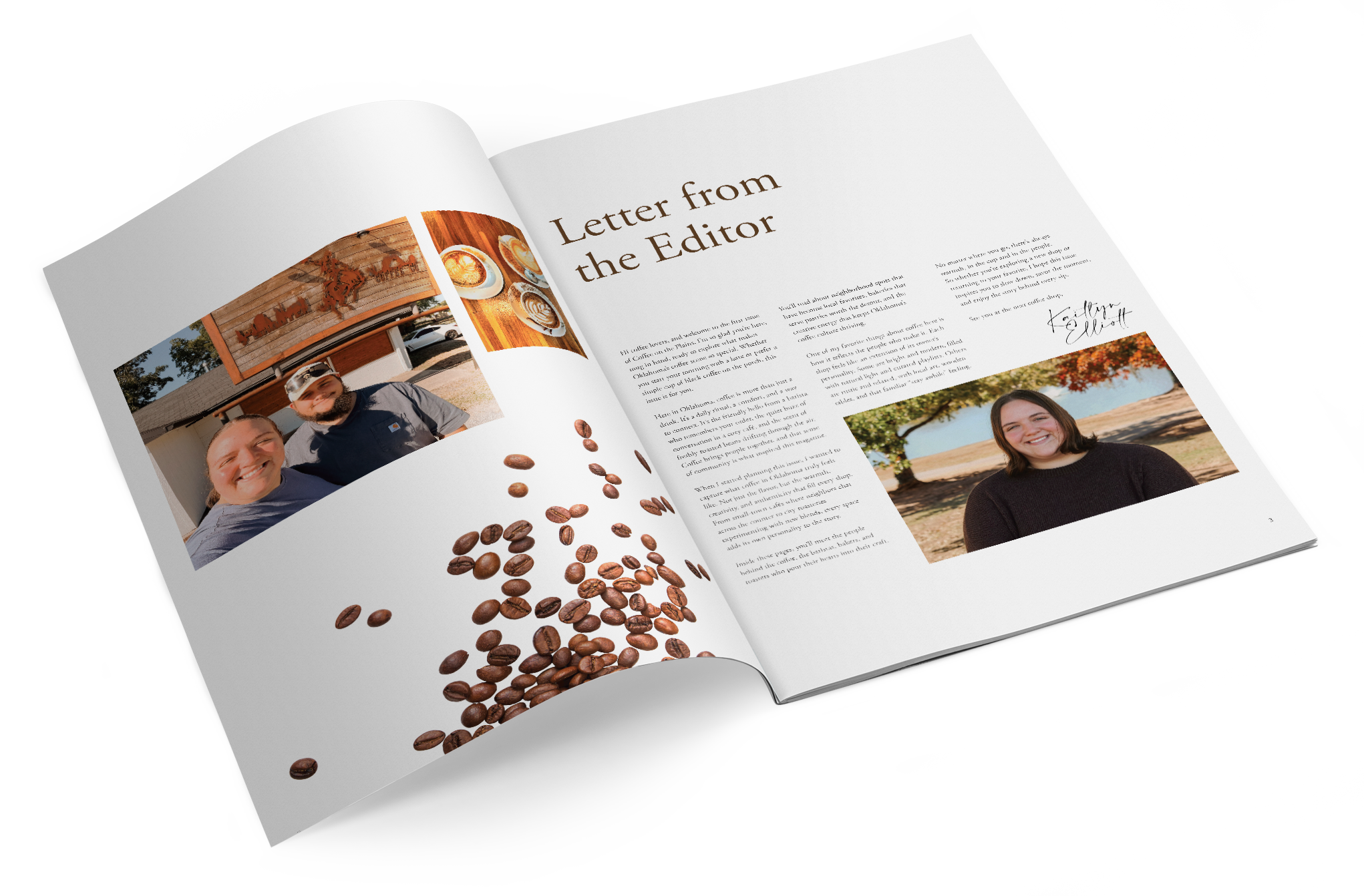
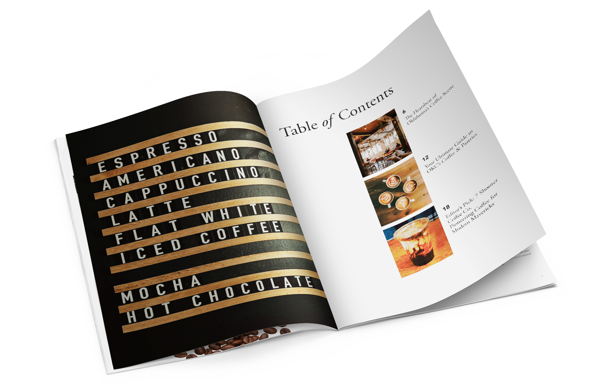
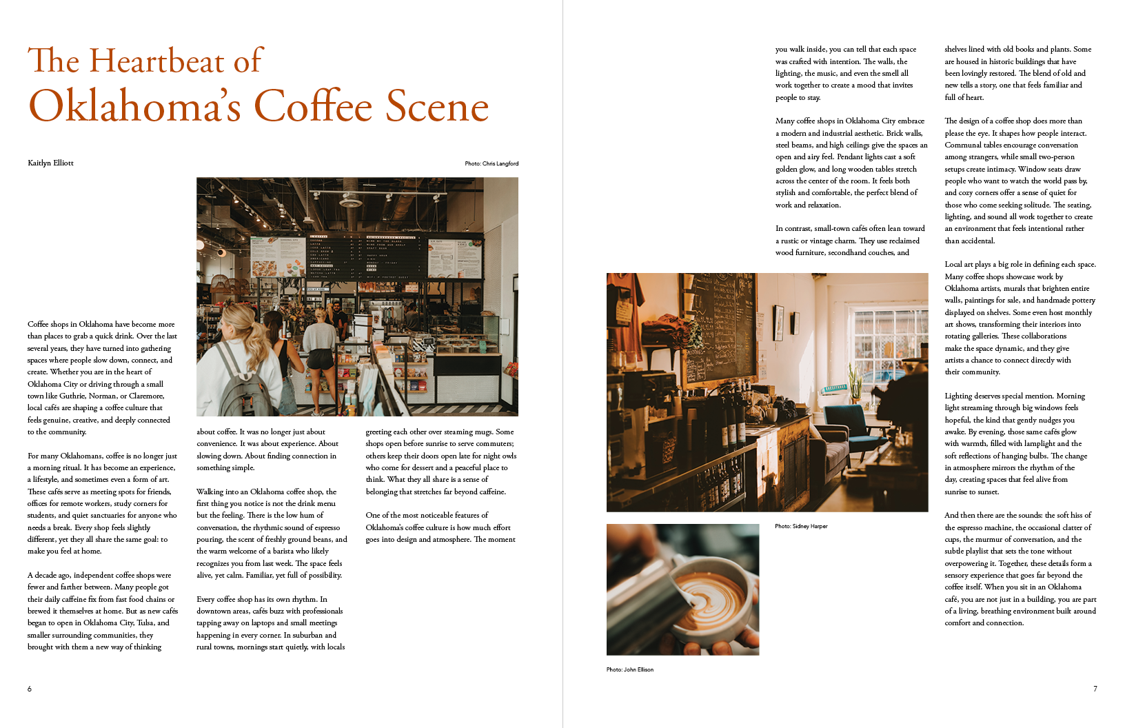
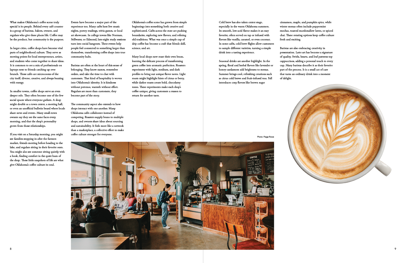
I chose to explore Oklahoma’s coffee culture through a full print magazine, focusing on how editorial design can tell local stories. The challenge was creating a publication that felt cohesive from cover to cover while allowing each article to feel distinct. Balancing long-form text with photography required careful attention to hierarchy, spacing, and pacing. The magazine needed to feel warm, approachable, and easy to navigate.
Solution
I created a flexible grid system and a clear typographic structure to support consistency across the magazine while allowing variation in layout. Instead of mixing multiple type styles, I refined a single typographic direction and used changes in scale, weight, and spacing to create hierarchy. Thoughtful use of white space and imagery helps guide the reader and supports the overall narrative of the publication.
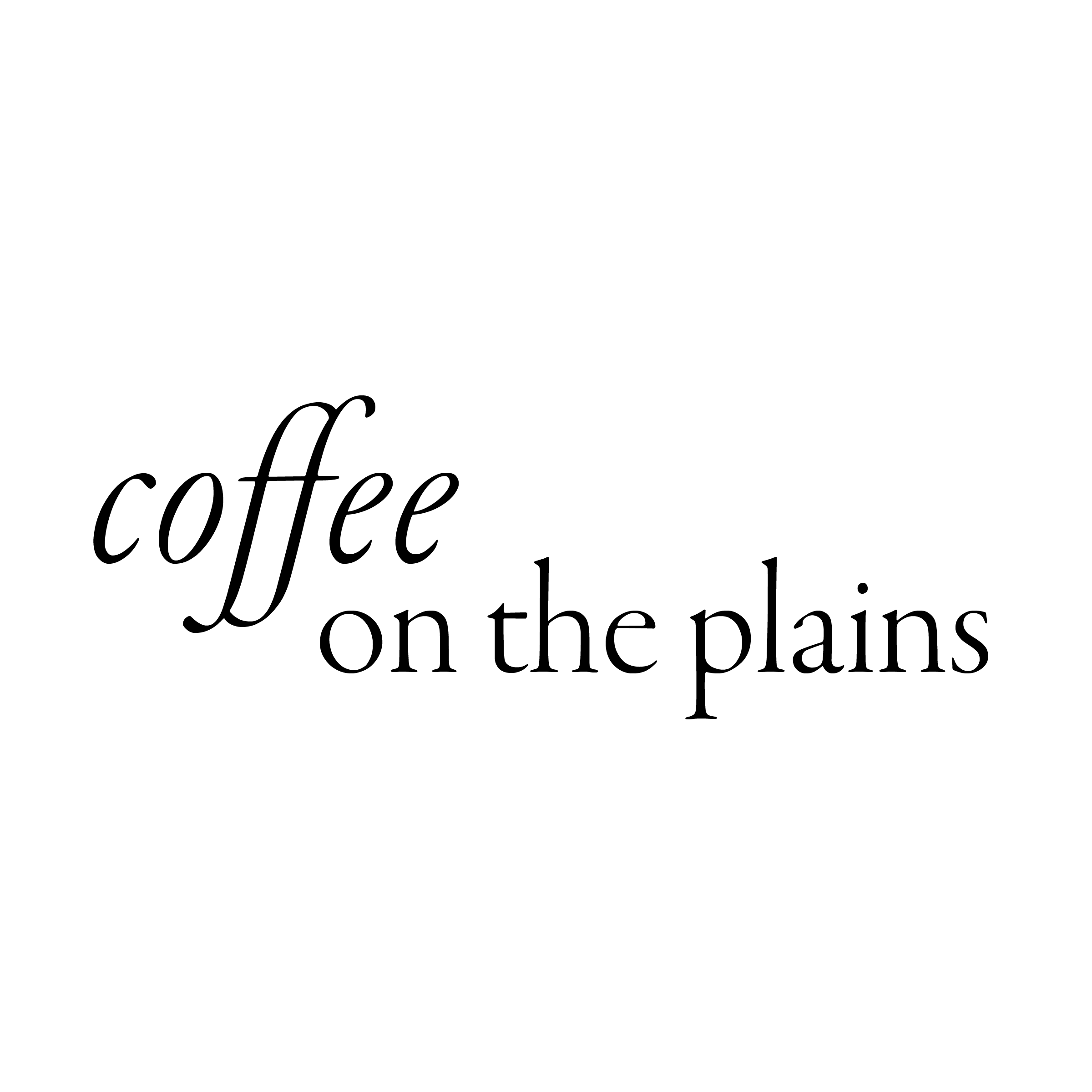
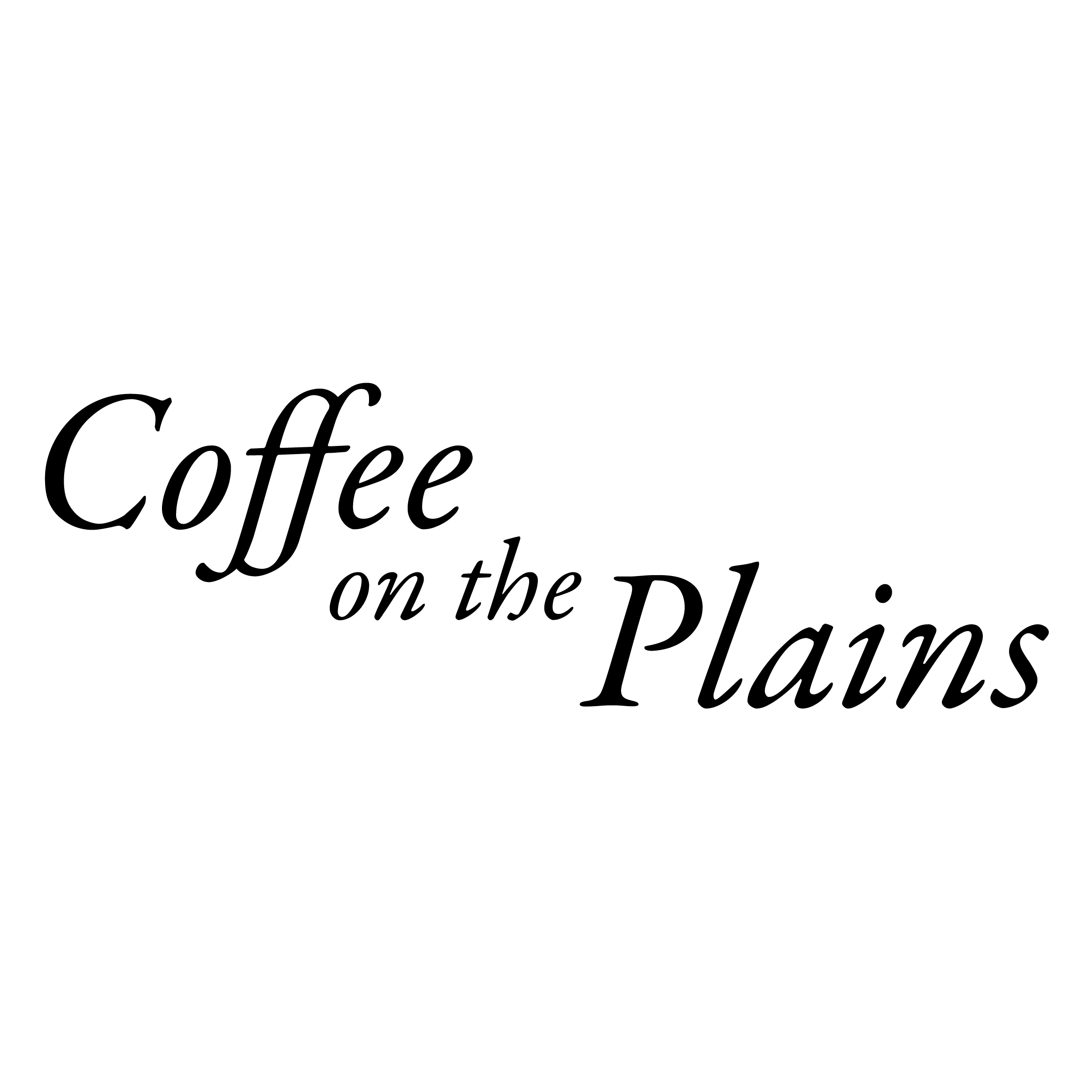
Type Exploration
Typographic studies testing serif and sans-serif combinations to establish tone, hierarchy, and visual consistency.


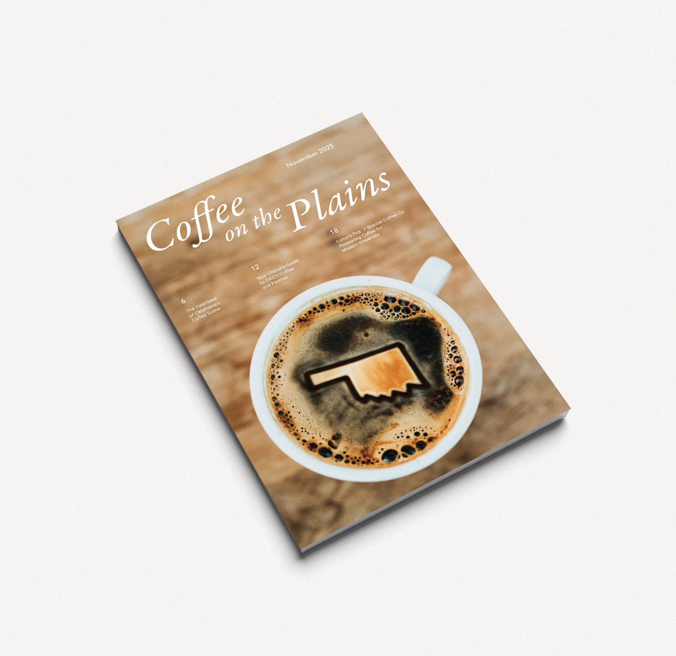
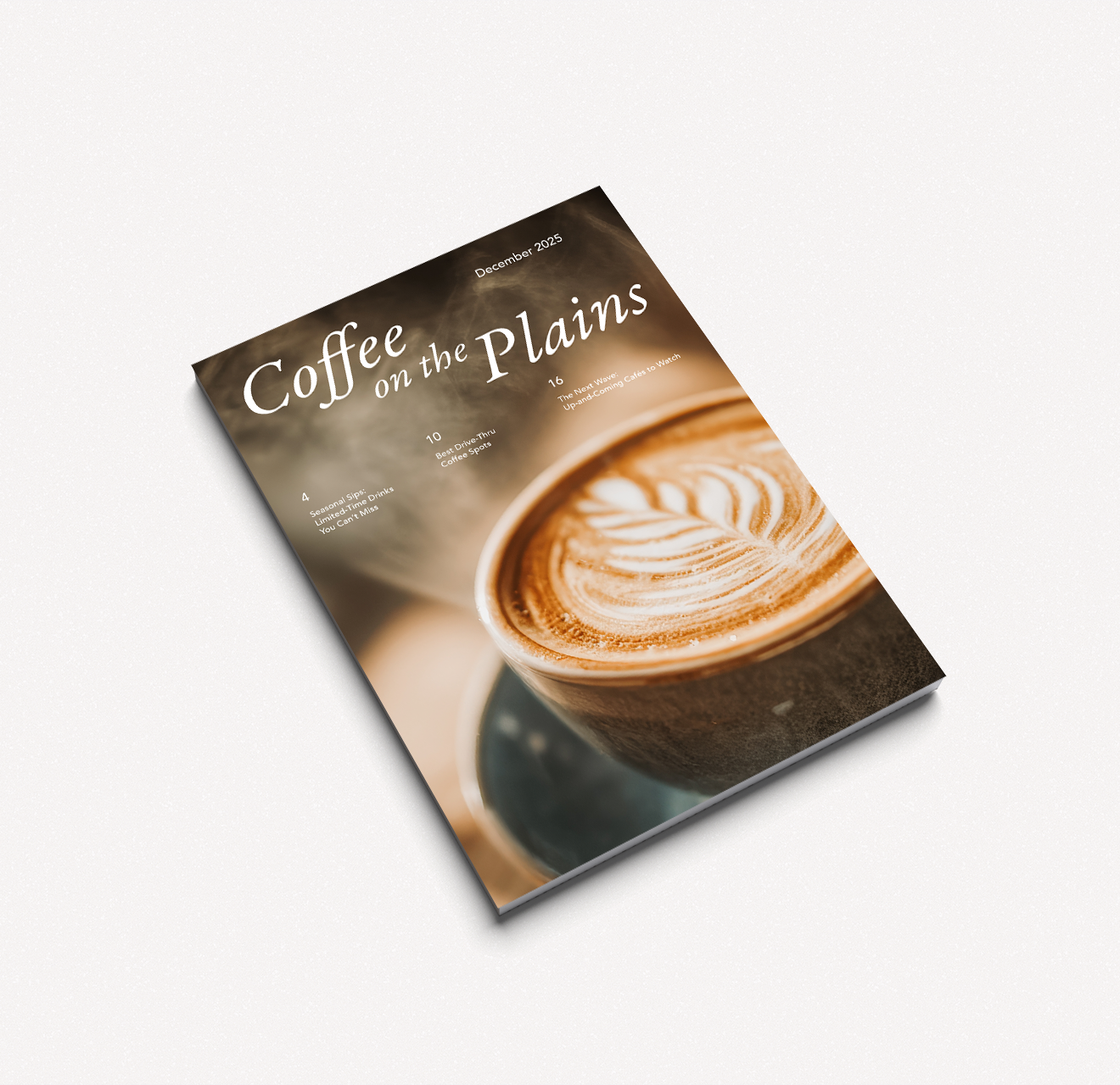
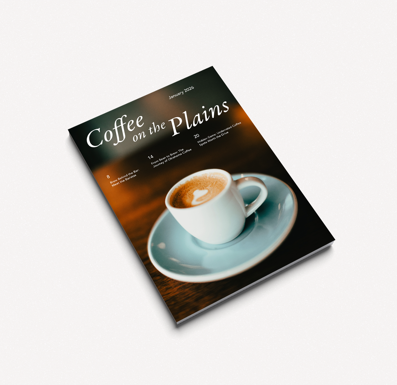
Cover Exploration
Explorations of full-bleed photography and typographic hierarchy to create warm, inviting magazine covers.
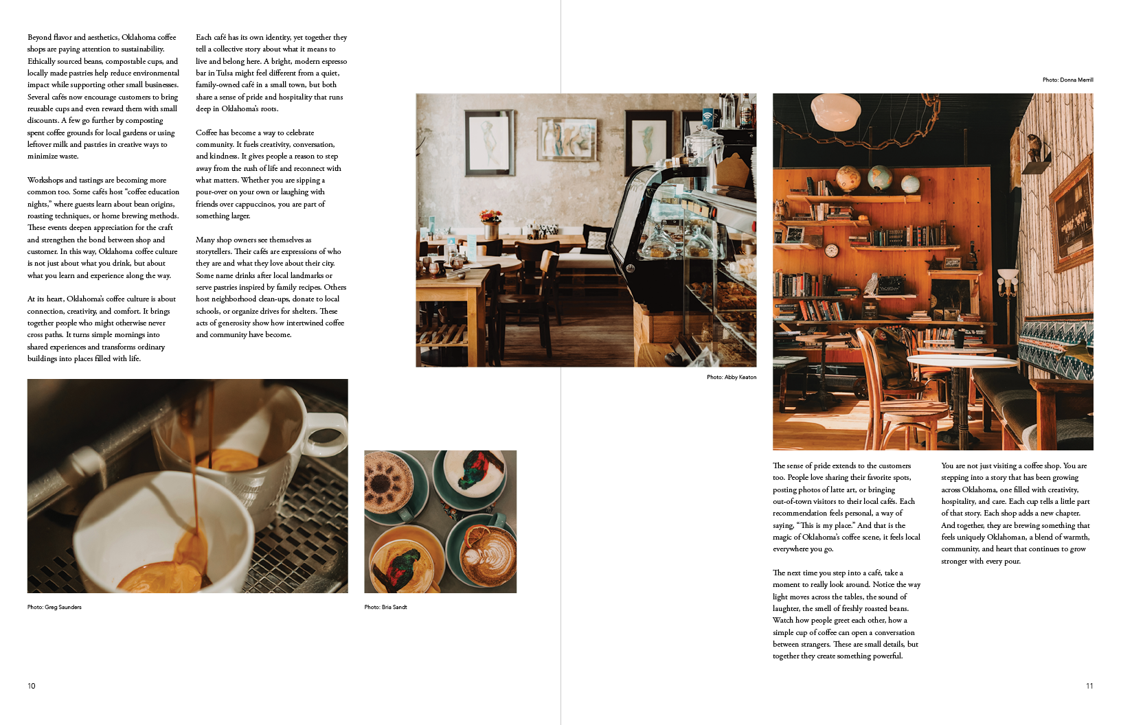
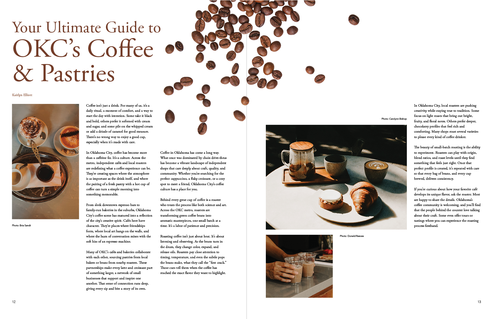
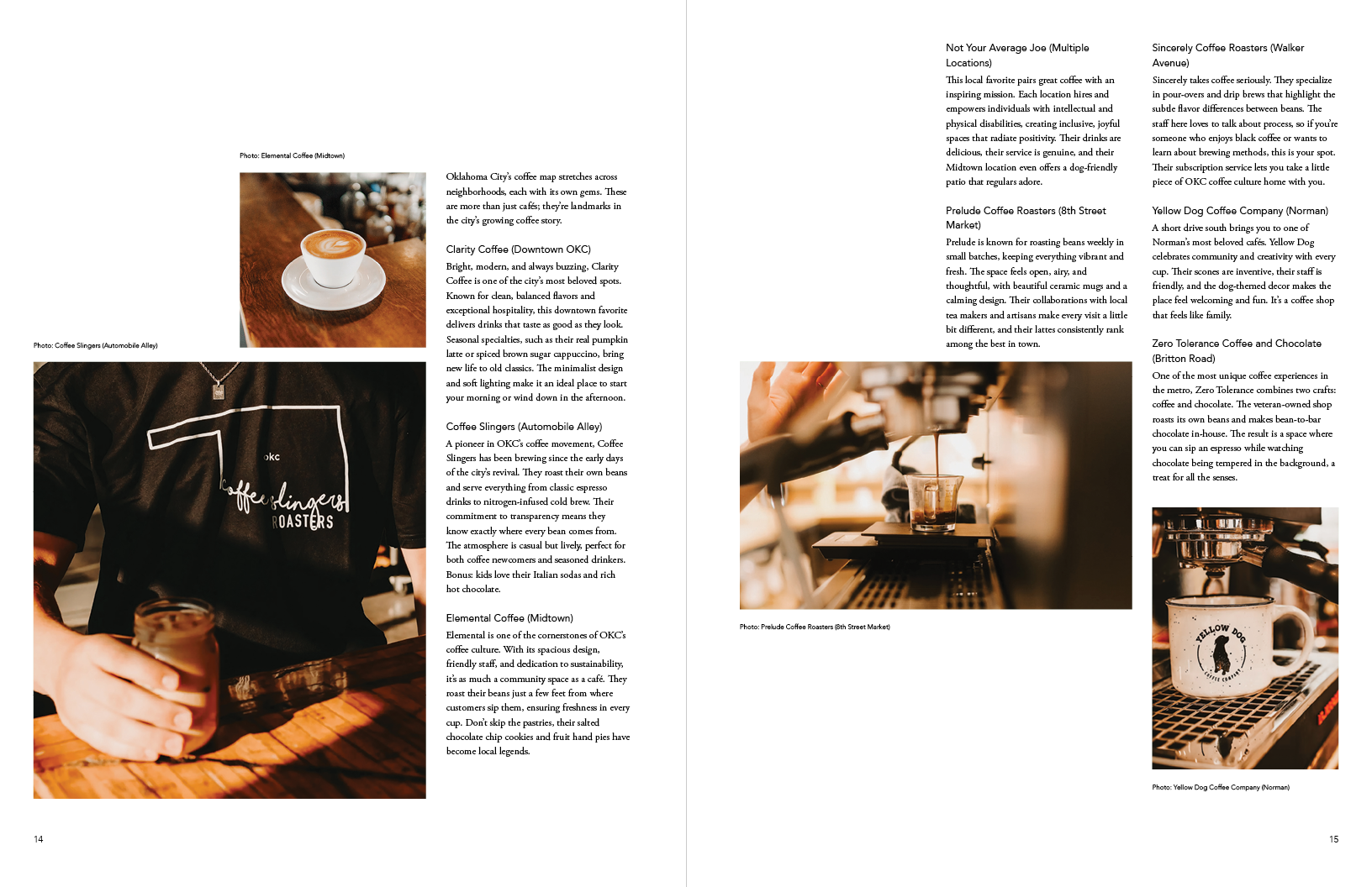
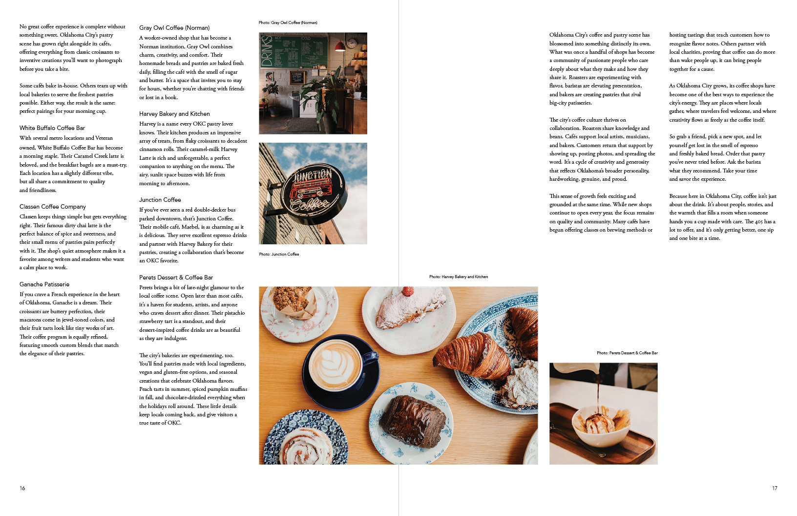
Magazine Spreads