
Dearly
This project focuses on AI-driven design to make journaling easier and more approachable. AI personalizes prompts and summarizes entries to reduce effort while supporting reflection and emotional well-being.
Problem
People reflect in different ways. Some prefer writing, while others talk through their thoughts, record voice notes, or jot things down quickly throughout the day. Although research shows that journaling supports emotional well-being, many people struggle to maintain the habit because existing tools require too much time, effort, or commitment to a single format. Reflection should fit naturally into everyday life: flexible, accessible, and low-pressure.
Secondary Research
A recent study from Cambridge University Press on journaling and psychological well-being suggests that both digital and analog journaling improve emotional regulation and self-awareness. However, many tools still rely on long-form, self-initiated writing that users often lack the time or motivation to sustain.
Research on AI-supported journaling, including the MindScape study, shows that short, AI-guided prompts can reduce effort and improve consistency. However, many AI tools still lack emotionally safe, low-pressure experiences and do not fully address privacy concerns or optional connection without social pressure.
Together, these findings highlight an opportunity to design flexible, AI-supported reflection experiences that lower the barrier to entry while preserving emotional safety and authenticity.
Competitive Analysis
To understand how other journaling apps support reflection and mental well-being, we analyzed competitors such as Apple’s Journal app, MindScape, and Finch. Each app was evaluated based on user experience, accessibility, emotional guidance, AI integration, and community features.
Strengths:
- Strong privacy and security
- Clean, simple interface
- Smart prompts based on real-life activity (photos, workouts, locations)
- Seamless integration into daily routines
Weaknesses:
- Limited emotional guidance or personalization
- No community or connection features
- Lacks AI-driven reflection or emotional insights

Strengths:
- Strong use of AI to identify emotional patterns and themes
- Personalized prompts that adapt over time
- Encourages deeper self-reflection without requiring users to analyze everything themselves
- Focuses on mental health and emotional awareness
Weaknesses:
- Can feel emotionally heavy or intense for casual users
- Less approachable for quick, everyday check-ins
- Focuses more on individual reflection than social or shared

Strengths:
- Highly engaging and friendly interface
- Gamification makes reflection feel fun and less intimidating
- Strong emotional support tone
- Encourages daily check-ins without requiring long writing
Weaknesses:
- Gamification may feel distracting for some users
- Focuses more on motivation than meaningful reflection
- Limited depth in journaling and emotional analysis
Proposed Solution
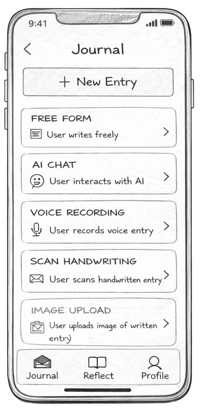
Based on our research, we propose a flexible journaling app that supports multiple reflection formats — text, voice, video, and scanned handwriting — within one platform. The system uses AI to provide optional prompts, summarize key themes over time, and reduce the effort required to revisit past reflections.
The goal is not to replace human reflection, but to assist it. By adapting to different reflection styles and energy levels, the app makes journaling more approachable and sustainable as a daily habit.
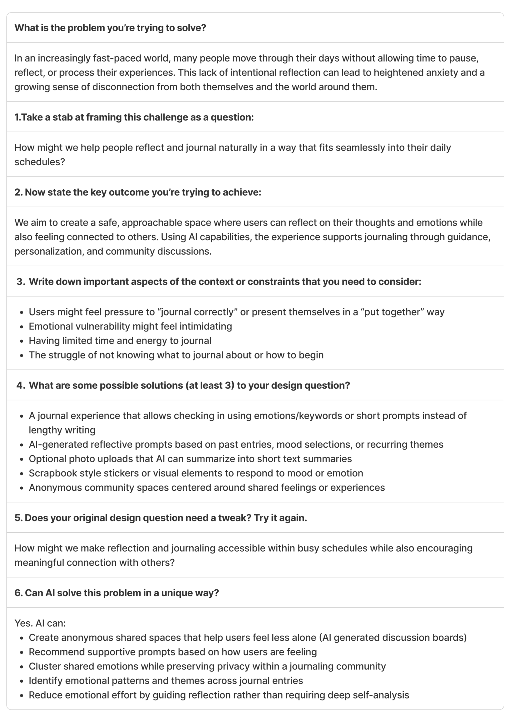
We used the “Framing Your Design Challenge” worksheet to iteratively refine and clarify our problem statement and solution direction.
Empathize
The goal of the empathize stage was to understand how people actually experience journaling and reflection in their daily lives. We wanted to learn:
- Why people journal (or want to)
- What makes journaling difficult
- How reflection fits into different lifestyles
- Where current tools fall short
This stage helped us validate whether journaling and reflection consistency is a meaningful design challenge and identify emotional and behavioral patterns across users.
Interviews
We interviewed 10 participants across a diverse range of ages (from a 6th grader to a 58-year-old adult), roles (college students, a therapist, and a parent), and journaling experience levels (long-term consistent journalers and individuals who struggle with consistency).
Participants represented:
- Analog and digital journaling preferences
- Faith-based and secular reflection practices
- Students with time constraints
- One participant requiring accessibility support for digital journaling
This diversity allowed us to compare different habits, motivations, emotional needs, and barriers to consistency.
Interviews were conducted using open-ended questions focused on journaling habits, motivations, frustrations, and emotional experiences.
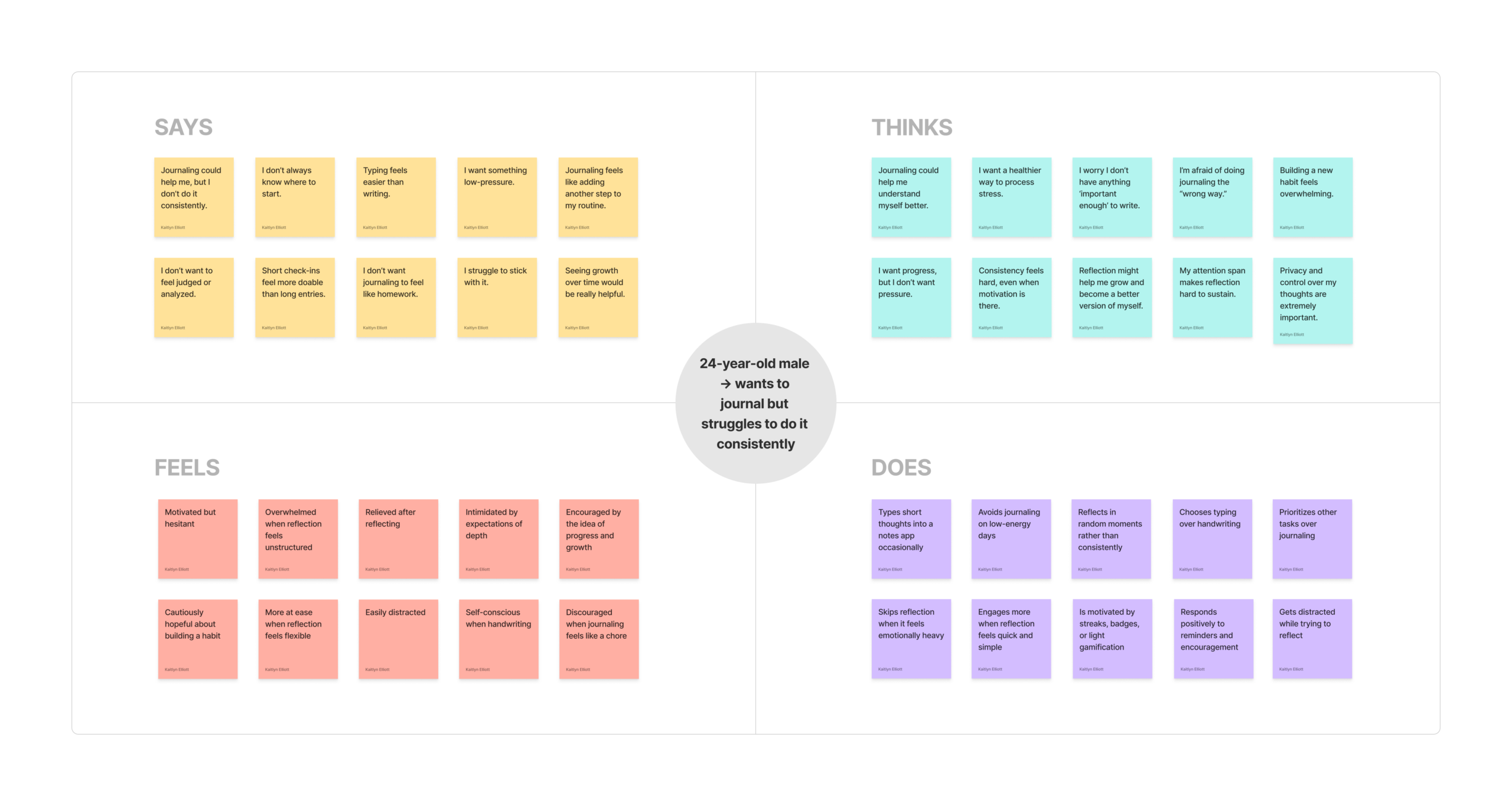
Empathy Maps
After conducting interviews, we created empathy maps to better understand what users say, think, feel, and do. These maps helped us synthesize emotional patterns, behavioral tendencies, and unmet needs across different personas.
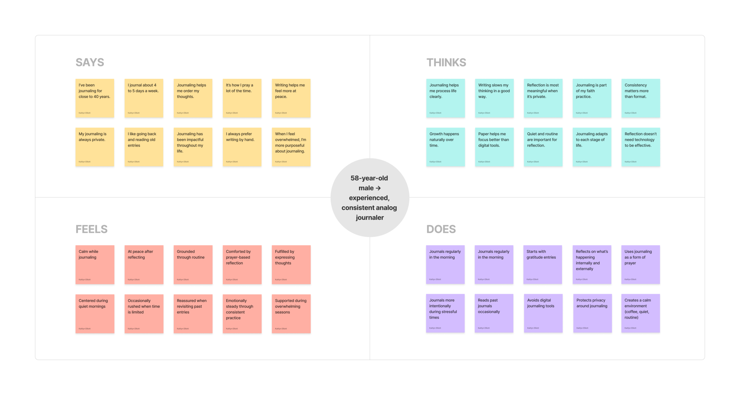
experienced, consistent analog journaler
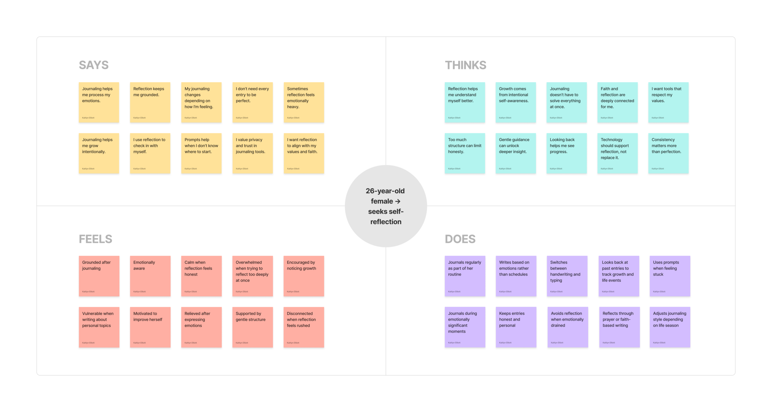
seeks self-reflection
Thematic Analysis
To gather collective insights from our interviews, we conducted thematics analysis of the interviews using ChatGPT. From the analysis, we found the following four themes across interview data:
1. Starting Is the Biggest Barrier
Across age groups, the hardest part was beginning. Many participants didn’t know where to start or felt pressure to write something meaningful. The blank page often created resistance.
2. Growth & Pattern Recognition Motivate
Looking back at past entries helped users notice emotional patterns and personal growth. Even participants who struggled with consistency said seeing progress would motivate them.
3. Privacy & Psychological Safety
Privacy was universally important. Participants emphasized trust, control over data, and not wanting to feel analyzed or exposed — especially in AI-supported experiences.
4. Journaling as Emotional Regulation
Participants described journaling as a way to process emotions, reduce overthinking, and feel calmer. Many shared that reflection helps them “clear their head” and feel more at peace.
Define
In this stage we translated user insights into actionable design directions. We focused on identifying a primary user, mapping their experience, and clarifying how AI could meaningfully support their needs.
Personas
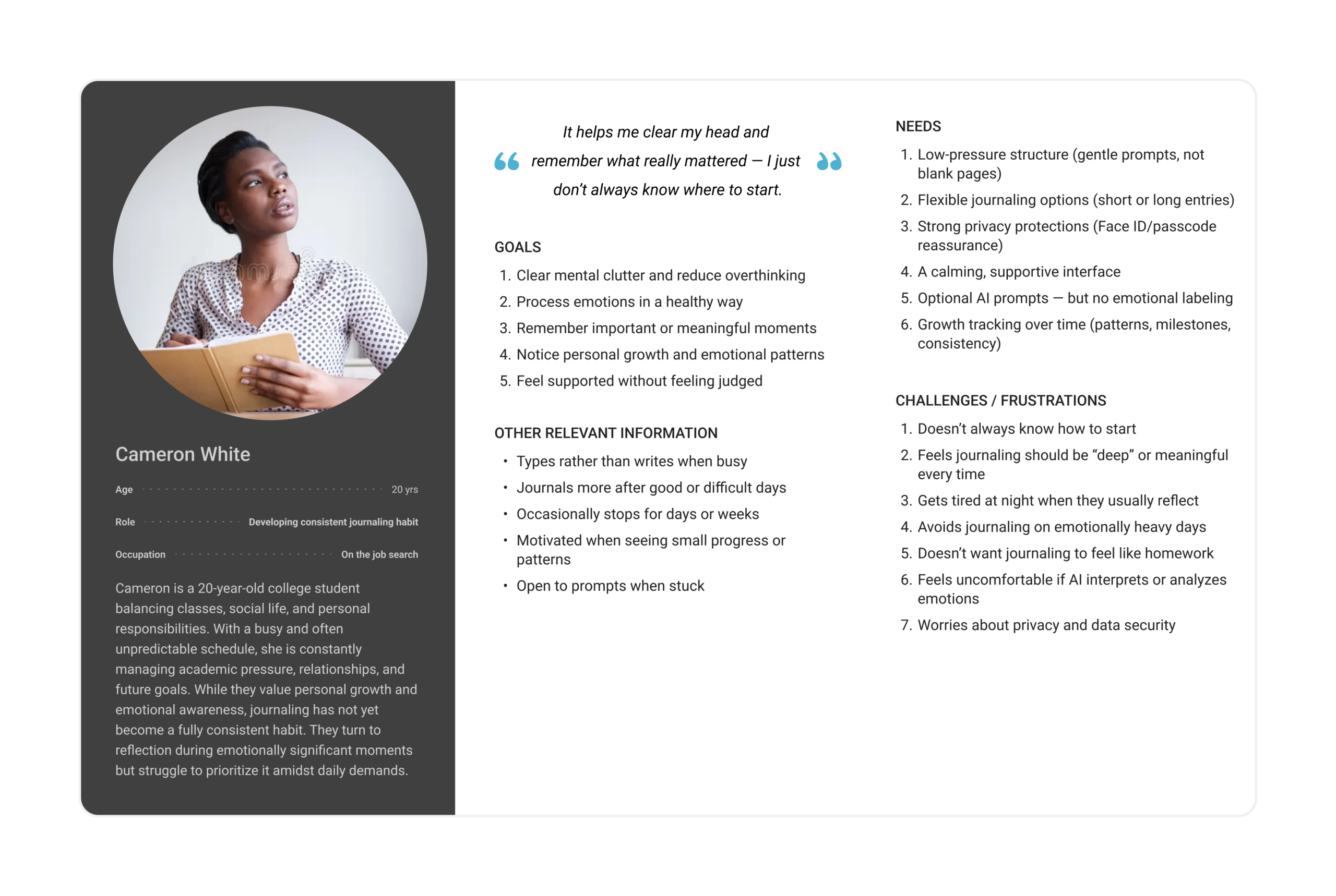
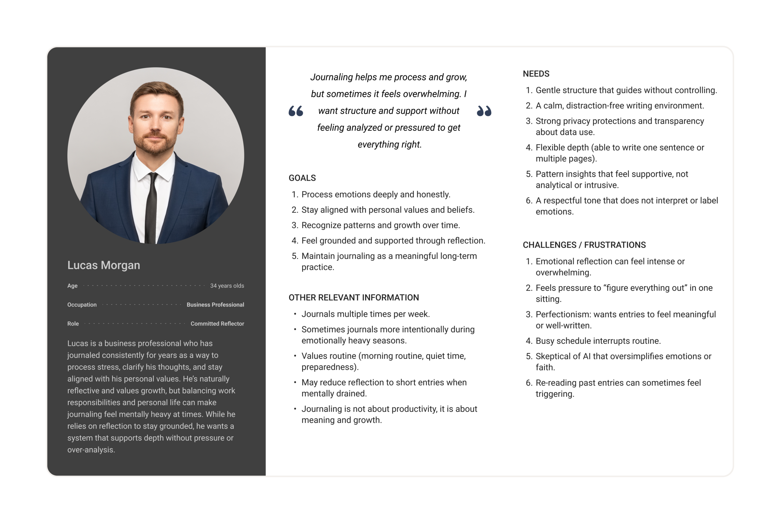
Based on patterns identified in our interviews, we developed two primary personas. Our research revealed two distinct but equally important user groups:
- Individuals who already journal consistently but value depth, privacy, and meaning.
- Individuals who want to journal but struggle with starting and maintaining consistency.
When we design for both extremes, we create solutions that also work for everyone in between.
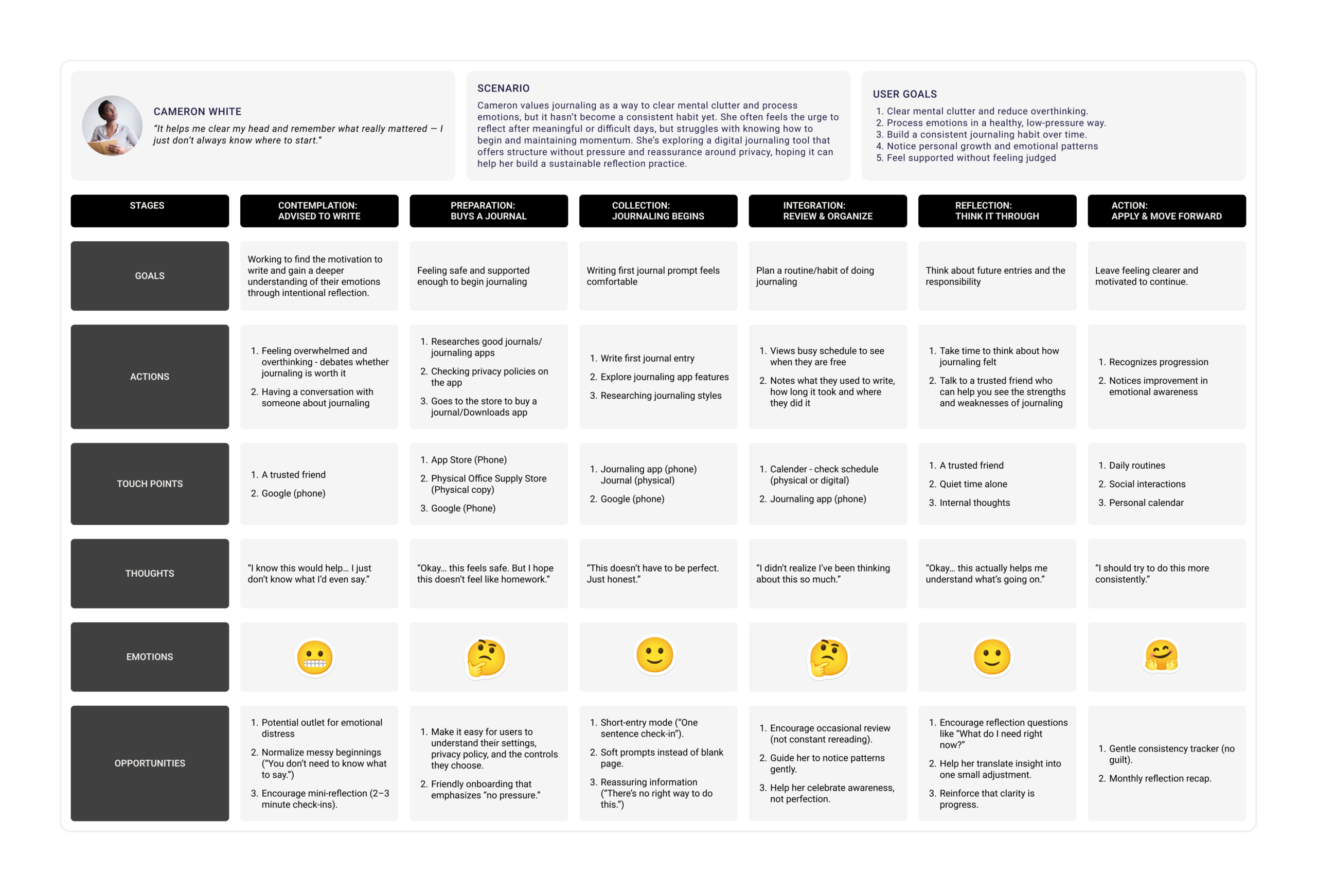
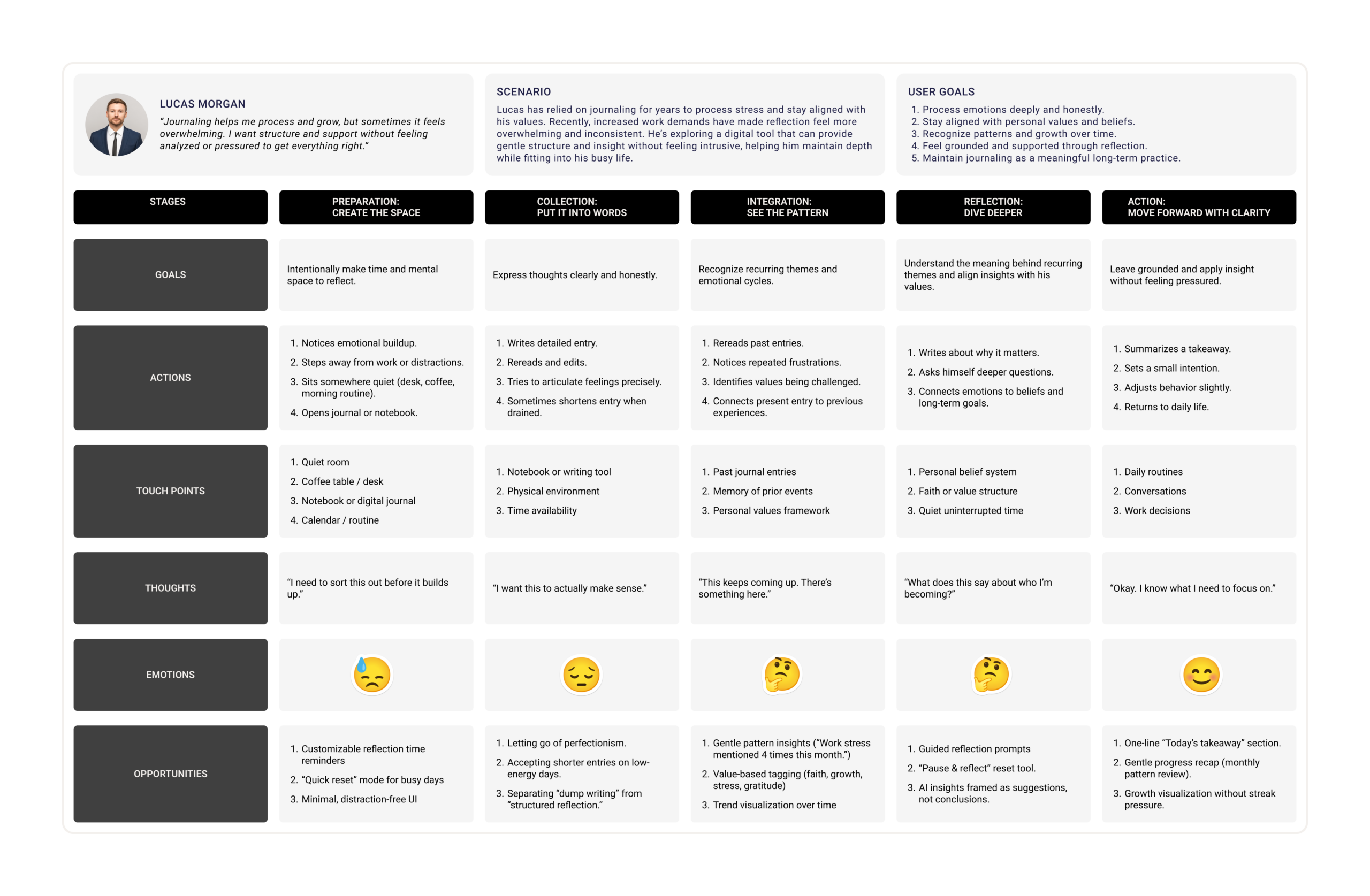
User Journey Maps
To better understand our personas, we mapped each persona’s current journaling experience before introducing any design solution. Our goal was to identify pain points, emotional patterns, and clear opportunities for improvement.
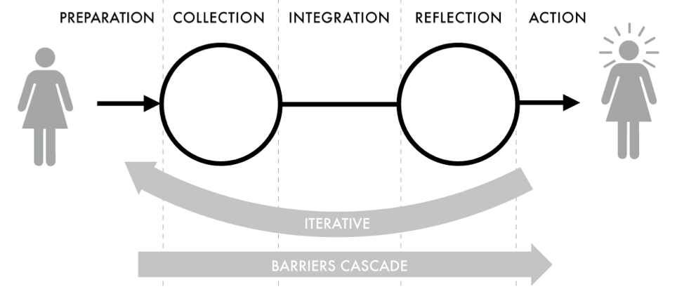
We were inspired by A Stage-Based Model of Personal Informatics Systems, which explains that reflection is not a single moment, but part of a larger process that includes Preparation, Collection, Integration, Reflection, and Action. This model also highlights that barriers in early stages often affect later ones, and that the process is iterative rather than linear.
The diagram below illustrates this stage-based framework that informed our approach:
Using this structure, we examined:
- Where unmet needs consistently emerge
- How users currently begin journaling
- Where resistance or drop-off happens
- What emotional shifts occur throughout the experience
This helped us recognize that the biggest barriers often happen before or during the act of journaling, not after, emphasizing the importance of designing for safety, flexibility, and low-pressure reflection.
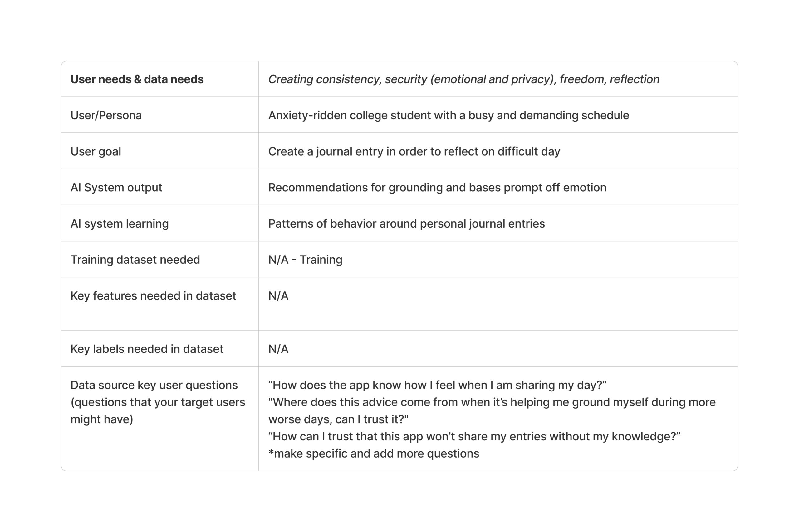
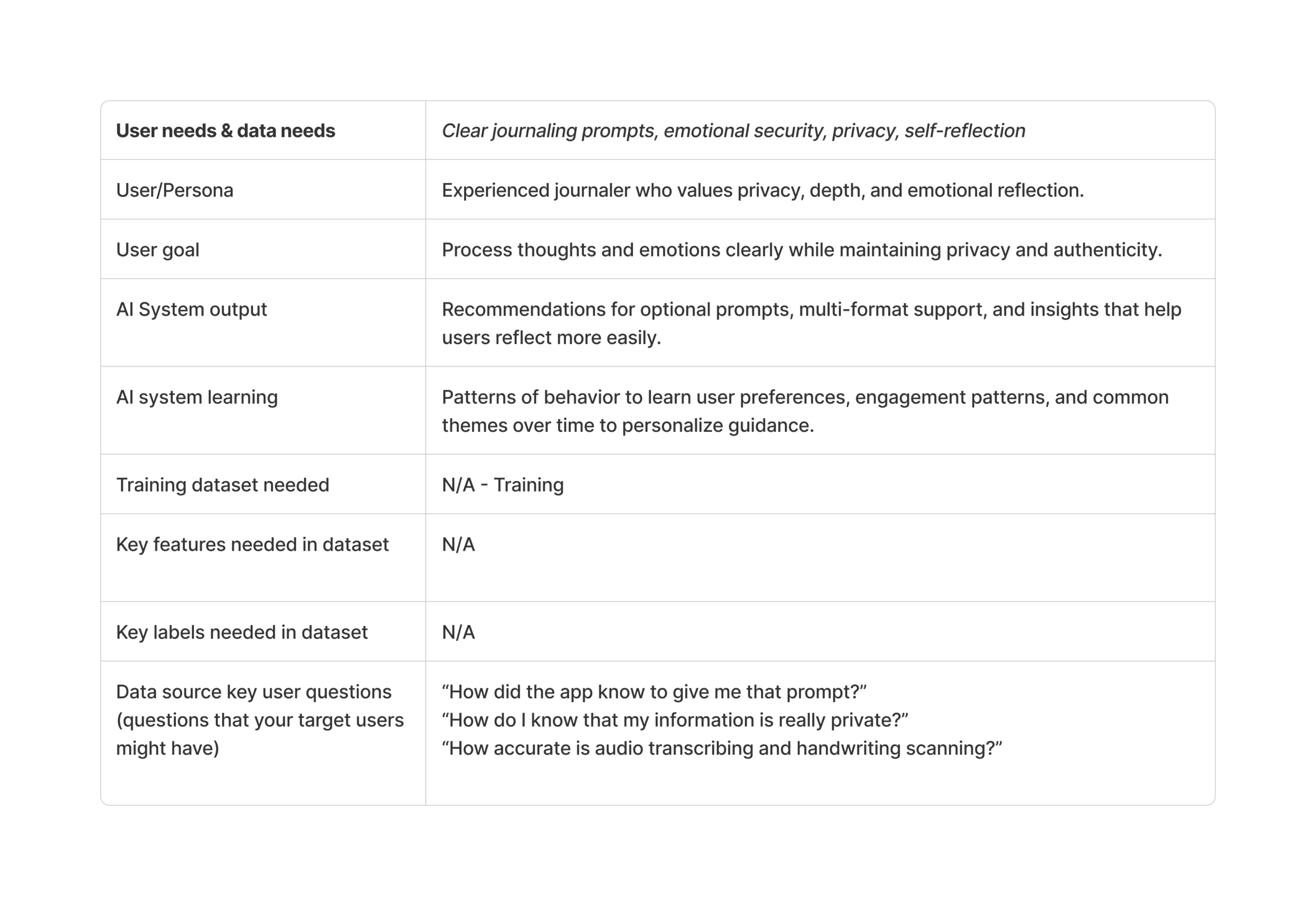
Mapping AI needs to Data Requirements
We evaluated the role of AI using this worksheet. We discussed where AI is necessary, where it meaningfully enhances the experience, and where it may add little value or introduce risk. For example, AI’s ability to summarize and synthesize personal entries can effectively support reflection by helping users revisit journal entries and identify recurring themes over time. However, AI may create harm if it attempts to diagnose emotions, label mental states, or present interpretations as conclusions. Because privacy and safety were consistently emphasized in our interviews, we intentionally limited AI’s role to optional prompting, transcription, and pattern highlighting rather than emotional judgment or analysis.
Finally, we mapped user needs to clear data requirements to ensure the solution is grounded in both user insights and responsible data use. We determined that the system needs curated inputs such as user-generated journal entries (typed text, transcribed voice recordings, or digitized handwriting), and user-controlled preference settings. These inputs allow the system to generate contextual prompts, summarize past reflections, and surface growth patterns over time. Importantly, all data originates directly from the user within the app, and no external emotional or diagnostic datasets are required.
Ideate
After defining the problem and identifying key user needs, we moved into the Ideate stage. In this phase, our goal was to explore possible solutions that could address the challenges uncovered during our user research.
To explore possible solutions, our team worked together to develop a creative matrix. After generating ideas as a team, I individually created a storyboard and user flow diagram to further develop and communicate the concept I plan to move forward with.
Creative Matrix
As a team, we created a creative matrix to explore different directions for solving the design opportunities identified during the Define stage.
We began by identifying several How Might We (HMW) questions that captured the key problems from our research. Some of these included:
- How might we help users reflect consistently in a way that feels low-pressure and adaptable to their daily lives?
- How might we reduce the barrier to starting reflection while keeping the experience personal and private?
- How might we support multiple journaling formats such as typing, voice notes, or handwriting?
- How might we help users recognize growth and patterns over time without over-analyzing their emotions?
Each team member contributed ideas within the matrix, which helped us explore a wide range of possible solutions. By working collaboratively, we were able to generate many concepts that approached the problem from different angles.
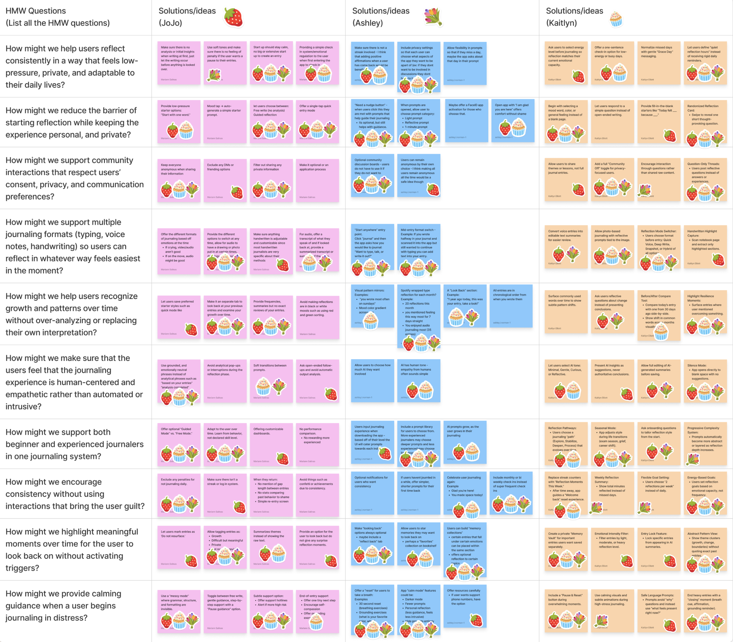
Some of the main ideas generated in the matrix included:
- Offering gentle prompts to help users start writing
- Providing optional reflection prompts during journaling
- Highlighting patterns or growth over time in past entries
- Supporting multiple journaling formats depending on the user’s needs
One concept that emerged from the matrix and influenced the final design was the idea of optional prompts that help users begin journaling without pressure.
Instead of presenting users with a completely blank page, the system can offer a simple prompt such as:
“What’s one thing on your mind right now?”
This concept aligns with several Human-AI Experience (HAX) design guidelines, including:
Make clear what the system can do
The prompt communicates how the AI can support the user while still allowing them to journal freely.
Support efficient invocation
The AI provides help when the user begins writing but does not interrupt the journaling experience.
Support efficient dismissal
Users can ignore the prompt and continue writing in their own way if they prefer.
These guidelines helped ensure the AI behaves in a supportive and respectful way, rather than taking control of the journaling experience.
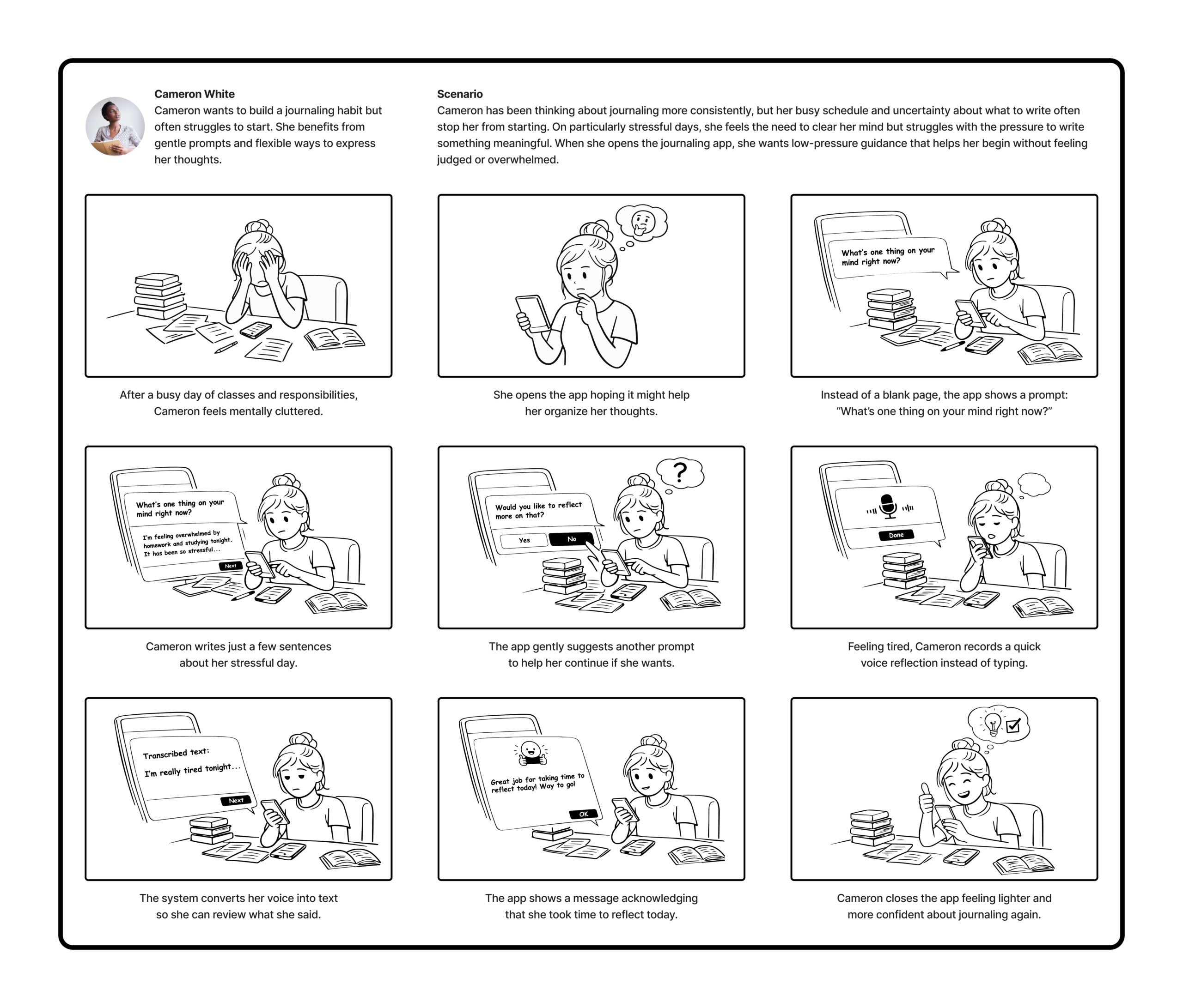
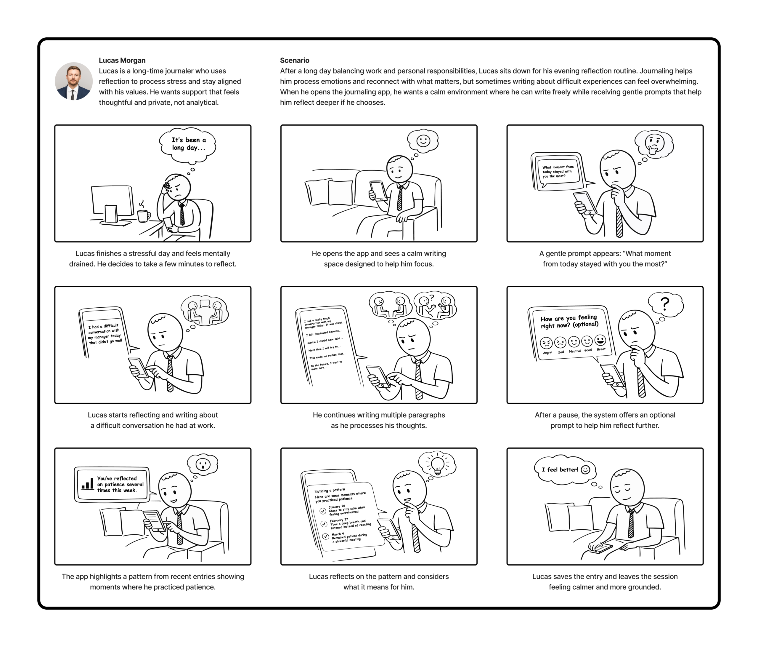
Storyboards
To explore how the system might be used in real life, I created two storyboards based on our personas: Cameron and Lucas. Each storyboard illustrates the context of use, the user’s actions, and how the system responds during the interaction.
User Flow Diagram
To better understand how users would interact with the journaling system, I created a user flow diagram that maps the main paths a user can take while using the app.
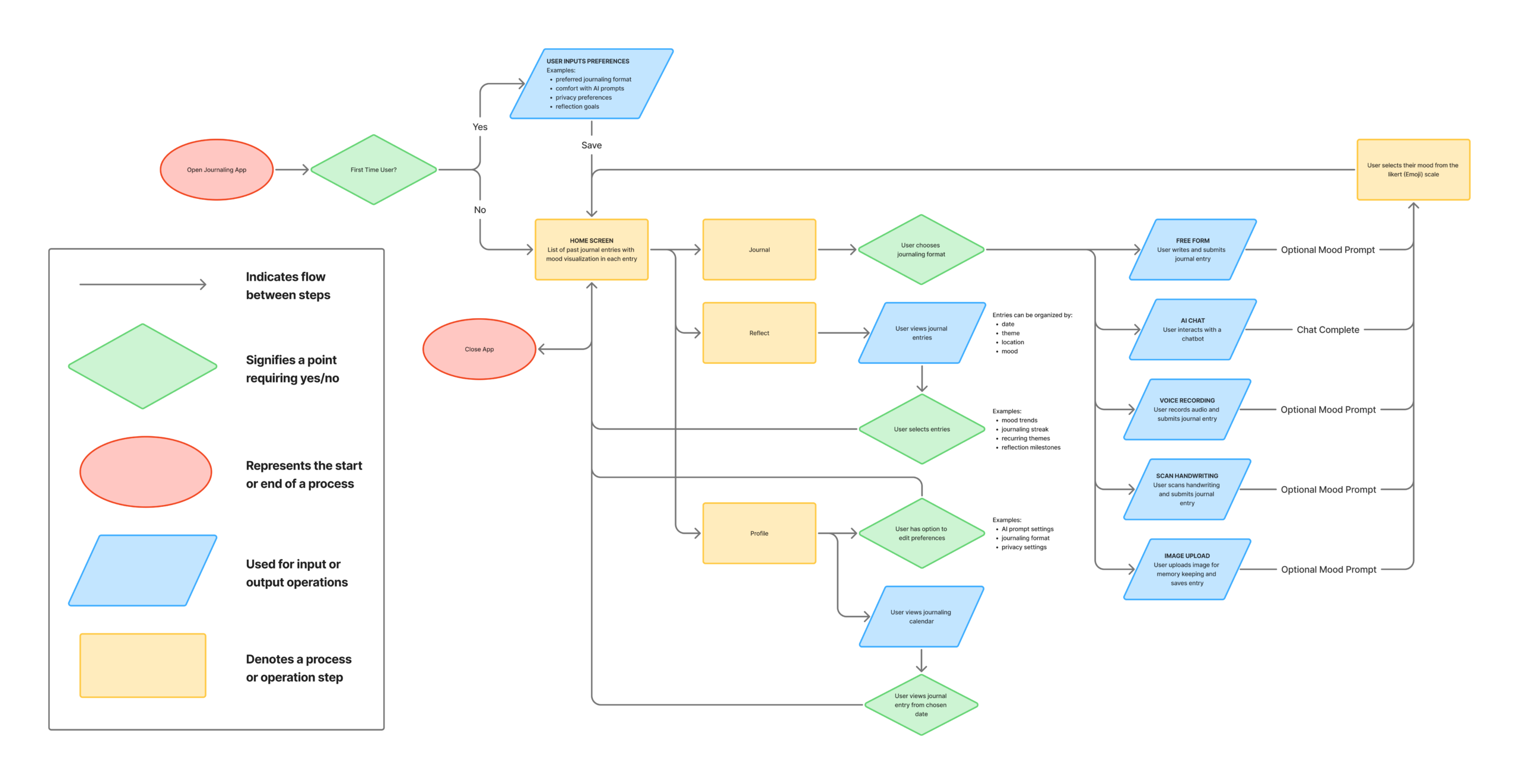
Overall, this user flow supports the design goal of creating a low-pressure, flexible journaling experience. By offering multiple ways to journal, optional AI guidance, and tools for reflection over time, the system helps users process their thoughts while maintaining control over how they interact with the system.
Prototype Lo-Fi & Test
The goal of this stage was to quickly test the core user flows of Dearly using a low-fidelity paper prototype. This allowed me to identify usability issues early, understand how users navigate the app, and validate whether key features are easy for users to understand before moving into higher-fidelity designs.
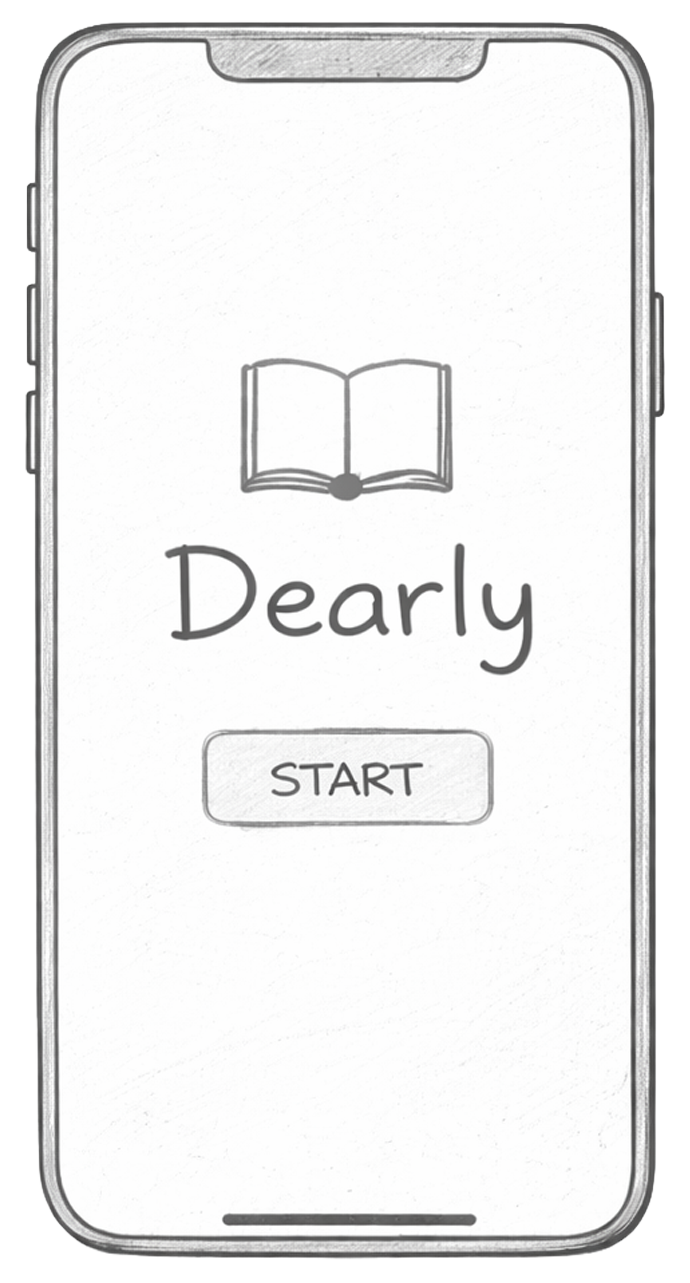
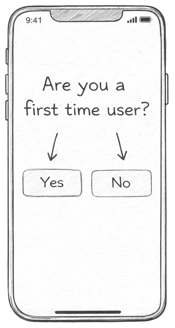
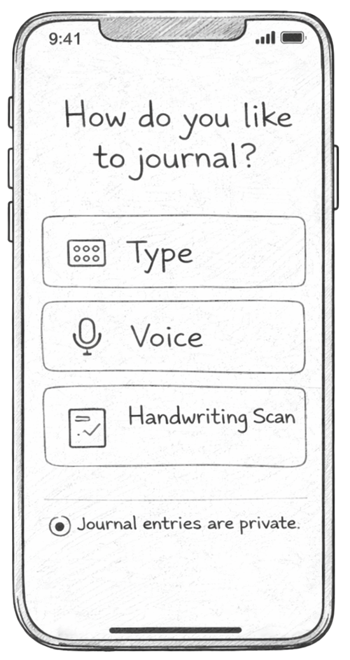
Paper Prototype
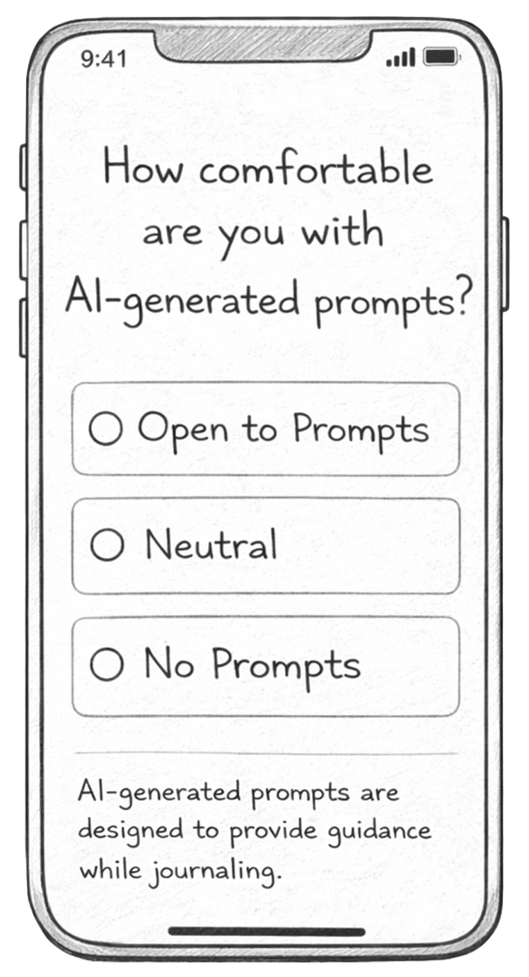
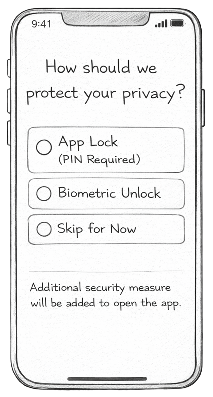
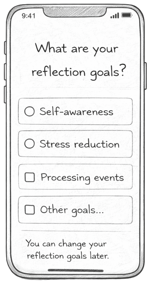
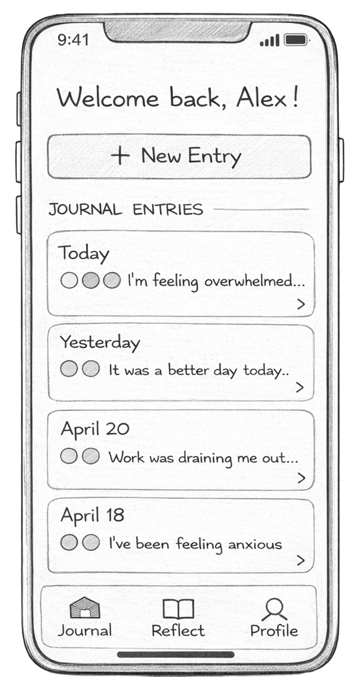
I created a set of hand-drawn screens representing the main flows of the app, including onboarding, journaling, reflection, and profile features. These screens were used to simulate real interactions during testing.
Cognitive Walkthrough
I conducted cognitive walkthroughs to evaluate how easily new users can complete key tasks in the app. The focus was on understanding whether users know what to do at each step and whether the interface supports their goals.
I selected the following 3 tasks:
- Onboarding process: This tests first impressions and whether users understand how to set up the app.
- Creating a journal entry: This is the core functionality of the app and must be simple and intuitive.
- Reflecting on mood patterns: This tests whether users can find value in their past entries and understand insights.
These tasks were chosen because they represent the main user journey: getting started, using the app, and gaining long-term value.
I tested with 2 participants, each completing all 3 tasks. For each task, participants were given a scenario and interacted with the paper prototype step-by-step. I observed their actions without guiding them and asked them to think aloud as they navigated. Throughout the process, I took notes on confusion points, errors, and questions.
These patterns were consistent across both participants:
- Onboarding clarity issues: Some users were unsure what certain options meant, especially AI-related settings and reflection goals.
- Too many journaling options upfront: Users hesitated when choosing between formats, indicating decision overload.
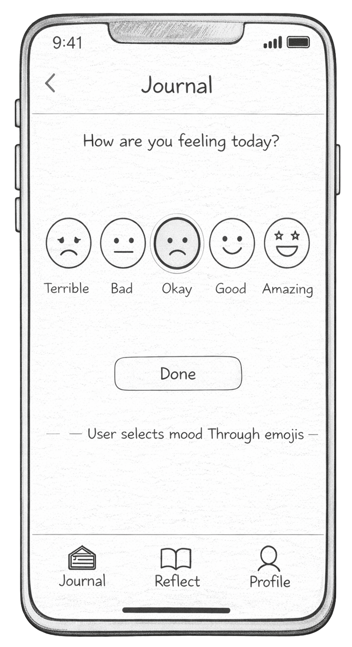
- Unclear next steps after writing: Some users didn’t immediately recognize they needed to select a mood before saving.
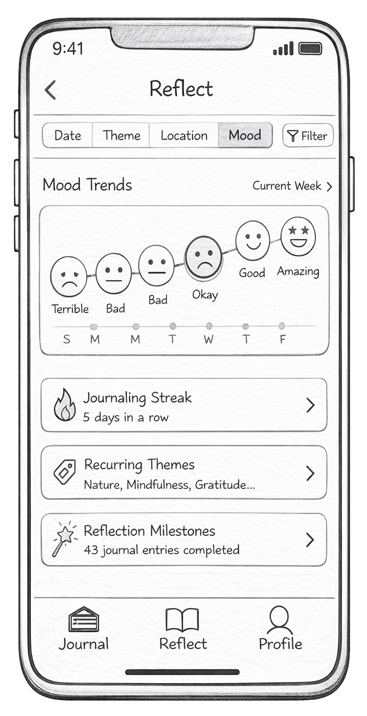
- Reflection section needed more guidance: Users understood the visuals but were unsure how to interact with filters or what insights meant.
Based on these findings, my next steps are to:
- Add clearer feedback in onboarding with a progress bar and back buttons
- Better guide journaling format choices
- Make the save flow clearer, especially around mood selection
- Improve selection process in the Reflect section to improve understanding
Hi-Fi Prototype, Test, & Iterate
Hi-Fi Prototype V.1
At this stage, I translated my low-fidelity paper prototype into a high-fidelity prototype in Figma. The goal was to refine the visual design, improve usability, and create a more realistic representation of the final design.
I applied Atomic Design principles by building consistent components such as buttons, cards, input fields, and navigation elements, which helped maintain visual consistency across various screens. I also considered usability heuristics, focusing on clarity, feedback, and simplicity to ensure users can easily understand and navigate the app.
I also followed AIX design guidelines by making the AI features more transparent and supportive, ensuring users understand when and how AI is assisting them, especially in the AI chat and journaling prompts.
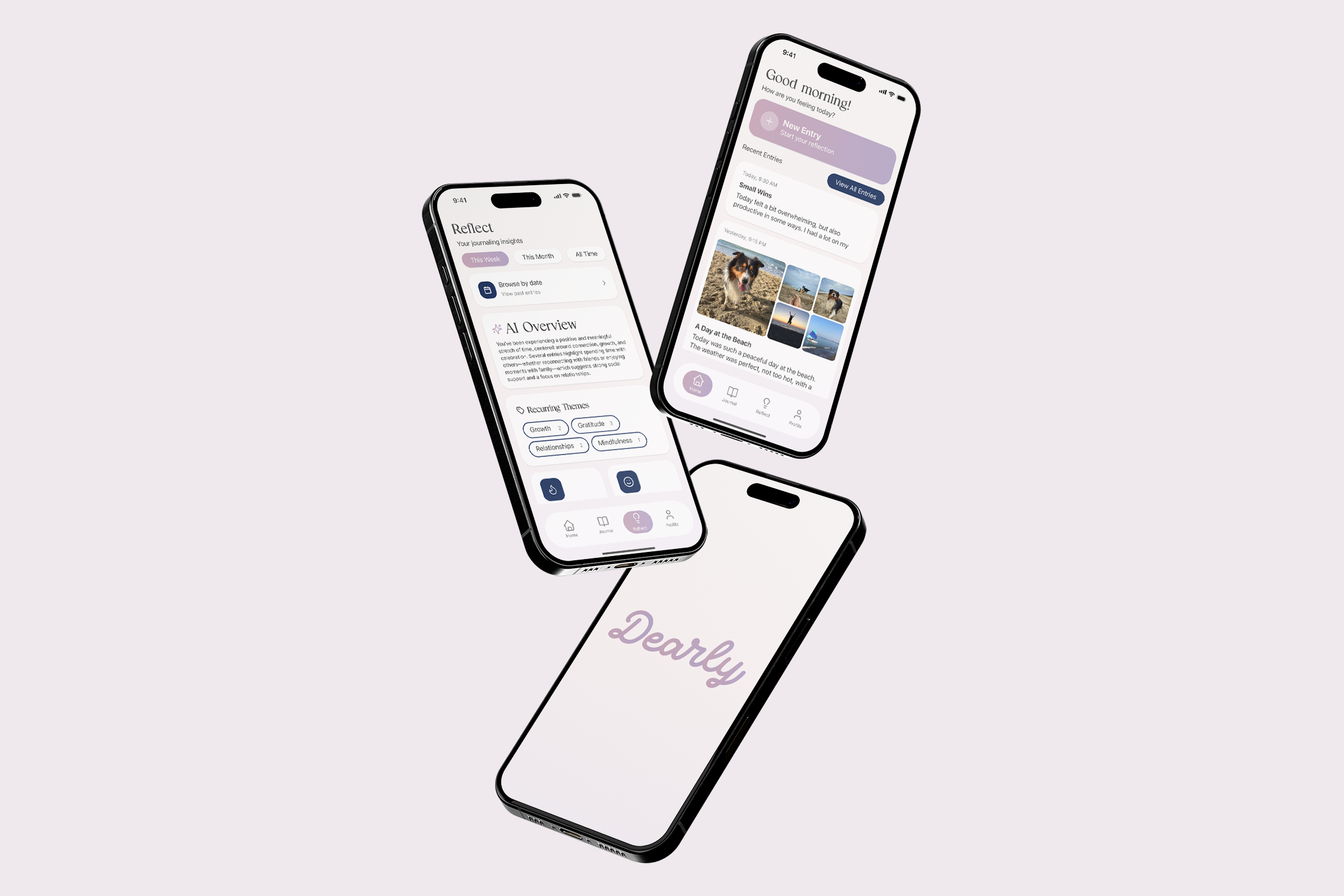
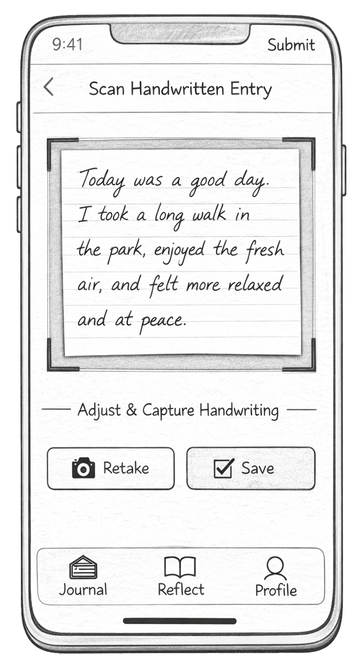
The initial Hi-Fi prototype included key tasks such as onboarding, journal entry creation (including multi-format options like voice, handwriting scan, and image upload), mood selection, and the reflect dashboard.
Test (Heuristic Evaluation)
Peer evaluation of the initial hi-fi prototype revealed the following issues: the overall concept was clear, but the app needed stronger consistency, clearer interactions, and more intuitive navigation flow.
One key issue was inconsistent buttons and visual patterns, which made some actions harder to recognize. I agreed with this, since consistency is important for usability.
Another major point was that onboarding felt too long. While users liked the customization, they wanted the option to skip and explore the app more freely. I agreed that giving users more control would improve the experience.
There were also issues with journal interactions and system feedback. Some actions, like typing and saving, did not match user expectations, and navigation after actions (like saving or adding images) felt misleading.
Lastly, some elements, especially on the reflect page, looked interactive but were not, which reduced clarity and user control.
Hi-Fi Prototype V.2
In Version 2, I focused on improving consistency, simplifying interactions, and strengthening the reflection experience through AI. I first standardized buttons and layouts across the app to make actions more predictable and consistent. I then simplified onboarding by reducing steps and adding a skip option, allowing users to enter the app more quickly.
AI + Reflection Improvements
A major focus in this version was improving how AI supports reflection.
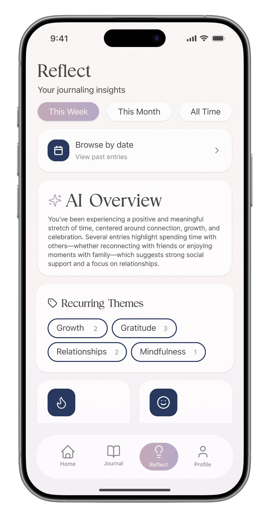
On the Reflect page, I introduced:
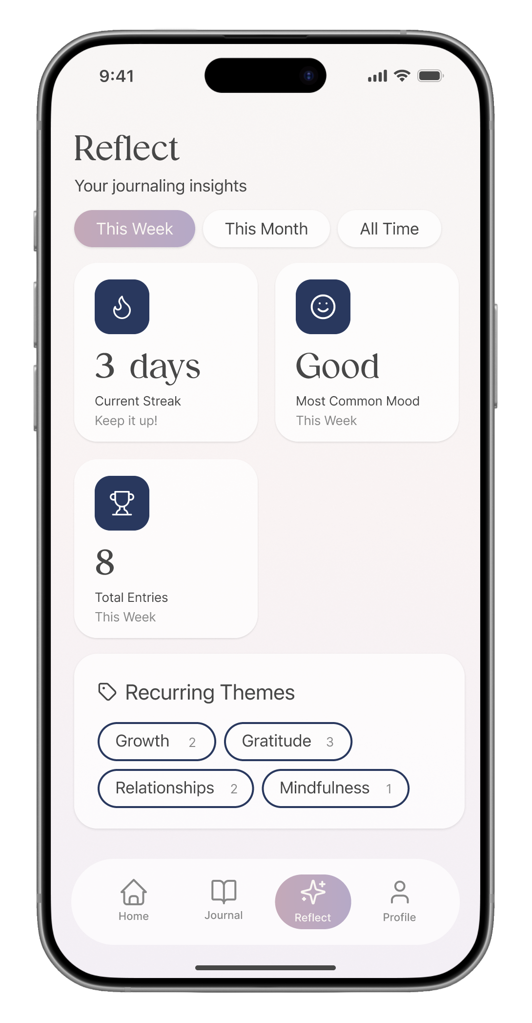
- AI-generated overviews that summarize user entries across weekly, monthly, and all-time views
- Mood pattern insights, helping users understand emotional trends over time
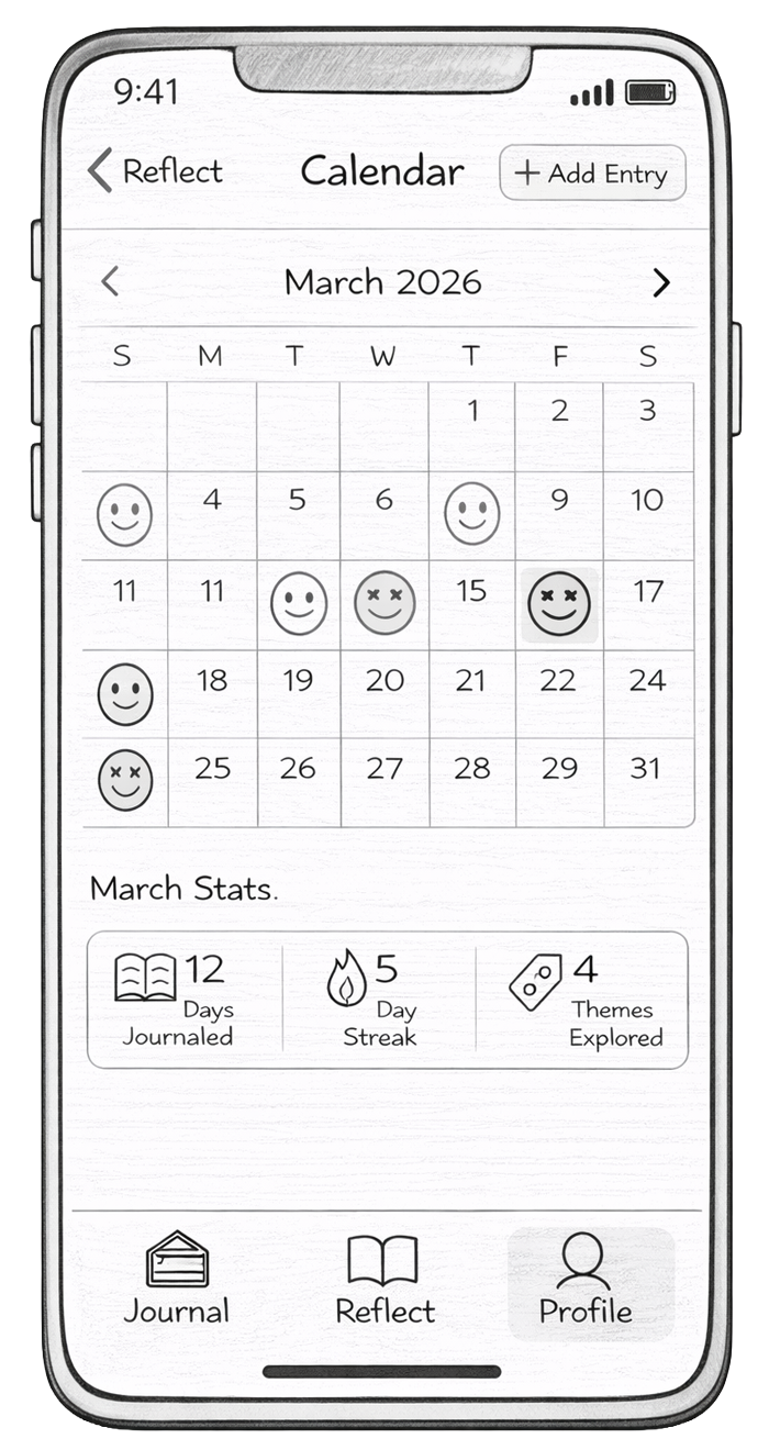
- A calendar view, allowing users to go back and explore entries from specific dates
These changes make the AI more visible and useful by helping users reflect on patterns instead of just individual entries.
Deeper Reflection Features
I also improved how users explore their entries by:
- Adding theme-based filtering
- Allowing users to narrow entries based on recurring themes
- Making past entries easier to revisit and understand
Reflection
Dearly is designed to be a simple and supportive space for journaling and reflection. It allows users to capture their thoughts in different ways, writing, voice, images, or even scanned handwriting, making the experience flexible and personal.
What makes Dearly useful is how it goes beyond just storing entries. The app uses AI to help users reflect on their thoughts over time. Features like mood patterns, AI-generated summaries, and theme-based insights make it easier for users to understand how they are feeling and recognize patterns they might not notice on their own. The calendar and filtering options also allow users to revisit specific moments and see their growth over time.
Through this project, I focused on making reflection feel more meaningful and accessible. Instead of overwhelming users with features, the goal was to create a calm and intentional experience that supports both daily journaling and deeper self-reflection.