KLAWZ: Nail Art Magazine
KLAWZ showcases the current popular nail art designs and highlights extraordinary nail artists and technicians
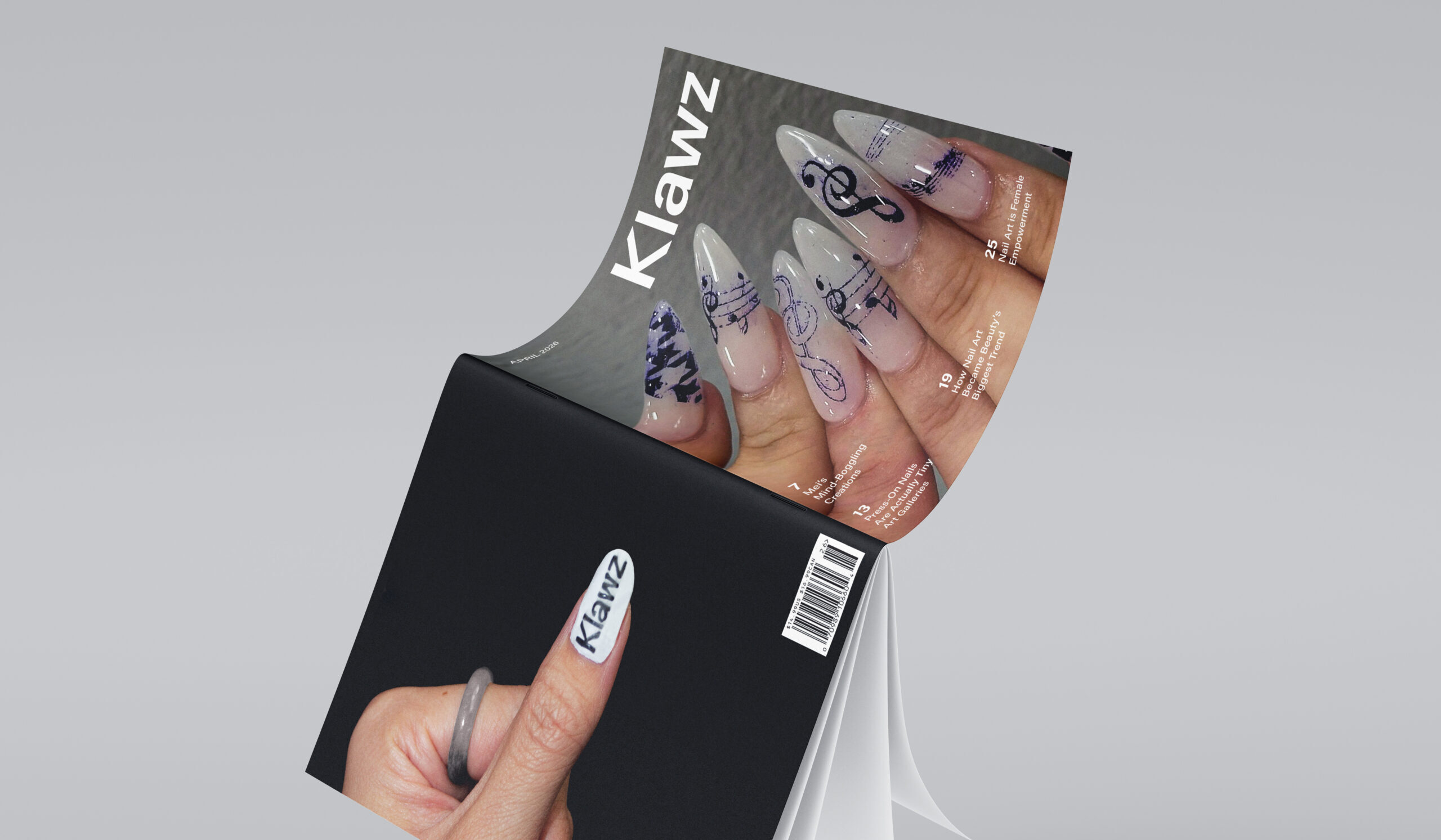
Objective
- Masthead
- 3 issue covers
- 3 articles with
3 spreads each
Role
Editor
Time and Tools
3 months
Photoshop, InDesign
Challenges
Searching for high-quality photos and bringing them to around 300dpi was one of the most challenging aspects of this project. It was also difficult to create spreads that utilized negative space creatively and were visually dynamic and pleasing.
Process
Solution
To maintain consistency and excitement, each article spread contains similar typefaces and incorporates various colors and fonts. A bold and sharp masthead was chosen to represent the edgy and eye-catching nail art designs that the magazine will reveal.
Cover Iterations
After experimenting with different forms of covers, I decided to use a full spread image setup. Additionally, I designed 3 covers using different images and article title arrangements to represent the continuity of this magazine topic. The leftmost image was chosen to be the final cover design because the image contents do not interfere with the type as much as the other photos.
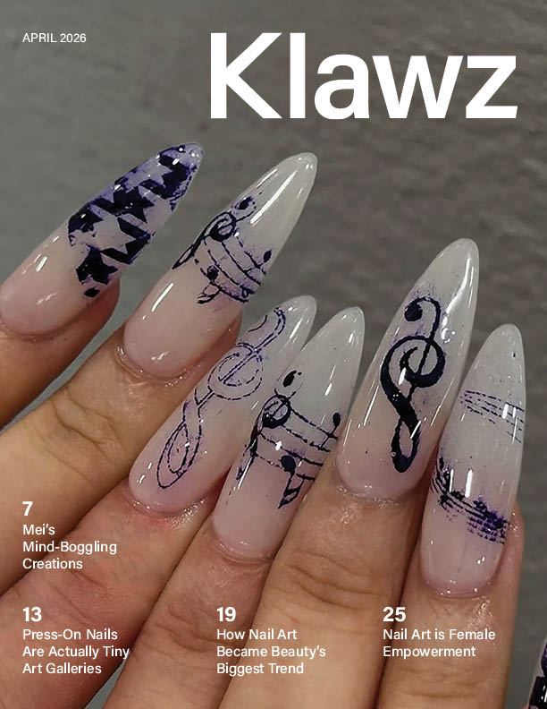
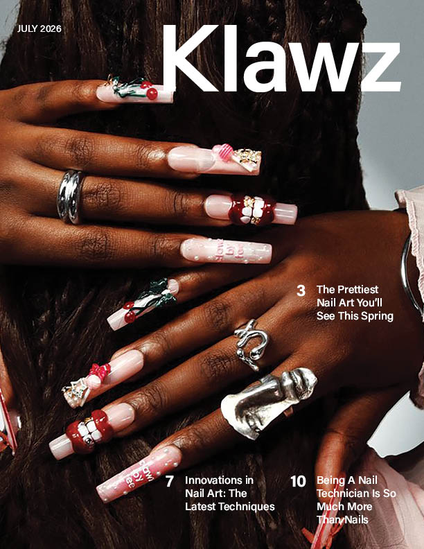
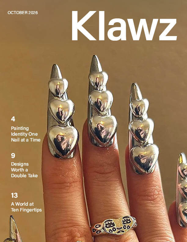
Table of Contents and Letter from the Editor
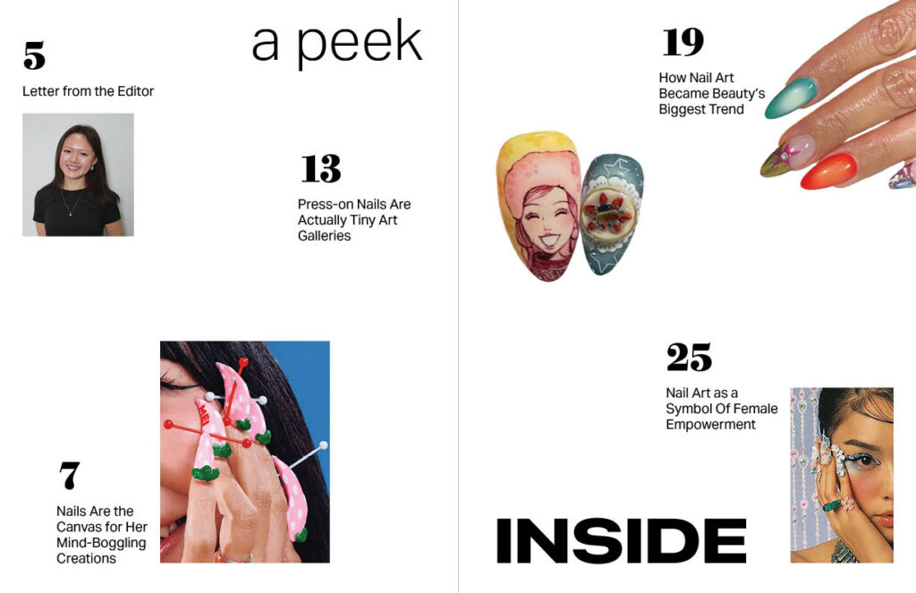
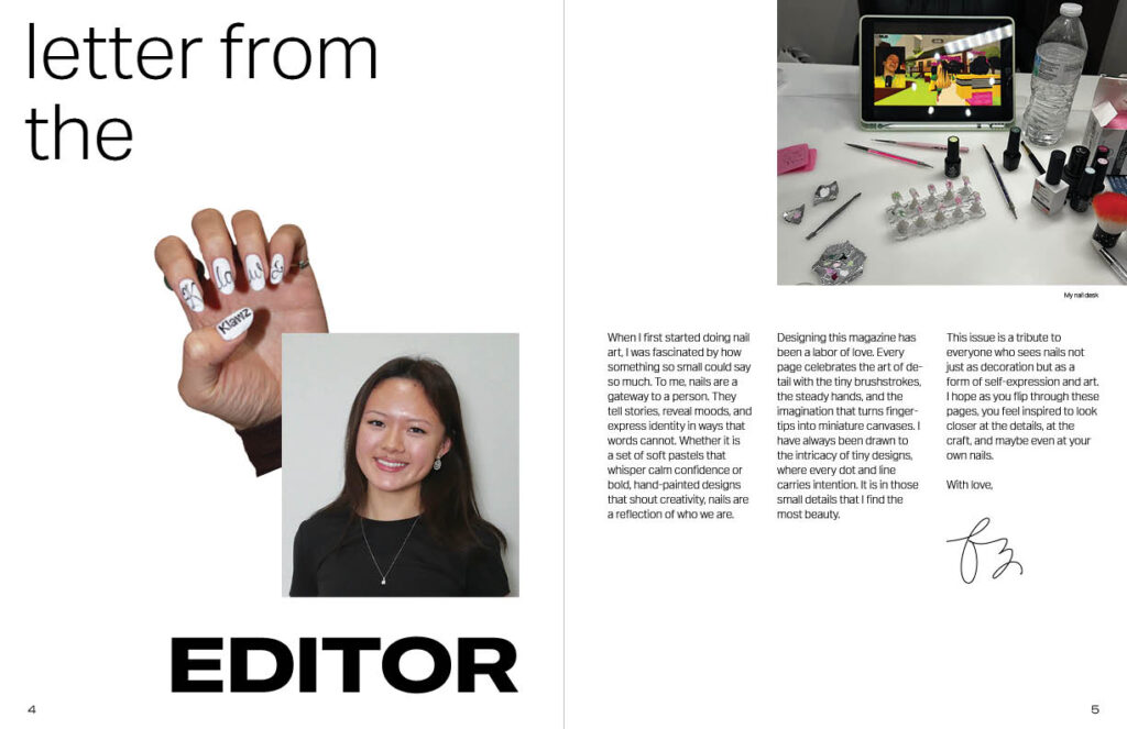
Because KLAWZ is a magazine that shares incredibly detailed and crazy nails, I wanted the Table of Contents and Editor’s Letter page to be just as playful.
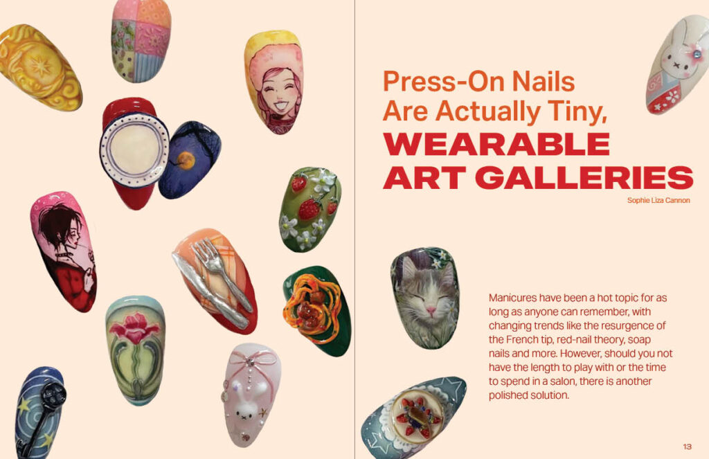
Instead of using the traditional “Table of Contents” phrase, I wanted to use a livelier phrase to further represent the magazine’s theme. The arrangement of scattered images for “A peek inside” was implemented, so the two silhouette images could be just as importantas the rest.
The “Letter from the editor” page showcases a photo of me, the nails I designed for this magazine, and a picture of my own personal nail desk to show my passion for this project.
Article Title Spreads
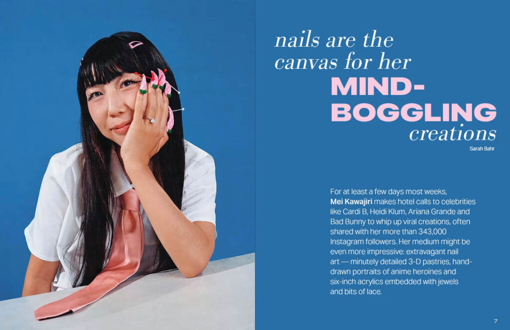
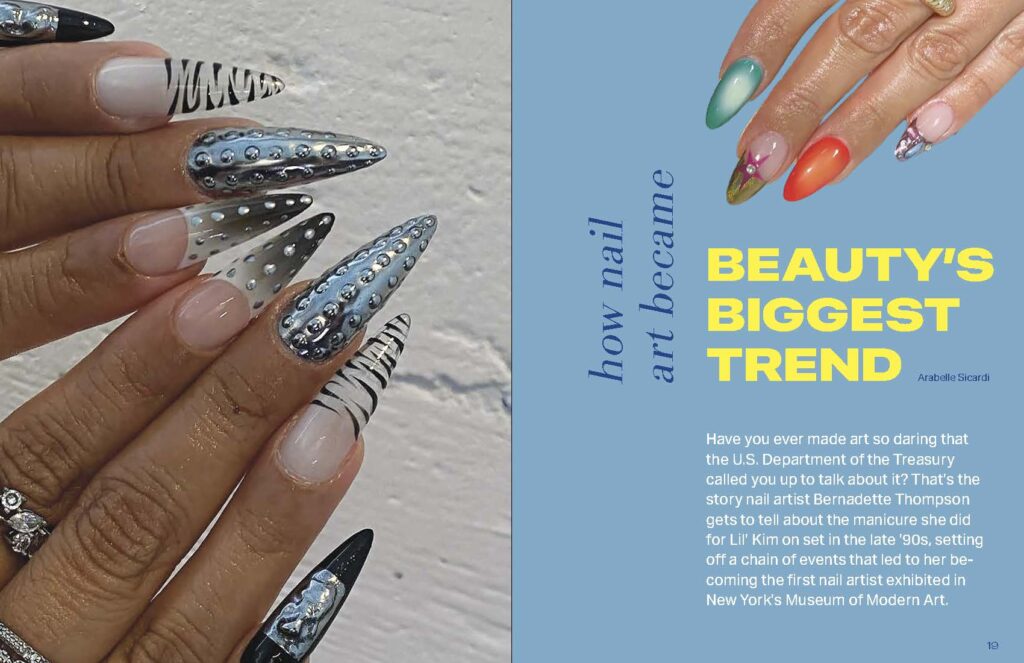
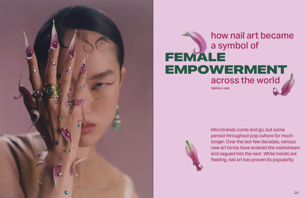
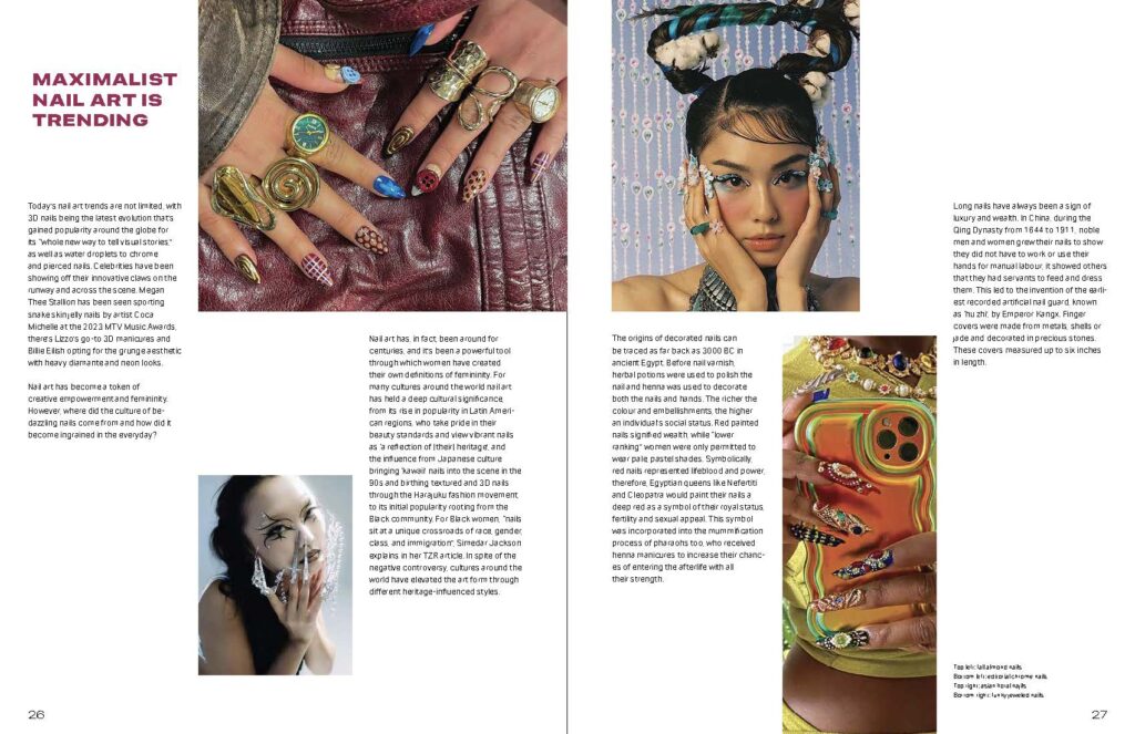
Each article title spread displays hints of what is to come in the content pages. The spreads are different in image and title layouts, but have consistent highlighted paragraphs and typefaces throughout.
Article Content Spreads
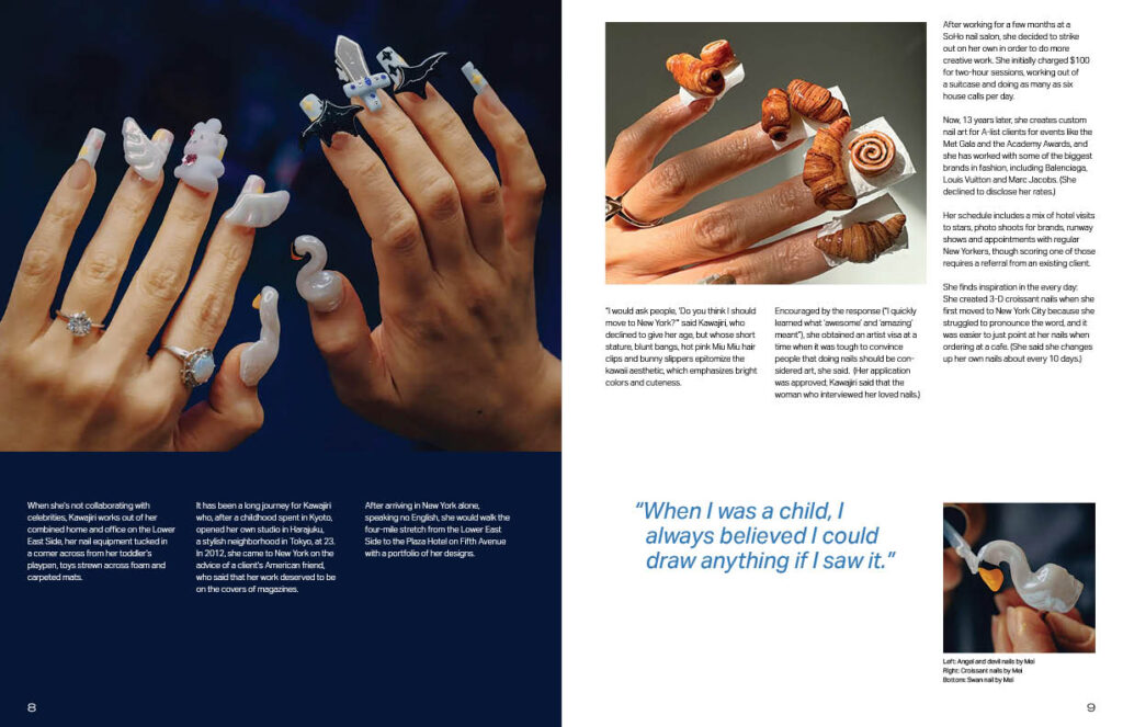
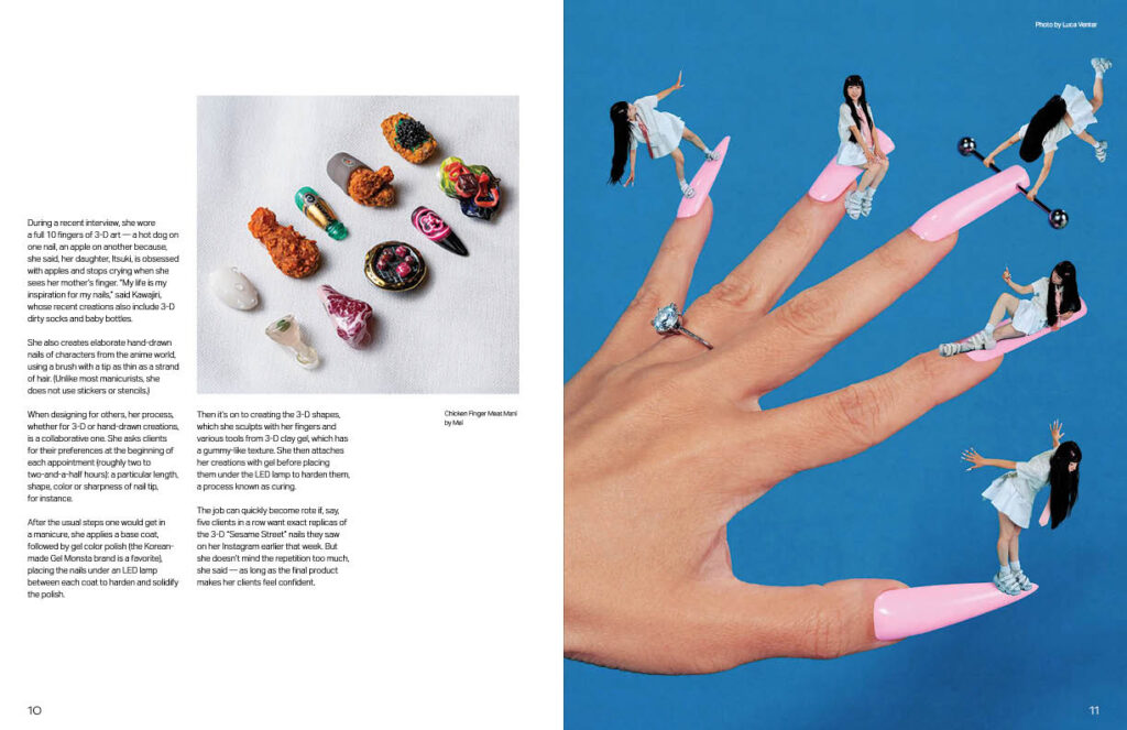
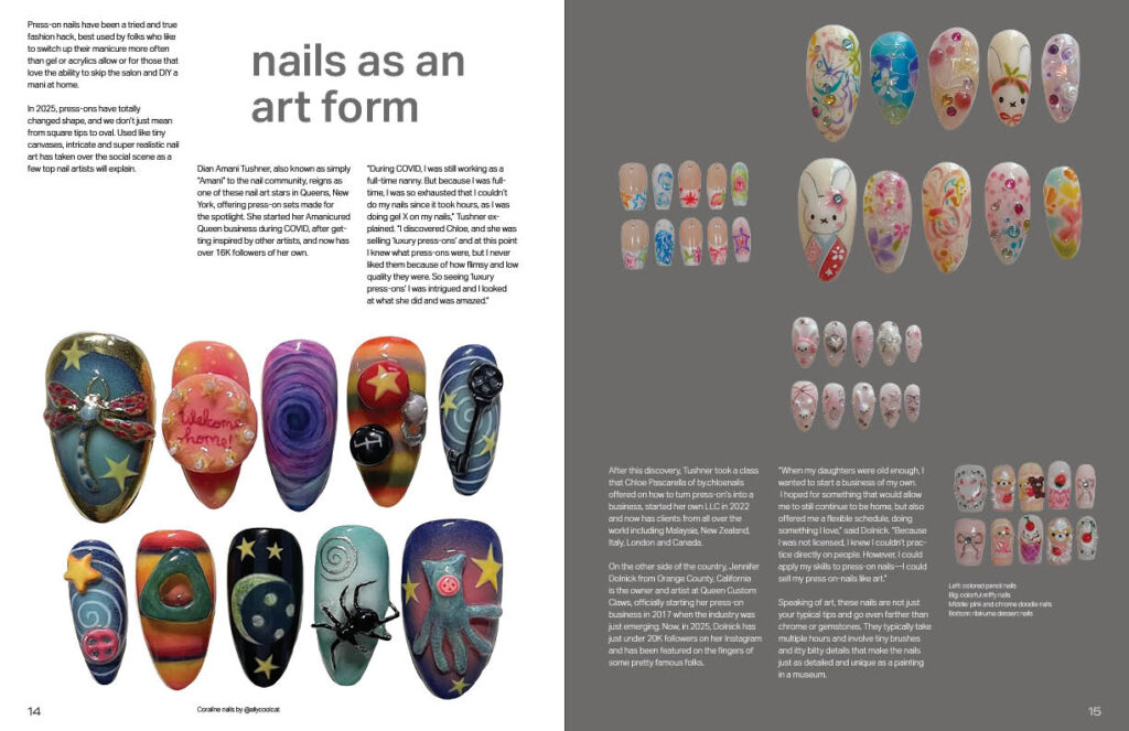
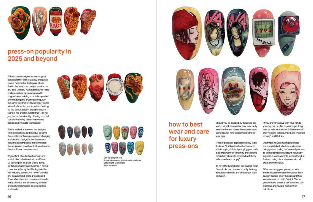
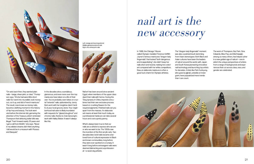
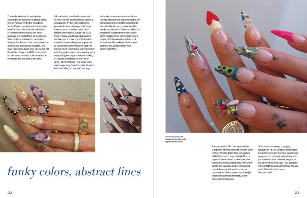
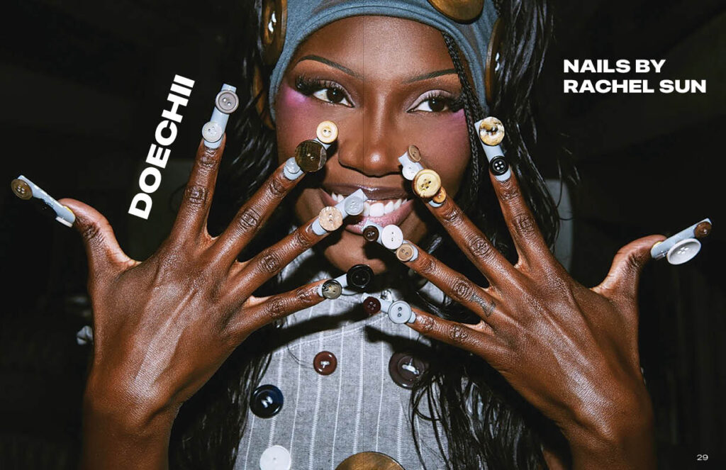
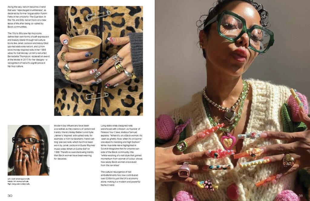
From all of the content spreads, the most challenging to complete were the spreads with the silhouetted press-on nails because of the undefined borders. Throughout the magazine, subheadings were incorporated to have more visual contrast on each page. I included one full-spread image for the effect of a surprise when flipping through the magazine. I would also imagine audiences using the spread as a poster.
Reflection
The fundamental knowledge and skills I learned from the typography studies in earlier semesters directly translated to the magazine design. While developing the magazine, my professor had weekly meetings to discuss any suggestions or helpful criticisms, which were always extremely helpful. During the process, the magazine went through many changes and iterations in order to be finalized.