Problem
The lack of information about the OU VisComm program causes challenges for students, parents, and faculty. Our audience needs a dedicated platform to find information about the program, explore student work, and find out what makes this program special.
Solution
By using the design thinking process, I designed a visually aesthetic website that has a clear navigation system that caters to all users. For accessibility, the website includes a light and dark mode and language options. Each page is formatted to allow the users to either skim through information, discover detailed explanations, and to have a dynamic viewing experience.
Meet the Team
Fiona Zhao

Lilly Lundstrom
Jojo Salinas
Empathize
The goal in this stage of the design thinking process is to understand what makes our competitors’ websites strong and weak, and how different user groups would interact with a Visual Communication website.
COMPETITIVE ANALYSIS
The top three schools we selected are: Oklahoma State University, because it’s one of our direct competitors; Rhode Island School of Design, because it’s known for its engaging website; and the University of Houston, because of proximity. While we navigated through the websites, we looked for aspects that attracted us at first glance. Then, we focused on what information was given. We wanted to know how detailed the program descriptions were, and looked for details that a prospective student would search for. In terms of cons, we sought out any unnecessary visual aspects, lack of interactivity and information, and navigation and readability issues.

Oklahoma State University
Strengths
- their “why us” has convincing points
- various career paths
- student stories
- easy-to-understand navigation
Weaknesses
- program details are vague
- no professor contacts
- generic design layout
- no “wow” factor
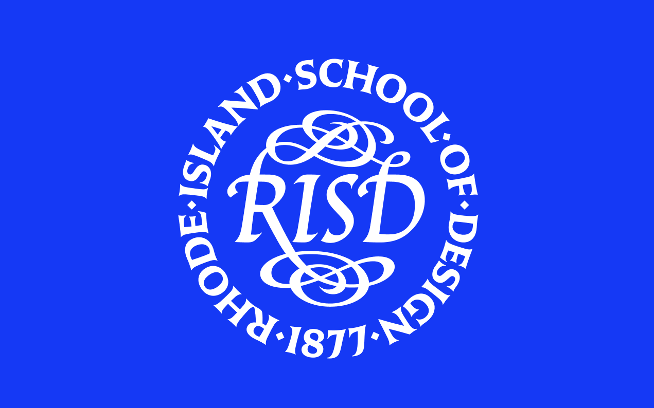
Rhode Island School of Design
Strengths
- interactive and engaging landing page
- useful info about BFA and MFA programs
- meaningful topics of info with detailed descriptions
- hierarchy of type is clear
- student/alumni work
- upcoming events
Weaknesses
- readability issues with headings

University of Houston
Strengths
- easy and compact
- strong visuals regarding web design
- strong branding
Weaknesses
- most content shown on socials instead of website
- info is too broad
- starts strong, but too simple
From the competitor analyses, we were able to gather some insights and features to include in our own website. Necessary information includes: application process, faculty information, tech preferences, updates on events, student-work showcases, and a run-through of what courses you might be expecting.
INTERVIEWS
To gather a deeper understanding of users’ needs, we interviewed 11 participants, including prospective students, faculty members, graduates with VisComm experience, parents, and advisors. A variety of user groups is essential to understanding our potential users. There are many similarities and differences among each specific person based on their perspectives and respective roles.
We made sure our interviews provided useful results by brainstorming general questions as well as ones that catered directly to our participants. A script was also loosely followed during the interview to keep us on track.
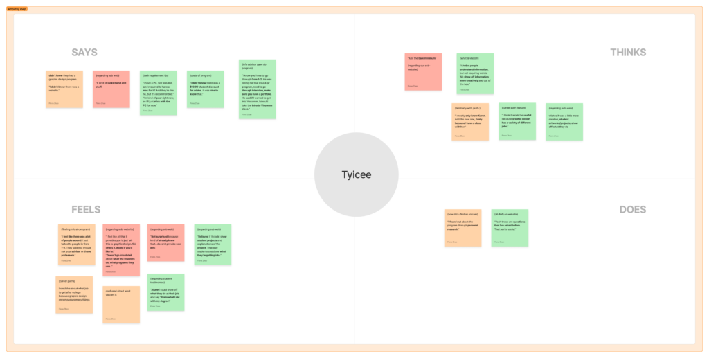
We used a two-step process to analyze the interview data. First, we created empathy maps for each participant to categorize what they said, felt, did, and thought. Then, we applied the affinity mapping method to group similar insights and identify common themes across all interviews.
Through this process, we developed the following themes, each reflecting key user needs.
Program Information Needs
Represents students who need information about Visual Communication.
Navigation Expectations
Represents all users because a simple navigation is crucial.
Technology Information
Represents students because they need to know what technology they need for the program.
Professor Information/Contact
Represents students because they need to connect with their professors.
Events and Opportunities
Allows students and faculty to connect with the community.
Student Work
Students need inspiration and examples of what they will be learning.
Application Information
Students need to know how to apply and prepare for the program.
Visual Design Expectations
All users need a website that is visually active and engaging.
Define
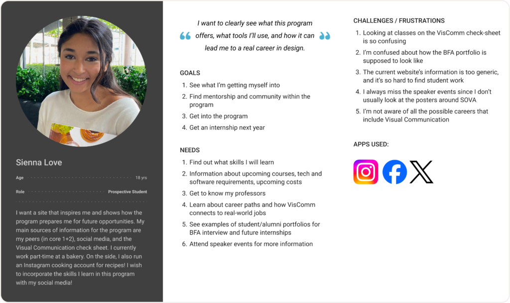
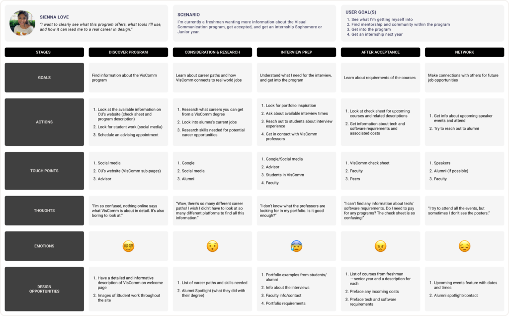
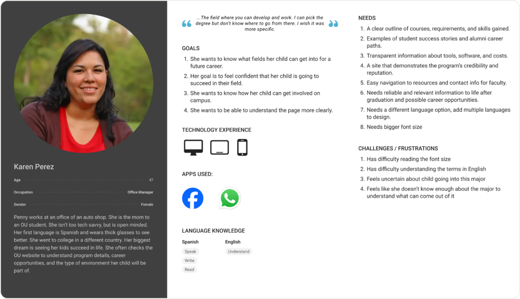
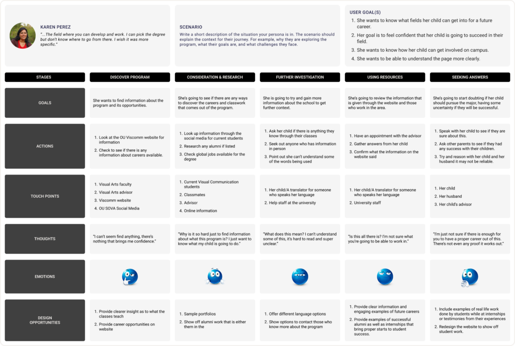
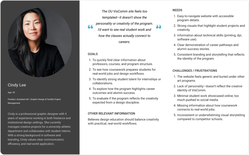
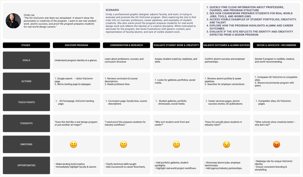
Based on the findings from the user interview data, we created 3 personas and journey maps for the user groups: students, faculty, and parents. Students, more specifically, prospective students, would be the primary users of our Visual Communication website because of their limited knowledge about the program. Members of the faculty are a big stakeholder in maintaining the program’s reputation, most likely using the website to showcase student works or even post their own work. Parents are similar to students; their curiosity and interest in their children’s major would make them a top priority as well.
READ MORE
Creating personas and user journey maps allowed us to understand each user group’s common needs with a Visual Communication website. From the diagrams, we found that users desire more information about our program, examples of student work, and sections for career paths and alumni to show the security of this major.
From all of our personas and user journey maps, we were able to find common needs that aligned with the 3 user groups. The student, parent, and professor all needed examples of what careers Visual Communication could provide. They also had difficulty finding detailed information about our program; they felt as though the information online was too vague. Although we gained many insights about information needs, we also came up with many design opportunities. With our parent persona, we understood that readable font sizes and accessibility to different language options were important.
Ideate
Taking the design opportunities from our group’s personas and user journey maps, we made a creative matrix, a sitemap, and corresponding sketches.
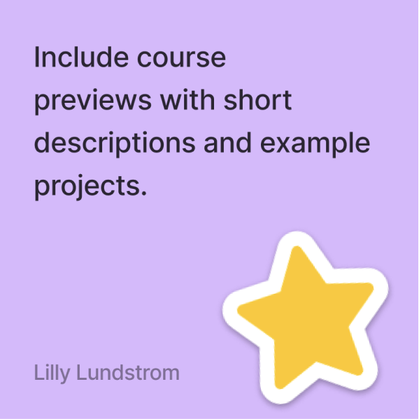
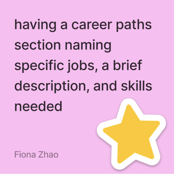
In our creative matrix, we generated “How might we” questions. Each HMW question was created with a design opportunity in mind to ensure a successful question. Each member then wrote down 3 ideas for each question. To prioritize the top ideas, we put a star sticker on the ideas that were ideal for the sitemap and a thumbs-up sticker on ideas that were a good feature to include within the website. This process helped us organize our design opportunities and determine why they should be implemented.
How might we inform students about their degree path by clarifying course work?
How might we make students feel safe in their major decision by sharing career opportunities?
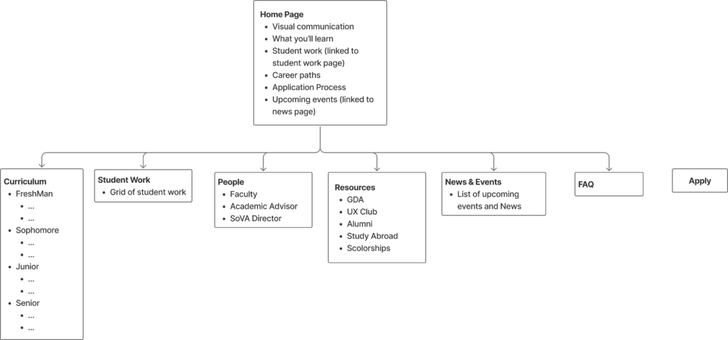
After our creative matrix was complete, we took the starred ideas and created a sitemap. This diagram was split off into two sections: the home page and the tabs. The information for the home page was short enough, so it did not require a separate tab. It was also highly important information that should belong on a home page. Making a sitemap allowed us to visually see how information would be organized on our website.
Our sketches were directly related to each aspect of our sitemap. These quick thumbnail sketches with general organizational and navigational information helped us visualize how pages might look and how they are connected. Maintaining simplicity in the sketches kept us organized and quickly understandable.
Lo-Fi Prototype
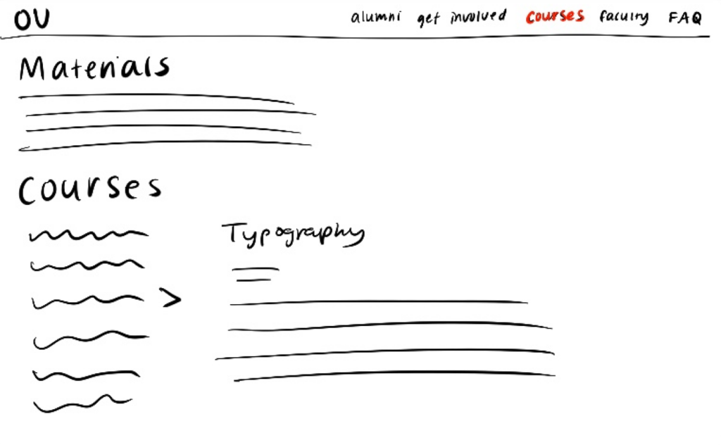
Based on the sketches of our sitemap, I created corresponding wireframes for each page. Wireframes are the initial blueprint for the final design, and are meant to test functionality. The color scheme is gray-scale and no images were to be incorporated, yet. In order to keep my Figma file organized, I sorted all components into their dedicated sections: atoms, molecules, and organisms.
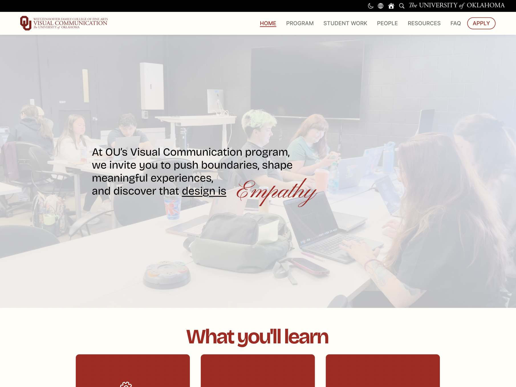
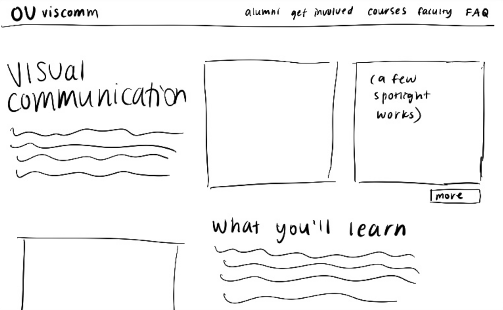
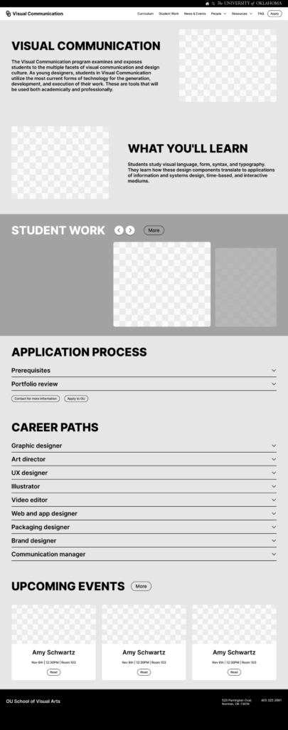
Landing Page
The home page is the most important page of a website, so I provided an explanation of what Visual Communication means and a summary of what students learn in this program. Two initial images of outstanding student work would work as engaging elements. The display of “Visual Communication” and “What You’ll Learn” are located on opposite sides to create dynamic visual movement.
Navigation Bar
The navigation bar contains 6 different tabs. “People” leads users to a drop-down menu containing faculty, alumni, advisor, and SoVA directors. Clicking the “Resources” tab opens a drop-down with the two different campus organizations related to VisComm and external links to study abroad and scholarship information. “Apply” will directly take users to an external site that allows them to apply to the University of Oklahoma. When hovering over each of these buttons, the appearances change to indicate feedback.
Student Work
I’ve displayed a select few student work examples on the home page in a carousel format highlighting one image at a time. The principle of continuity is utilized here with the arrow buttons and the view of additional images to the right. The “More” button will take users to the “Student Work” tab where the page is filled with a gallery of student works with different image sizes. When hovering over images, the artist’s name and year of creation will be shown. Specifically on the “Student Work” page, a description of the project and additional images will be displayed as an overlay when clicked.
Application Process
The “Application Process” is vital information about the prerequisites of the program and the annual portfolio review. “Portfolio review” will answer common inquiries our interviewees had. It explains what one will need in their portfolio and when the reviews are held.
Career Paths
Because a few interviewees questioned the security of finding a job with this degree and wondered what jobs VisComm could provide, “Career Paths” was made to provide details about 9 different careers VisComm is related to.
Upcoming Events
“Upcoming Events” contains 3 spotlighted events from the two organizations, GDA and UX Club. Users are allowed to click “Read” for more information about each event. A drop-shadow will appear when hovering over the events to indicate feedback.
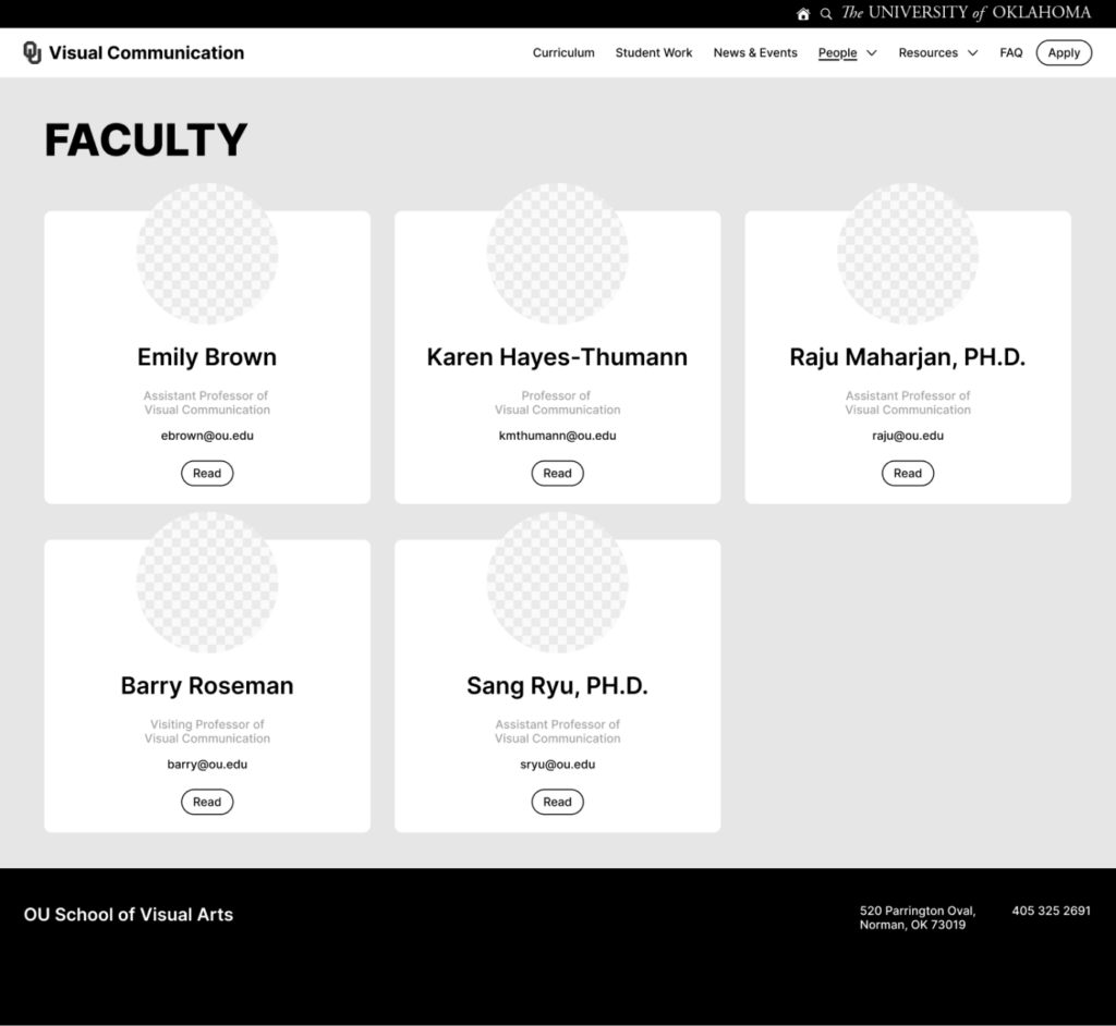
Faculty
Throughout the prototype, the Gestalt principle, proximity is kept in mind when separating each section of information. Norman’s principle of consistency is also apparent with the section titles being bold and all caps. I incorporated visual hierarchy within each faculty card. The name is the largest and bold type for ease in differentiating each member. The email address is prioritized before the role of each member for easier visibility. It also hints users that the email address is clickable.
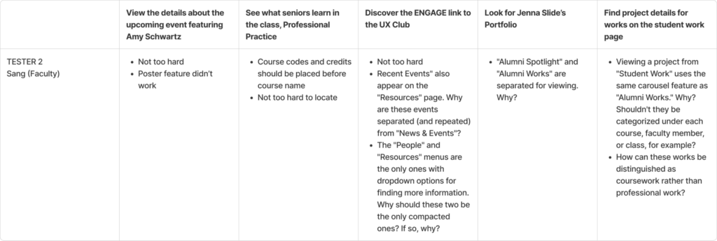
Thinking Aloud Tests
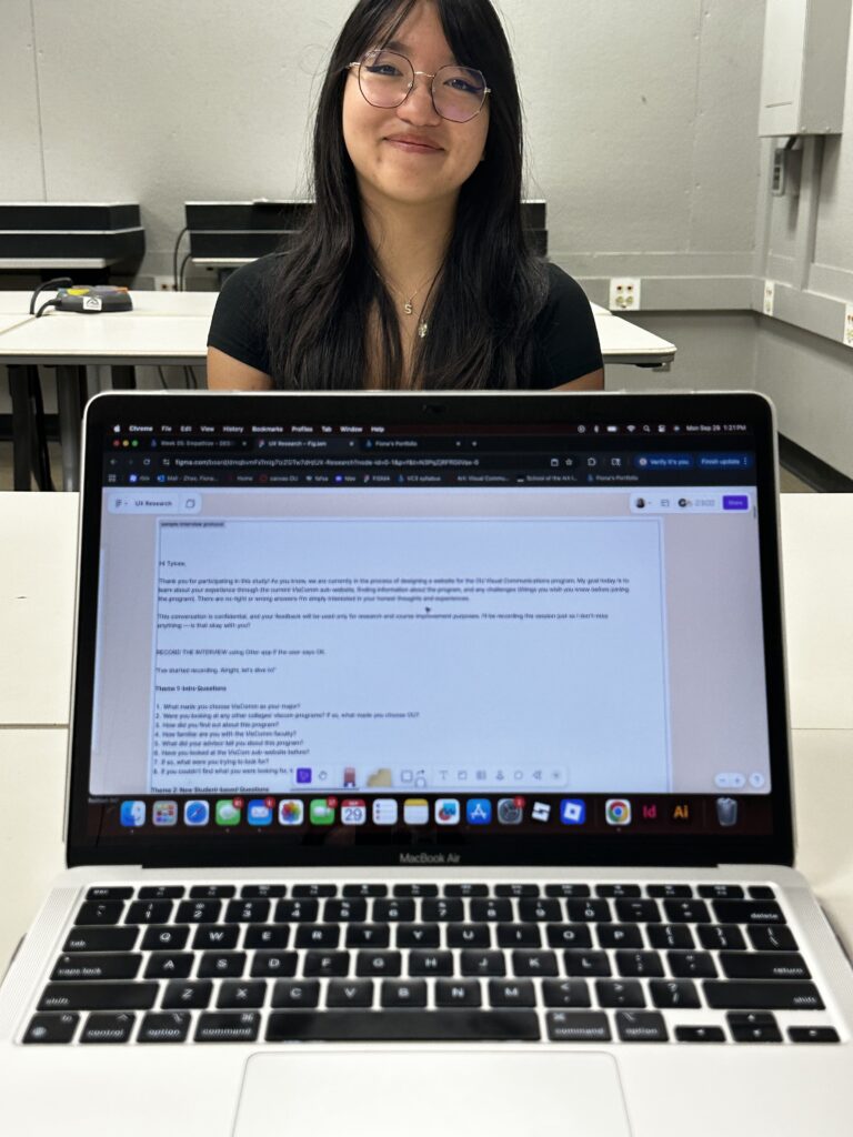
We used the Think Aloud method to evaluate the usability of the wireframes. Since different user groups would have unique objectives when navigating through a Visual Communication website, 5 different tasks were delegated to a student, parent, and faculty member. The purpose of this test was to observe and understand how our users navigate through our prototype. I wanted as much information about their challenges and confusions as possible, so I screen recorded this process. Reassuring my participants was important because it lets them know they are doing everything correctly and anything they struggle with is my responsibility to rethink my design decisions.
Throughout all of the insights I gained from this process, I learned that some terms weren’t familiar with some participants, some scroll features were unknown, some people were confused with tab drop-down contents, and repeated information was confusing. Having a parent participant allowed me to understand which words were confusing. The professor provided me with many organizational insights. The student user helped me see that, for the most part, my wireframes were fairly easy to navigate.
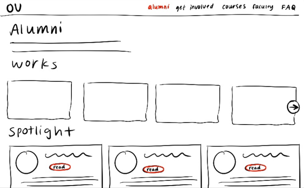
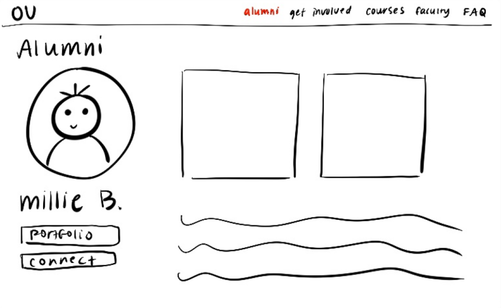
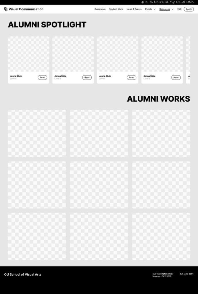
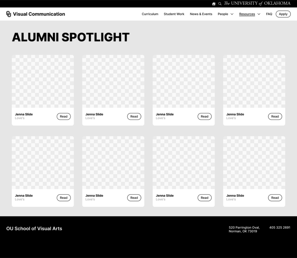
Tending to the confusion with “Alumni Spotlight” and “Alumni Works,” I’ve decided to only display the alumni cards. Users will be able to view alumni works within each alumni profile through their portfolio.
(Before)
(After)
Hi-Fi Prototype
The wireframes were then further developed into an interactive prototype with colors and images. The intention behind the landing page was to show the audience the ambiance of the program’s classrooms. Brief information about the VisComm program was included in a meaningful way by including fading definitions of design. By using skill cards that are flippable for the “What you’ll learn” section, the users are less overwhelmed with too much text. The interaction also provides visual interest. An interactive image carousel was used to display student work in a way that emphasizes one work at a time. The career path section contains information about how much money a job may provide to help students narrow down their decision. The alumni section also has an interactive hover element for visual interest while navigating through the many different possibilities after the program.
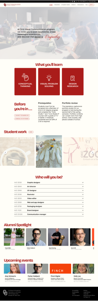
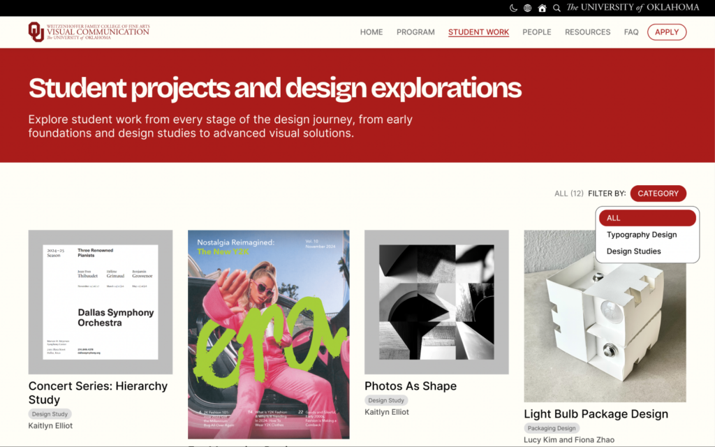
Student Work Page
The student work page aims to show the different material that students from each year create. Users are able to select specific categories to view for easier access. Once clicked, an overlay displays more images from the same project as well as a description of what the project was about.
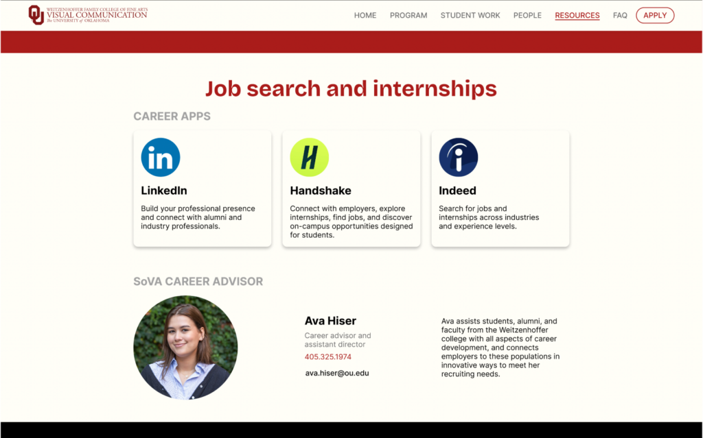
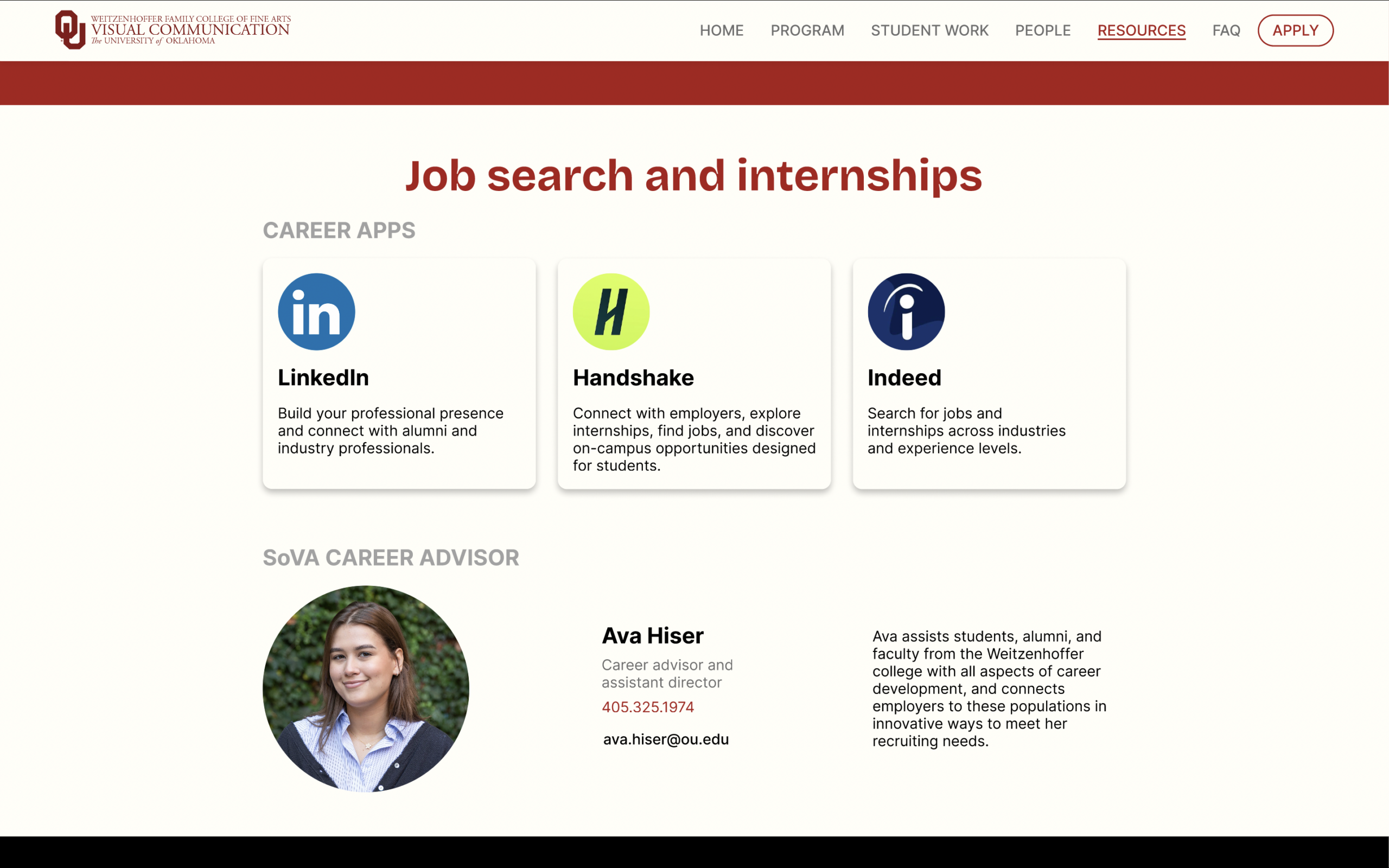
Job Search/Internships Section
In the “Job search and internships” section of the resources page, links and descriptions are provided for the 3 most-used career apps. Ava Hiser, the SoVA career advisor is also displayed if students have further curiosities about their future.
A/B Testing
The A/B testing method to evaluate the usability of the Hi-fi Prototype. From this evaluation process I learned that simple is better and users enjoy more details and multiple examples of alumni, which was implemented in the final version of the prototype. I tested with my mother (parent who is less familiar with website navigation), Arienna (student who is not involved with design), and Tyicee (student who is a sophomore in the program).
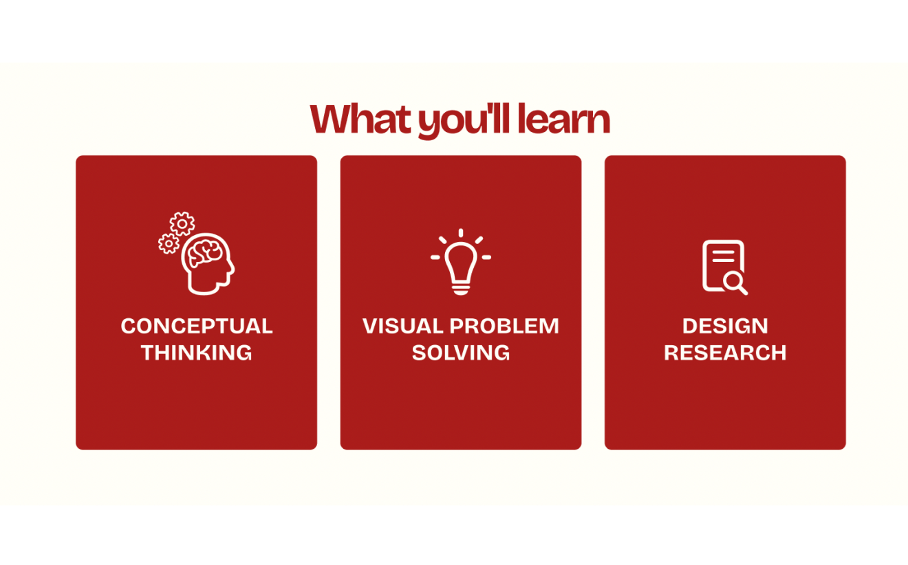
TEST 1: Experimenting interactive cards on “What you’ll learn” section.
The intention of the left design was to experiment with parallax animation. On hover, the bundled cards would separate into their dedicated positions on the left. The final decision was to have the cards displayed in their dedicated positions because of the unanimous votes for the arrangement on the right due to simplicity.
A
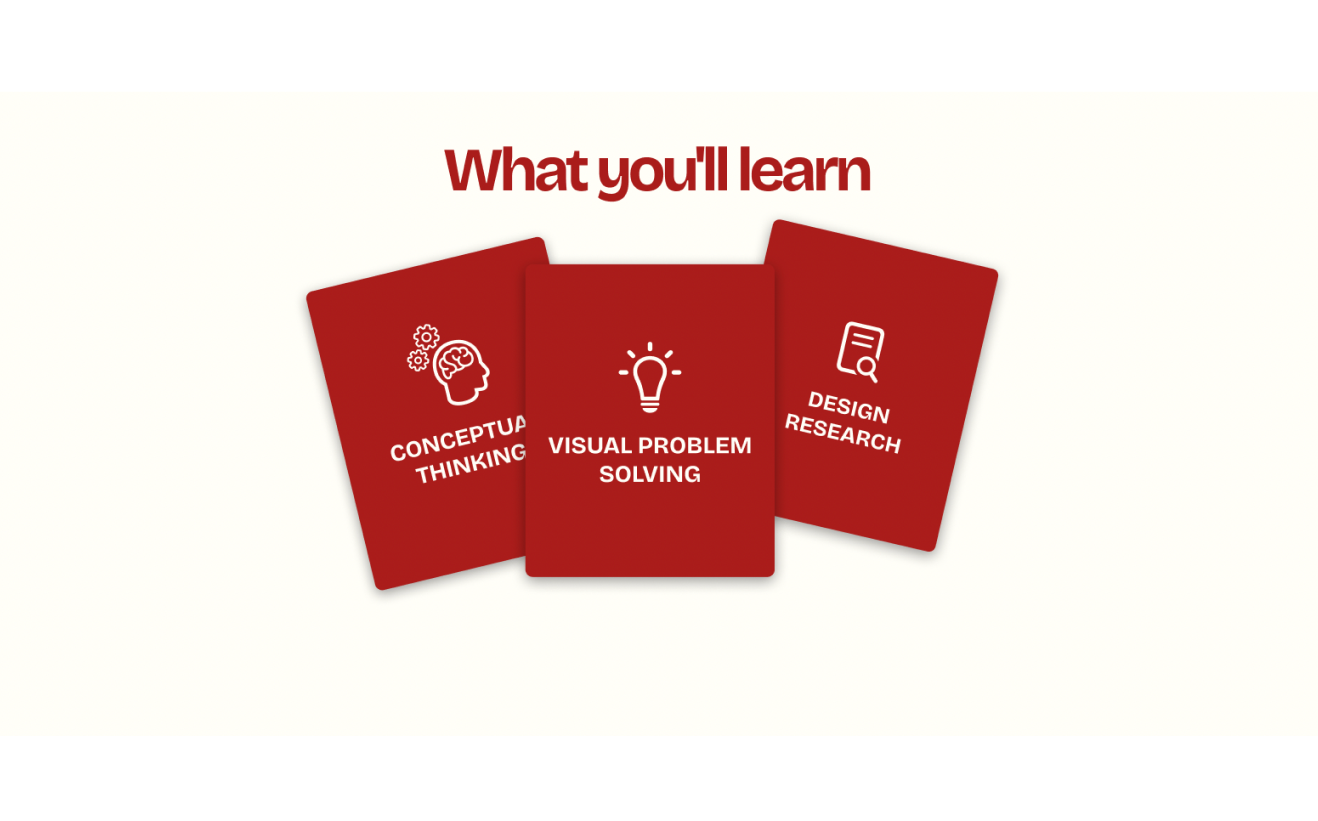
B
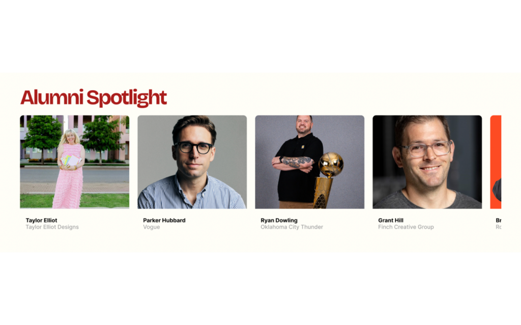
TEST 2: Alumni Spotlight layout/presentation.
The intention of the left design was to make each alum information easier to access. The cost was shortening the amount of alumni displayed. On the right, users are able to access more alumni with interactive horizontal scrolling, but users would be required to hover and click to get to more information about each alum. The final decision was the one with more alumni because the overall opinion of my users were that it would be more successful to show off all the different paths that the alumni have taken.
A
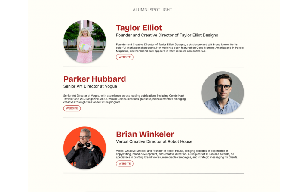
B
TEST 3: Student work pop-up presentation.
The intention of the left design was to allow users to have access to a larger images of the student work. The right design aimed to show multiple images and give users context to the projects. After the votes were in, the final decision was to implement the one on the right. My users stated that the layout and extra information about the work was appreciated. My mom also gave valuable feedback, saying, “I don’t want to use my brain to figure out what the project is.”
A
B
Final Prototype
In the final prototype, each page has a red header in order to add a pop of color that represents our school and communicates consistency throughout the website. Small features like the ability to filter categories of student work and a search bar for further questions on the FAQ page further supports a user’s needs in smaller ways. A mix of flush left and centered formations across pages generates dynamic movement of the users’ eyes.
Conclusion and Reflection
The objective of this project is to create an informational and accessible website for OU’s Visual Communication program that appeals to these potential user groups: students, parents, and faculty.
Creating a website opened my eyes up to the user experience and user interface world. I find myself to be more appreciative of the designers behind all the large and minuscule elements of an app or website. Conducting user research and tests during this project helped me understood the importance of understanding who your audience is and what they need. If I were to start this process over, I think I would focus more on making the website have a more academic theme. I would also explore multiple new layout variations for each section and try not to get attached to one specific idea. This project introduced and gave me a deeper understanding of new design concepts like visibility, feedback, proximity, and more. I also learned about why certain design decisions are more successful for users
Leave a Reply