OPTIMA: Integrating AI into Scheduling
Objective
- App
Role
UX Researcher
UX/UI Designer
Team
Jay Thompson
Taryn Hall
Fiona Zhao
Time and Tools
1 Semester
Figma
ChatGPT
Secondary Research
According to Piedmont Technical College’s article about time management, 90% of college students struggle with procrastination. College students who don’t manage their time well struggle with burnout, excessive stress, and physical and mental strain. The study from Frontiers in Education states that planning, goal-setting, prioritization, and task organization emerged as particularly beneficial strategies for enhancing productivity, well-being, and overall performance. in academic and professional settings.
Problem
How might we help college students manage their schedules in a way that caters to their needs and goals, while considering self-care
and socialization?
We used the reframing design challenge worksheet to reframe the design challenge and develop the proposed solution.
Solution
Our product uses users’ rigid schedule data and personal goals to help college students optimize their schedules without overlooking self-care and socialization.
Our main features include:
- Event creation
- Augmented rescheduling (based on workload balancing)
- Augmented social-time scheduling
Design Thinking Process
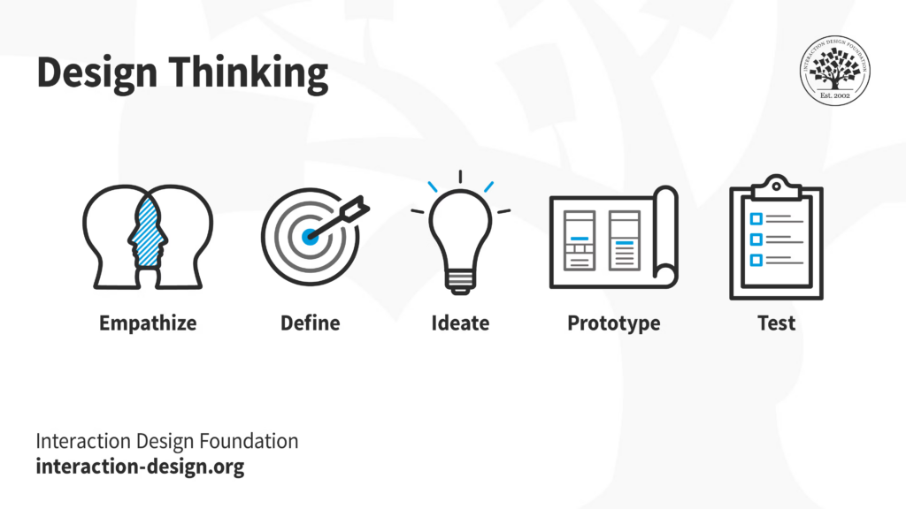
Empathize
The goal within this stage is to understand the goals, needs, and frustrations of potential users.
Competitive Analysis
Although we were unsure of what our solution would look like in the early stages of the project, we explored what competitors had to offer for inspiration. Most scheduling apps fall short because of manual planning, little to no flexibility, and a lack of integration with other tools. They often cannot easily handle last-minute changes and unexpected emergencies.
Interviews
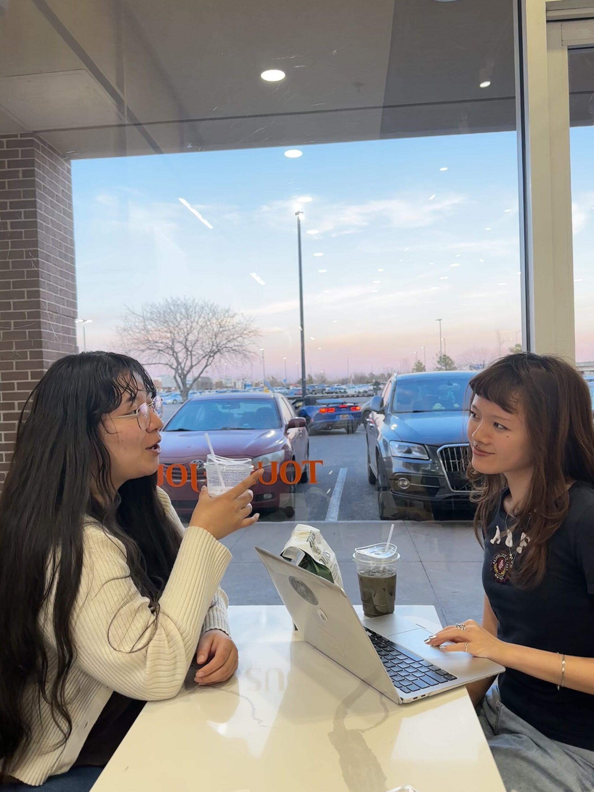
Our target audience is college students and young adults, so our team interviewed 9 participants fitting into this category. We wanted feedback from both people who rely on scheduling tools and people who don’t use scheduling tools at all to receive insight on the full spectrum. Each participant’s level of busy schedules is varied as well for diverse responses.
To ensure we would get useful responses, we framed our questions in a way that prompts thoughtful answers. Keywords and phrases, like method and how do you, ” let us know our participants’ personalities and how they navigate through their responsibilities with or without scheduling tools.
Interview Data Analysis
To analyze our participants’ responses, we used empathy maps and generated a thematic analysis with the help of ChatGPT. The empathy maps allowed us to find valuable insight about how users would not enjoy AI giving unsolicited advice, find trouble planning hangouts with friends that use different scheduling methods, and feel more motivated to see how many tasks they’ve completed. Sorting user quotes into empathy maps also allowed us to start the process of brainstorming design opportunities. For example, Hozshona said she wishes for her calendar and the ability to share with others without giving them full access to everything. This insight helped us come up with giving users the option of how much detail in their schedule they want to share with others.
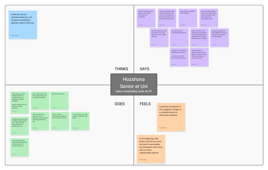
With the 9 total empathy maps, we organized the quotes into themes.
The 3 themes include:
- Users operate reactively
- Participants often procrastinate and do things last-minute.
- “Prioritizes based on what’s due first or most important.”
- Social coordination friction
- Participants are frustrated with friends not responding. They do not have access to each other’s schedules, which creates challenges.
- “When my friends don’t have the same scheduling tools as me, it’s difficult to see when free times align.”
- Schedule tools ignore real-life needs
- Most participants rarely ever schedule meals, sleep, and rest intentionally.
- “I was in so many classes, and I did schedule everything out, but it just felt like I didn’t schedule like times to eat, like I didn’t even schedule times to sleep.”
Define
The goal of this stage is to synthesize the insights gathered during the Empathize stage and clearly define the core user needs and design opportunities that will guide our solution.
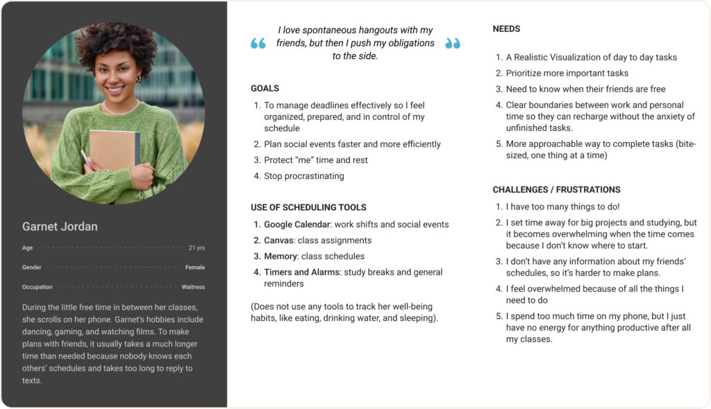
User Persona
Based on the information gathered from all 9 interviewees, we created a persona that represents our users. First, we visualized the common challenges faced, then correlated the users’ goals to the challenges, and aligned their needs to the goals as well.
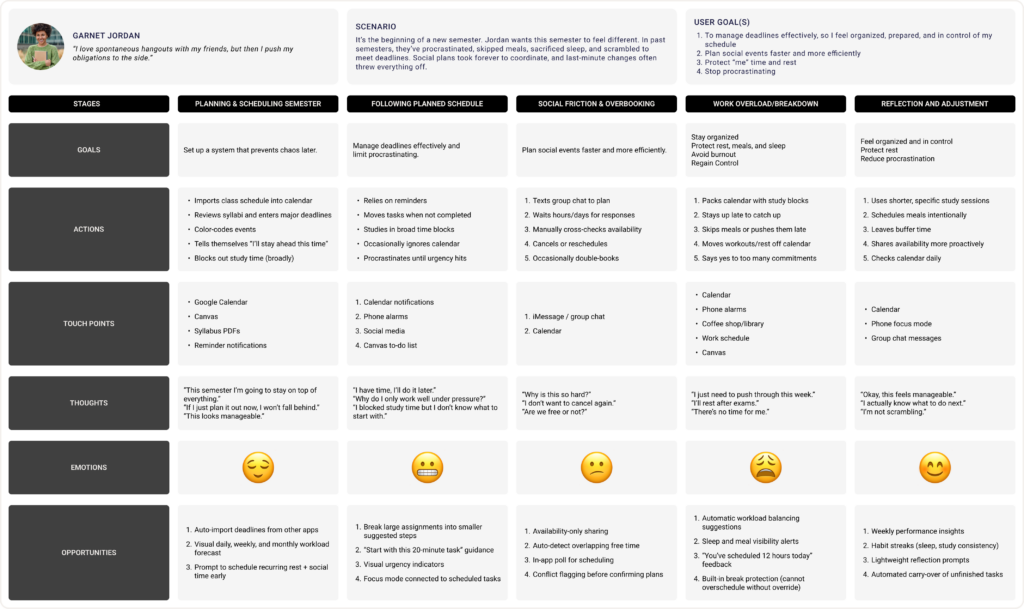
User Journey Map
From Garnet’s persona and her goals, we created a user journey map that represents the experiences that our interviewees currently go through. Developing a user journey map allows us to understand when and why our users struggle and come up with design opportunities that alleviate their frustrations.
Evaluating User and AI Needs
To make sure that the problem we are creating a solution for is actually needed by users, we utilized this worksheet. According to previous secondary research and primary research through interviews, there are two primary needs: Users need a way to remember to eat and sleep even with busy schedules, and users need more efficient ways to schedule social events with others.
Using this worksheet, we collectively determined if artificial intelligence was even necessary in our proposed solution and in what ways it would be beneficial or act as a disadvantage. One example of how AI could combat burnout, lack of rest, social scheduling stress, and schedule optimization is by suggesting rescheduling certain tasks, so users do not try to do too many things in one day. On the other hand, it would not be possible for AI to force users to follow a schedule, to completely solve a user’s procrastination habits, etc.
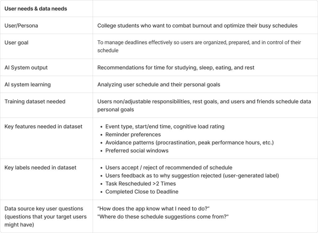
Lastly, we evaluated the data required to allow the AI in our solution to provide reliable and verified information to our users based on their goals. The initial information the AI needs is the user’s non-adjustable responsibilities, like class times, their personal goals regarding rest, eating, and sleep, and friends’ schedule data. Other examples of user inputs include reminder preferences, preferred social windows, their choice of accepting or rejecting recommendations, and their behavior. Understanding these factors enables us to create a realistic solution.
Ideate
The goal of this stage is to explore and develop possible design solutions based on the needs identified in the Define stage. Through a collaborative creative matrix, individual storyboards, and a user flow diagram, 3 features were prioritized for the solution
Creative Matrix
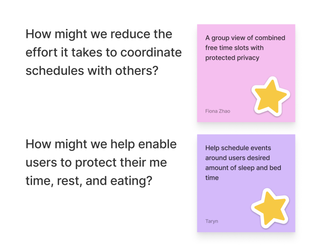
Our team used the creative matrix method to brainstorm diverse ideas to confront the “How Might We” questions we created. This allowed us to think about the smaller challenges within our main problem. Each of us came up with about 3 ideas for each HMW question, allowing us to mix and match ideas for greater creativity.
After our ideas were finalized, we went back as a team to discuss which ideas were vital to implement into our solution.
The top question and idea address the common users’ frustration with the constant and time-consuming back-and-forth it takes to plan a meet-up with friends. The bottom ones tackle our interviewees’ issue of unhealthily putting their academic and professional work before their personal well-being.
One of the main features I plan to emphasize in the solution is rescheduling based on missed tasks or workload balancing. With this feature, I will apply a few important HAX guidelines. The AI feature will support invocation, dismissal, and correction by letting users accept, cancel, or retry an AI suggestion. When the system suggests a rescheduling option, it will explain why it could work well based on input data from the user’s needs and goals.
Storyboarding
Branching off into individual work, creating a storyboard helps test the ideas we prioritized and visualize a scenario of how our solution might be used. By creating a potential experience in sequential order, any gaps and issues within our solution relating to the user and product relationship are exposed.
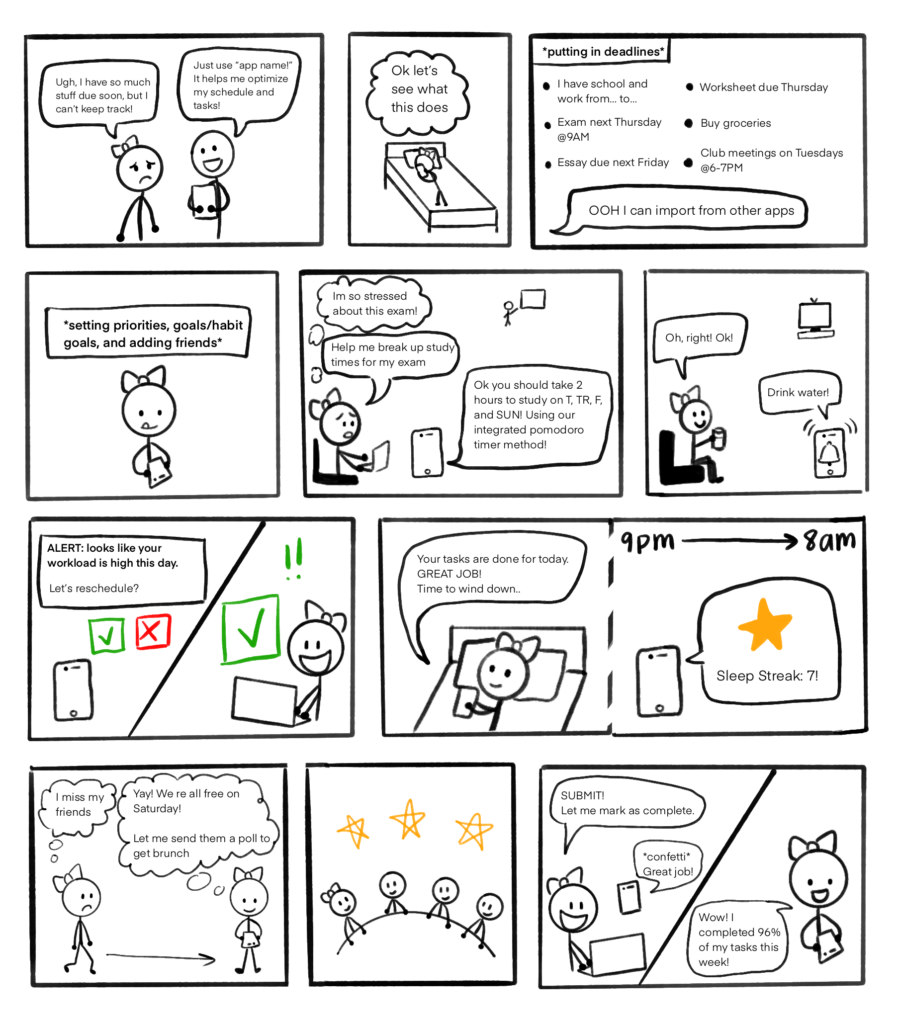
Using the user persona my team and I developed, the storyboard follows Garnet as she navigates through her challenges with scheduling, personal health, and social scheduling by using our app.
Garnet is a college student struggling to prioritize her sleep, meals, and water intake alongside her academic commitments until she comes across an app. The sequence follows a timeline of around a week and a half and demonstrates Garnet’s journey in managing her frustrations by interacting with features in the solution.
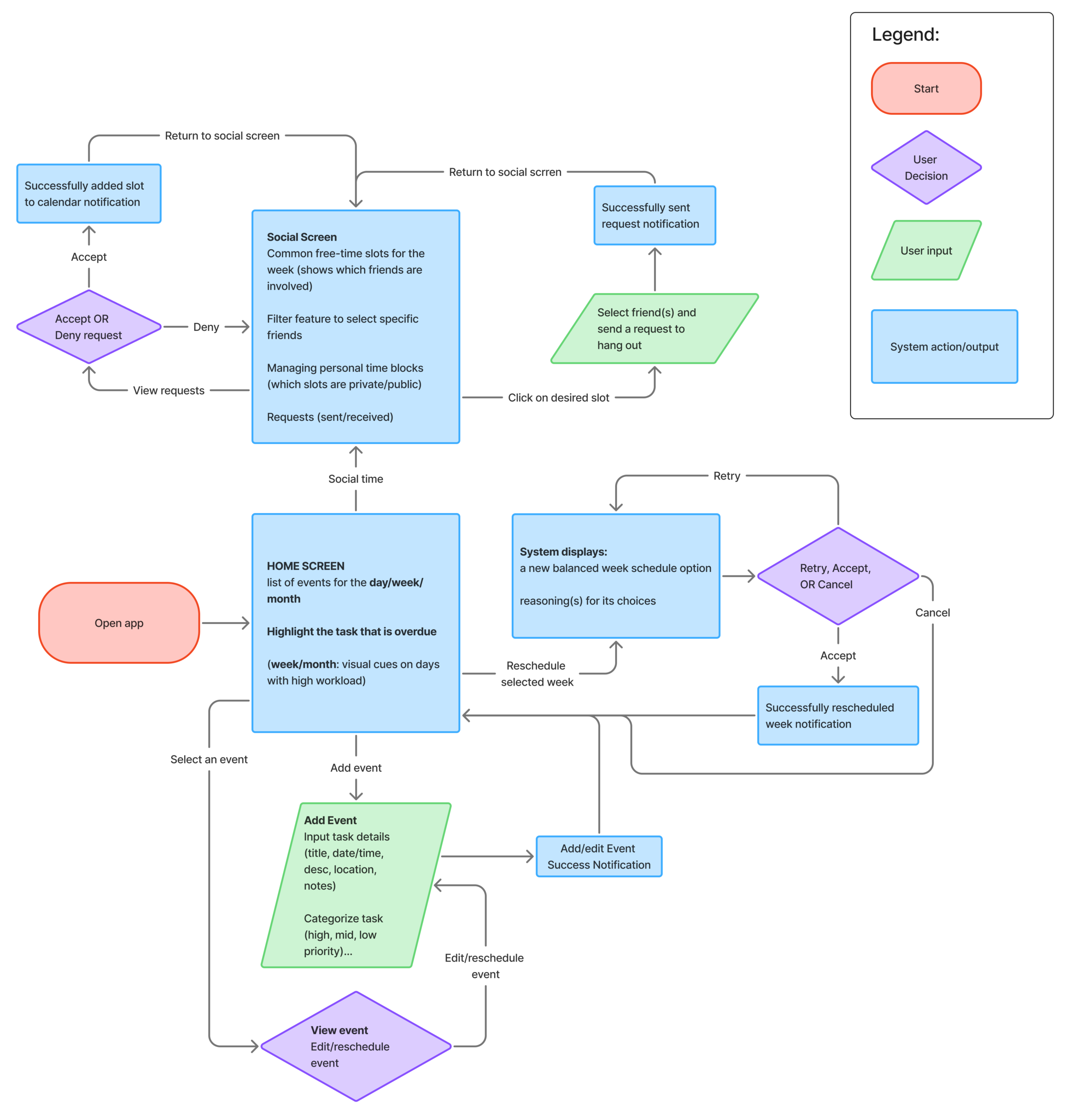
User Flow Diagram
Focusing on the solution’s three main features (social time scheduling, rescheduling missed tasks or high workloads, and task creation), I created a user flow diagram to visualize how users interact with the system to complete key tasks. The diagram maps the actions, decisions, inputs, and outputs required by both users and the system, while keeping users’ goals at the center. For example, to support user control, whenever the AI generates an output, users can choose to retry, accept, or cancel the action. For social scheduling, the app shows overlapping free-time slots among friends and allows users to send hangout requests. In some cases, the system also sends notifications that prompt users to open the app.
Prototype Lo-Fi & Test
The goal of this stage of the design thinking process is to explore a wide range of design possibilities and gain insights about how users interact with them before investing too much time into high-fidelity development. Having users test paper prototypes early on also helps find interaction issues or breakdowns. This process ensures that all design decisions are user-centered, informed, and efficient.
Paper Prototypes
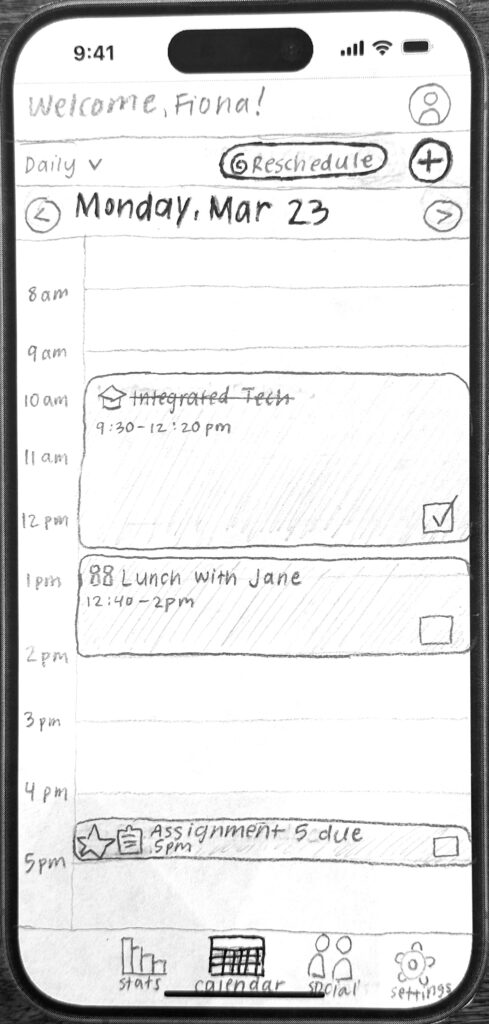
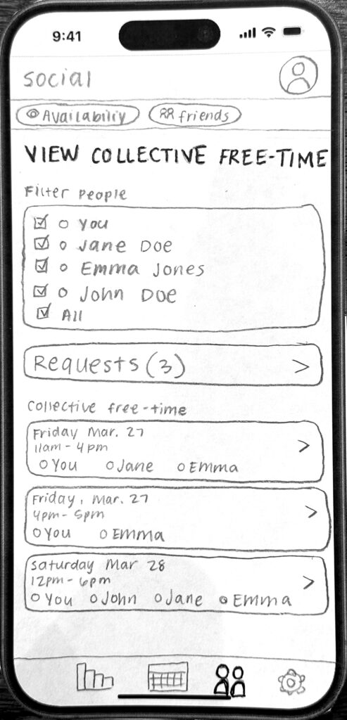
The paper prototypes are sorted into a series of screen flows for the 3 main features prioritized within the app. As each one is created, new ideas emerge, making it common to discard sketches throughout the process.
Sketch 1: Home Screen (daily view of schedule)
Sketch 2: Main Screen of Social Tab
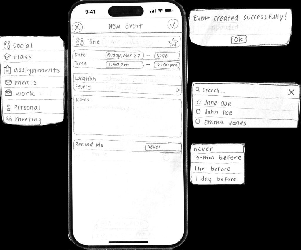
Sketch 3: Add New Event Screen (with categorization, people, and reminder toggles and confirmation message after tapping the check mark)
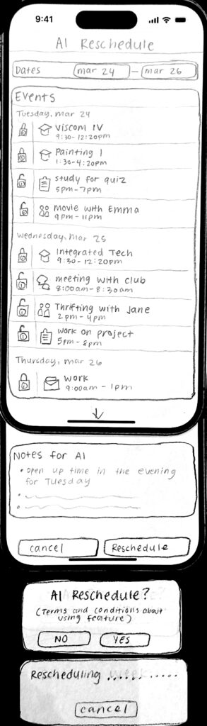
Sketch 4: AI Reschedule Screen (with a user decision pop-up and loading pop-up)
Cognitive Walkthrough
For this activity, I tested the paper prototypes for usability issues and friction between my mental model and the user’s mental model.
The 3 tasks that were selected are:
1. Add an event to your schedule
2. Reschedule events from Mar. 24-26
3. Accept a hangout request from John
These 3 tasks are important for users to complete because they directly align with the 3 main features of the app (event creation, augmented rescheduling, and augmented social scheduling).
6 total cognitive walkthrough forms were created to document the testing process. I conducted tests for 3 tasks with 2 different participants. Each task was broken down into actions that participants are expected to take. Evaluation of each action was based on four criteria: addressing the mental model match-up, visibility of action, labels/signifiers, and system feedback.
Across all 6 walkthroughs, I found a few issues with the prototypes:
- Participants were unaware that there was a categorization option during event creation.
- Change: Add a dropdown button next to the category icon.
- On the ‘Hangout Requests’ screen, participants were confused about how to navigate the list of people under a request.
- Change: Add an “Attending:” label.
- The AI reschedule explanation box was mistaken for a user input field.
- Change: Add an “AI reasoning” icon.
- Participants tried to modify fixed class schedules while rescheduling.
- Change: Disable the feature to toggle fixed events.
Hi-Fi Prototype Test and Iterate
This section addresses the process of developing Optima’s final prototype.
Hi-Fi Prototype V.1.
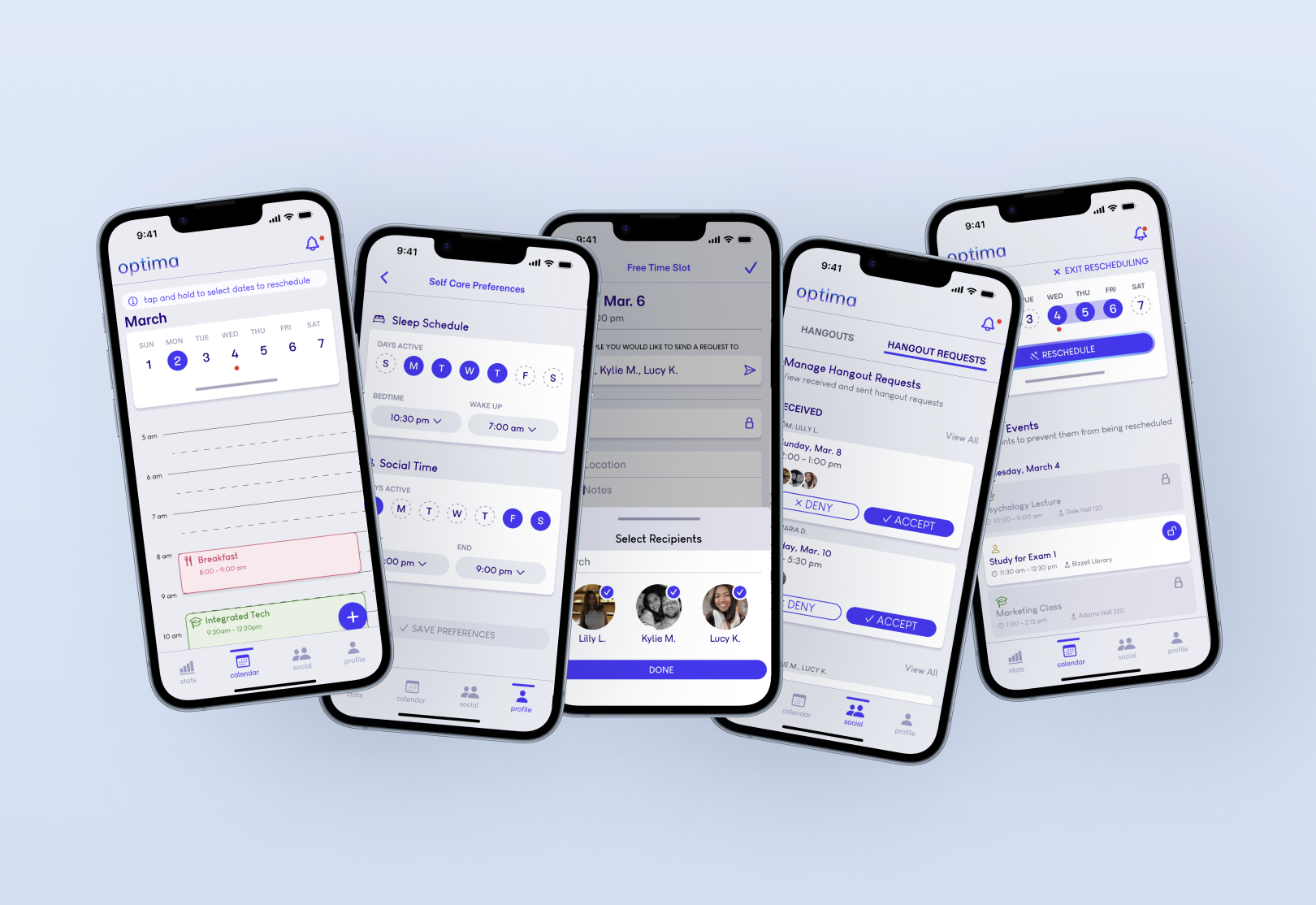
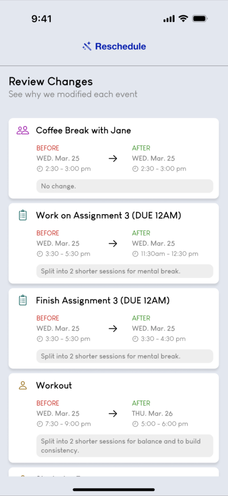
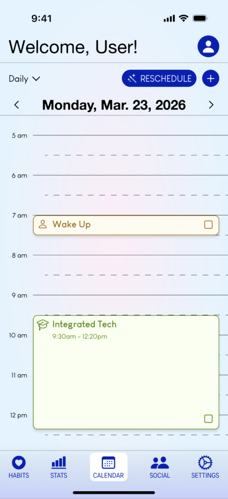
Using the paper prototypes and the feedback from the cognitive walkthroughs, I designed the first version of the Hi-Fi prototype. I utilized Base44, a vibe-coding website, and Pinterest for UI inspiration during times of struggle. I integrated a neutral color palette to maintain a calm, readable, and organized experience. I applied Atomic Design Principles, like atoms, molecules, organisms, and page templates, to make designing the interface more efficient and consistent. Components, variables, and styles kept the prototype uniform as well.
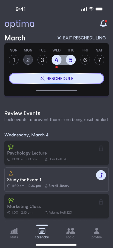
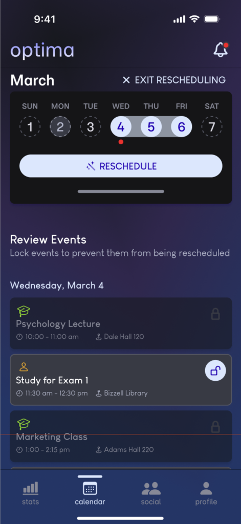
I considered Usability Heuristics with features like lock toggles, confirmation pop-ups, approve/deny buttons, and selected dates to give users control, prevent errors, maintain consistency, and show visibility of system status. Transparency, personalization, and human-centered interaction. I followed AIX Design Guidelines through transparency with how the AI system works, allowing users to personalize their sleep and social time, and promoting human-centered interaction by giving users the freedom to choose.
Heuristic Evaluation Testing
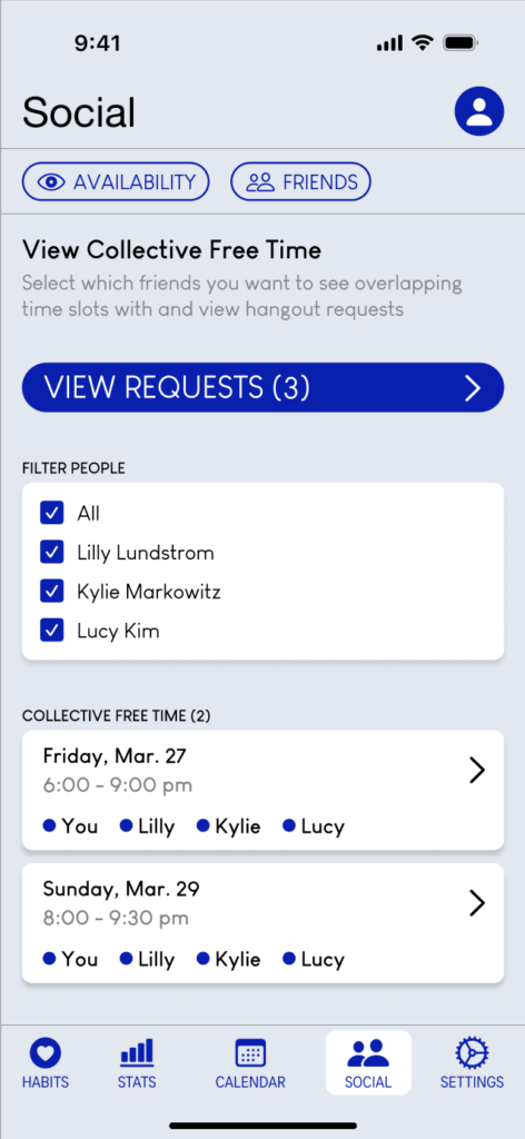
Peer evaluation of the initial Hi-Fi prototype revealed the following issues:
- AI rescheduling screens confusion (The rescheduling feature and flow weren’t clear.)
Reflection: I agreed and changed the rescheduling feature to be activated by tapping and holding on the homepage calendar. The date selection and event review were combined, so users could reschedule days with fewer taps. - Social screen visuals (The display of friend selections could be more visually pleasing. Sections like hangout requests, friends, and availability privacy could be moved to different locations.)
Reflection: I agreed and changed the “filter people selection” check-boxes into a sheet overlay, and I also switched the “people attending” UI to profile photos to improve visual aesthetics. I created a profile tab to store “manage friends” and “manage availability privacy.” - User control issue (There was no option to edit or delete events.)
Reflection: I agreed and added a feature where users could edit or delete events after they’ve tapped on it for user control and error recovery.
Hi-Fi Prototype V.2.
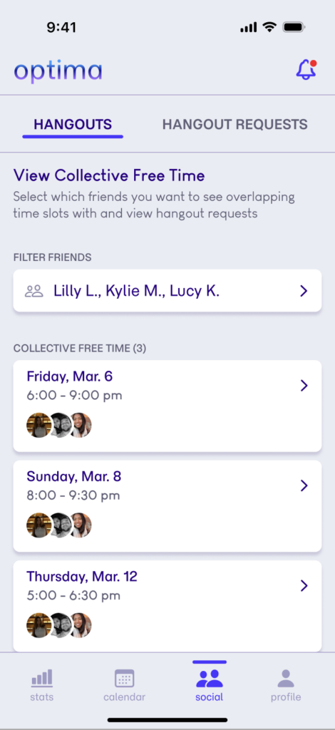
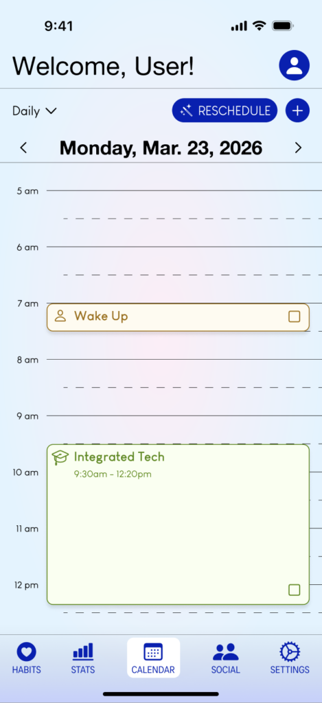

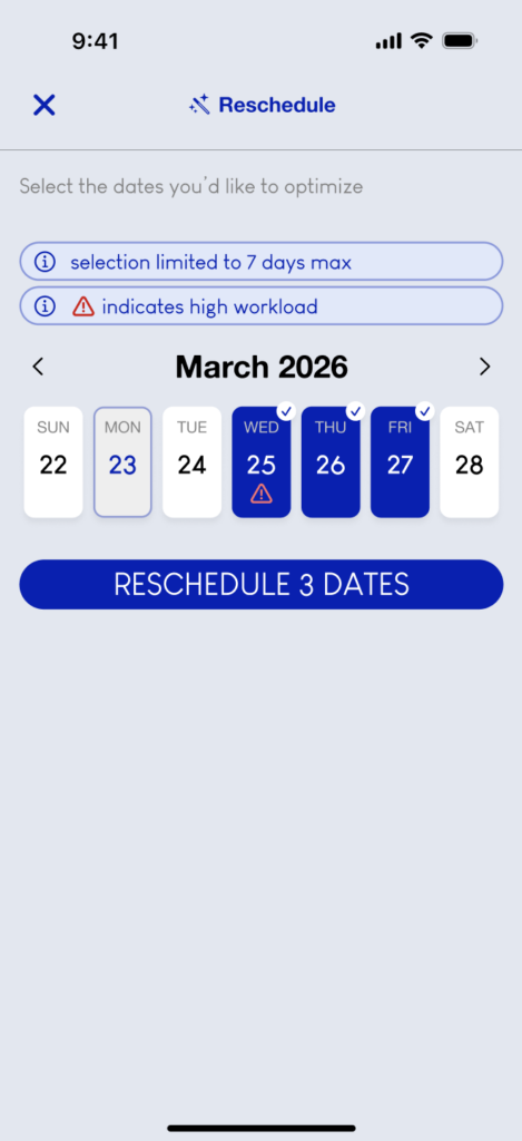
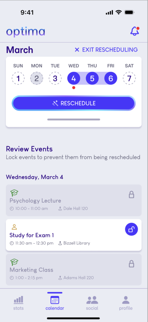
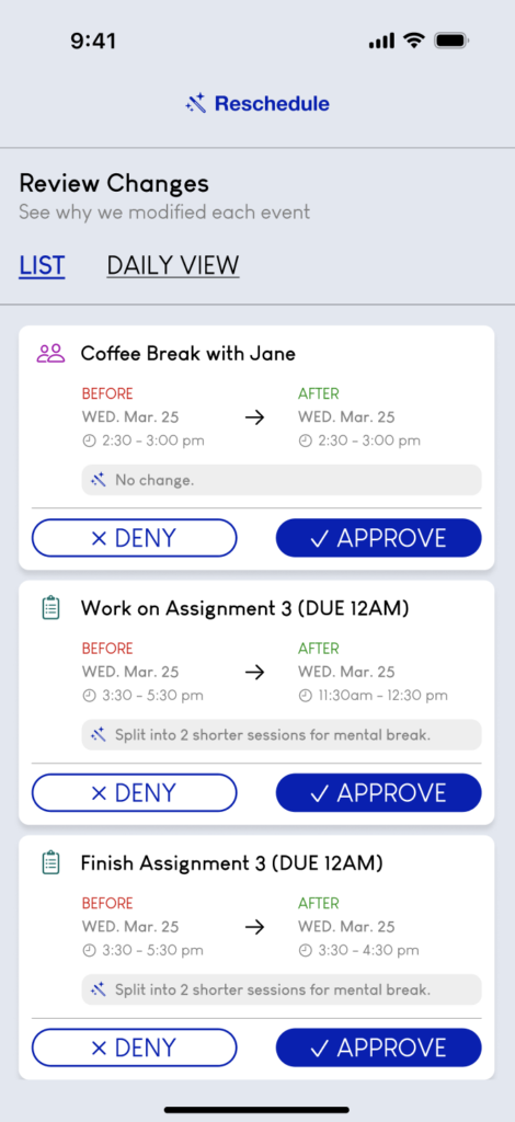
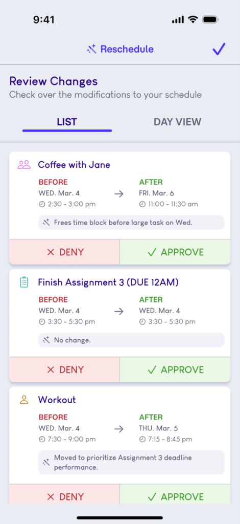
Overall, I made improvements on the app through user control, transparency, user-centered design, consistency, and more efficient interaction prototyping. The app’s color scheme remained neutral, but with a more vibrant blue-purple to convey a calm energy and AI integration. For features that incorporate AI, I’ve added an animated gradient border to symbolize its involvement.