VisComm Website UXDesign
Website Design Visual communication program didn’t have a website, which made it hard for people to engage. So, we built a website to show off our work, and expand our reach During this project we used 5 stages of design thinking process Which are as follows Empathize The goal is to understand the issues behind…
During this project we used 5 stages of design thinking process Which are as follows
Empathize
The goal is to understand the issues behind the lack of a website and to design a website with the information that was learned through interviews
Competitive Analysis
First me and my team found key competitor universities, then went through and evaluated what information the universities presented, simultaneously identified what we individual thought to be their weaknesses.

From looking at the competitor websites, it’s clear that the OU website is lacking information on what the Viscomm program is. From examples of the competitor website, clear information and showcasing the students work can give people on insight on what the program includes of.
Interviews
In order to better understand the users needs, we conducted multiple interviews of parents, students and faculty to get an insight on what the program is lacking and what information would be helpful for the Viscomm website.
We then organized all the gathered information from the participants and input the correlating thoughts, needs and feels of the user into groups. Through these interviews, I’ve learned that people often prioritize simplicity over an intricate design. Many participants have stated their difficulties and frustration with cluttered websites and how they make it difficult to find information.
Define
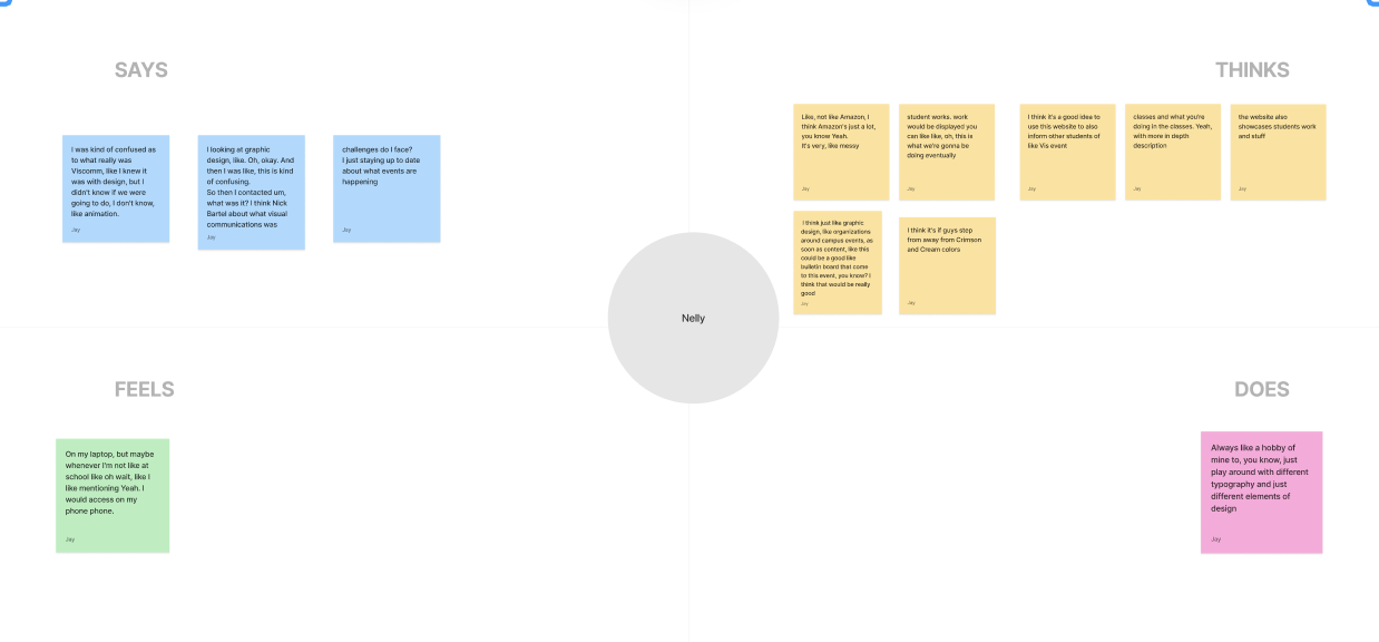
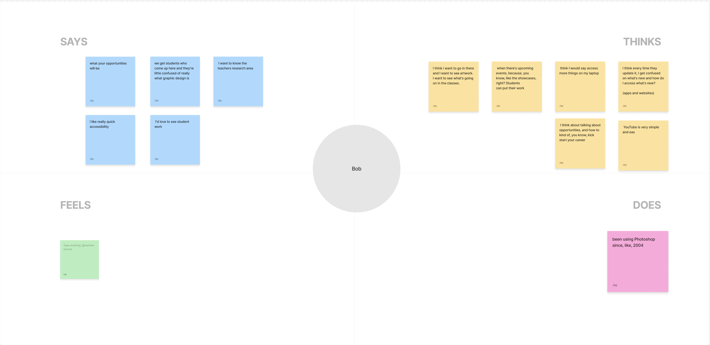
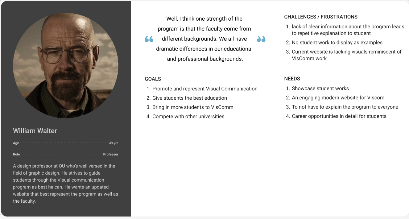
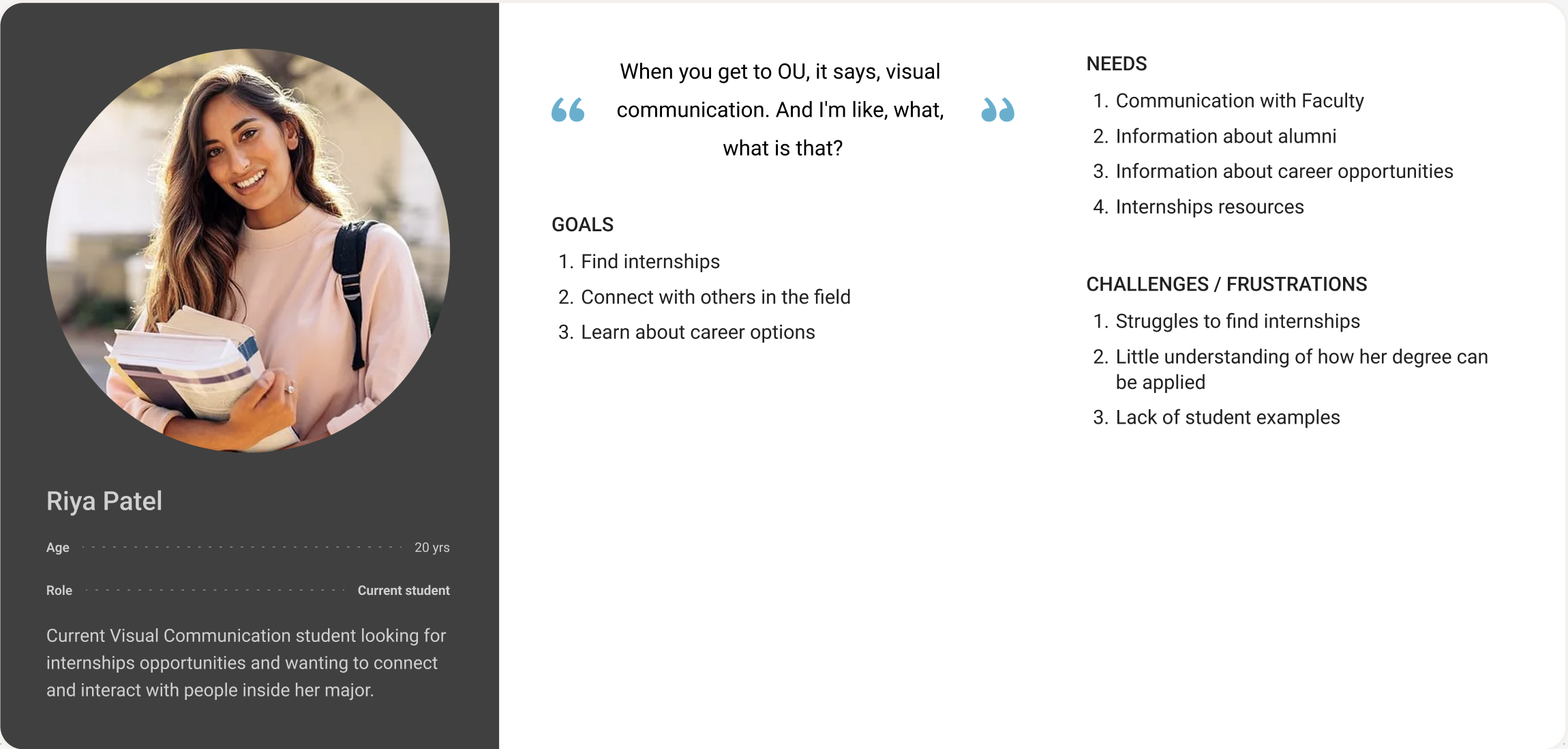
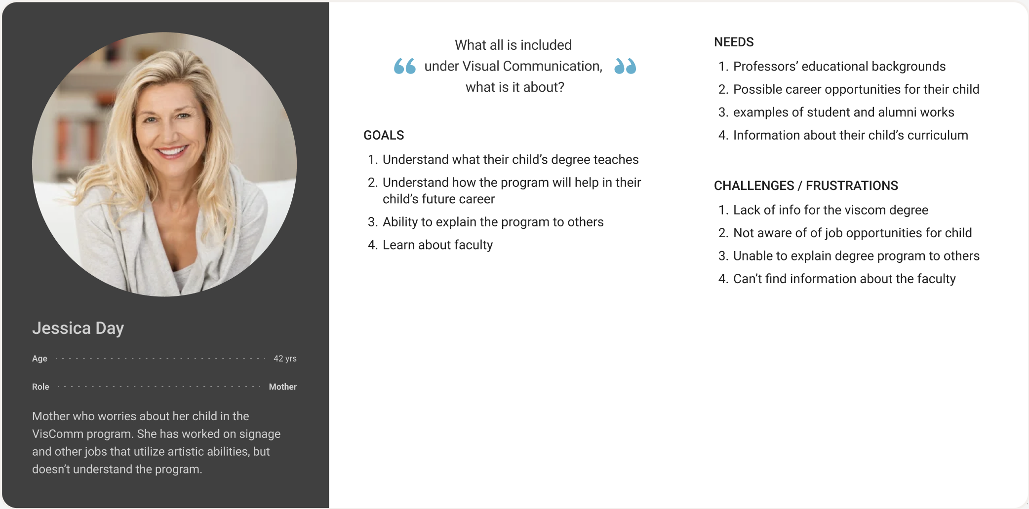
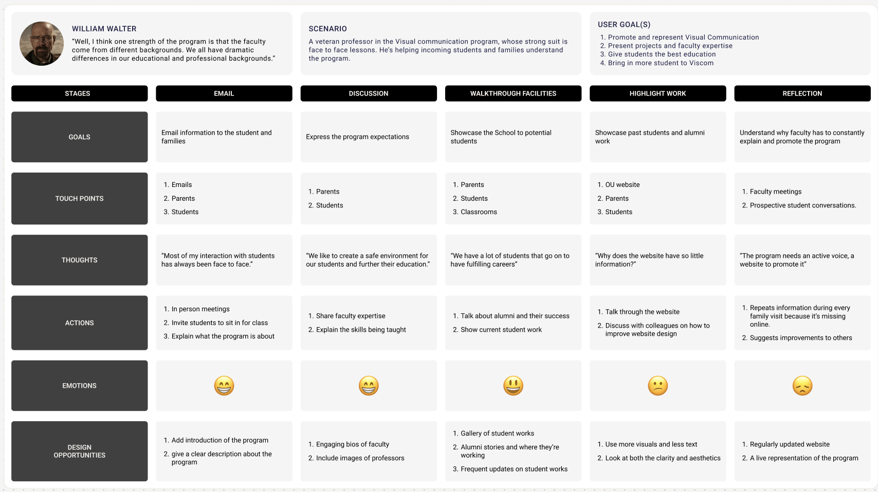
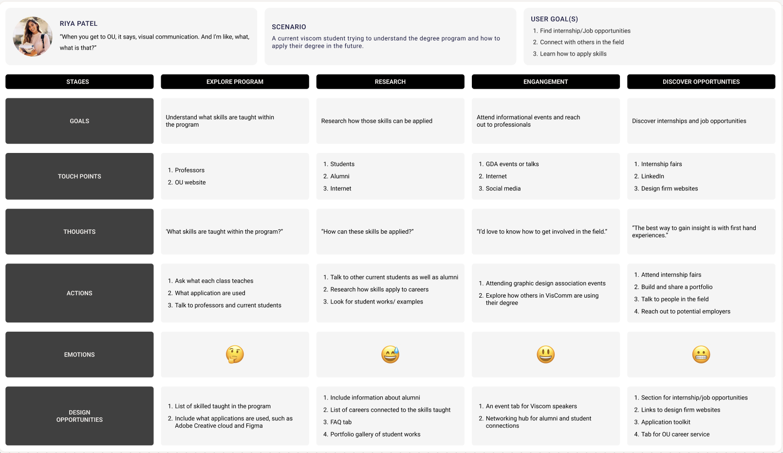
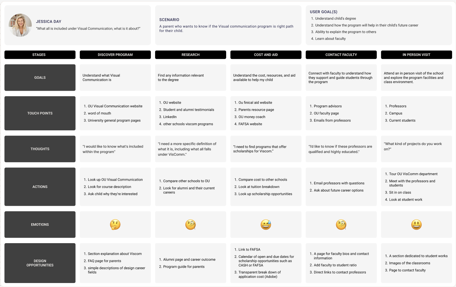
Based on the findings from the user interview data, each one of us created 3 personas journey maps for student, professor and parents.
Then continued to combine the user groups goals, needs and challenges from our collected data into to each groups persona. All the groups had similar needs and challenges around needing to see students work within the program and not knowing what the projects of the program consist of. Based on the personas , we created journeys maps which visually represents the experience of a user throughout their interaction with a program. This map includes the various stages, goals, touch points, thoughts, actions, emotions, and opportunities that can help us understand the user better. These journey maps help us comprehend different user group experiences.
Ideate
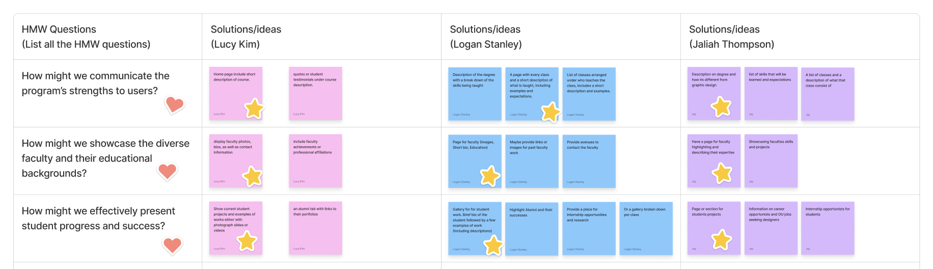
We framed the user challenges, needs and goals into HMW questions.
As a team we came up with what we felt to be the most valuable questions based on our interviews, then we all came up with separate ideas and solutions and then continued to group all of our ideas together that were similar. The top 3 questions were what we thought would best fit our users needs. Which is to better understand the program, being able to have information on professors and to view students work and success within the program.
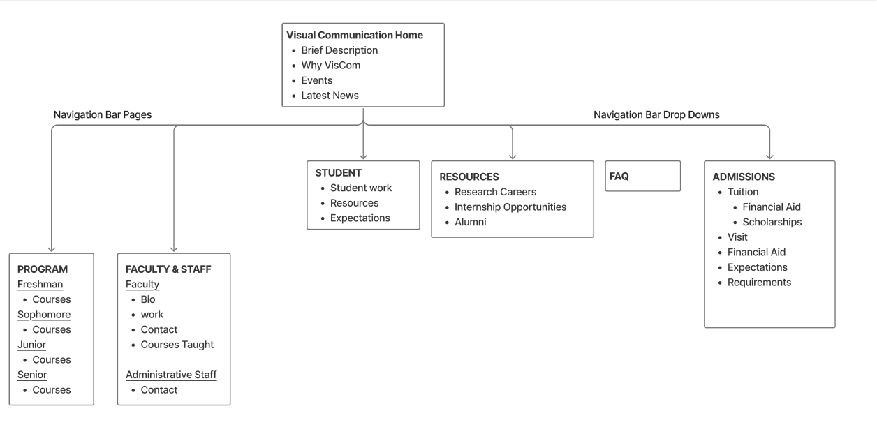
This is the site map that we came up with as a team that consists of the initial set up that we think the website should have. It consists of the information that should be provided on each page and and drop down menus for the website.
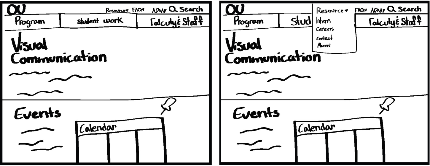
These are some example sketches that visualize the ideas from the sitemap.
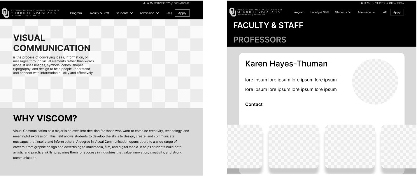
Lo-fi prototype
The sitemap acted as the foundation for my design decisions. It helped me map out the overall information and defining what pages were needed, and how they connected, and the logical flow a user would take through the site. As I moved from sketches to digital wire frames, I referred back to both the sitemap and sketches to ensure consistency. The sitemap ensured I maintained a logical user flow, while the sketches and sitemap guided me through the process. While i was designing the wire frames I realized some of my original sketches and ideas weren’t needed and would make the overall layout more complicated and was able to better align my design decisions with the users goals.
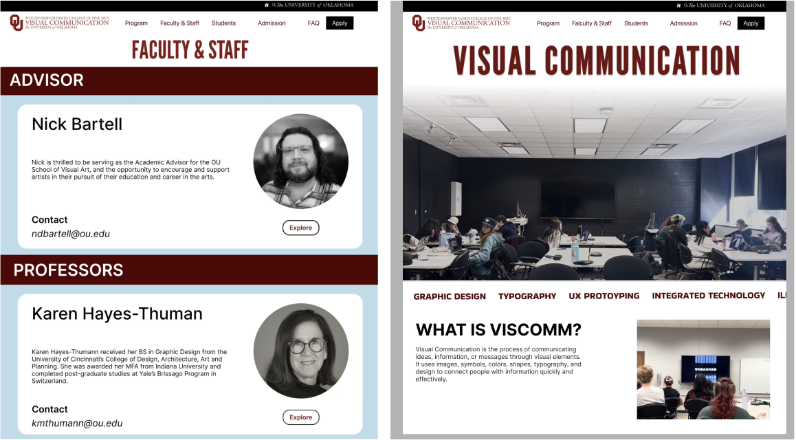
Test (Think ALoud)
I used th think aloud testing method to evaluate the usability of the wireframes involving 3 participants. Each user had different difficulties when navigating the task. The prospective student had easy navigation for each task and thought it was straightforward. Parent user also thought it was straight forward, thought the subheadings maybe should be a different size to not get mixed of what the primary page was about. Current student user had easy navigation, with all the task except for finding the alumni portfolios. The first action they took when looking for alumni portfolio was too look in students tab under student work, there second action was to look in the students tab under resources. I could probably fix the hesitation with finding alumni information by making it a page in the navigation bar.
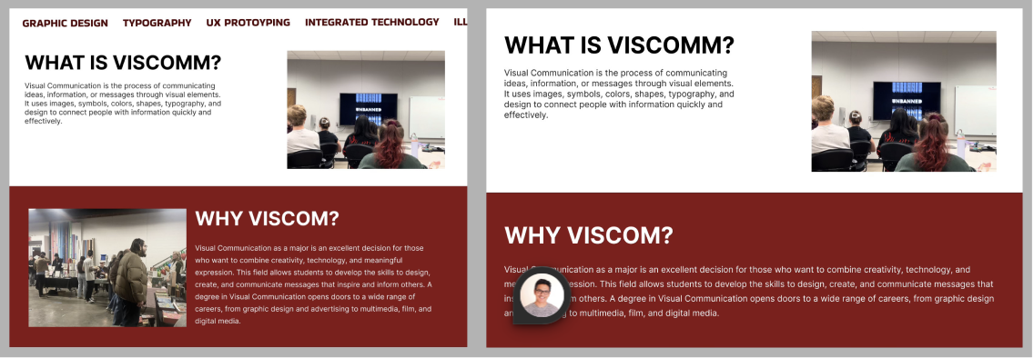
HI-fi prototype
The wireframes were then further developed into interactive prototype.The Hi-Fi prototyping process involved creating a detailed, interactive version of my design. This allowed me to test the user flow and interactions I incorporated OU’s brand colors by using their official color palette, ensuring that the prototype reflected the university’s visual identity.
A/B TEST (heuristic evaluation)
A/B testing is to evaluate the usability of the Hi-fi Prototype. One of the most significant insights gained was the critical importance of user feedback in the design process and the power of simplicity in design. These test were conducted to see what design resonated with the audience more. One of the specific challenges I faced was deciding on the layout for the home page. I was torn between two distinct approaches: one that emphasized visual appeal with large imagery and the other that prioritized words over the pictures. To resolve this, I conducted A/B testing with a representative sample of target users. The results clearly indicated that the information-dense layout was more effective and visually pleasing. This data-driven decision not only improved the home page’s usability but also reinforced the value of A/B testing as a tool for resolving design decisions.
Test 1: Tested which of the professor card designs users felt was most effective
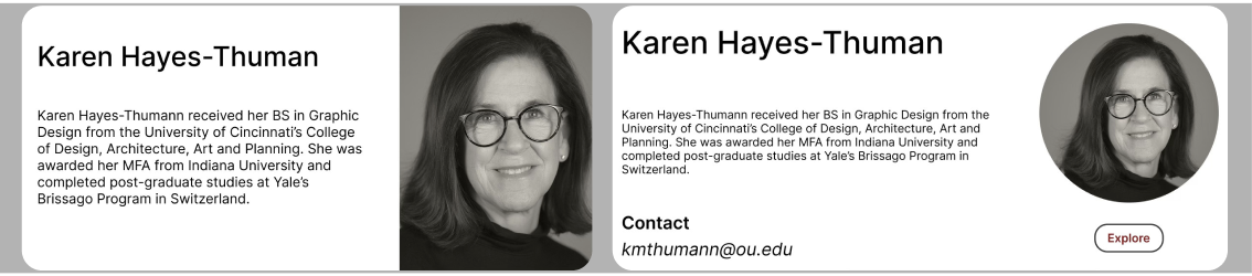
User 1: Preferred option 2 as they like the circle for the picture, they thought was good to not have all the elements be squares
User 2: Also preferred the second option because they had the option to find out more with the explore button
User 3: Thought the second option was the most effective with the explore button, but also liked the simplicity of the first option
Test 2: Was to figure out which design worked better for the audience option 1 being both section with pictures and option 2 being only one section with a picture
User 1: Preferred Option 1 because they like the multiple pictures
User 2: Liked the second, because one had a picture and the other section one didn’t
User 3: Also like option 1, because both of the sections had pictures
Test 3: Was to test which design was more visual interesting, option 1 with the blue background or Option 2 with the full blown picture
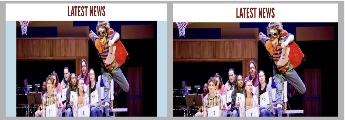
All of the users like option 1 because they liked how the background had the color blue, instead of it being a fill blown picture compared to option 2
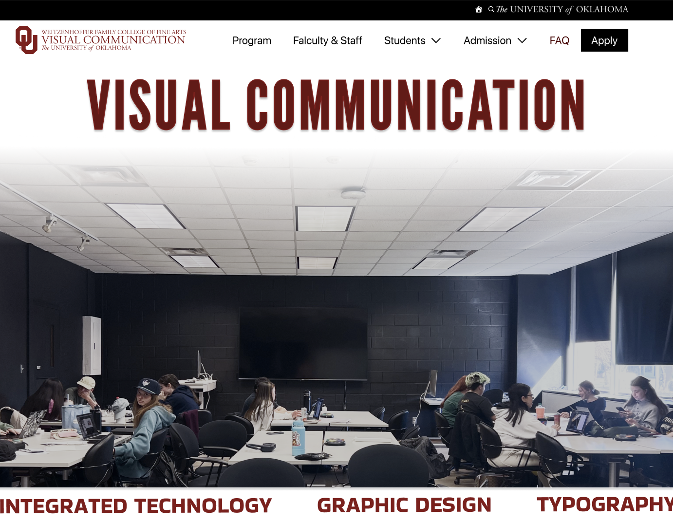
Final prototype
Conclusion & Reflection
The process of creating the hi-fi prototype and conducting A/B testing has significantly contributed to my growth as a designer. It has reinforced the importance of empathy in design, teaching me to see the UI from the user’s perspective and to prioritize their needs above my own preferences. It has also honed my analytical skills, as I have learned to interpret user data and translate it into actionable design improvements. Furthermore, this experience has given me a deep appreciation for design and recognizing that design is not a one-time thing but an ongoing process of refinement
Leave a Reply