VisComm Website: UX Design
Problem
Solution
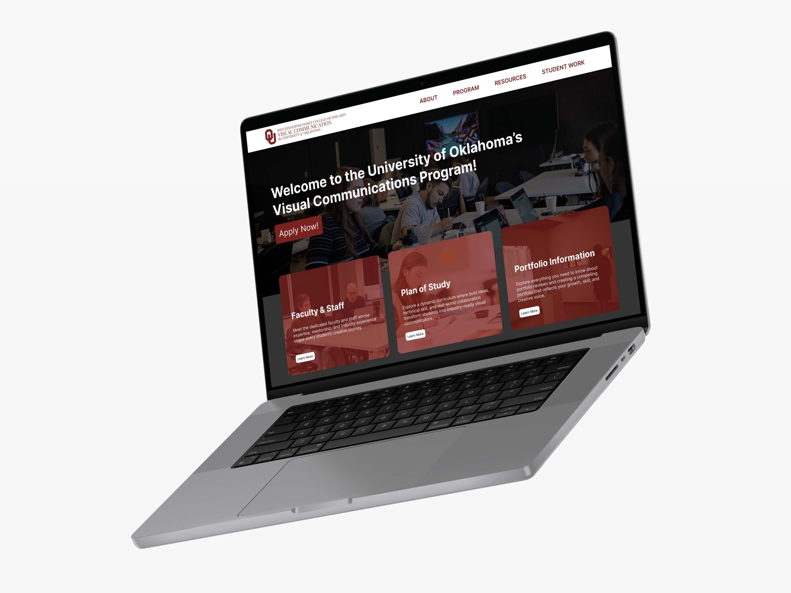
The Visual Communications website was difficult to navigate and didn’t effectively showcase the programs uniqueness or provide users with any reason to be interested in our program.
We redesigned the website using the design thinking process, creating navigation, interactive elements, clear and concise information, and storytelling elements to highlight the program’s strengths and engage users.
Empathize
The purpose of the empathize stage was to gain an understanding of the goal, expectations and challenges surrounding the stakeholders of the OU Visual Communications program and website. By researching other visual communications websites, we were able to get insights on what an OU site should and should not include. Applying these insights, the team was able to develop and conduct interviews with a variety of stakeholders to further our knowledge of what prospective users will need.
Competitive Analysis
To better understand the broader landscape of Visual Communication programs particularly how peer universities present their programs online, we conducted a competitive analysis of these institutions. We explored the websites to gather the pros and cons of their designs and provided information. It gave our team insight on how to create a program website that considers the stakeholders needs while being user friendly. We were able to explore these findings further after our interviews due to some website recommendations we received.

Oklahoma State University
Website Link:
https://go.okstate.edu/undergraduate-academics/majors/graphic-design.html
Strengths:
- Student examples
- Career paths
- Has a section for career paths
- Good hierarchy for the information they have
University of Central Oklahoma
Website Link:
https://www.uco.edu/programs/cfad/design/graphic-design
Strengths:
- Having the related links for more information
- Links for different types of students
- Has an alumni story
- Simple color theme that pulls information together
Carnegie Mellon University
Website Link:
Strengths:
- Uses visuals and student examples
- alumni stories
- FAQ’s and important information at the top of the website
Weaknesses:
- No top bar
- Layout is not consistent
- Not a lot of information
- No FAQs
- Weak hero/introduction
- No work of past or current students
- Does not show what sets them apart from other graphic design programs
Weaknesses:
- Top bar goes away when you scroll down
- Text heavy
- Alignment issues
- Repeated information
- Hierarchy issues
- Curriculum info is to far down
- Need more student project examples
- No FAQs
- “Request Information” on the left side is too primary
- Does not showcase any current projects
Weaknesses:
- Search button that sticks as you scroll
- Simple colors that don’t overcrowd the information
- Visuals adapt well to different screens
From our research findings, we concluded that our visual communication website should be well organized, user friendly, and include information that is useful to stakeholders, those being, prospective and current students, parents, donors, and faculty. We concluded that having clear sections separating key information such as, admission requirements, faculty information, student work, course guidelines, and prospective careers is a must. We gathered that it is also important to consider hierarchy and navigational ease while looking at the current program web page.
Interviews
To gather a deeper understanding of users’ needs, we interviewed 9 participants consisting of students, parents, and faculty.
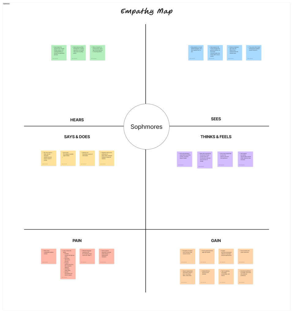
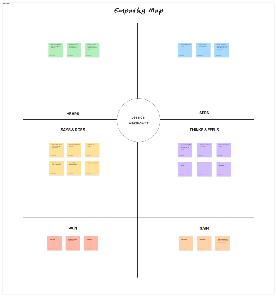
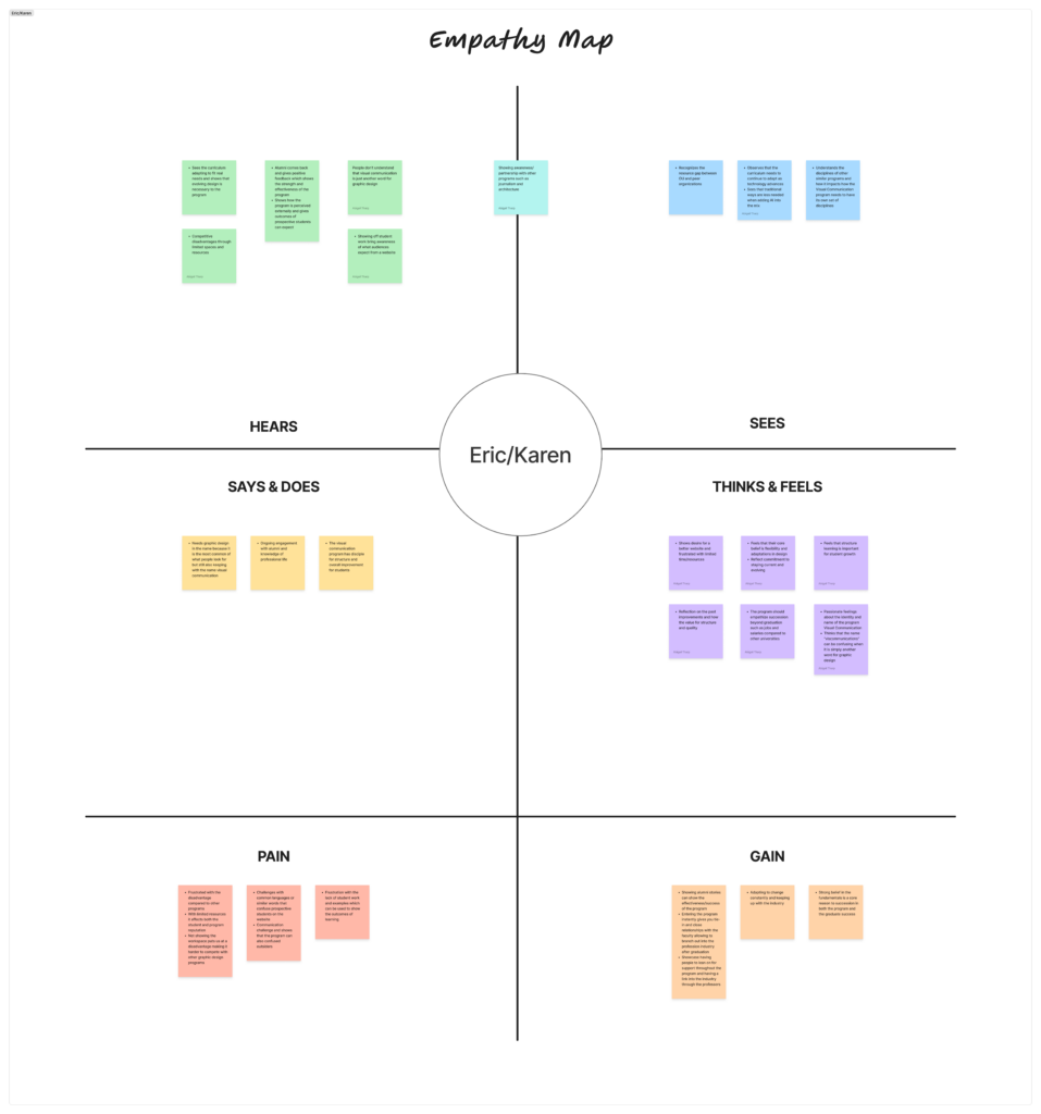
We then organized related topics within the empathy maps into distinct clusters using affinity mapping process. Through this process we discovered three main touch points, clarity, expectation, and accessibility.
Clarity/Expectation: There is a lot of confusion when it comes to the expectations and intricacies of the Visual Communication program. Students are unsure about when they officially enter the Visual Communication program and how it differs from “graphic design.” They want clear, consistent information about the steps from being an Art major → applying → acceptance. There’s a need for straightforward messaging that defines what the program includes and how it differs. Having an explanation on career paths and skills possible through the program and a clear description of majors, pathways, and specializations. How smooth is the transition between high school arts (graphic design) and college level visual communication is a common question.
Accessibility: The current website is seen as unclear or too generic. Students need a user-friendly, detailed hub with up-to-date program info, portfolio guidelines, and pathways. There is a need for an easily accessible and navigable website with clear and concise information. It needs to provide more outreach than just by word-of-mouth with an easy to find website that is also used by the faculty to help recommend the program. Clear course descriptions which outlines on what is to be learned is expected.
Define
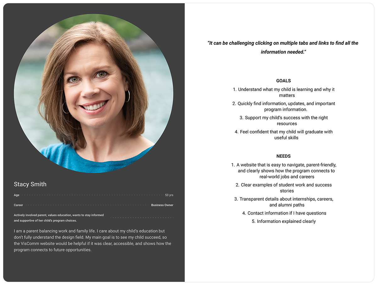
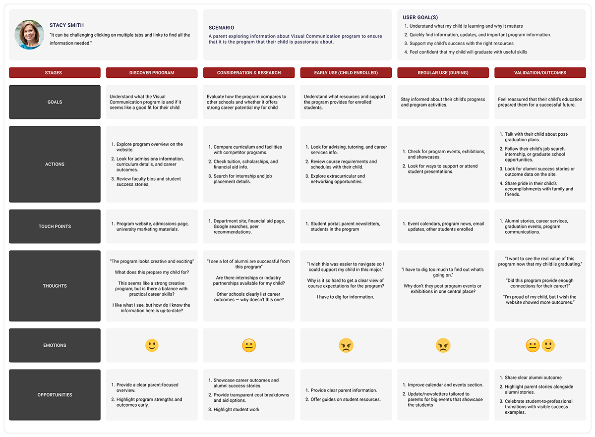
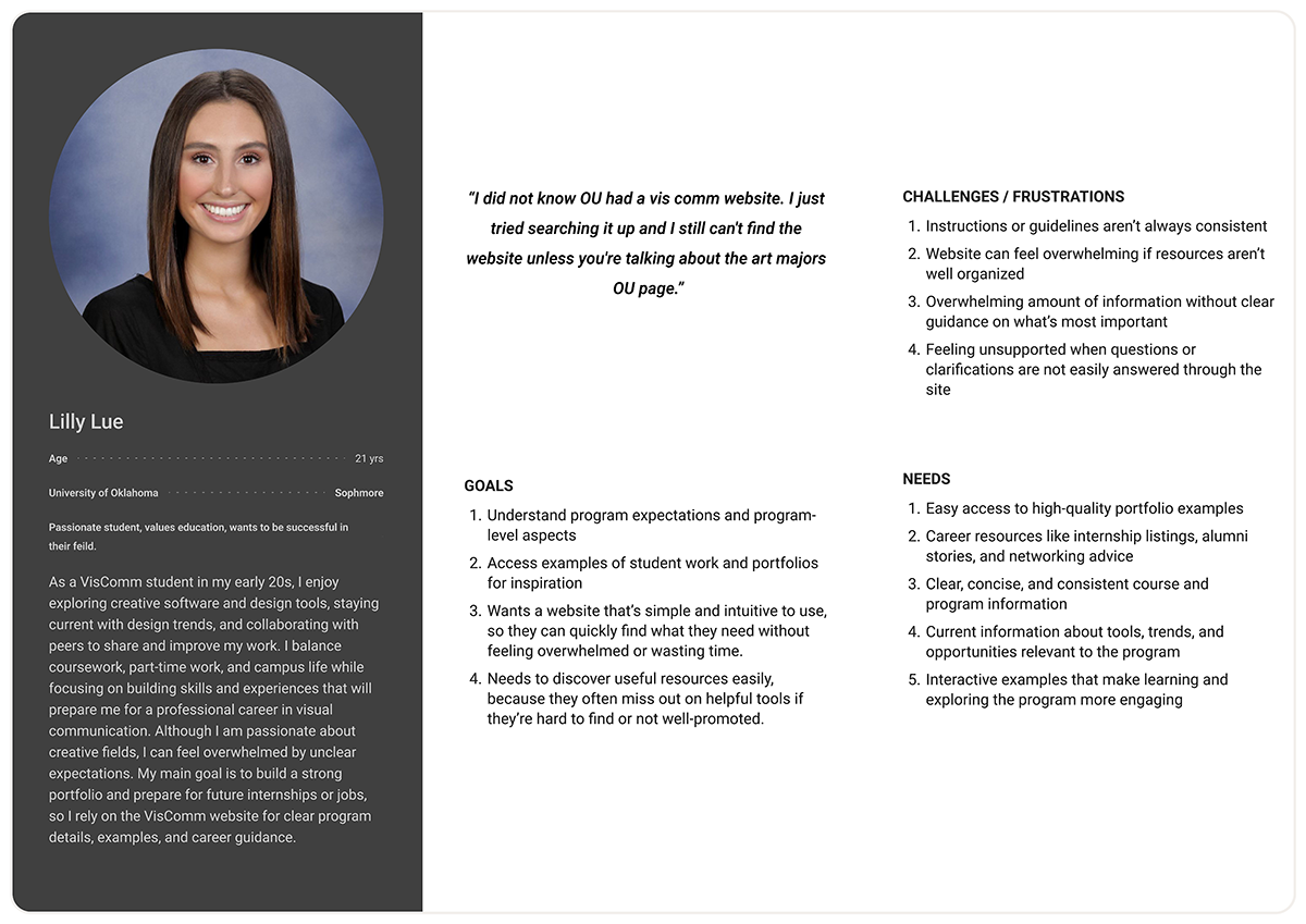
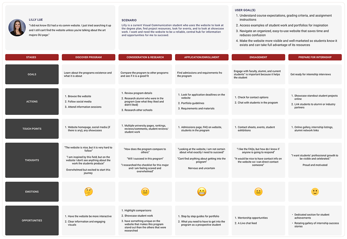
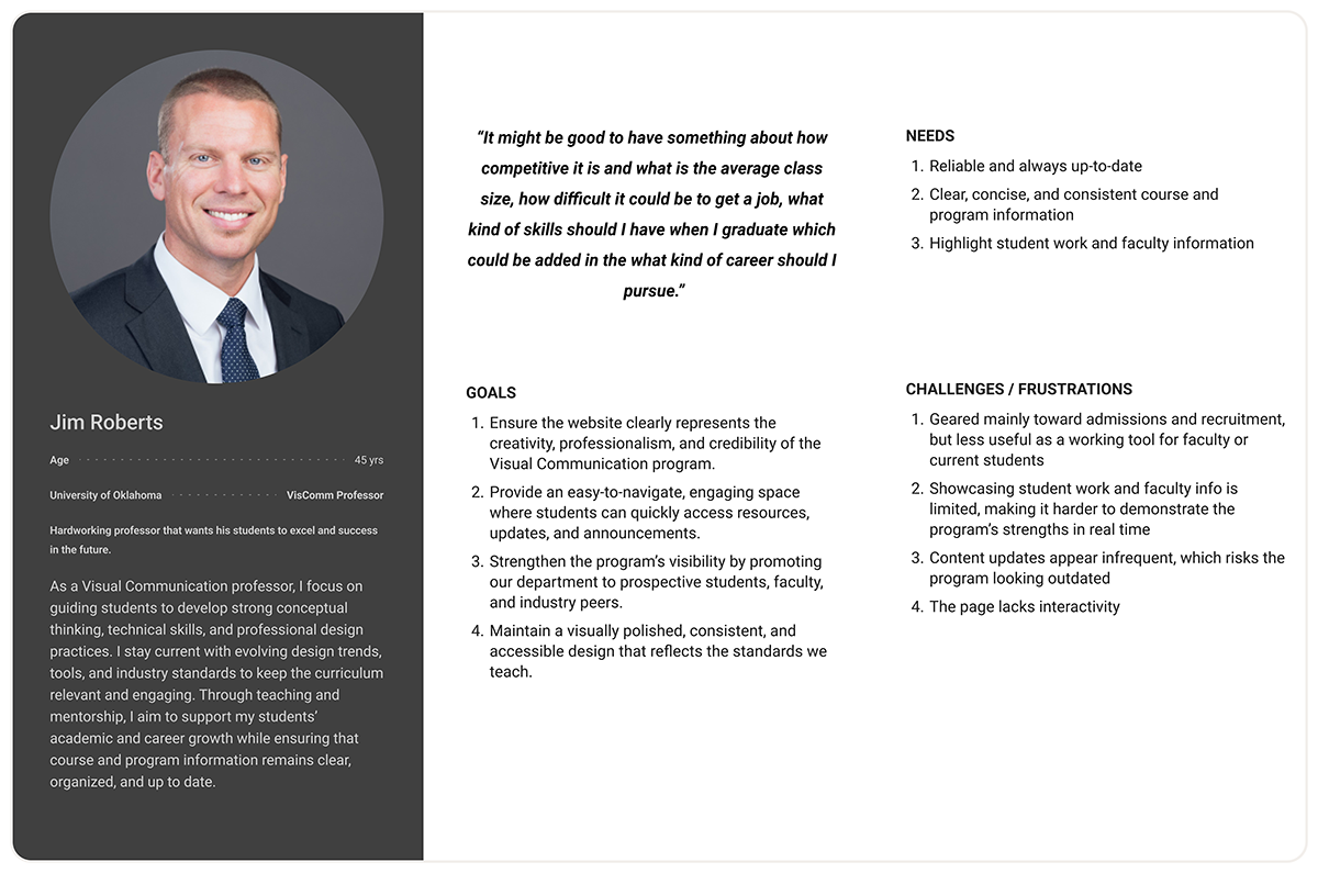
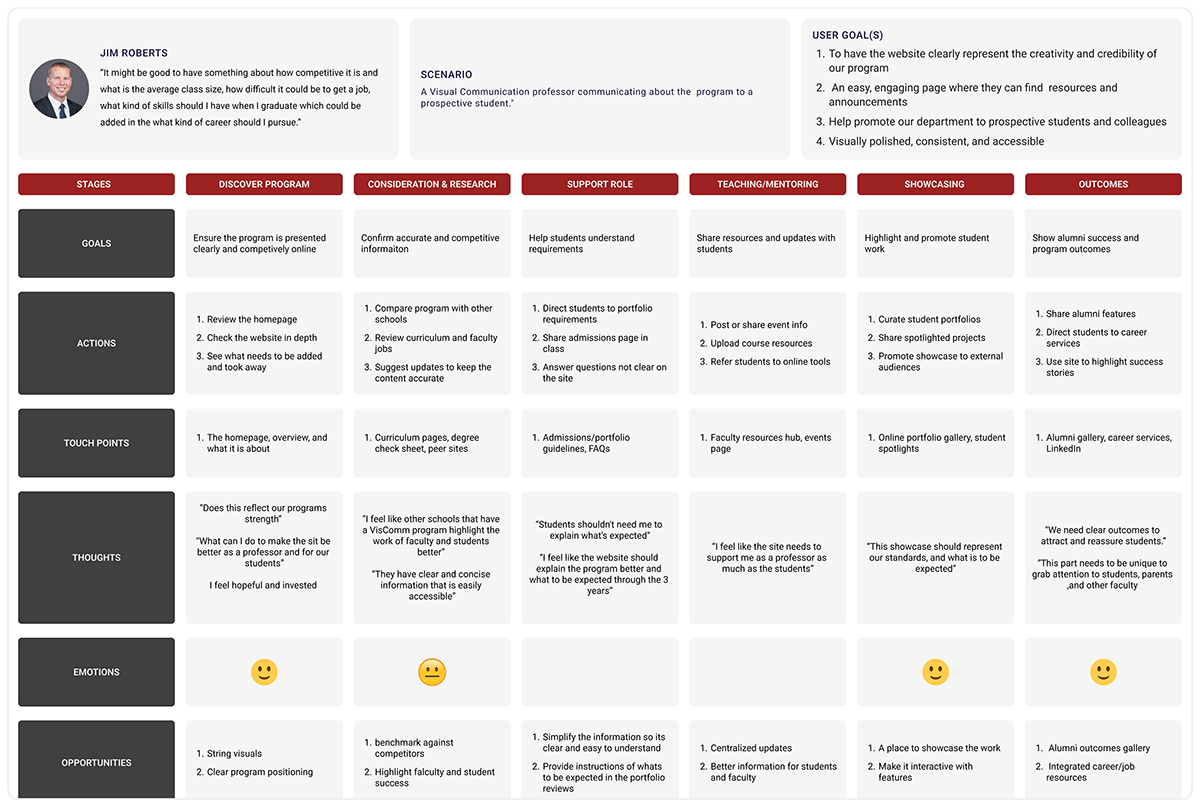
My team wanted to highlight the three major user groups we interviewed, those being: parents, students, and faculty. We developed these personas to reflect the experiences someone in these user groups may have when discovering the program and exploring the current website. We made sure to highlight how each group would interact, expect, and want different things from a program website.
Personas and Journey Maps
We created personas and user journey maps to better understand the experiences and needs of our three main user groups: parents, students, and faculty. By mapping their journeys, we were able to see how each group discovers and interacts with the program website, what they expect, and what information or features are most important to them. This process helped us identify differences in priorities and preferences, ensuring the redesigned site would serve each audience effectively.
Ideate
Out of many design ideas we came up with in the creative matrix in the initial ideation phase, we chose to focus on three main categories, those being academics, program information and student experience. We used these as basic building blocks to expand our site because they allow us to meet the needs of most user groups.
Creative matrix
My team used a creative matrix in this project to organize all the different content areas and user needs in one place. With so many elements like student work, faculty info, navigation, facilities, and storytelling, the matrix helped us break down the complexity, spot connections, and quickly generate ideas for each section. It also pushed me to explore more innovative solutions and choose the options that best supported the site’s goals.
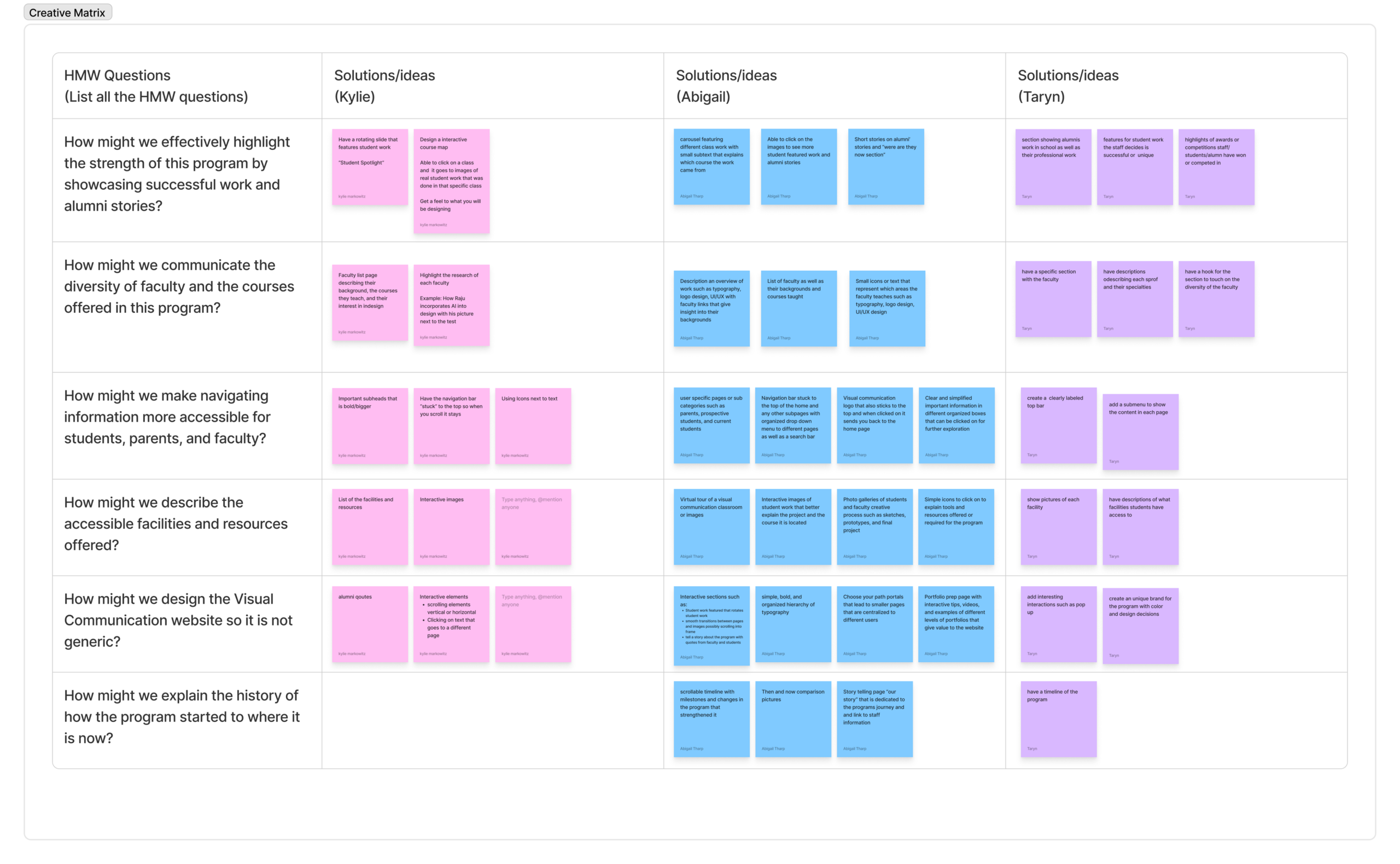
Our creative matrix showed clear opportunities to design the website by making student and alumni work interactive, presenting faculty expertise clearly, and strengthening navigation through sticky menus and organized pathways. It also highlighted the value of using visuals and interactive elements to showcase facilities, and the potential of timelines and storytelling to communicate the program’s history and identity.
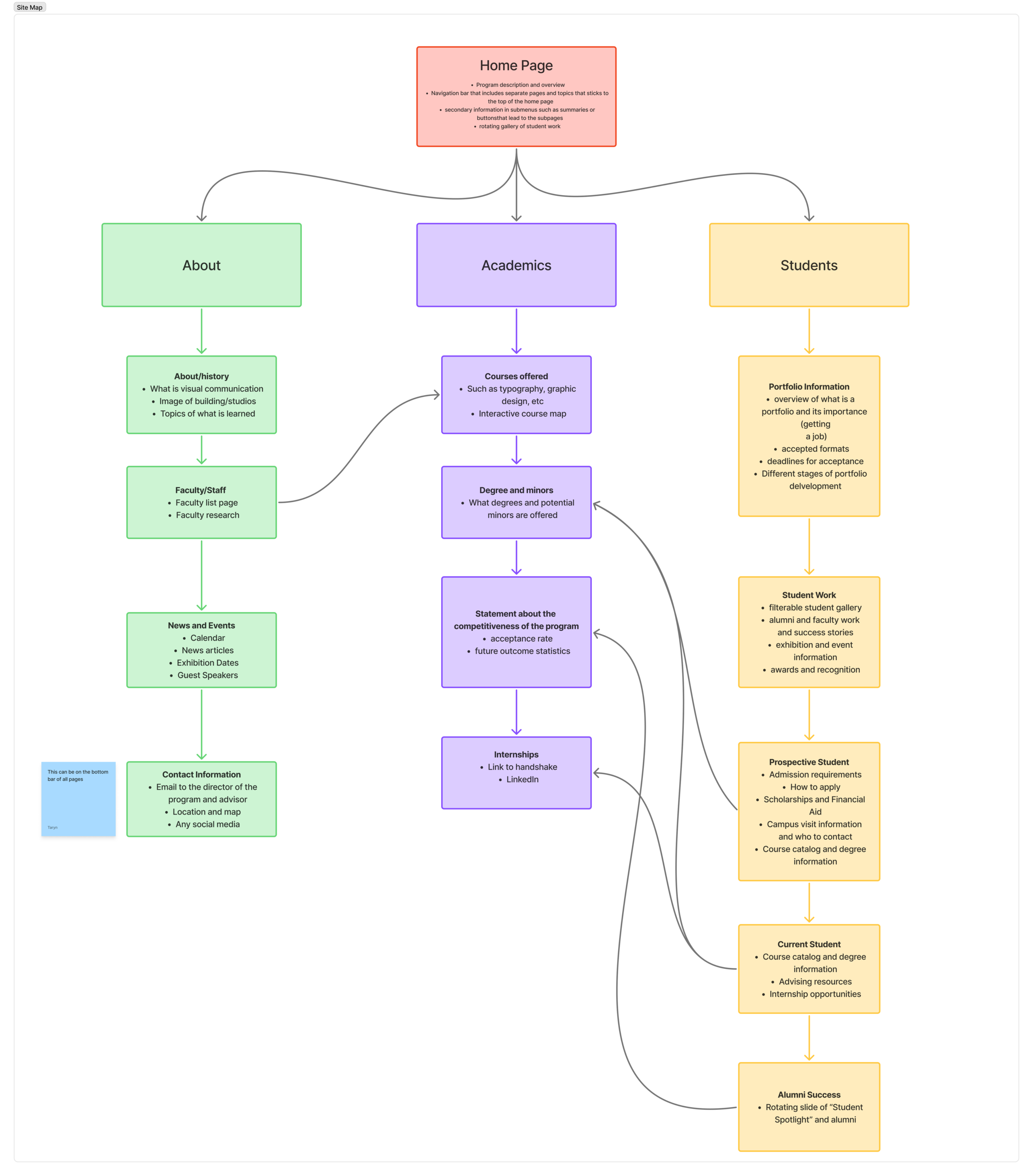
Site Map
We created a site map to clearly organize the structure of the website and make sure every section fit together logically. With so much content, the site map helped us define hierarchy, plan user pathways, and ensure the site would be easy to navigate. It also allowed us to spot gaps, avoid redundancy, and create a layout that supported a smooth, intuitive user experience.
Sketches
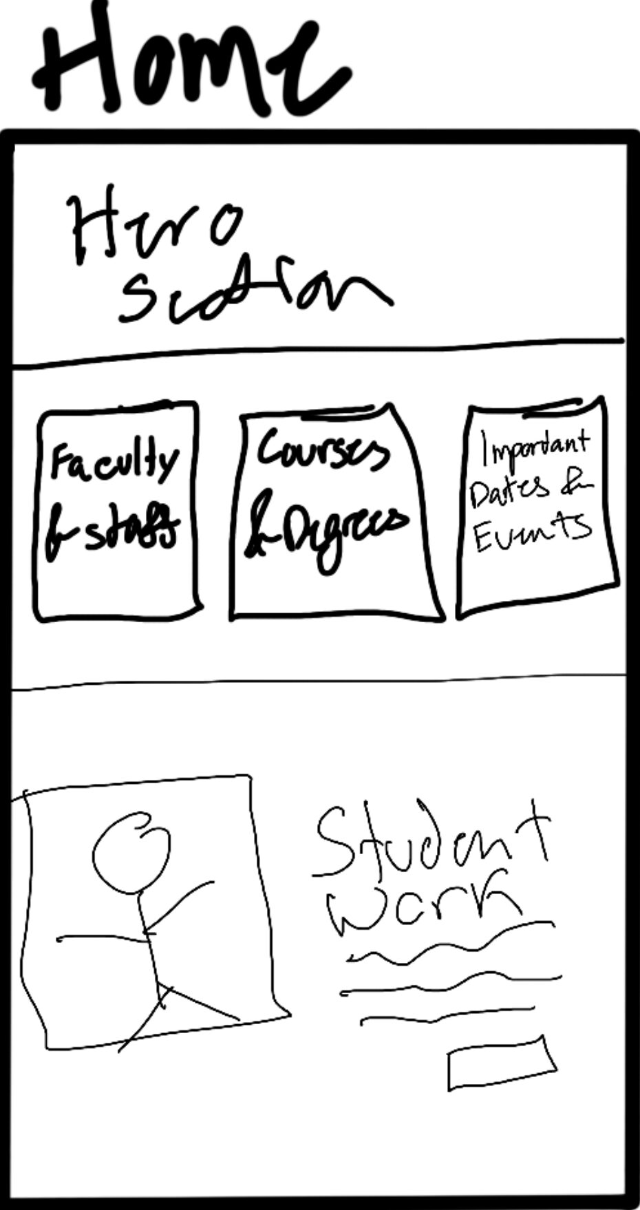
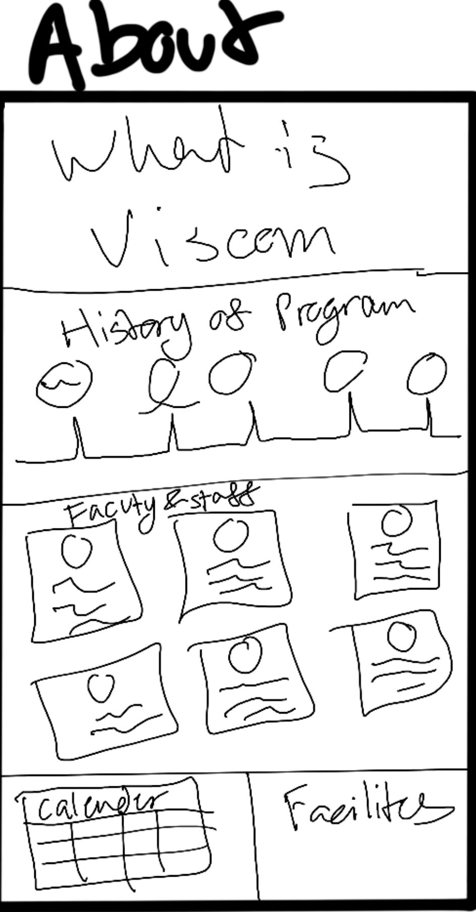
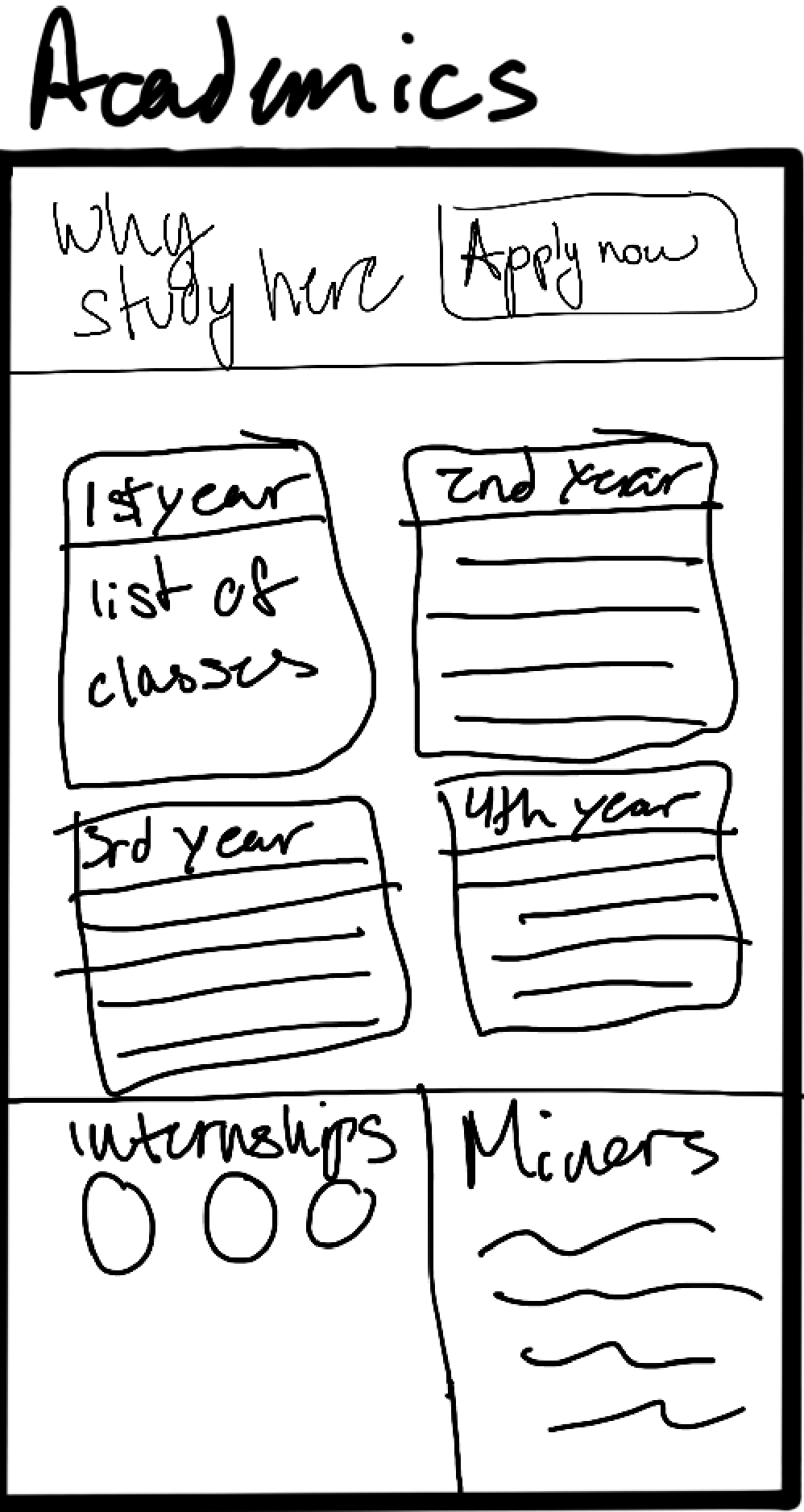
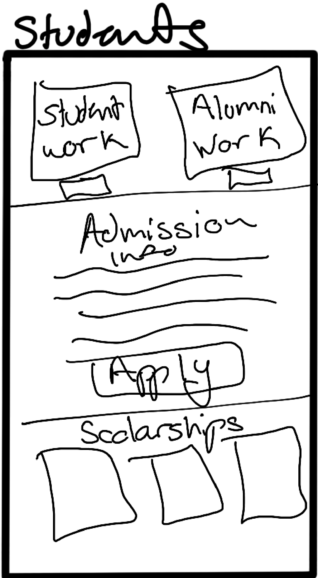
These are the initial exploration of the UI designs through sketches
Lo-fi Prototype
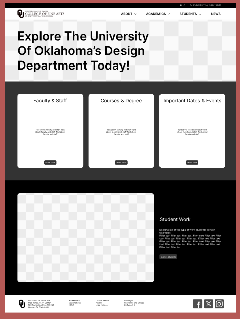
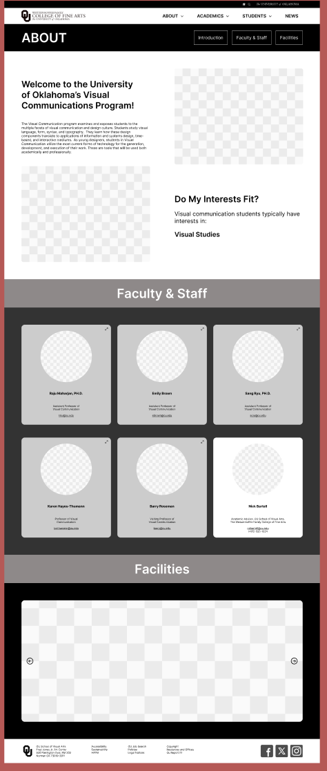
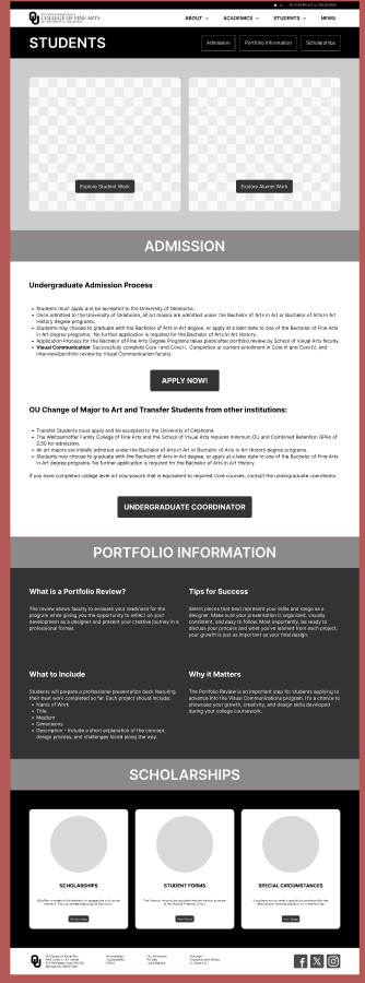
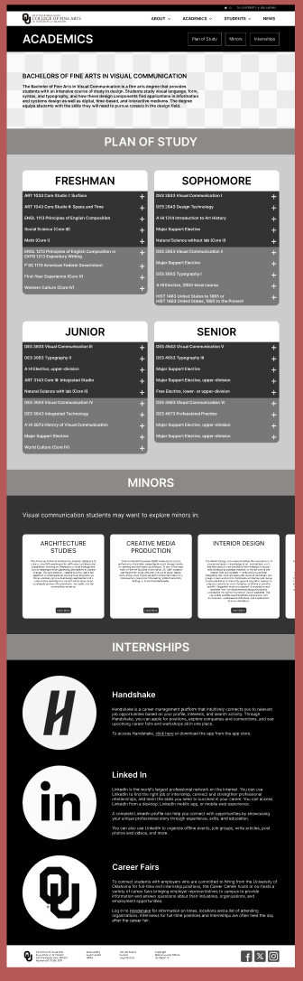
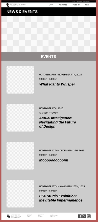
I developed following wireframes based on the sketches by using the 3 established categories as a base. I strayed from the site map and sketches when the information did not fit the category and added a few pages to make sure no page was too long.
Test: Think Aloud
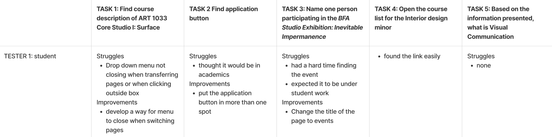
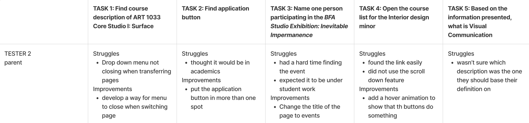
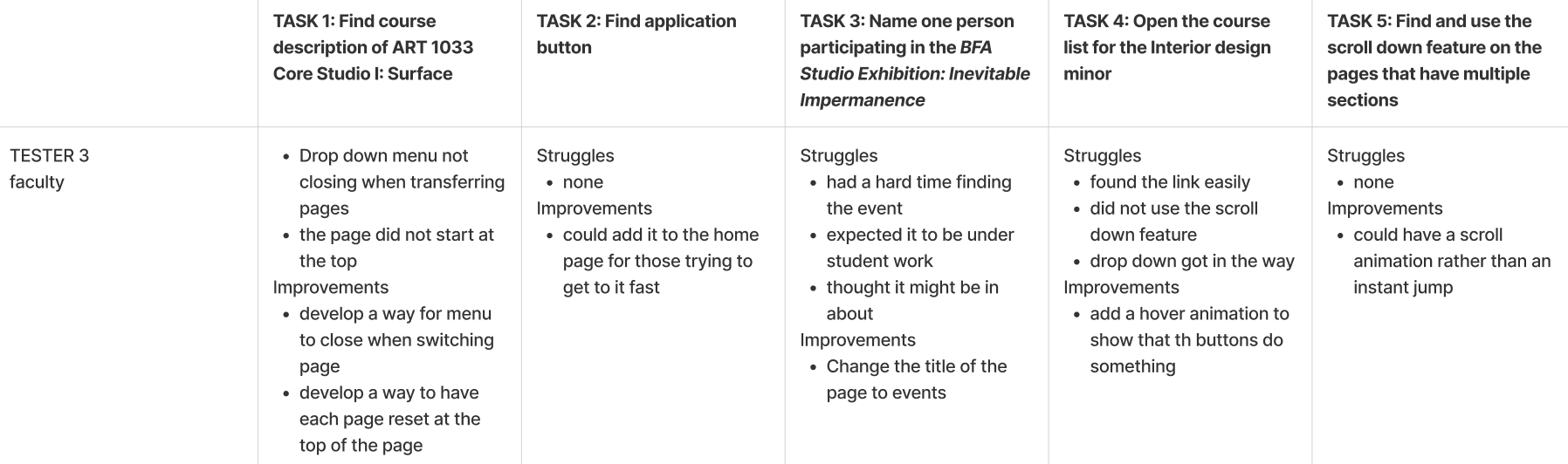
I used the Think Aloud method to evaluate the usability of the website. From this evaluation process I learned that clear titles are necessary for smooth navigation , people assume certain pop-ups will close on their own, and not everything is intuitive. These findings help us to improve our designs in terms of revising labels, finding a way to have dropdowns close automatically, and I should make sure all buttons have a hover animation. The main takeaway i gathered from testig in that in need to make sure everything in the website is clear on what it is for and how users can interact with it.
High-Fi Prototype
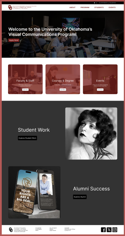
The wireframes were then further developed into interactive prototype. My initial stage of development did not change much other than adding the relevant information and colors. However, I was able to refine them a lot thanks to the testing and feedback I received.
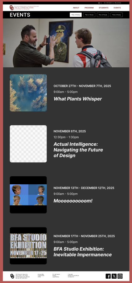
Test: A/B
I used A/B Testing method to evaluate the usability of specific elements in the Hi-fi Prototype. The goal of this test was to see which element fit the websites overall design as well as user preferences. For each test, I documented which element more clearly communicated the necessary information and which users found easier to navigate.
Test 1: Hero section
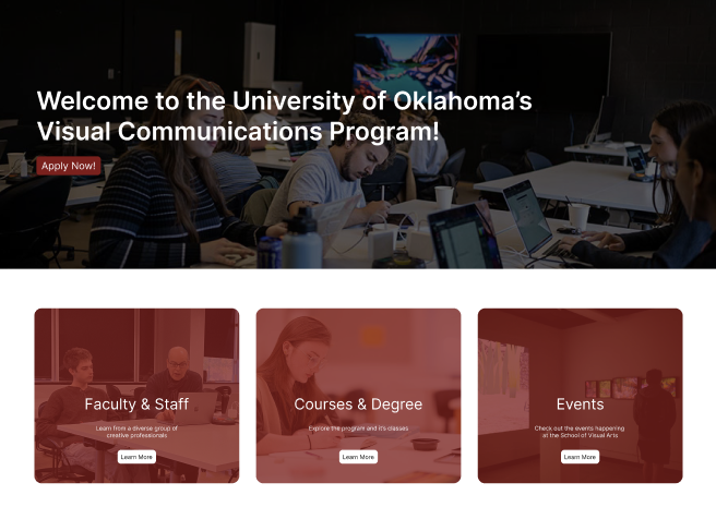
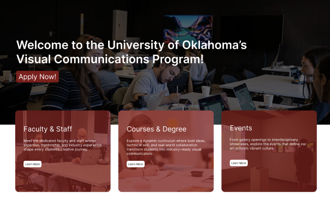
The goal of this hero section was to communicate what the program is like simply and clearly. Both options have the same elements but B offers a different layout than A.
All the testers preferred B because it offered a connection between the hero statement and the cards that A does not. They also liked the larger button as it was easier to read.
Ultimately, I chose B do to the tester feedback and the narrative it provided for my website.
A
B
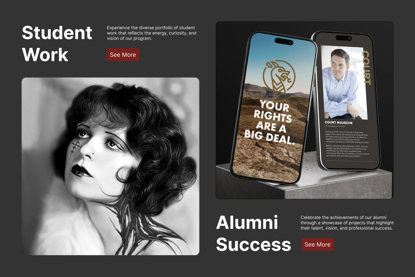
Test 2: Student and alumni section
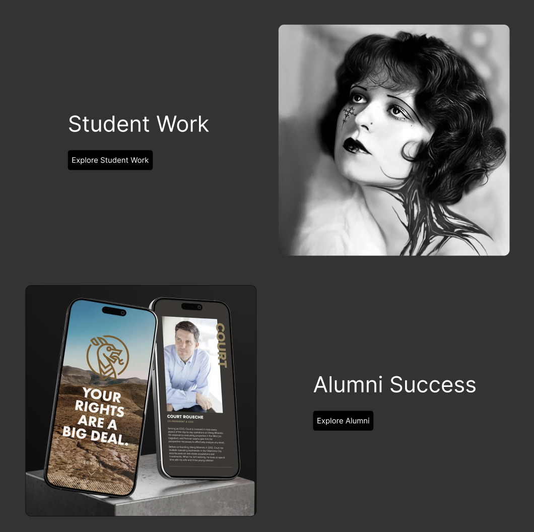
This second section of the home page was meant to engage users and convince them to check out the student and alumni work examples on another page. Both options provide rotating imagery of examples: A providing separate sections for the work while B connects them with overlap and descriptions.
All the testers chose B, stating that it is more visually engaging due to the text/photo interaction. They also preferred the red buttons as they were more eye catching and added color that was not present in the initial photos.
I agreed with the testers and chose B. B added a level of visual appeal that A did not and enhanced the home page narrative I was working on developing.
A
B
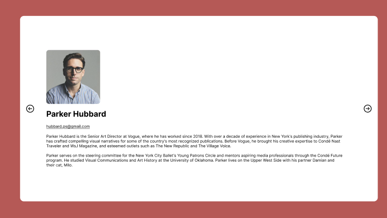
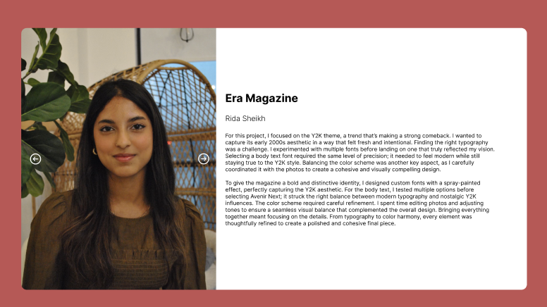
Test 3: Student work overlay
These elements were proposed as what would pop up when expanding specific student and alumni work card. They both feature arrows that allow users to click through different slides and information. A had full screen slides, with photos taking up the whole overlay with text only on one slide. B changes in that the text is constant while users can click through the pictures.
The testers reactions were mixed as some like the full screen photos more than the consistent text. All the testers agreed with the title being bold with the name secondary, however.
I ended up choosing B despite the different opinions of the testers. This is because option B allows viewers to read the information about the project while exploring the visuals of it. Having the text and pictures at the same time provides a layout that could accommodate a project that references specific sections of a project.
A
B
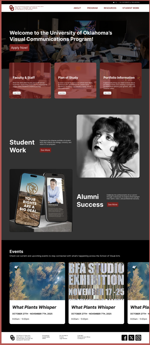
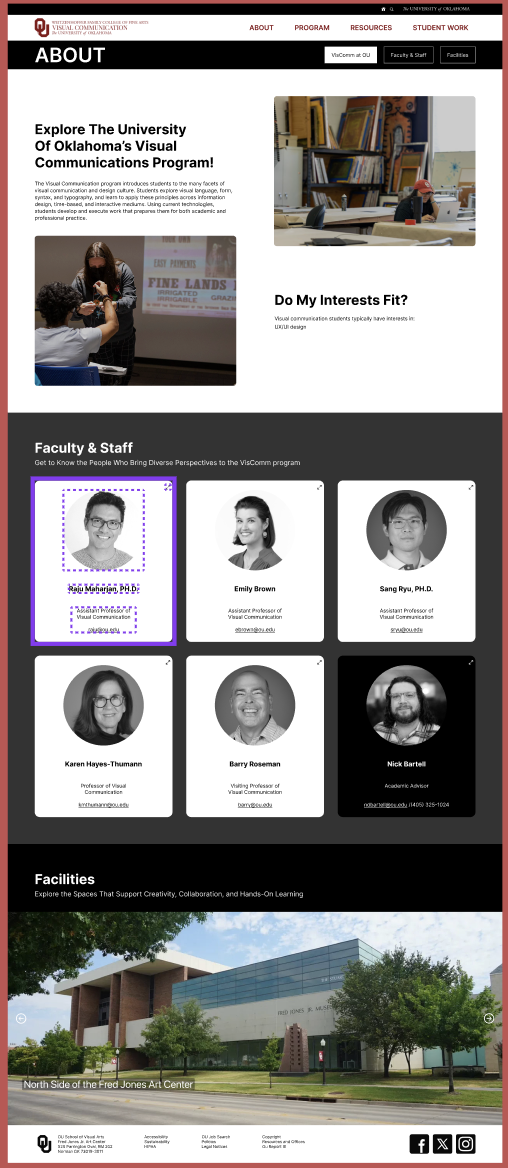
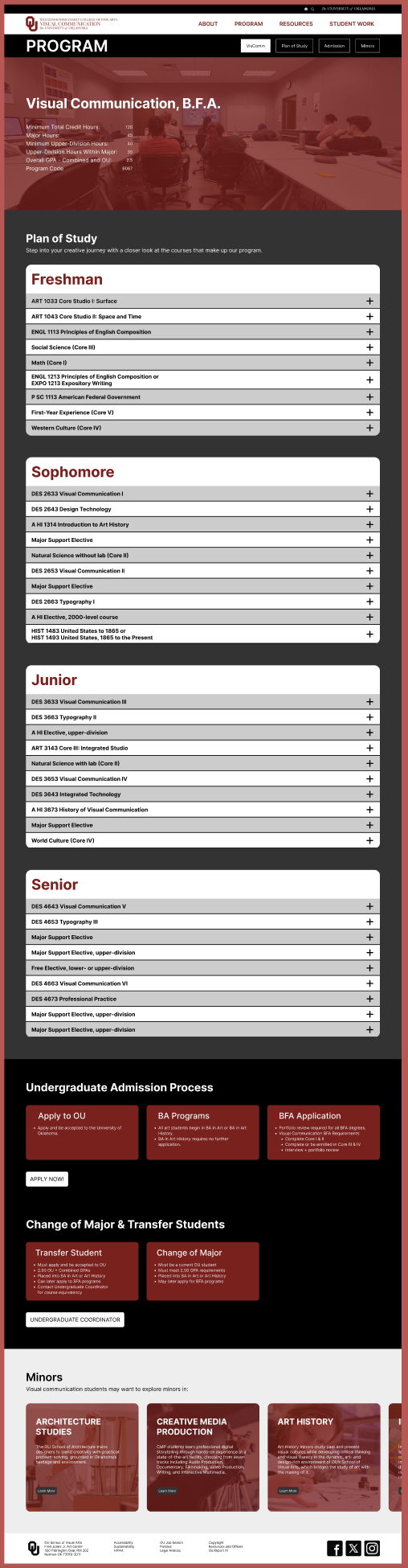
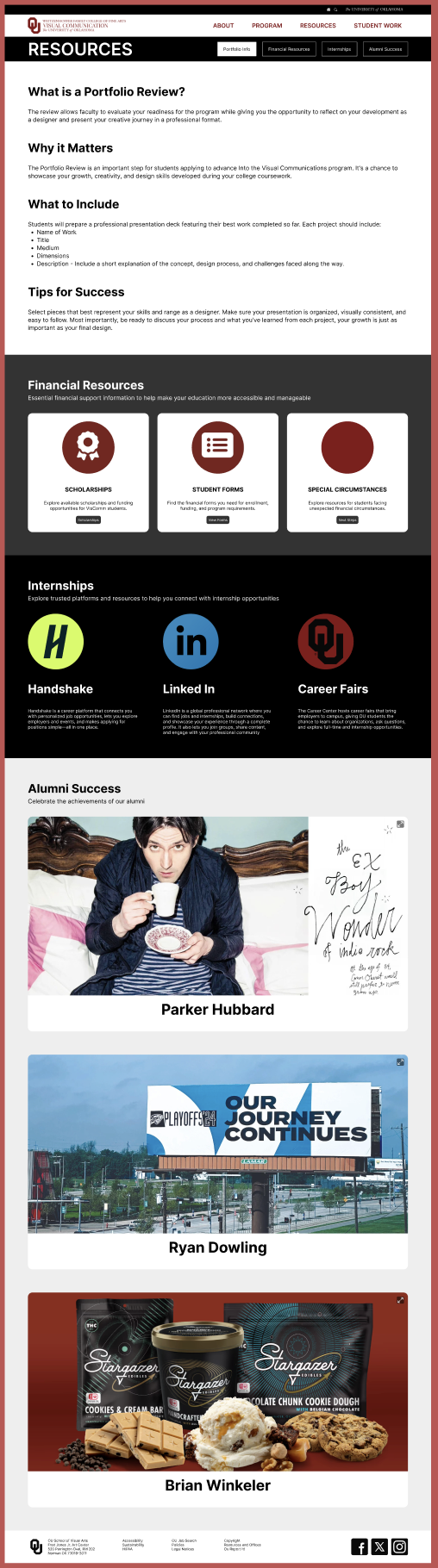
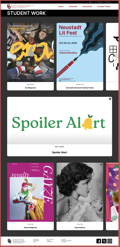
Final Prototype
After many iterations, I was able to fully develop my website into its final prototype, refining the design, improving usability, and incorporating feedback at every stage to create a polished, user-focused experience.
Conclusion
Designing a website for the Visual Communications program allowed me to combine research, visual storytelling, and user-centered design into a cohesive website. The project aimed to reflect the program’s creative identity while clearly communicating its curriculum, community, and resources for students. Each step above helped inform and progress the websites design.
Several things went well over the course of this project. Early research, like user interviews and competitive analysis,
helped clarify key priorities. Usability testing validated certain decisions and highlighted pain points, allowing me to further develop the design.
Challenges included balancing my desire to be creative, with usability and accessibility. There were many new things that
I had to learn in Figma, which added another layer of difficulty. If I approached the project again, I would conduct testing earlier and dedicate more time to the refining process.
This project strengthened my ability to take user centered research and create design solutions from that information. It
improved my confidence in creating interfaces and using Figma, as well teaching me that effective design is guided by user needs. Overall, this experience has helped me grow as a designer, teaching me to approach challenges thoughtfully,
prioritize clarity, and continuously test and refine ideas.
*Some website descriptions and content were generated with the assistance of AI tools to help with writing and explore phrasing options. All final content was reviewed and edited by myself to ensure accuracy, clarity, and alignment with the program’s goals and the project assignment.