
Nudge
Smarter Scheduling for Real Life
Problem
College students and young adults rely on digital calendars to manage classes, work, and responsibilities, but most existing tools focus solely on productivity. These platforms rarely account for burnout, rest, or flexibility, requiring users to manually schedule personal time and adapt when plans change. The research around student well-being highlights high levels of stress and burnout, often caused by overwhelming schedules and a lack of balance. A scheduling tool that helps manage rest, spontaneity, and one’s workload could ease that pressure.
Target users: College students and young adults balancing school, work, and personal commitments.
Solution
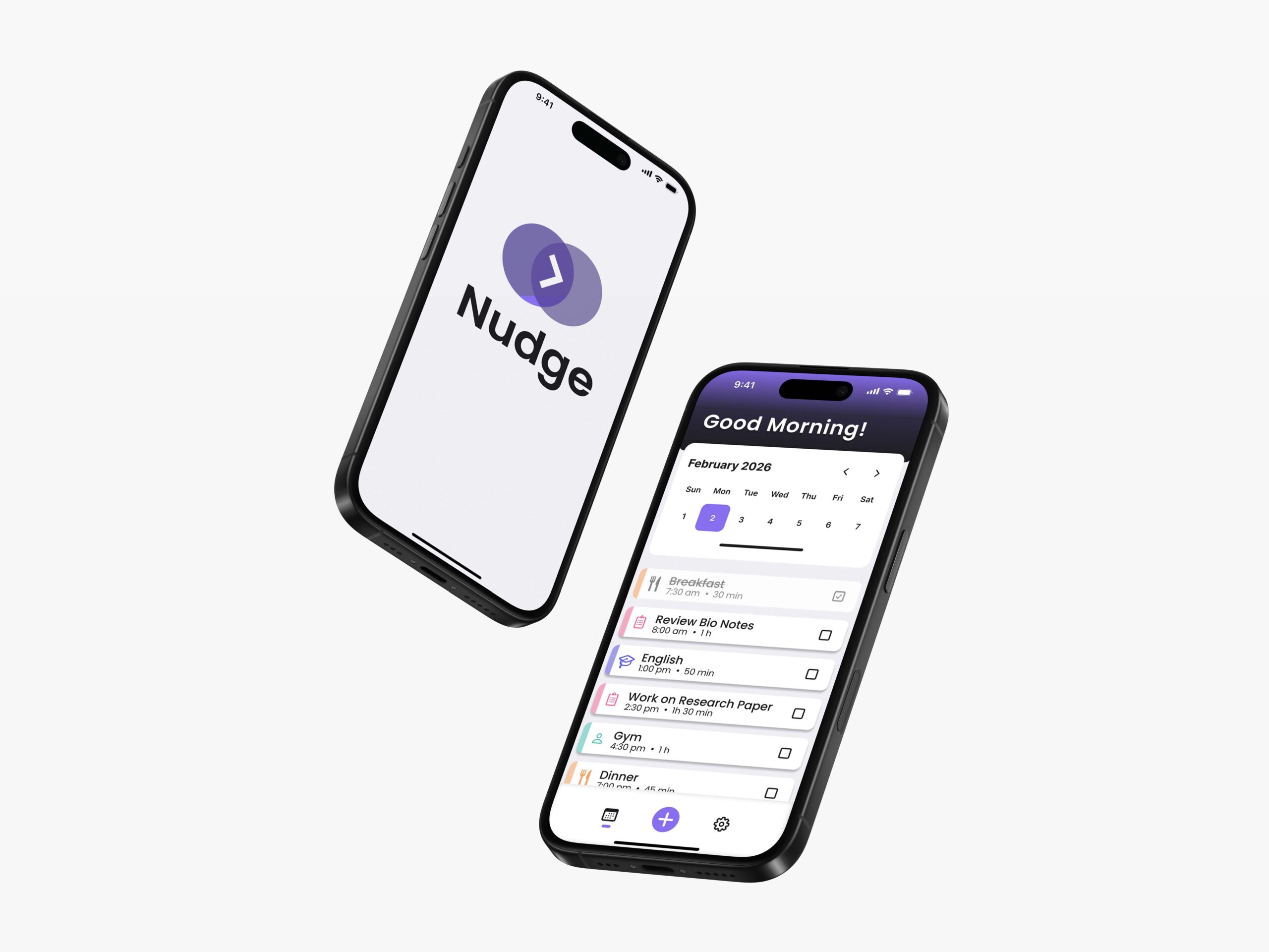
A personalized scheduling tool that helps manage rest, spontaneity, and one’s workload could ease that pressure. This project explores an AI-assisted scheduling tool designed to help users create balanced, personalized schedules around non-negotiable responsibilities like class and work. The AI assistant helps prioritize personal goals, suggest rest, and adjust schedules when emergencies or spontaneous plans arise. Features include urgency labeling for tasks, flexible rescheduling options, and a clear daily overview paired with an optional AI chatbot. Unlike existing tools, this solution reframes productivity as sustainable balance rather than constant output.
Design Challenge Framing: We used a design challenge worksheet to develop a frame work for our problem.
Empathize
In the empathize stage, my team and I focused on understanding how students currently manage their time and what challenges they face when using scheduling tools. Rather than jumping straight into solutions, we wanted to uncover patterns in behavior, frustration, and emotional response. Our goal was to learn how users prioritize tasks, what makes them feel overwhelmed, and where current tools fall short. This stage helped us build a strong foundation before defining any design direction.
Interviews
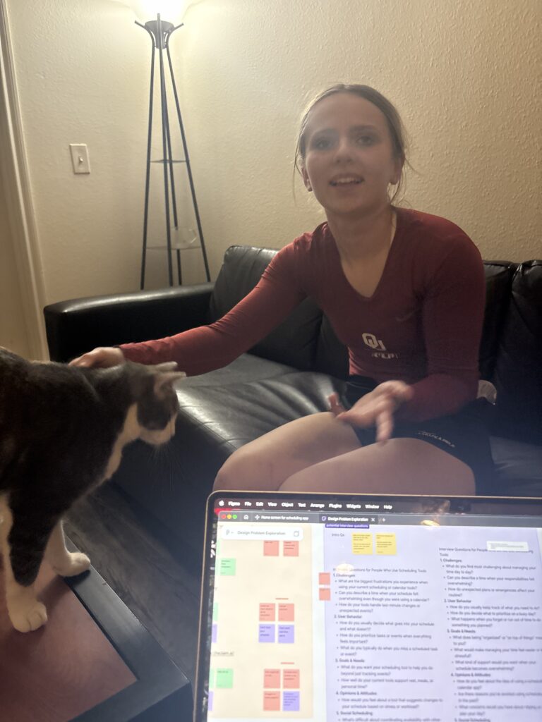
Our team interviewed nine participants, all of whom were college students balancing academic responsibilities, and in many cases work or extracurricular activities. Some participants worked part-time jobs, held leadership positions in organizations, or had heavy course loads. Several mentioned challenges such as procrastination, fatigue, or difficulty prioritizing tasks. Most relied on tools such as Google Calendar, Outlook, Apple Calendar, Canvas, or Google Sheets to manage responsibilities, though usage and consistency varied greatly.

Empathy Maps
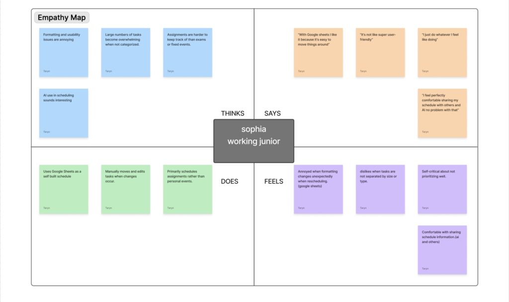
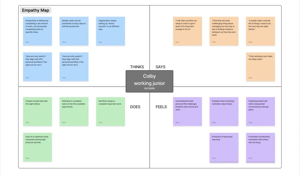
After completing our interviews, we created empathy maps to better visualize what users say, think, feel, and do. This helped us recognize patterns in frustration, avoidance, overwhelm, and reliance on manual systems. While many users want structure and clarity, their behaviors often reflect procrastination or inconsistency, revealing a gap between how they plan their time and how they actually manage it.
Thematic Analysis
Through analyzing our interviews, we noticed several patterns that appeared across different participants. Many students expressed wanting more structure, but also did not want a tool that felt too controlling or automated. A common frustration was feeling overwhelmed when tasks were not clearly organized or visually separated. Another major insight was that most tools focus only on productivity, while neglecting rest, meals, and balance. Overall, users need clarity and flexibility at the same time.
Define
In the define stage, we synthesized our research to clarify core problems and user needs. Our findings showed that while students rely heavily on digital calendars, these tools often fail to support balance, flexibility, and rest. Using a persona and user journey map, we identified key moments of stress and friction. We also completed an AI and user needs worksheet, assessing evidence of user need, determining whether AI added meaningful value, and mapping specific user needs to clear data requirements to inform our solution.
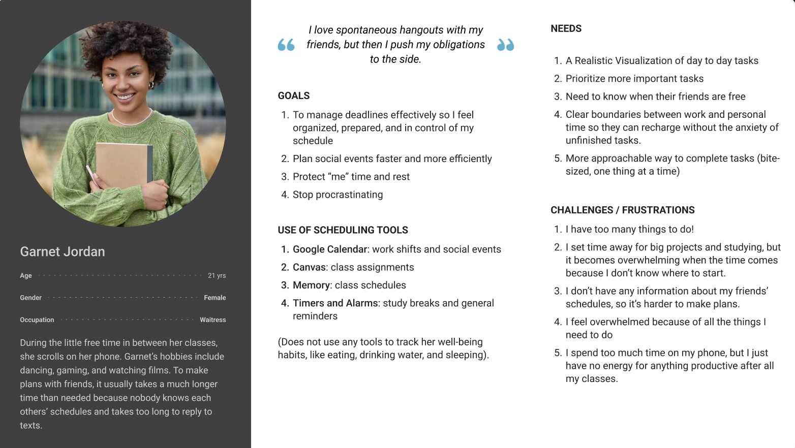
Persona
To create our persona, we looked at patterns we noticed across our interviews and research. We looked at common frustrations, behaviors, and emotional responses, then connected those to users’ goals. Rather than designing for a broad audience, we focused on one representative student whose needs, motivations, and challenges reflected what we consistently observed. This persona helped keep our decisions user-centered and intentional.
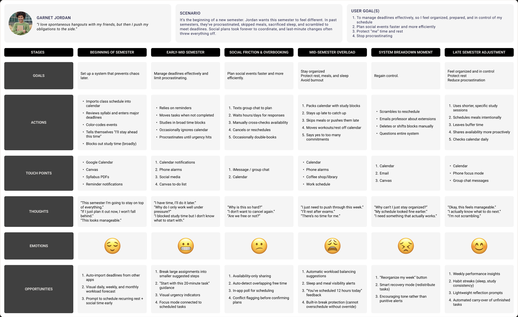
User Journey Map
Using our persona as a basis, we created a user journey map to visualize how a student would move through a semester while trying to manage responsibilities, rest, and personal time. Mapping out each step helped us see where stress builds, where tools fall short, and where flexibility is needed most. This process allowed us to identify specific moments of friction and find opportunities to better support our potential users.
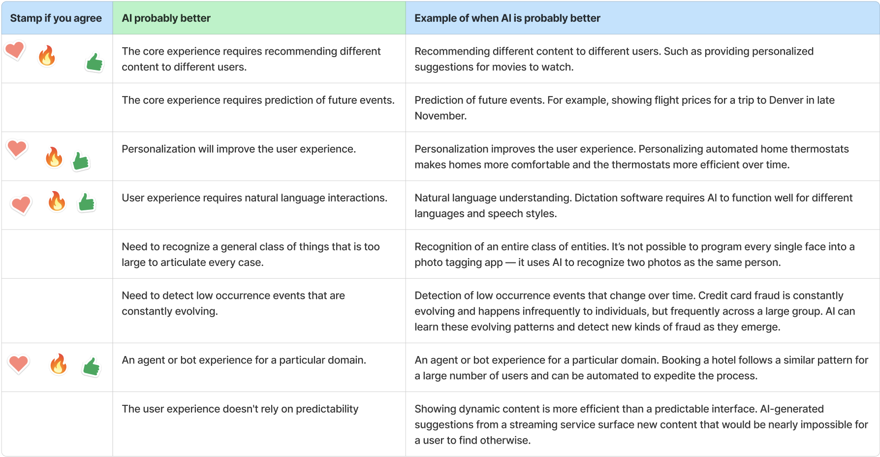
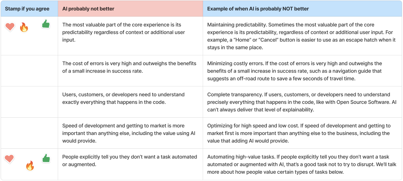
User/AI Need
To ensure we were solving a meaningful problem, we completed a worksheet evaluating our user needs and whether AI was truly necessary. We identified key needs around burnout, rest, and social scheduling, then assessed where AI could add value and where it might fall short. Finally, we mapped user needs to specific data requirements, clarifying what the system would need to provide thoughtful, personalized support.
Ideate
In the ideate stage, my team explored potential solutions based on the problems and opportunities identified during the define stage. Using a creative matrix, we generated a wide range of possible features and approaches to support balanced scheduling. I then developed a storyboard to visualize how a student might interact with the tool in a real life scenario. Finally, I created a user flow diagram to map the structure of the system and how users would move through 3 key tasks.
Creative Matrix
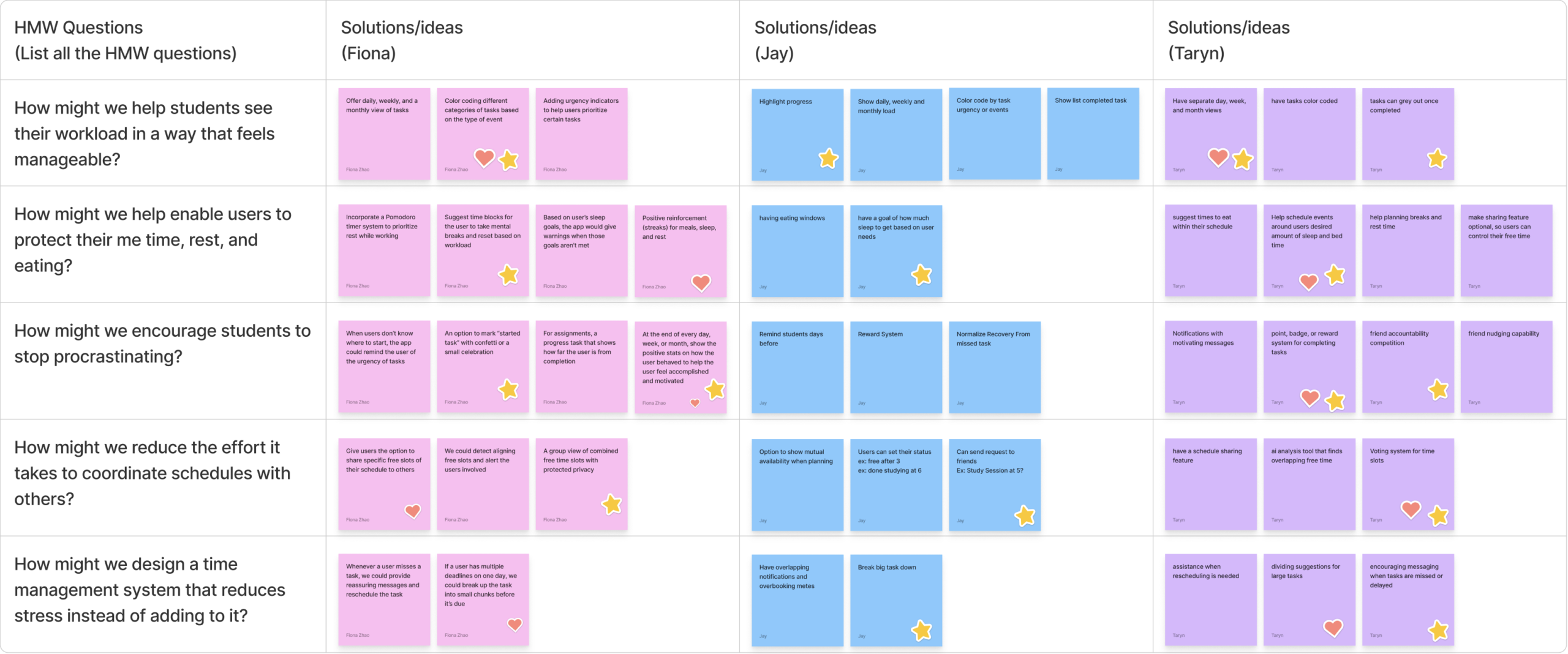
To explore potential solutions, our team created a creative matrix based on the design opportunities identified in the Define stage. We developed several “How Might We” questions focused on helping students manage workload, protect rest, reduce procrastination, coordinate schedules, and lower stress. These questions encouraged us to think broadly and generate multiple ideas before narrowing down potential directions.
One idea that we developed was priority-based rescheduling when tasks are missed or when a user’s workload becomes too high. Instead of manually reorganizing their calendar, the system could suggest a rebalanced schedule by prioritizing urgent tasks and moving lower priority tasks to later time slots.
HAX Guidlines
Using a HAX Guidelines worksheet, we focused on principles such as making clear what the system can do, explaining how suggestions are generated, and allowing easy dismissal of AI actions. For the priority-based rescheduling feature, the system would explain that schedule adjustments are based on factors like deadlines, task priority, and existing commitments. Users would always be able to accept, reject, or modify suggestions, ensuring the AI supports decision making while maintaining transparency and user control.
Storyboard
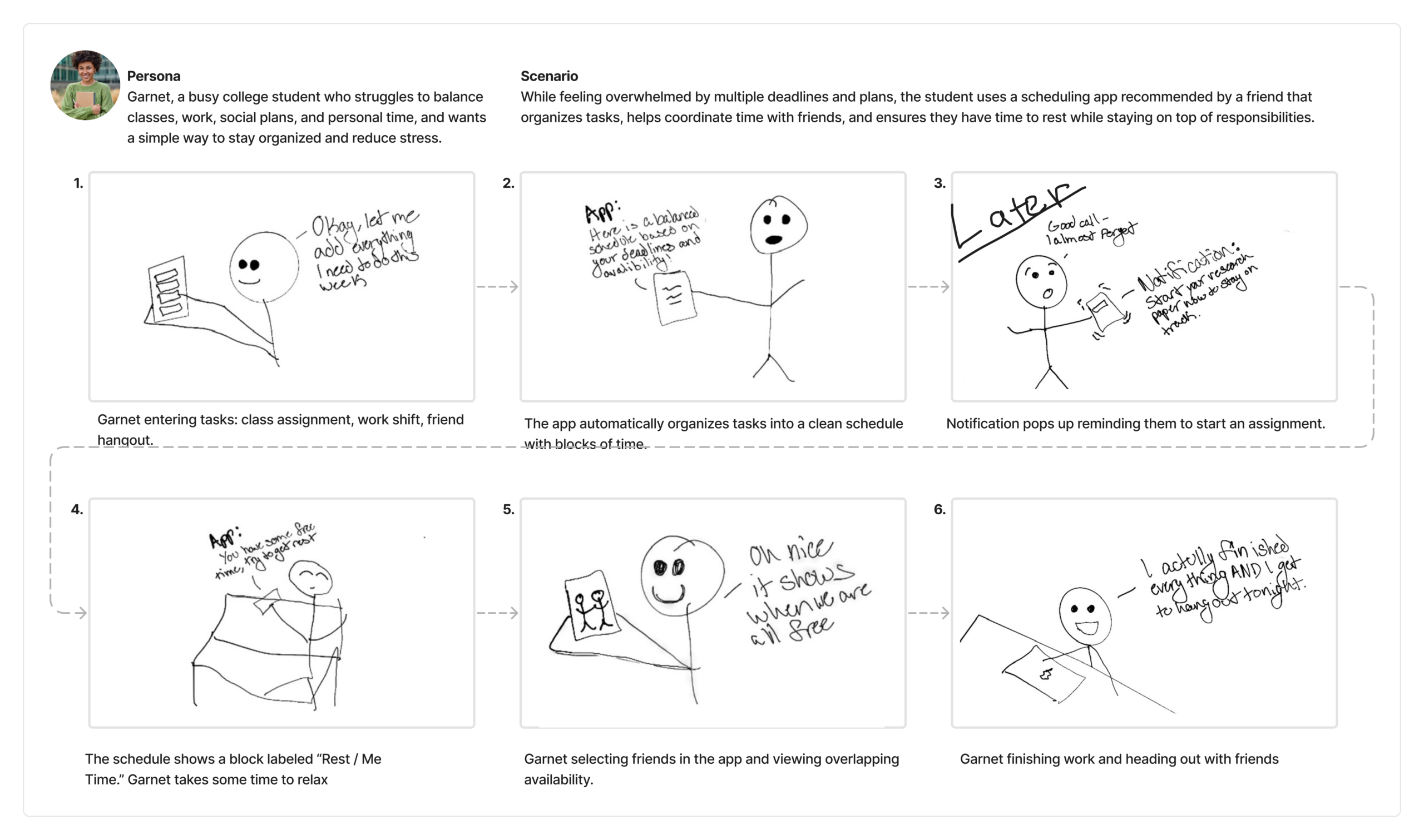
Creating a storyboard helped me visualize how our proposed solution would fit into a student’s everyday life. By mapping a realistic scenario step-by-step, I was able to explore how users might interact with the system and how different features work together to support their goals. This process helped me evaluate whether the solution could meaningfully address the problem of overwhelming and unbalanced schedules.
User Flow Diagram
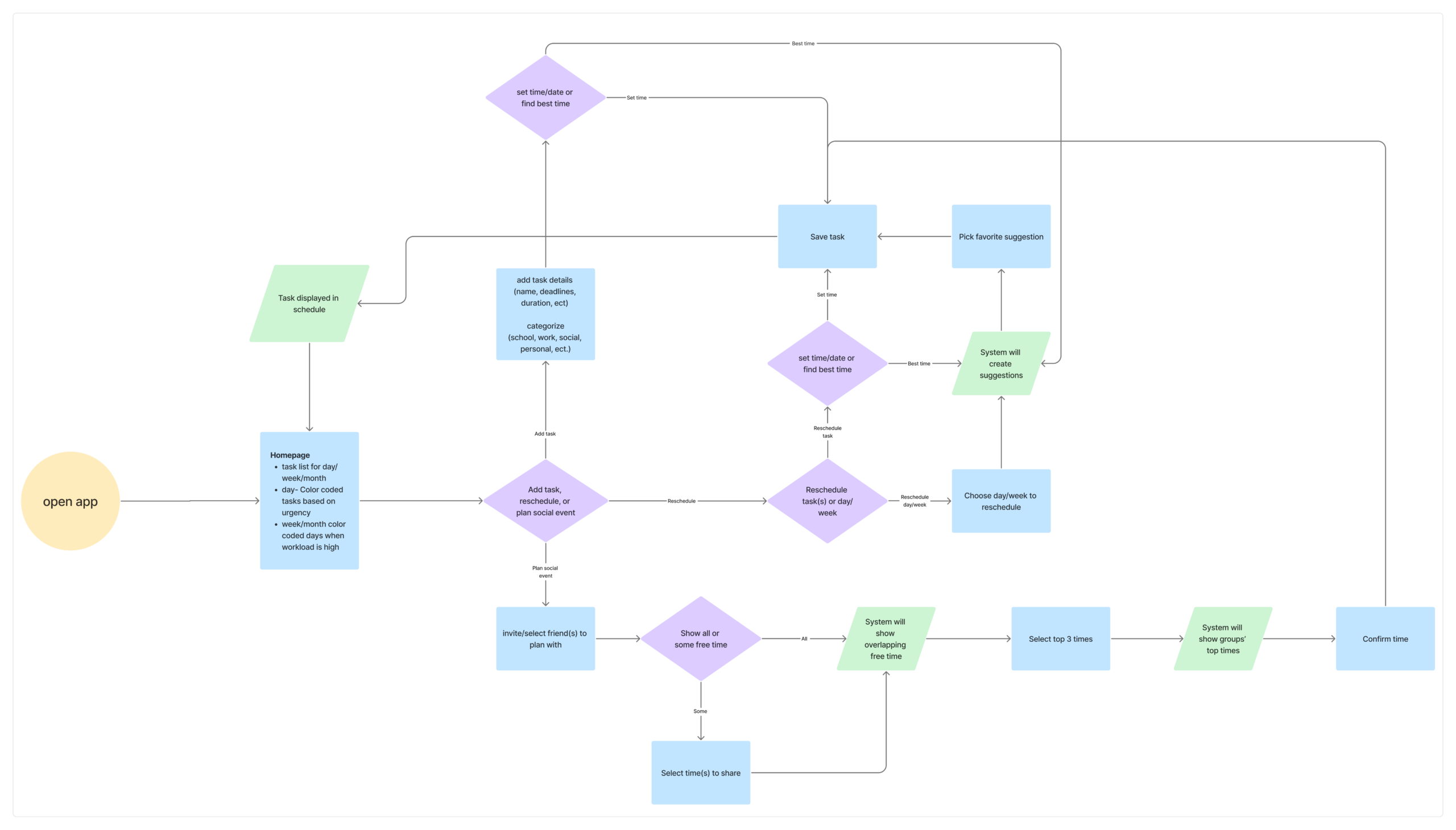
Based on the features proposed in the creative matrix,I developed a user flow diagram to map how a student would move through the app while completing common actions including, adding tasks, rescheduling responsibilities, and planning social events. Mapping each step helped clarify how users would interact with the system and where automated suggestions could reduce effort. This process helped ensure the flow will supports users’ goals of staying organized, adapting when plans change, and coordinating time with others more efficiently.
Lo-Fi Prototype
& Test
In the Prototype Lo-Fi & Test stage, I created paper prototypes to visualize and test 3 core features without investing having to invest time into creating wire frame designs. These prototypes allowed me to explore layout, interactions, and overall usability early on. I conducted cognitive walkthroughs to evaluate how users would navigate the system step-by-step. This process helped me identify usability issues and ensure the design aligned with expectations before moving forward.
Paper Prototype
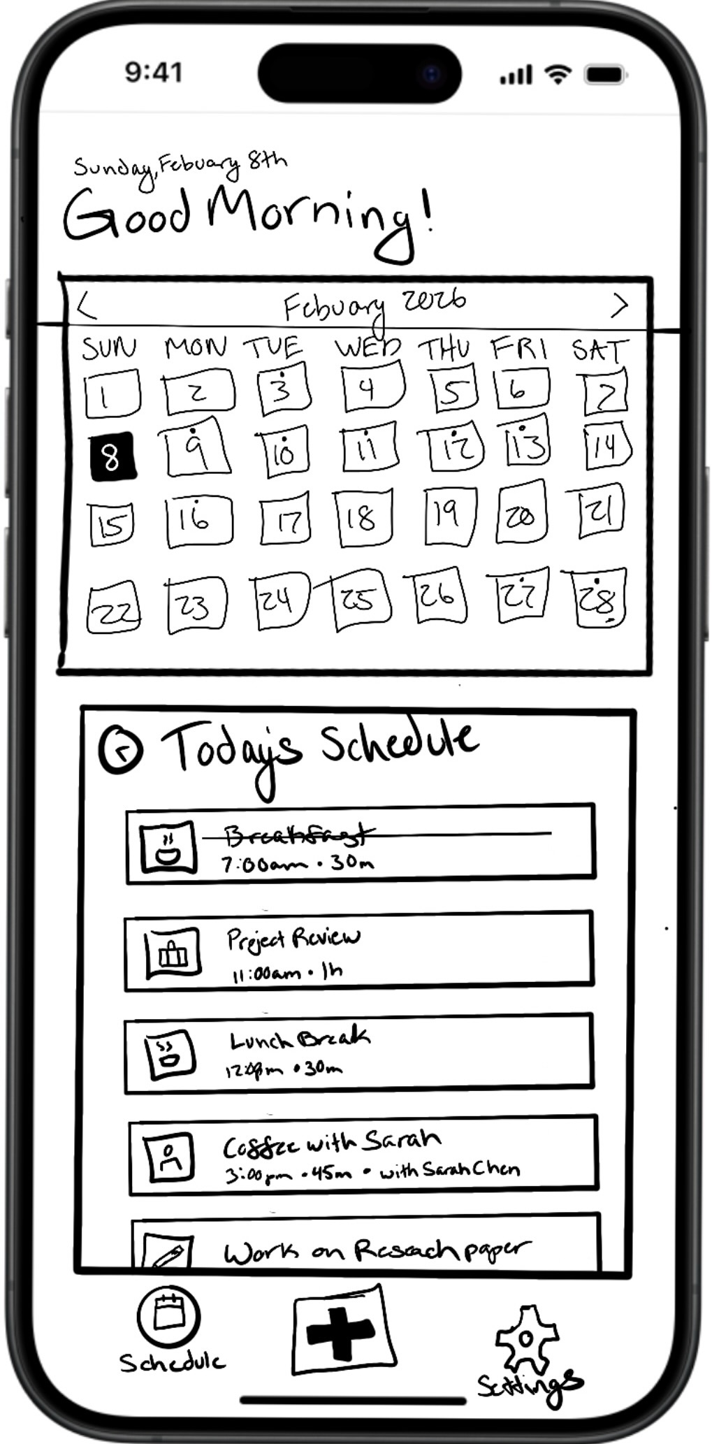
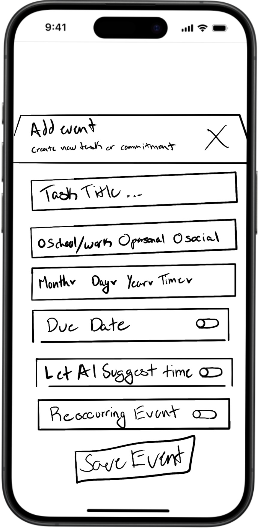
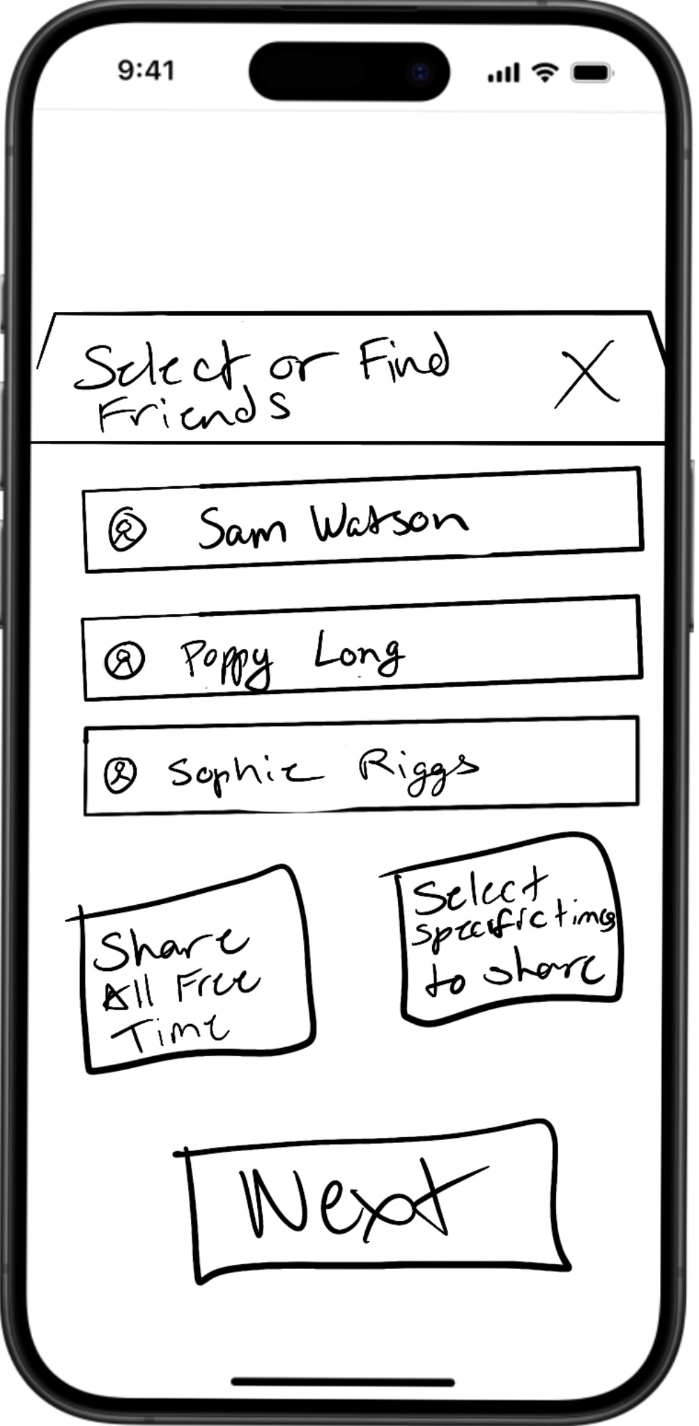
The paper prototypes focused on adding events, rescheduling tasks, and planning a social event with friends. These sketches allowed me to quickly test how users interacted with the system, helping ensure the flow felt intuitive and supported the my apps goals.
Cognitive Walkthrough
The purpose of testing was to evaluate how intuitive our core features were before moving to high-fidelity designs. I focused on adding events, rescheduling events, and planning social schedules for these tests. Cognitive walkthroughs were conducted by having participants complete tasks using paper prototypes while explaining their thought process. A key issue was that users found it unclear how to reschedule a specific event due to the lack of a clear button. Moving forward, I plan to improve clarity by adding more obvious actions and better visual cues.
Hi-Fi Prototype, Test & Iterate
In the final stages of the design process, I transitioned from low-fidelity prototypes to a high-fidelity interactive design, tested the experience through heuristic evaluation, and refined the product based on feedback. This process focused on improving usability, strengthening AI interactions, and ensuring the solution effectively addressed student burnout and scheduling challenges. Each iteration helped move the design from a conceptual idea to a more realistic, user-centered product.
Hi-Fi Prototype V.1
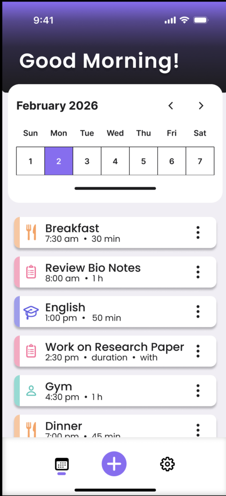
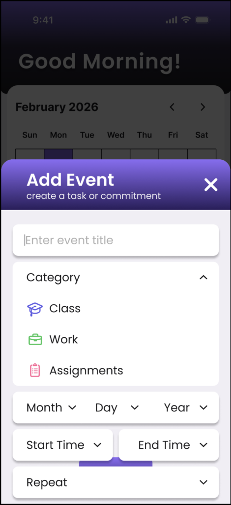
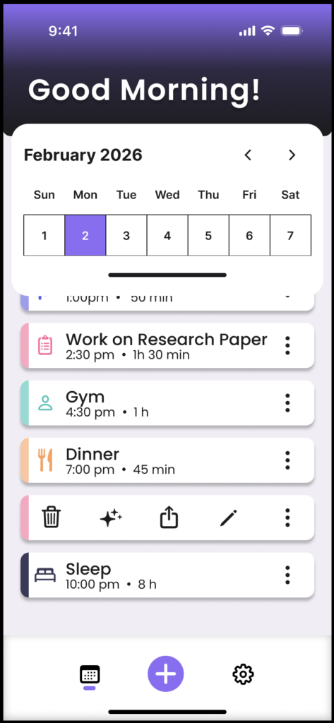
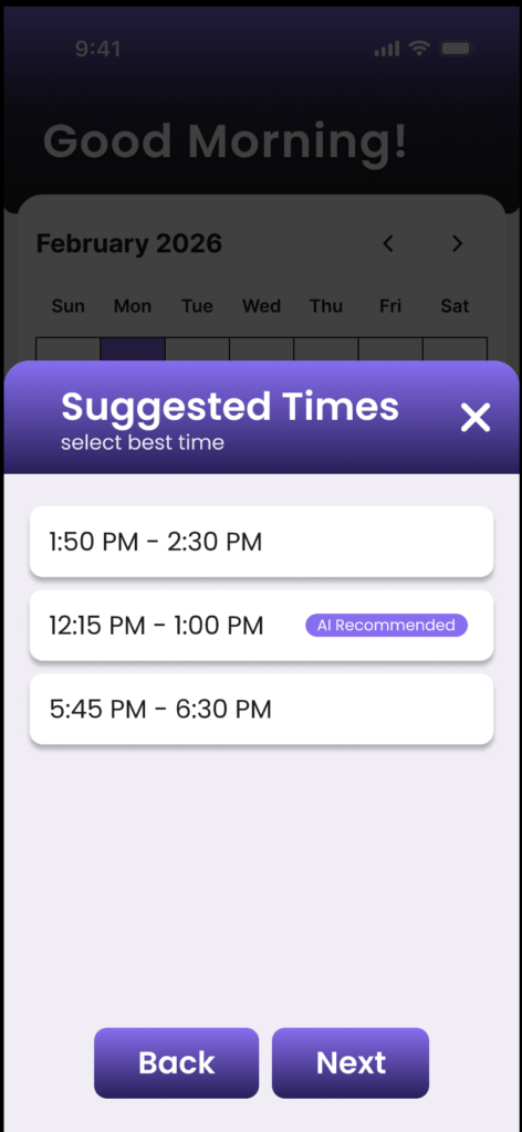
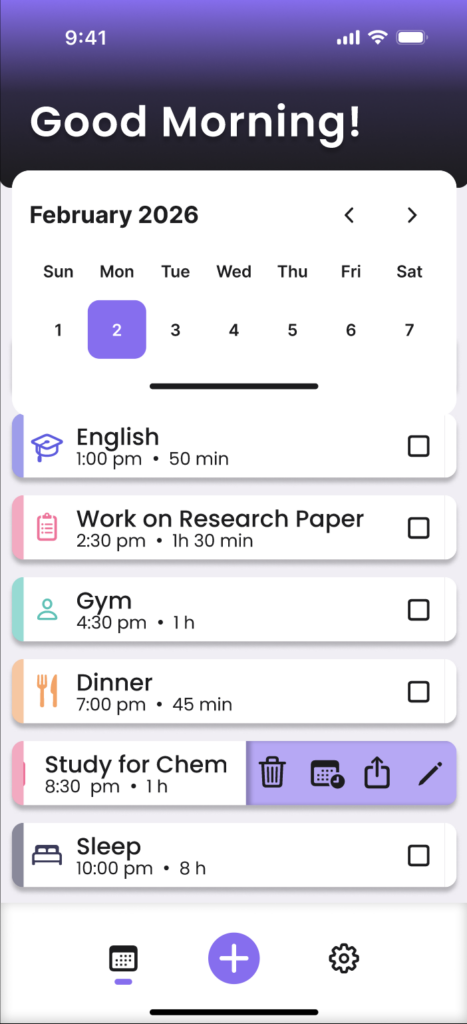
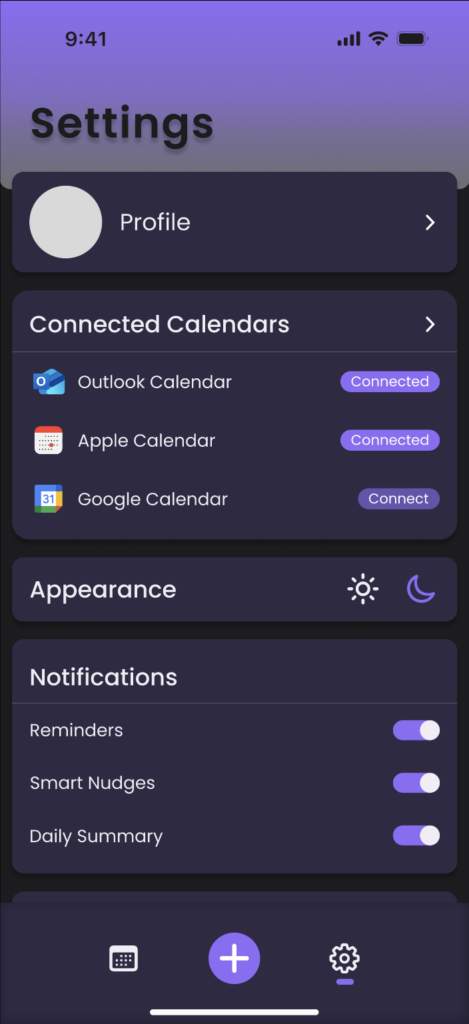
The lo-fi prototypes were transformed into a h-fi design in Figma by refining interactions based on testing insights. Feedback from cognitive walkthroughs helped improve clarity, especially around actions like rescheduling. Atomic Design principles were used to create consistent components, while Usability Heuristics guided clearer navigation and feedback. AIX guidelines were also considered to ensure AI suggestions were transparent and easy to understand and control.
Heuristic Evaluation
Peer evaluation of the initial hi-fi prototype revealed several usability issues related to navigation clarity, system feedback, and AI transparency. Users noted confusion around rescheduling interactions, unclear icons, inconsistent button behaviors, and difficulty understanding when AI suggestions were being applied. Feedback also highlighted issues with calendar interactions, edit functionality, and visibility of saved actions. I agreed with many of these concerns, especially around clearer communication and stronger system feedback. However, some suggestions were not implemented because they did not align with the core goals or scope of the project.
Hi-Fi Prototype V.2
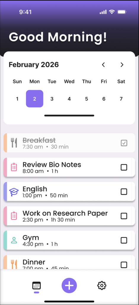
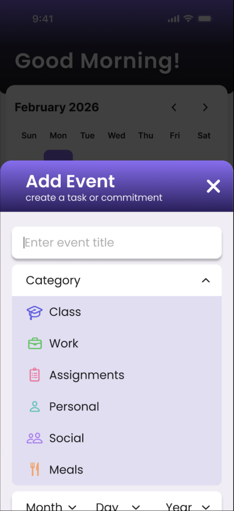
Based on the heuristic evaluation feedback, the prototype was refined to improve clarity, consistency, and usability. Updates included clearer rescheduling interactions, improved calendar navigation, stronger visual feedback for saved actions, and more consistent button behavior across screens. AI-generated scheduling suggestions were also made more visible to improve transparency and user understanding. These changes helped create a more intuitive and user-controlled experience while better supporting flexible and balanced scheduling.