Spirit Airlines
A conceptual rebrand exploring a more cohesive, modern, and expressive identity for a new generation of travelers.
Goal
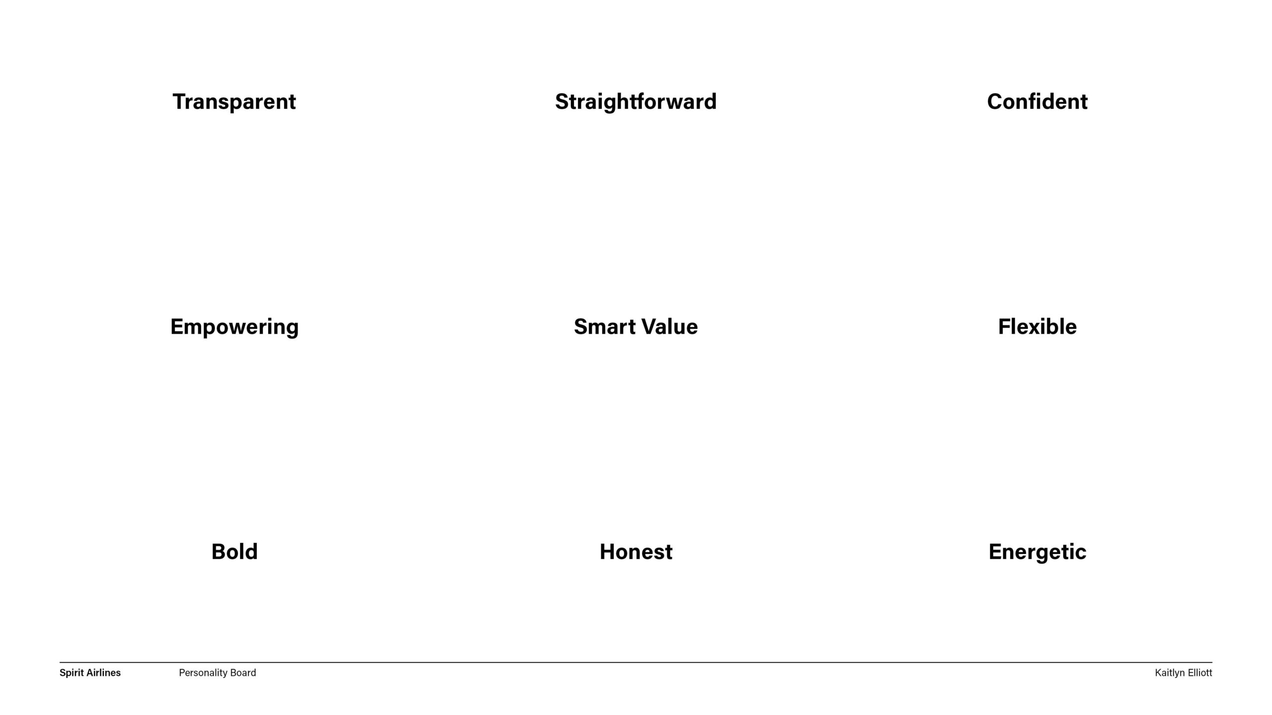
Spirit Airlines is widely recognized for its low fares, but often associated with a minimal and inconsistent travel experience. I saw this as an opportunity to shift that perception, reimagining the brand to feel both bold and trustworthy, while better communicating value and transparency. My goal was to create a cohesive identity system that elevates key touchpoints across the passenger journey, without losing Spirit’s core accessibility.
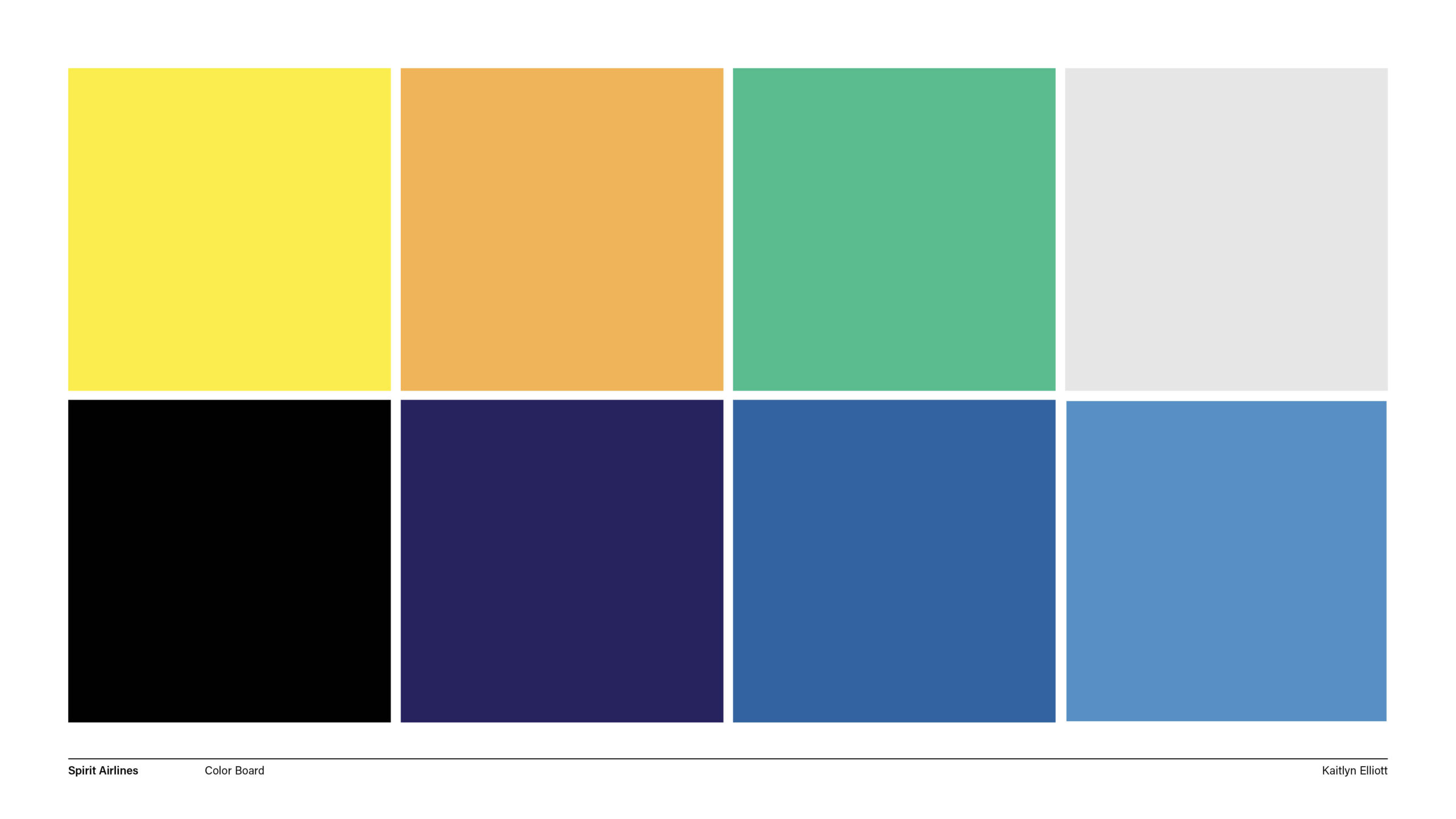
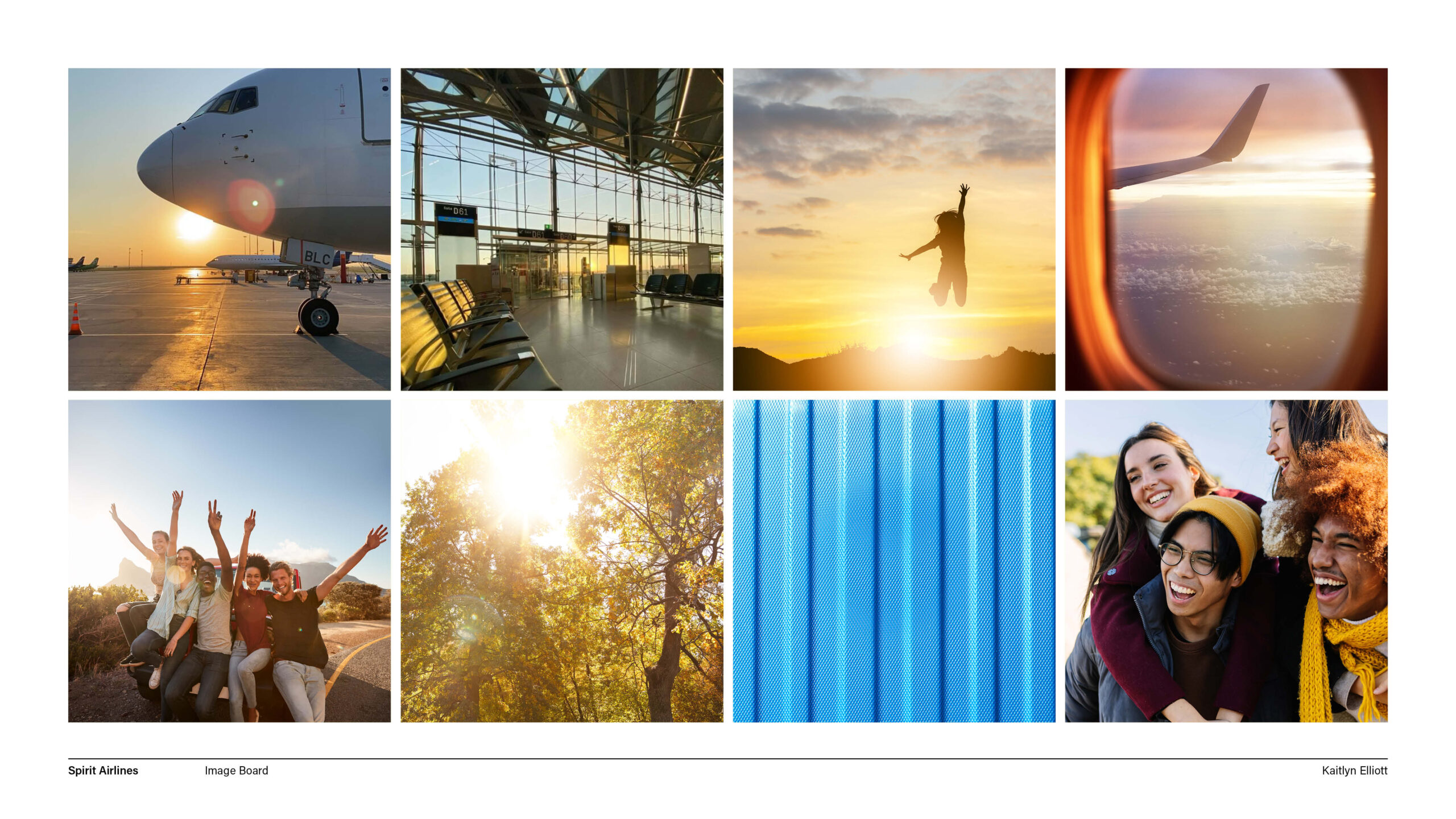
Initial Moodboards
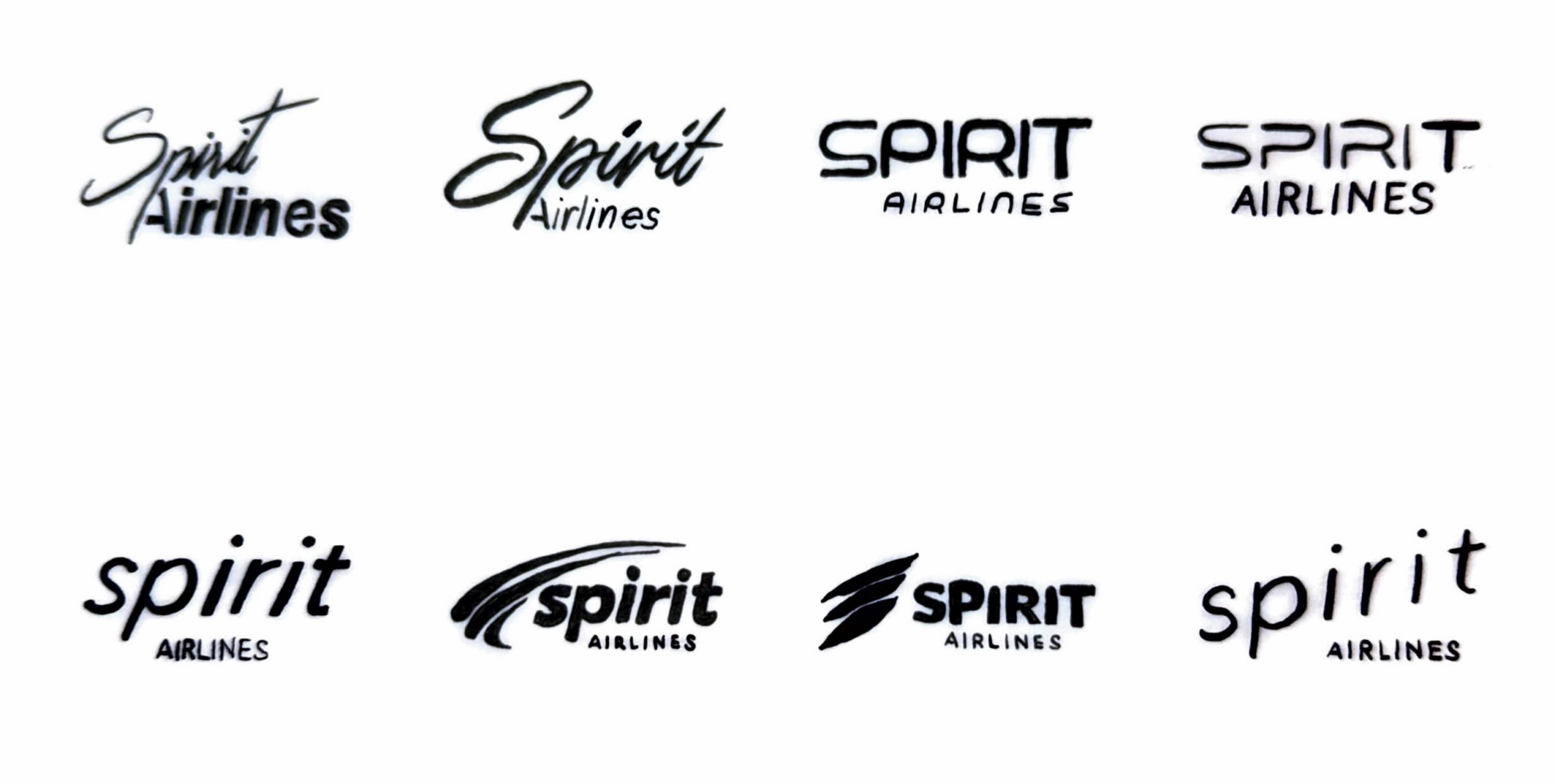
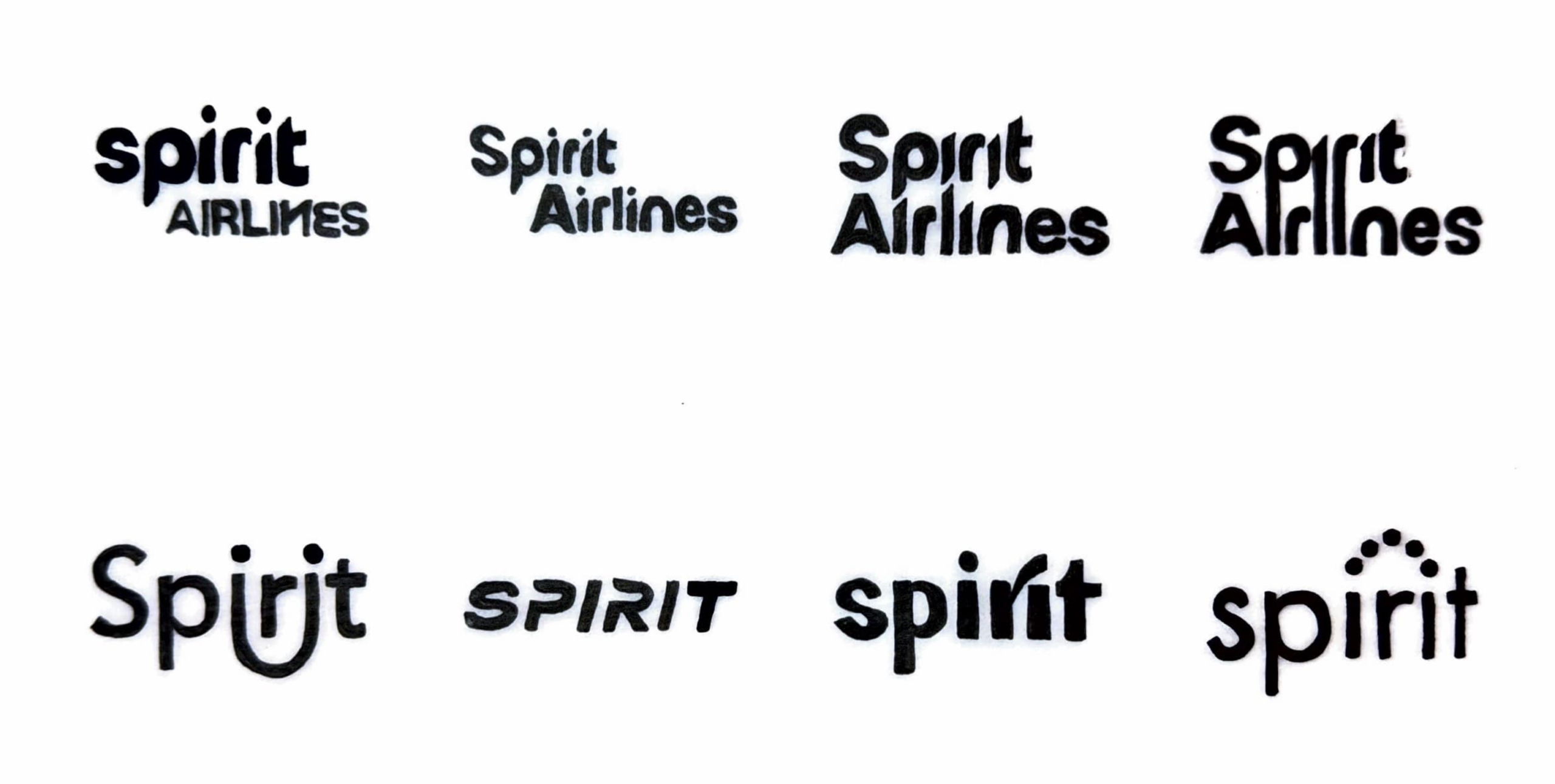
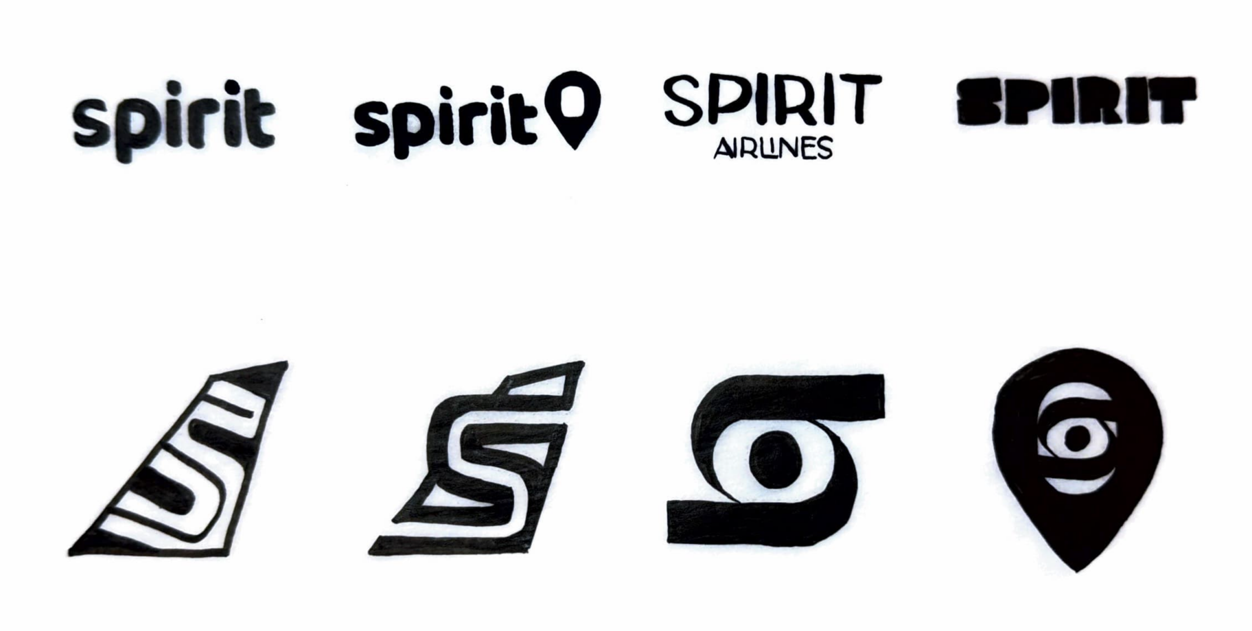
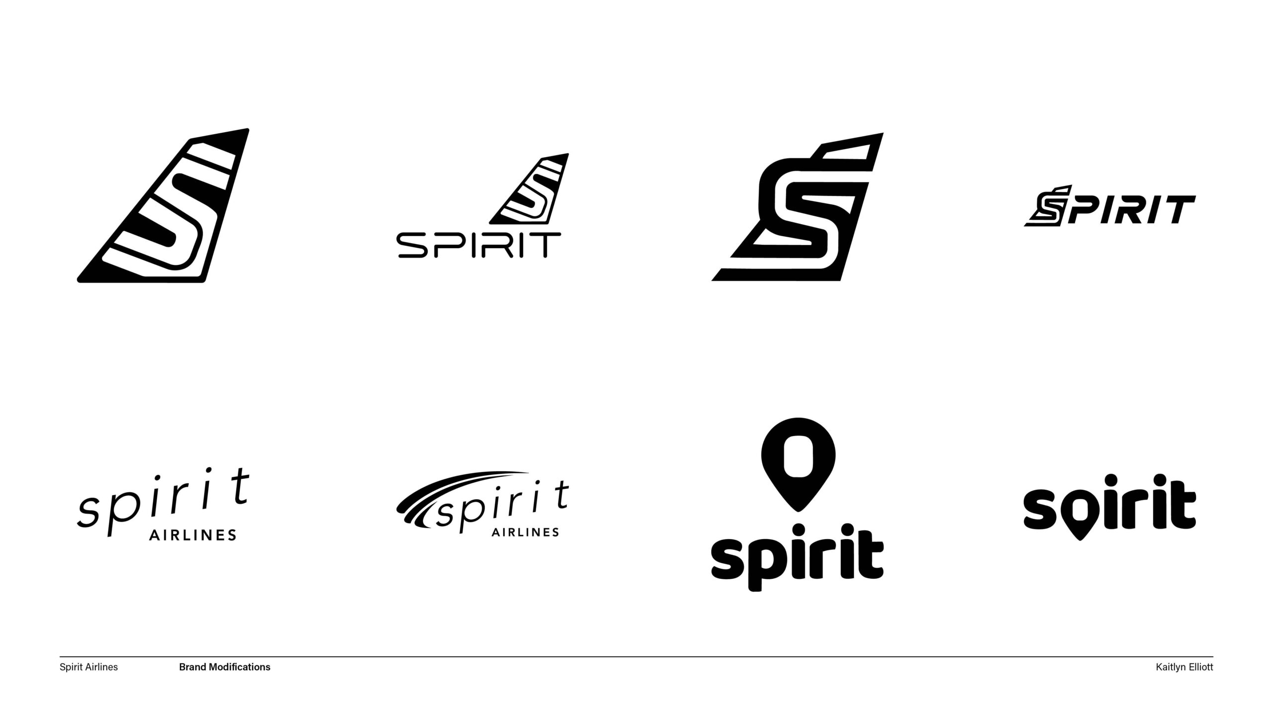
Sketches and Brand Modifications
I iterated through a wide range of typographic and symbolic directions, focusing on clarity, motion, and recognizability. These explorations helped refine a mark that could scale confidently across both digital and physical environments.
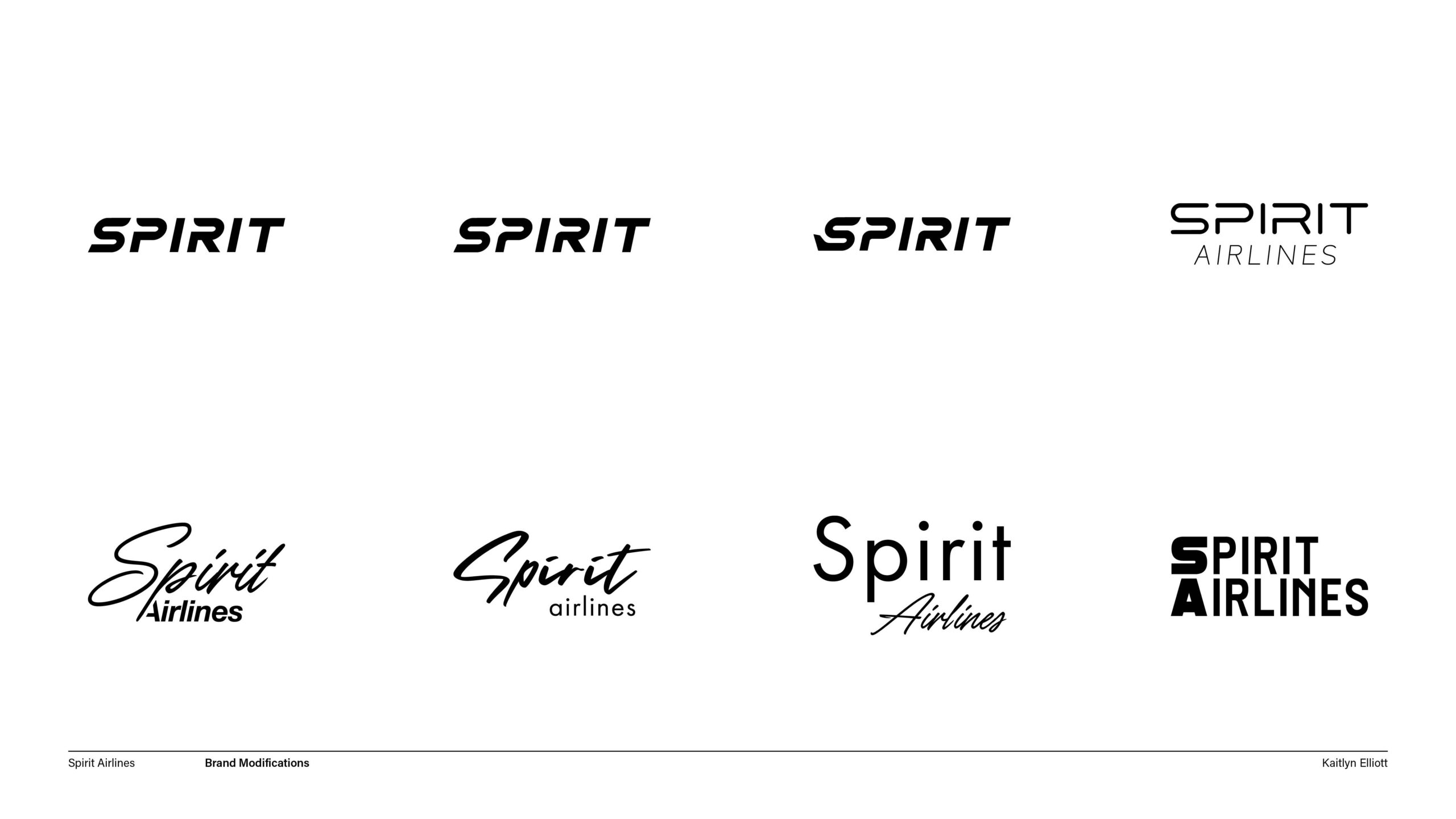
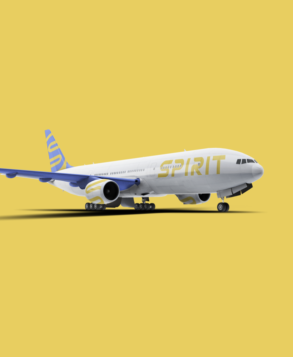
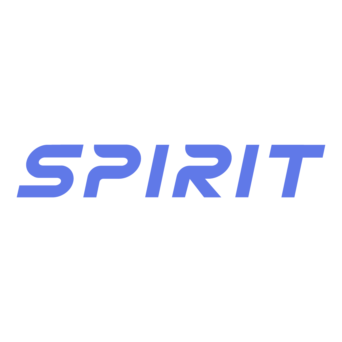
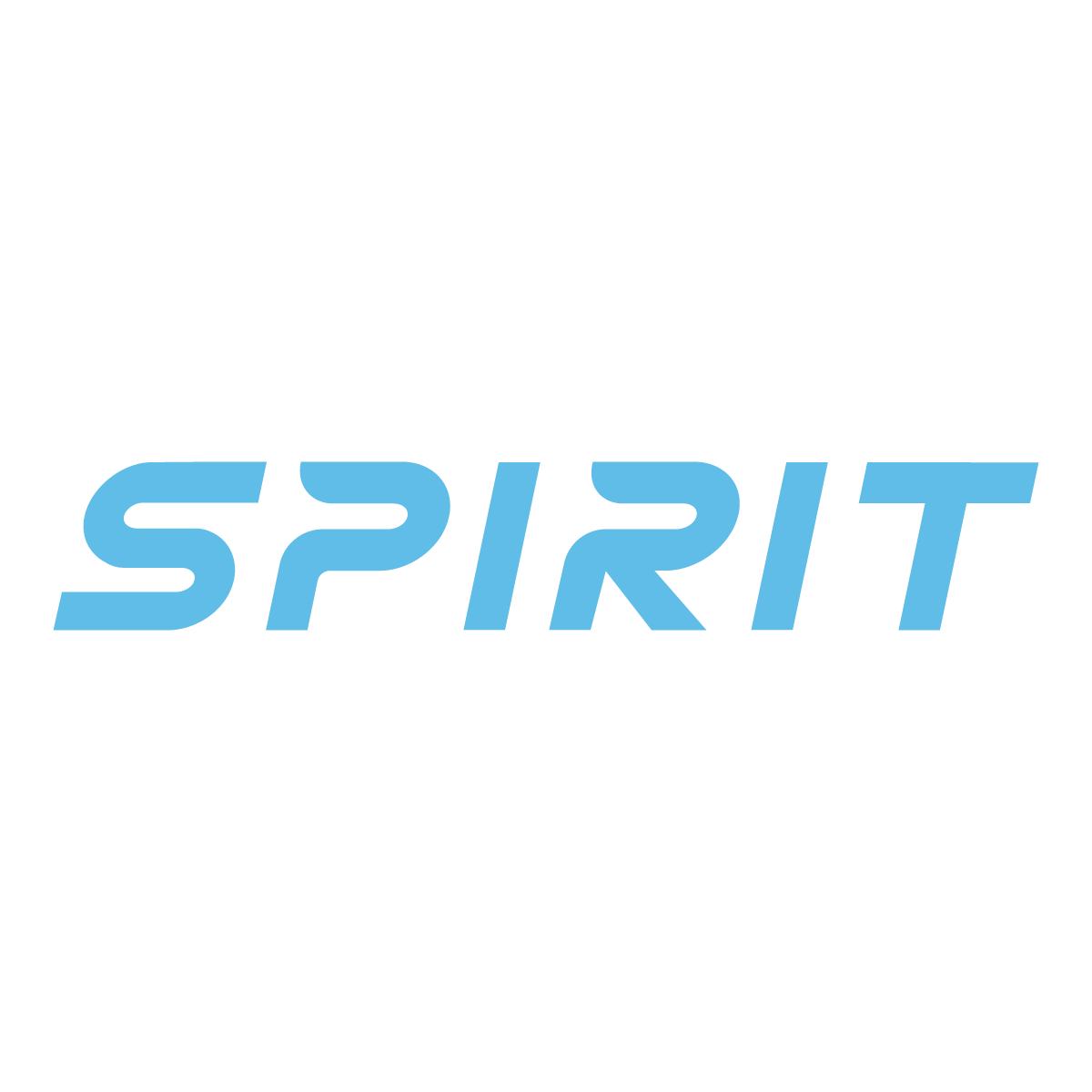
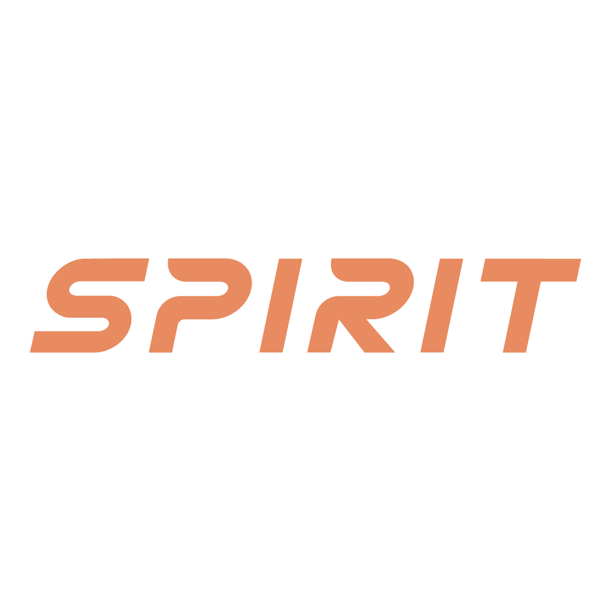
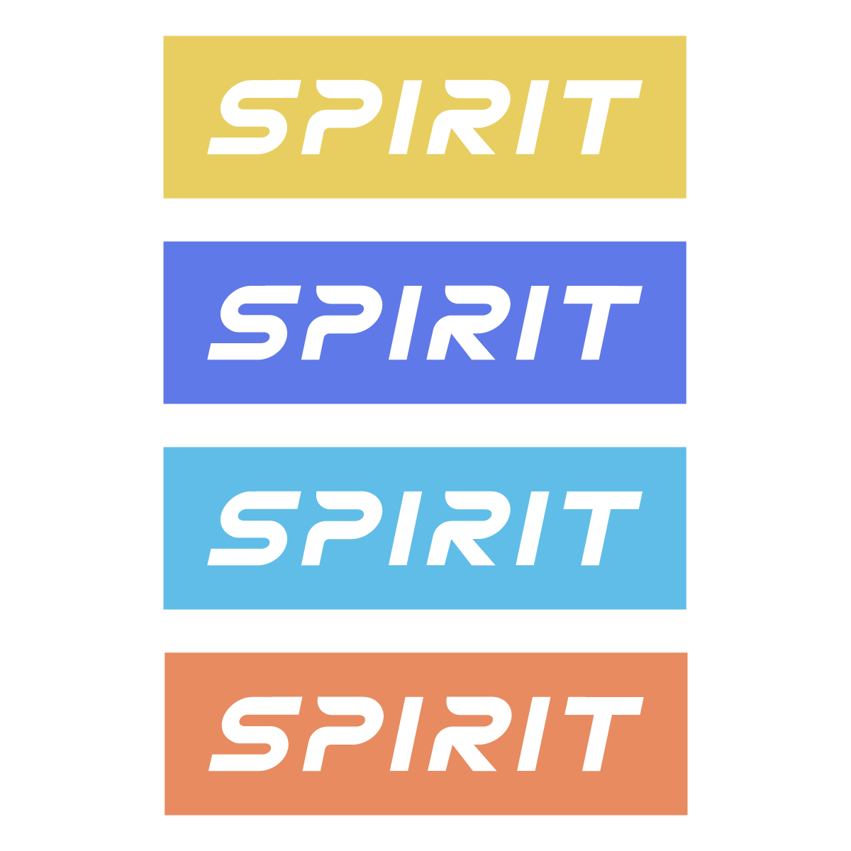
Final Logo
I developed a refined wordmark and signature element that emphasizes movement, confidence, and clarity. The final direction builds on Spirit’s bold presence while introducing a more modern, flexible system that feels both dynamic and dependable.


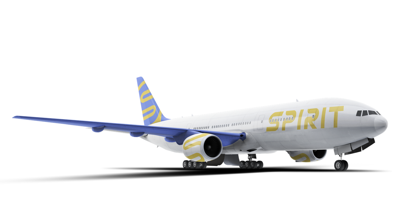
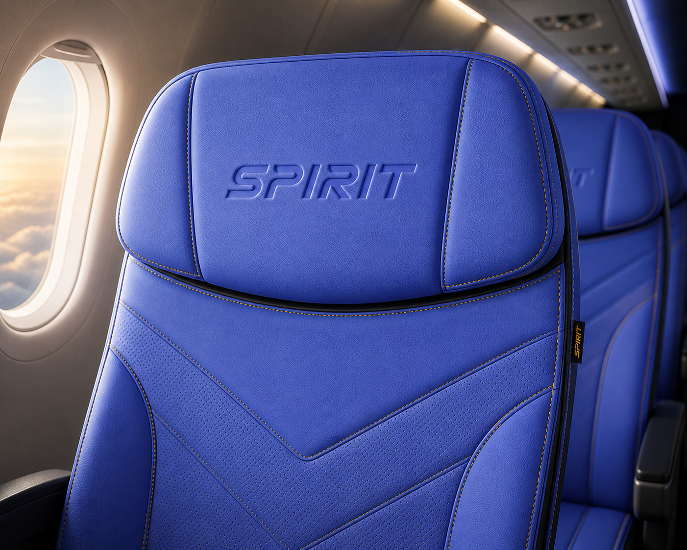
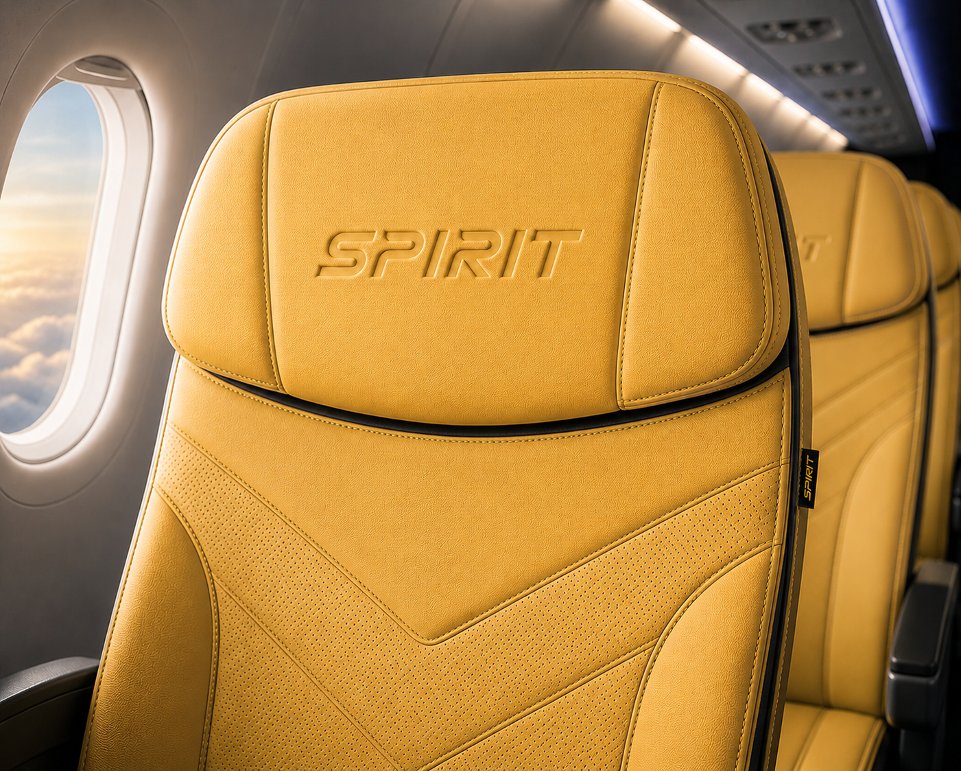
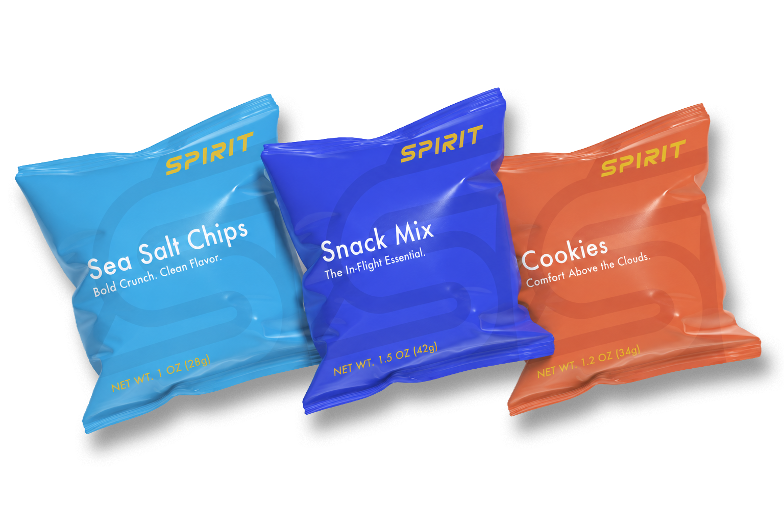
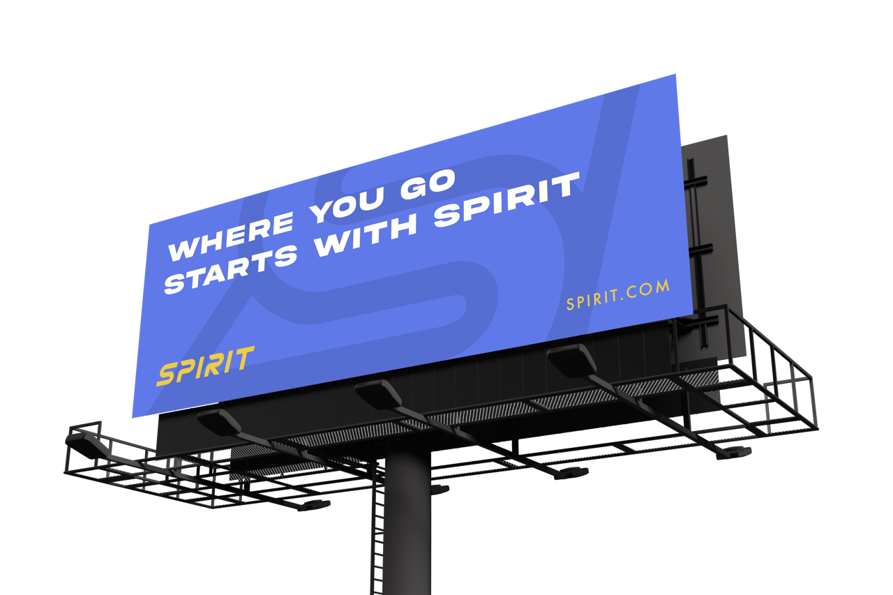
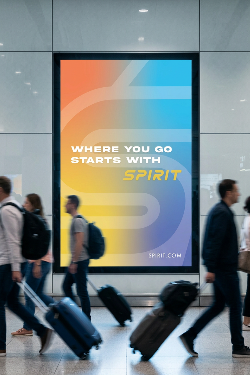
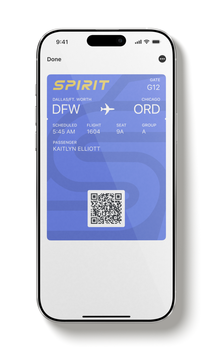
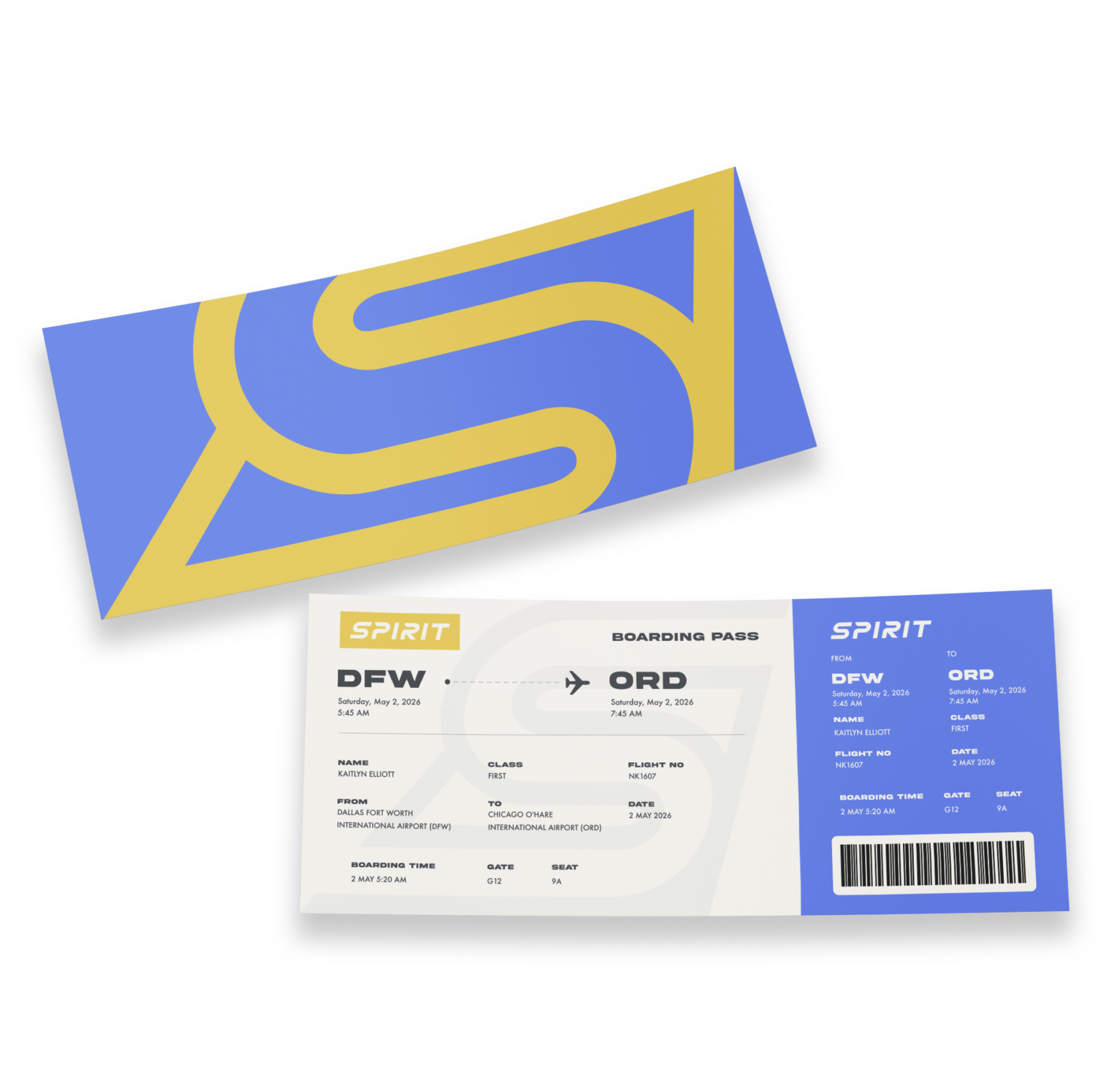
Brand Touchpoints
I applied the identity across key passenger touchpoints. Each application is designed to feel bold and engaging, while maintaining clarity and consistency, creating a more seamless and trustworthy travel experience.