Planit
Problem
College students and young adults often struggle with a packed schedule involving classes, homework, and work shifts. With so many tasks to do at various times, it can be easy to forget or mix up when assignments are due, forgetting to eat and not having enough time to sleep. This can lead to missed deadlines, skipped meals, and poor sleep, which affects their health and grades.
Solution
A tool that helps create a schedule based on one’s personal goals?
An assistant that helps one navigate an overwhelming schedule while balancing personal time, while also being engaging for users.
1. A calendar and daily activities displayed on the landing page for easy viewing access.
2. AI chatbot/assistant to help with scheduling
3. Letting users color code or apply a label that symbolizes urgency/importance to certain activities
4. Offer flexible and scheduling options for user to complete their activities if they are missed and to adjust as needed.
5. Add rewards and badges when users complete there specified tasks
6. Customizable avatars
Empathize
The objective in this stage of the design thinking process was to explore potential design challenges faced by college students and young adults in managing busy schedules. Specifically, the goal was to understand how current scheduling tools meet or fail to meet their needs, with an emphasis on creating a personalized AI-driven app that helps users balance their time for sleep, socializing, and other activities. The interview we conducted provided valuable insights on the frustrations and gaps in existing tools, such as the lack of alarms.
Me and my team interviewd 9 people total. With the demographic being working and non working college students.
Empathy Map
We then created empathy maps to better understand a person or group by exploring what they say, think, feel, and do. To gain deeper insights into their needs, motivations, and challenges.
Thematic Analysis
We used thematic analysis method to identify, analyze, patterns within our data. It helps you organize and describe the data in detail by finding common ideas or topics that come up repeatedly.
Theme 1. Users do not fully trust their tools. Trust ranges from:
- “Not at all”
- “General outline”
- “Pretty good”
- “A lot”
Theme 2: Many participants operate reactively:
- Prioritize when deadlines are close
- Beg professors after missing assignments
- Adjust after emergencies
- Delete/edit when things shift
- Handle urgent items first
Theme 3: Social Coordination Friction
Patterns include:
- Friends not responding
- People not using scheduling tools
- Difficulty aligning availability
- Desire for shared availability visibility
- Frustration when others are abstract about time
The interviews reveal that users struggle with trust, reactivity, and social coordination, which together create unstable and stressful planning experiences.
First, users do not fully trust their tools. Trust ranges from “not at all” to “a lot,” but most participants treat tools as rough guides rather than dependable systems.
Second, many users operate in a reactive mode. Meaning they prioritize tasks only when deadlines are near, adjust plans after emergencies, and focus on urgent items over long-term priorities.
Third, users face significant social coordination friction. Friends may not respond, others avoid scheduling tools, and aligning availability is difficult. Participants express frustration with vague time commitments and desire clearer shared visibility.
Overall, users have uncertainty about their tools, their time, and other people. This drives reactive behavior, reduces system reliability, and complicates coordination. The challenge is not just scheduling tasks, but creating a trustworthy, proactive, and social system for managing time.
Define
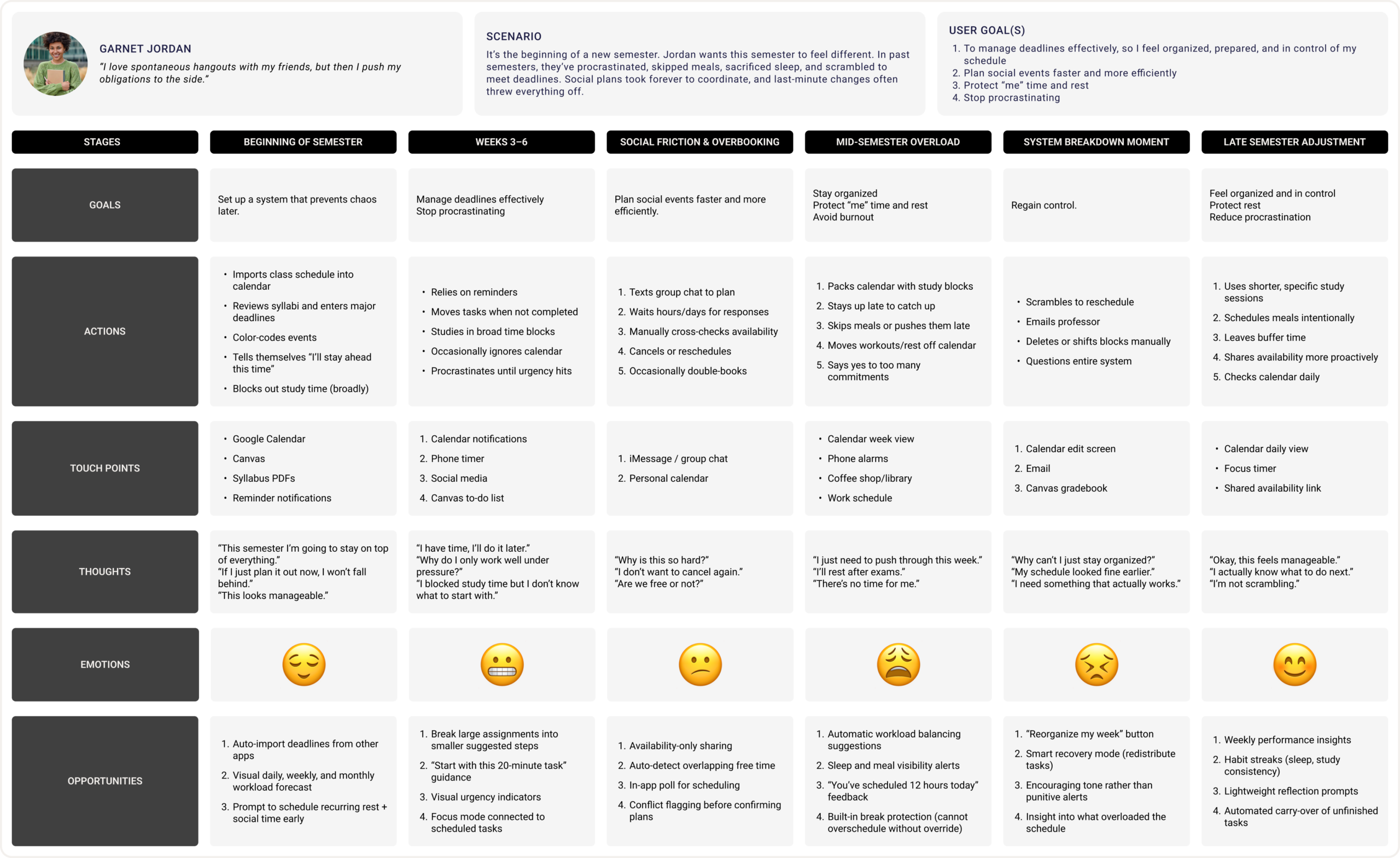
Me and my team thrn developed personas and user journey maps that reflect the research insights by bringing together key patterns, points, and goals that were expressed in all our interviews. Rather than listing findings separately, the persona integrates them into a realistic profile that reflects shared needs and decision-making. This helps translate research themes into a character, making it easier to empathize with the target audience and apply insights directly to strategy and make design decisions.
Persona and Journey map
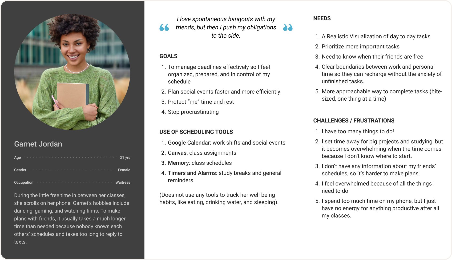
This persona represents a motivated yet time-constrained college student balancing academics, social life, and future career goals. She values efficiency and flexibility. While ambitious and goal-oriented, she experiences stress related to workload, finances, and uncertainty about the future. This persona synthesizes research insights by reflecting common student priorities and goals and challenges
Mapping Ai To Data Requirements
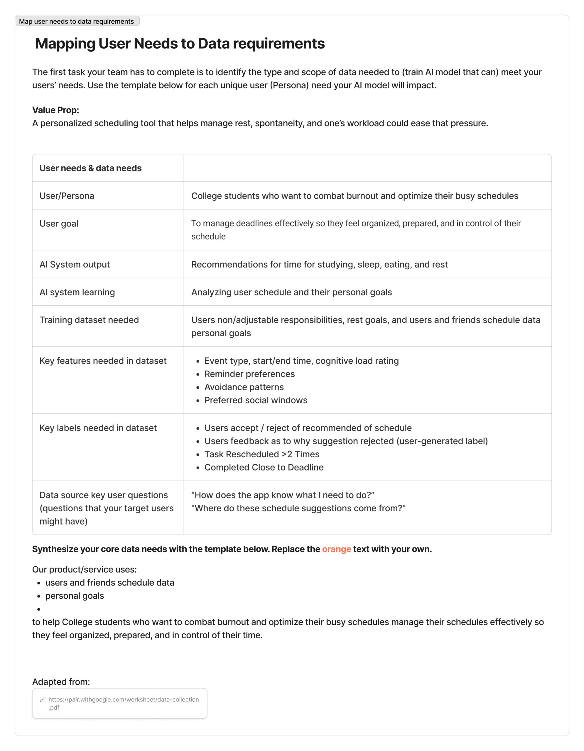
Our primary users are college students balancing coursework, jobs, and personal responsibilities. Research shows a need for time management support, academic clarity, guidance, and an easier way to coordinate schedules with friends. Students expressed feeling overwhelmed by deadlines and unsure how to prioritize tasks. Our solution addresses these needs by providing structured planning support and personalized academic recommendations.
We chose to use AI specifically where personalization and pattern recognition. AI is used to analyze students’ schedules and coursework to generate adaptive study habits and help with social outcomes.
The data required aligns directly with each user need. For time management support, we need course schedules, assignment deadlines, and self-reported availability; this data comes from student input and optional LMS (Learning Management System) integration and is necessary to generate realistic, personalized study plans. For academic guidance, we require course enrollment data, this data helps the AI tailor recommendations and detect when additional support may be beneficial.
AI Is Used
1. Learn from accept/reject behavior
2. Analyze the user’s schedule (fixed and flexible commitments)
3. Evaluate cognitive load across the week
4. Detect avoidance patterns (e.g., task rescheduled >2 times)
5. Generate recommendations for studying, sleep, eating, and rest
Ideate
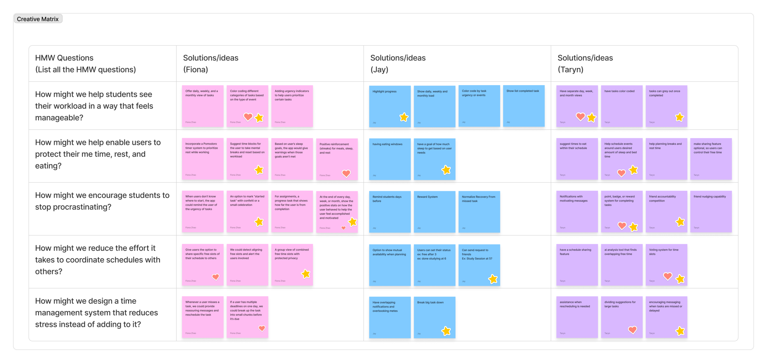
The How Might We questions helped our team reframe the design opportunities identified in the Define stage into problem prompts. Instead of jumping directly to a single feature, the HMW questions encouraged brainstorming across multiple perspectives.
Each HMW question focused on a specific user need, such as reducing stress, improving task visibility, or supporting rest. By structuring the creative matrix with my team members, we were able to quickly generate a wide range of possible solutions while also identifying overlapping ideas. This approach allowed us to explore both individual productivity features (like task breakdown and reminders) and social coordination features (like schedule sharing and friend accountability). The matrix helped reveal patterns across our ideas and identify promising directions for our design concept.
StoryBoard
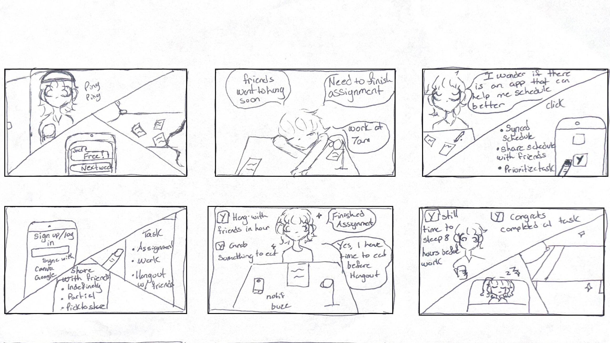
A college student balancing school, work, and social life. She feels overwhelmed by deadlines and responsibilities and wonders if there is an app that can help her manage everything. She comes across an app that is able to sync her schedule, while AI prioritizes her tasks and shares her schedule between friends. This helps her stay organized and balance work, school, and social life.
User Flow Diagram
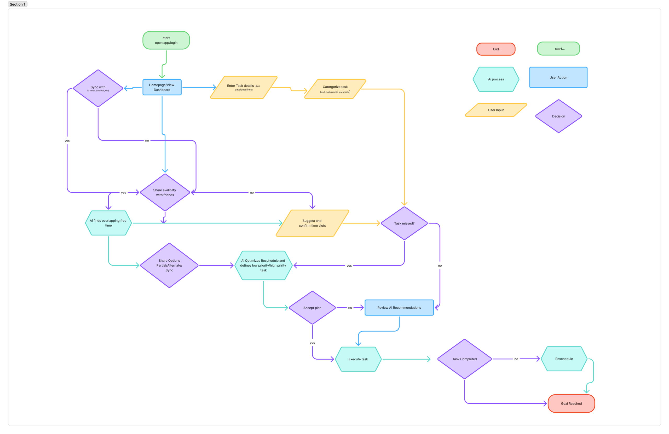
The user flow supports the user’s goals by guiding students through a simple process that helps them manage their time and academic responsibilities more effectively. By being able to sync their schedule, the system gathers all important information such as classes, deadlines, and meetings in one place. The AI then prioritizes tasks based on urgency and workload, helping students focus on the most important assignments first. The option to share schedules also makes it easier to coordinate group meetings by finding overlapping free time with classmates.
A college student balancing school, work, and social life. She feels overwhelmed by deadlines and responsibilities and wonders if there is an app that can help her manage everything. She comes across an app that is able to sync her schedule, while AI prioritizes her tasks and shares her schedule between friends. This helps her stay organized and balance work, school, and social life.
Prototyping Lo-Fi & Test
The goal: was to create a visual and functional representation of how these features would be organized within the app to ensure easy and effective navigation. By focusing on these main features, I aimed to address user needs effectively and prepare for usability testing.
The three key features:
- Prioritize task
- Sync calendar
- Share availibilty with friends
The purpose of the testing is to make sure the app works well and meets users’ needs. The three features selected, prioritizing tasks, syncing the calendar, and sharing availability, were chosen because they help users manage their time better, avoid conflicts, and easily coordinate plans with friends. These features matter because they improve organization, reduce stress, and make planning more efficient.
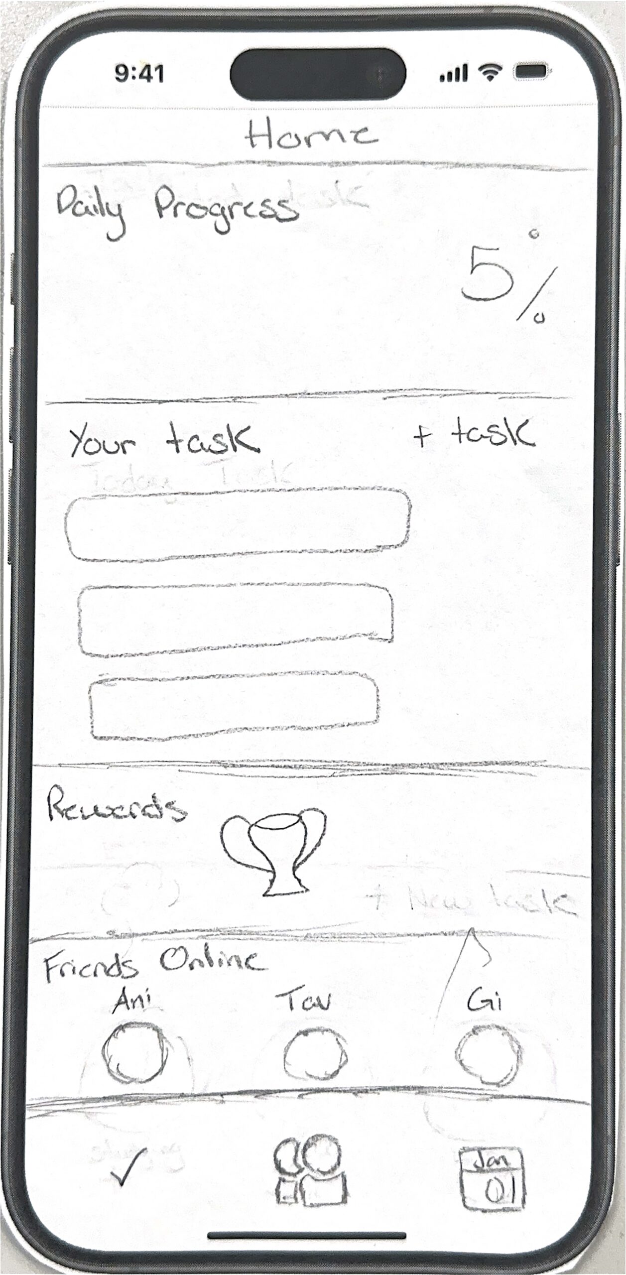
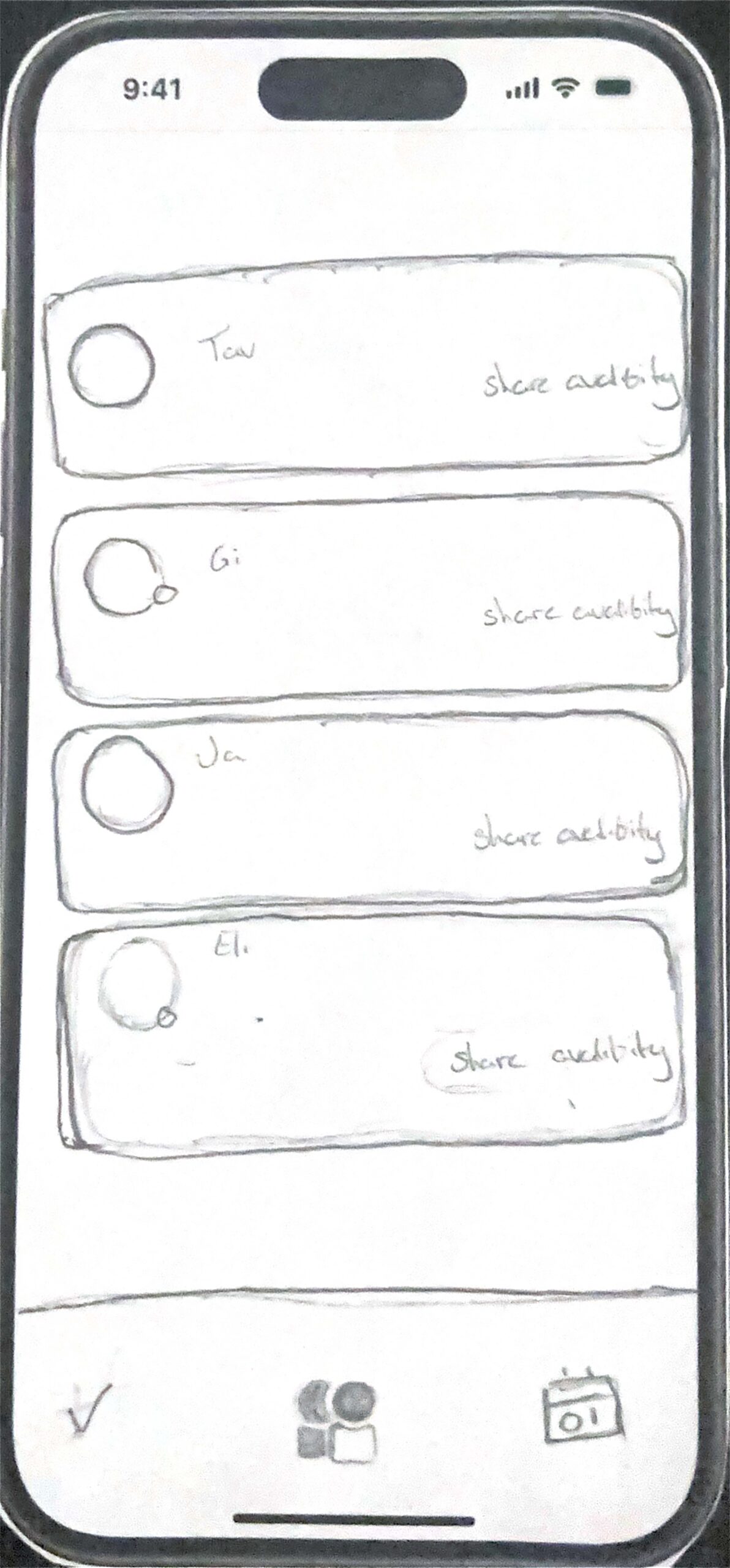
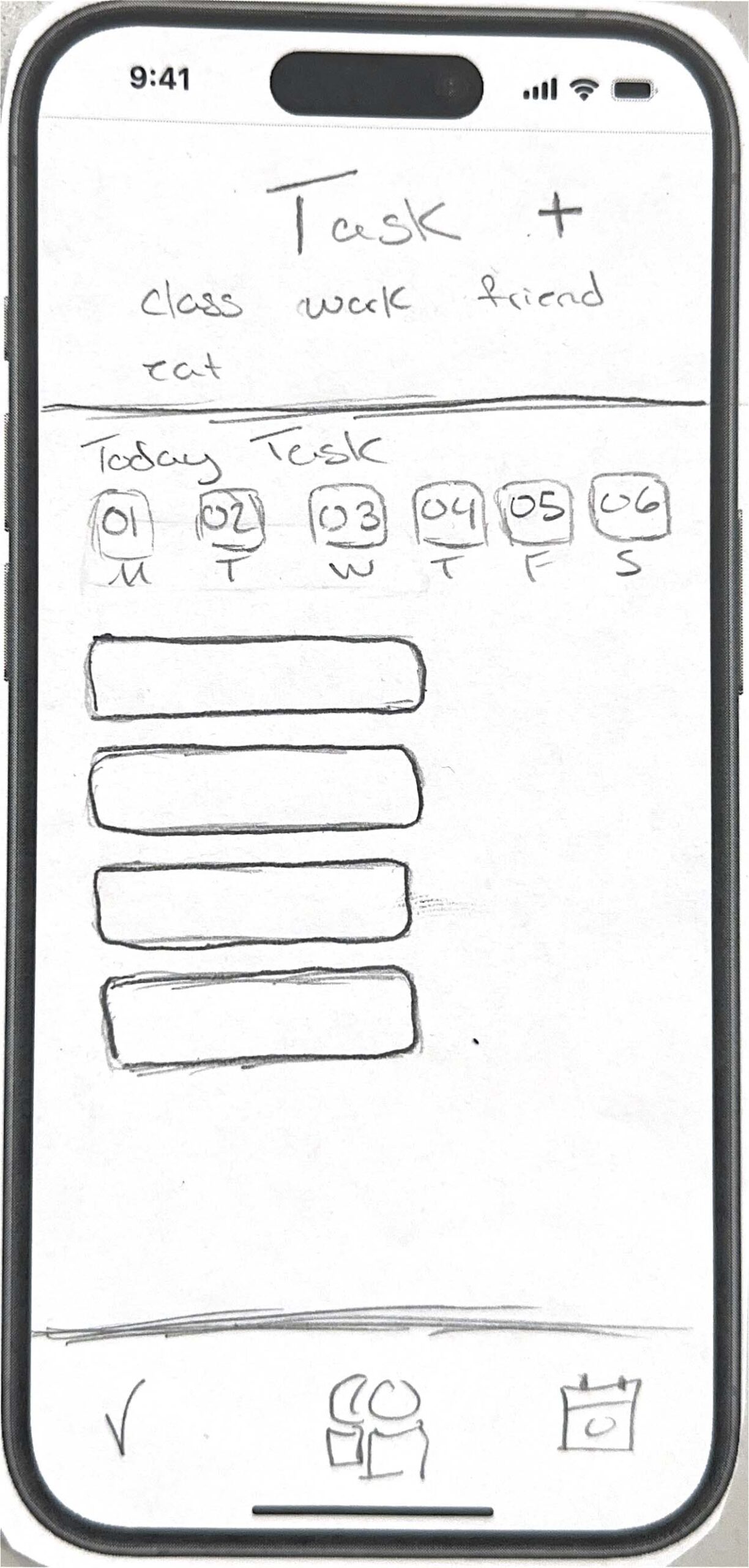
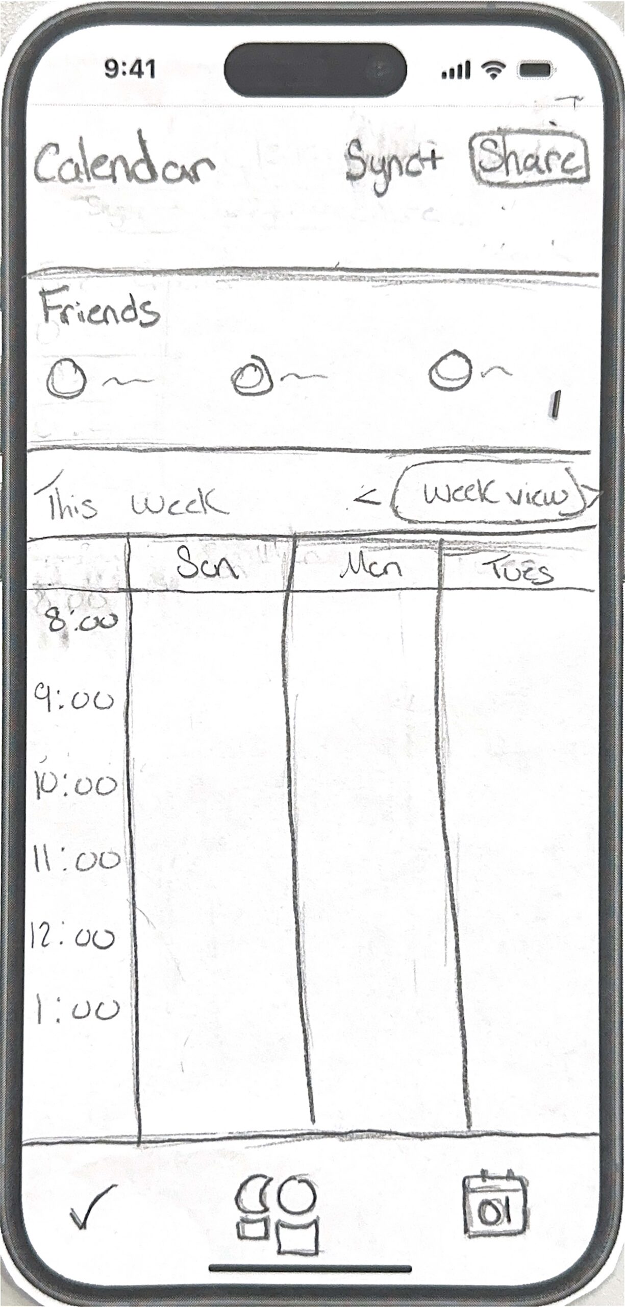
Across all 6 walkthroughs, a key pattern was user confusion around the checkmark symbol for tasks, it wasn’t clear if it meant completed or selected. Also, users misunderstood the shared availability on Tuesday feature, thinking they had to click indefinitely first, rather than pressing the “choose to share” button and selecting specific days like Tuesday to share indefinitely. To fix these issues, I plans to redesign the checkmark icon for clearer meaning and simplify the availability sharing process by making the selection steps more intuitive and adding clearer instructions.
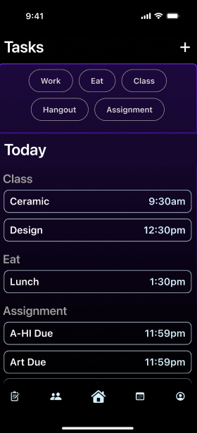
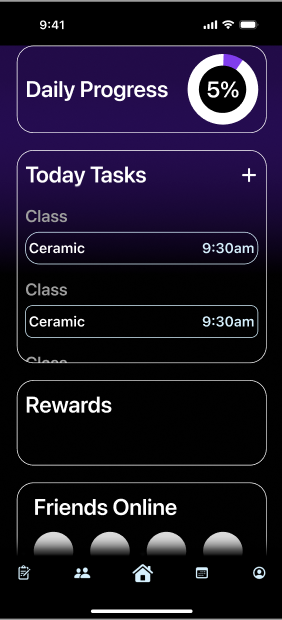
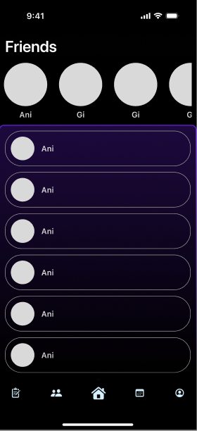
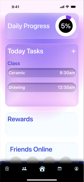
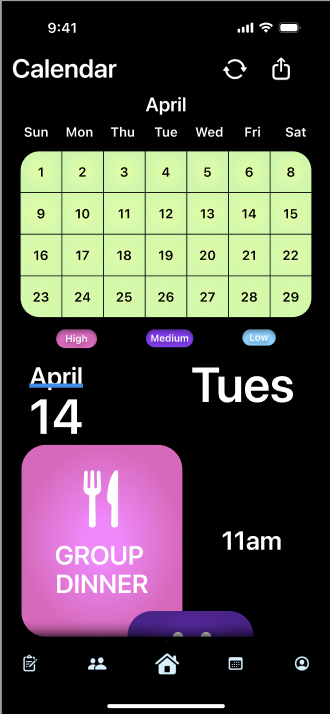
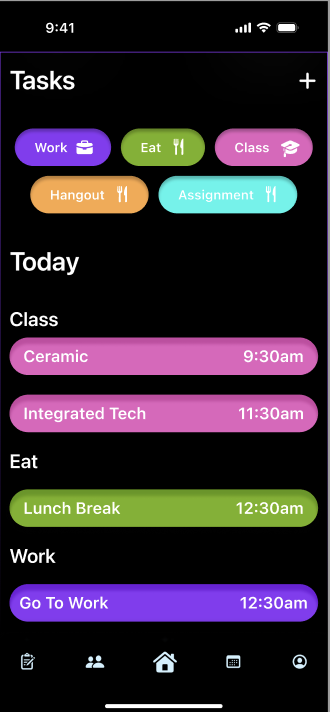
I experimented with different color variotions
Atomic Design Principles
I used Atomic Design by breaking the app into smaller, reusable parts. Atoms included icons, text, colors, check circles, and buttons. The Molecules included task cards, category pills, and profile rows. While also utilizing some Organisms that included the full task list and profile card. This helped keep the design consistent across the prototype.
Usability Heuristics
I considered the visibility of system status by showing a “Task completed” section after a task is checked off. I used user control and freedom by adding a Share Availability switch, so users can decide if friends can see when they are free. I also used consistency by keeping the same card style, colors, icons, and bottom navigation across screens.
AIX Design Guidelines
1. Make clear what the system can do
In my scheduling and social app, the system should clearly show users that it can help them sync their calendars and share availability with friends. For example, the Sync Calendar screen can explain that connecting a calendar allows the app to organize classes, tasks, and social plans in one place. The Share Availability feature also makes it clear that friends can only see when the user is free, not their private calendar details.
2. Make clear how well the system can do it
For the Sync Calendar feature, the app should clearly show how successfully it connected to the user’s calendar and how complete the synced schedule is. For example, after a student connects Google Calendar or their school calendar, the app could show a message like “Calendar synced successfully.”
3. Provide global controls
The app should give users control over the AI and availability features. For example, users can turn Share Availability on or off from their profile. They should also be able to choose who can see their availability, such as all friends, close friends, or selected friends. These controls are important because calendar information is personal. The user should always decide what is shared and when it is shared.
Test ( Heuristic Evaluation)
Peer evaluation of the initial hi-fi prototype revealed the following issues:
some screens had inconsistent spacing when navigating from one page to the next
The buttons stopped working during testing.
Hi Fi Prototype V2
For my second version of the high-fidelity prototype, I improved the app based on the feedback I received from peer evaluation. The main issues were that some screens changed spacing when users navigated to the next page, and some buttons stopped working. These problems made the prototype feel less complete, so I focused on making the experience smoother, more consistent, and easier to understand.
I fixed the spacing by checking each screen and making sure the layout stayed consistent across the prototype. I kept the same margins, card spacing, button placement, and bottom navigation on each screen. This helped the app feel more polished and made the screens look like they belonged together.
I also fixed the clickable interactions. I reviewed the prototype links in Figma and made sure important buttons worked correctly. This made the prototype easier to test because users could move through the app without getting stuck.
For the AI features, I improved the Sync Calendar and Share Availability flows. The Sync Calendar screen now uses realistic content instead of placeholders, such as calendar connection options and messages like “Calendar synced successfully.” This helps users understand what the system can do and how well it is working. The Share Availability feature now includes a clear switch so users can choose whether friends can see when they are free.
Figma