Design Diary
Objective
The objective in this stage of the design thinking process was to develop and improve the user interface for a scheduling and social app made for college students. The main goal was to make the app feel simple and easy to understand. I focused on three themes.
- Prioritize task
- Sync Calendar
- Share Availability with friends
The goal was to make it easier for students to manage their time, connect with friends, and find shared free time without having to text back and forth. Since college students often have busy schedules.
For the Sync Calendar feature, the objective was to allow users to connect their school, Google, or personal calendar so that their schedule could automatically appear in the app. This would reduce the amount of manual input needed.
For the Share Availability feature, the objective was to let users choose whether friends can see when they are free. The focus was on privacy and control, so the user should be able to turn availability to share on or off.
AI Usage
I used ChatGPT with image generation as the main generative AI tool. I used it to create visual mockups and revise screens. One of the prompts I used was “Create profile visual for my scheduling and social app for college students.”
The AI generated a detailed profile screen with a student profile photo, class schedule, events, interests, study buddies, and availability. After reviewing it, I realized it had too much information, so I asked it to make it “More simplistic and with what should be in the profile section, don’t add anything unnecessary.”
The output was a cleaner profile screen with only the essentials: name, school, major, bio, about section, interests, and an edit profile button. For the task flow, I used prompts like:
“Make the task how to press completed and what it will show.”
I then input this photo of my prototype into AI to give more accurate results.
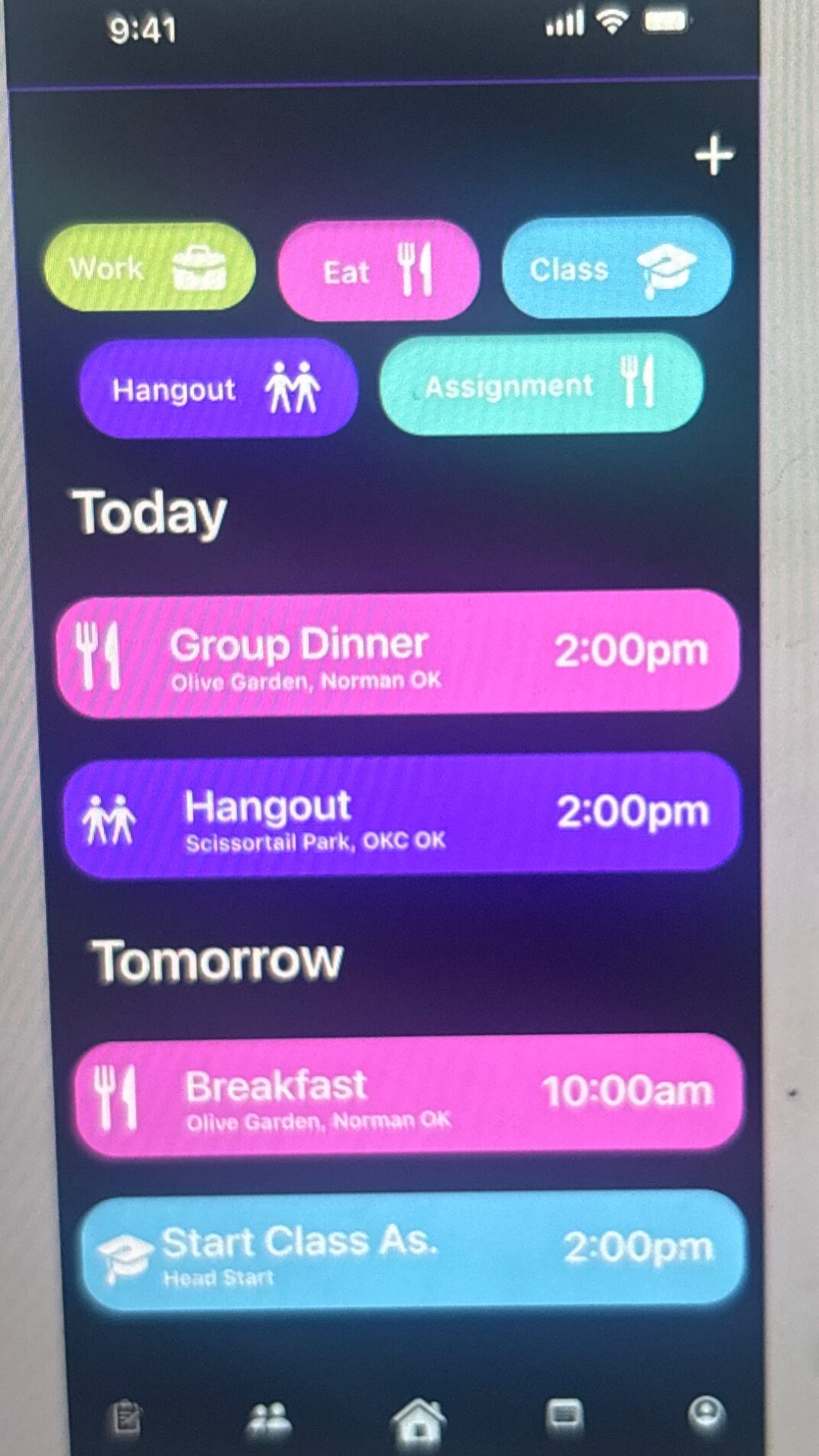
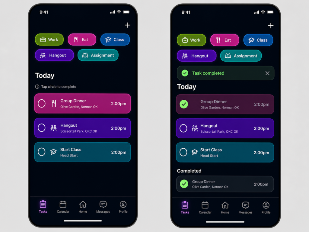
I asked this question as I was confused about how to make that setup as I wanted it to be simple but also visually appealing. The AI created a two-screen concept showing the task before and after completion. Later, I simplified it with prompts such as:
“Make more simple and easy to use.”
The final direction showed that the user taps a circle on the task card, the task becomes checked, a “Task completed”.
Benefits and Challenges
The biggest benefit of using AI was speed. AI helped me visualize ideas, compare layouts, and improve the design step by step.
One challenge was that the AI sometimes added extra elements that were not needed, such as too many dashboard sections or duplicated completed tasks. I had to give very specific prompts to remove clutter and make the layout easier to understand. Another challenge was making sure the wording and interaction made sense for real users, especially the completed task section.
Reflection
AI played the role of a visual brainstorming and prototyping. It helped generate options, but I made the design decisions. My role was to decide what belonged in the app, what was unnecessary, and what would be easiest for college students to use. The AI helped create polished visuals, but the human part was still important for judging usability, simplicity, and purpose. For a scheduling and social app, the design needs to feel quick, friendly, and not overwhelming. AI helped me explore those ideas faster, while I guided the final direction.