OU Visual Communication Website Design
We redesigned the Visual Communication website using design thinking. The primary goal of the website was to fulfill the needs of its users. Conducting interviews and tests, helped to guide the process.
During this project we used five stages of design thinking process which are as follows:
Empathize
At the empathize stage, the goal is to conduct a competitor analysis and understand user needs that need to be included within a Visual Communication website.
Competitive Analysis

University of Central Oklahoma
- Website Link: https://ucodesign.com/
- Strengths: Extensively highlights student work
- Weaknesses: No information describing the various degree paths that are offered

University of Arkansas
- Website Link: https://art.uark.edu/undergraduate-program/graphic-design.php
- Strengths: Had information about the degree: a description, studios, and mentioned alumni
- Weaknesses: Cluttered and hard to navigate

University of Texas
- Website Link: https://designcreativetech.utexas.edu/undergraduate-design-program
- Strengths: Information on everything: events, faculty, students
- Weaknesses: Only mildly redundant category groupings
Interviews
To gather a deeper understanding of users’ needs, we interviewed a total of nine participants within the categories of students, faculty, and parents.
We analyzed the interview data using the ’empathy map’ method, organizing each interview into what they did, said, felt, and thought. In short, we found that people had a lot of questions regarding Visual Communication. Without a website, the program has no presence or voice to convey its purpose and reach a wider audience outside of itself.
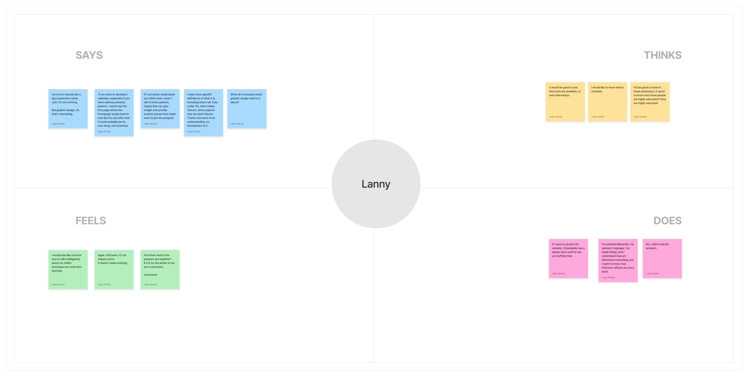
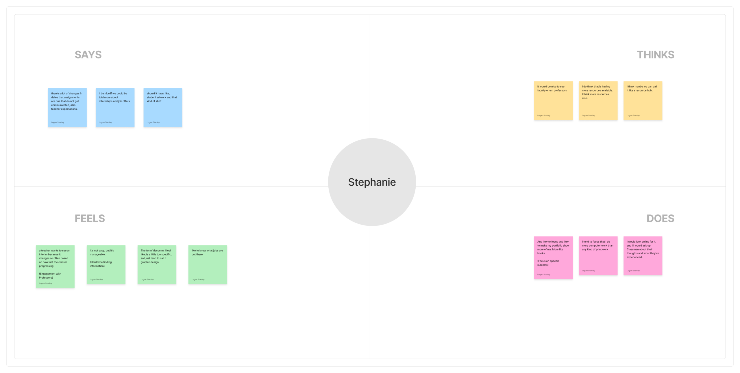
We then organized related topics within the empathy maps into distinct clusters using affinity mapping process. Through this process we discovered four distinct themes: Information, Engagement, User Experience, and Website Design. Information relates to the various questions people have regarding the program. Engagement relates to how people want to engage with others within the program, such as viewing student work or contacting faculty. User experience relates to the usability or how they would use the website. Website design relates to how people would like the website to be represented or specific features they think could be useful.
Define
Based on the findings from the user interview data, we created 3 personas and their journey maps. To reflect the people we interviewed, we chose to focus on students, parents, and faculty as personas.
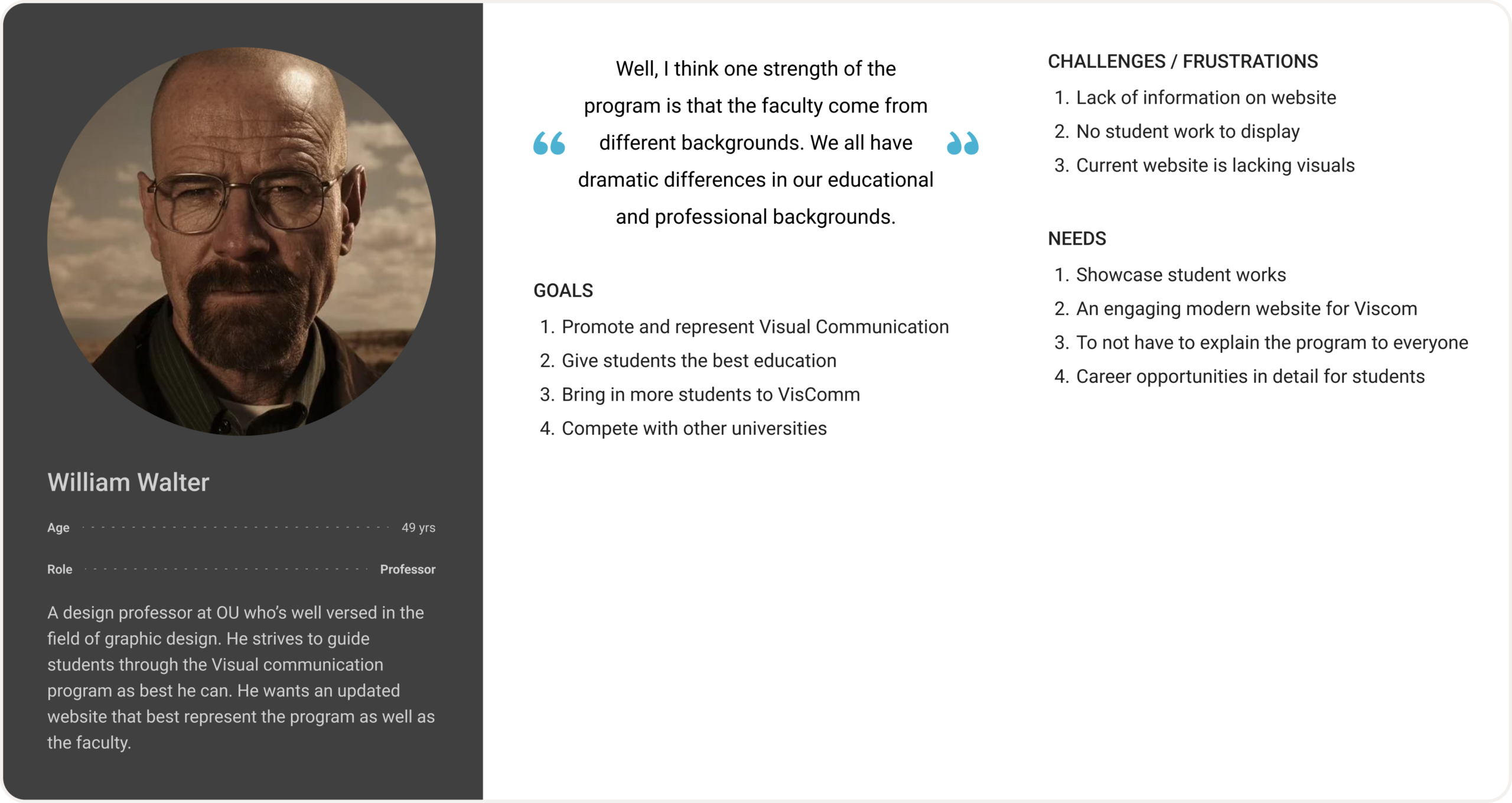
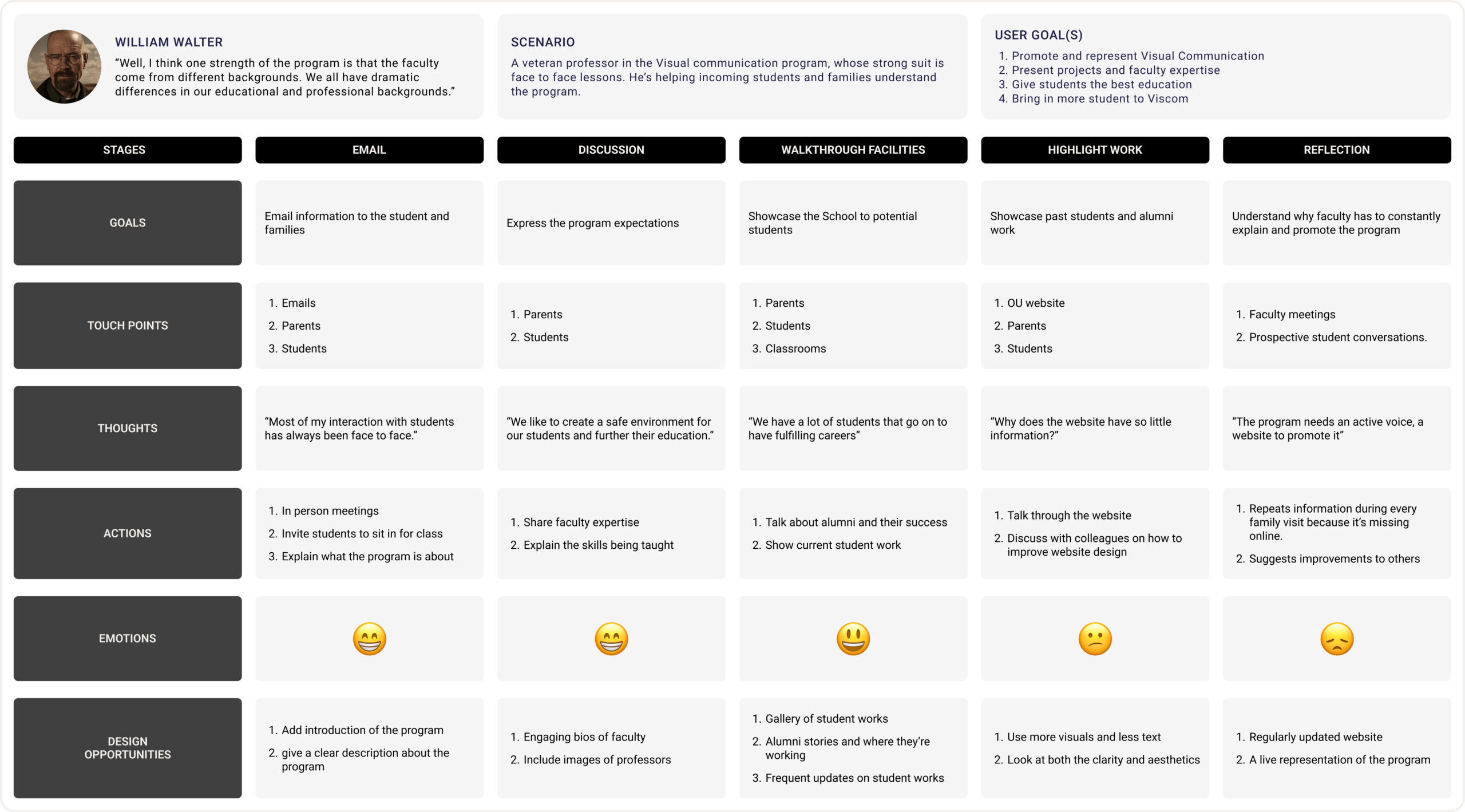
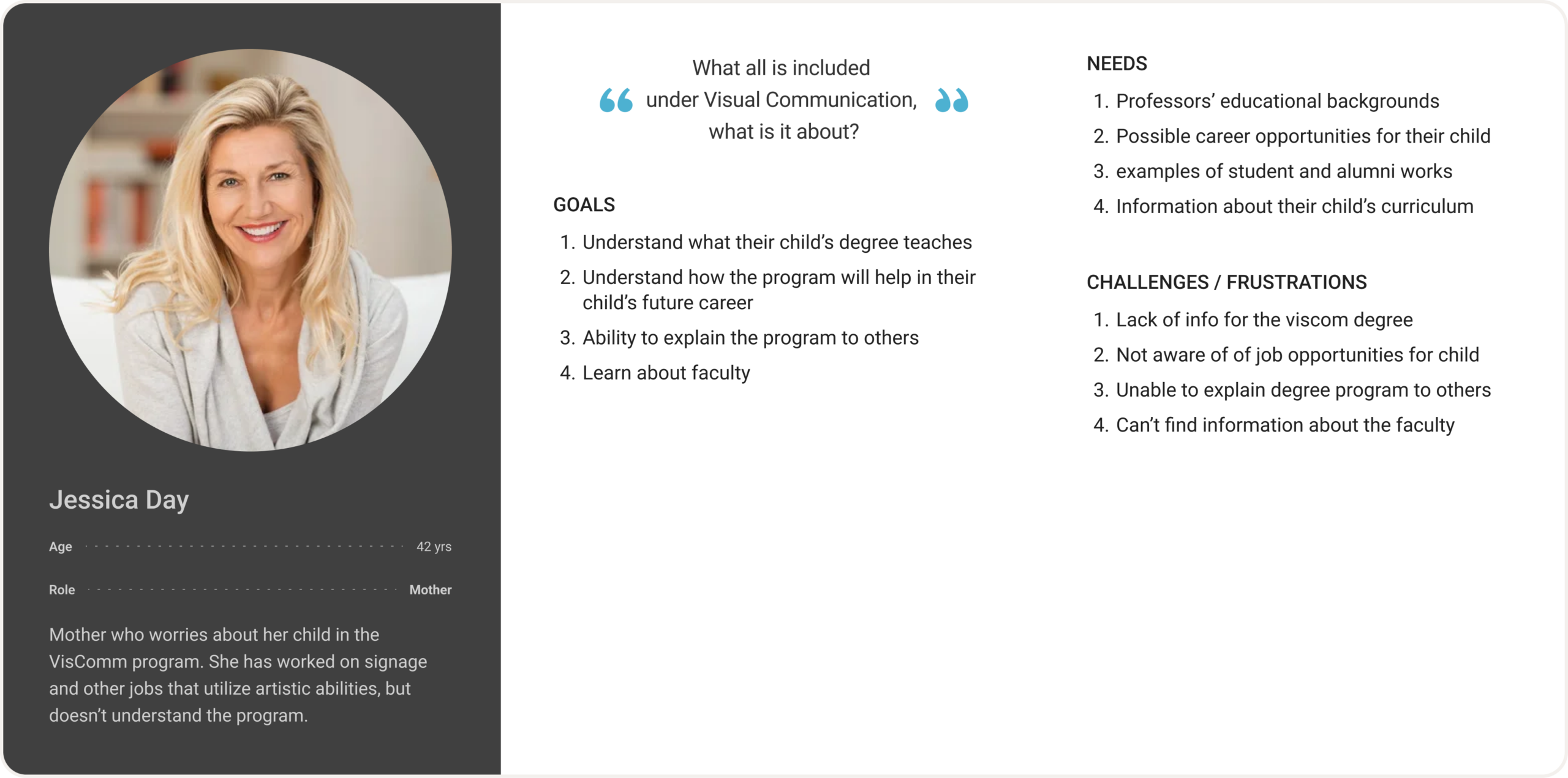
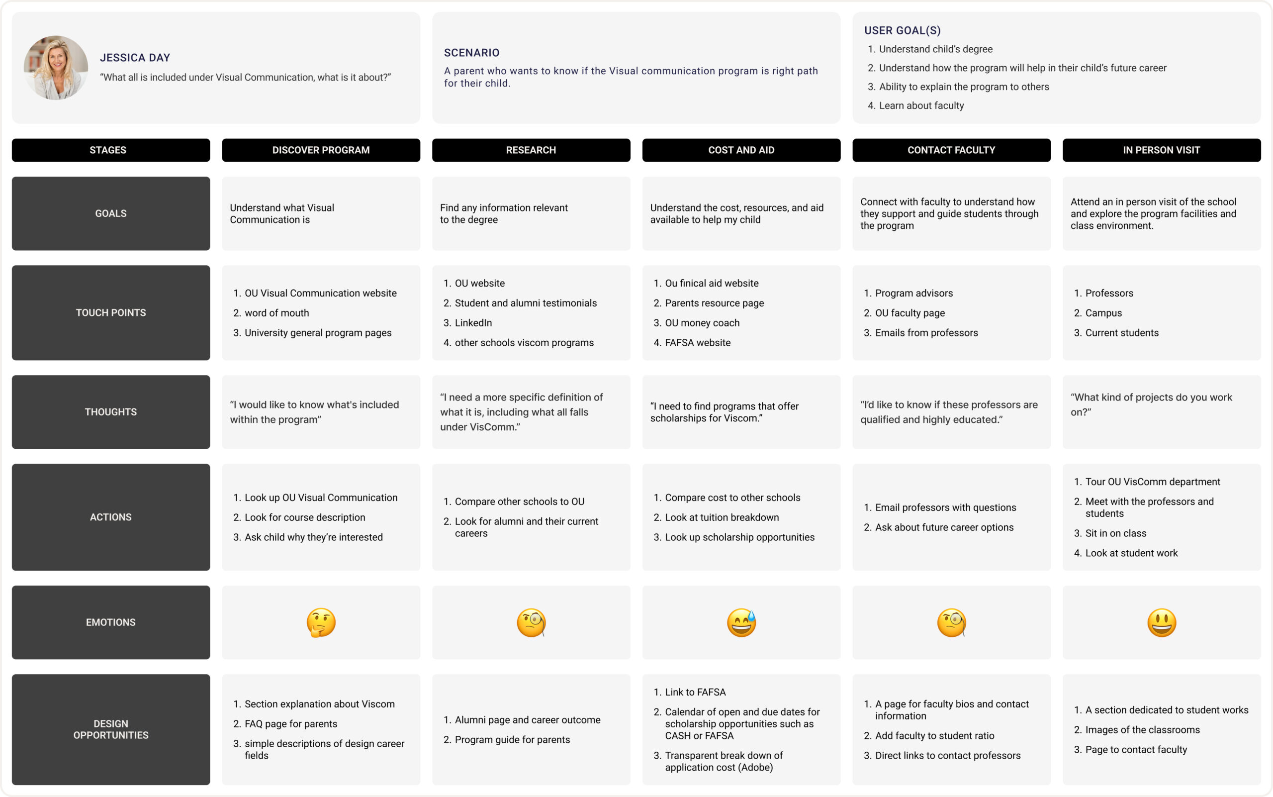
Overall, every persona suffers from a lack of information or the accessibility of it. The student could use a detailed breakdown of the classes and list of resources for her to utilize. The parent would like to know about the classes too, but would also like info about the professors and their educational backgrounds. The professor needs a student gallery that shows student work in order to promote the program.
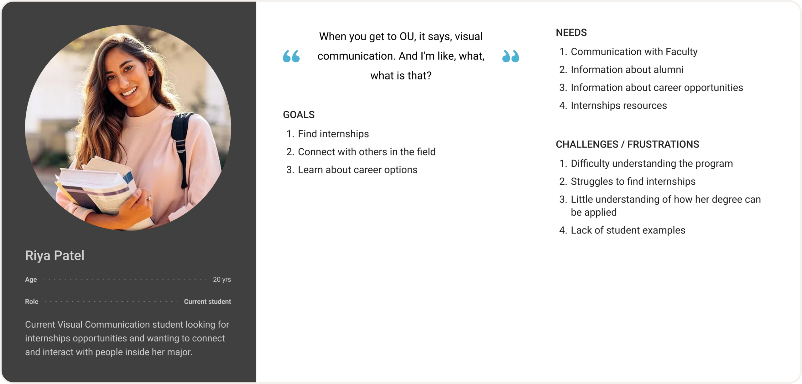
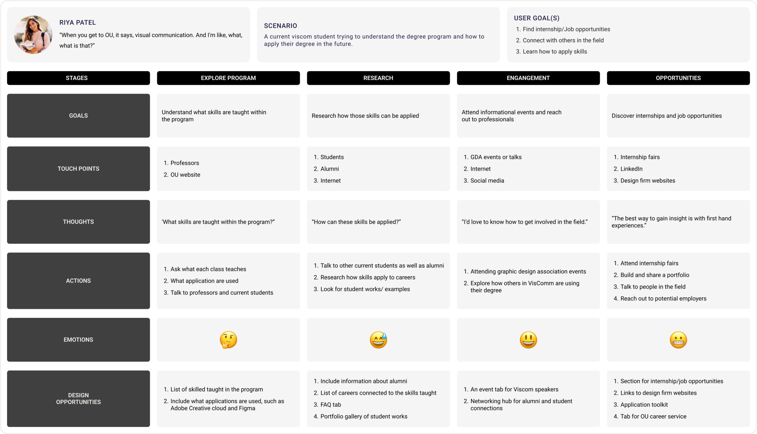
Student Persona
The student, Riya Patel, is meant to be a current student, exemplifying her need to understand the degree and how she can apply it. She has to keep reaching out to faculty and professionals to find more information and opportunities.
Faculty Persona
Lastly, the professor, William Walter, has to constantly promote the VisComm program, wishing that there was a better way to do so. For one family, he has to dedicate a lot of time and effort to convey the program and its goals.
Parent Persona
The parent, Jessica Day, knows nothing about her child’s degree and wants to know more. Her journey is filled with questions about the degree, faculty, and facilities.
Ideate
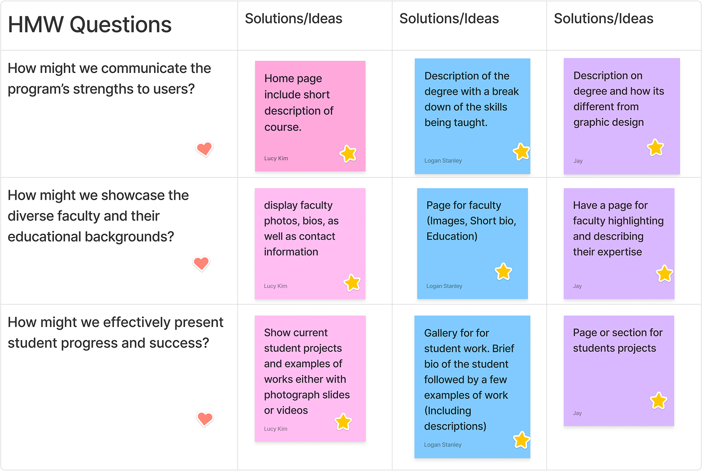
During the initial ideation phase, we developed How Might We (HMW) questions based upon the challenges our personas faced. Everyone in the group worked independently to brainstorm solutions and then we discussed them. We selected the most impactful ideas to implement into the website. Each one addresses common problems across our personas: a lack of information about the program, the faculty, and no representation of student work.
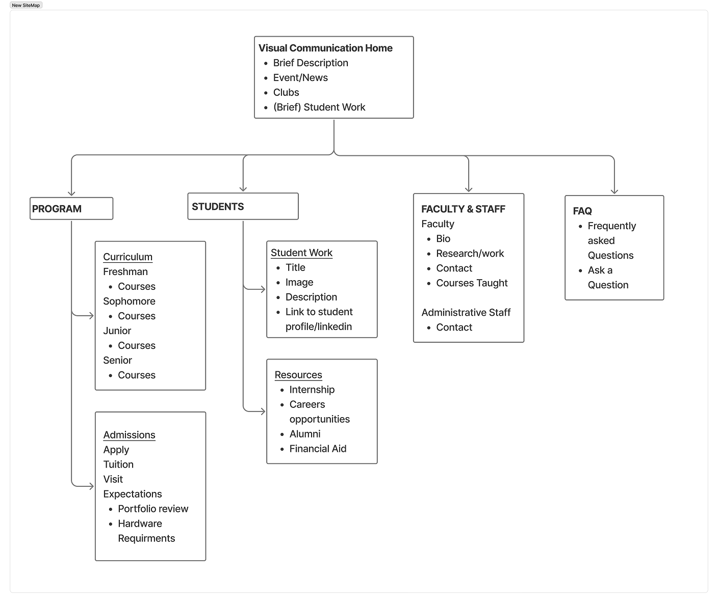
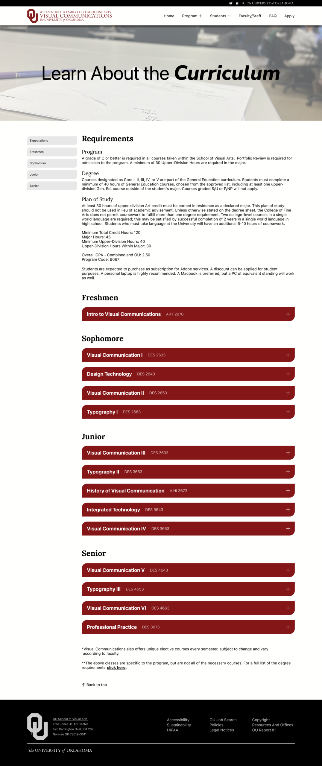
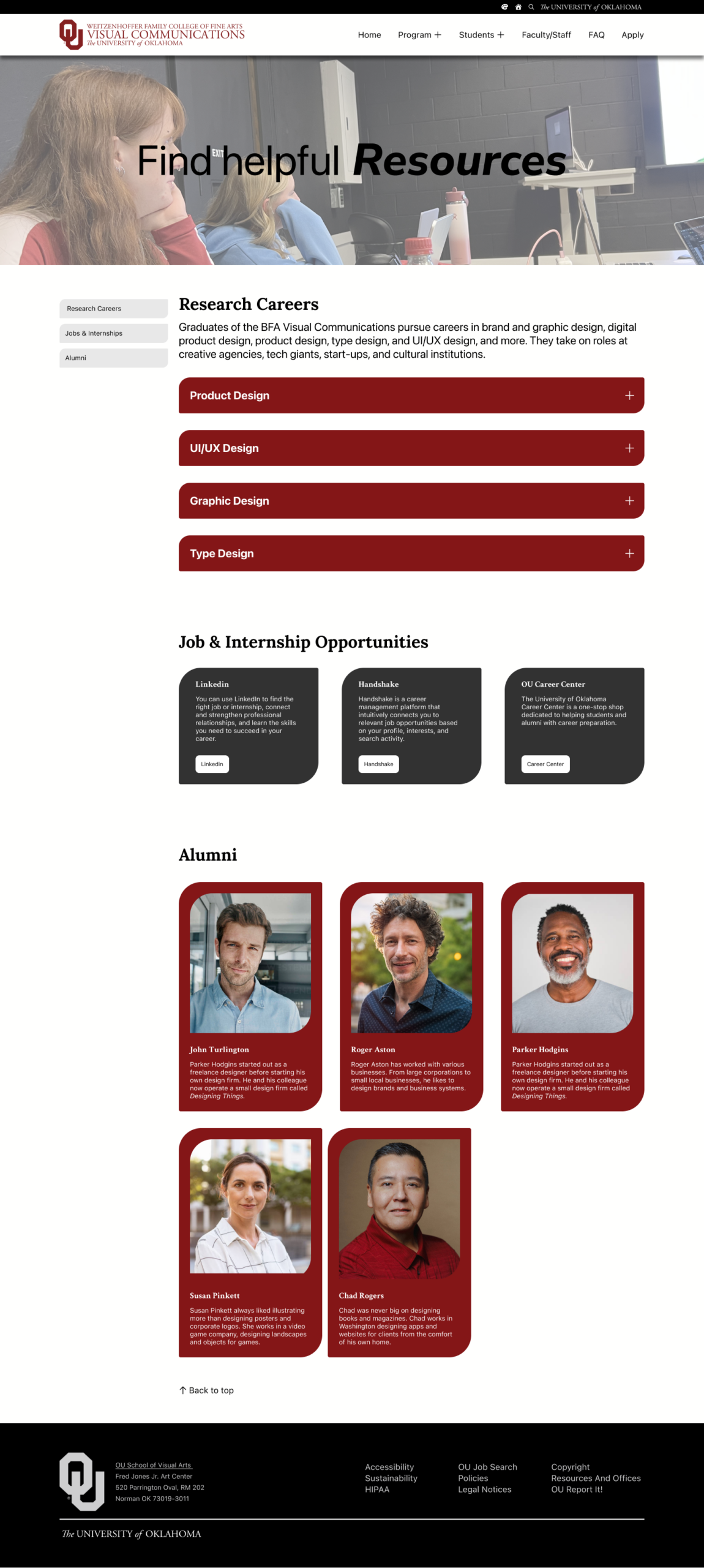
This one of the latest iterations of the Site Map. The home page contains a brief description of the degree along with events related to the program. At the top of the page, four categories are available: program, students, faculty/staff, and FAQ. The program and student section both utilize a dropdown menu to access other pages. These groups directly address several problems faced by our users, and will contain pages filled with their relevant information.
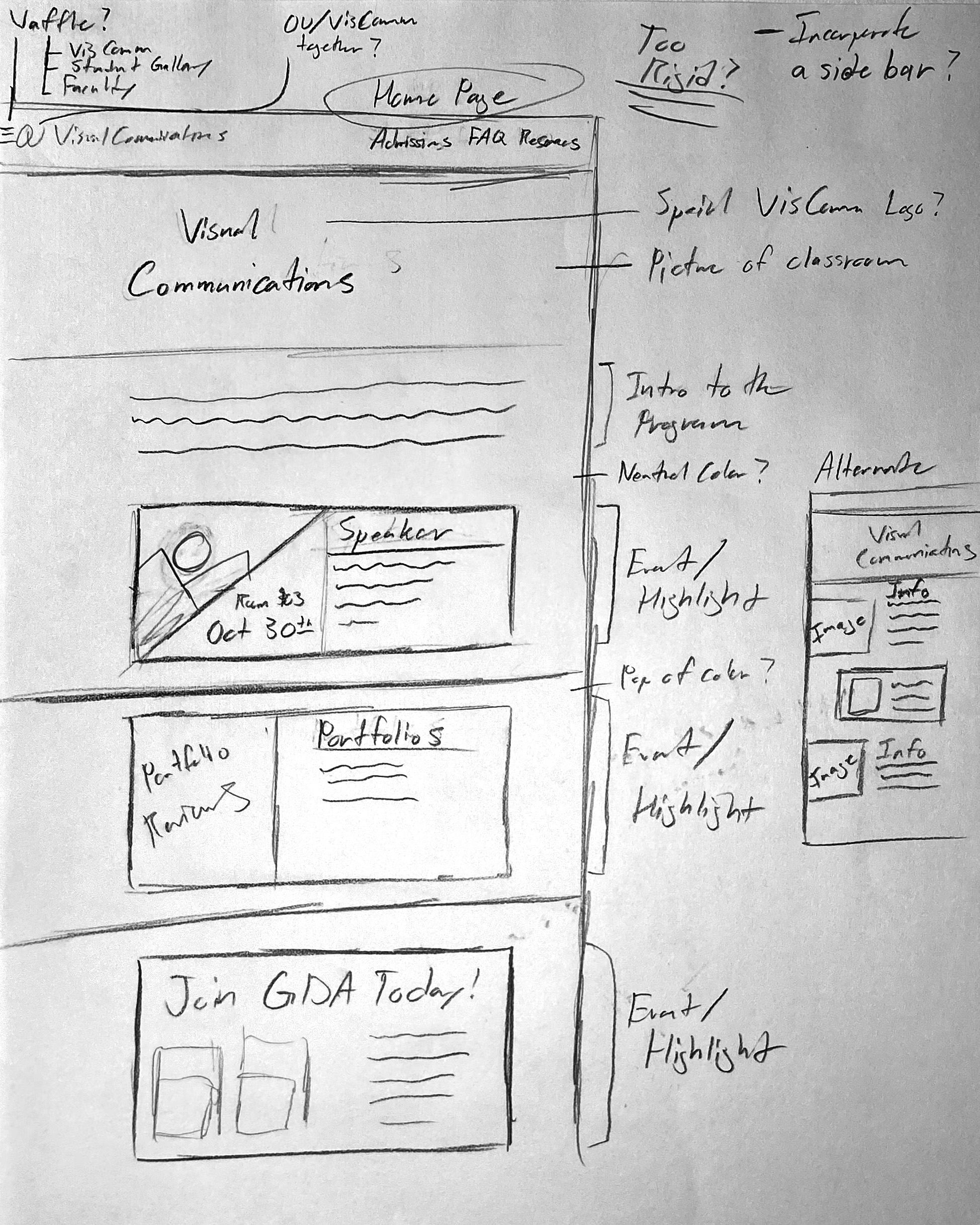
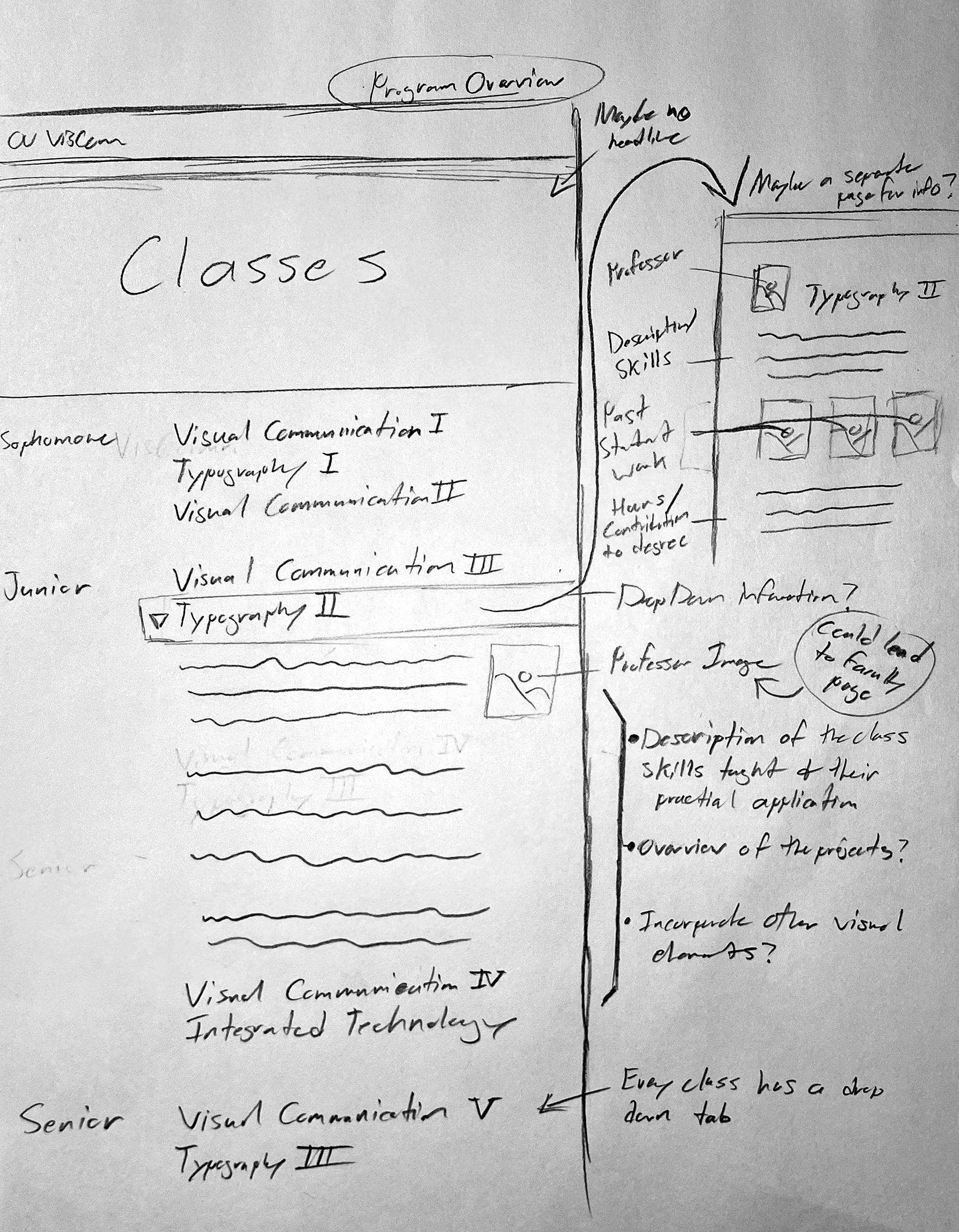
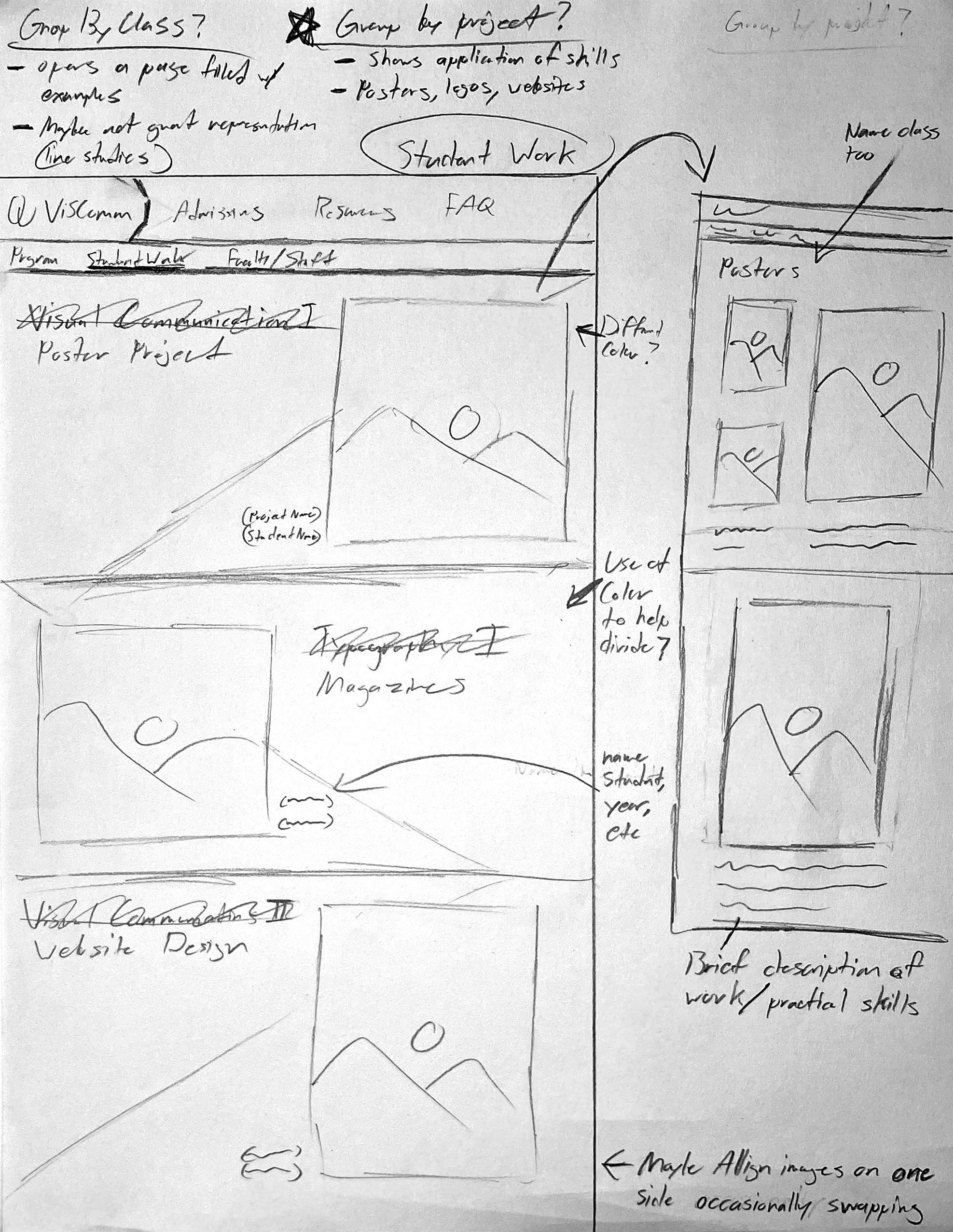
These are the initial exploration of the UI designs through sketches. Some design elements remain fairly consistent across the sketches, such as the top bar. However, almost everything else has a manner of variance, an exploration of other possibilities and opportunities.
Lo-fi Prototype
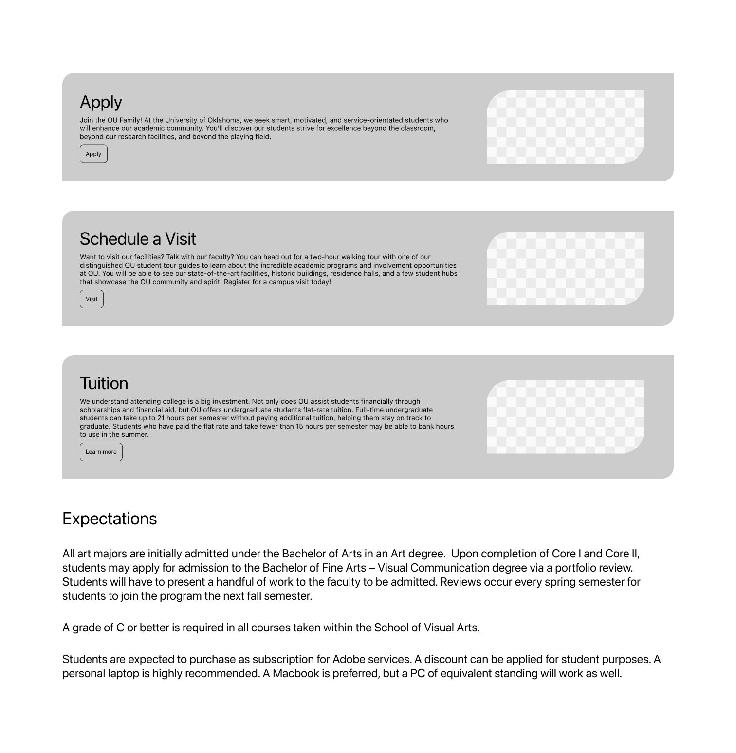
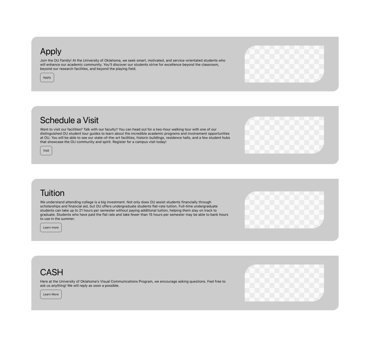
I used the site map as a foundation for my website’s grouping of information and navigation. I used the sketches as inspiration as to how the information is presented. This stage of the project is low fidelity, so the website is just the wireframes: no images, no color, and mainly contains information. All of the buttons and interactions are meant to be done along with the general layout of the pages. The wireframes are meant to be an exploration of the website, not finished for aesthetics, but for usability.
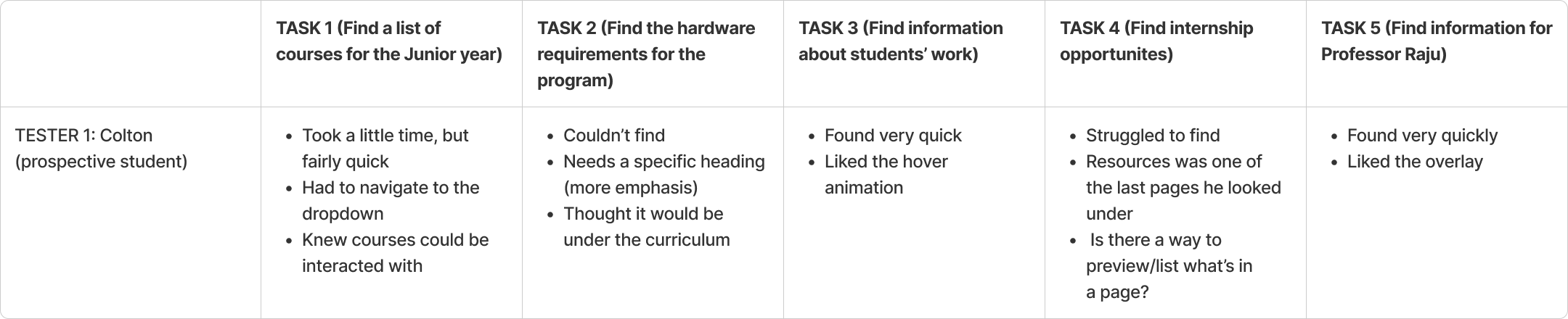
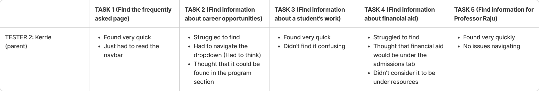
To test my wireframes, I recruited three people to navigate my website, each one representing a different user group: students, parents, and faculty. Then, I asked them five questions related to finding information within the wireframes. For example, find a list of junior level classes, find information about a professor, find student work, etc. As a part of the process, they would think aloud, expressing their thoughts and struggles. It allowed me to better grasp the strengths and flaws of the wireframes, so I could make changes.
Tester 1
Tester 2
Tester 3
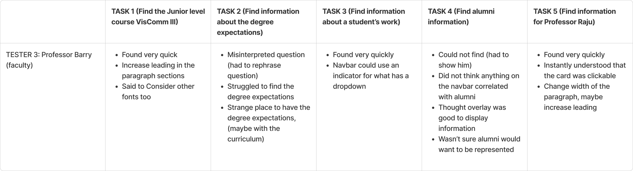
Most of my users found it difficult to identify what had a dropdown on the navbar, so I added a plus icon on the relevant headings. They also found certain information, such as course expectations and financial aid to be in strange locations. I moved the expectations to the curriculum page, and the financial aid to the admissions page. Overall, there was at least two pieces of information they found difficult to find, largely due to the grouping of information.

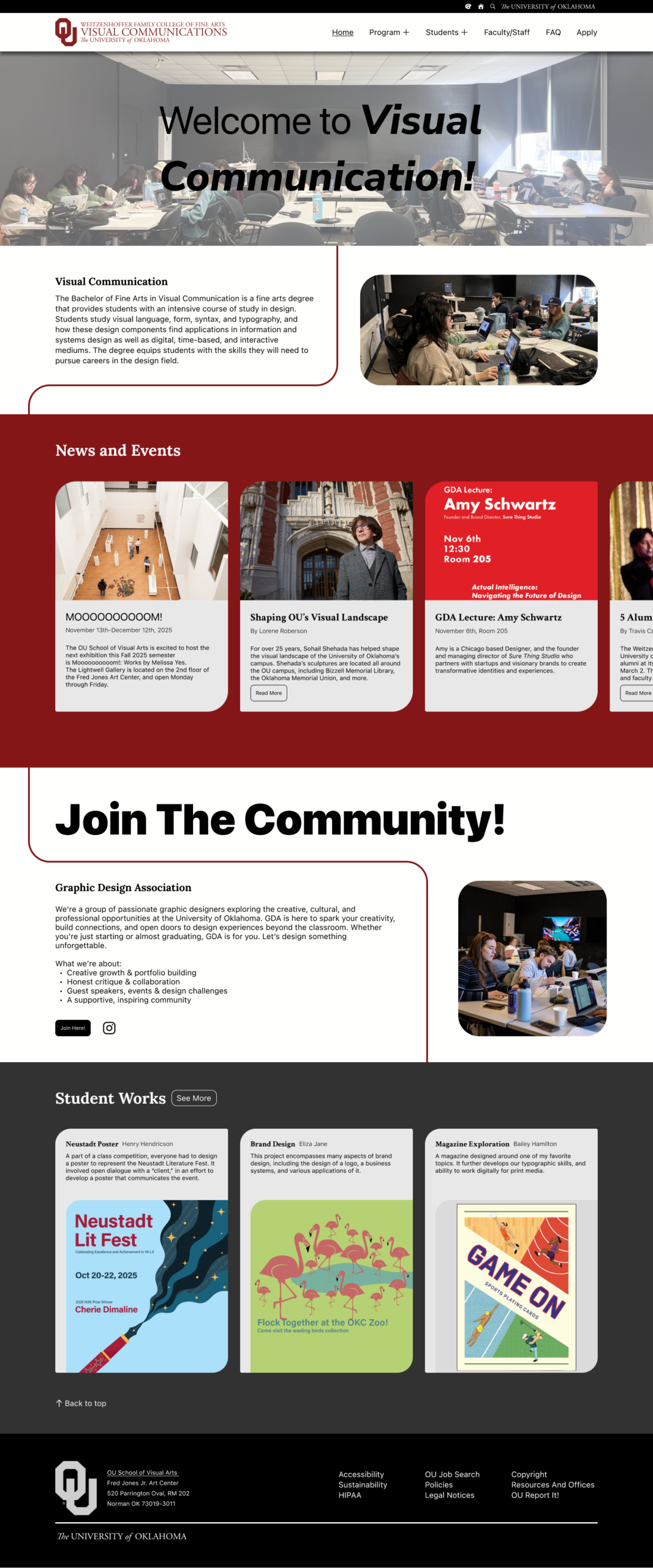
Hi-fi Prototype
After completing the wireframes, most of the components were already interactive, so I worked on adding images and color. Most of the colors adhere to the University of Oklahoma’s guidelines, but I also made it possible to change the colors to have a blue focus instead of red.
TEST (A/B Testing)
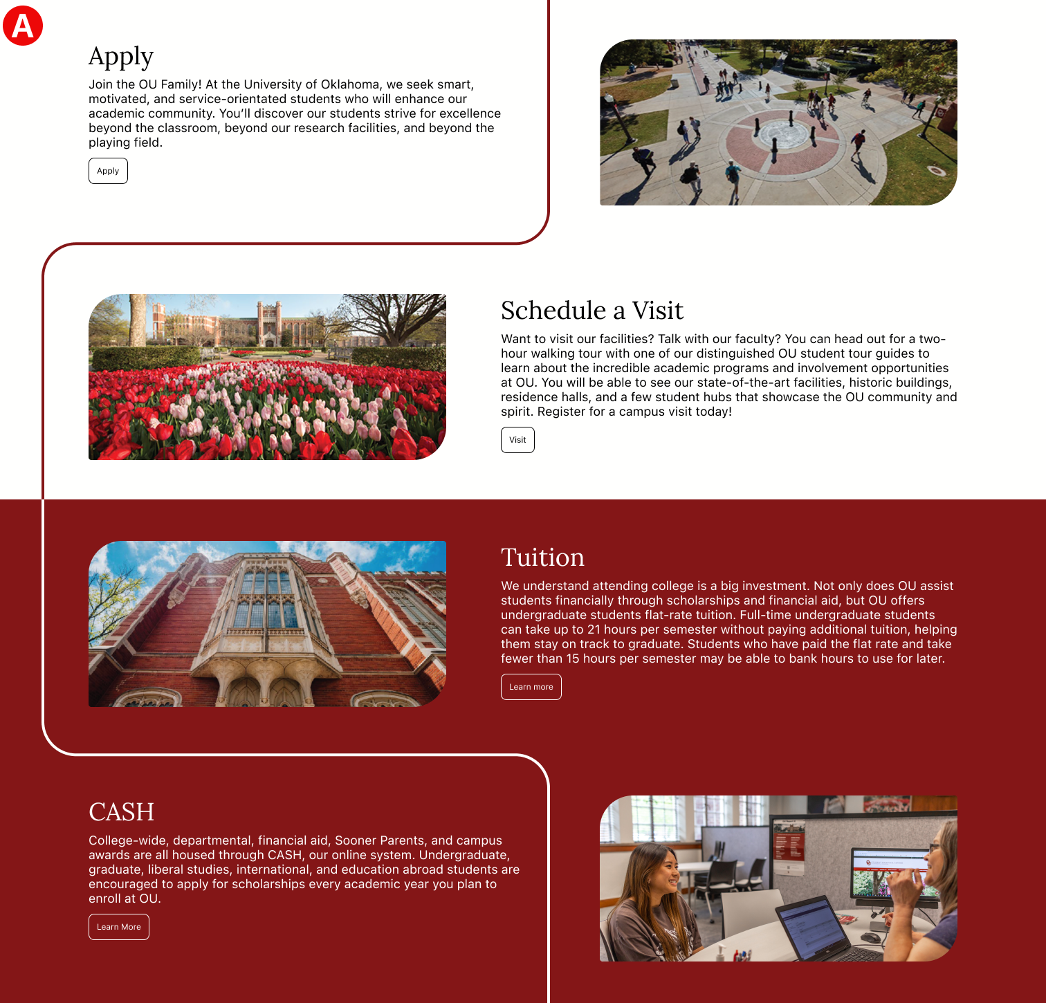
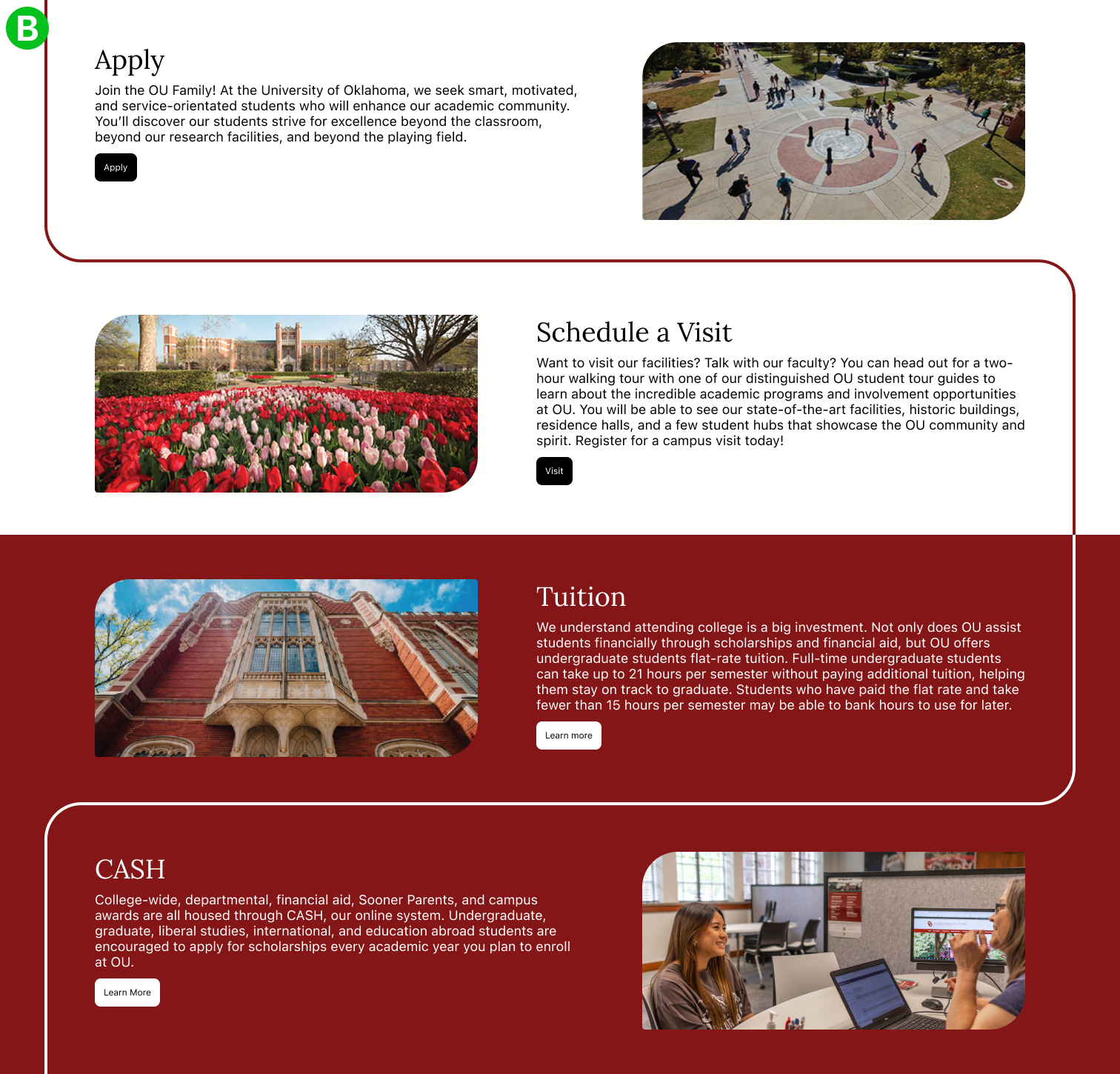
I used A/B testing to compare and contrast three different designs I thought could use a rework. In every case, the goal was to improve clarity and ease of use, which was determined by gathering information from testers.
Test 1: Admissions page information grouping and buttons
The admissions page was fairly monotonous, so I created two variants and asked testers which design was easier to use and understand. I chose the second design because it received feedback that information was more clearly arranged, and the buttons were easier to delineate from other elements.
Test 2: Viewing student work in the student overlays
I conducted a similar test for student overlays. The first design is very limited and attempts to contain several images. I chose the second design because testers said it was easier to view the works with larger images. Plus, it provided more opportunities for showing more images.
Test 3: Interactive page elements
I also tested a different interaction with the rounded corner elements. Instead of only being highlighted when interacting, the shapes inverted. The goal was to make the pages more dynamic and interactive; however, I quickly reverted my work to the original. I received feedback that the interactions were very distracting and sometimes jarring.
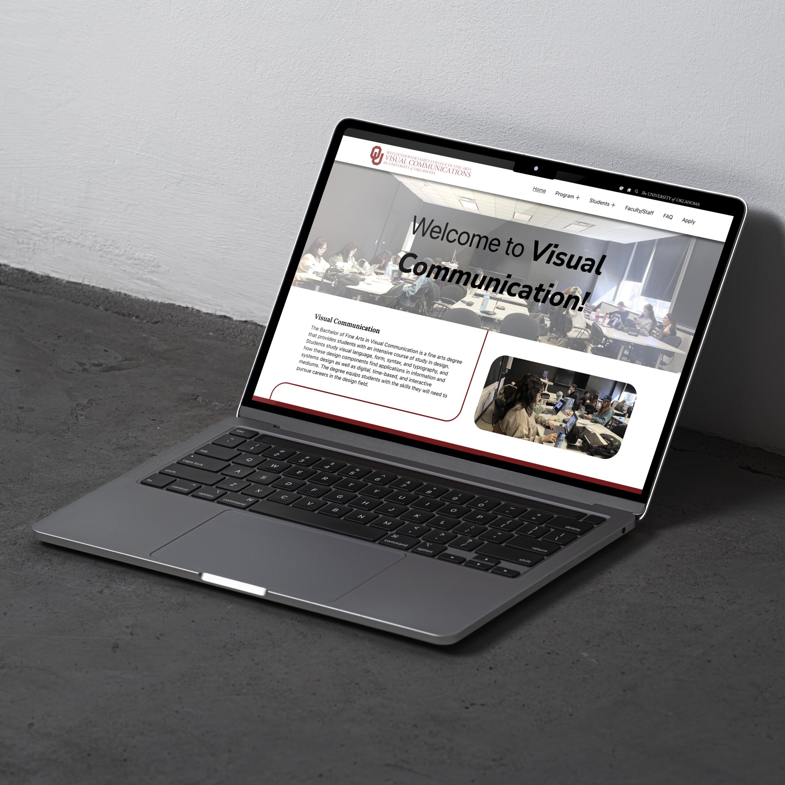
Final Prototype
Conclusion & Reflection
Overall, the project required a website design that fit my user’s needs. Through researching, prototyping, and testing, I think I managed to make a fairly successful website. The project provided lots of opportunities for growth and learning. I had very little experience with interviews, but now I know how to handle different situations and people. All the methods were new to me as well; they helped a lot when I was researching and conducting interviews. If I could go back and change something, I would probably spend more time researching websites and sketching. I think I could have pushed a more creative website. With that said, my favorite part of the project was actually creating the website in Figma. I really enjoy discovering different methods and solutions to my problems. For example, making a sidebar that scrolled with the navbar was a fun challenge, the same goes for implementing a color system. Making a website where everything works is incredibly fulfilling, and I wouldn’t mind doing it again.