EverFit – Motivation to Exercise
Often times people will say they’re going to go to the gym or get more exercise only to give up in a few months. Motivation is a key factor in exercise, but people often struggle with a lack of motivation.
Research
Consistent exercise is fueled by motivation. However, a large portion of people struggle with motivation: less than 50% of adults in the U.S. are considered regularly physically active. Apps have tried to promote or sustain motivation through goal tracking and notifications, but their users still burn out. The sooner adults start to work out consistently the higher the chance they continue later in life.
Problem
How might we provide feedback and reminders to keep users motivated and consistent in their physical activity goals?
Solution
An application that utilizes AI to support consistency in physical activity and enable the user to fulfill their personal goals.
1. Empathize
During this stage we wanted to better understand our potential users by knowing their goals, needs, and challenges. Individually we interviewed 3 people each for a total of 9, looking at college students that exercise consistently and those that don’t. We recorded our interviews, so that we had a transcript to refer to.
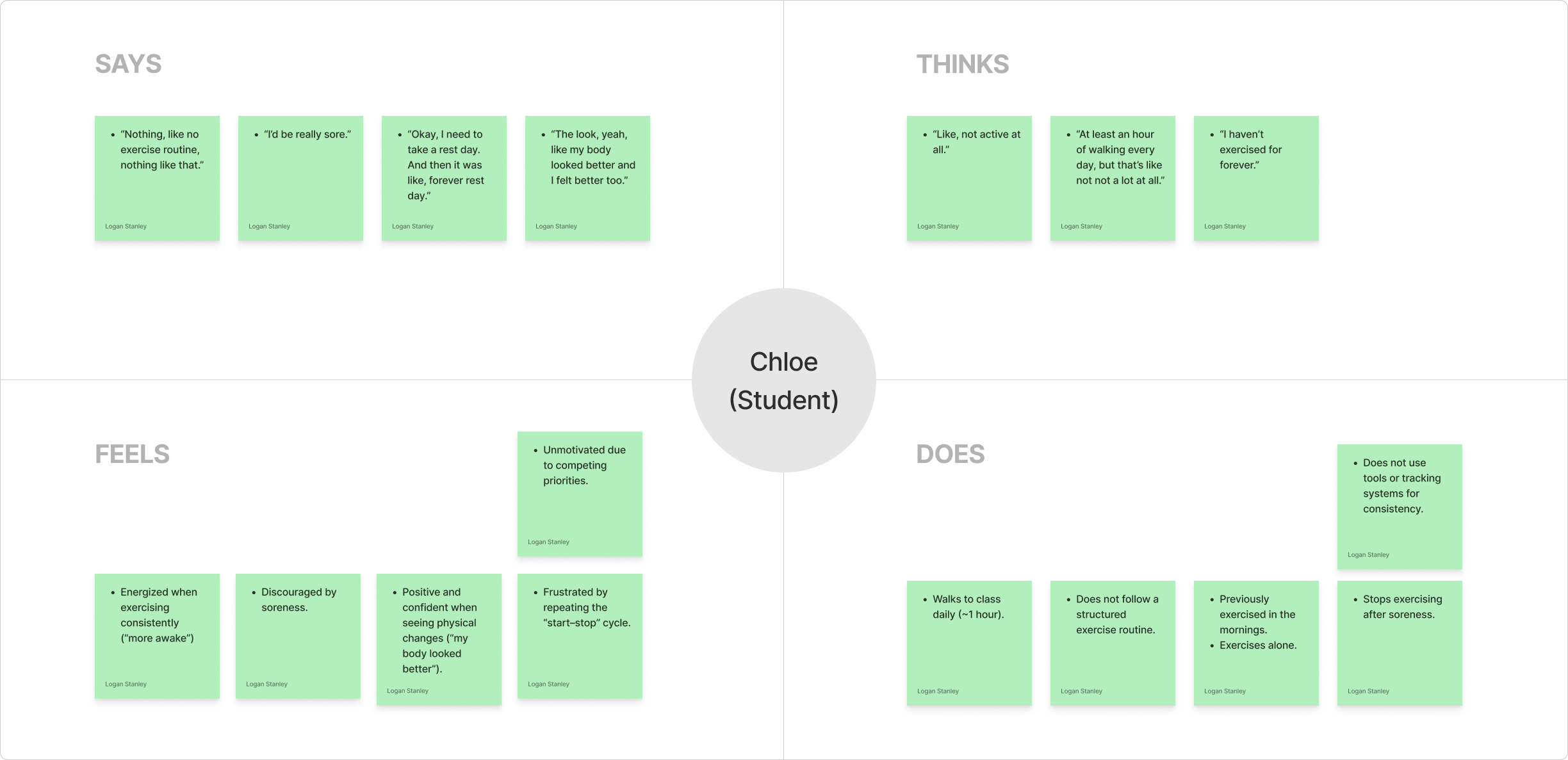
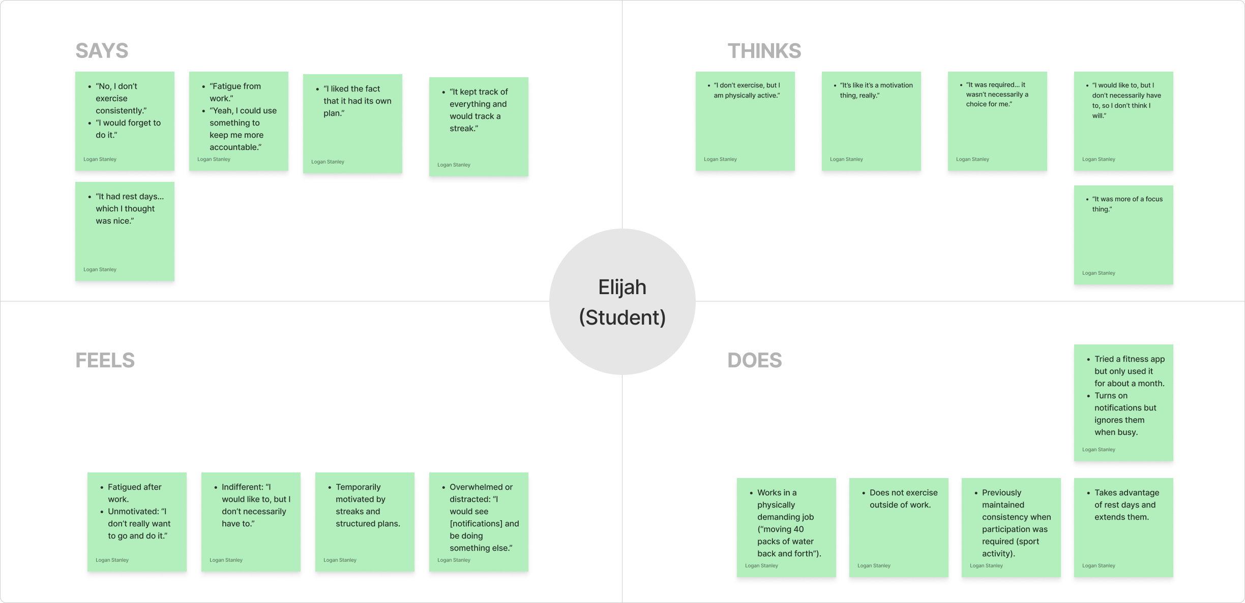
Empathy Maps
We analyzed the interview transcripts with ChatGPT, ensuring that we engineered a suitable prompt. It responded with participants’ individual quotes, organizing them into thinks, says, feels, and does. We verified the information and created empathy maps. View all Empathy Maps.
Thematic analysis
We then engineered a prompt for ChatGPT to conduct a thematic analysis. We refine its parameters and developed central themes.
- Motivation is Contextual: Motivation can fluctuate and differ from person to person. One participant said, “I lose interest quickly.” Motivation needs to be renewed and supported to be kept consistently.
- Consistency Requires Structure: Clear goals and outcomes kept people motivated and engaged in exercise. One participant said, “Sports helped me keep exercising.” When accountability is taken out of the equation, consistency decreases.
- Outside Variables Interfere: Time, fatigue, and other variables interfere with exercise. One participant mentioned, “Fatigue from work.” Factors outside of their control can affect their willingness to engage in exercise.
- Feedback can Motivate or Backfire: Viewing progress can embolden or hinder consistency. One participant said, “The more progress I see, the more I think I can stop.” Feedback needs to be personalized and adaptive to maintain effectiveness.
2. Define
During this stage, we synthesized insights from user research to clearly articulate the target user, their core problems, and needs. We focused on creating a persona and mapping their experience to better understand how AI could support our target users.
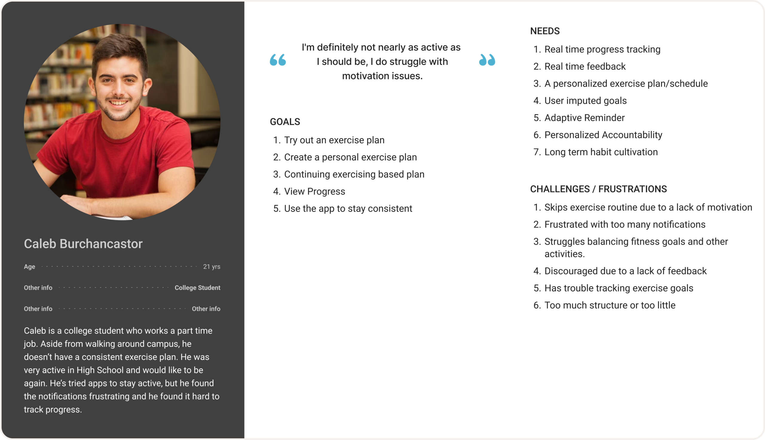
Persona
We created a persona to better define our user’s goals, motivations, and frustrations. The persona was synthesized from our interview data. Caleb Burchancaster is a college student who wants to exercise consistently. He wants a personalized plan that he can view and track his progress.
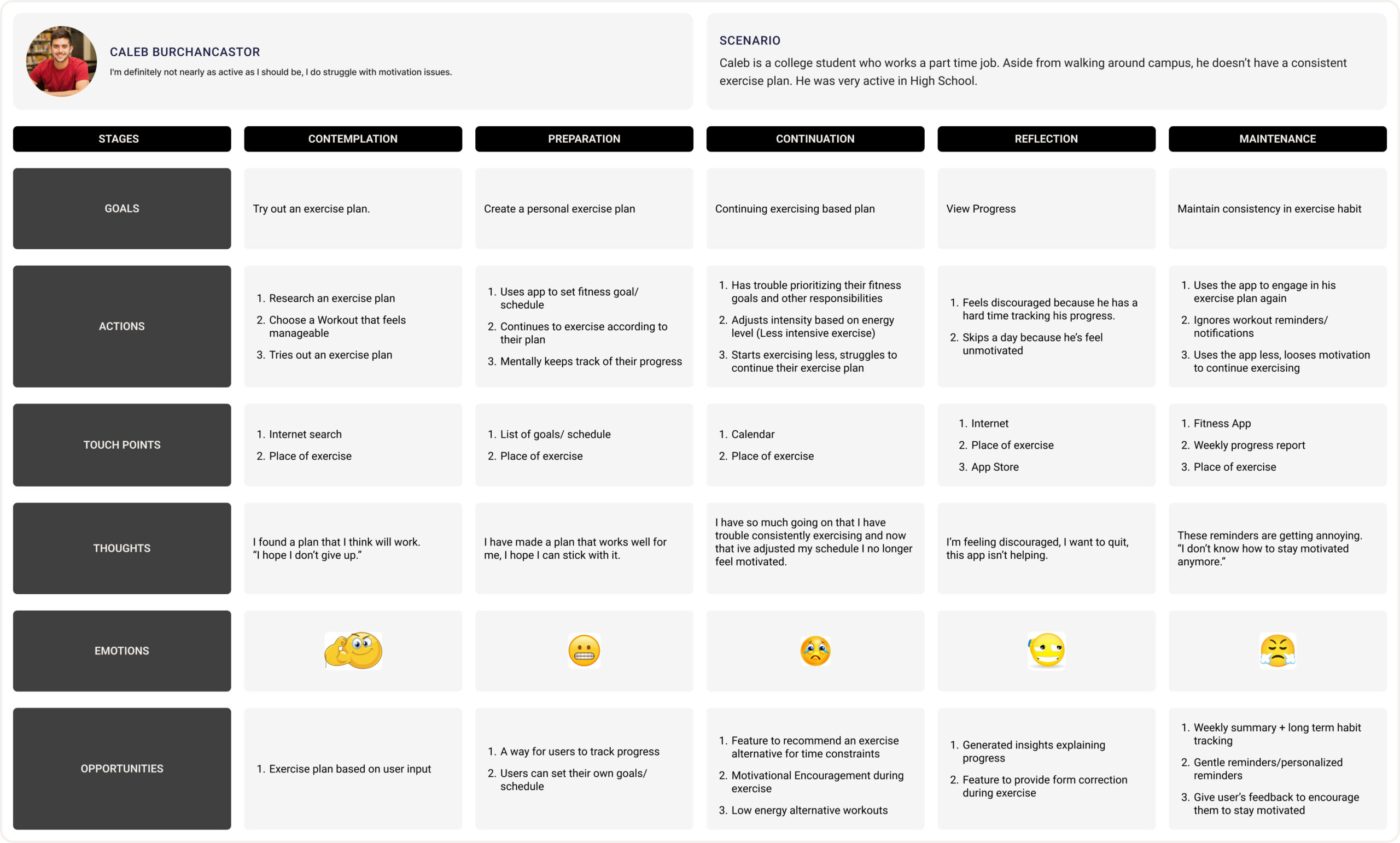
Journey Map
We created a journey map to illustrate our target users’ current struggles and identify opportunities for improvement. Our persona starts by researching an exercise plan and his journey follows his struggle to stay motivated and exercise consistently. We identified several design opportunities such as progress tracking, motivational encouragement, and gentle, personalized reminders.
Mapping AI need to Data Requirements
To understand how AI could help in our solution, we used our persona and journey map to identify important needs. We determined that users need a personalized plan, improved motivation, and progress tracking.
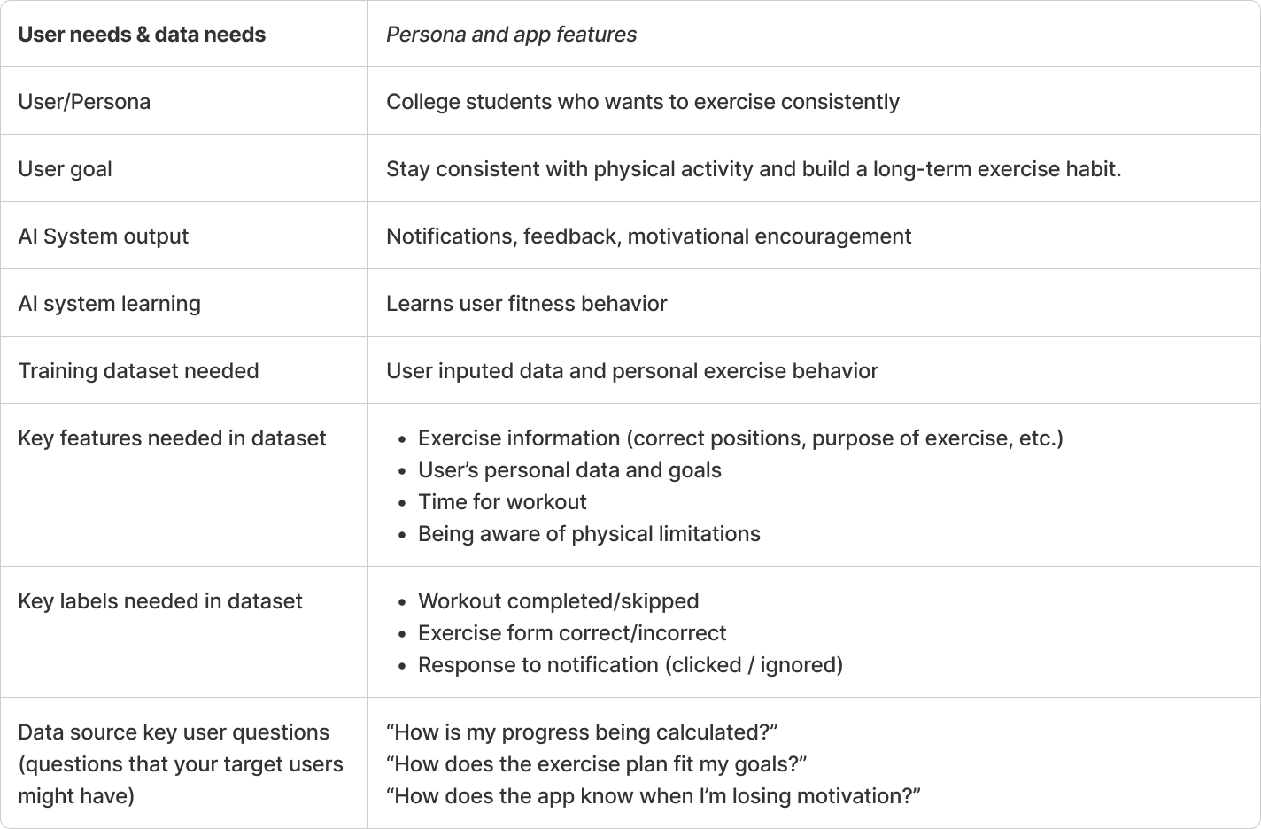
At this stage, we used a worksheet to evaluate the need of AI in our solution. We referred back to our research to identify needs and struggles that needed to be resolved. Then, we evaluated instances where AI is useful and if similar uses could work with our solutions. We looked at instances where AI had potential and other instances where it added little to no value. For example, Ai has the ability to recommend content to users and could introduce new exercises and tips to keep users consistently exercising. However, AI can’t perfectly detect fatigue without data input. View worksheet.
Finally, we mapped user needs to data requirements. We had to understand the type and scope of data needed to train an AI model for our user needs. For an AI to be a part of our solution, it needs to understand exercise information, along with personal goals and limitations to curate an exercise plan for consistency.
3. Ideate
During the Ideate stage, we worked on developing solutions based upon the problems and insights gained from our research and define stage.
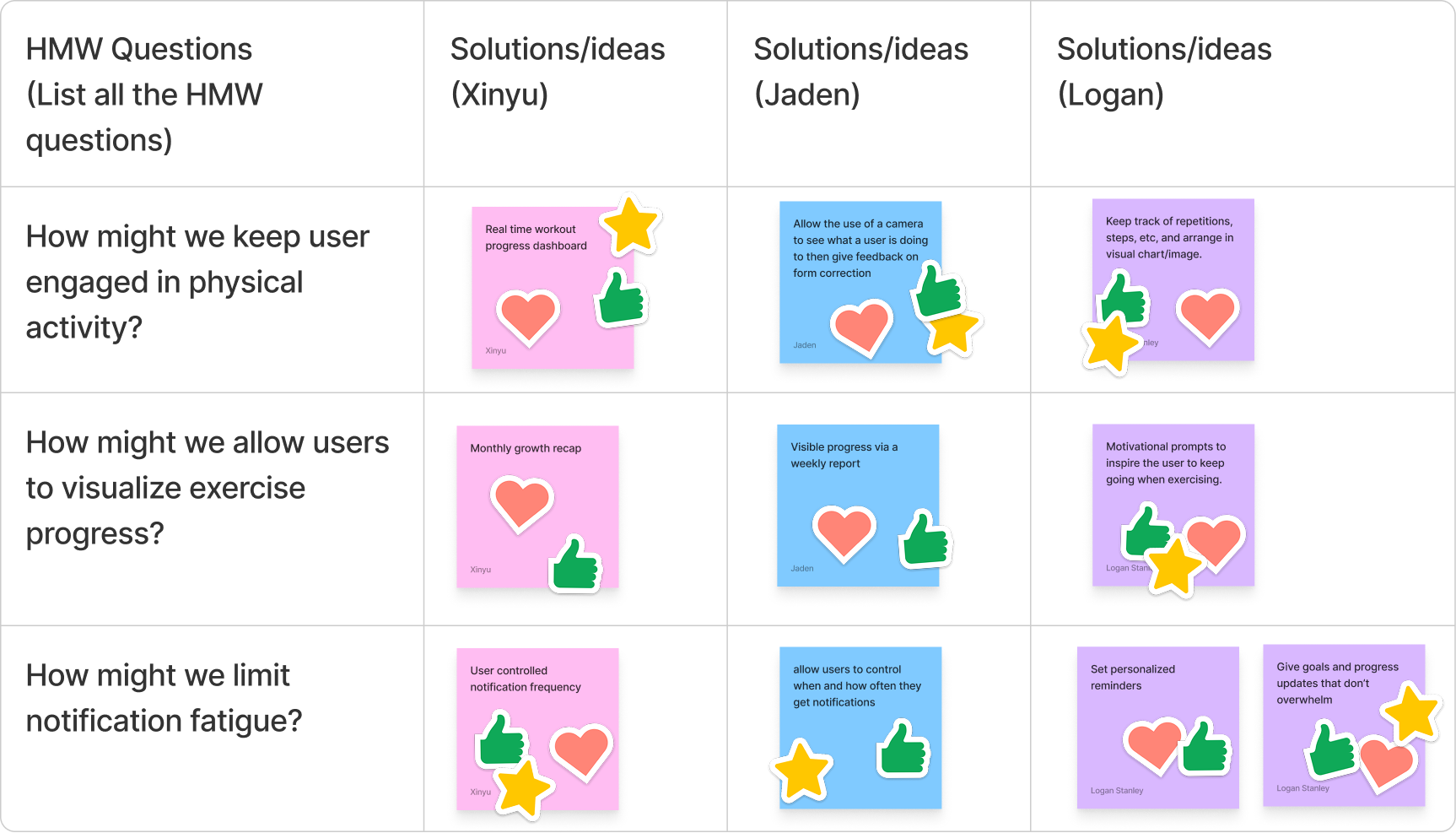
Creative Matrix
We developed how might we questions based on user insights to narrow our focus and start exploring solutions. The questions had to be framed carefully, so they weren’t too broad or too narrow. After individually brainstorming solutions to the problems, we worked as a group to choose the best ideas. We developed three major features: real-time exercise feedback and motivation, visualization of exercise progress, and personalized reminders.
We explored HAX design guidelines, focusing on those most relevant to our core features, to improve user–AI interactions. For example, we looked at our feature that provided real-time exercise feedback and used a HAX guideline worksheet to evaluate our feature. We determined that guidelines such as showing contextually relevant info, matching social norms and mitigating social biases were really important. If the system is going to give motivational prompts, it needs to understand how and when to appropriately engage the user. However, there were some guidelines that we felt were not relevant, such as the ability to support efficient correction. Our prompt system reacts to the user while in exercise. A user may not be able adapt or change the AI when in exercise.
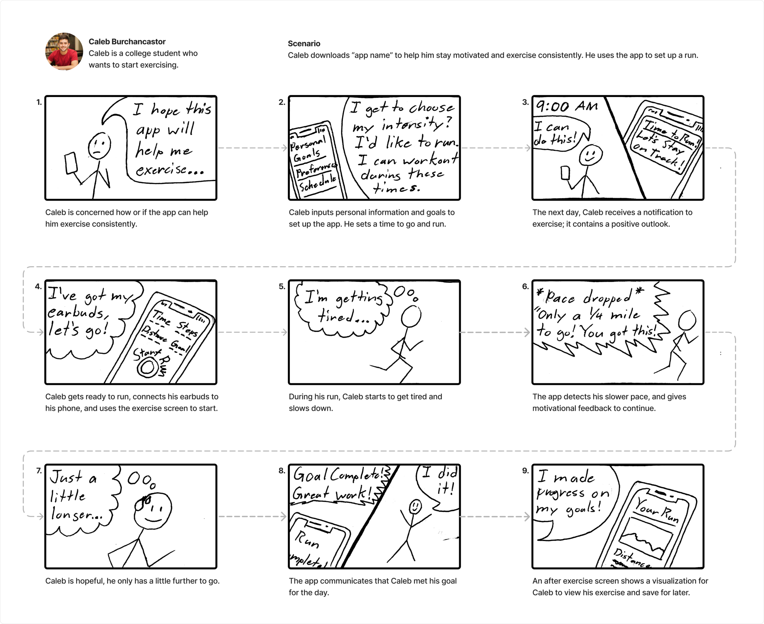
Storyboard
Working independently, I developed a storyboard to visualize a user interacting with the app. I used the persona we made and created a scenario. Caleb downloaded the app and used it to complete a run. The storyboard references Caleb’s emotions and reflects several system features such as feedback, visualization, and notifications.
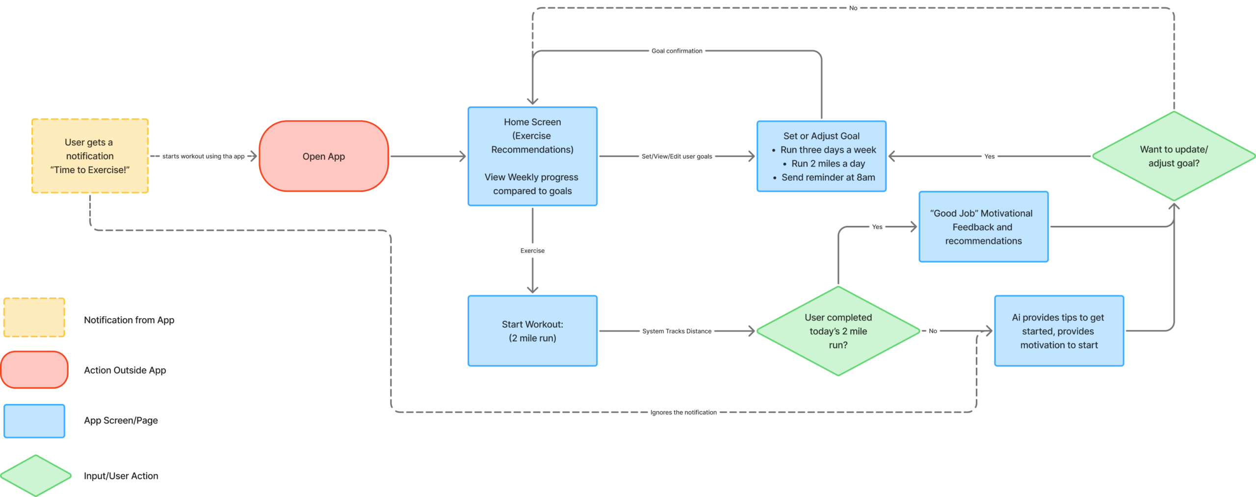
User Flow Chart
The user flow chart visualizes key interactions within the app. It starts with the system reminding the user to exercise. Home contains viewable exercise progress and provides exercise recommendations from the system. Plan contains the ability to create, edit, or view an exercise plan. Exercise allows users to track an exercise session and receive helpful feedback and motivation. If the user doesn’t complete their goal or ignores the original notification, the system tries to motivate the user. After the exercise, users are given the option to adjust their goals to better suit their needs. Everything is personalized and attempts to keep the user engaged in consistent exercise.
4. Prototype Lo-Fi & Test
During the Prototype phase, the goal is to start developing how the app will function and if those functions and interactions make sense to the user.
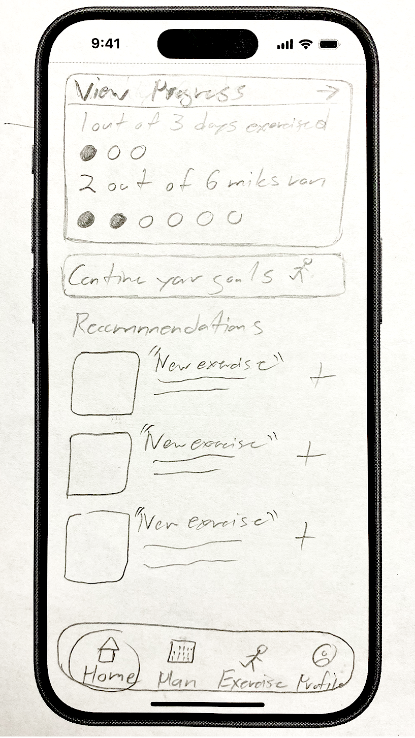
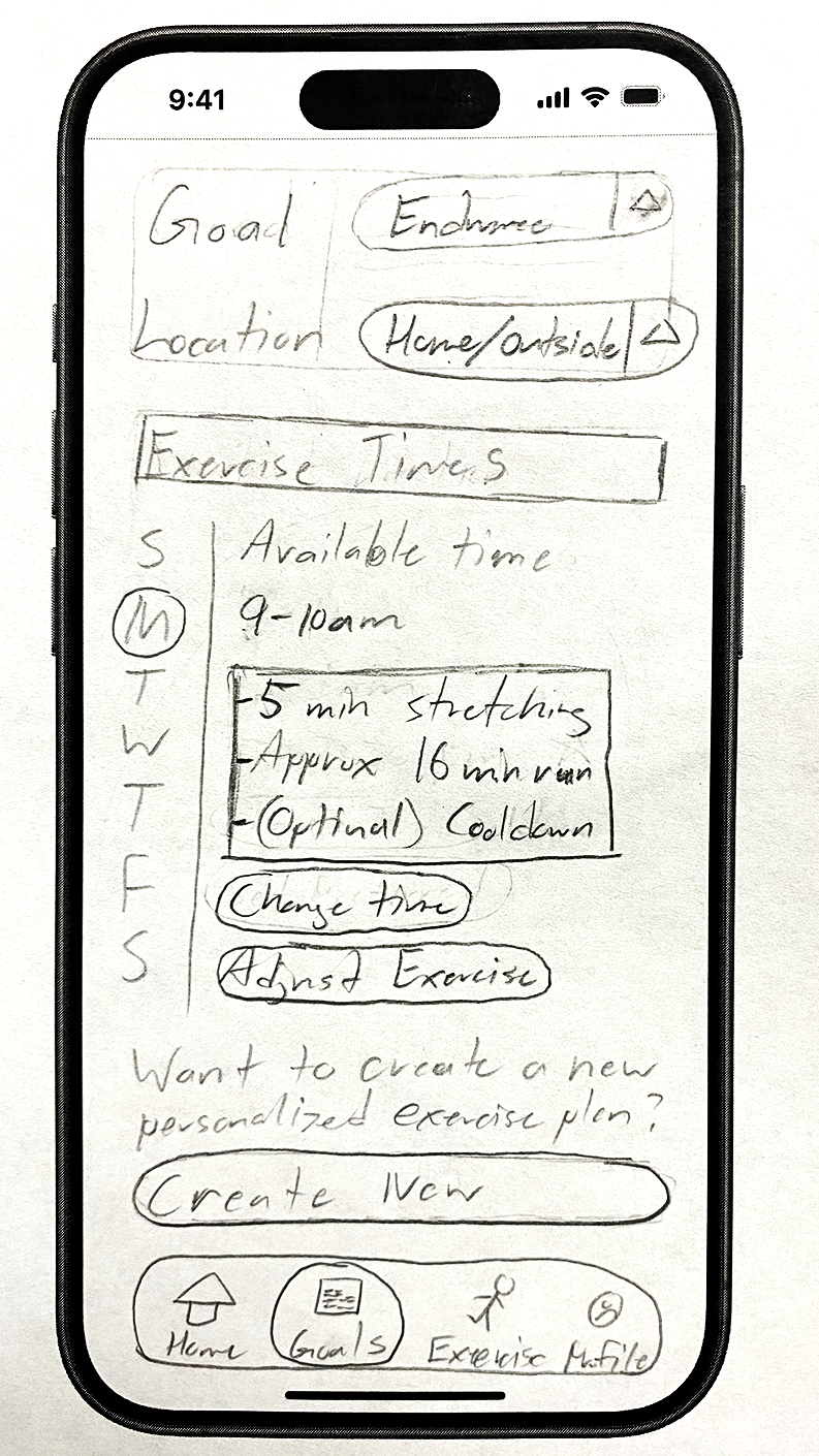
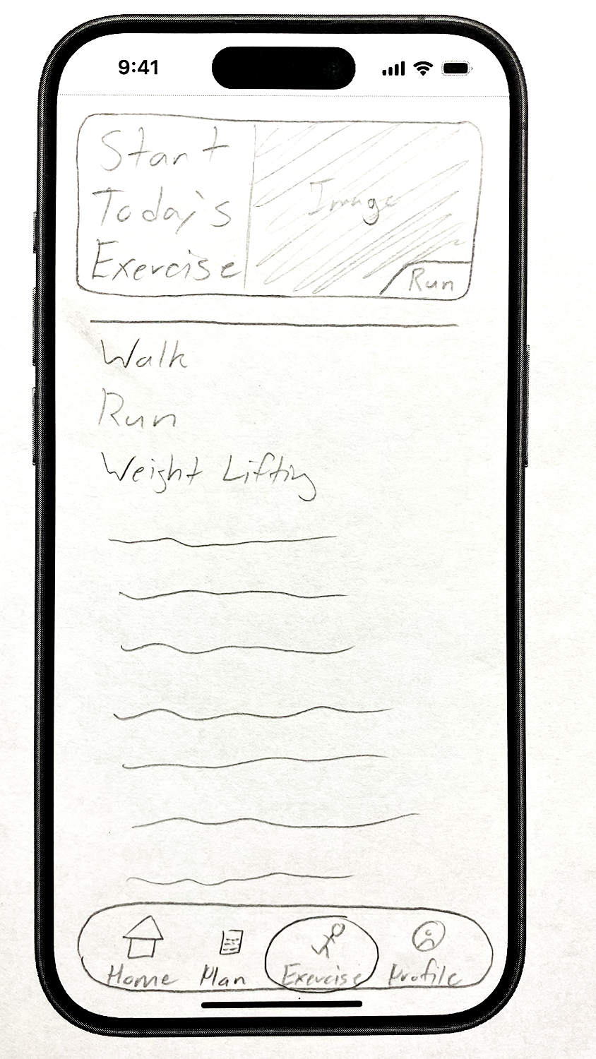
Paper Prototype
I developed a paper prototype to develop how the app would look and work. Based on some of the How Might We questions from the Ideate phase, I worked to include screens specifically for viewing exercise progress, tracking and feedback, and personalized notifications. We intended for AI to learn how and when to push notifications based on user behavior. However, it is hard to show that in a paper prototype, so I focused on implementing a feature that helps create a new exercise plan instead.
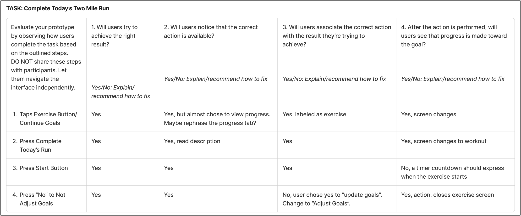
Cognitive Walkthrough
To evaluate the functionality and effectiveness of my paper prototype, I had two people participate in a cognitive walkthrough. I prepared three tasks: view exercise goals over a monthly period, create a new exercise plan, and complete today’s two-mile run. Each task relates to key features we developed in the Ideate Phase. Then, I mapped out the steps required to do each task. I would give a participant a task and ask them to think aloud. I took notes as they tried to navigate my prototype by pressing on parts of the sketches they thought lead to the right action. I evaluated each step they took based on four criteria as seen below.
Key Insights
Oftentimes, testers would choose the wrong button because of its labeling. For example, a participant tapped on “new exercise” to create a new plan: the new exercise was a recommendation from the system. Also, towards the end of “completing the exercise” task, users misinterpreted the system. After an exercise, the system asks if the user wants to update their goals; both testers thought it was asking to update their progress and said yes instead of no. In general, the labeling needs to be more precise in order to avoid confusion and misinterpretation. Not to mention, some buttons need an interaction feature to let the user know they pressed it.
5. Hi-Fi Prototype, Test and Iterate
During the High Fidelity phase, I translated my paper prototype into a working prototype, making sure to integrate insights gained from the cognitive walkthrough.
Hi-Fi Prototype V.1
To create my high-fidelity prototype, I used my sketches as references. I made a master template to have a foundation for all of my screens. Then, I gathered icons and singular elements to use as atoms before making molecules, more complex collections of atoms. My template had a large section where I use molecules to make an organism and then perfect into a final screen. Usability Heuristics guided some of my design as well. For example, if I ever used icons, I tried to relate them back to the real world, like the Usability Heuristic number two: matches between the system and the real world. I also tried to follow number four: consistency and standards. I wanted everything to be consistent and coherent across the entire app. AIX Design Guidelines played an important role when working on the AI parts of the app. For example, when making a screen for the new plan creation, I wanted the system to show contextually relevant information and match social norms, so the system was accurate and approachable to users.
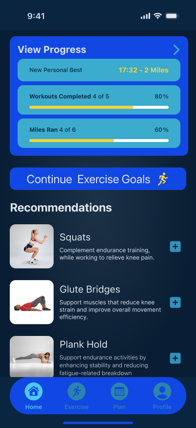
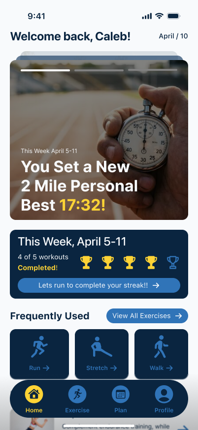
Home Screen
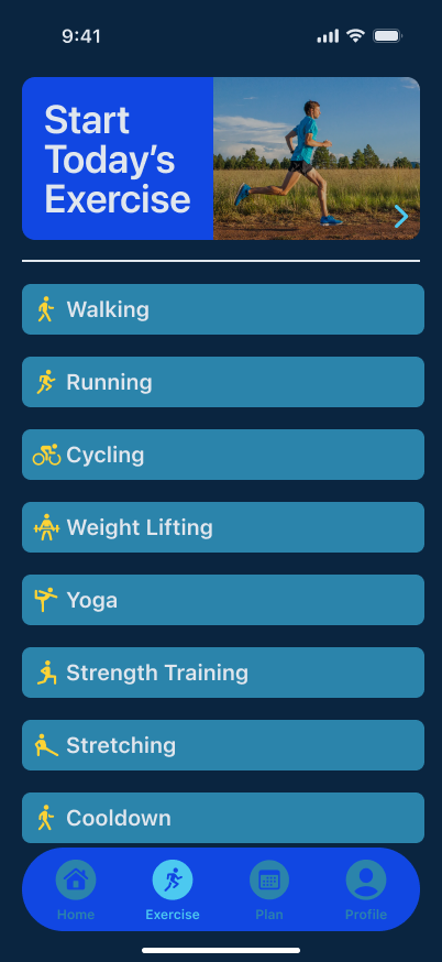
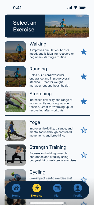
Exercise Screen
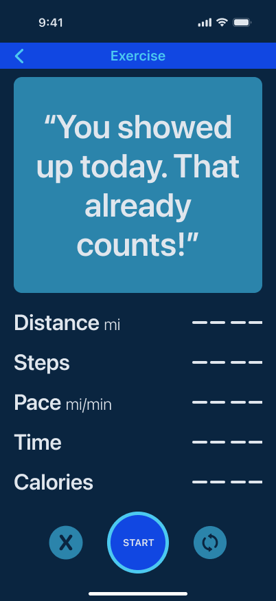
Running Screen
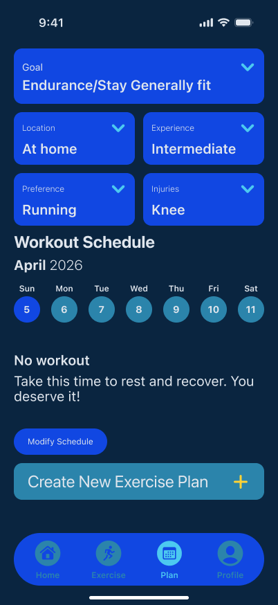
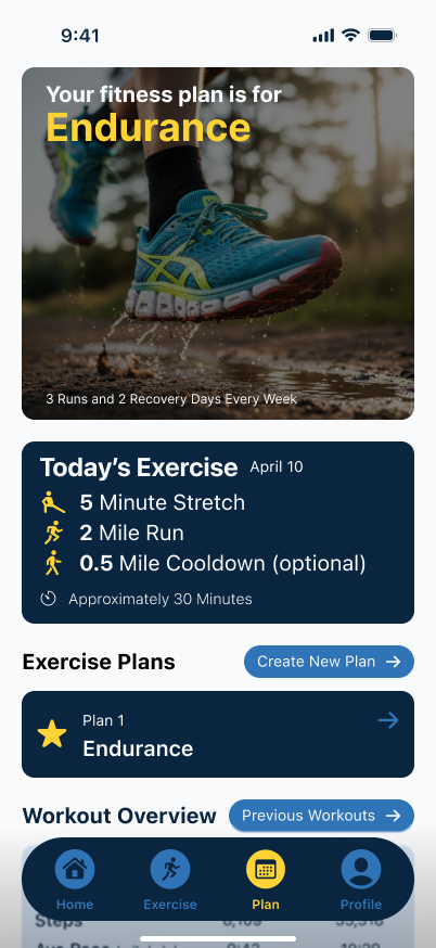
Plan Screen
Test (Heuristic Evaluation)
Peer evaluation of the initial hi-fi prototype revealed issues with Usability Heuristics four, seven, and eight: consistency, feedback, and minimalism. Some buttons and interactions were different from one another and distracting to users. I agreed with the observations, so I went back and revisited everything to make them more consistent across the board. Some of my elements had different rounded edges or had different padding. Also, I had some interactions without any feedback. For example, the AI exercise plan creation had no way of saving the plan. I added a button to save the plan along with a notification for confirmation. Not to mention, recommendations on the homescreen had no clear button for interaction, so I added a button icon. My design wasn’t clean and minimalist either. The colors were disruptive and some of the screens felt constricted. I gave more padding and tried to break up the screens differently. Not to mention, I revisited my color palette to make it more clean and easy to read.
Hi-Fi Prototype V.2
After the testing, it was brought to my attention that my app was too generic and didn’t help with motivating users. So I completely revised most of my screens. I made the home screen more welcoming and included fun statistics for motivation. I added a streak counter for the week and shortcuts to exercises. I changed the exercise screen so it could breathe and give more descriptive details for each exercise. I converted several screens into overlays such as the running screen and summary. Plus, the plan screen was readjusted to show the plan and provide access to plan editing and plan creation along with viewing other forms of progress. Everything was refined to try and promote motivation and ease of use.