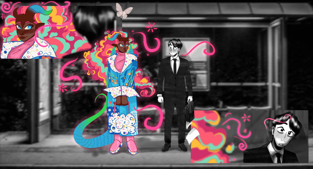
“It gives you the opportunity to be very creative and to display yourself” – Thelma Salinas
Objective
This project takes on the challenge of creating a website to represent the program of Visual Communication at The University of Oklahoma. My goal is to understand what people think about our website and how they feel about the provided information.
The Problem
The issue that the program has is a lack of a website dedicated to it. Without a website you can easily get confused, lose possible students due to lack of information, and reflect the program very poorly.
“…Because I just went in blind, I’m not gonna lie, I think a lot of us do.” – Michael Farris
Where to start?
When starting off, it had seemed easy enough to simply jump into the project. Though we had written down our ideas, trying to figure out how our plan would go along. The start had us research and then analyze our competitor colleges. Through my personal competitor analysis of The University of Houston is I had noticed some key insights.

Our findings
Strengths I had discovered while navigating the website as if being a student who was interested had included,
- Having a strong appearance when it comes to their web design when you first open the website.
- Social media being up to date and consistently posted to so that those who are curious about the community and those involved in the program have diverse opporunities to visually see the content
- The major has an official branding style and consistent posting
- Website design is strong and easy to navigate, having big and bold fonts and easily readable text providing accessibility to those with poor eyesight.
I had also found some weaknesses,
- The design starts off strong, showing student work, having some bold design work but then becomes boring and like any other website directly after.
- If you want to see more work from the students you have to know they have an Instagram and scroll through that instead of either a direct link that is highlighted through the website or a portfolio of past student work
- When you want to discover the checklist or the courses you must take, clicking on the button leads you to the same generic website instead of a specific list of necessary courses.
- The information, though mostly helpful, was generic and could have been expanded upon, especially for those interested in the program. It had come across as basic and could use more motivating language and visuals.
What did we ask?
Using these, we had learned some elements that would be included in our interviews. We had taken some disadvantages, some questions we had and thought of how each perspective would approach the website. We had gone in with different eyes, different ages and positions trying to think of what they would ask and why.
We found through the interviews that many users found the website vague, incredibly lackluster, and in a way, discouraging from even pursuing the degree. Some had found it hard to read through the tiny and thin font, causing an accessibility issue. Those who had wanted to get a BFA were utterly lost and didn’t know the process, finding themselves struggling when it came to pursuing this path. Additionally that many had misconceptions on what it meant to be an art major, either thinking that Viscomm is only brand design and technical work while some thing we just draw and do nerdy things. The biggest point many had brought up was the lack of visuals, many craving student work and examples of the classroom and the environment that it brings.
Everything considered, the thing that had surprised me was thinking of the language options when it came to the website. My mother sometimes struggles with English and she had asked me if there was a Spanish option. It made me think of an accessibility issue that hadn’t even occured to me.

Any roadblocks?
A challenge that occured during this process was everyone being overworked by trying to gain interviews with people who could only speak with us the week after the due date. Our entire class had felt it. We were all rushing for alternatives, asking for calls, being answered over text, but I knew that we would have poor results if we had not found a later due date. I had, instead of doing what I would have done a year or two ago, and swallowed it and rushed through it, I had asked and then recieved an extension. Many people had indeed needed an extension and it made me more confident to ask for what I needed, seek out the opinions of my colleagues and prioritize quality work over just getting it over with to meet the deadline.