Viscomm Website UI/UX Design
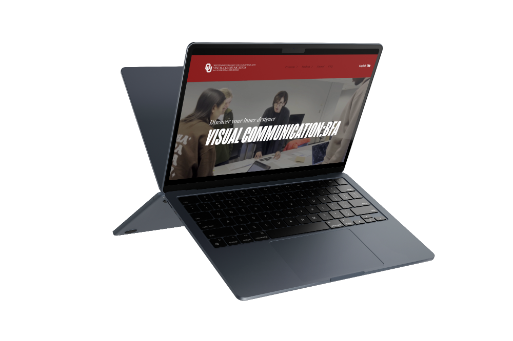
Visual Communication in OU deserves a proper brand and look, through research, new tools, and teamwork, it produced a new experience when navigating the website.
The Five Stages of Design
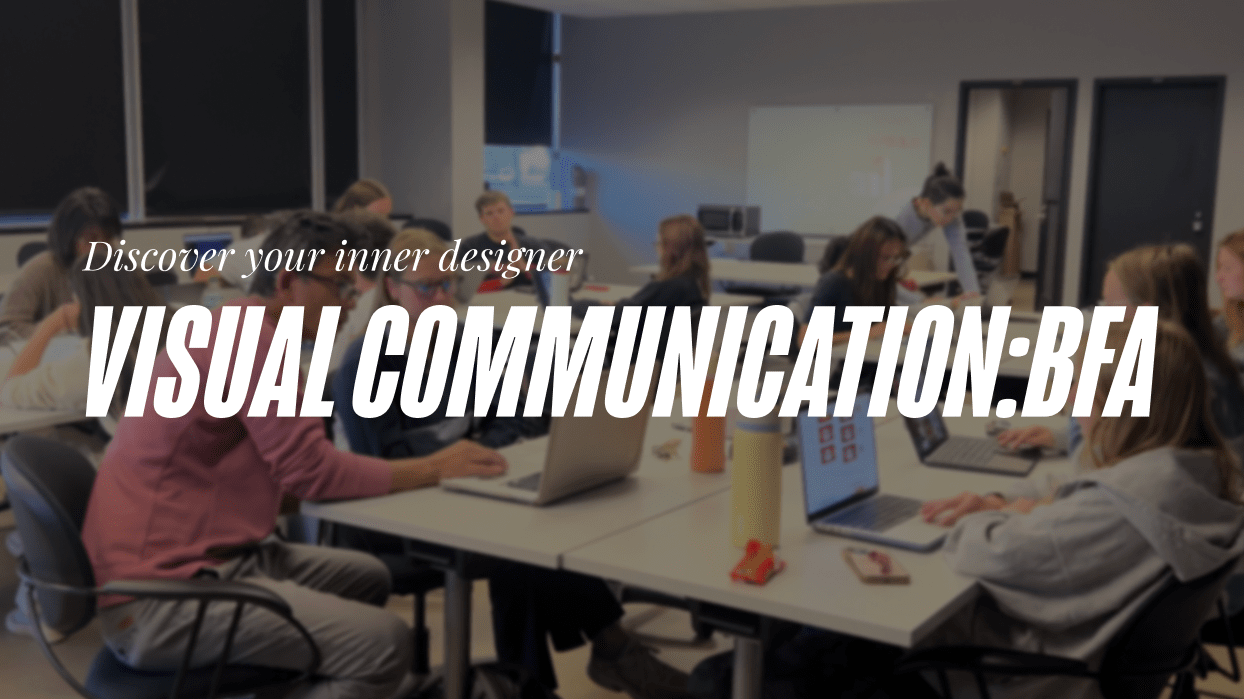
The Visual Communication Program at OU lacks a website that accurately represents the program.
We designed a website to display the programs strengths, projects, and possibilities for future students by using the design process.
Approaching the problem
Creating the website we used the 5 stages of the Design Thinking Process:
Empathize → Define → Ideate → Prototype → Test
Using this method allowed us to hone in on what would improve and emphasize our program.
→ Empathize
When using the design thinking process, we had a team of three total students. We had started with the first phase:
Our goal in this stage of the process is to find competitors to the program at OU. It will be to study their strengths, weaknesses, what additional steps they take as well as what we could learn from them. We tried to think of those who would be our target audience for the project to make our selection.
SECONDARY RESEARCH: COMPTETITOR ANALYSIS
When analyzing competitors we had split up between local colleges and neighboring state colleges to spread our scope since many students come from Texas and nearby states. We had picked University of Houston, Oklahoma State University and University of Arkansas. We decided to explore everything when it came to the schools, their social media, their additional websites, anything that would proper context.

Strengths:
- Visuals
- Social media presence
- Compact site
Weaknesses:
- Strong start, lackluster end
- Lacks student work
- Information is too vague

Strengths:
- Video examples
- Listed Achievements
- Career paths
Weaknesses:
- No dedicated website
- Poor website design
- No information on faculty

Strengths:
- Easy navigation
- Informative site
- Good amount of imagery
Weaknesses:
- Limited showcase
- No interactive elements
- Lacks compelling visuals
From this stage we went full into analysis mode. This included interviews with our intended audiences.
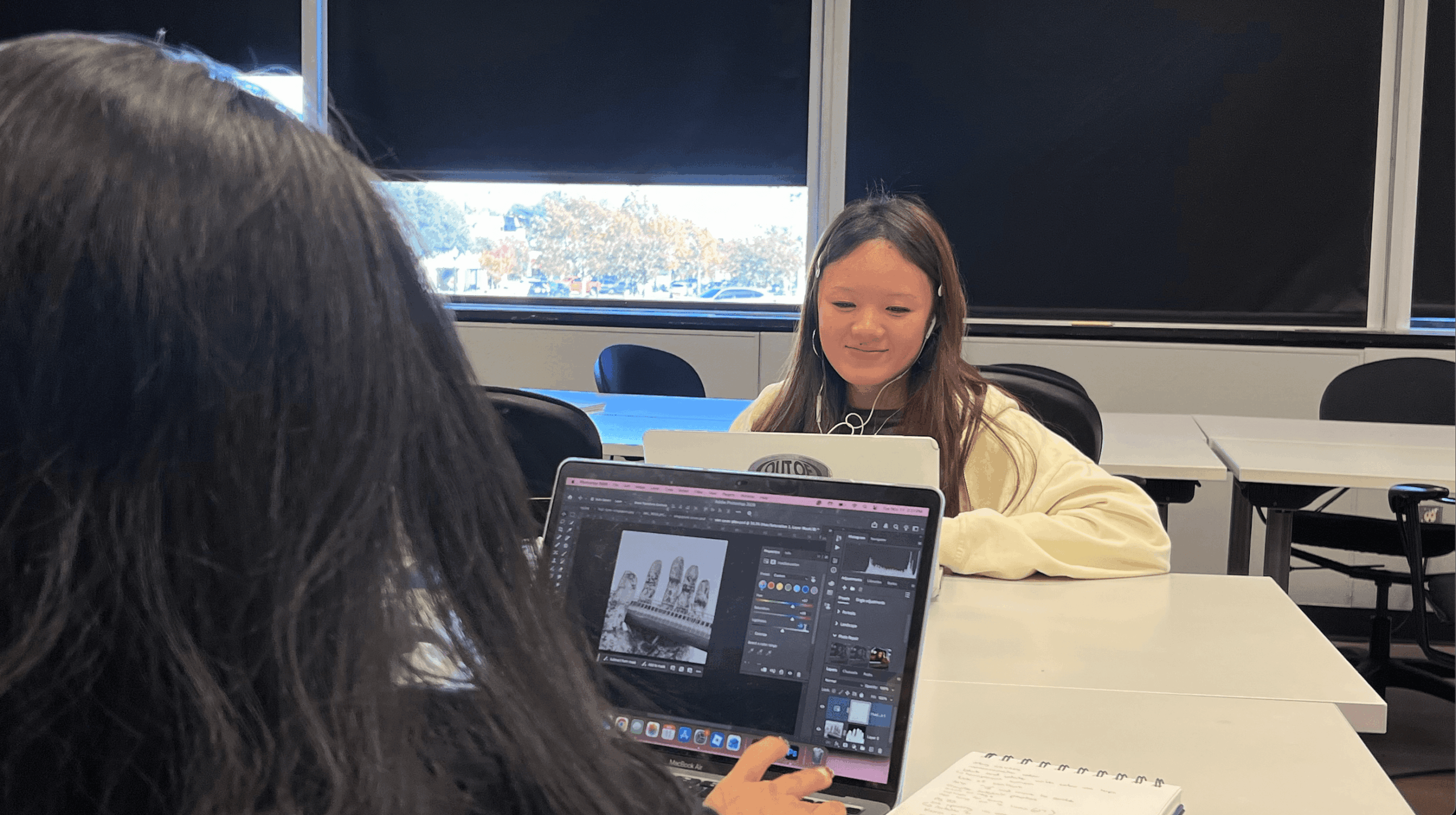
We had interviewed 1 senior, 2 faculty, 1 alumni, 2 new students, 1 new professor, and 3 parents. These were our focus groups based on who would be visiting the website for information the most.
EMPATHY MAP
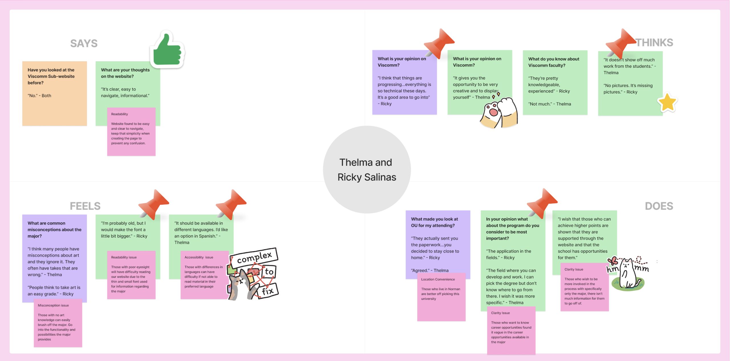
When exploring our audiences we had taken notes on what each had provided. We have noticed the biggest points and concerns brought up during the interviews were mostly problematic
❌
- No student work available to view on the site
- The font is very tiny for the important information
- Fails the method of appealing to readers; Fails to be skimmed
- No clarifying course information
✅
- Website is very simple
- There is information on studying abroad
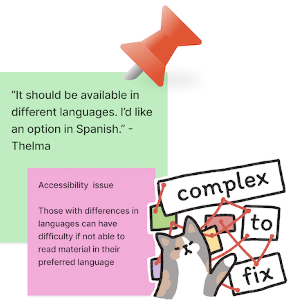
Some unqiue concerns brought up were language differences. Some had brought up how some might have qualms about future careers, fearful of what success they can gain from this experience.
→ Define
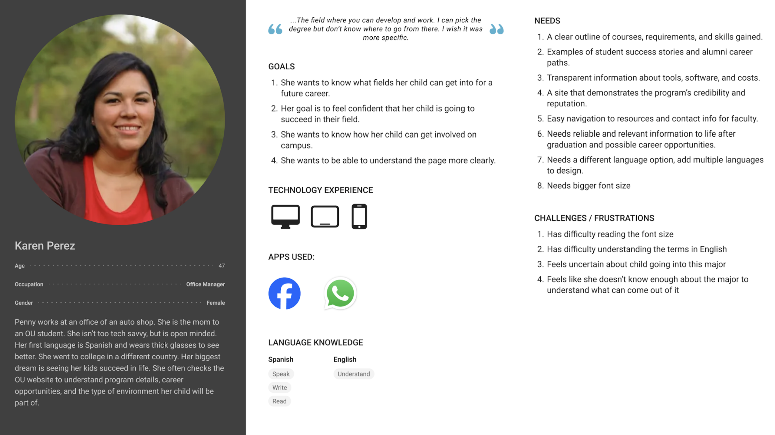
When working through this stage, we had created personas who would be visiting our website. We had focused on their likes, their dislikes, their goals, their motivations, everything that would be important when approaching the design of the website.
PERSONA
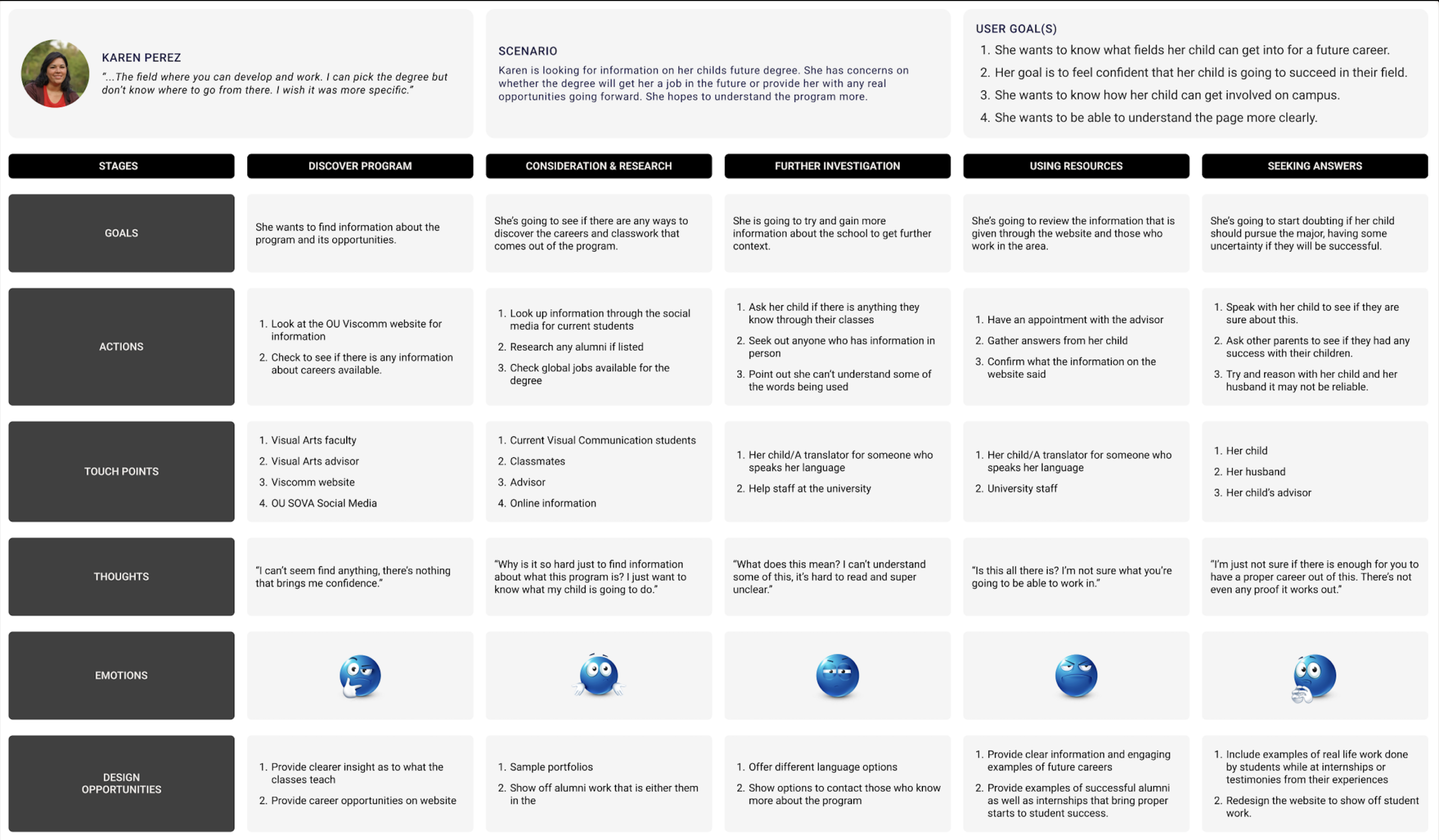
This is Karen Perez, a mother whose child is going into the program. She’s a representation of our parents who we had interviewed. She has a language barrier and due to being older, had difficulty reading the smaller font, and doesn’t feel confident in her child going in due to the website being lackluster in design. She has minor technology knowledge due to her office job.
USER JOURNEY MAP
With this new persona we had made a User Journey Map where we had marked down what the user would be feeling while going through our website. It went through the emotions, actions, and touch points throughout the experience.
→ Ideate
Throughout the ideation phase, we had taken in all our insights from the previous phases, creating a smooth and coherent interface that our users would benefit from, gaining the most insight from our program.
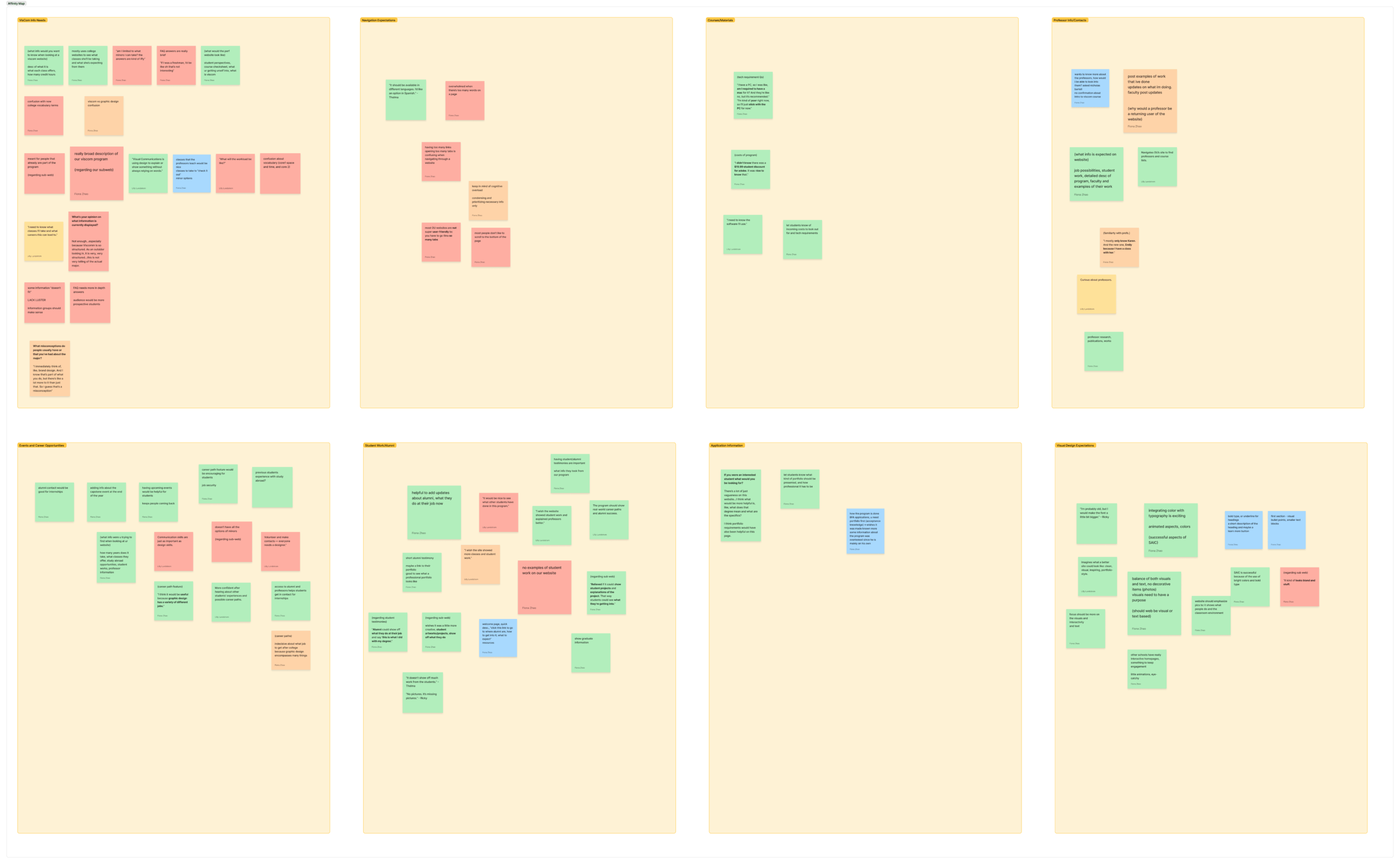
CREATIVE MATRIX
SITE MAP
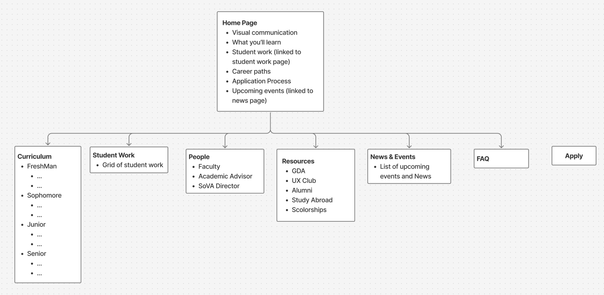
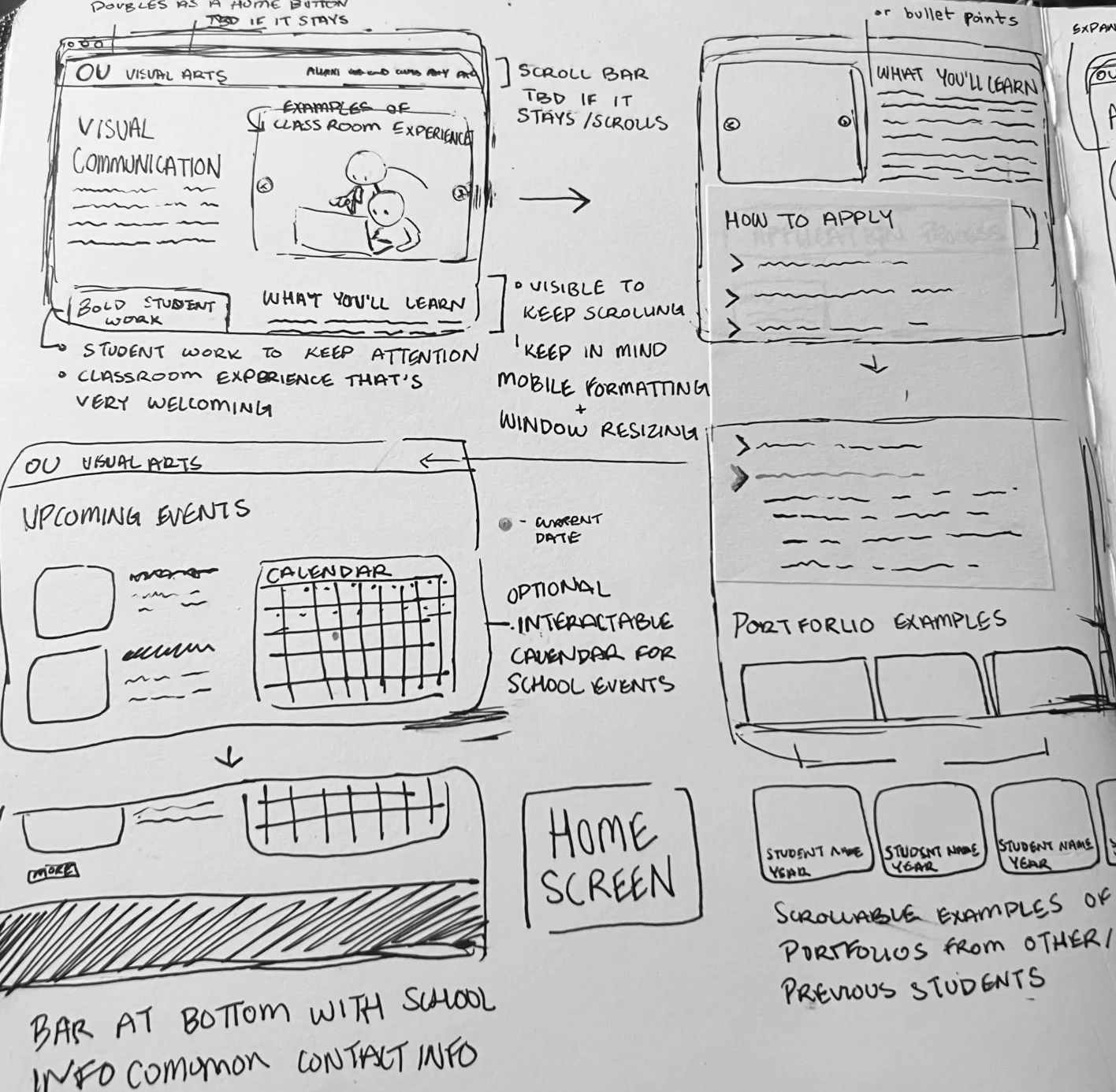
We created a site map based off all our prior notes and had started to work based off this general outline. This design came from all the prior feedback from our interviews. These would turn into the sketches for our upcoming wireframes.
SKETCHES
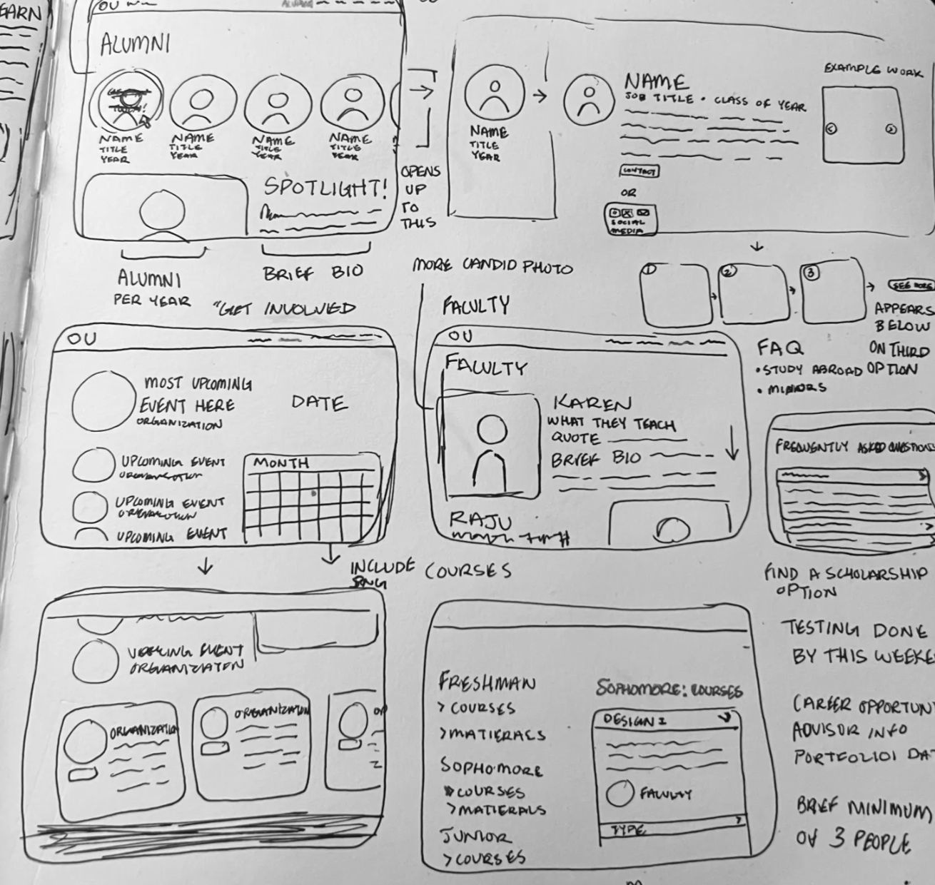
→ LO-FI prototype
Using the sketches, information and feedback during the ideate phase, we had begun to create our wireframe our low-fidelity prototype to begin to visualize our website design. It used the previous input of major concerns such as font sizing, an option in order to change the language as well as including multiple visuals.
WIREFRAME
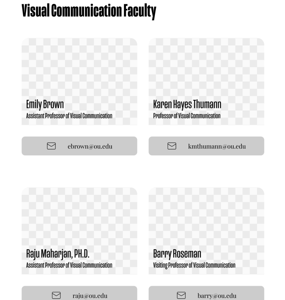
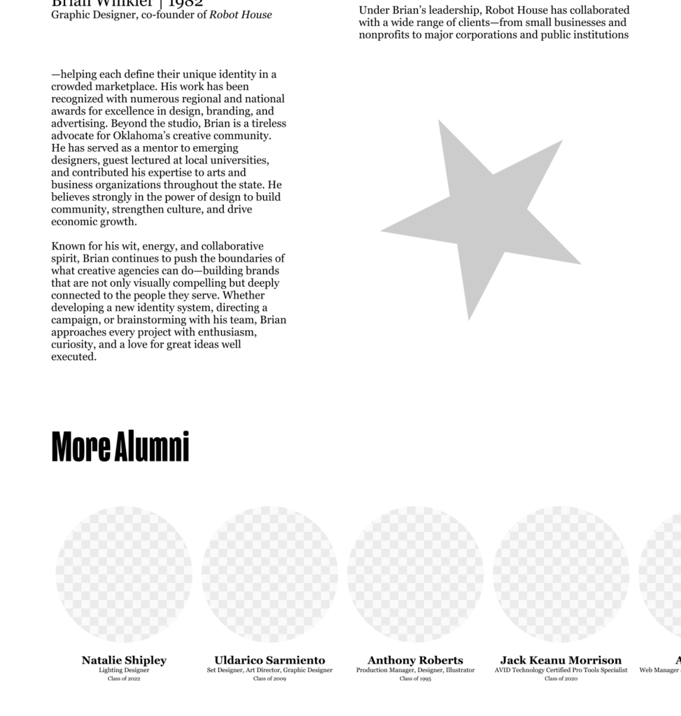
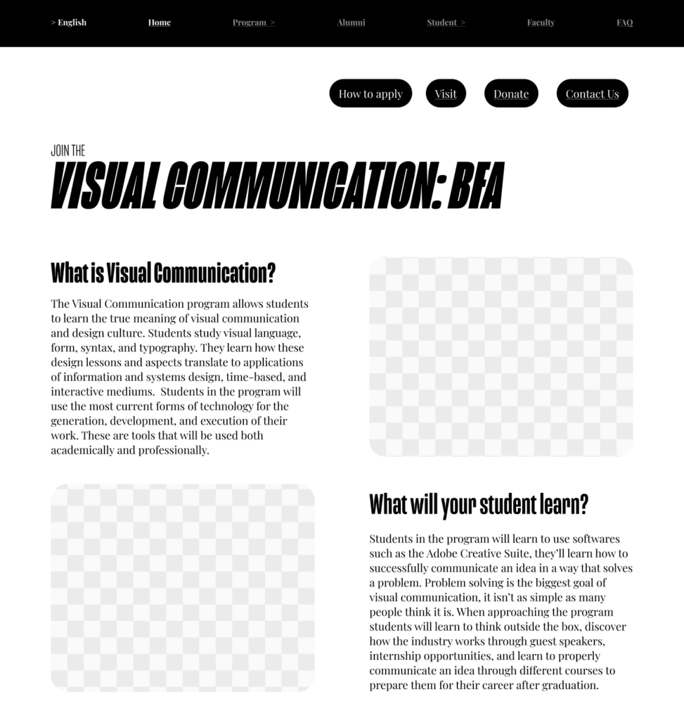
Users will be able to easily navigate to each topic that they are interested in with strong visuals and easily found interface tools to guide them to their needed page.
→ Think Aloud
During this part of the prototyping, we had then gone back to our interviewees and had asked them to conduct a specific type of testing, a think aloud test. This method is telling them to travel through your website to complete a task with no external assistance. This is to test if the website has any confusing interface, too much or too little information, universal misunderstanding, etc.
I conducted these tests with my parents who had some more unique perspectives, a viscomm student, as well as an ATC student who had graphic design knowledge. I had sat them all down, explaining what the test was, how it would go, and what they needed to do, asking for their every thought.
Test Results
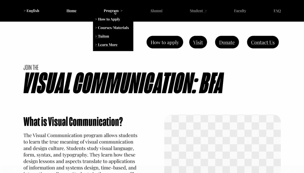
I had a few flaws as I had created this initial wireframe. One of them had been an oversight of the human nature of skimming information. The repeat in student had led to a vital portion of the website being overlooked and had led to a problem.
Changes Made
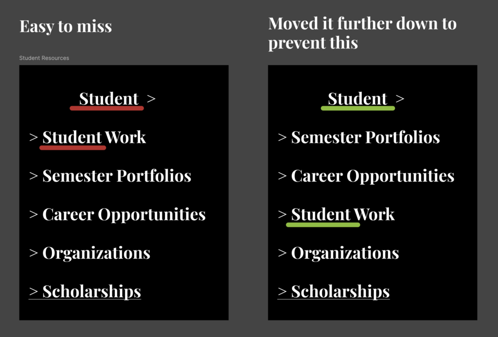
This made me reread the book chapters given to us of “Don’t Make Me Think!” which had reminded me of interface that would be easier to find and work with.
→ HI-FI prototype
Now with feedback from our professor as well as previous testing we had started our high-fidelity version of our prototype. This includes visuals, colors, themes, and creative liberties on approaching the website.
Mood Board
I had taken in visuals and had an abstract type of mood board, taking in individual ideas that made sense once it all came together.
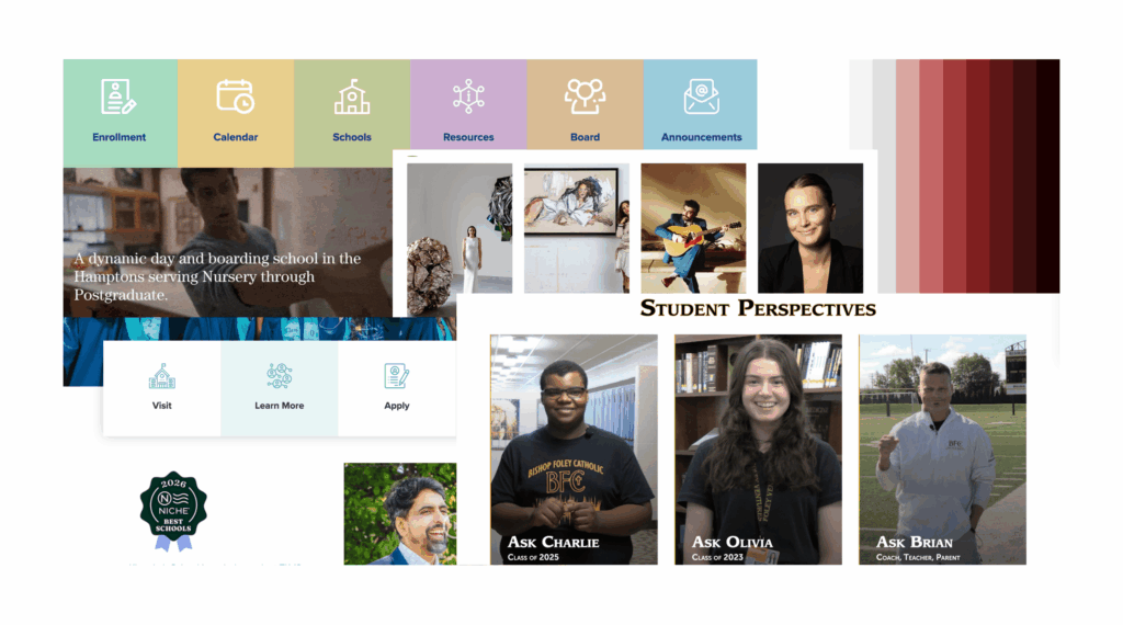
Taking inspiration from other websites and palettes already at our disposal, I had incorporated these aspects into my own design.
Hi-Fi Prototype
→ A/B Test
Soon we used the method of A/B testing. This method is where you provide two or more options for your user to test and for them to answer which works better. This can be testing accessibility, usability or any specific problem you’re trying to solve. It can be used to test certain aspects of your creation to see what could be improved in a specific spot. I had used it to test between some options that I felt might be a problem and provided my users options.
Layout Test
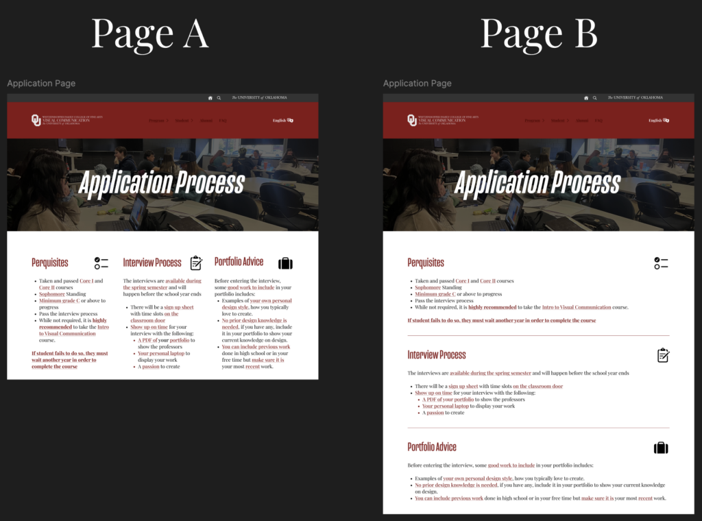
An example of a test I gave was for the layout of a page. I had not been able to decide and realized, even as a designer,
I wasn’t the audience that would benefit the most from staring at it.
I had tested on a collection of users, two parents, a viscomm student, an ATC student and a family member who had seen it all for the first time to gain a fresh perspective. In the end, page B had won, all finding it more clear to read and easy to separate in view.
→ Final website
Reflection
When working on this website, I had definitely had a major shift in perspective. I had not realized how much had gone into making a website. When working on this website as I visited other websites and even playing games, I had noticed how much thought had been put into the interface. I saw hovers, buttons changing colors, how I had easily navigated their menus and realized just how much web designers have worked on finalizing universal language when it came to something everyone used.
This project had me achieve various skills such as research, communication, collecting perspectives, being flexible, and so much more. It truly gave me a new appreciation and genuine love for this craft of web design. Figma is known to be used in the industry today so being able to use it and not only gain so many skills but learn some of its functions was an amazing experience.