Zoological Symbol System
Challenged to create a way for zoo animals to be represented, balancing recognition with simplicity became the goal
Focus: How do you balance creating a system that is consistently simple but universally recognizable?
The Initial Study and Reset.
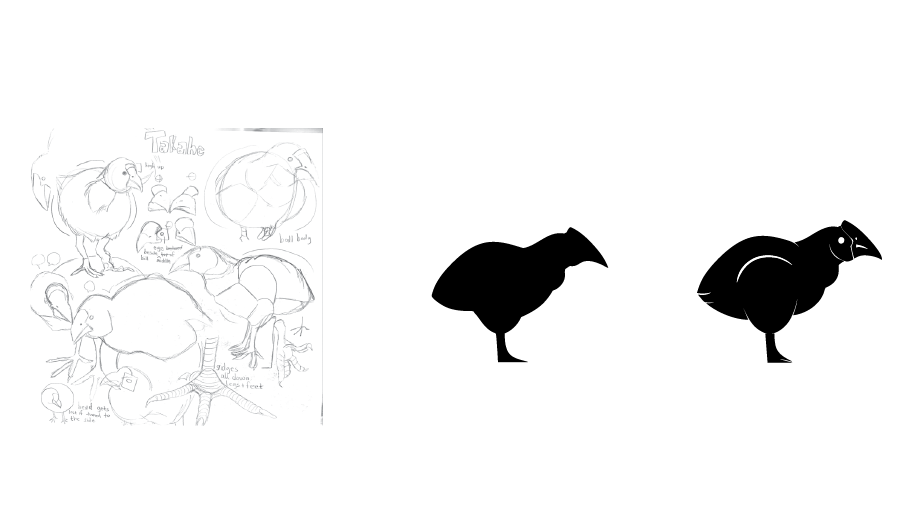
When approaching this problem of creating this symbol system, I had a roaming mind. I had gone much more illustrative to start off. I had seen this as a way to explore styles and thought of how to make an intriguing system. Looking through them after had made me realize my sketches originally had too little details. On the other hand I had also run into the problem of my sketches adding too much detail.
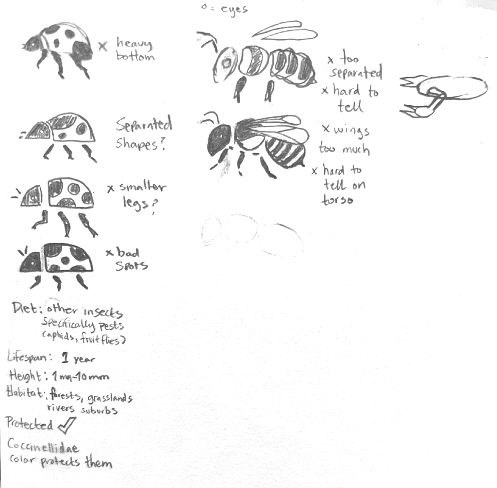
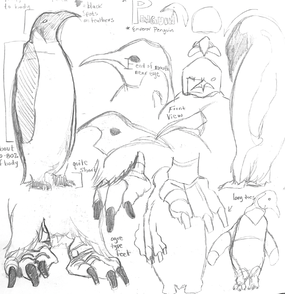
Compact Sketch Studies
I realized that these couldn’t be universal. This was the biggest tipping point on understanding how to achieve a reliable and sustainable set of visuals to convey across an entire zoo and their wildlife. I had decided on a different approach to my work from here.
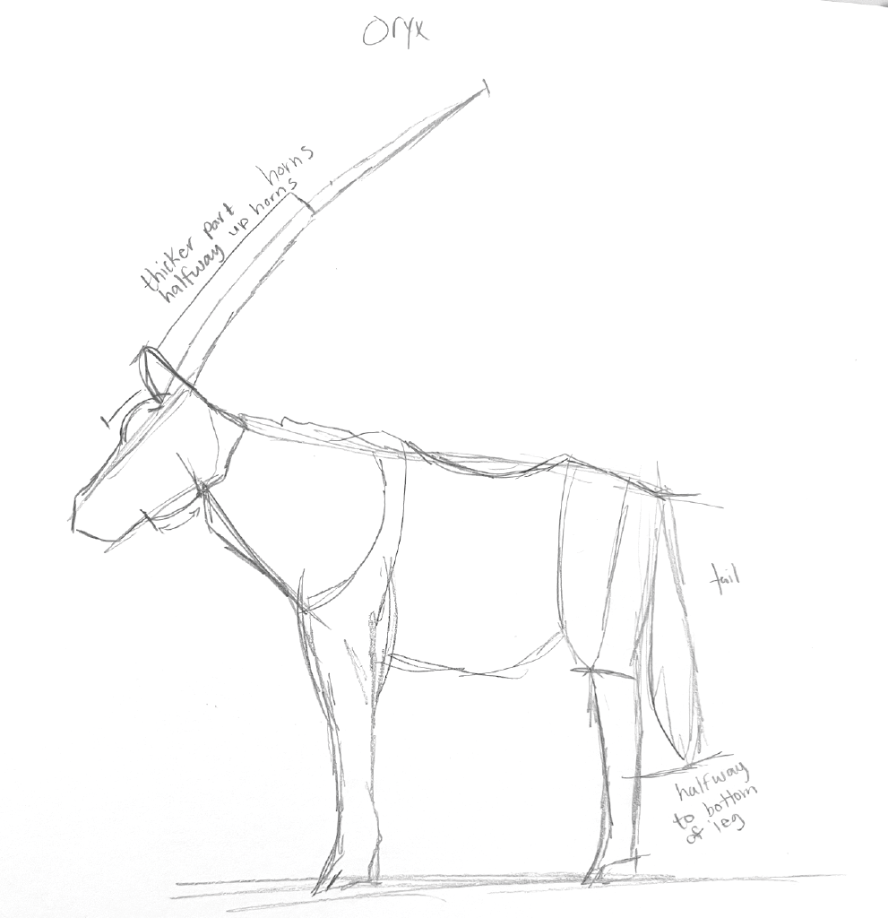
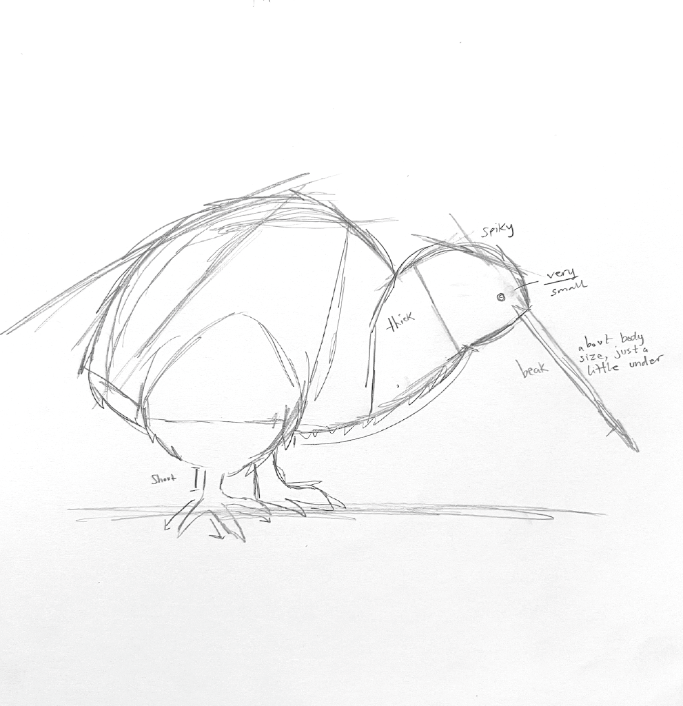
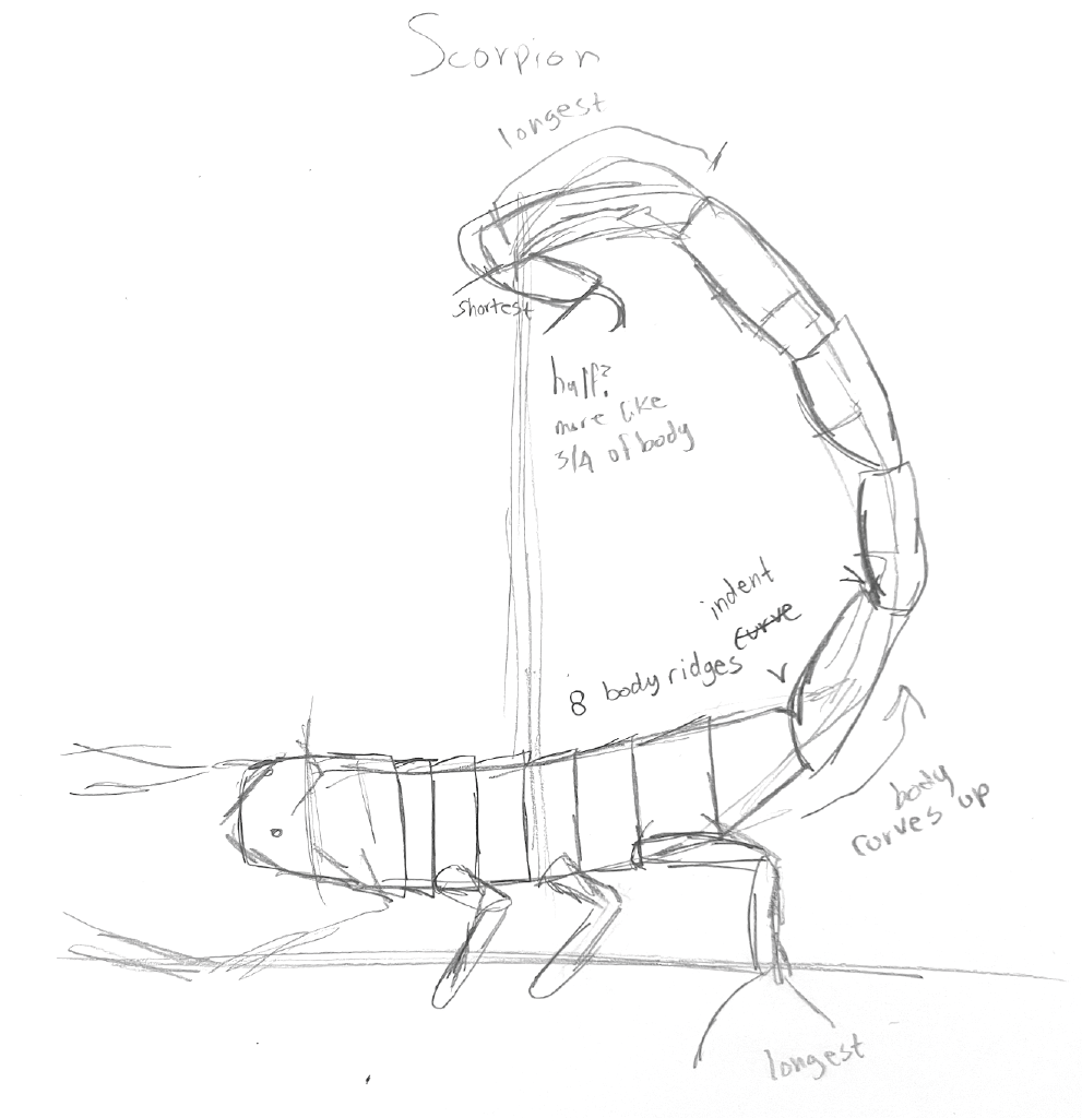
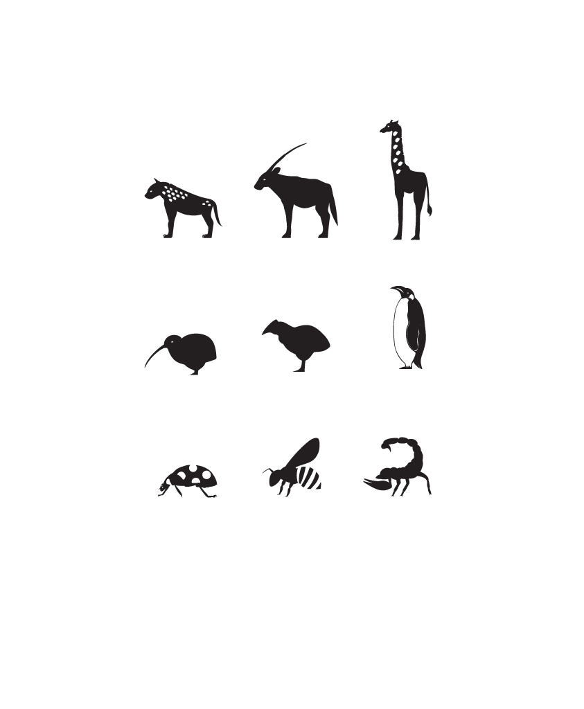
The process began to be digitalized, the silhouette being the priority before attempting to add any details to the symbol. Any sketches done were refined before any finalized lines began to be studied which took a few turns
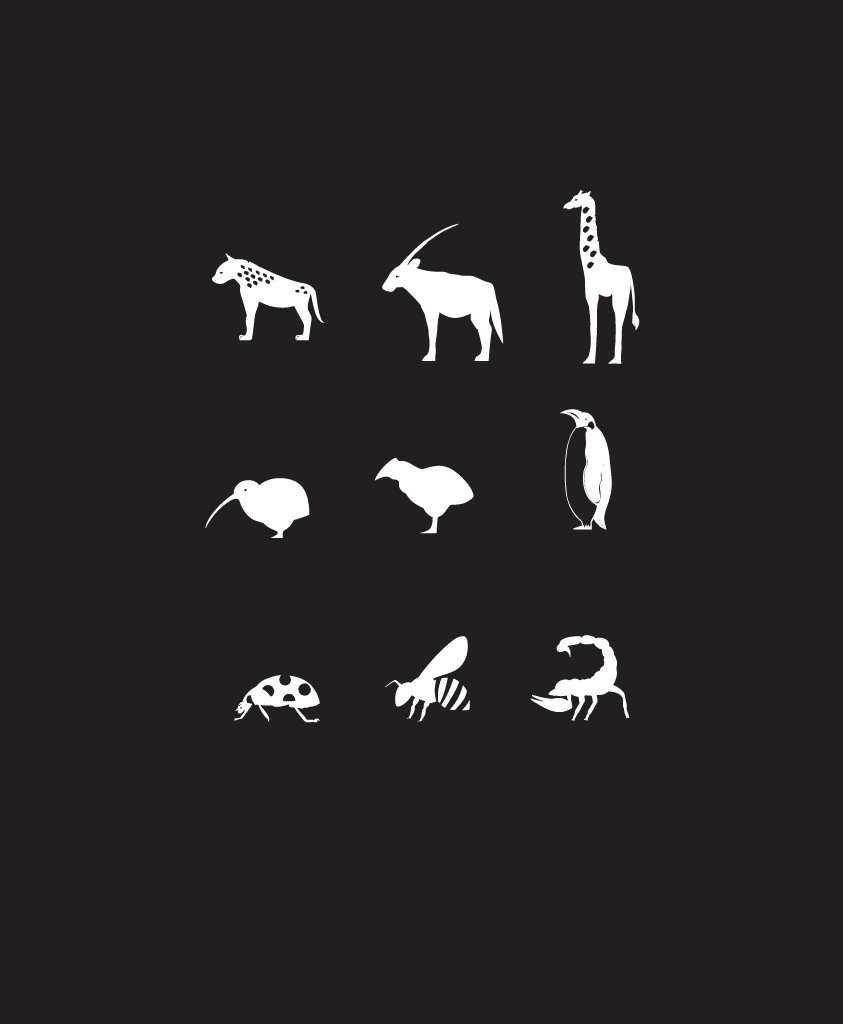
Final Symbol System
Symbol to Poster
For this portion we had taken our symbols and planned to create a poster, trying to make others want to come to the zoo while appealing to children and to the parents who would be taking the children to the zoo. We had even thought about those who were more elderly taking their grandchildren so they could read it from afar. I had focused on making puns, thinking bright colors and big font.
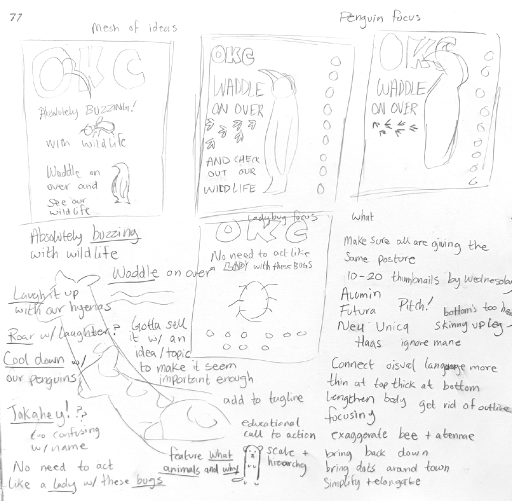
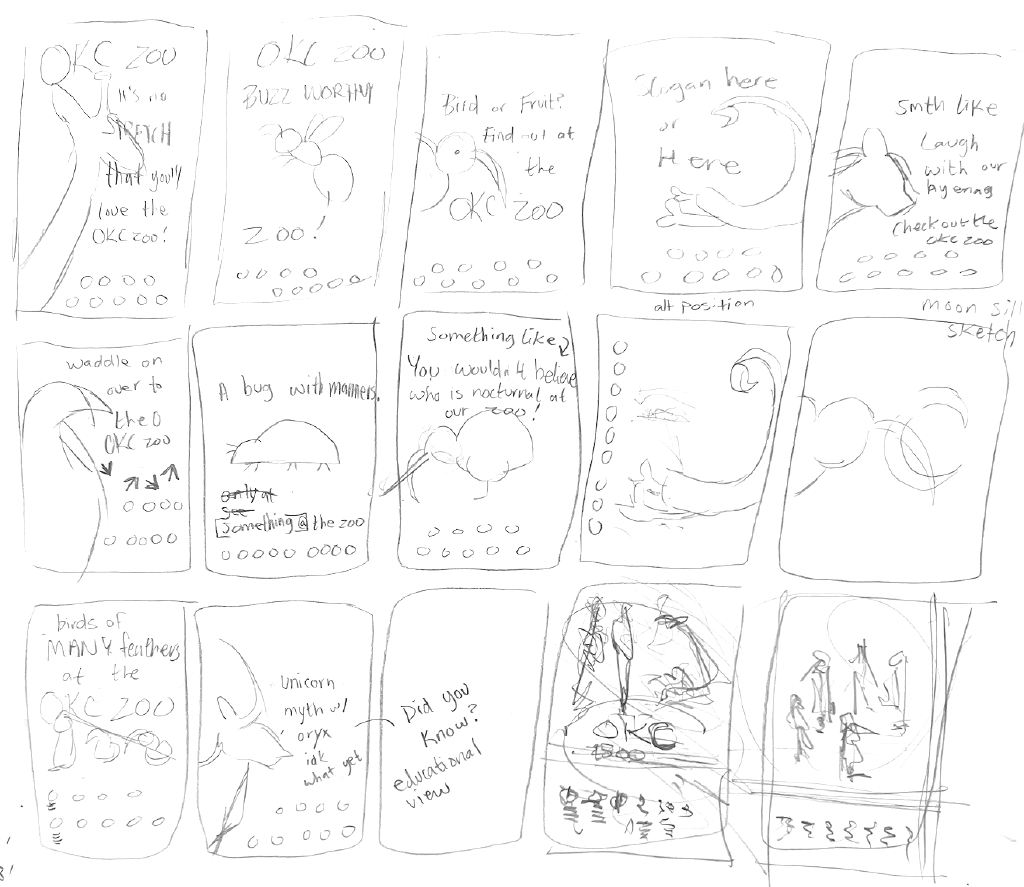
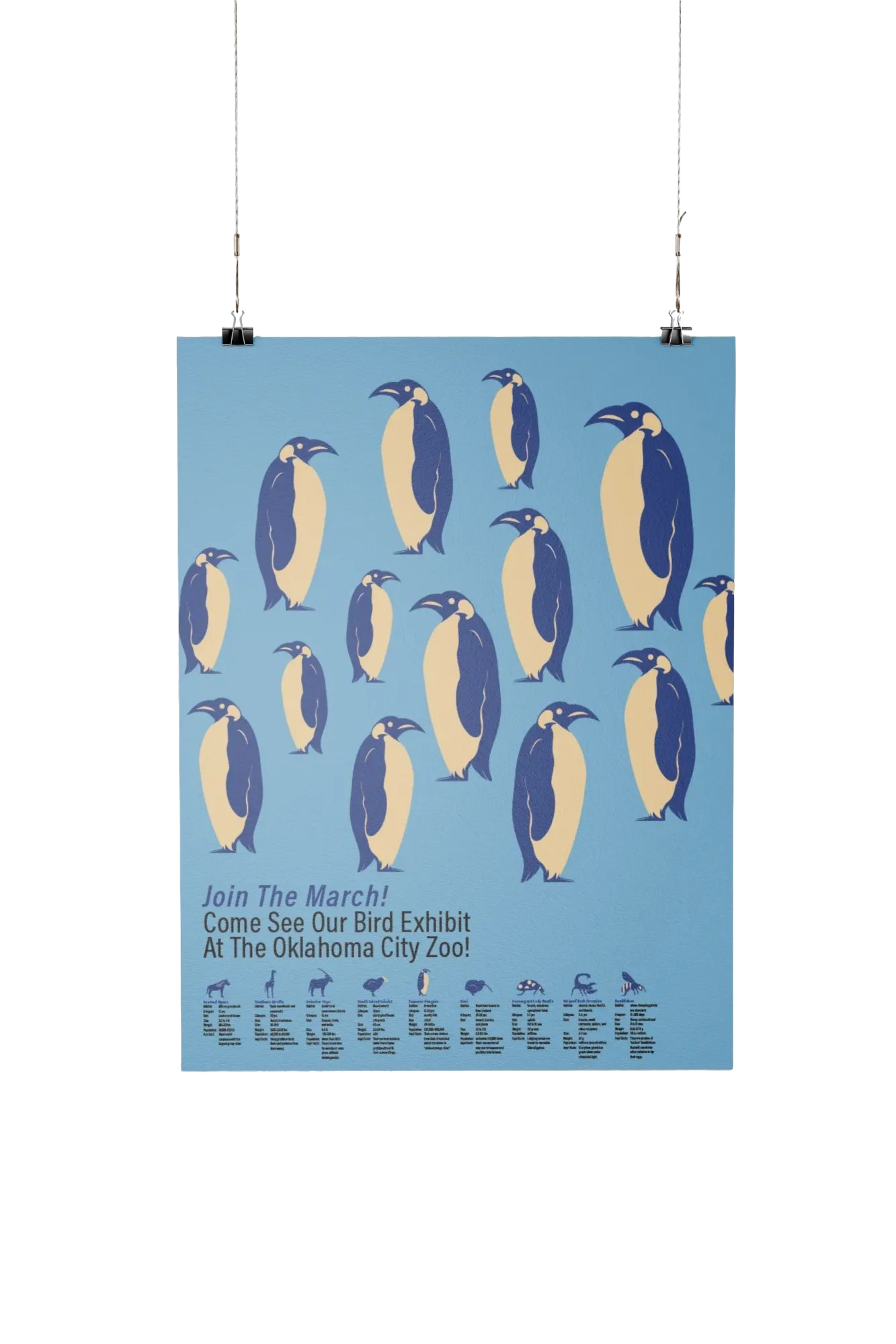
In the end, I focused on my penguin poster, wanting to do something with marching or waddling, this was due to research I had done with the iconic documentary March of the Penguins that I wanted a hint to for this poster.
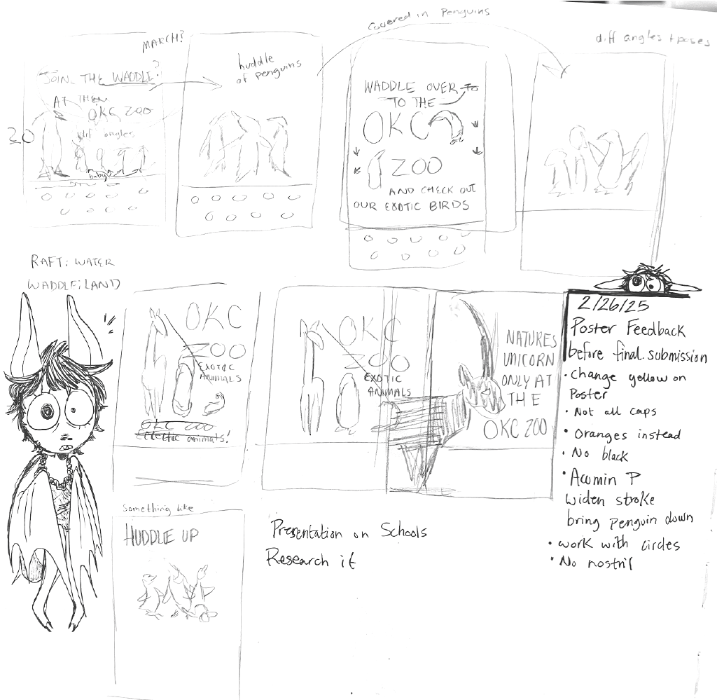
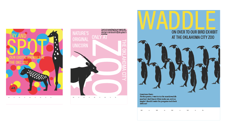
Concepts I had made sure to experiment with different symbols to not isolate on just the penguin idea alone. I had puns made on spots, the history of some of these animals being part of the selling point, and big type for readability. These were to use this imagery to bright a playful vibe to this idea.
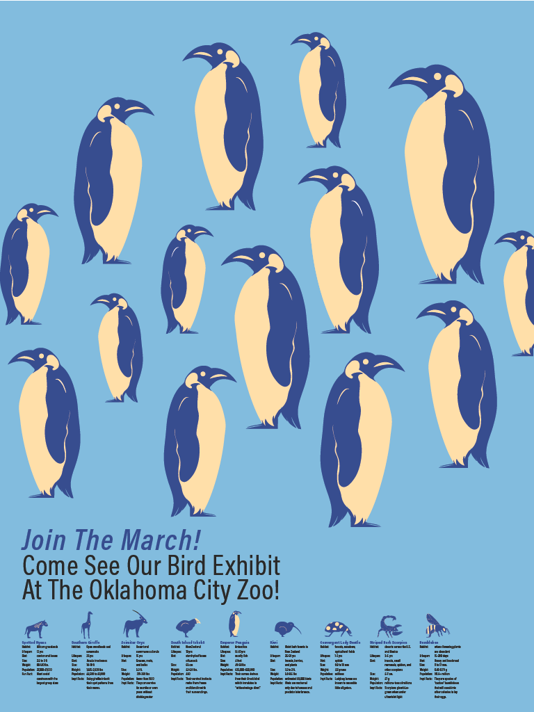
Final Poster
In the end I had kept my reference to March of the Penguins with the slogan, “Join the March!” and had played with both scale and placement to bring life to the poster, keeping the palette simple but changing the colors to be blue and yellow, calming and contrasting at the same time.
Letterform
The letterform was to play with the shape of the symbol and place it on a letter while cutting a chunk of it out. Making it appear natural was the goal, not something extremely far off.
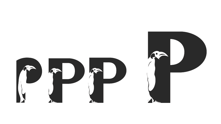
Final Works
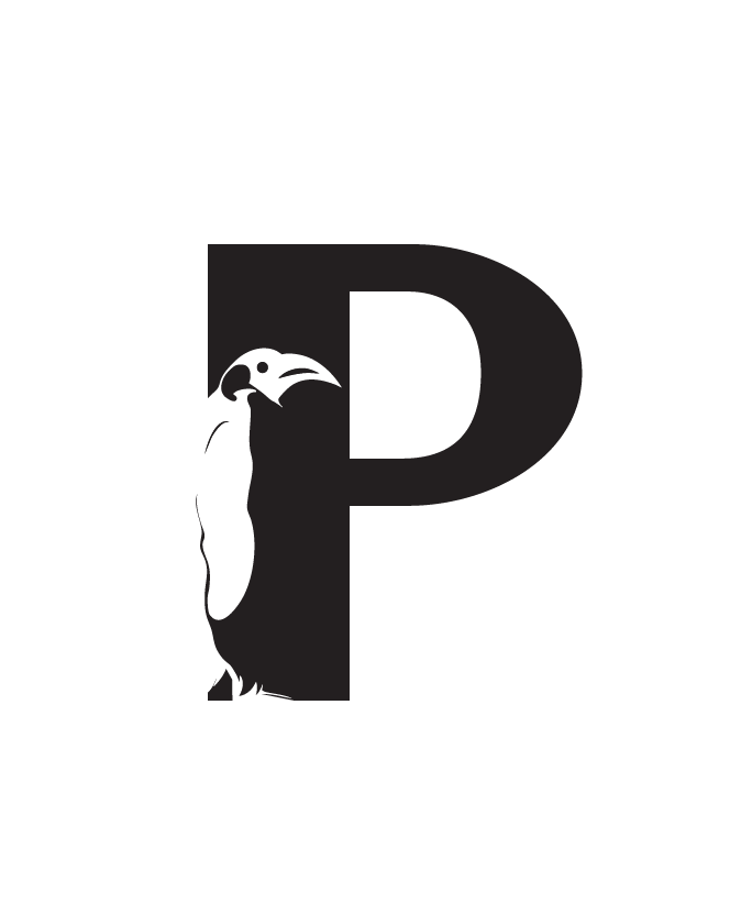
Conclusion
What I’d do differently
I would work more on simplifying the shapes of the animals and keeping them consistent as they start to move away from the shape language I gave some, missing in others. They aren’t by any means my worst work, as I was still learning but looking back on them now I have gained insight on how to improve them.
The poster would have more life and playfullness to it, I have the same sight of what I could do but also accept that this was a brilliant learning curve and had shown me a proper challenge.
Key Takeaways
I had learned that even if you have a style, it doesn’t mean it’s always consistent across ideas. It’s best to take your time and think beyond your comfort zone. Getting silhouettes was the best course of action as it broke it down and helped you see what there was to improve.