


Dearly
The starting point for our app tried to take on regular journaling and building connection, I decided to venture into the strings attached.
Focus: How do we help those who can’t find the words, who can’t find that center to help them better understand their own mind?
Problem
What context does this problem have?
We want to approach this gap of journaling in society nowadays. Todays society is fast paced, busy and full of stacked responsibilities. The ability to sit down and write for 15 minutes alone is too much for some people, let alone an hour. Many journaling apps currently have a drawback or penalty for not writing daily which in this very busy setting is contradictory. We want a stress free journaling experience, not one where you feel like you have to write, it defeats the purpose of journaling and its benefits.
Who is this for?
This is for users that are typically college-aged adults who don’t have the time, the money, or emotional balance to traditionally journal. They have busy schedules, don’t have the money to keep buying new journals, are always on the go so can’t always carry a physical journal and writing utensil or prefer a different method of journaling.
Why should this be made?
There are multiple psychological, physical, and overall regulation benefits to journaling that many could be gaining but due to the business of everyday life we often find ourselves too busy, too into our responsibilities that we forget to regulate our emotions. Through research we had found multiple benefits that could be found through journaling. We want our target audience of college-aged adults to be able to use this app and realize they aren’t tied to one medium, they don’t need to write every day and can find connection through this app. It will provide a chance to breathe in this overworked world.
But…What are these mentioned benefits?

Associated Clinic of Psychology had stated that journaling can:
- A boosted mood
- Journaling has seen to reduce stress from the day
- Strengthed immune system
- Expressing emotions has been found to improve your immune system
- Improves sleep
- Helps by clearing your mind before you sleep and lower blood pressure

University of Rochester: Medical Center brought a perspective that many can personally attest to.
They don’t realize that journaling is just the “grown-up” term for keeping a diary. They forget the catharsis that spilling everything into that little book had brought them. The university also points out that journaling can:
It was in fact a topic brought up in our initial zoom call discussion while overviewing our app topic. Many had a diary when they were younger. You would spill your feelings, your experiences you went through during the day, what you learned, what hurt, everything. Now, people can’t find the time to journal, to put their feelings down.
- Prioritize any written and listed issues that are provided in the entries
- Assist in tracking daily feelings to provide recognizable triggers and how to move forward with these tools
- Provide a chance on looking back at your previous entries to see what you have said and reflect on any specific language you use

PosititivePsychology.com on the other hand had shown ways that journaling is used in psychotherapy.
They had brought up two methods, Expressive and Gratitude journaling.
Expressive journaling focuses on the deepest feelings that the client is experiencing while Gratitude journaling has a focus on the positives to see what good came out of a situation.
They had provided multiple studies to the benefit of journaling and how it can bring a connection to those around you through your self improvement. We want our app to make you see that you are not alone, this can be a way to connect over these experiences.
💡Empathy
What is our plan?
We have researched multiple journaling apps, including:
- Finch
- Apple Journal
- Rosebud
- Day One
- Minescape
- Insights
Through competitor analysis, we want to see what are the weaknesses and strengths to see what are common factors.
What is going to make Dearly any different?
For Dearly, we want to gill the gaps that the other journaling apps had in their design and interface.
Discovered issues we want to avoid are:
- Emotional reflection was either nonexistent or too intense
- Not easy for quick use
- No community or connection
- Cluttered interfaces
- Come across more as a game than a reflection app
These can be detrimental to our app if it falls under the same problem. We want that emotional reflection to feel casual enough that you don’t feel too exposed but deep enough it provides an open dialogue. We want that laidback feeling to journaling, if we give penalties or make it too intense to put a quick entry, it will switch off many users. We want the app to be clean and accessible, connecting with many.
Discovered strengths we want to have are:
- Strong AI that identifies patterns across your entries
- Prompts that are accurate and desirable to the user
- Mental health focus for user
- Strong privacy for those who want private entries
- Clean and minimal interface
- Balancing the tone to make writing less intimidating
These are all focuses our group had in mind when it came to this project. We want to balance comfort with deep reflection in order to connect.
🧠 Our Figjam Brainstorming
With this Figjam we had collected our problem statements to look them over but had all wanted to do the journaling concept. We had filled out the form and divided ideas between the three of us. Additional ideas that won’t be in the app until much later in concept were put in sticky notes to recognize it could change or be scrapped entirely later. We had written down our mixture of research. This included competitor analysis, going behind why the very act of journaling is helpful and how it can tie into the prompts given or social connections, as well as jotting down some sources to come back to.
What can we do to provide security and make our app appealing to those who journal?
When it came to approaching the empathy phase, we had to take in account multiple aspects of the audience that would be involved that journal. An excellent diagram shown to us in class was an arc with both ends of the spectrum for your audience.
Ours for example would have people who would love to share their journals and entries versus those who would hate to share their entries, even sharing how they cringe at their past entries. We decided to try and understand both sides, interviewing a wide variety of people.
We had seen what many others had used, apps such as:



Day-One
Finch
Apple Journal
In total we had interviewed 10 participants which were from a varied range of ages (from a 6th grader to a 58-year-old adult), each having unique roles (college students, a therapist, a parent), and managaing their personal journaling experience levels across the spectrum (long-term consistent journalers and individuals who struggle with consistency). Participants had shown these two sides of the extreme spectrum for the consitency of journaling, the focus of is such as being faith-based or secular reflection practices, or what medium they prefered. Due to one of them having time constraints we found that digital journaling would greatly support their needs and has for a while.
Each had provided powerful insights into our research, giving us varied answers in our work towards our goal of creating a beneficial app for everyone who wishes to journal for mental health improvement.
With this information we created several helpful empathy maps to really crack down on the core values and insight each participant gave us.
A vital insight I had was being able to interview a therapist who gave incredible feedback about our specific topic and how to approach it. Providing thorough answers of our questions offered new perspectives and pathways to go down when designing our app.
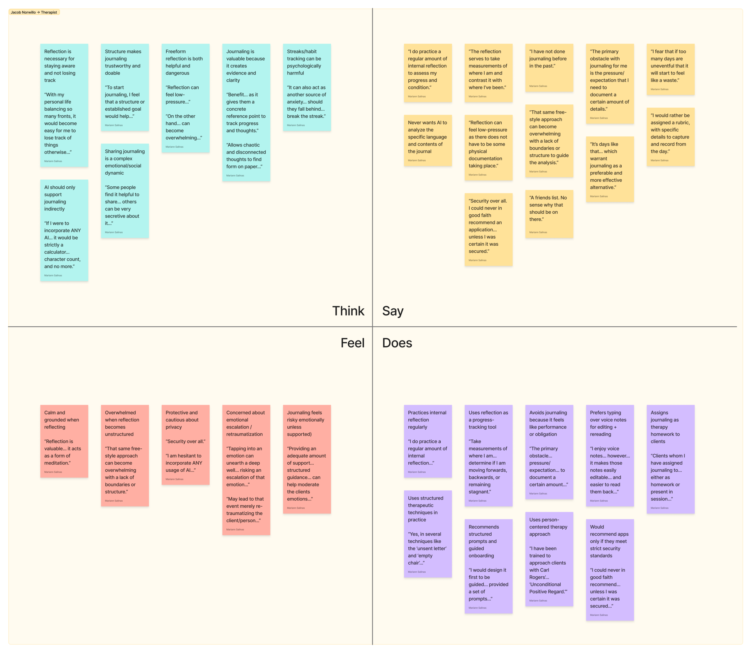
💭 He thinks
- Sharing journaling is a complex emotional/social dynamic
- Reflection is necessary for staying aware and not losing track
- Streaks/habit tracking can be psychologically harmful
- AI should only support journaling indirectly
💬 He says
- “That same free-style approach can become overwhelming with a lack of boundaries or structure to guide the analysis.”
- “The reflection serves to take measurements of where I am and contrast it with where I’ve been.”
❤️ He feels
🎭 He does
- Calm and grounded when reflecting
- Concerned about emotional escalation/retraumatization
- Overwhelmed when reflection becomes unstructured
- Protective and cautious about privacy
- Practices internal reflection regularly
- Assigns journaling as therapy homework to clients
- Uses structured therapeutic techniques in practice
- Avoids journaling because it feels like performance or obligation
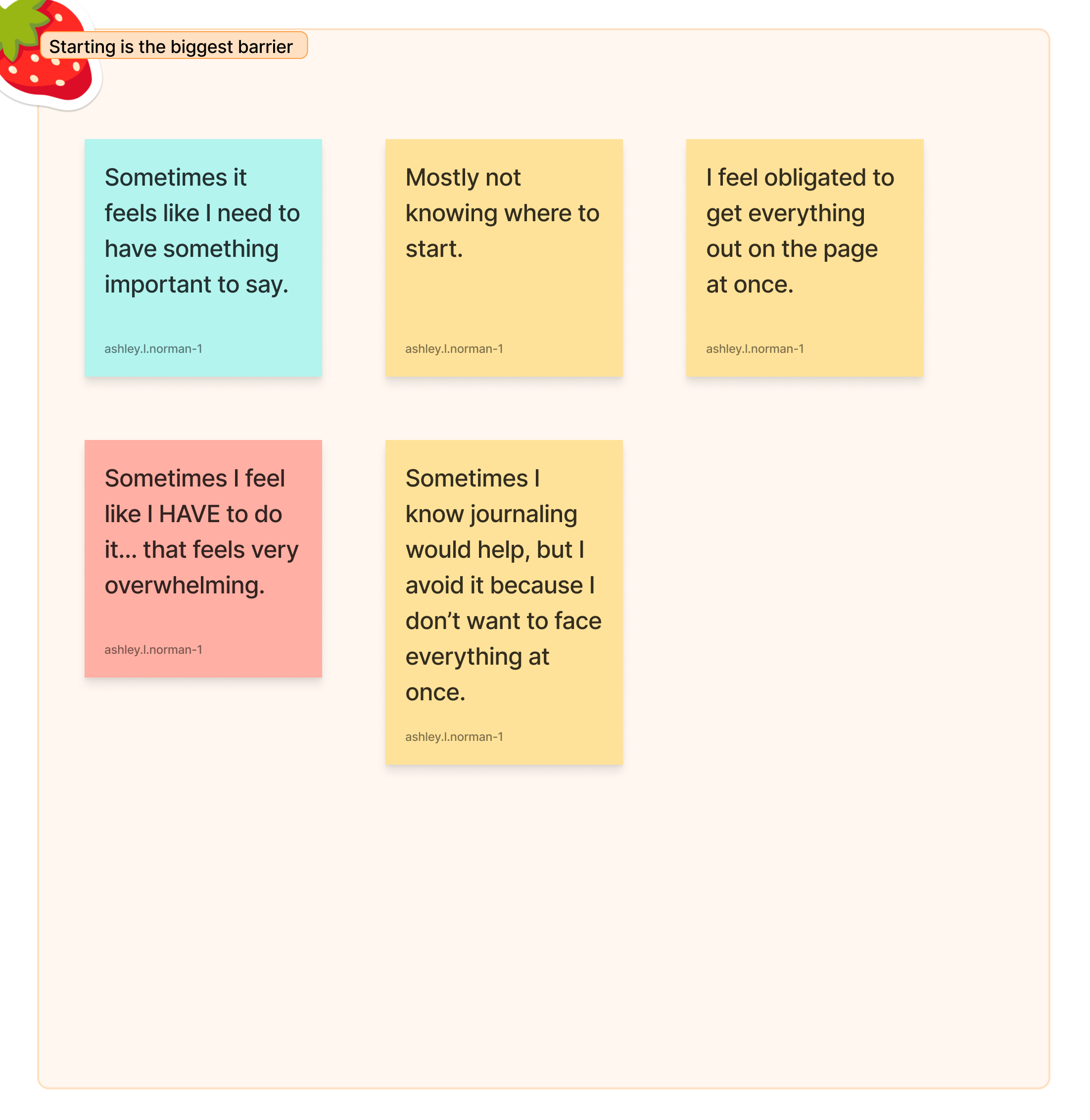
In our findings, we noticed the major themes that had been focused upon in every interview had been, that starting is everyone’s biggest barrier, their concern over privacy and psychological safety and motivation would come from their recognizing their pattern of growth.
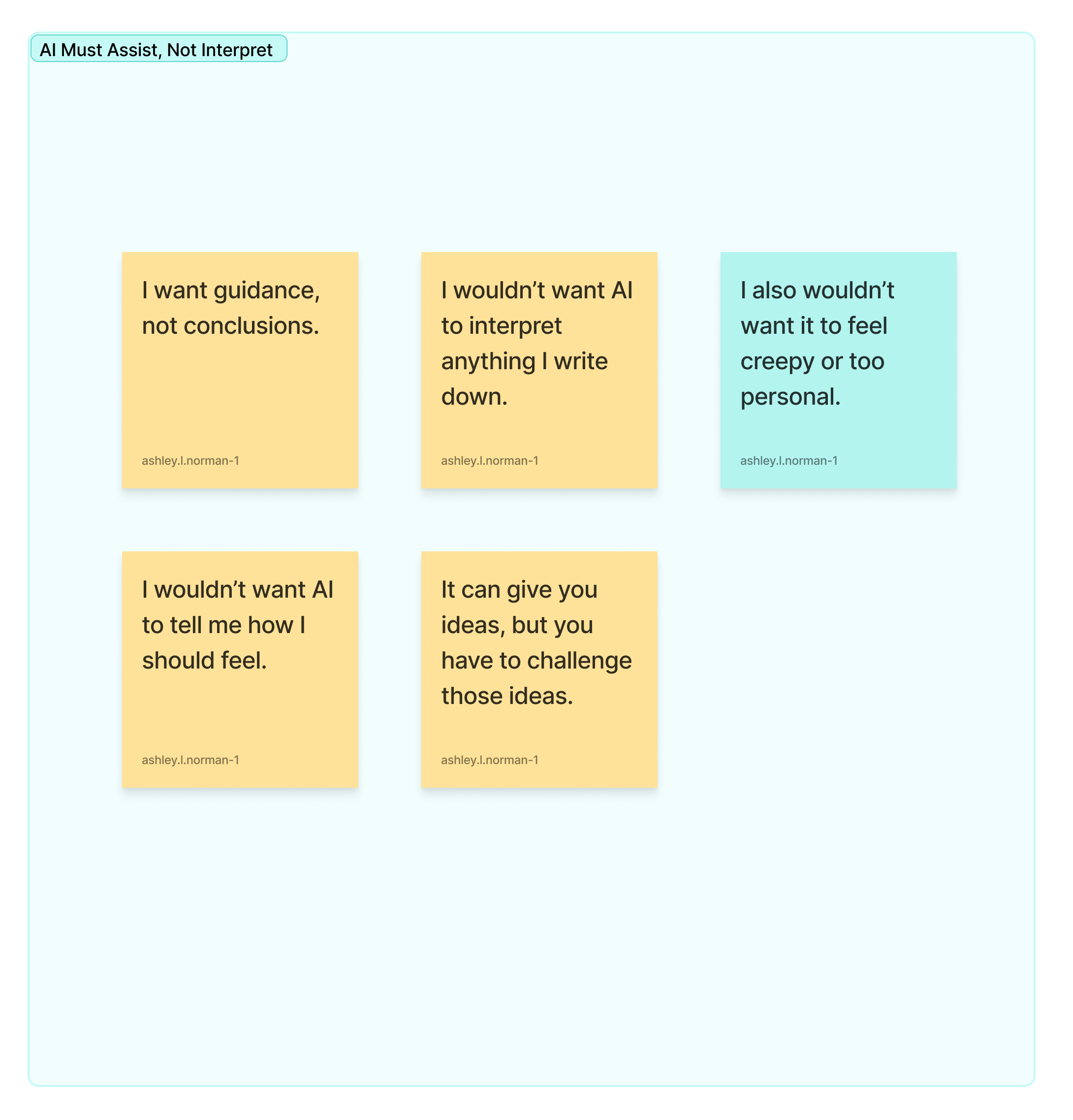
A core insight that was almost consistent from everyone was how AI should assist not interpret. Many had concerns about how it would try and take over something so personal as journaling their inner most thoughts.
💡Define
Approaching the Define phase we had seen that we had two extremes on our insights. The side of those who journaled consistently and those who don’t journal/have stopped journaling but wish to again, being held back by one reason or another.
For now, we will focus on someone who wishes to have this consistency,
👤 Persona:
Ava Amor “The Anxious Reflector”
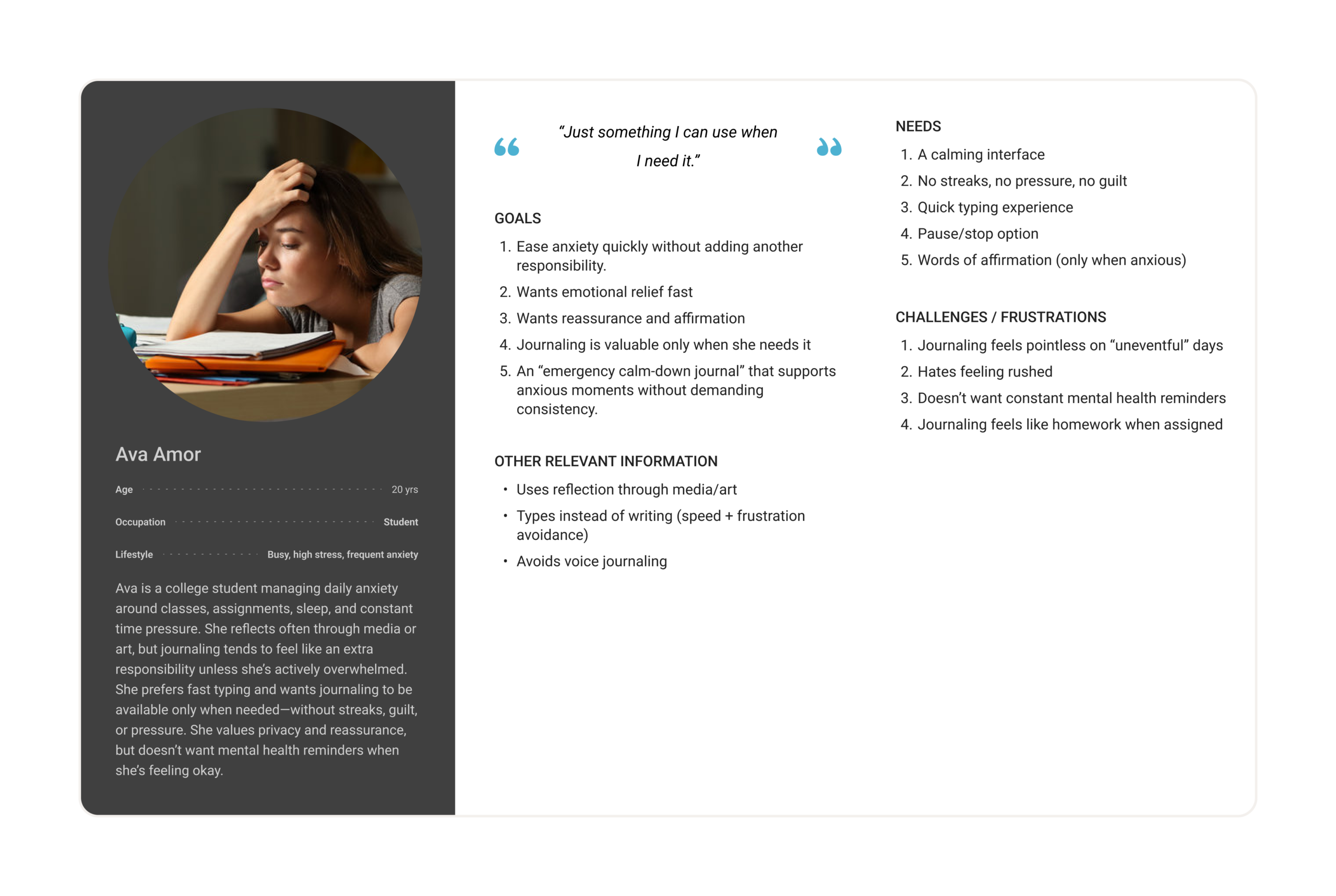
As I went through our interviews to create this persona, there were repeated topics that stayed consistent throughout everyone who wanted to journal. Several that don’t journal consistently, yet want to, feel that it couldhelp them regulate their emotions, gain a new perspective, and feel grounded.
In order to capture these aspects I chose to make one based on our interviews who covered their emotional distress but don’t have time to journal and made a persona, Ava Amor.
Ava is a college student who reflects often internally but doesn’t have the time to sit down and journal but does truly wish to do it, especially during anxious or overwhelming moments. Ava has described that their main motivation when it came to reflecting was being able to emotionally decompress while working towards self-improvement. The downside is she has come to think that journaling feels like homework, often associating the task with needing to keep a streak to maintain which brings a sense of guilt to her already guilt ridden mind, or something that requires being “fun enough” to justify writing down.
🏁 Goals
Ava’s goals are to:
- Calm her overwhelming anxious thoughts in a productive way
- Reflect without spiraling
- Capture progress in a way that feels meaningful and not graded.
Ava wants journaling to be available where she needs and wants it to be, especially during her more stressful days, without becoming another daily chore.
💭 Motivations
Ava is motivated by the possibility of emotional regulation and by the structure that makes journaling feel purposeful and productive. Ava wants a flexible and free structure. She wants something that will provide guidance in a way that reduces blank-page pressure. The main motivation is doing this without forcing a rigid routine. Her biggest values are in her autonomy, refusing to have intrusive prompts and psychological safety, making the process a judgement free zone.
💢 Frustrations
Ava’s biggest frustrations and challenges are repeated themes echoed in the interviews:
- Journaling feels like “another responsibility” on top of her already incredibly busy life.
- Uneventful days feel pointless and make it a challenge to write.
- The pressure to write “enough” creates avoidance.
🎭 Relevant behaviors
Ava reflects frequently but privately and mentally. She wishes she could journal at random but when emotions peak, she struggles to find that possible, and stops journaling quickly when it feels assigned or watched.
We found it common in most of our personas, they want this emotional regulation, they want this sense of relief but find it difficult sometimes. We approached it in our two extremes and those can be found below.
🗺️ User Journey Map
To map Ava’s behavior on an average anxious day, I created a journey map that follows this scenario: Ava feels overwhelmed, wants relief and clarity, and considers journaling—but often struggles to start or sustain it.
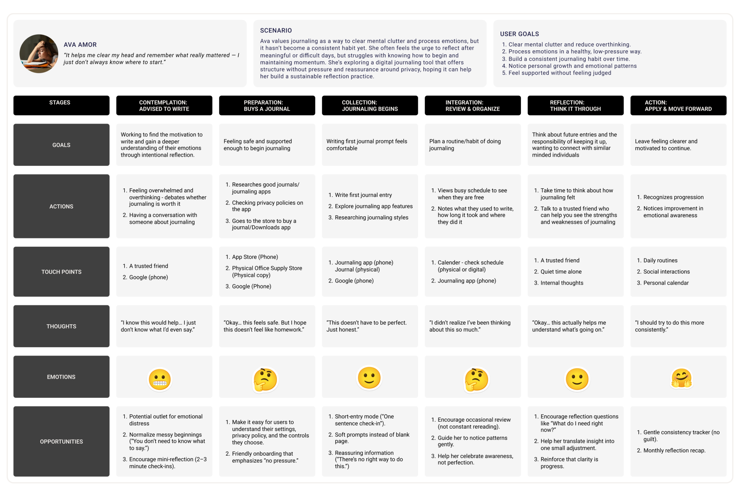
🔑 Key stages and insights
- Trigger:/Emotional Distress Anxiety and the overwhelming feeling of having no time starts a spiral.
- Decide to journal: Ava debates whether journaling is good while in this mindset but picks it up anyways.
- Start writing: Blank-page paralysis shows up while in this frenzied mindset. She freezes and wonders where should she start.
- Mid-entry: Ava types quickly for to provide that movement for her hands while allowing her to stay quick in her work, but still can’t stop worrying about “doing it right” or reflecting incorrectly.
- Stop/Save: Ava may stop early due to the thought of it stressing her out when it should be comforting her.
- Afterwards: Ava feels a little calmer, but the habit doesn’t form due to the anxious situation. Journaling remains reactive, like a last resort, much rather than a consistent practice.
Through this journey map I was able to think up ways to help our common user and we had these with our other personas. These can include prompts for “uneventful” days to take away the scare, providing optional structure to reduce blank-page pressure, offer a prominent pause/stop feature to prevent rumination, and privacy controls that are visible and understandable at the exact moment of vulnerability.
This is the more emotionally distressed individual but through exploration into other aspects we were able to explore a different perspective we were given through our findings during the Empathy phase. You can find how we balanced both a consistent journaler and one who wants to consistently but doesn’t below.
🗺️ Mapping AI Need to Data Requirements
This is a topic we were discussing to see how our app could fair against the very nature of having AI in our work. We had looked through an incredibly interesting form which walked you through your work and see if you would need it or if you had to start again on your app brainstorming.
A major point was that participants want support, but not surveillance. Journaling is such a private and intimate thing, yet it doesn’t mean that AI can’t be utilized without compromising the users data and trust. The key is using AI only when it solves a user pain point without violating trust.
Primary user needs
- Get started quickly
- Receive reassurance
- Protect privacy
- Avoid rumination
- See progress
Where we can use AI (and where not to)
- Use AI lightly for optional starter prompts based on user-selected mood/goals that are not inferred from journal content. This supports quick starts without reading private writing and making the user feel violated.
- Use non-AI templates for affirmations or allow AI only if the user opts in; keep it mood-tag driven, not content-driven to emphasize privacy.
- Do not use AI to analyze journal text by default. Multiple interviews flagged this as a trust-breaker as well as a therapeutic piece of advice.
- Use metrics-only insights using things such as timestamps or character count to show progress instead of content analysis as many had shared concerns about the feedback coming off as “tone-deaf” or providing the user an unsafe interpretation.
Users will not engage in something personal if they feel watched, judged, or exposed.
💡Ideate
User research reveals a clear pattern: many people value reflection but struggle to journal consistently. Our interviews had shown that participants often reflect internally yet avoid written journaling because it feels like another responsibility, mention anxiety, pressure to write something meaningful, and distrust of technology that analyzes personal thoughts.
These insights guide the team toward a central design opportunity: create a journaling experience that supports emotional clarity without pressure, judgment, or surveillance.
The team focuses on users like Ava, a hesitant reflector who wants the benefits of journaling but often stops when the activity feels forced or overwhelming. Ava reflects often but seems to only want to journal only when stress rises. The ideation phase explores ways to reduce friction, support emotional expression, and maintain user trust. Design tools guide this exploration: a Creative Matrix, AI HAX Design Guidelines, a Storyboard, and a User Flow Diagram.
💭 Creative Matrix
Creative ideation begins with a Creative Matrix that organizes potential solution directions. The matrix combines design opportunities with different interaction formats to spark multiple ideas.
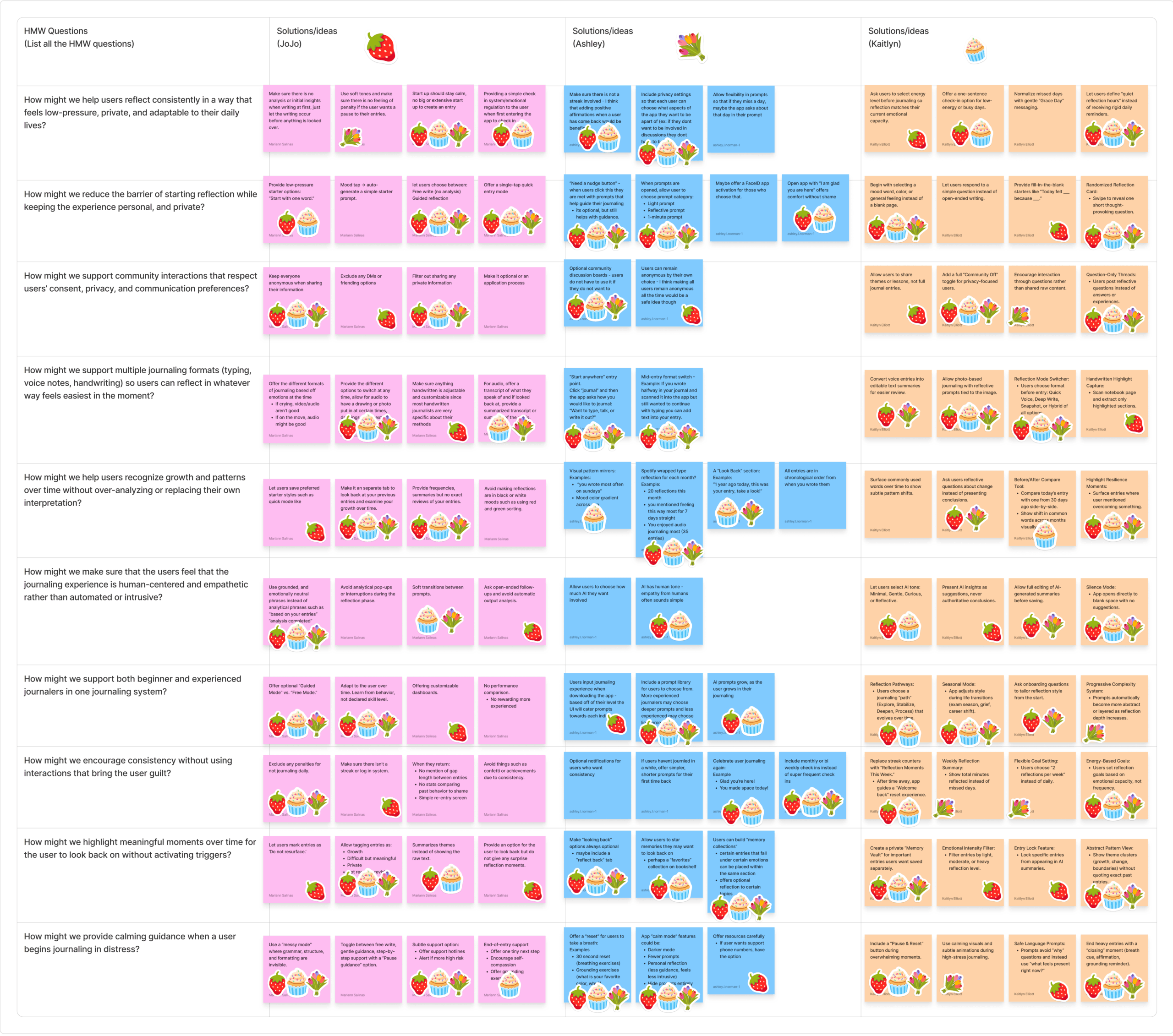
Columns represent design opportunities such as guided prompts, low-pressure journaling, and emotional support tools. Rows represent possible solution formats such as mobile applications, voice tools, visual journaling spaces, and reflection assistants.
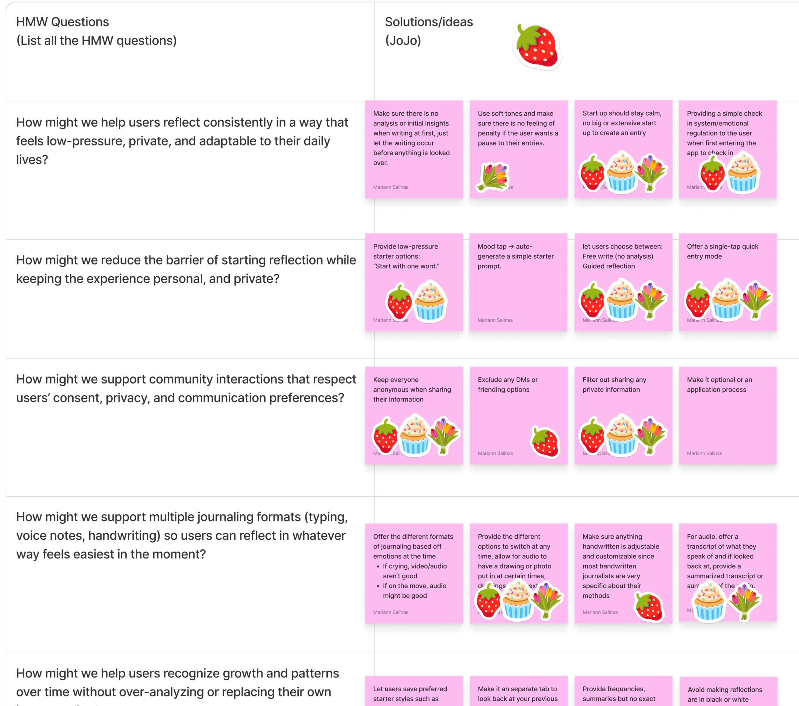
The matrix draws inspiration from several How Might We (HMW) questions, including:
- How might we help users recognize growth and patterns over time without over-analyzing or replacing their own interpretation?
- How might we make sure that the users feel that the journaling experience is human-centered and empathetic rather than automated or intrusive?
- How might we encourage consistency without using interactions that bring the user guilt?
- How might we provide calming guidance when a user begins journaling in distress?
Each intersection in the matrix generates a potential idea. For example, guided prompts and initial moods leads to the concept of a mood-prompt generator. In this idea, the user selects a mood or goal and receives a simple prompt that helps start writing. This feature addresses blank-page anxiety and reduces the pressure to invent a topic.
Another promising concept emerges at the intersection of low pressure and reflection assistants. This idea introduces a pause or stop reflection tool. When a user feels overwhelmed, the system allows a pause and suggests grounding prompts rather than pushing deeper reflection.
This concept aligns with several HAX (Human-AI Experience) guidelines. First, the system maintains transparency by showing users exactly how prompts appear described in Guideline 1: Make clear what the system can do in their initial phase. Second, the design supports user control by allowing prompts to remain optional described by Guideline 8: Support efficient dismissal, making sure the prompt isn’t intrusive and can be easily turned off. Third, the design will grow alongside the user so that their entries feel personal and that they feel heard as a user which follows Guideline 13: Learn from user behavior, that way common themes can be addressed and recommended to the user while following the previously listed guidelines to prevent feeling too analytic. We made sure that the app intentionally avoids AI features that attempt emotional diagnosis or interpretation.
🖼️ Storyboard
The storyboard illustrates how the concept functions in a real context of use.
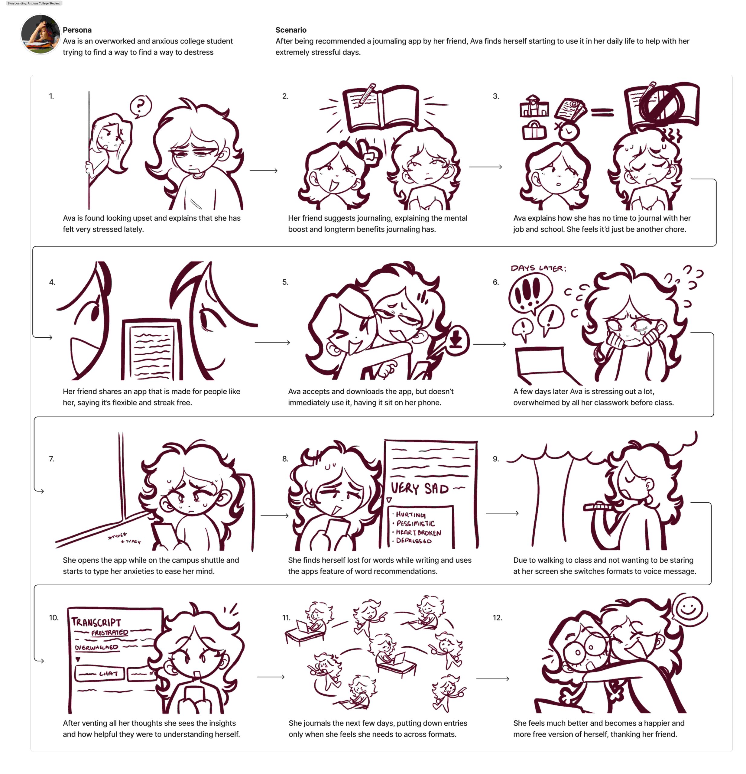
The scenario begins with Ava, who experiences anxiety after a stressful day. Ava is told by a friend about the journaling app and though Ava downloads it, she doesn’t immediately start using it.
When she feels extremely down she finds herself finally journaling and exploring all the options that are available to her through the app. This includes the option to improve your writing since she finds herself struggling to articulate her feelings while typing, being able to switch formats as she is on the move and cannot type as she walks which the app picks up on and lets her switch to, and receive feedback and suggestions for those who are going through similar things.
This storyboard highlights the main design principle: the system acts as a gentle support tool rather than a strict journaling system that can work towards an improved mental health state.
👤 User Flow Diagram
The user flow diagram communicates the sequence of interaction steps that support Ava’s goals.
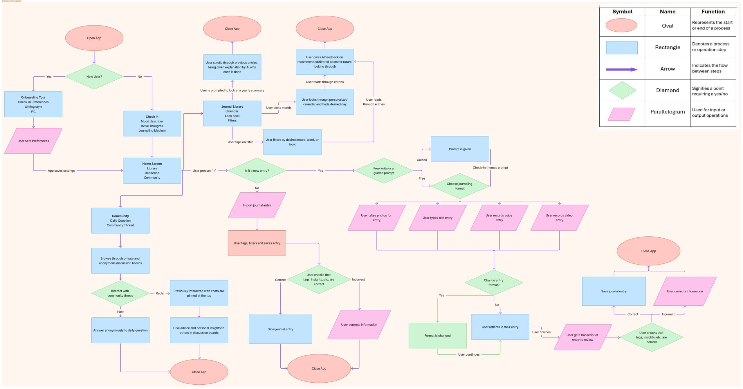
An example of a path taken through the flowchart is having the process begin when the user feels emotional stress or confusion. The user opens the journaling tool and chooses between starting a blank entry or selecting a mood prompt. After this step the user writes thoughts freely. Optional guidance appear in their bar to switch formats or save. Finally, the user saves the entry and exits the tool.
This flow supports the design problem identified in research. It reduces friction at the start of journaling, maintains user control during writing, and avoids overwhelming the user with complex features. The system emphasizes flexibility, allowing users to journal when they need emotional clarity rather than forcing a daily habit.
Conclusion
The ideation phase explores multiple directions while staying true to the information originally in the research insights. The creative matrix helps the team explore design possibilities and user centric solutions, while the storyboard and user flow translate these ideas into a more realistic play-by-play interaction between the user and the app. The result focuses on how the user will experience low-pressure journaling that prioritizes privacy, emotional support, and user control. This direction aligns closely with the needs of hesitant journalers like Ava and provides a foundation for future prototyping and testing.
💡Prototype Lo-Fi & Test
The goal of this type of prototyping is to quickly test early app ideas with users without spending much time or effort. Even though cost isn’t a concern for us, this approach still helps us move faster. By using simple sketches, we can directly observe how people interact with the app, what feels intuitive, and what causes confusion. This process lets us catch issues early, make improvements, and build confidence in our design before moving on to more detailed prototypes or development.
As I reviewed and revised my flowchart, I noticed several issues during the design phase. I returned to my interview data, looked for common themes, and even reached back out to the therapist I had spoken with to get additional feedback on specific elements.
After discussing these points, we decided to remove the community tab entirely. While the idea of connecting users sounded valuable at first, concerns about privacy, the risk of it feeling like social media, and its potential to distract from individual mental health made it less effective. In the end, we felt it introduced more problems than benefits.
📋 User Tasks
With these changes in mind, we asked two participants to complete three key tasks in the app. These tasks helped us gather feedback on usability, identify areas for improvement, and decide what features we should refine or remove. The three main features we focused on were:
- Initial Check-In
- Reflection
- Library
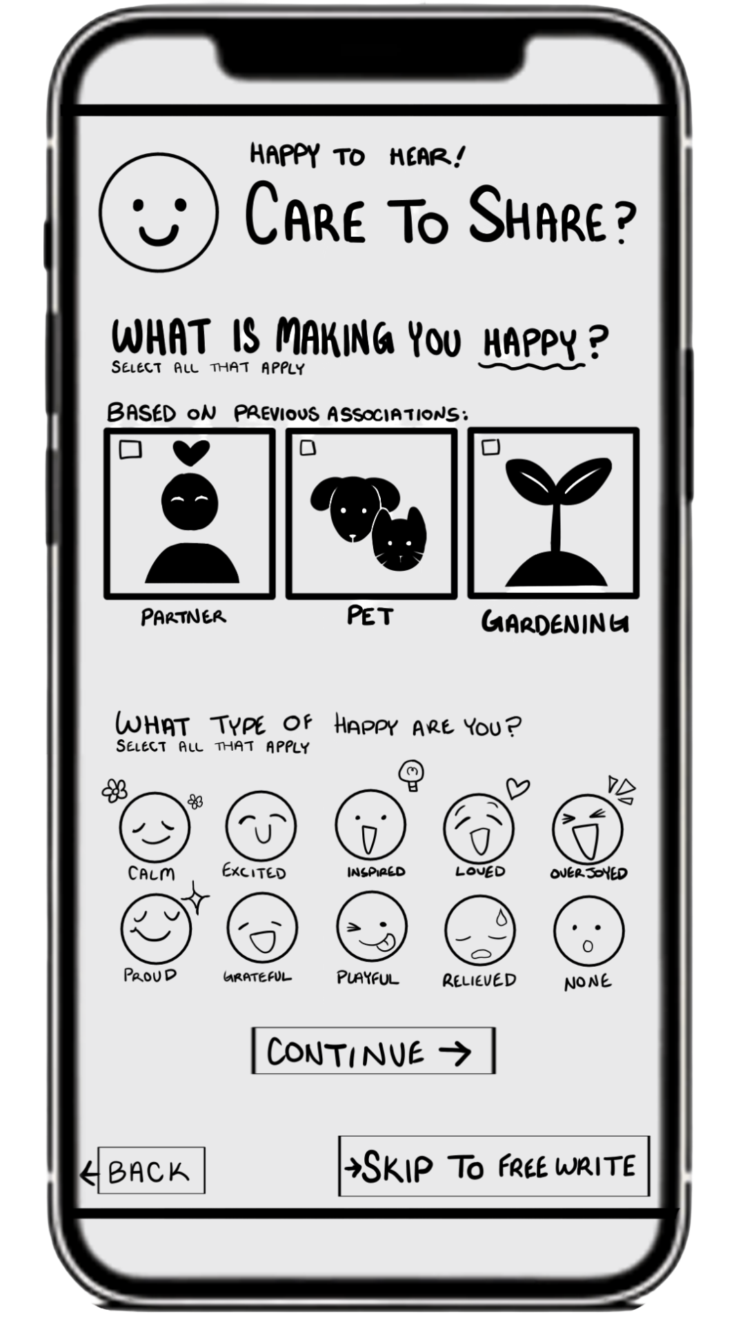
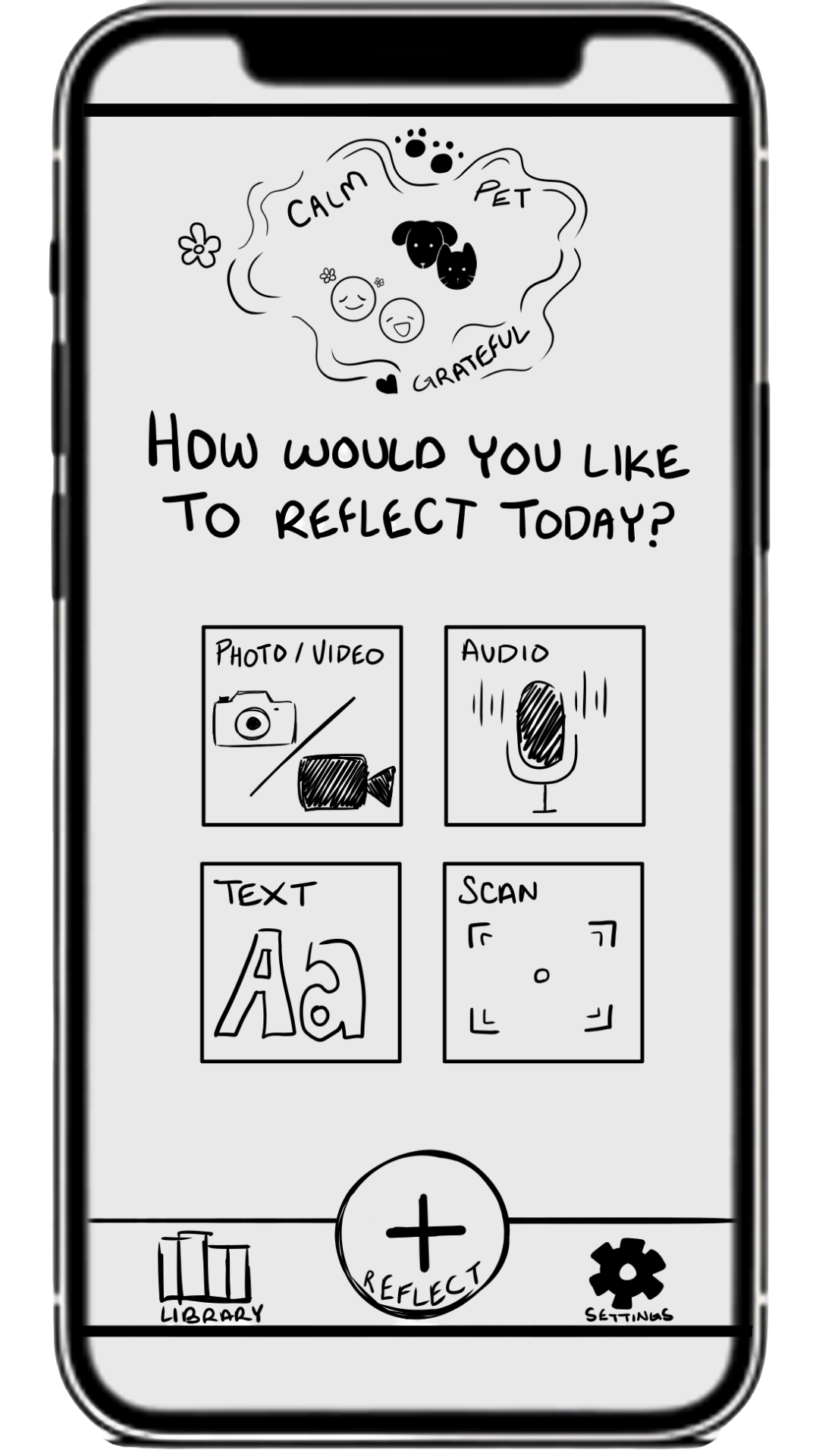
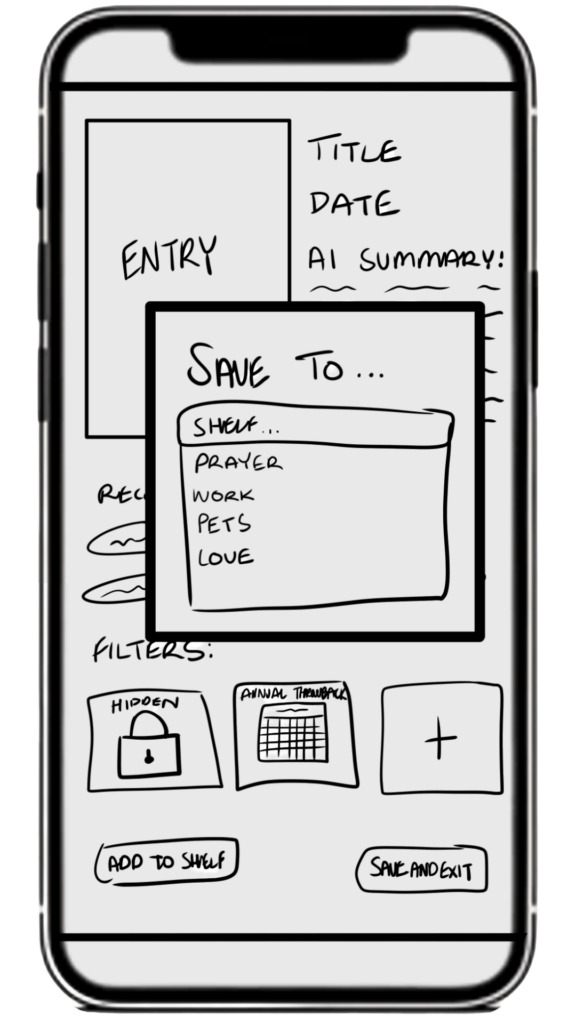
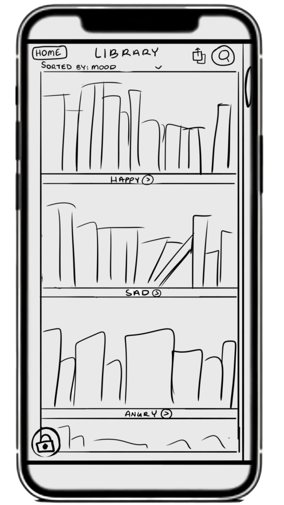
These would be chosen due to being the main aspects of the app, being what most will seek out when opening the app.
The initial check-in is personalized, customizable and based on previous entries. It will be a main feature for those opening up the app. The reflection is what makes it the journaling app. It is the very aspect of journaling. Having it be flexible yet understandable is the key which is why it must be tested. The library is allowing them to look back and sort their memories however they see fit.
Cognitive Walkthrough
The goal of a cognitive walkthrough is to evaluate how easy it is for users to navigate an app and complete tasks, especially when they’re using it for the first time. By stepping through key actions and observing how users think and respond at each step, you can identify where they get confused, make mistakes, or hesitate. This helps designers spot usability issues early and improve the app so it feels more intuitive and user-friendly.
How I conducted these walkthroughs is by giving my users tasks that one would use while casually using the app, I’ll use the first test user as an example of what I did.
My first task to them was to go through the initial reflection check in process in order to generate a prompt. I had written down a general task for myself but found that when explaining to my user what I had in mind I had to make sure the words were more proper and explanatory while staying simple enough to be understood.
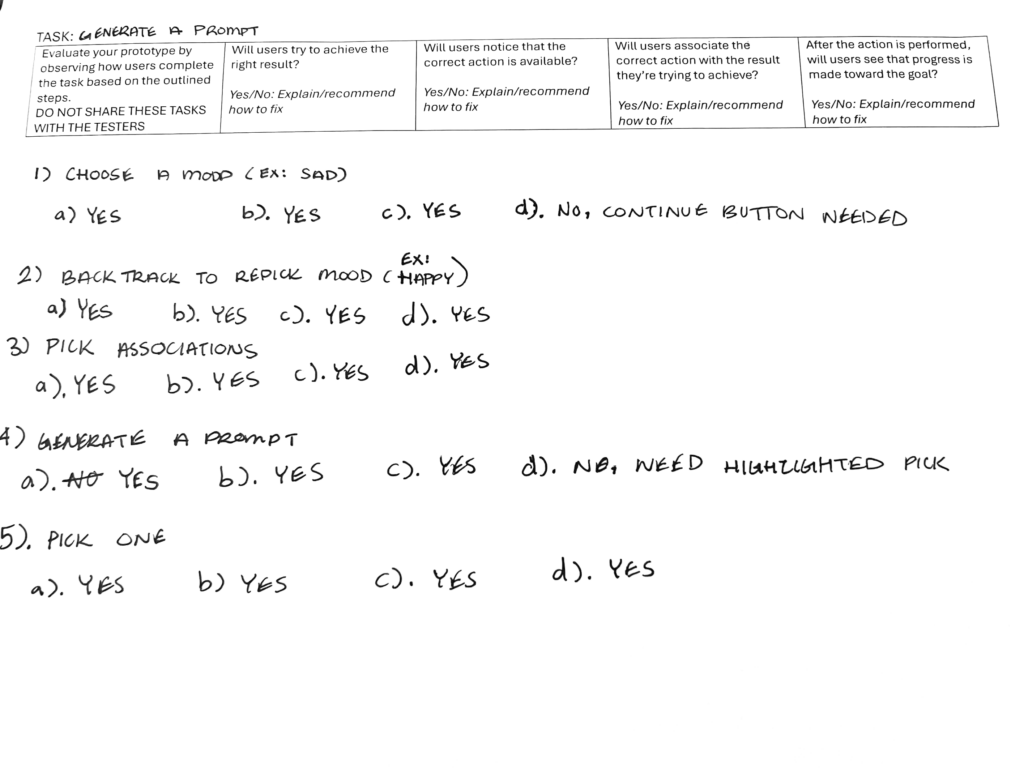
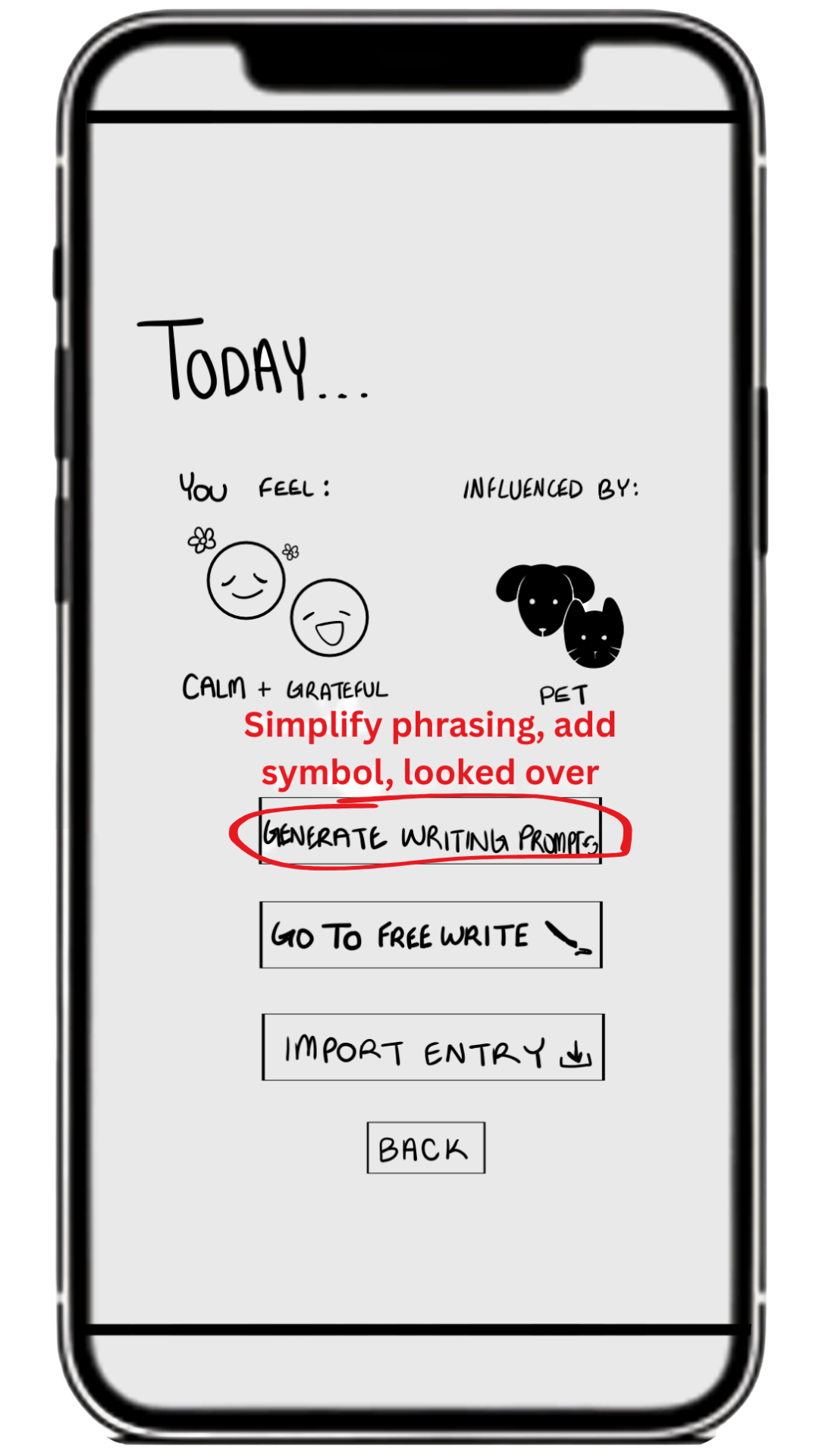
The first task was a general success with a small hiccup or two. I had run into two problem screens.
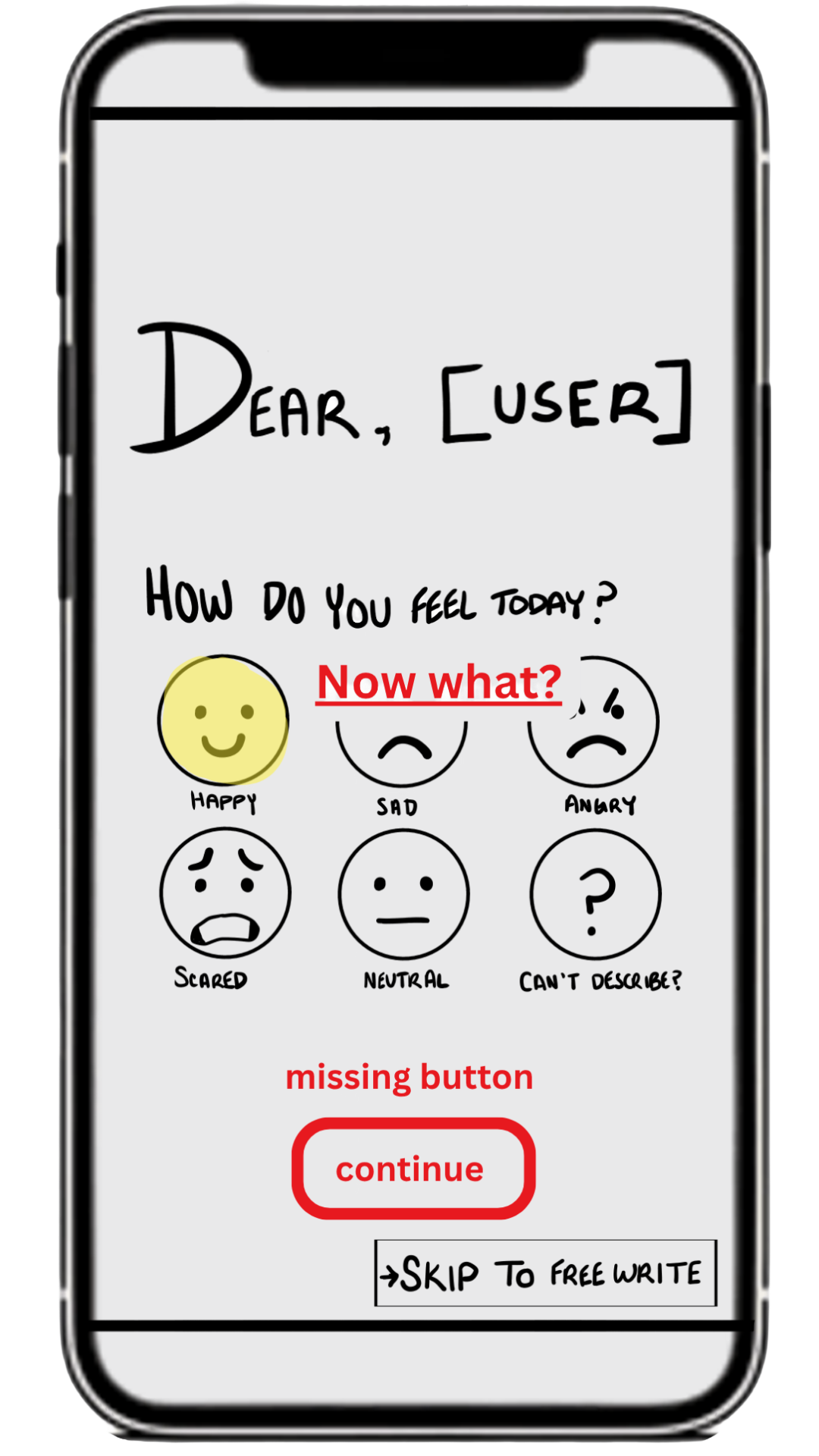
My first screen had the option to choose the emotion but no way to understand on if you pick the emotion, did it do anything?
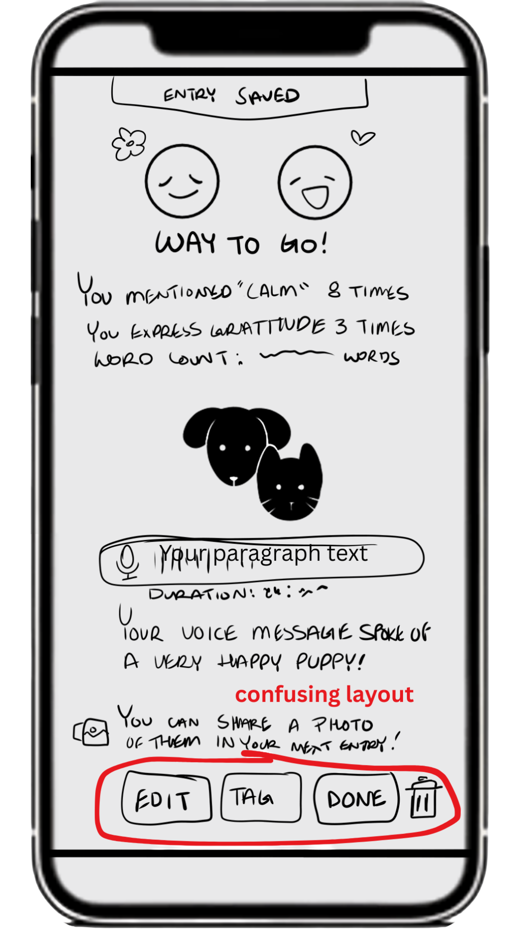
My screen after finishing your reflection analysis has a button that is too long which means most users will glance over it.
Along the way I had found more and more errors.
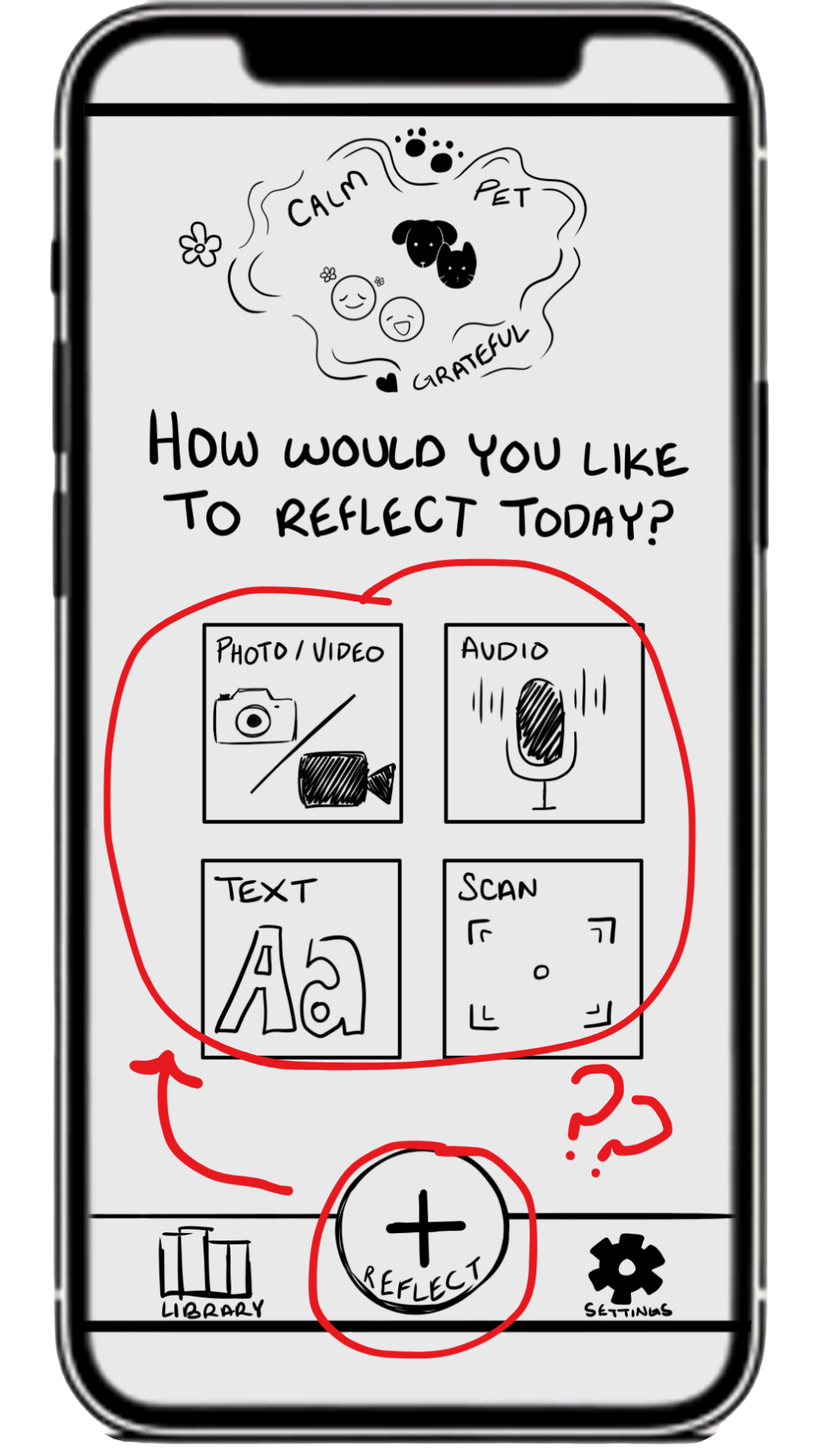
From confusing home screens that have possibly repeating features which has created mass confusion among testers,
To main aspects of doing journal entries being confusing which create future problems with tagging
Conclusion
These were incredibly insightful pieces of feedback for me. Most issues I found were hierarchy and missing just one extra label that would group everything together. I thought I had planned for these specific parts of the app but having someone actually walk through and show you the common users eyes are always a humbling but necessary experience.
💡Hi-Fi Prototype Test
and Iterate
The transition from low-fidelity to high-fidelity prototypes for this mental health journaling app focused on evolving a basic structure into a more emotionally engaging and interactive experience.
In the lo-fi stage, the designs were simple wireframes that mapped out core user flows, such as logging moods, writing journal entries, and identifying emotional triggers. These early sketches prioritized functionality over aesthetics, ensuring that the app’s core goal—helping users understand the relationship between their moods and triggers—was clearly supported.
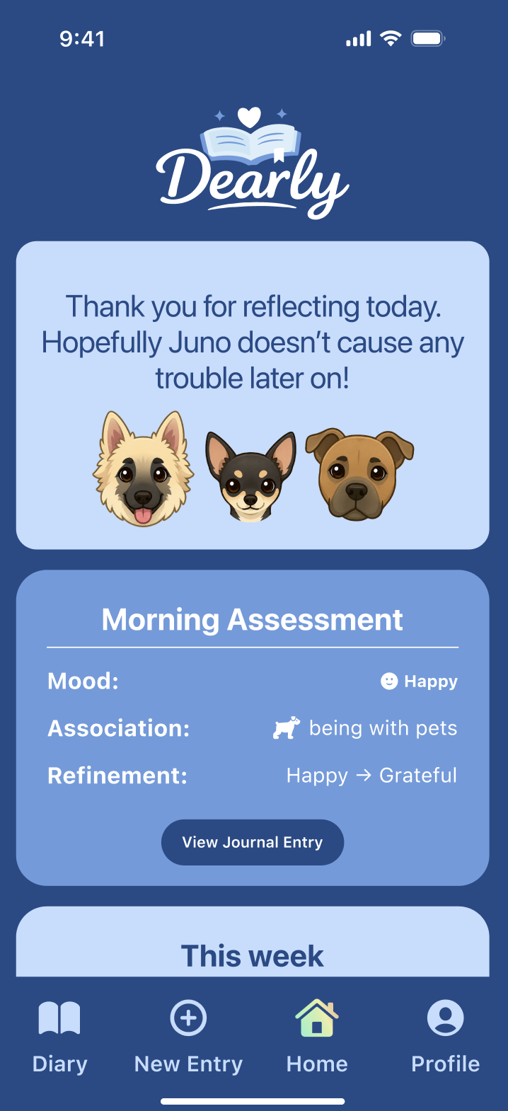
As I moved into the high-fidelity stage, I refined the interface to better reflect the sensitive and personal nature of mental health tracking. This included introducing a calming color palette, soft typography, and thoughtful spacing to create a safe and welcoming environment. Additionally, interactive elements such as buttons, transitions, and AI feedback states were incorporated, allowing users to experience how the app would respond to their inputs in real time.
Atomic Design
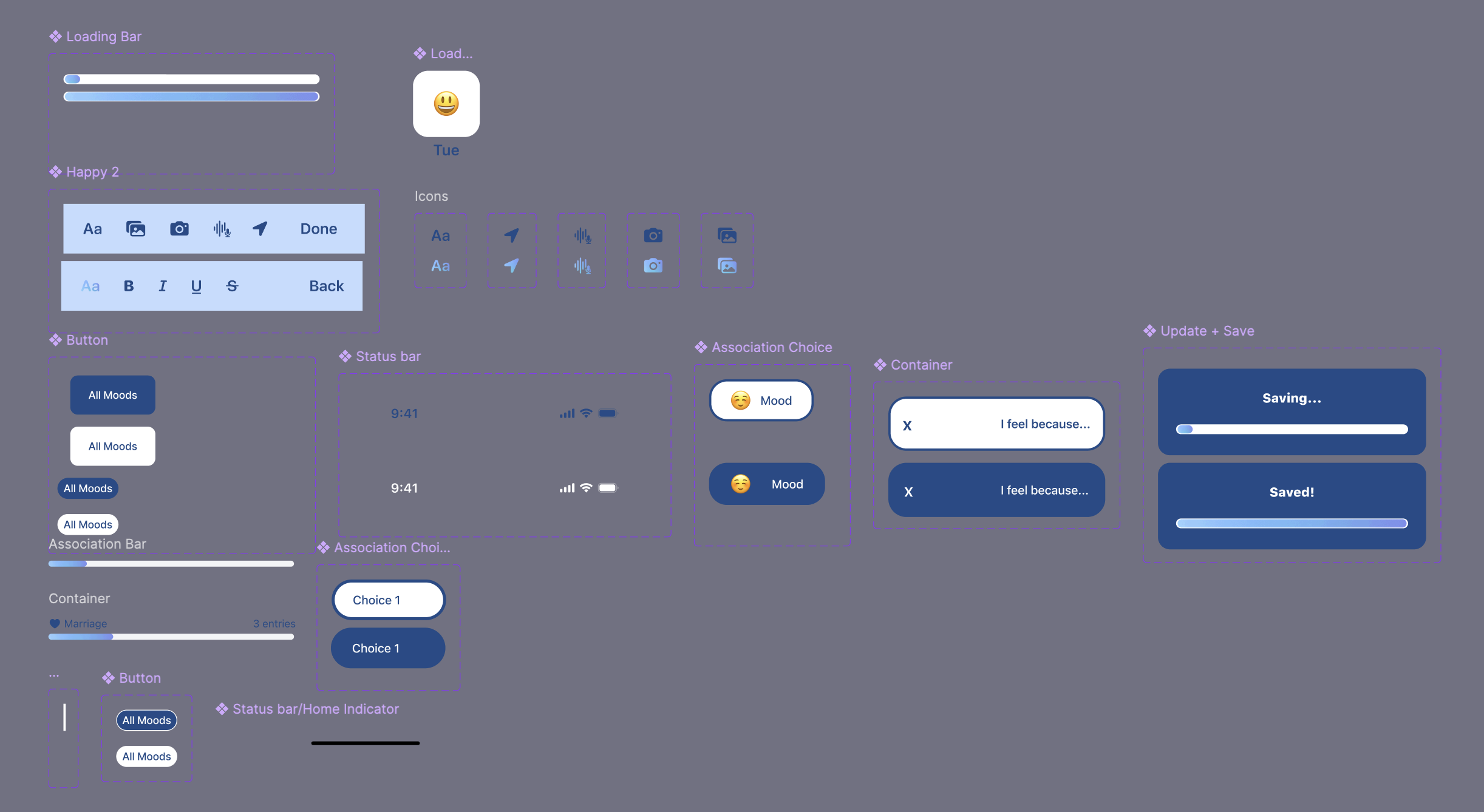
Atomic Design principles were used to create a consistent and scalable system across the app. Each level of the design hierarchy supported the journaling and mood-tracking experience.
- At the atom level, elements such as mood icons, text inputs, buttons, and typography styles were defined.
- These were combined into molecules, such as mood selection components, journaling input fields, and loading bars.
- More complex organisms included the mood logging section, AI insight panel, and daily journal view.
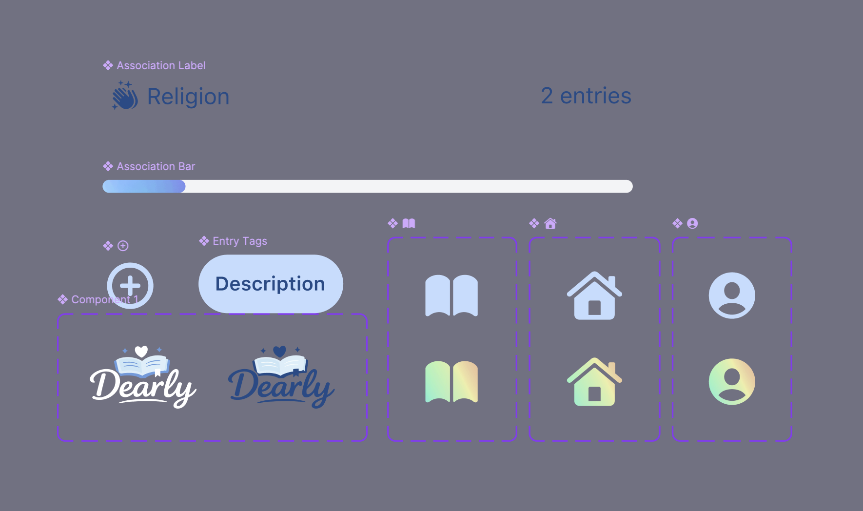
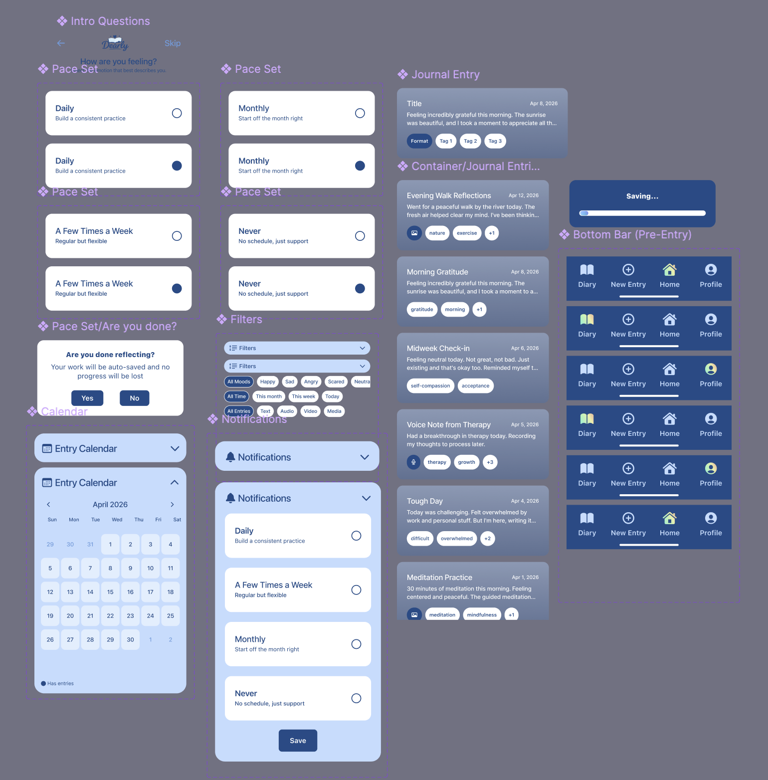
- These organisms were arranged into templates, such as the home dashboard and journaling flow layout.
- Finally, pages represented complete screens populated with real content, such as a daily check-in screen or an AI-generated reflection summary.
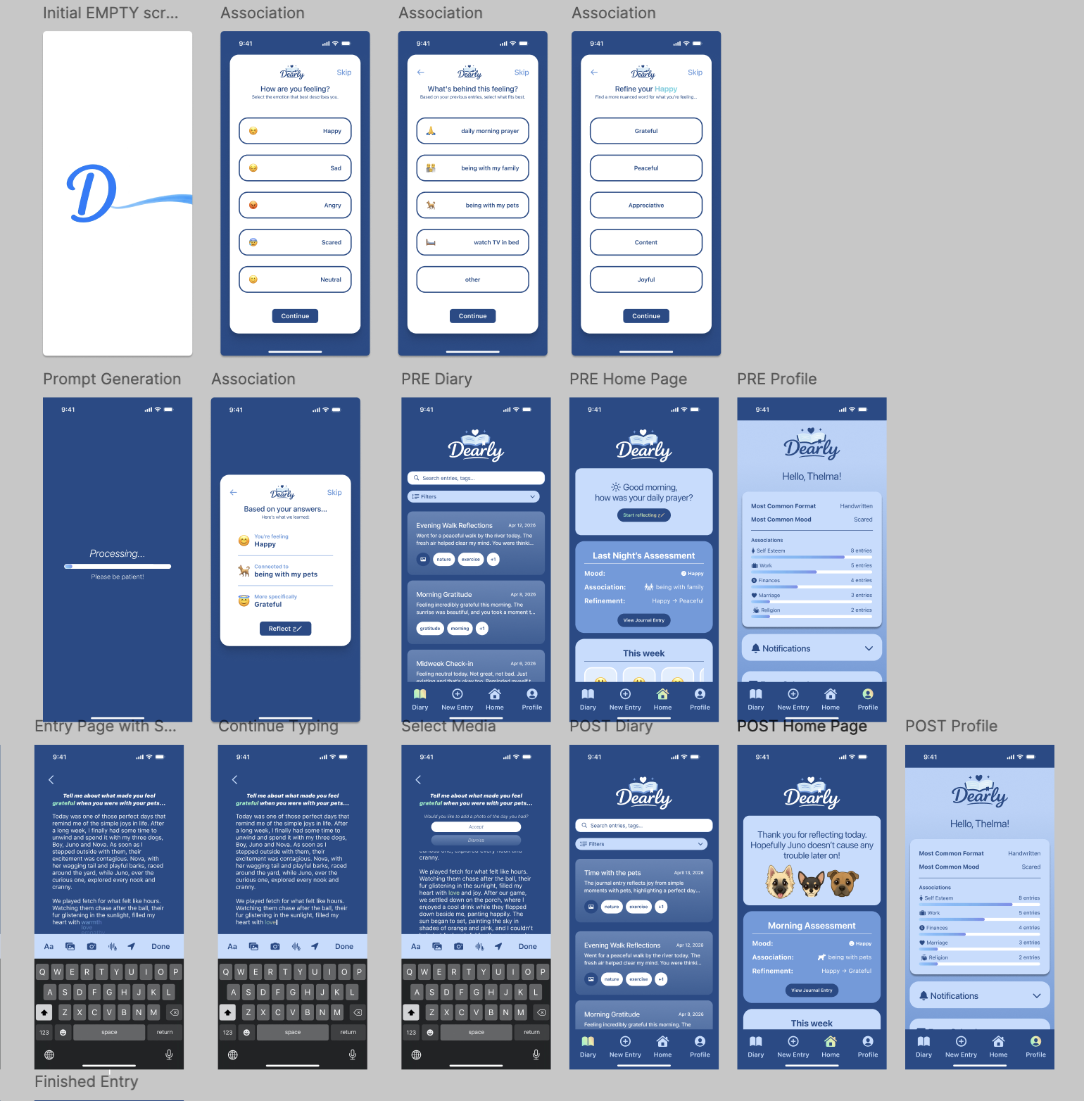
This structured system allowed for consistency across screens and made it easier to iterate on individual components without disrupting the entire design.
Usability Heuristics and AIX Design Guidelines
To ensure the app was intuitive and supportive, I applied Nielsen’s Usability Heuristics throughout the design. For example, visibility of system status was addressed by including feedback when users insert different media formats or when the AI is generating insights. The app also follows consistency and standards, using familiar icons and predictable navigation patterns to reduce confusion.
Other important usability considerations included:
- Encouraging recognition rather than recall through mood icons and suggested triggers from their entries.
- Preventing errors by keeping interactions simple and guided and allowing any undoing from choices.
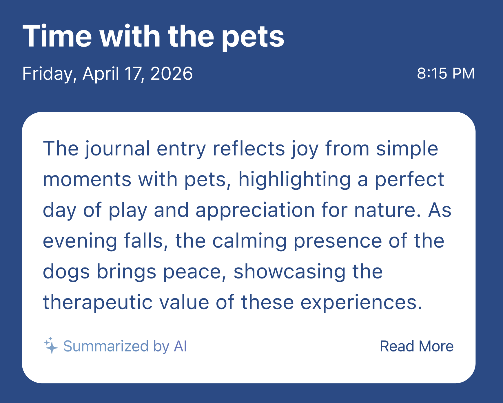
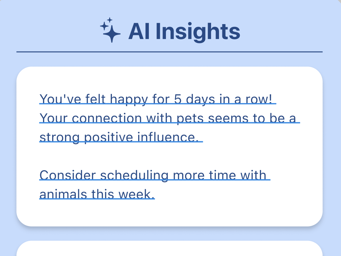
Because the app includes AI features that analyze journal entries and suggest mood-trigger connections, AIX Design Guidelines were especially important. I ensured that AI interactions were transparent by clearly labeling AI-generated insights and indicating when the system was processing user input. Users are also given control over these insights, such as the ability to accept, ignore, or refine them. This helps maintain trust and ensures that the AI supports, rather than overrides, the user’s personal reflection process.states to handle cases where the AI might fail or produce unclear results.
Initial Hi-Fi Screens
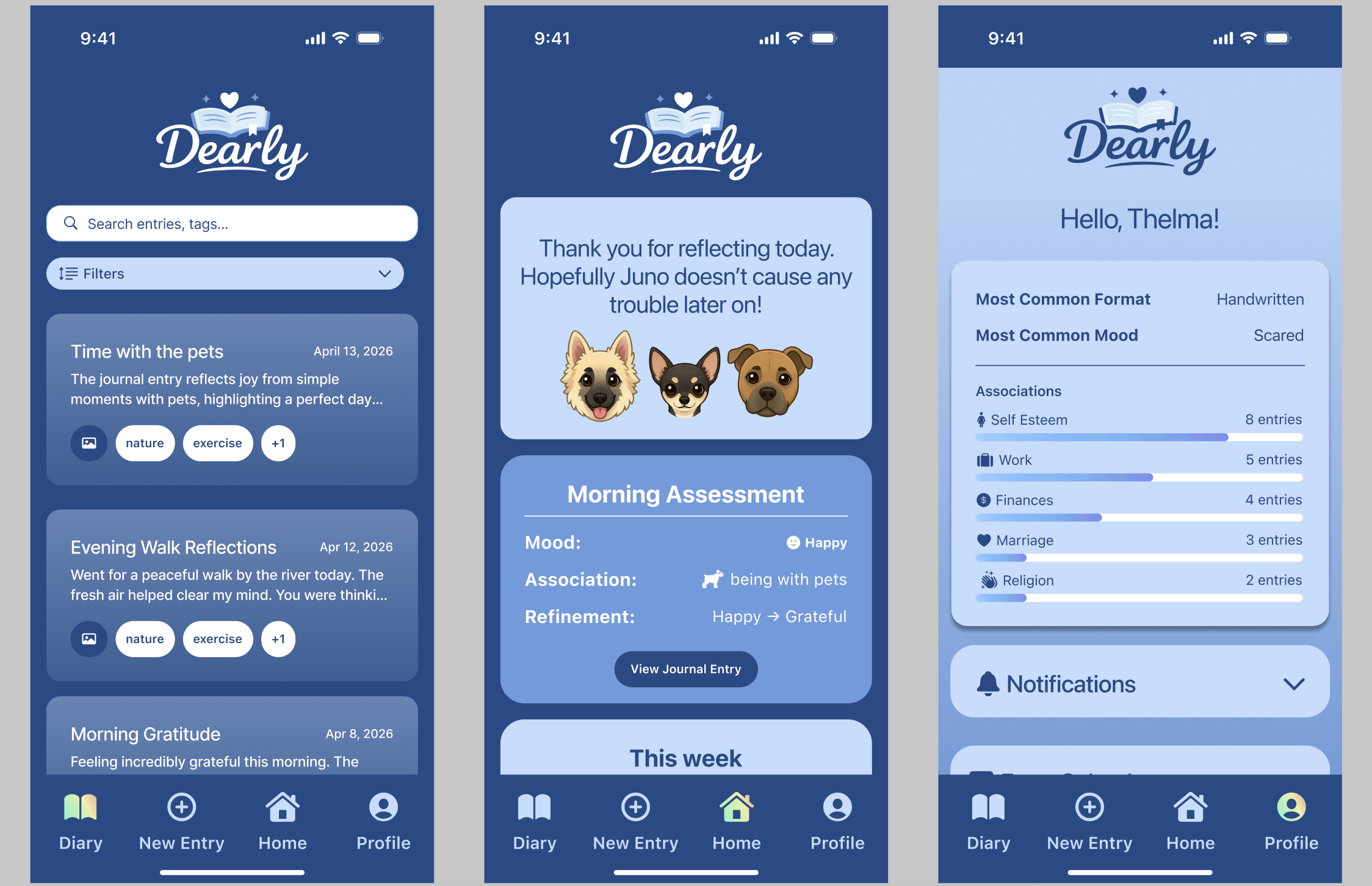
The initial high-fidelity prototype included several key screens that reflect the core functionality of the app:
- The Home Dashboard, where users can view recent moods and quick insights
- The Diary Screen, allowing users to read previous entries and see what information AI gives for their emotional process.
- The Profile Screen, which provides summaries and detected patterns between moods and triggers
Test (Heuristic Evaluation)
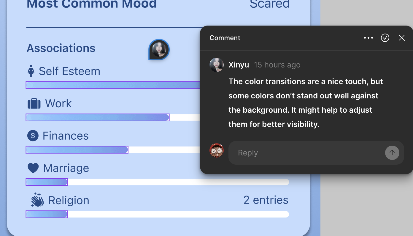
Peer evaluation of the initial hi-fi prototype revealed issues, particularly more visuals that would pop out to the average user. Many had found a small size difference that had shown up in one screen which would be obvious.


This pointed out visuals that if going between screens would have a more obvious change to someone going between menus.
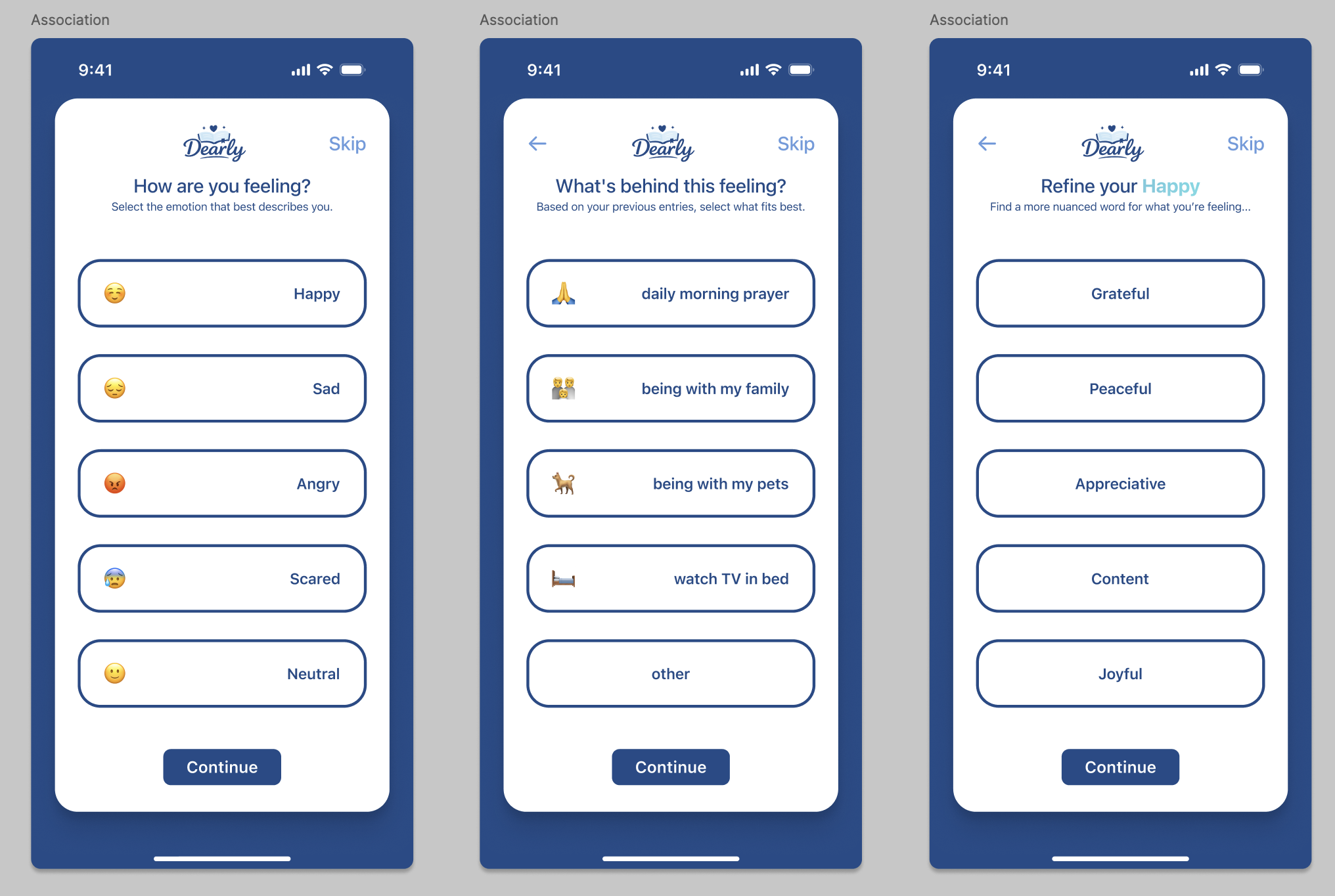
Though the comments were for minimal visuals, they were clearly in the long run going to save me a long amount of time trying to see what I was missing. This screen had given me such an uncertainty on what was wrong that new eyes had assisted in helping me see what it was.
Another piece of feedback given were color switches such as buttons not appearing with strong contrast or colors that could be stronger in the menus.
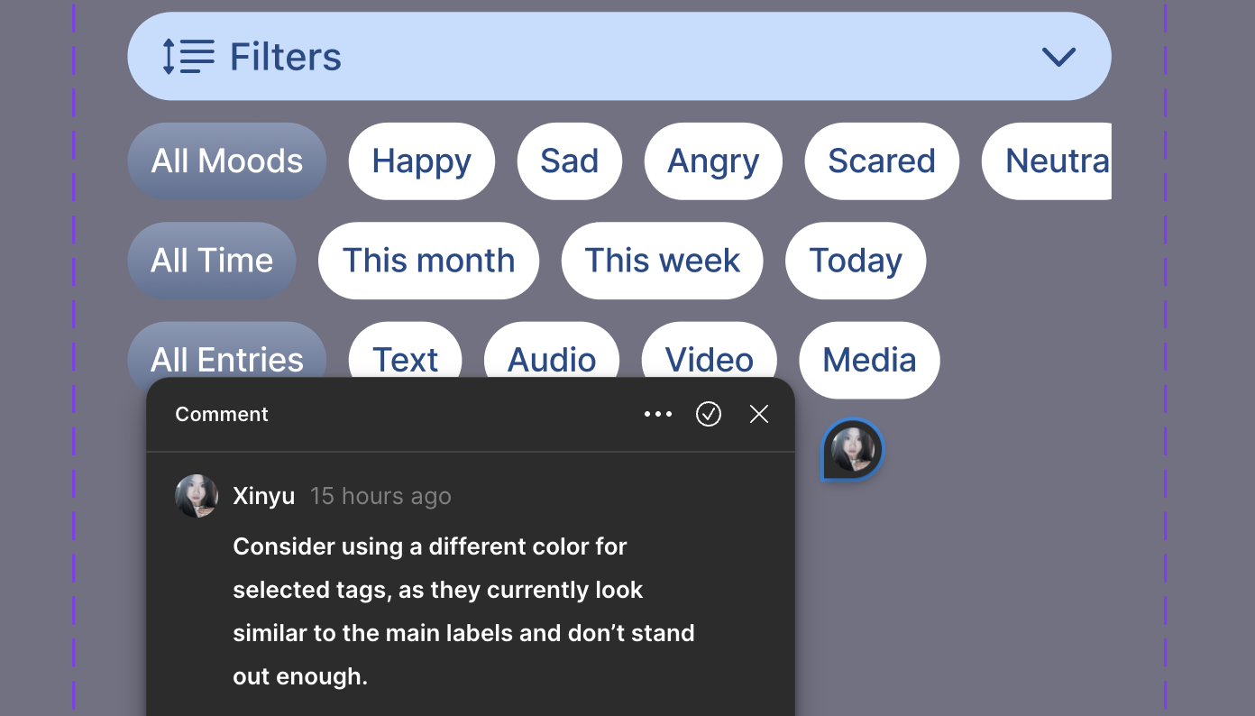
These had helped to make my app that much stronger and yet I found myself wondering with these tests what would someone who goes through these tests despite not knowing the name would say about my app.
Thus I went back to my original tester, an interviewee who had seen everything up until it had touched Figma which meant every piece of a screen was brand new to them. I had asked them to walk through the app and explain what worked and what didn’t during the process. This was a non-designers way of approaching a designers evaluation as one could see it just not knowing what it applies to.
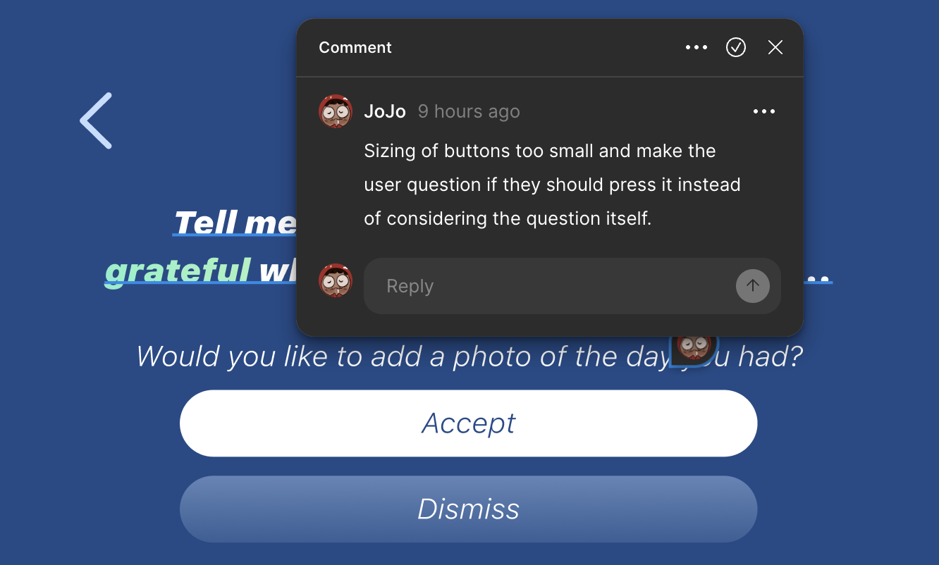
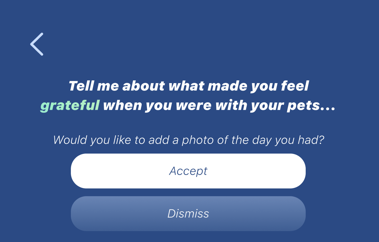
Examples I had found were the questioning of button sizes, my tester had stared for a little, giving me a hesitant look before pressing accept. Had it been more appealing or the usual size the user wouldn’t think much of it but due to the size and how close they were, I was shown hesitance on how reliable the buttons were.
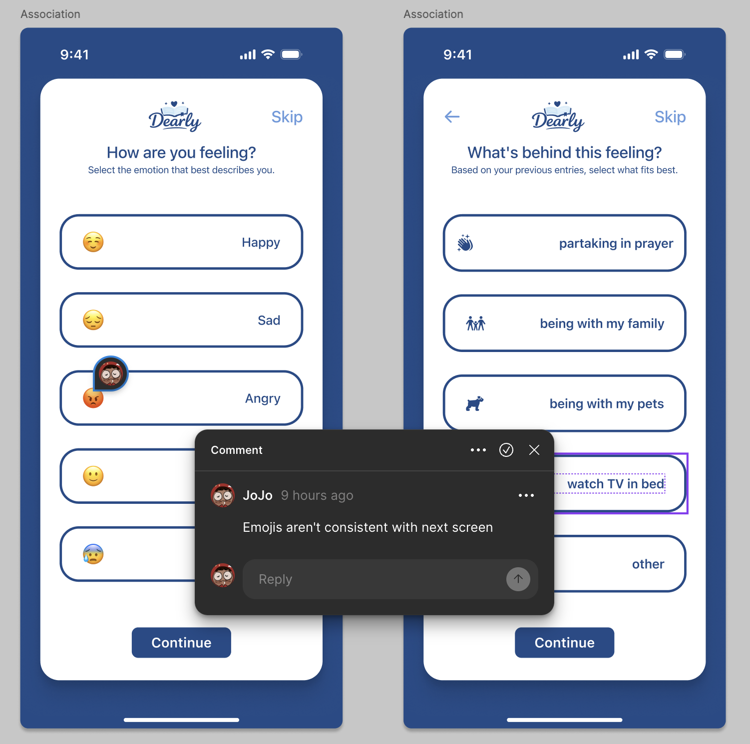
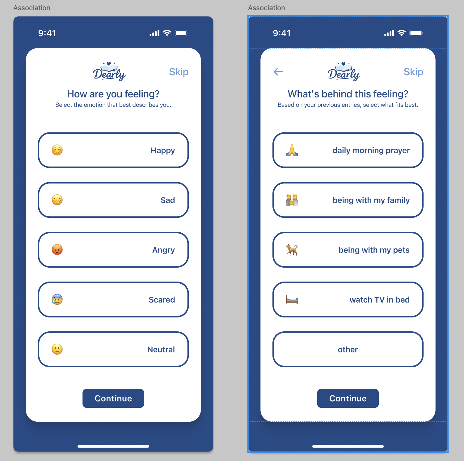
Another came from inconsistent visuals, making my tester tilt their head and ask if it meant it would lead somewhere different which I hadn’t considered before, it brought me a new perspective on how this would be a part of my creation.
Working with these three variety in perspectives, one being for spacing, one for contrast, and one for an average user had allowed me to see this more clearly and reflect more on these minute details.
When it came to AI, I hadn’t received anything specific until I tested with the third user. They had noted how they had preferred how the journaling app had included AI. They didn’t want it to interact with their actual writing and enjoyed it that it had worked with the aftermath, allowing summaries and additional tools and visuals while staying out of their personal business.
Seeing what I had worked towards be a belief in an avid journal enthusiast made the hard work towards an assisting AI over a chat bot or a self-writing journal all the more worth it.
Feedback Links
Reflection
I strongly agree with the feedback regarding the visuals and tiny improvments as they would strengthen the design. Through discussions and comments I had agreed on focusing on the trust in AI interactions. In a mental health context, it is especially important that users feel in control of their data and understand how insights are generated. Without this clarity, the AI risks feeling intrusive or inaccurate, which could negatively impact the user experience.
However, I disagreed with the idea that the AI insights were unnecessary. I believe that the feature itself is valuable, as it supports the app’s goal of helping users identify patterns in their emotions. The issue lies in how the insights were presented, rather than the concept itself. With clearer communication and improved interaction design, the AI can become a meaningful and supportive tool.
Based on this feedback, I identified several improvements to enhance the AI experience:
- Add clear indicators when AI is analyzing journal entries
- Provide explanations for how insights are generated (e.g., highlighting keywords or patterns)
- Allow users to edit, confirm, or dismiss AI-identified triggers
- Improve personalization of AI suggestions based on user history
- Visually separate AI insights from user-written content
Overall working on this project had given me a different perspective on AI as well as how much should be included in the process of a persons life and average mobile app. I had gone from being hesitant, if anything a little resistant to the use before realizing that it doesn’t always have to be generative and if anything can be incredibly helpful for those who don’t always have the resources that others do to find themselves.