Magazine Design
Creating a publication over a topic that will captivate your audience while earning their investment into this topic.
Focus: How can you make someone care about what you care about?
The Initial Study
For a proper exercise we had been given the opportunity to create a magazine publication for a topic we had both interest in as well as a topic that was unique enough it would be worth publishing.
I had a selection of choices in mind as we had started off with having the choice of 3 topics. I thought it too little originally until I realized how much thought went into these ideas.
Psychology Magazine
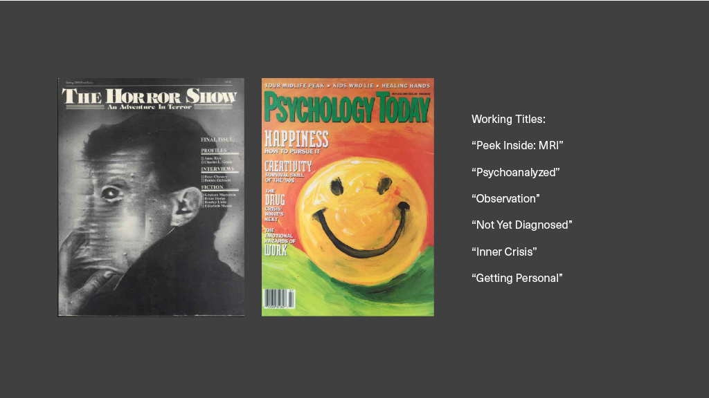
In this publication, I didn’t want to cover popular psychology topics, not trends or trying to give happy little tips. I wanted to explore raw and uncomfortable mental illnesses, psychology that truly deserved to be covered and destigmatized. I found often psychology tried to glorify or simplify mental issues and I felt they deserved proper exploration.
Cinema Magazine
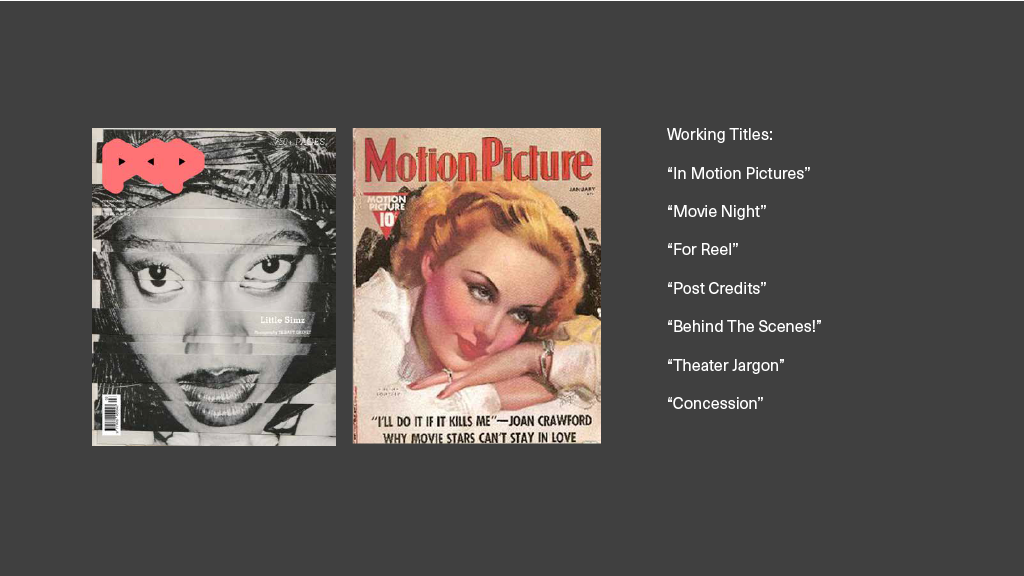
In my second proposed publication I had wanted to focus on directors, casting team, makeup and set designers, people behind the film from start to finish. I wanted to explore stunt doubles, costume designers, getting interviews with extras. I had this urge to explore this underappreciated crowd of creators to help those who want to get into the industry as a non-actor.
Animation Magazine
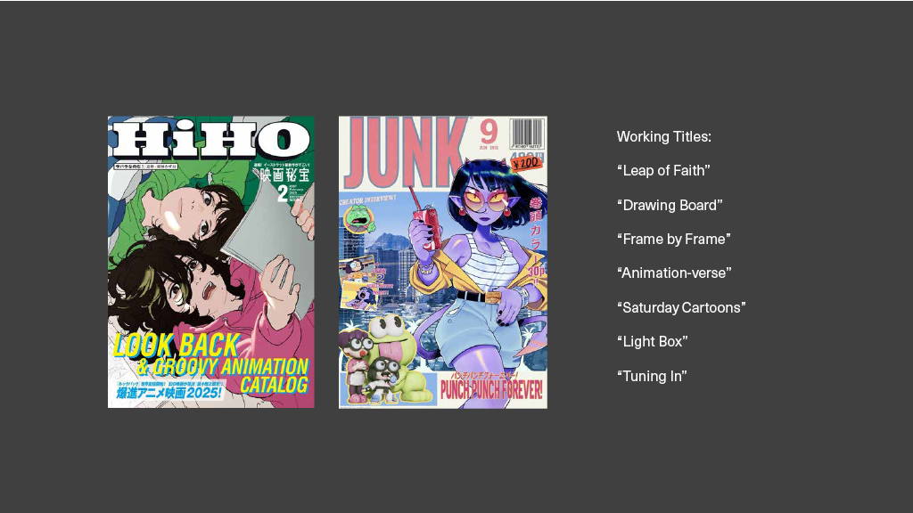
My final publication proposal was covering revolutionary Western animation. There is always someone covering animation overseas, someone going over recent and popular animation, but I wanted to cover things that were more local and underrated. This could range from indie animations that would be made purely for the love of it or huge blockbuster films who change the world of animation.
Ultimately I chose the topic of animation. It had interested me the most for creating a unique audience, impactful spreads and a bigger representation of Western creators.
Magazine Cover
To find an identity within the publications, the process began with creating a logo, a title, a brand to this idea. I had chosen the title: “Tooning In” to play on words of “cartoon” and to “tune in” to create this purposefully incorrectly spelled title of “Tooned In.”
Magazine Title
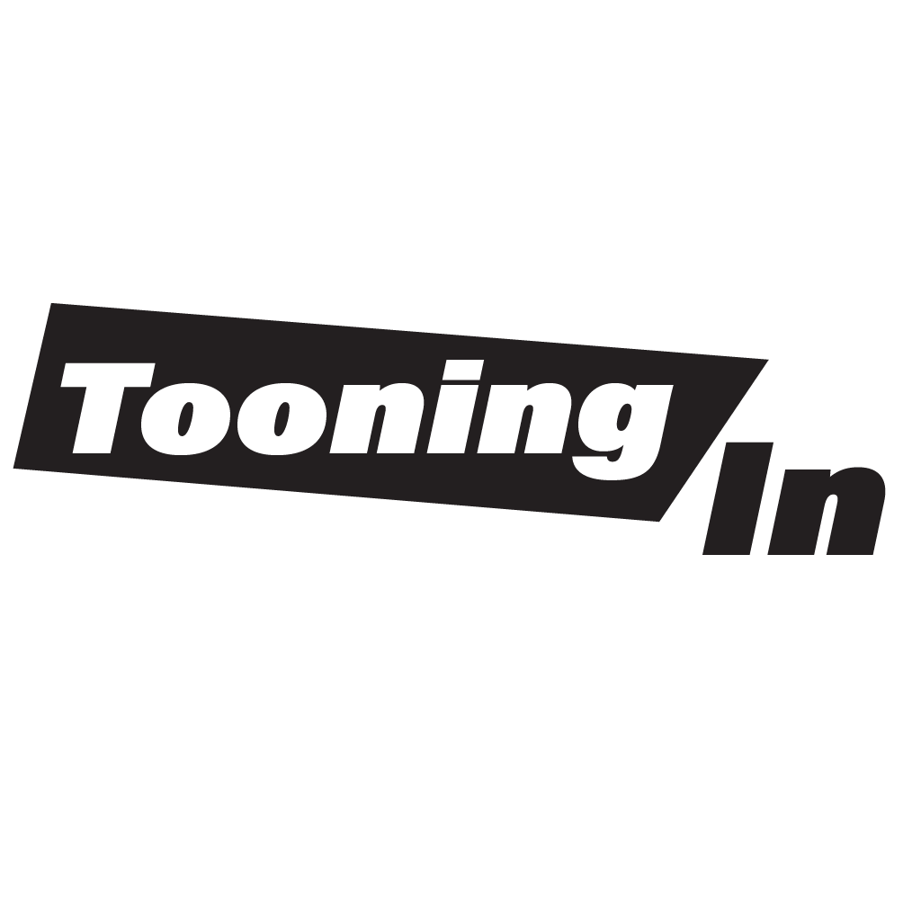
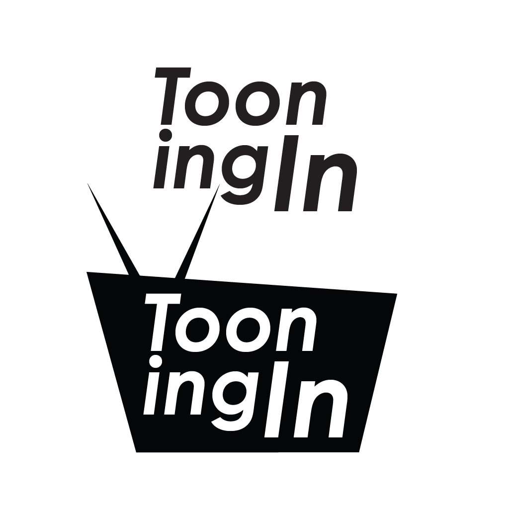
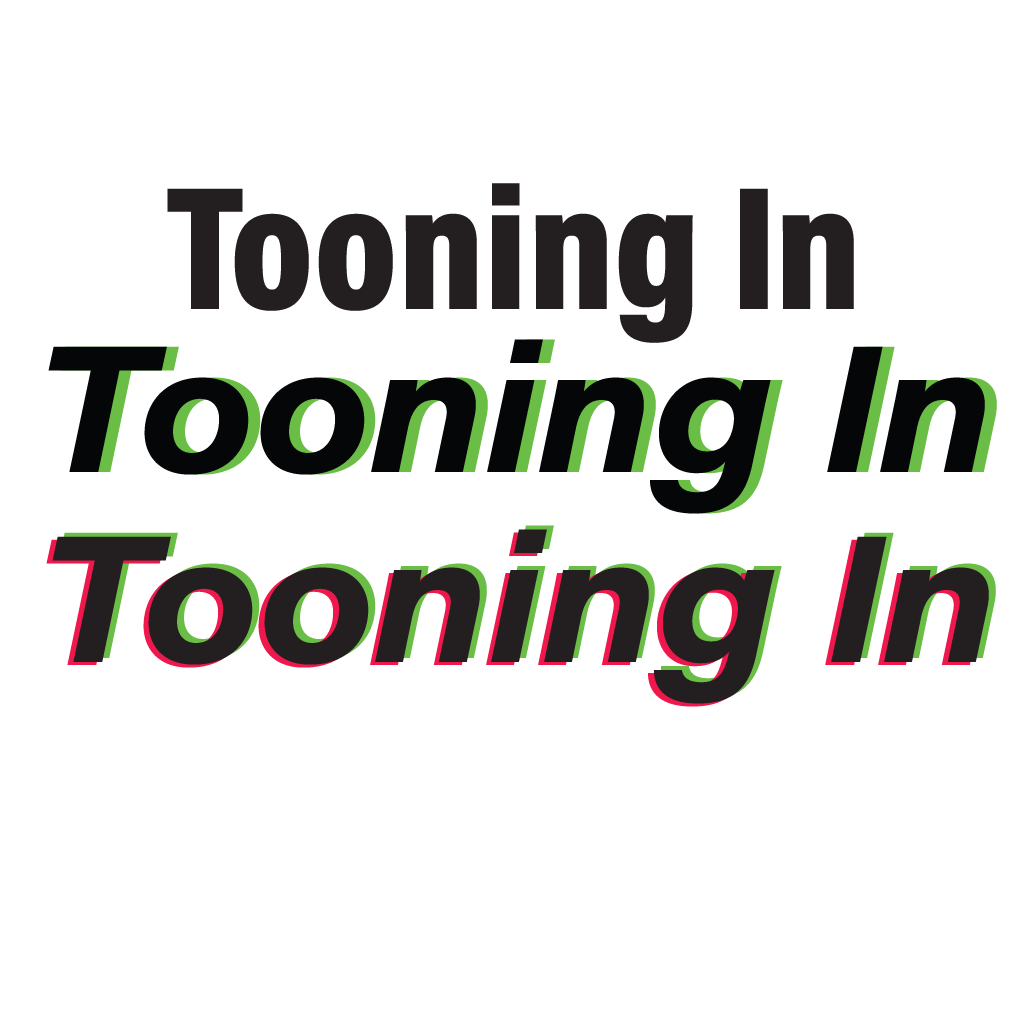
In the end I chose a way of showing animation frames which will use different colored lines in order to differentiate between lighting and shadows from the main study which remained in black. I kept this with the color palette and the soon to be exaggerated colors.
Cover Layout
Approaching this section of the magazine brought some good perspective on how to have the imagery work with your title and how to balance the ratio of it. I had wanted to bring this fun and dramatic tone to the work, having the main focus be the specific media I would be covering and then have the text play around it.
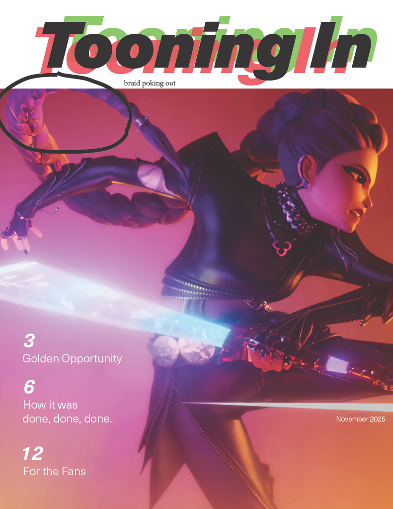
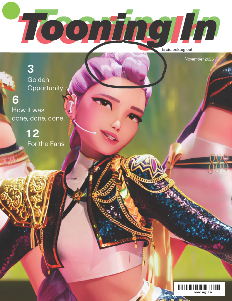
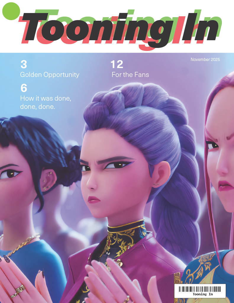
A challenge I faced was the text had played secondary, failing to keep up and flow with the imagery I had placed in the work. This led to more experimentation with the works. Thus led to working with differnet layouts with the text and imaging.
Full Bleed
Pros:
- Bold captivating visuals
- If empty space is available, makes for some interesting layouts
Cons:
- Need for text friendly shots
- Needs to work with the limited palette of the title
Blocked In
Pros:
- Clean and sharp visuals
- Easy application to images
Cons:
- Focal point needs to fit within ratio
- Composition needs context
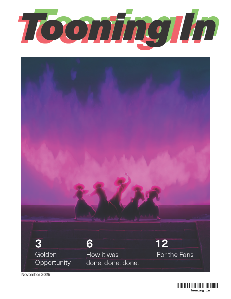
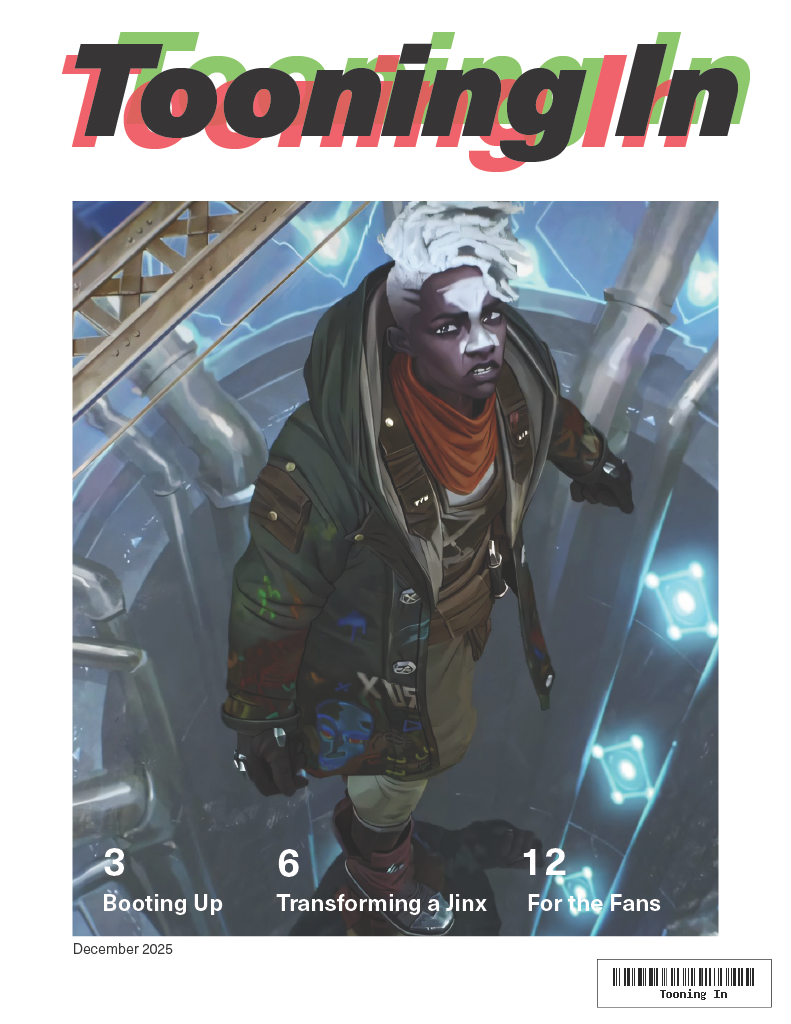
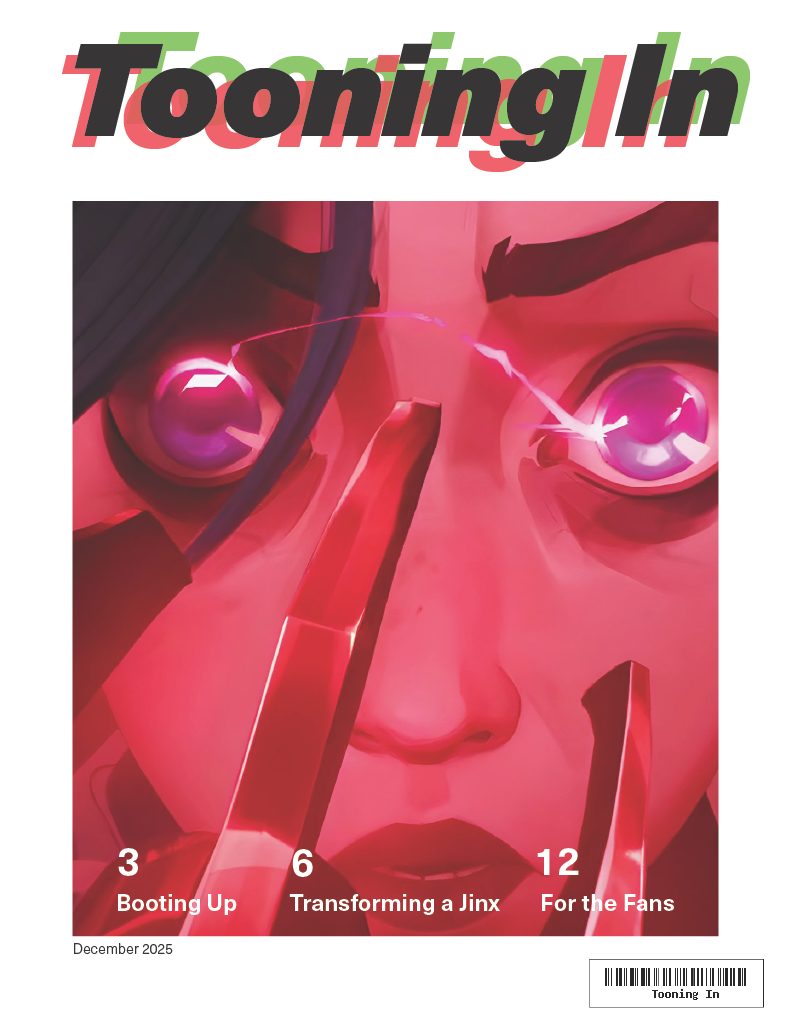
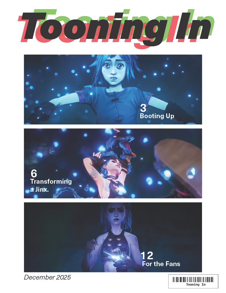
Triple Threat
Pros:
- Compels to look to the bottom
- Endless possibilites
Cons:
- Limits to 3 articles
- Pressure to make them flow
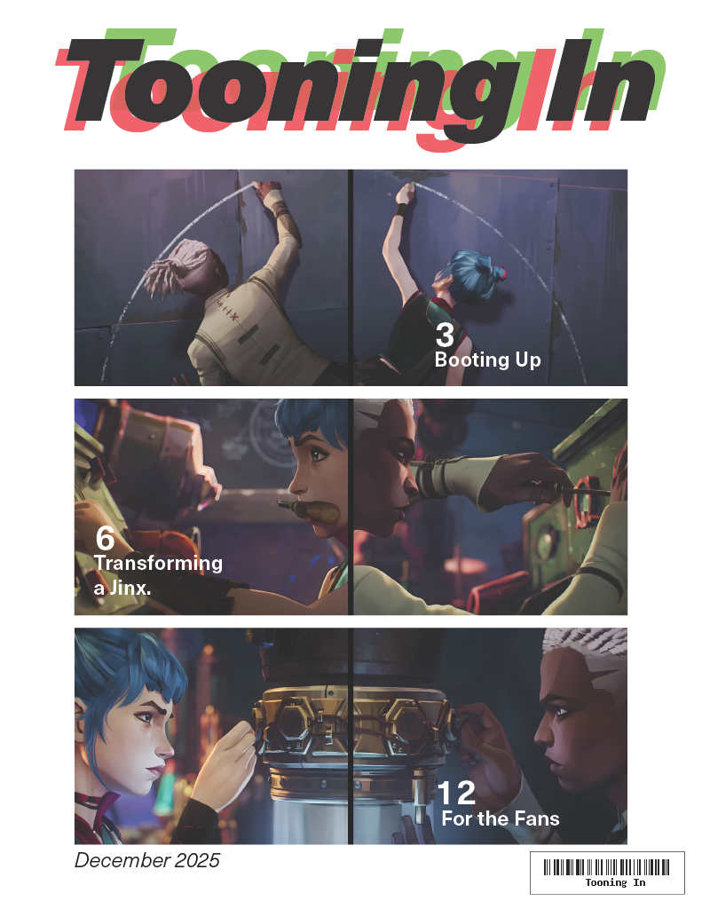
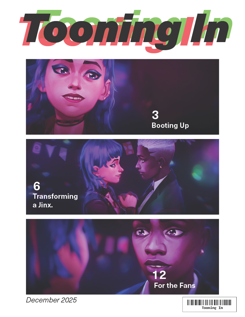
Scrapbooked
Pros:
- Eyecatching visuals
- Shows themes of topic
Cons:
- Can quickly become messy
- Text gets lost and hard to read
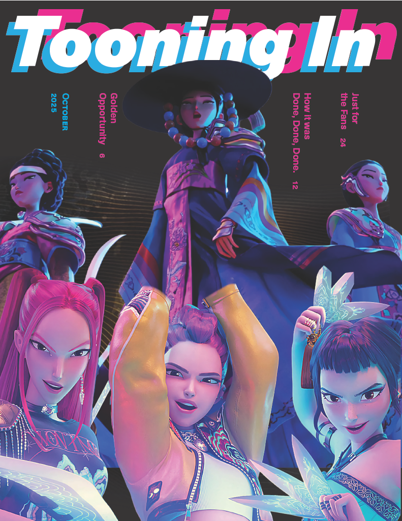
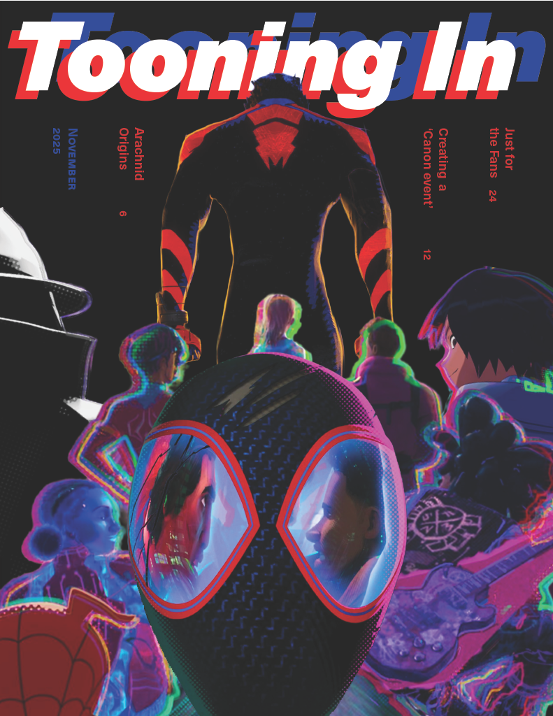
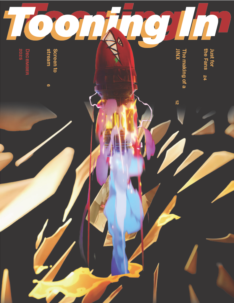
Final
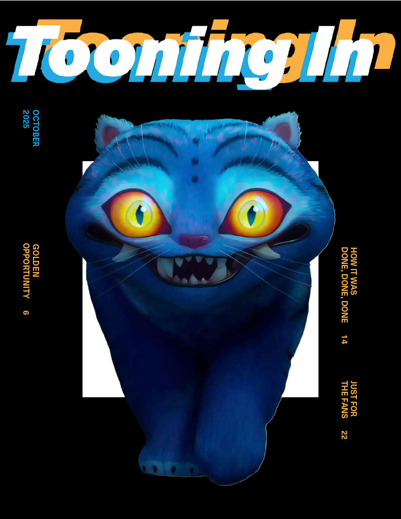
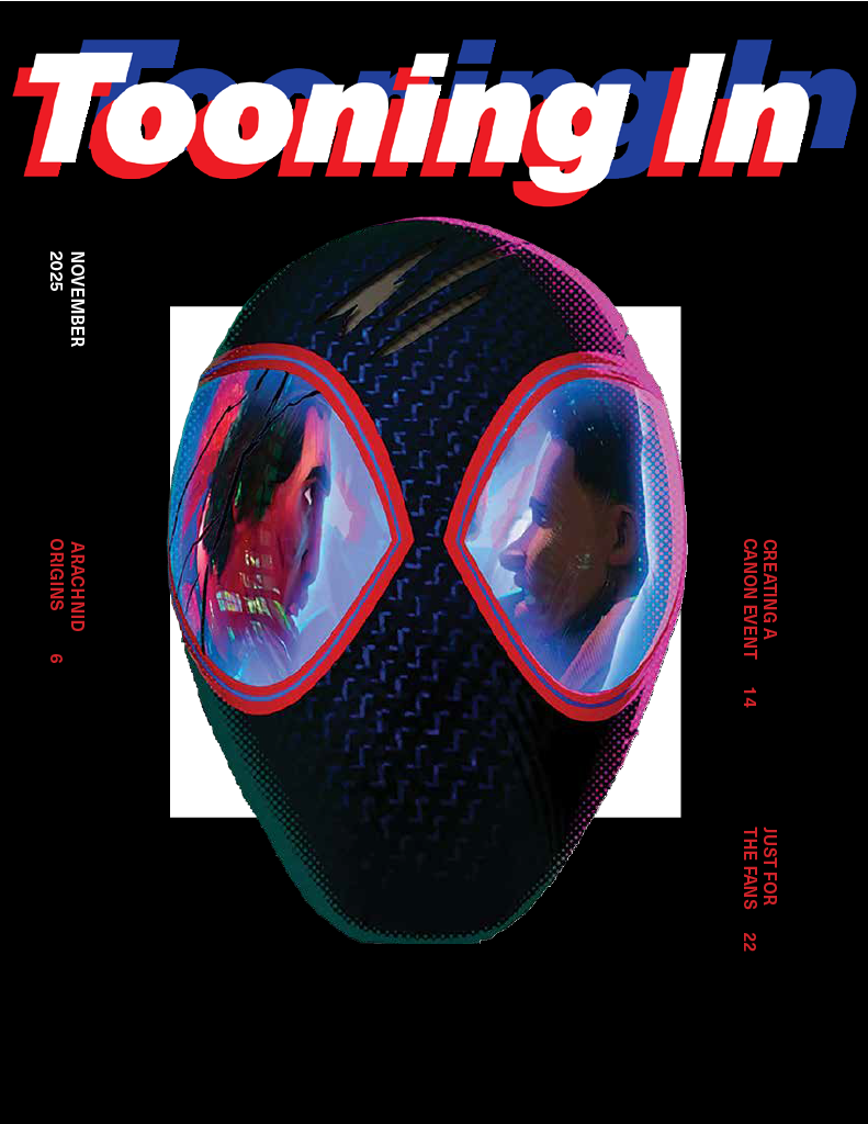
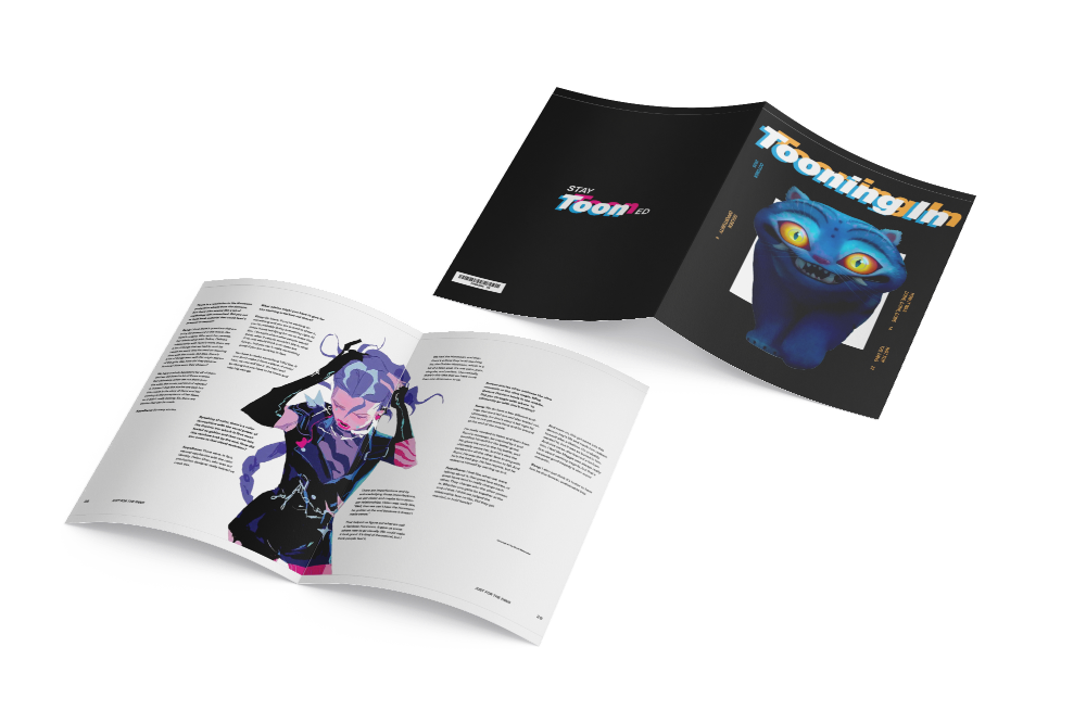
1. Spider-verse had been the original focus of the issue, it was a huge inspiration and literal animation revolutionary. The colors would match the colors of Spider-Man to stay on theme.
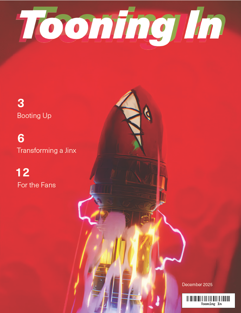
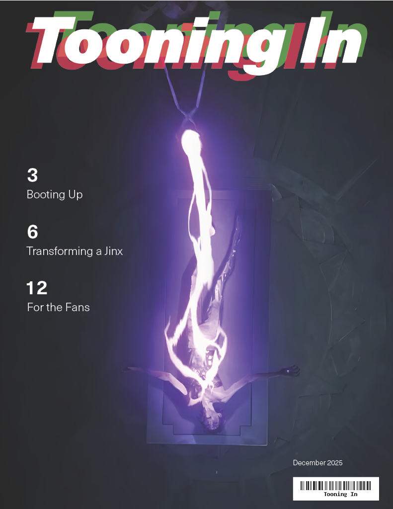
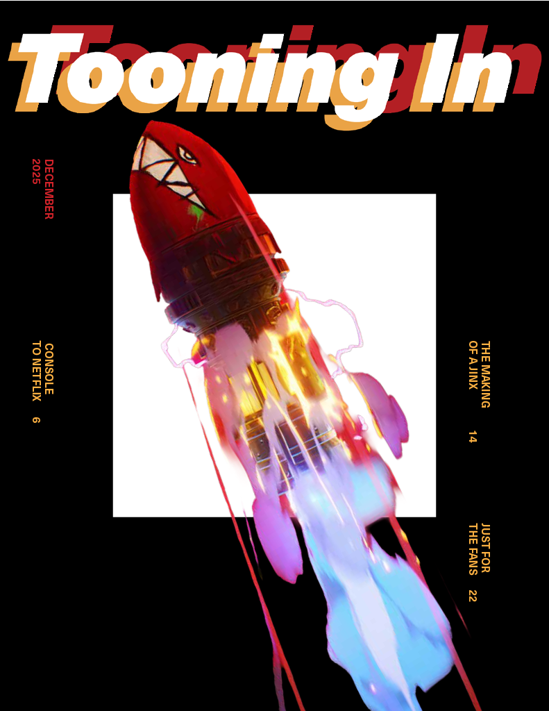
When creating these covers, I had finally settled on an incredibly simple pattern. Matching the palette to the image while keeping it tied with a simple white square to play with depth.
2. Arcane had been a second media to explore as this bomb being shot is an iconic scene in the series and could be recognized by fans but also bring curiosity by those who aren’t. (Yet.)
Spreads
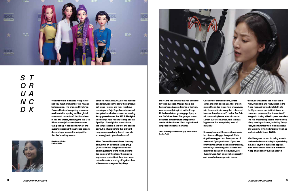
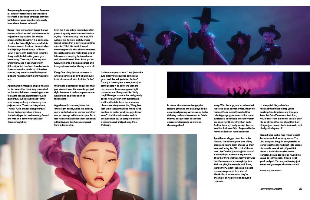
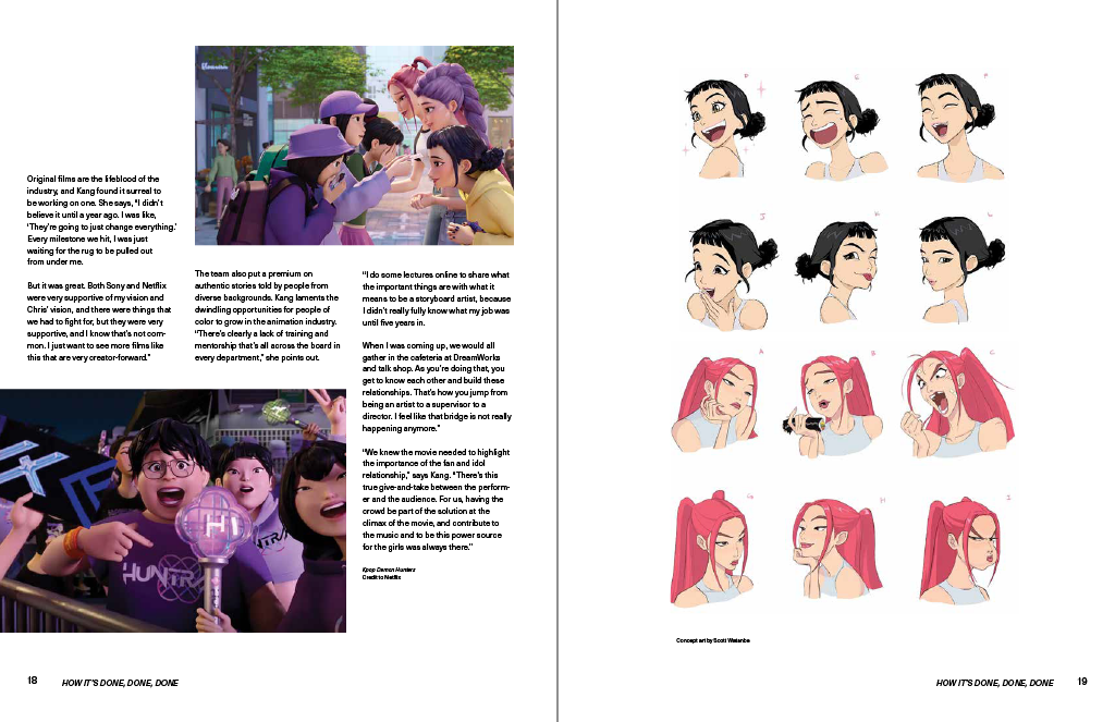
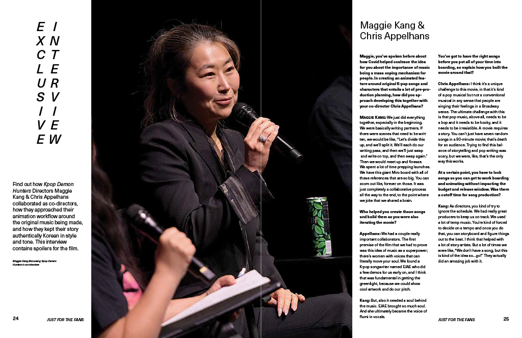
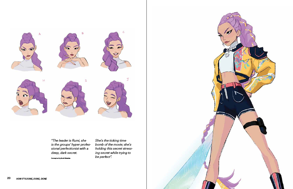
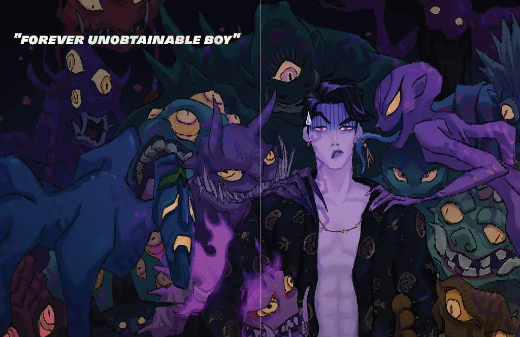
Conclusion
What I’d do differently
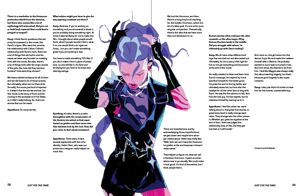
I would take my focus off the visuals and focus on improving my typography. When I focused on it my work had improved such as my last spread. I had instead focused on how to make a spread more interesting with the text and using the visual as a base instead of the focus and had gotten a more interesting layout due to it.
I would be able to do more as well if I was physically available more often as I had to be absent for some vital classes. It didn’t make the process any less fun but would have definitely helped throughout the days of work.
Additionally I wouldn’t have done hotel type as I thought it would be a more unique text but can see the readbility issue that arose due to it and would change it to make sure no cross-eyed readings occur.
Key Takeaways
I learned how to play with balance on text and visuals, how to research beyond your topic and how you can make something make sense and catch the audience by a more unique approach to your work. I have new knowledge on how to work on different mediums as this was a huge project to undertake.