Type, Image, & the Grid
This project allowed us to explore typography and the wide range of possibilities it offers. It was completed in five distinct phases, each with its own set of criteria and design challenges.
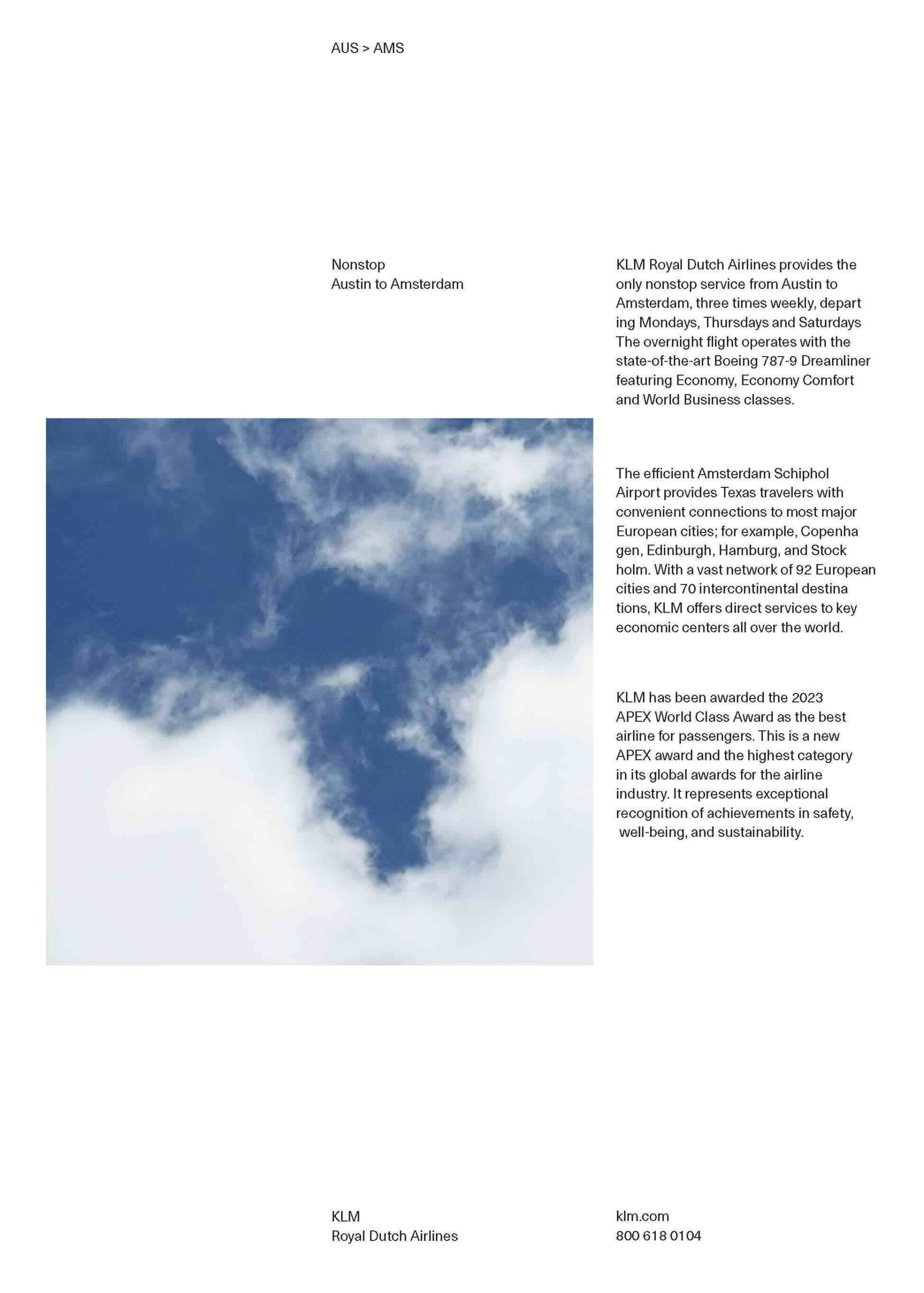
Phase 1:
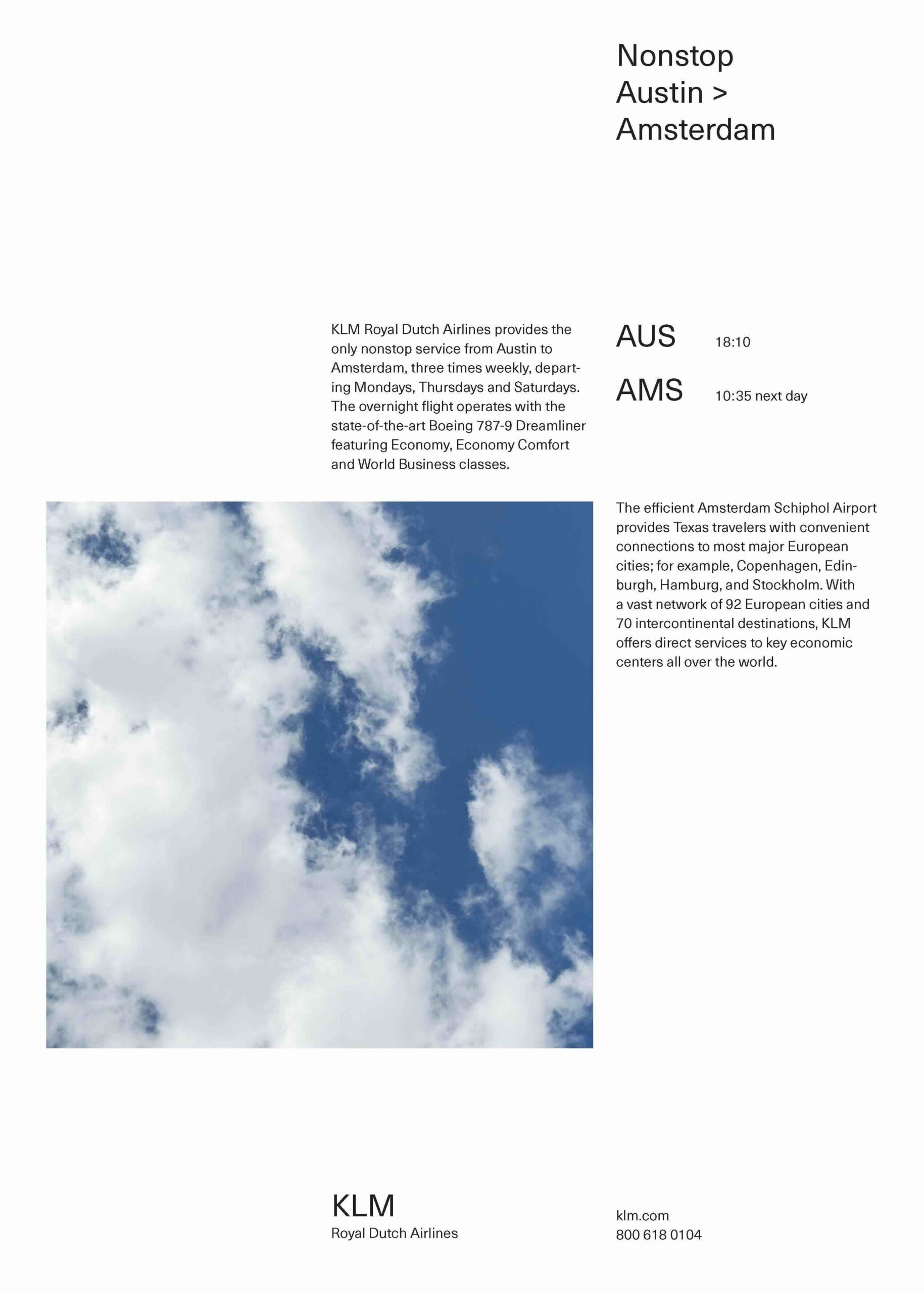
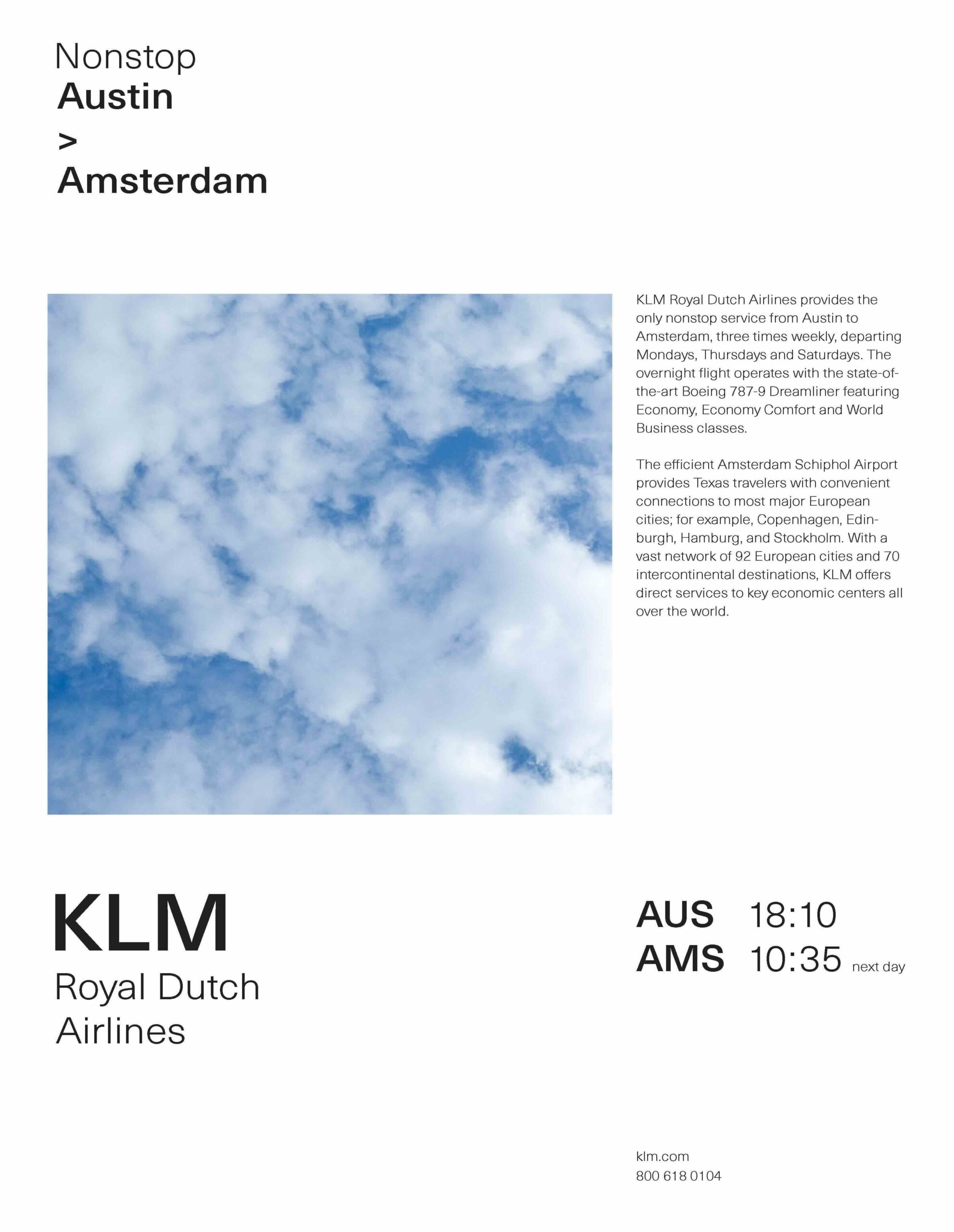
All typography is set at the same size and weight, creating a consistent visual rhythm that allows the normal-sized text to move naturally around the image.
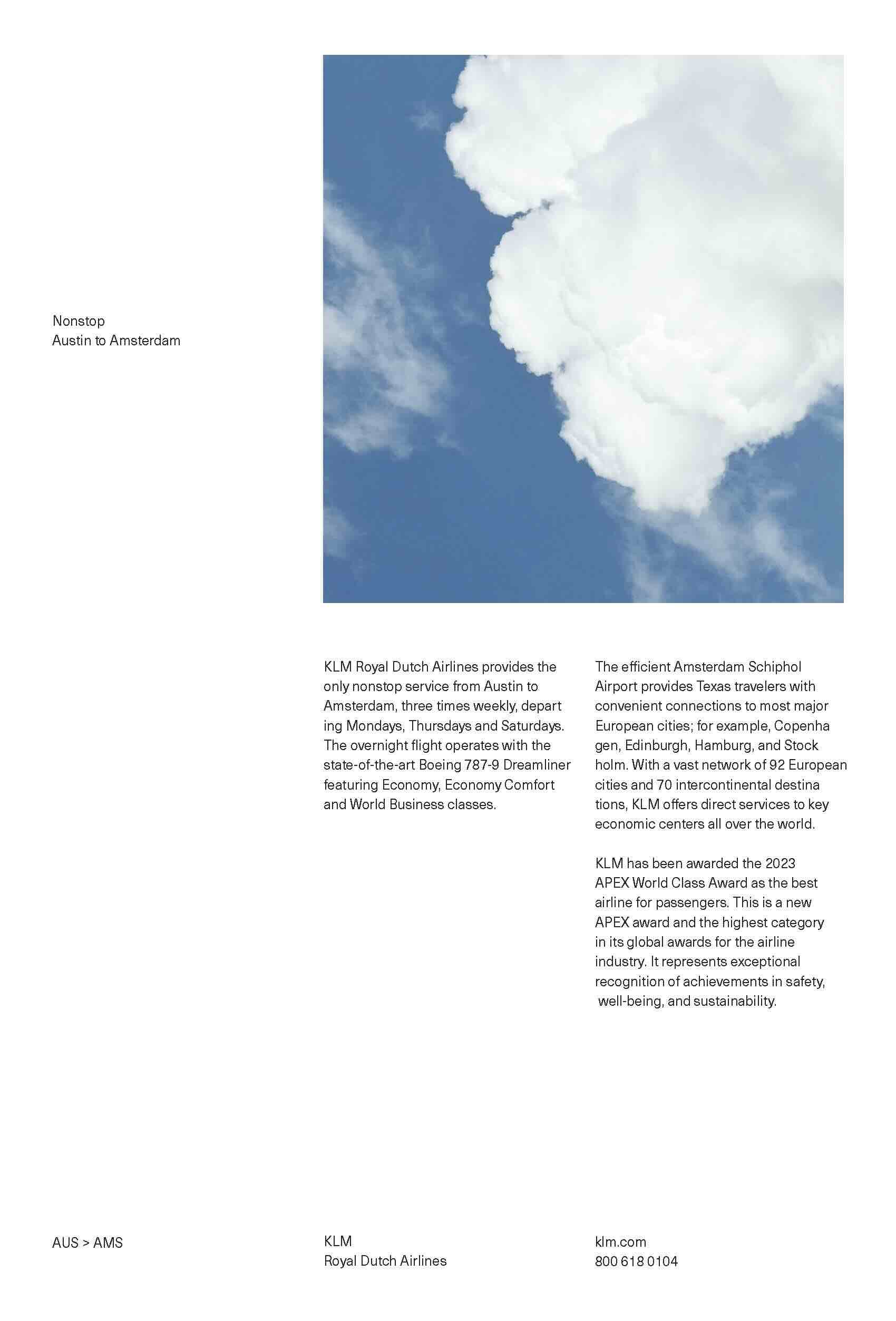
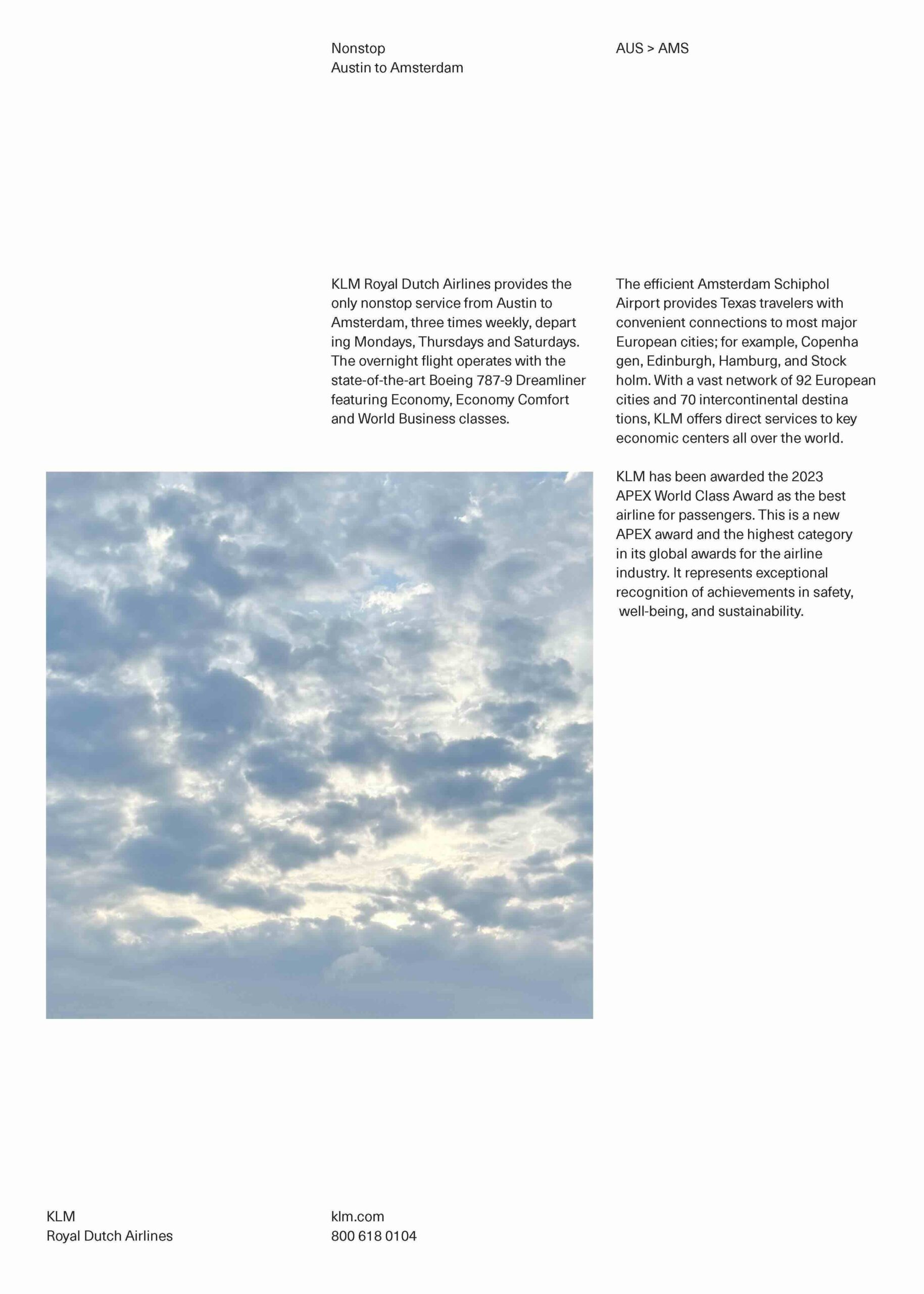
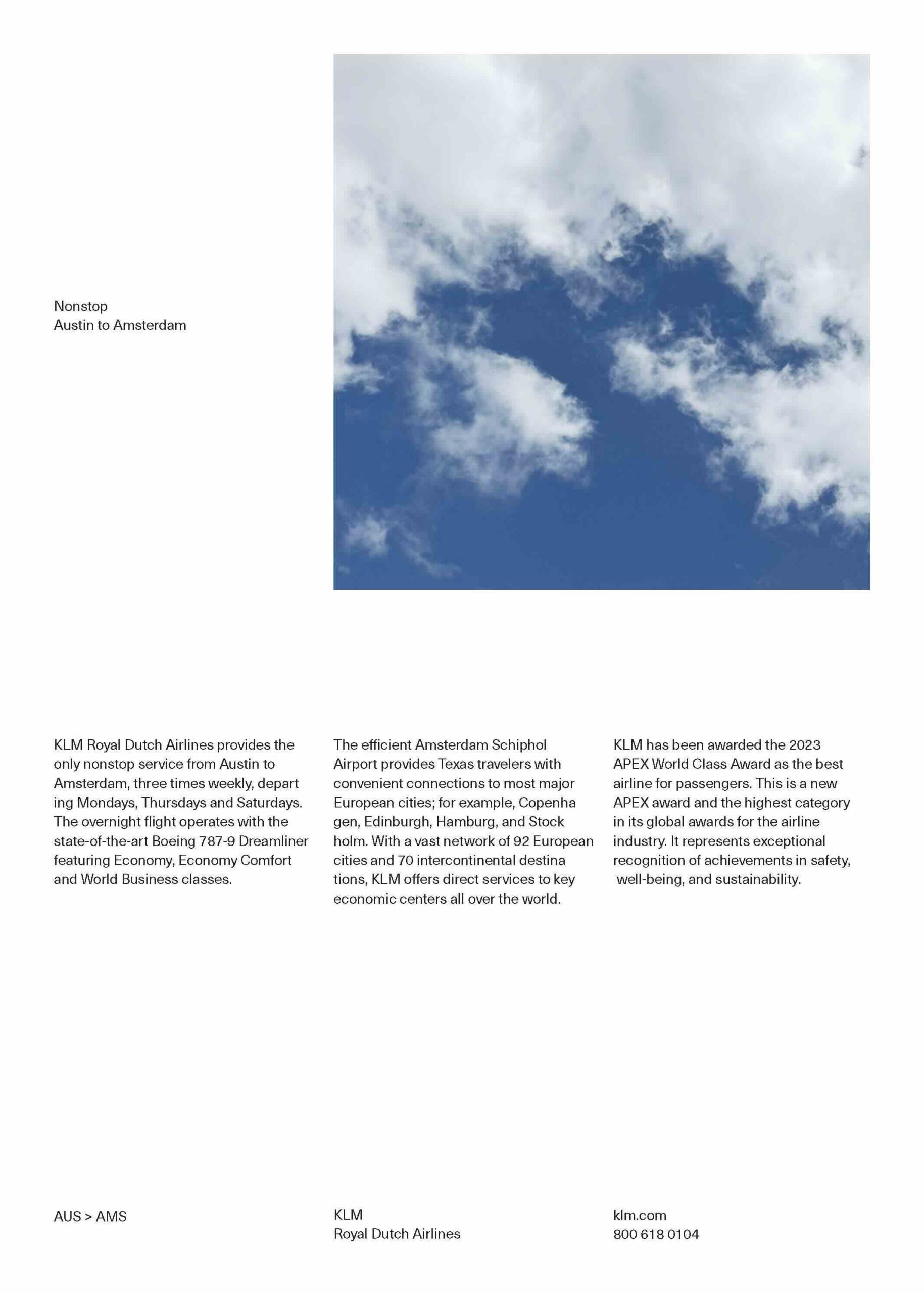
Phase 2:
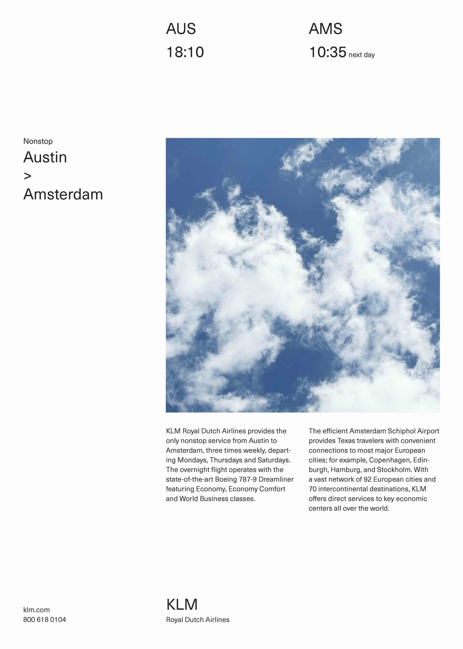
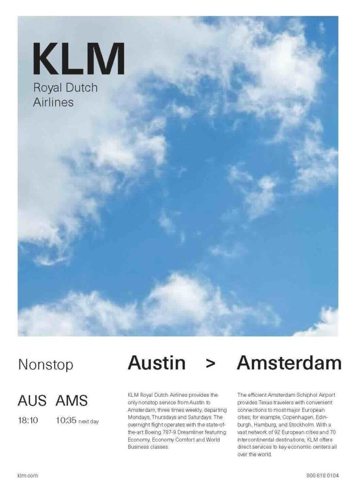
Different type sizes are used while keeping the weight consistent, allowing for moderate typographic contrast that makes the composition more visually engaging.
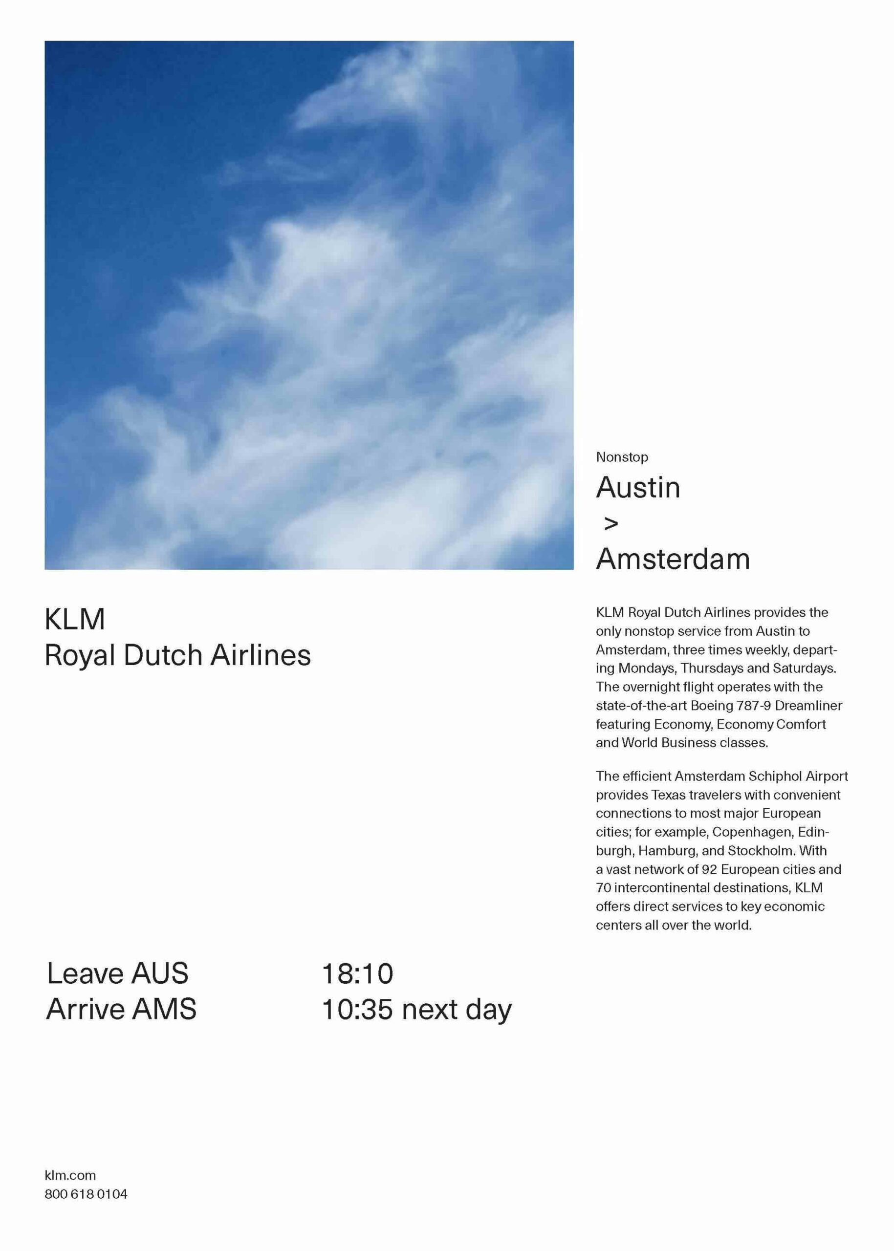
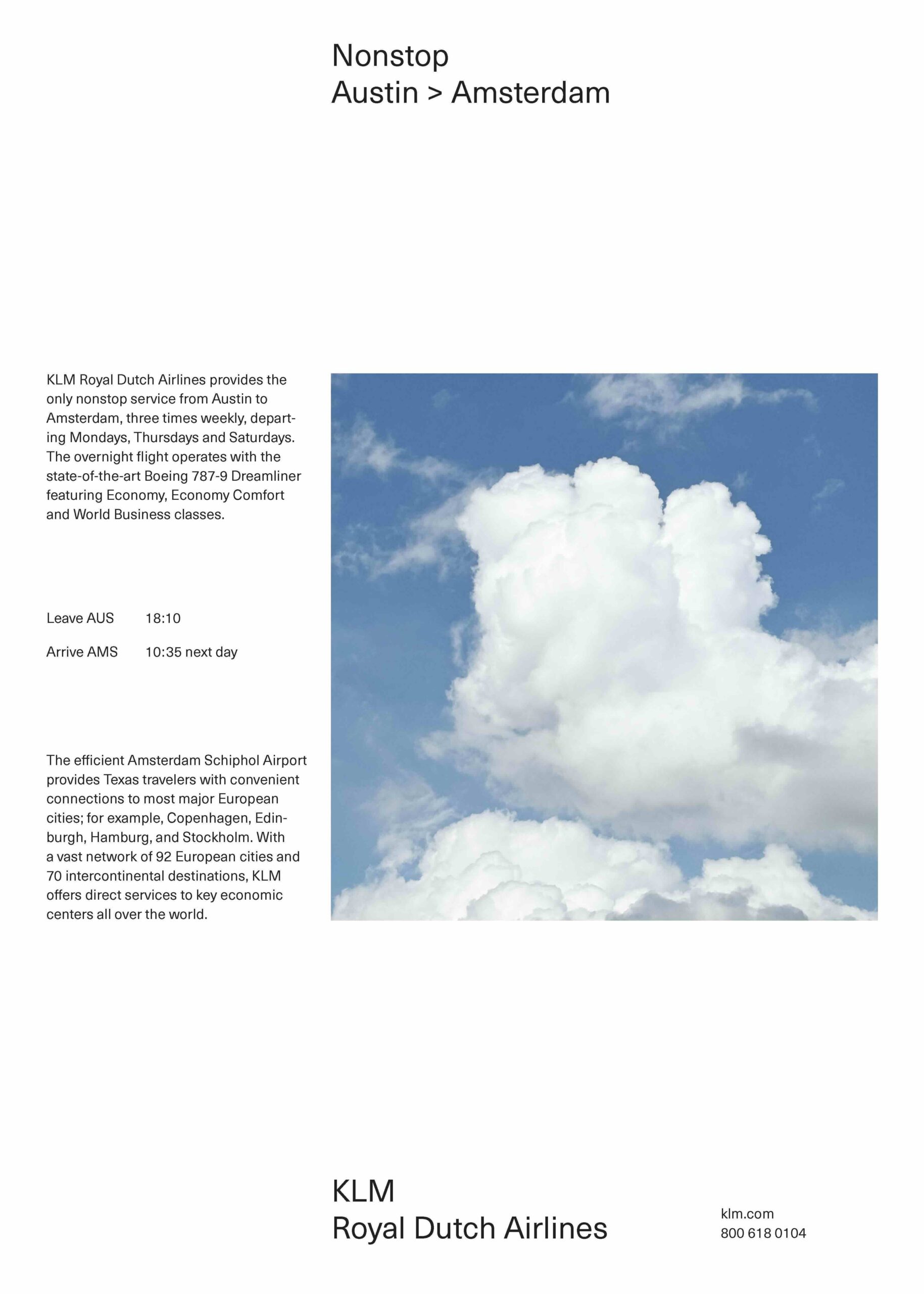
Phase 3:
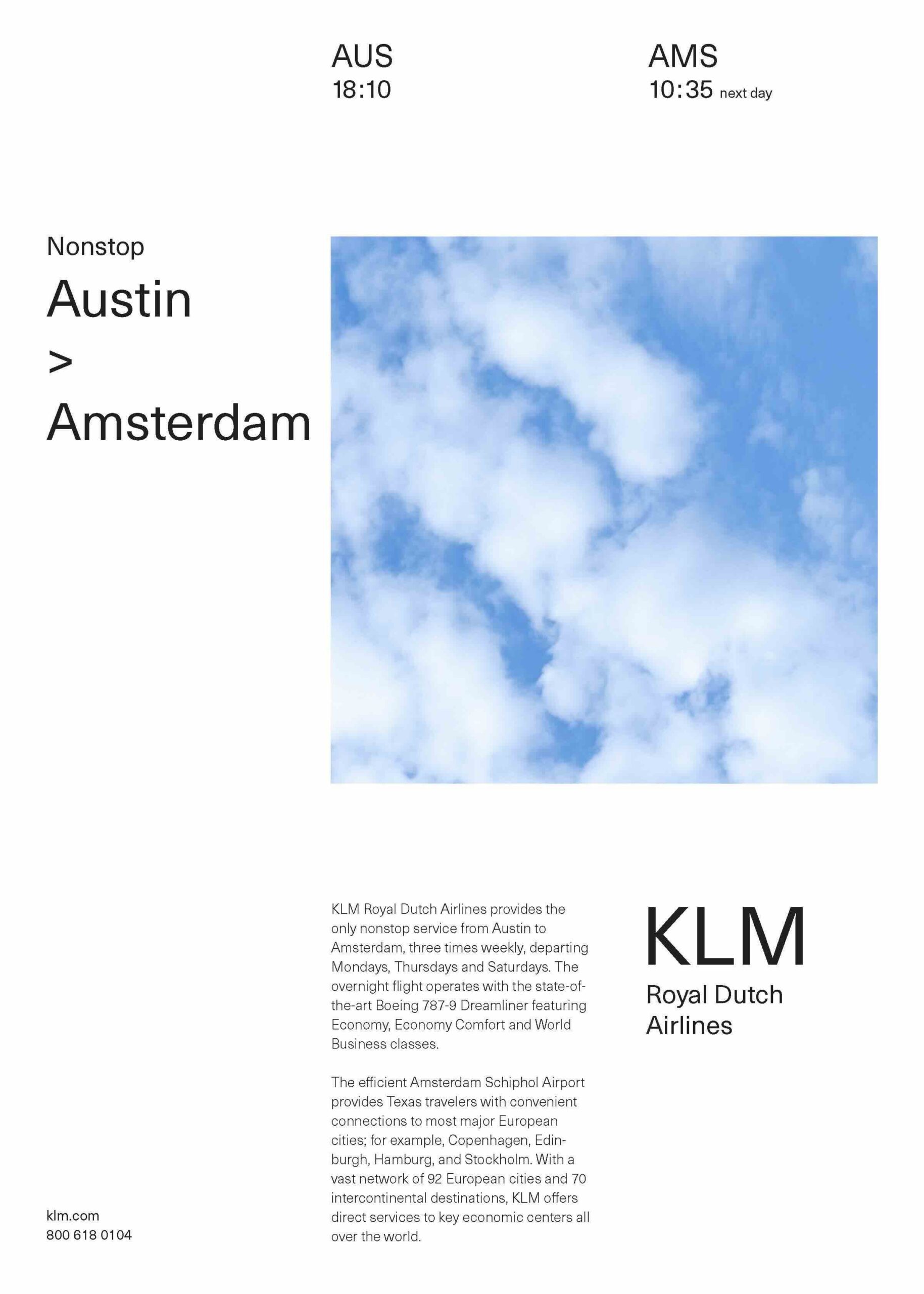
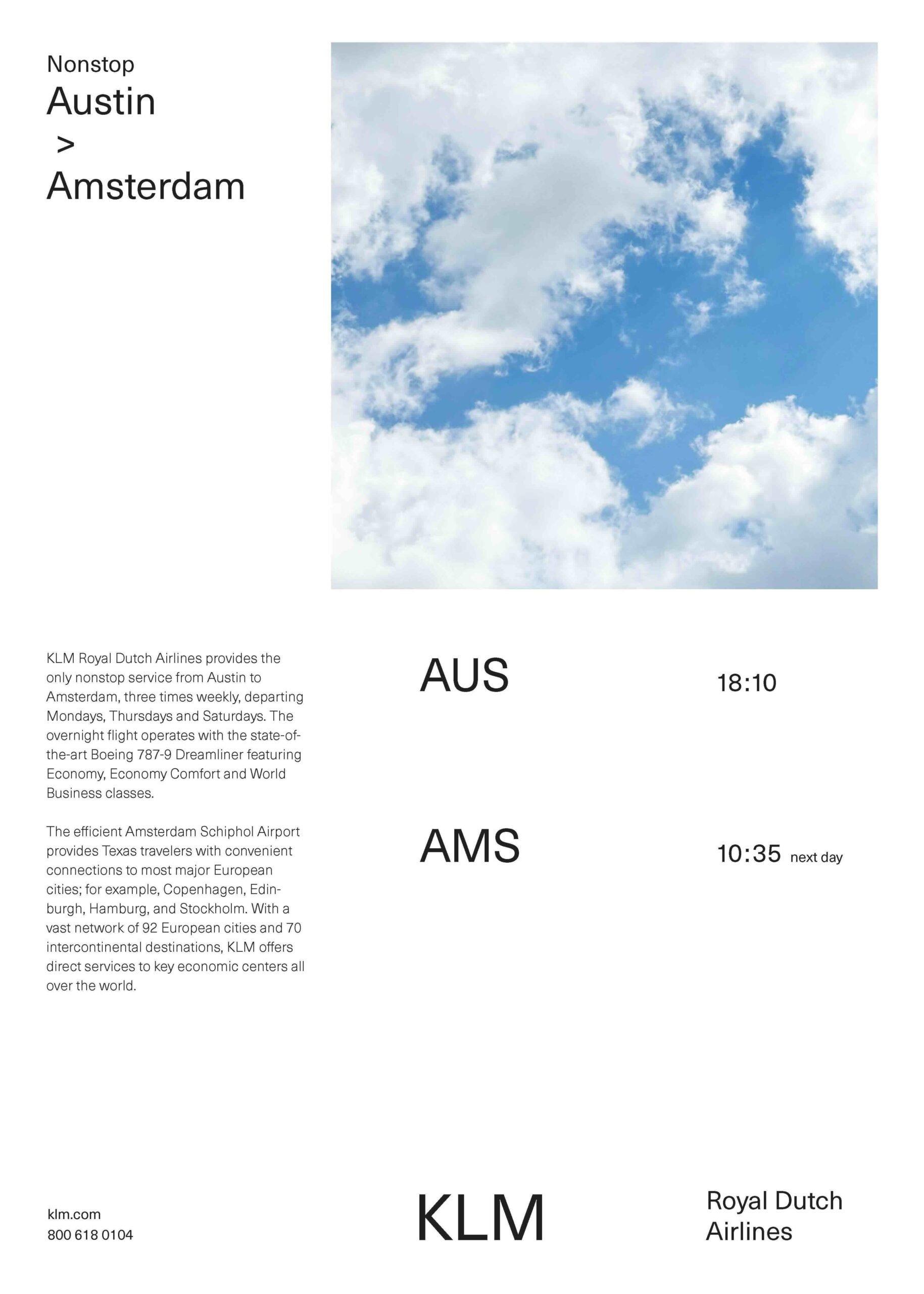
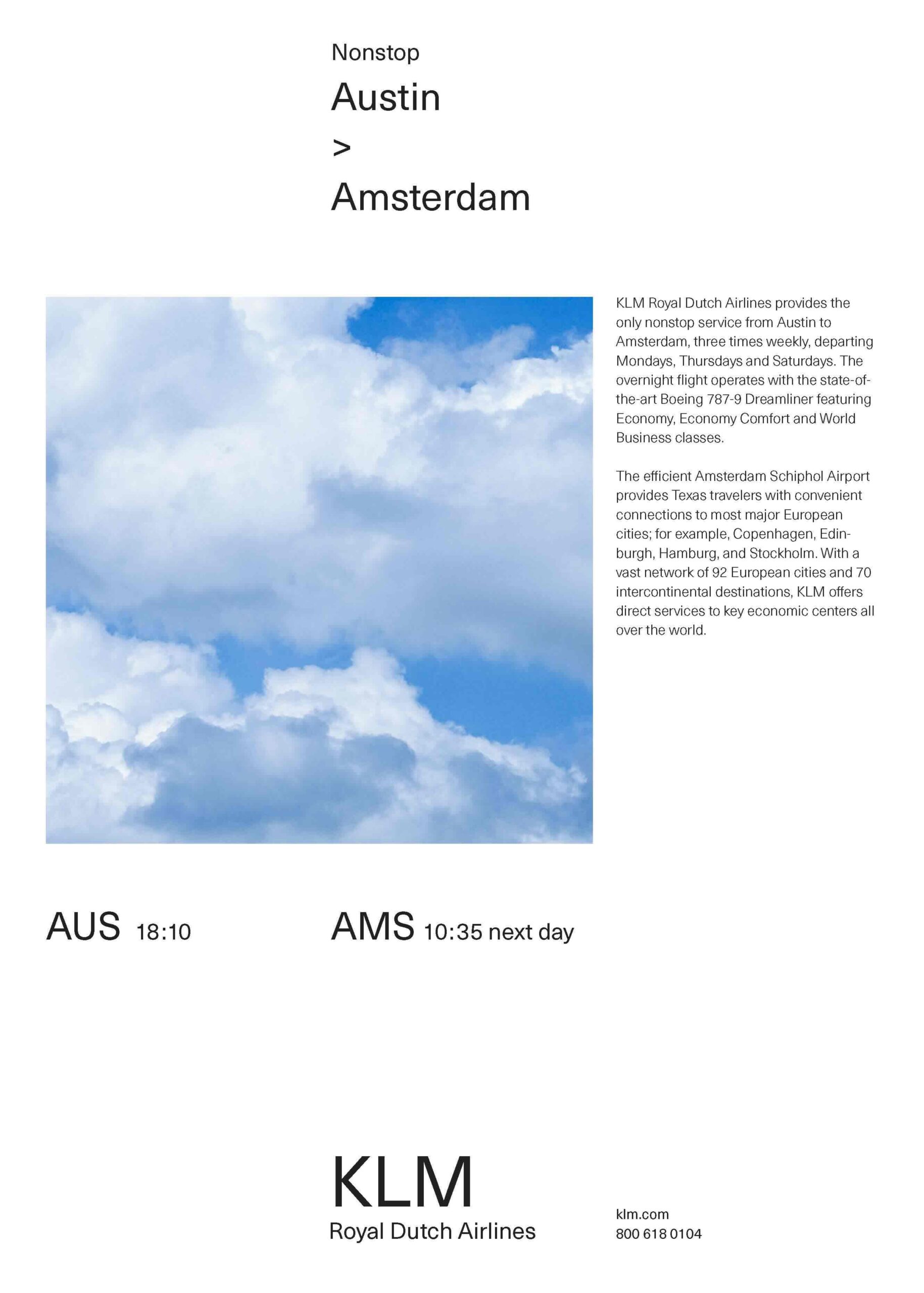
This phase continues to maintain a consistent type weight while introducing greater variation in type size, as we were instructed to increase scale in order to create a clearer distinction within the text.
Phase 4:
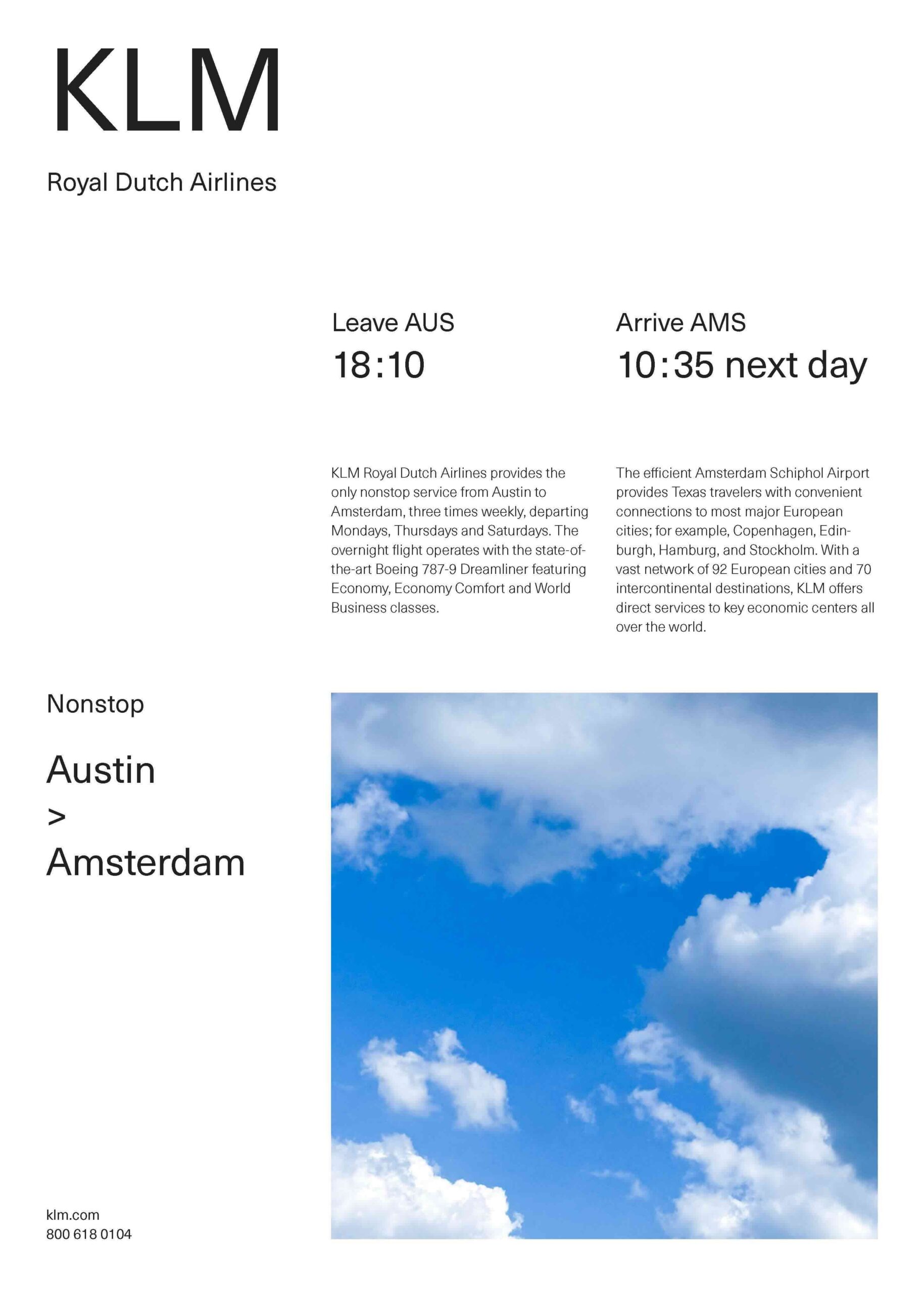
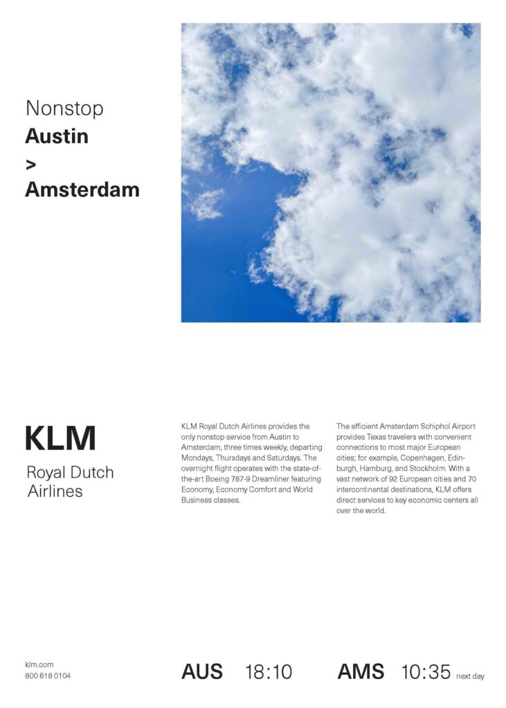
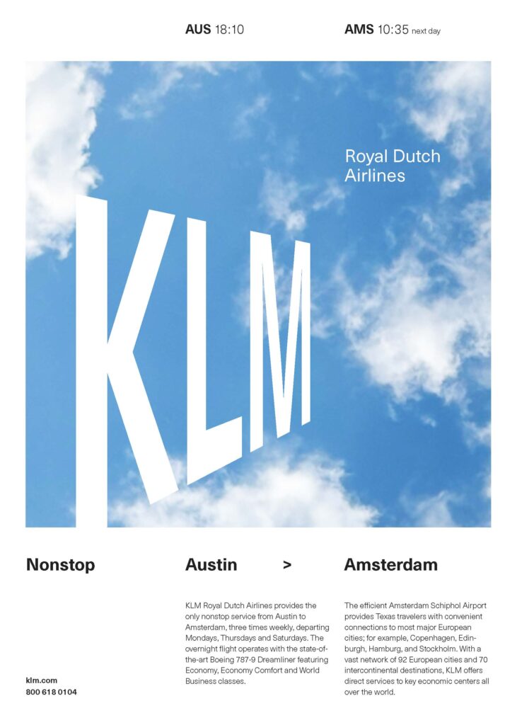
In this phase, both type size and weight were varied to create an even greater sense of contrast within the composition.
Phase 5:
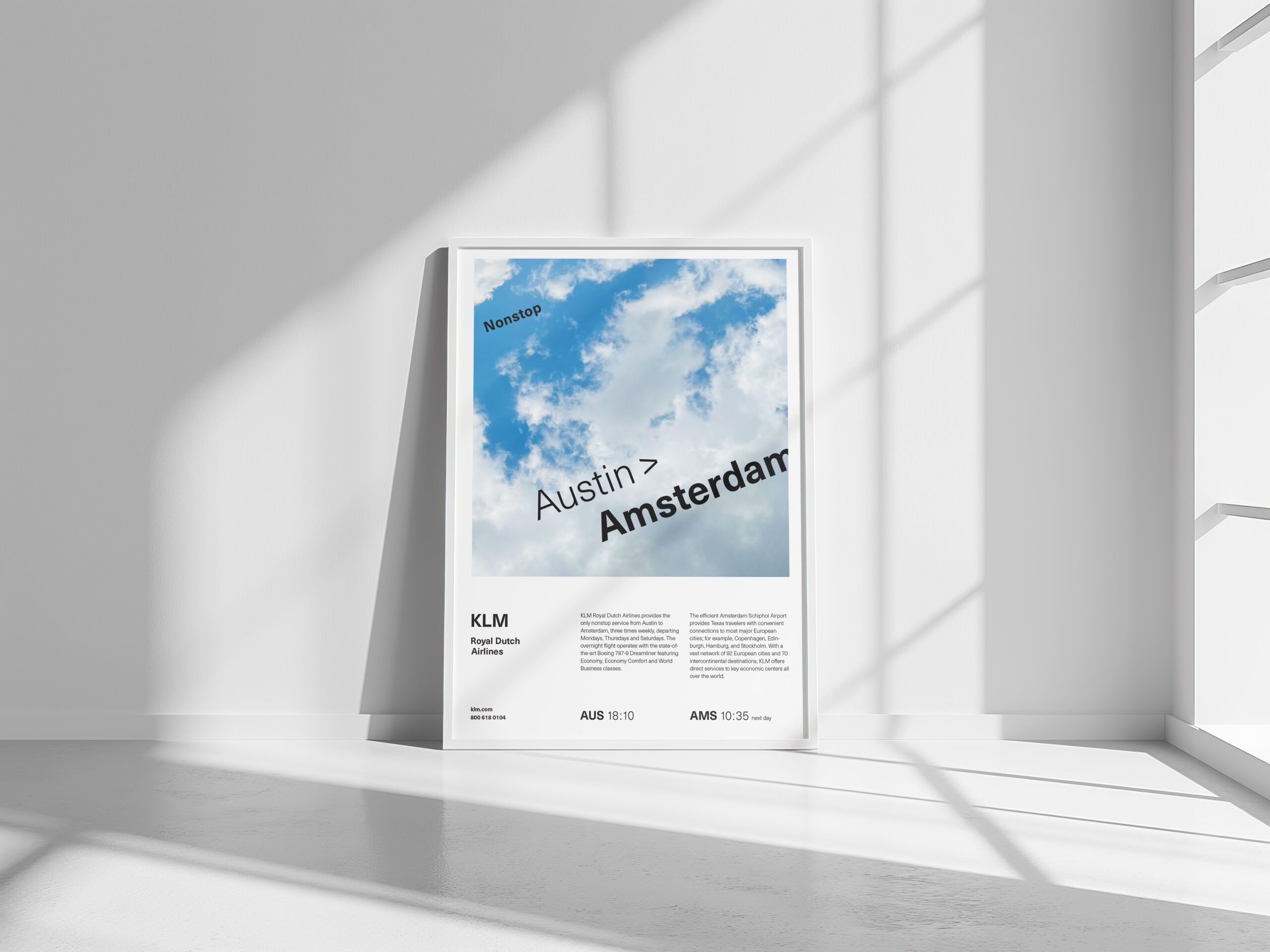
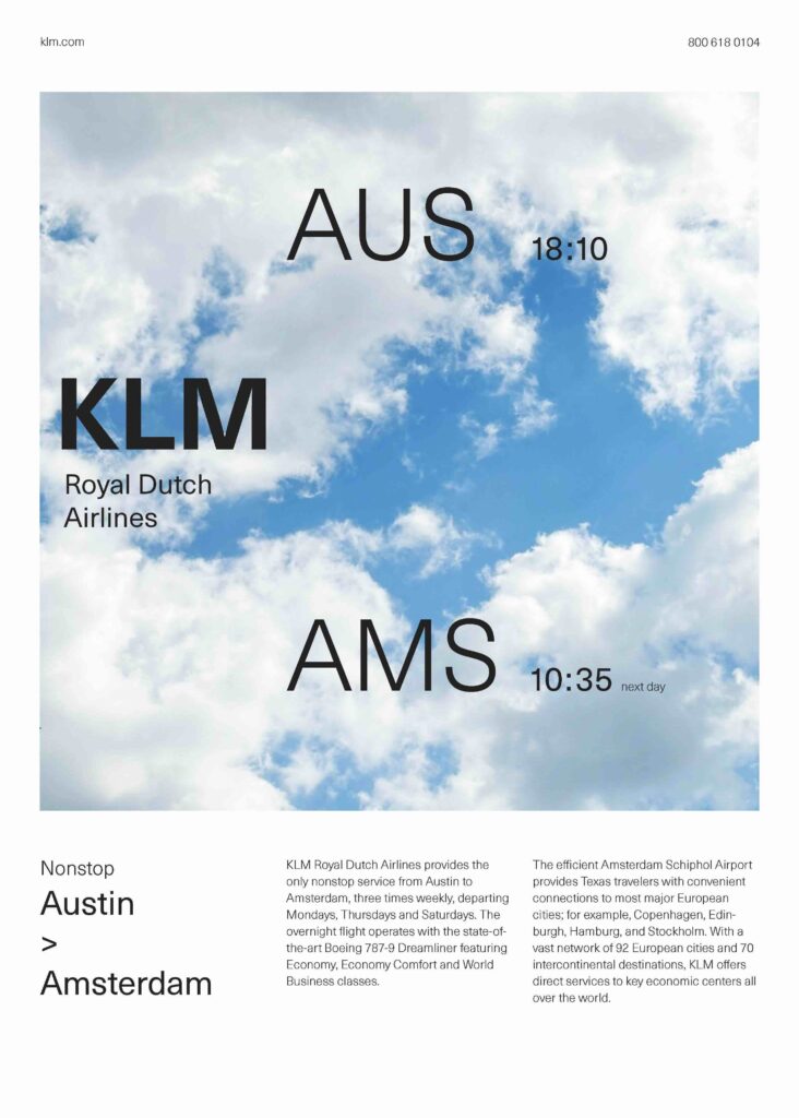
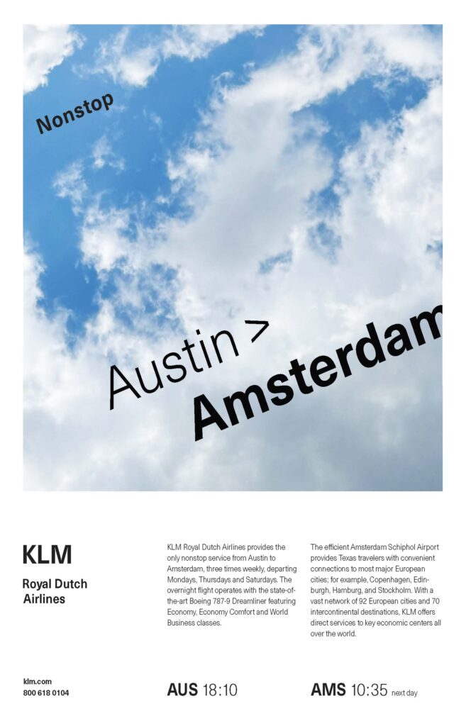
In this final phase, the goal was to introduce a sense of flight and movement into the composition by integrating text directly into the image.
Leave a Reply