
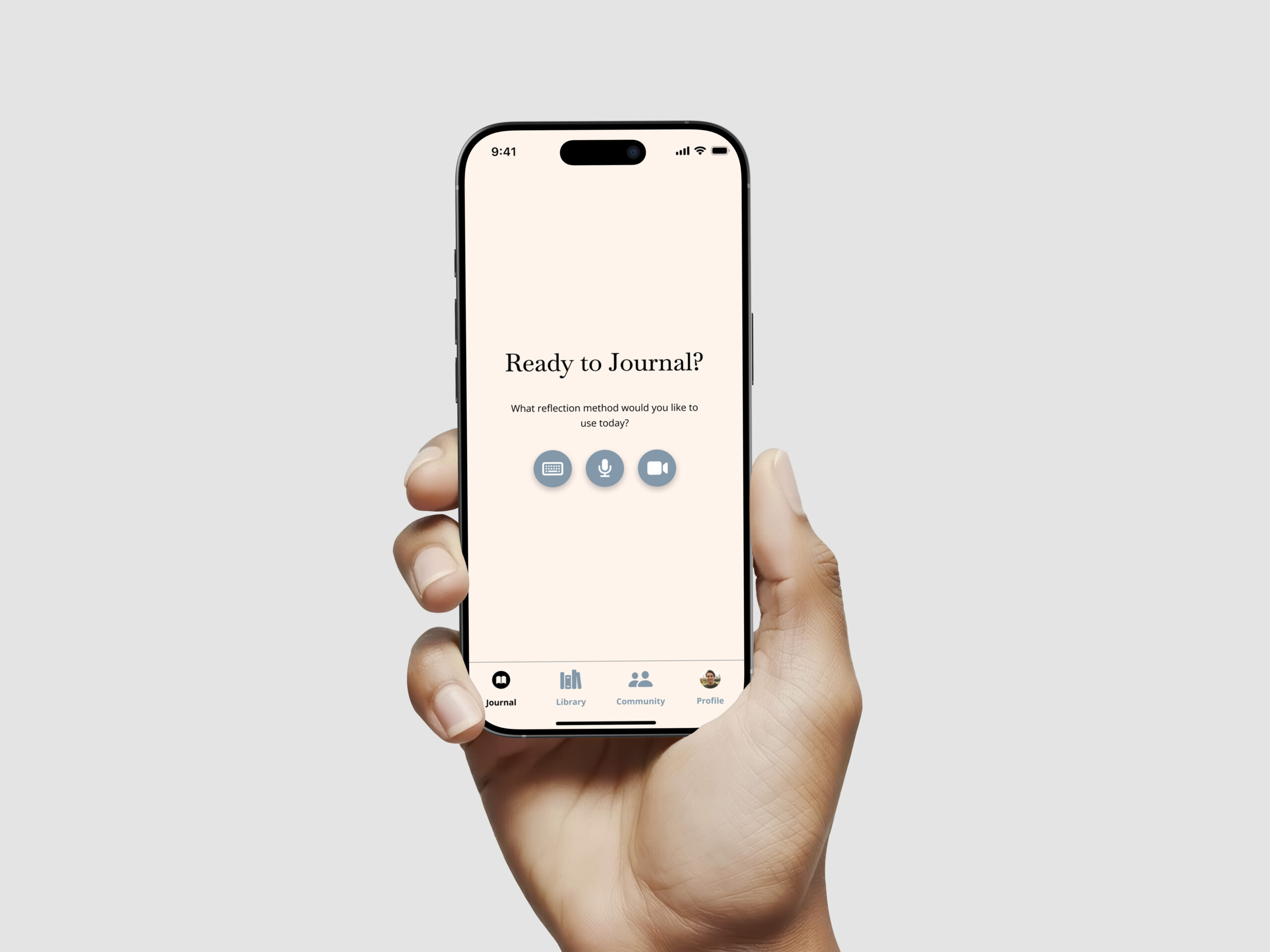
AIX Design
For this project, we are tasked with creating an app based on our personal interests. Our group chose to design a journaling app that integrates AI as a key feature. We believe journaling is an essential practice that helps individuals reflect on their day and gain a deeper understanding of themselves.
Design Problem
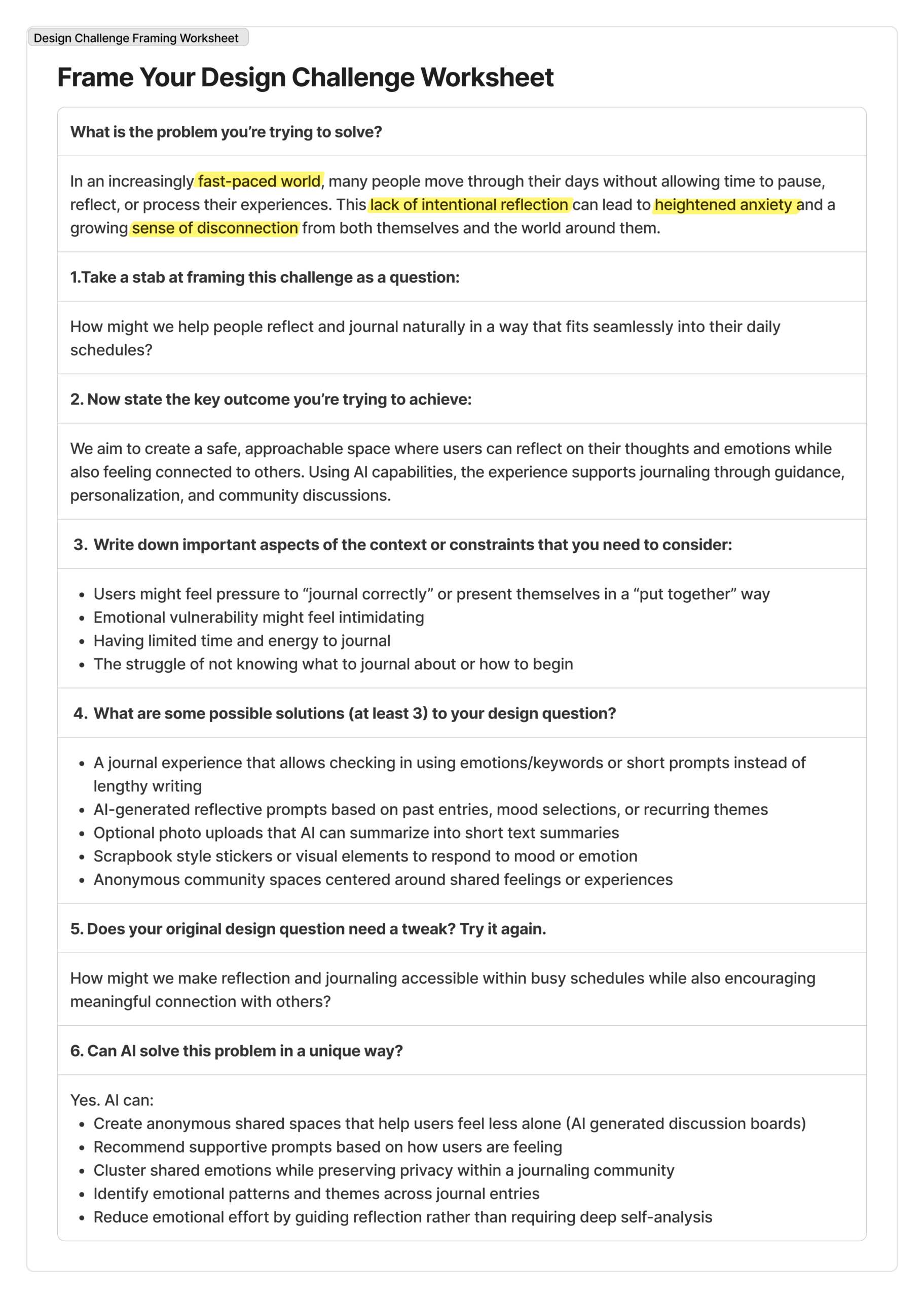
In an increasingly fast-paced world, many people move through their days without allowing time to pause, reflect, or process their experiences. This lack of intentional reflection can lead to heightened anxiety and a growing sense of disconnection from both themselves and the world around them. Research shows that time constraints are a major barrier preventing people from engaging in meaningful reflection about their day.
Our Solution
We aim to create a safe, approachable space where users can reflect on their thoughts and emotions while also feeling connected to others. Using AI capabilities, the experience supports journaling through guidance, personalization, and community discussions. Users can engage as deeply or as casually as they choose, whether that means writing a few sentences or exploring guided reflections.
The initial phase of our app development involved evaluating competitors to identify their strengths and weaknesses and to define opportunities for differentiation within the market. We did this by conducting a competitor analysis
Competitor Analysis

Day One
Strengths:
- Clean design
- You can add videos, photos, or audio recording
- Easy to look back at old entries
Weaknesses:
- Costs money in order to use the advanced features
- Certain features make it feel cluttered for users

Apple Journaling
Strengths:
- Simple Layout
- Helpful prompts (based on your daily life)
- Supports photos, videos, audio, and location
Weaknesses:
- Limited organization within app
- Takes time to look back at old entries
- Cannot use this on non-apple devices

Rosebud
Strengths:
- Easy and simple to use
- It learns from you and improves suggestions.
- Works on phones and computers
Weaknesses:
- Certain features in app cost money
- Certain prompts feel generic
- App glitches occasionally
While many competitors offer AI-generated prompts, blank journaling options, multimedia entries, and mood tracking, they often overlook what we believe is essential: community. Reflecting independently is valuable, but reflecting alongside others can be just as powerful. Sometimes, all a person needs is someone who understands and can relate to what they are experiencing.
By learning from past entries and emotional patterns, AI helps generate reflective prompts that encourage users to open up at their own pace. AI also helps with the community component, allowing users to engage in discussion boards based on shared experiences, with the option to remain anonymous. Whether the topic is light or deeply personal, we want users to feel supported and reminded that they are not alone, fostering a sense of community that can be hard to find in everyday life.
Empathize
During the empathize stage, our goal was to understand our audience’s current journaling practices, along with their needs and challenges. To gather these insights, we conducted user interviews.
Interviews
In our team of three, each member conducted three interviews, for a total of nine. We spoke with a diverse group of participants, including parents, grandparents, sixth graders, and people in their early and late twenties. This range gave us a broad set of insights. We created empathy maps capturing what participants said, felt, thought, and did, and it was insightful to compare patterns across interviews.
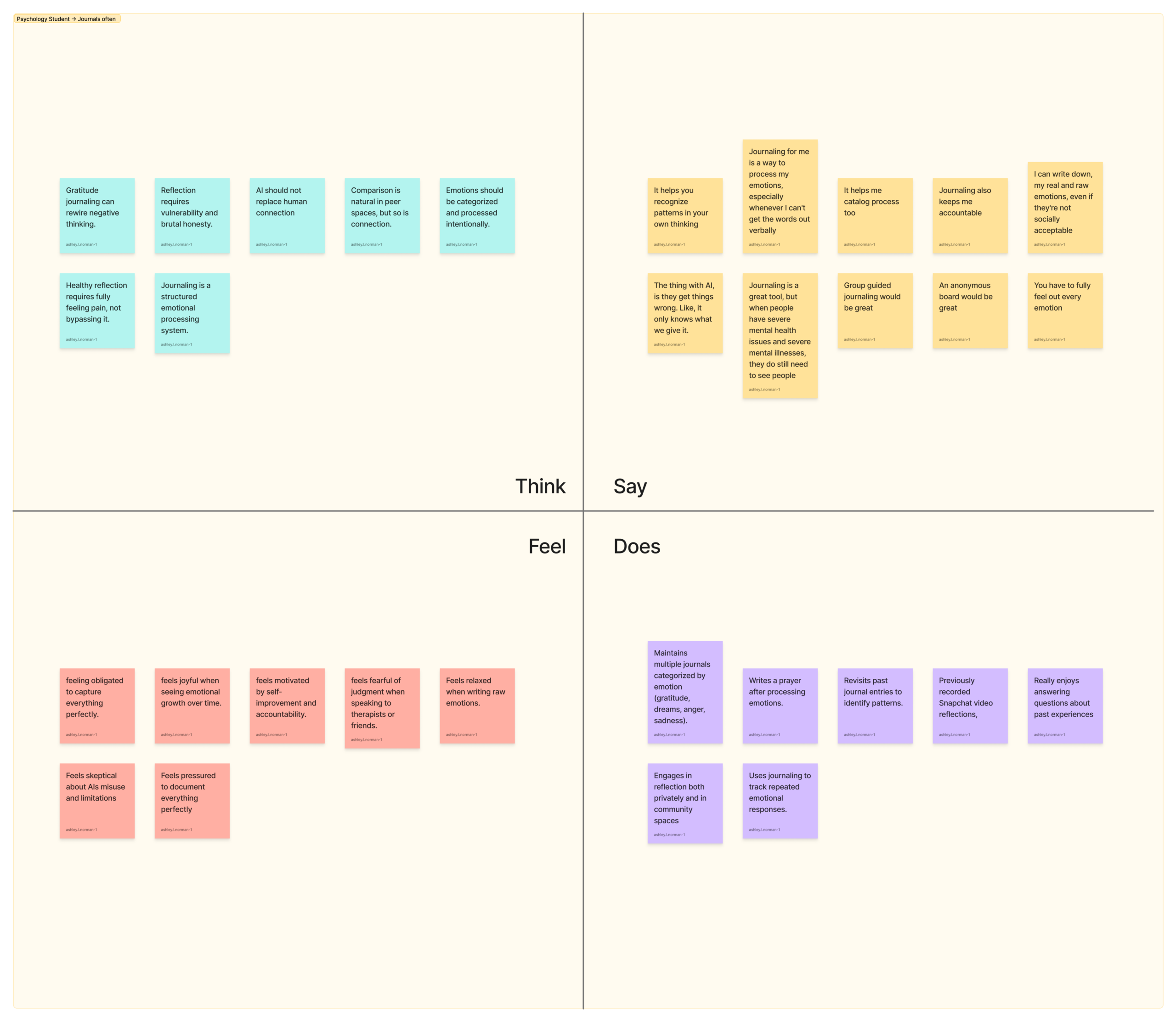
Through our interviews, we found that journaling is valued primarily as a tool for emotional regulation and personal growth rather than productivity. Although participants saw reflection as meaningful, the biggest barrier was simply getting started. Users emphasized the need for low-pressure, flexible experiences that feel supportive instead of demanding. Privacy and psychological safety were non-negotiable. Users are ok using AI-generated prompts, as long as the AI doesn’t interact back with them. While participants welcomed an optional anonymous community space, they insisted that journaling still has the option to remain private and self-directed. Long-term growth and pattern recognition emerged as key motivators to continue journaling.
Define
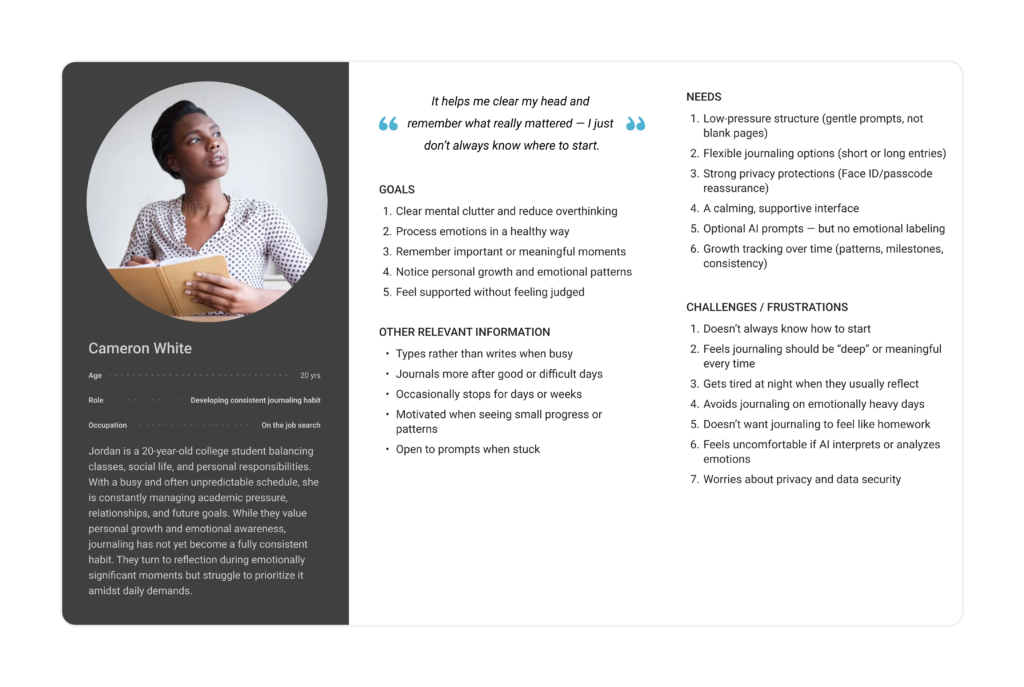
In the define phase, we analyzed the insights gathered during the empathize phase to better understand our users and identify realistic ways to meet their needs. We started this process by developing user personas.
User Personas
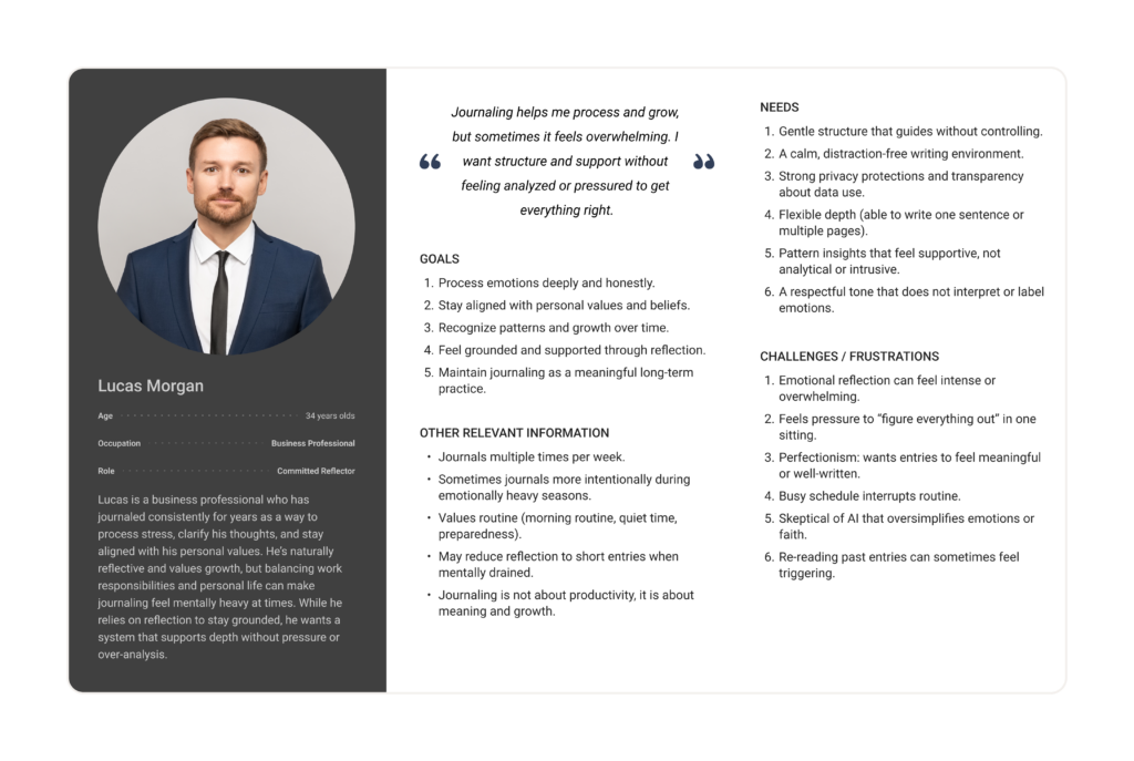
While developing user personas, we identified two distinct user types: active journalers and individuals who journal less frequently but still see its value. We discovered that regular journalers are interested in exploring new approaches and appreciate guided prompts that encourage deeper reflection. In contrast, those who journal less often struggle to start and maintain the habit due to busy schedules, so they are looking for a solution that motivates and supports consistency.
User Journey Maps
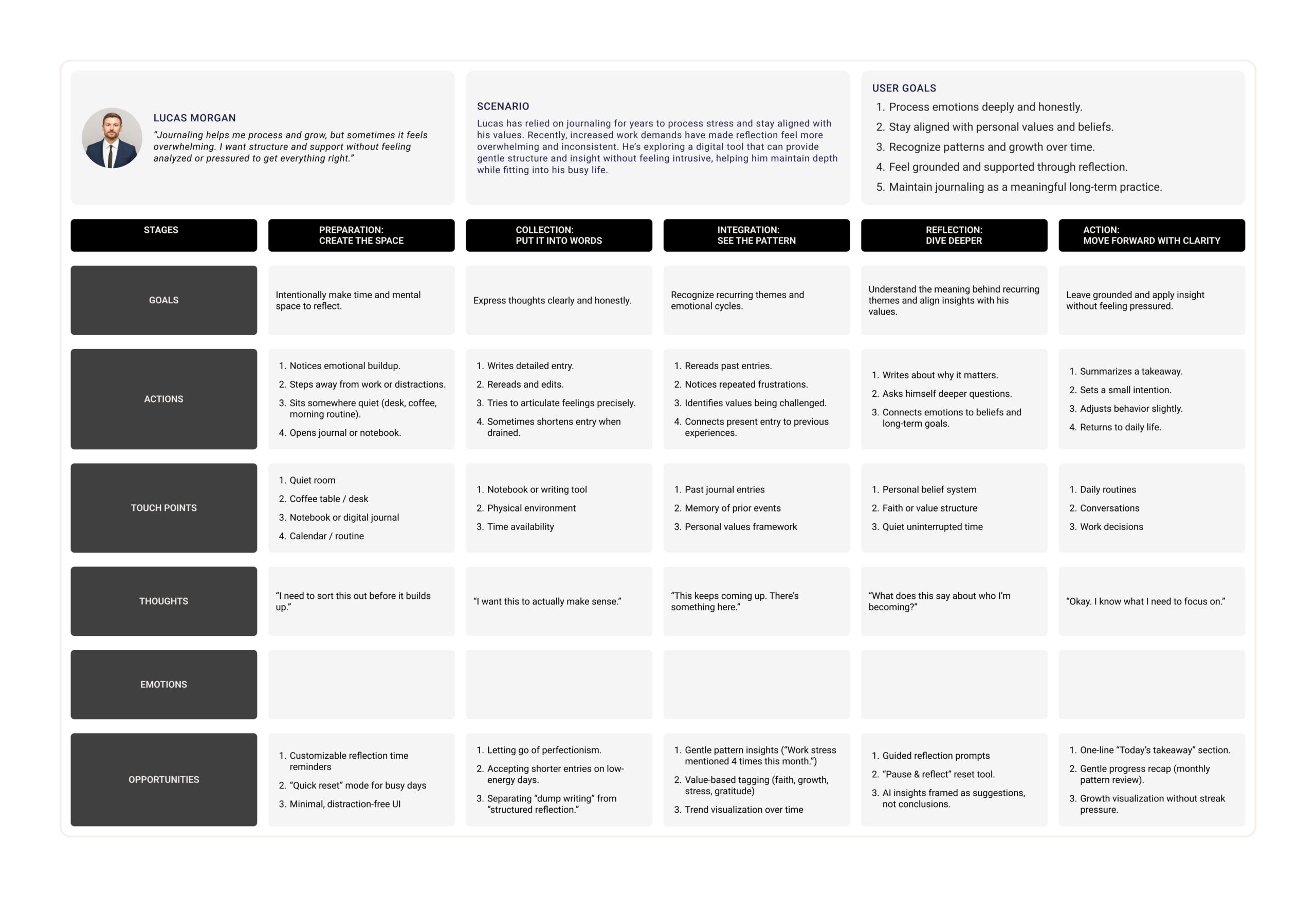
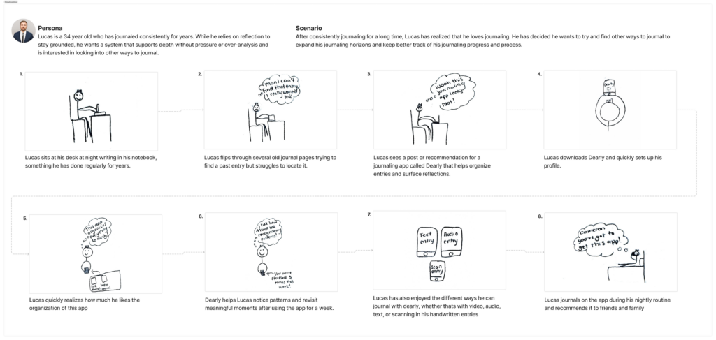
Using our user journey maps, we developed a scenario for each persona to better understand the challenges they might face while journaling. From there, we identified how our app’s design decisions could address and support those specific struggles. Here is our journey map for Lucas Morgan:
Mappings AI needs to Data Requirements
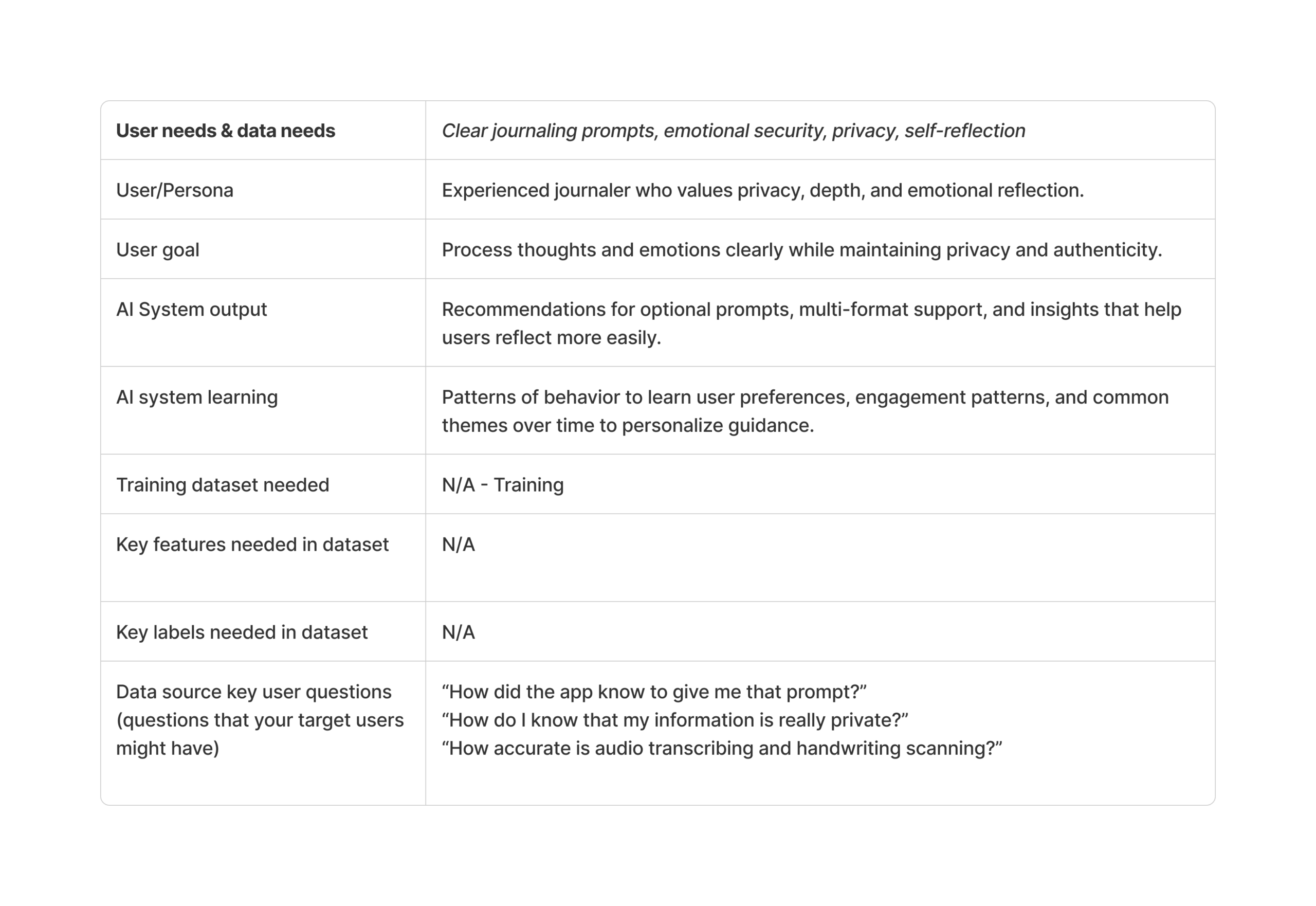
After identifying our users’ key needs, we began exploring how to integrate AI into our design solutions. To do this effectively, we first determined which needs were most critical and where AI could provide the greatest value within the app. We identified four primary priorities that we learned during our interviews: offering user guidance, supporting motivation, enabling multi-format journaling options, and providing easy access to past entries. We then evaluated the potential role of AI in each of these areas.
Using this worksheet, we assessed and voted on where AI would be essential versus where it would not add value. We also developed “How Might We” questions to explore solutions, both AI-driven and design-based, that could address these challenges.
Finally, we considered whether AI would require additional training to function effectively within our app. In our case, no specialized training is necessary. Since AI is already designed to analyze information and generate ideas, we plan to use it primarily to create meaningful, personalized prompts that guide and inspire our users.
Ideate
During the ideation phase, my team began working independently from each other. This stage of the project is when we started making design decisions and developing ideas for the app. I reviewed the research we had conducted and began brainstorming ways to design the app, focusing on what I believed would work most effectively.
Creative Matrix
Before we began working independently, my team and I created a Creative Matrix using “How might we…” questions. This helped us generate questions such as, “How might we reduce the barrier of starting reflection while keeping the experience personal and private?” For each question, we added sticky notes with possible design solutions. After brainstorming, we reviewed all of the ideas and stamped the solutions we believed were the most successful. For example, one solution to the question mentioned above was, “Provide low-pressure starter options: ‘Start with one word.’” This idea was stamped by my entire team, which indicated strong support and made it something I would seriously consider incorporating into my app design.
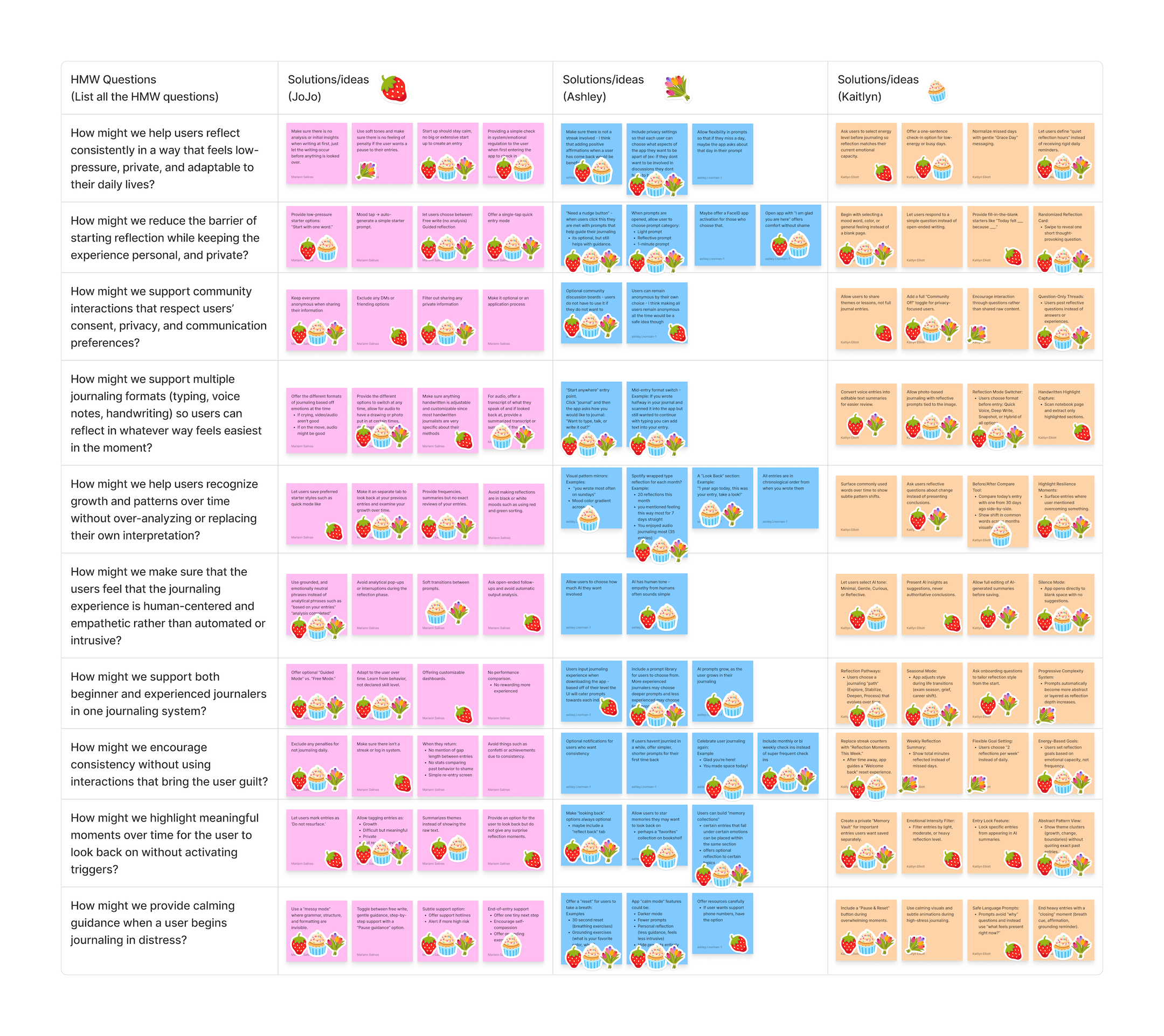
Afterward, we used an AI feature in Figma to organize our sticky notes by theme and by the number of stamps each idea received. The results of this organization can be accessed from this link.
Storyboard
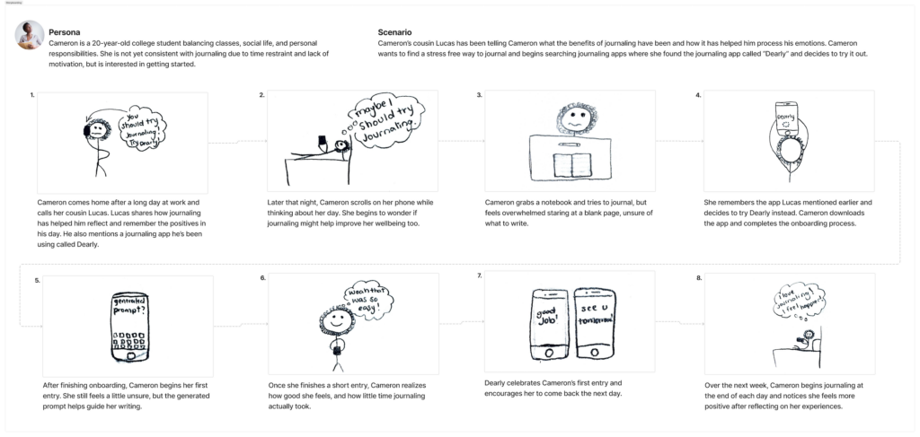
Next in the ideation phase, I began creating storyboards. To do this, I developed scenarios for our two personas: consistent journalers and infrequent journalers. This process helped me understand how users might discover the app, the emotions they might experience while using it, and how the app could leave them feeling afterward in a way that encourages them to continue using it.
In the consistent journaler scenario, Lucas was looking for an easier way to reflect on his journaling. After seeing an advertisement for the app, he decided to download it and give it a try. Lucas enjoyed the app’s layout and appreciated how organized it was. He was able to revisit previous journal entries and even scan his handwritten entries into the app, which he found especially useful since he had only journaled on paper previously.
In the infrequent journaler scenario, Cameron had been struggling to understand her thoughts and reflect on her day. Her cousin recommended the app, so she decided to try it. Once she began journaling in the app, she appreciated how low-pressure the experience felt, which had previously been a concern for her when it came to journaling. She also enjoyed the app’s affirmations after completing an entry, which encouraged her to continue using it.
User Flow Diagram
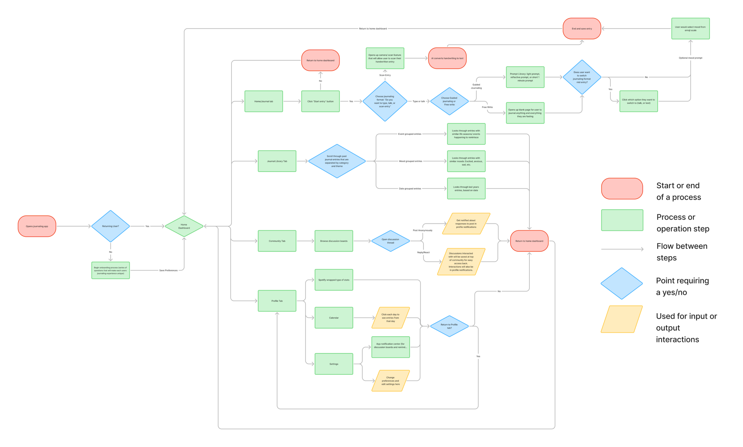
Next, I created a user flow diagram to better understand how the app would function. This helped me determine the order of features and develop a broad outline for how the app would be structured, including how information and interactions would be organized. The user flow supports our users’ goals by ensuring the journaling app includes the features they expressed wanting during the research phase.
When a user first opens the app, new users will go through a short onboarding process designed to learn about their preferences and journaling habits. Returning users, however, will simply log in and be taken directly to the home page. The app includes five navigation tabs located at the bottom of the screen. From left to right, these tabs are: Reflect, Library, Journal, Community, and Profile. Each time a user logs in, they will begin on the Journal tab, but they can switch to any other tab at any time. Here is a description of what each tab will contain:
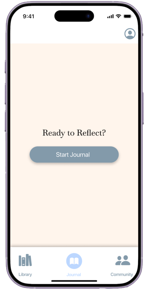
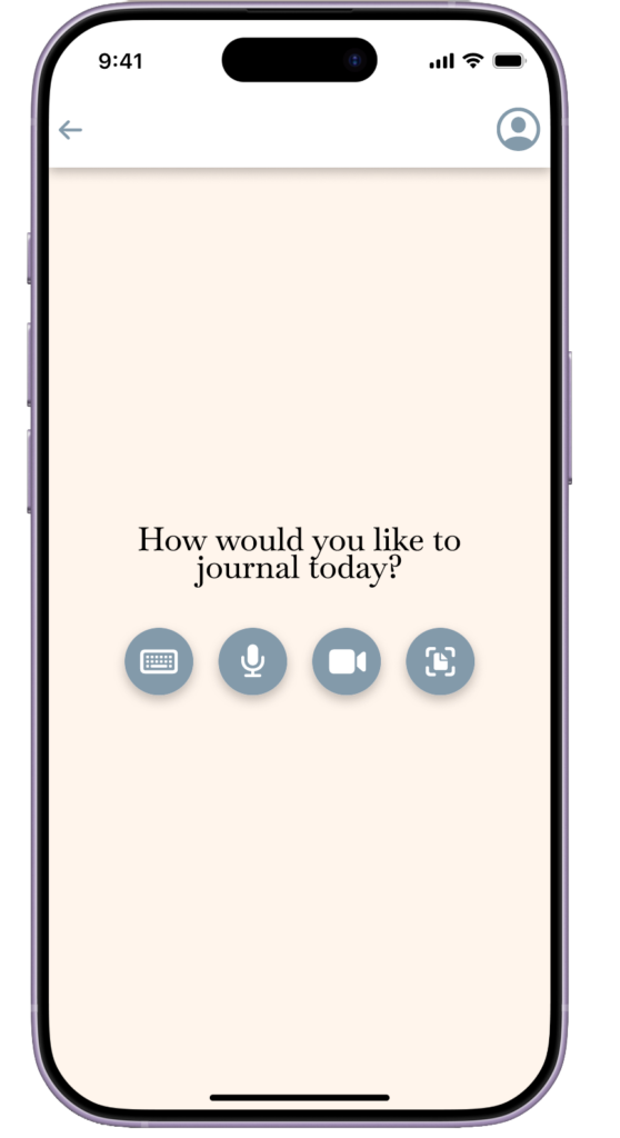
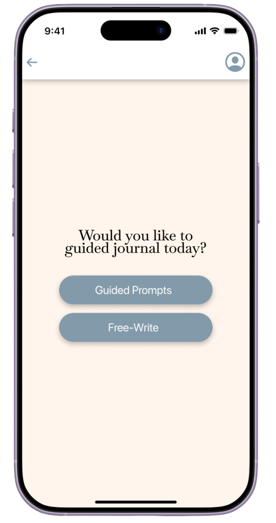
- In the Journal tab, users can select “Start Journaling” when they are ready to write. After selecting this option, they can choose their preferred journaling format and begin journaling. They also have the option to use AI generated prompts or free write while journaling and are able to change their journaling format throughout the journaling process.
- The Reflect tab allows users to revisit past entries, review logged moods, or write a new reflection entry.
- The Library tab stores all previous journal entries, which can be organized in multiple ways, such as by theme, date, or entry length.
- The Community tab provides an anonymous discussion board where users can read posts and interact with others if they choose. Participation in this space is completely optional, allowing users to engage as much or as little as they prefer.
- The Profile tab allows users to adjust their settings and preferences. In this section, they can also view a calendar showing the days they have journaled and directly access entries from specific dates.
Prototype Lo-Fi and Test
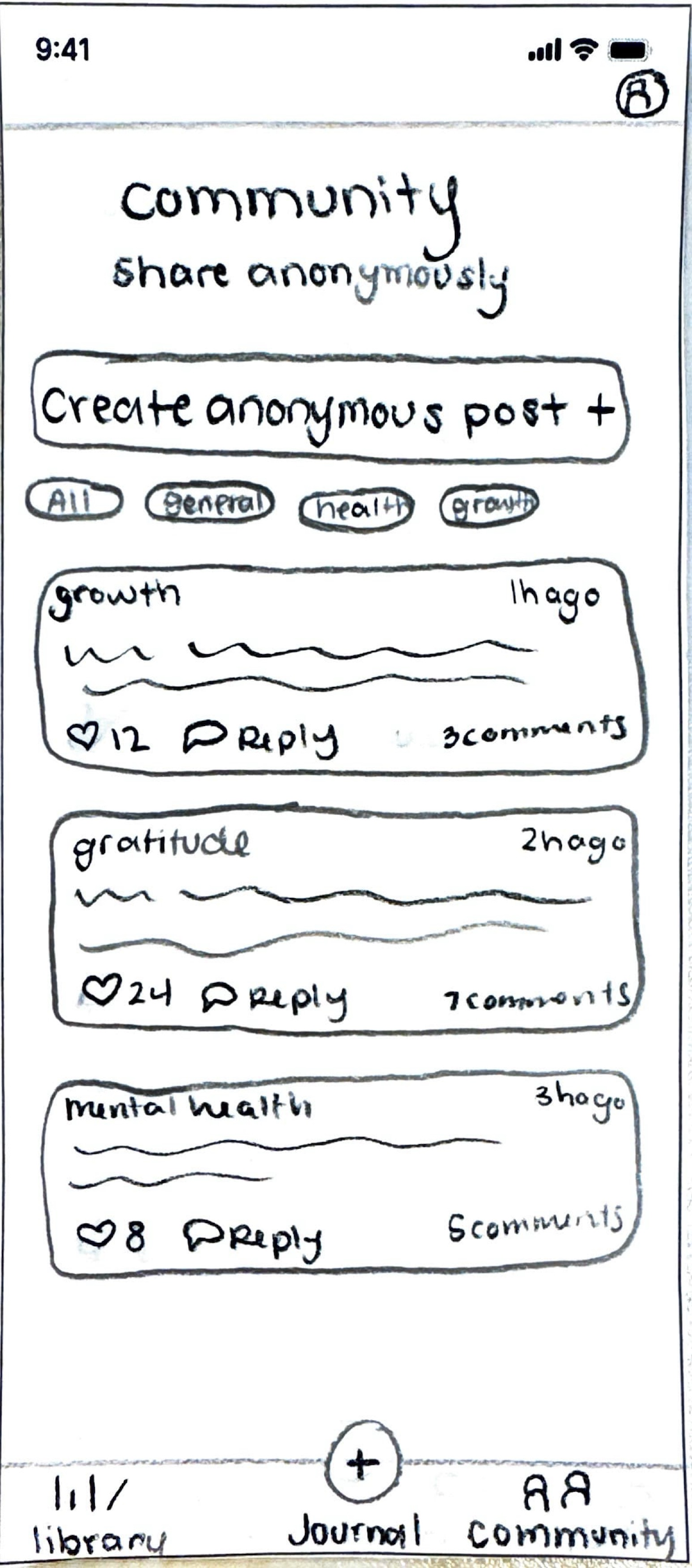
The goal of this stage in the process was to begin sketching prototypes to better understand how the app would function and to identify areas that still needed improvement. It was interesting to recognize which features were difficult to incorporate into my hand-drawn sketches, yet still important to consider while developing the prototype.
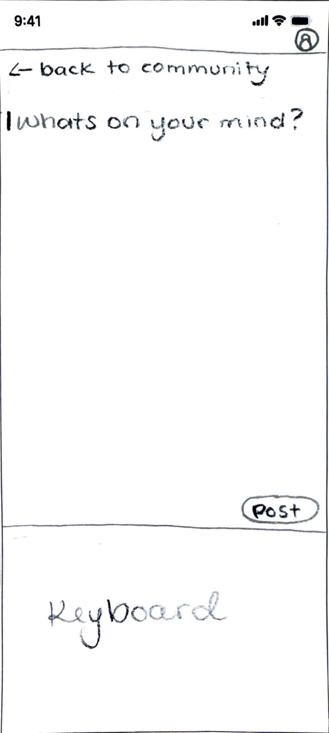
After completing the sketches, I conducted a cognitive walkthrough to assess how users would interact with the app. During the evaluation, each participant was given three tasks to complete. They reviewed the sketches and identified where they would click on the screen to carry out each action. Based on their selections, I presented the next corresponding sketch to simulate the app’s response. The tasks included navigating to settings and adjusting preferences, creating an anonymous post, and completing a guided journaling entry.
Some key insights from the testing process was the importance of providing clear feedback to users, specifically, notifying them when journal entries are saved or when actions have been successfully completed, such as enabling or disabling features. Additionally, I realized that within the “community” tab, it is important to consistently remind users on each screen that all interactions are completely anonymous, so that they will be comfortable using this feature. I think I could add this somewhere near the top of the text box for them to view when they are creating the post. I also found that most of the tabs and actions were pretty clear, which made it easy for users to move through the app. That should make things a lot smoother when turning it into the high-fidelity prototype.
Hi-Fi Prototype V.1
After completing the initial prototyping phase using low-fidelity sketches and insights gathered from the Think Aloud testing method, I transitioned into developing my high-fidelity (Hi-Fi) prototype. The feedback from users helped identify usability issues and areas where clearer navigation and feedback were needed, which directly informed my design decisions.
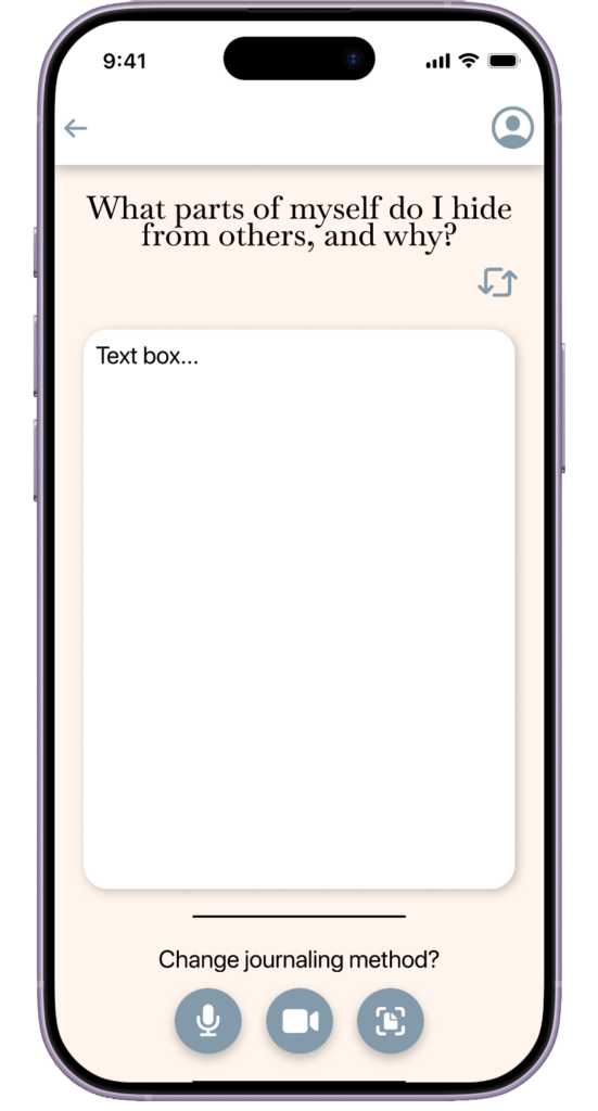
To build the Hi-Fi prototype, I established a consistent visual system using a simple color palette, including a light peach background and complementary light and dark blue tones for interactive elements like buttons. This helped create visual hierarchy and improve clarity. I also applied Atomic Design principles to keep my Figma file organized and to structure my interface strategically. I started with basic elements like buttons and input fields (atoms), combined them into components such as the navigation bars (molecules), and then built full screen sections (organisms). This approach helped maintain consistency across the app and made the design easier to update and scale.
In terms of usability, I applied several key heuristics to improve the overall user experience. I focused on match between system and real world by providing language that feels familiar to what the user hears in the real world, consistency and standards by maintaining uniform colors, layouts, and interaction patterns, and error prevention by including clear navigation options such as back buttons to help users recover from misclicks. Additionally, I followed the AIX Design Guidelines by making the app easy to use, reducing confusion, and giving clear, immediate feedback so the experience feels smooth and predictable. Shown below are the initial screens created to guide users as they navigate the journaling process.
Heuristic Evaluation (Testing)
In order to continue with my design of the Hi-Fi prototype I conducted a Heuristic Evaluation, this where three of my peers reviewed my app design and functionality and provided feedback according to the Nielsen-Molich heuristics. Peer evaluation of the initial Hi-Fi prototype revealed the following issues:
- Visibility of System Status (Heuristic #1):
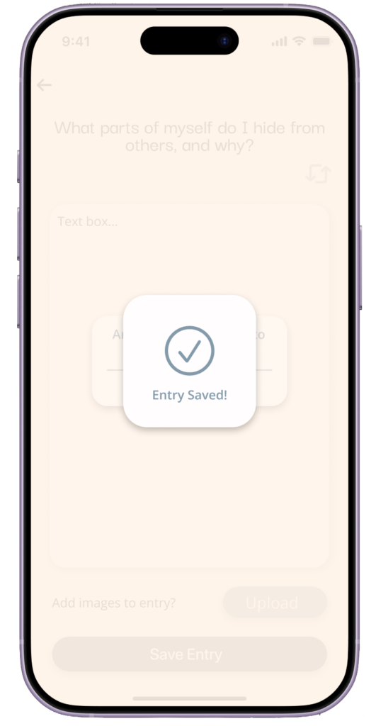
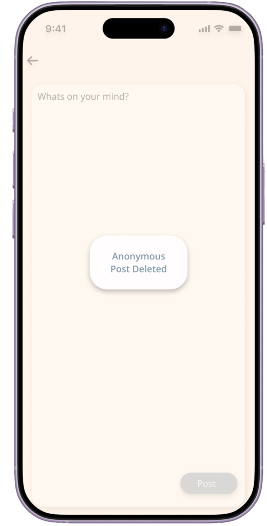
Users wanted clearer feedback, such as confirmation messages like “Entry Saved” or “Entry Deleted.” This is especially important for AI-related features so users know their input has been processed. - Error Prevention (Heuristic #5):
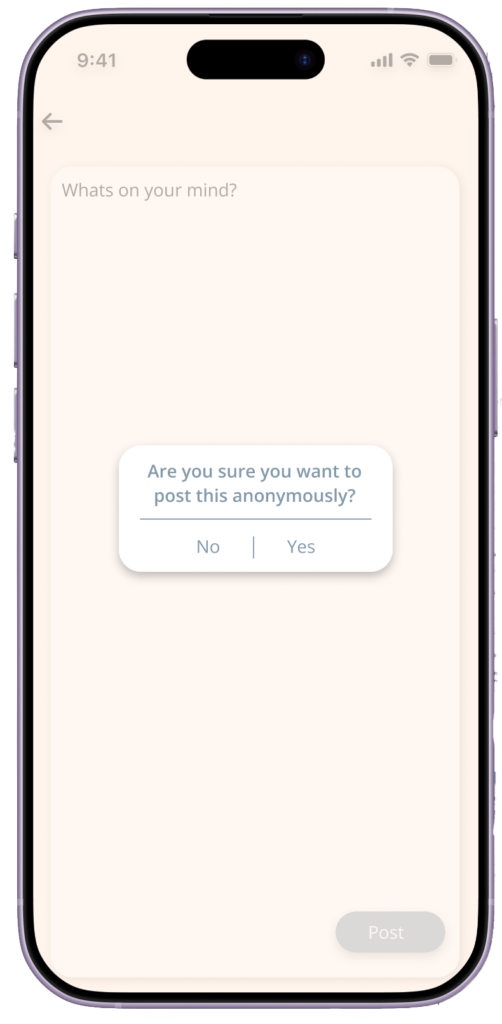
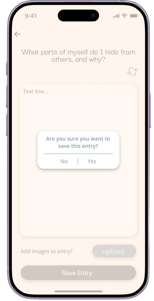
Feedback pointed out the lack of confirmation prompts before saving entries. I agree with this, as users could accidentally submit incomplete content. Adding confirmation dialogs will help prevent mistakes. - Recognition Rather Than Recall (Heuristic #6):
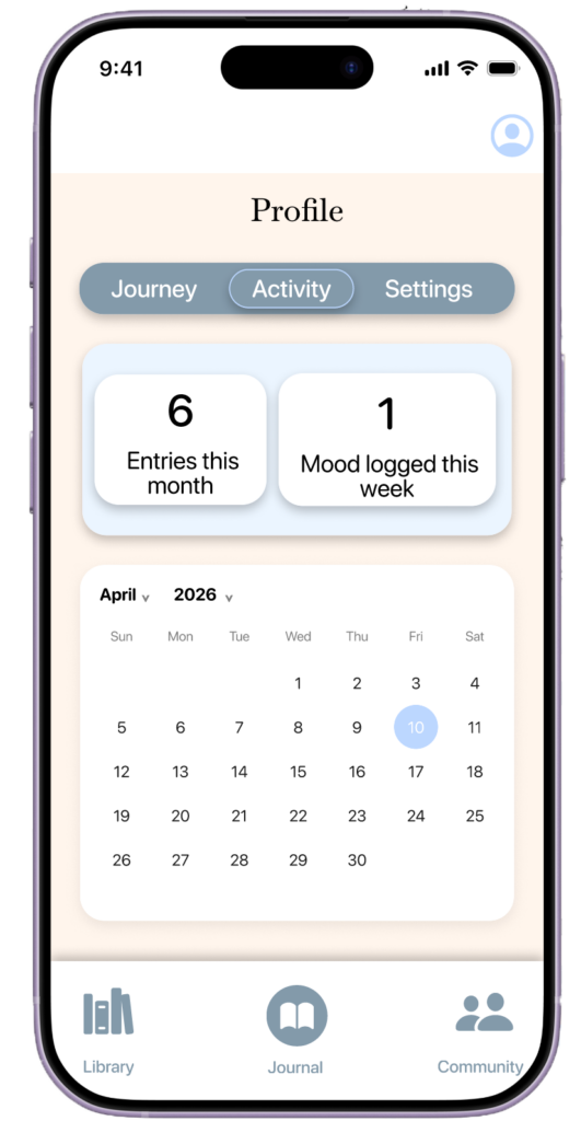
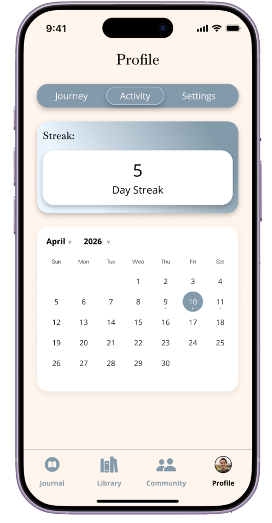
Users suggested improving the calendar by highlighting days with entries. I agree this would make it easier for users to recognize past activity without needing to remember it. - Aesthetic & Minimalist Design (Heuristic #8):
Some elements were seen as unnecessary and distracting, such as excessive lines on the journaling page. I agree and plan to simplify the layout to improve focus.
To access my Figma Heuristic Evaluation files Click here:
Hi-Fi Prototype V.2
During the final prototype phase, I made several design improvements based on feedback from the heuristic evaluations.
To improve visibility of system status, I added overlays such as confirmation messages (e.g., “Entry Saved” or “Entry Deleted”) to provide users with real-time feedback. Below are the new overlays I added. A before screen is not shown since these were newly introduced features.
For error prevention, I implemented confirmation prompts before users submit or save entries to reduce accidental actions. Below are the new overlays I added. A before screen is not shown since these were newly introduced features.
To address recognition rather than recall, I enhanced the calendar feature by adding visual indicators (such as dots below the dates) to show when entries were made, making it easier for users to identify past activity. The image on the left shows the before version, while the image on the right shows the after version:
I also refined the aesthetic and minimalist design by removing unnecessary elements, like excessive lines on the journaling page, to create a cleaner and more focused interface. Additionally, I enhanced realism in the prototype by incorporating interactions that would occur in the actual app, such as enabling document scanning instead of displaying it as a static page. The images on the left display the before and after designs of the home screen, where users are able to begin a journal entry. The images on the right display the before and after designs of the scan journaling feature.
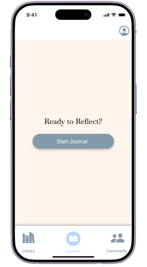
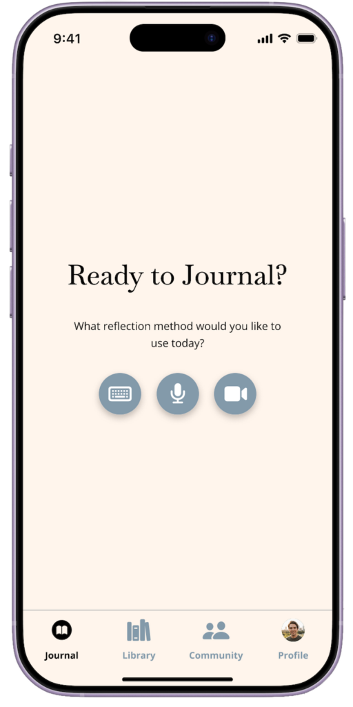
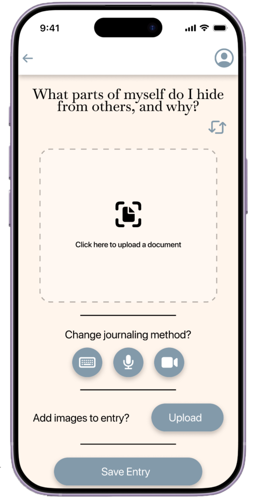
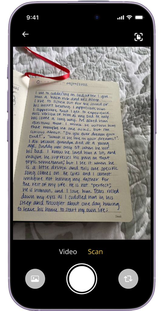
When comparing the before and after designs, the updated screens show clearer feedback, improved navigation, and a more streamlined layout. These changes make it easier for users to understand their actions, whether they are journaling, interacting with community posts, reviewing past entries, or viewing AI-generated insights about their progress.
Final Prototype
Leave a Reply